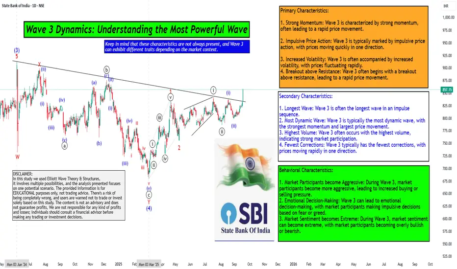
Wave 3 Dynamics: Understanding the Most Powerful WaveHello Friends, Welcome to RK_Chaarts,
For Learning and Practicing chart Analyzing, Today we are trying to Analyse the State Bank of India (SBIN) chart from an Elliott Wave perspective, we can see that the intermediate-degree Wave (3) completed at the June 2024 high. This was followed by a complex correction that ended at the March 2025 low, marking the completion of Wave (4).
We are currently unfolding Wave (5), which will complete the higher-degree Wave ((3)) of Primary degree in black. Within Wave (5), we have five minor-degree subdivisions, which we can see unfolding.
The first minor-degree Wave 1 completed at the 22nd April 2025 high, followed by a Wave 2 correction that ended at the May 9, 2025 low. We are currently in Wave 3, which is a dynamic wave with strong momentum.
Within Wave 3, we have five minute-degree subdivisions, which are unfolding. The first two subdivisions are complete, and we are currently in the third subdivision.
The characteristics of Wave ((iii)) of 3 are evident in the price action, with a strong breakout above the resistance trend line and good intensity of volumes. The Moving Convergence Divergence (MACD) is also positive, and the Relative Strength Index (RSI) is above 60, indicating strong momentum.
The daily Exponential moving averages (50 and 200) are also aligned in favor of the trend. All these parameters support our view, and we can see an inverted head-and-shoulders pattern or a double rounding bottom pattern unfolding.
Overall, the breakout looks promising, and we can expect further upside in SBIN as per Elliott wave theory.
Detailed wave counts on chart
Primary Characteristics:
1. Strong Momentum: Wave 3 is characterized by strong momentum, often leading to a rapid price movement.
2. Impulsive Price Action: Wave 3 is typically marked by impulsive price action, with prices moving quickly in one direction.
3. Increased Volatility: Wave 3 is often accompanied by increased volatility, with prices fluctuating rapidly.
4. Breakout above Resistance: Wave 3 often begins with a breakout above resistance, leading to a rapid price movement.
Secondary Characteristics:
1. Longest Wave: Wave 3 is often the longest wave in an impulse sequence.
2. Most Dynamic Wave: Wave 3 is typically the most dynamic wave, with the strongest momentum and largest price movement.
3. Highest Volume: Wave 3 often occurs with the highest volume, indicating strong market participation.
4. Fewest Corrections: Wave 3 typically has the fewest corrections, with prices moving rapidly in one direction.
Behavioral Characteristics:
1. Market Participants become Aggressive: During Wave 3, market participants become more aggressive, leading to increased buying or selling pressure.
2. Emotional Decision-Making: Wave 3 can lead to emotional decision-making, with market participants making impulsive decisions based on fear or greed.
3. Market Sentiment becomes Extreme: During Wave 3, market sentiment can become extreme, with market participants becoming overly bullish or bearish.
Keep in mind that these characteristics are not always present, and Wave 3 can exhibit different traits depending on the market context.
Here are some snapshots shared below to understand the concept & example
Largest wave among wave 1-3-5
Strong Momentum like 90 degree move, Vertical move, Rapid move & Dynamic move
Breakout with good volumes
Price trading above 50, 100 & 200 Day Exponential Moving Average
RSI Breakout on Daily
RSI Breakout on Weekly
MACD weekly
MACD Daily
Pattern Repeating
I am not Sebi registered analyst. My studies are for educational purpose only.
Please Consult your financial advisor before trading or investing.
I am not responsible for any kinds of your profits and your losses.
Most investors treat trading as a hobby because they have a full-time job doing something else.
However, If you treat trading like a business, it will pay you like a business.
If you treat like a hobby, hobbies don't pay, they cost you...!
Hope this post is helpful to community
Thanks
RK💕
Disclaimer and Risk Warning.
The analysis and discussion provided on in.tradingview.com is intended for educational purposes only and should not be relied upon for trading decisions. RK_Chaarts is not an investment adviser and the information provided here should not be taken as professional investment advice. Before buying or selling any investments, securities, or precious metals, it is recommended that you conduct your own due diligence. RK_Chaarts does not share in your profits and will not take responsibility for any losses you may incur. So Please Consult your financial advisor before trading or investing.
X-indicator
Every counter has a sweet spot. Every counter has a sweet spot. The only question: are you trading it at the right time?
Most traders obsess over what to trade, but few stop to ask when to trade it.
Timing is the difference between a setup that compounds consistently… and one that bleeds capital.
That’s exactly why I built thenexxtradealpha — Adaptive Opening Framework.
It’s designed to identify the optimal timeframe for any counter, so you’re not second-guessing whether you should be looking at the 5-minute, 15-minute, or daily chart.
The framework adapts to the counter itself — helping you trade in alignment with its natural rhythm, not against it.
Because once you know the right time, you stop forcing trades…
And start trading with precision.
Technology Stocks & The AI BoomIntroduction: The New Tech Gold Rush
In every era of human history, technological revolutions have shaped the way societies evolve and how wealth is created. The Industrial Revolution brought us mechanization, the 20th century gave us electricity, telecommunications, and computers, while the late 1990s introduced the world to the internet revolution. Today, we are living through another seismic shift: the rise of artificial intelligence (AI) and its transformation of the stock market, especially technology stocks.
Investors around the world are eyeing AI as the most powerful catalyst of the decade. Just as oil fueled the 20th century economy, data and AI algorithms are fueling the 21st century economy. The AI boom is not just hype; it is fundamentally changing industries, reshaping business models, and creating trillion-dollar opportunities in stock markets.
This essay will dive deep into the evolution of technology stocks, the rise of AI as their newest driver, the role of big players like NVIDIA, Microsoft, and Google, the risks of a bubble, and what the future holds for investors who ride this wave carefully.
The Evolution of Technology Stocks: From Dot-Com to AI
Technology stocks have always fascinated investors because they sit at the heart of innovation. Let’s rewind a little:
Dot-Com Boom (1995–2000): The internet promised to change everything, and it did. Investors poured money into startups with “.com” in their names, many without real revenue models. NASDAQ soared, then crashed in 2000, wiping out trillions in value. However, companies like Amazon and Google survived and thrived, proving that real innovation eventually wins.
Mobile & Social Media Era (2005–2015): Apple, with its iPhone, reshaped communication. Facebook (now Meta) revolutionized social networking. Google became the “gatekeeper” of information, and Amazon scaled e-commerce like never before. This was the era when “FAANG stocks” (Facebook, Apple, Amazon, Netflix, Google) dominated markets.
Cloud & SaaS Boom (2010–2020): Companies realized that software could be rented as a service (SaaS) instead of sold as a product. Cloud computing giants—Amazon Web Services, Microsoft Azure, Google Cloud—emerged as critical infrastructure providers for the digital economy.
The AI Revolution (2020–present): The launch of ChatGPT in 2022 was a watershed moment. Suddenly, AI wasn’t just research—it was mainstream. From generative AI tools creating text, images, and code to predictive algorithms in finance, medicine, and logistics, AI began touching every corner of life. Stock markets reacted explosively, with NVIDIA becoming the poster child of the AI rally.
Technology stocks thrive on “future potential.” AI fits perfectly into this pattern because its potential is vast, even if not fully monetized yet.
AI as the Core Driver of the Next Tech Wave
Why is AI considered the core driver of the next tech wave? Several reasons stand out:
Exponential Data Growth – AI thrives on data, and we are producing more than ever (social media, IoT devices, sensors, financial transactions, medical records).
Computational Power – Thanks to GPUs from NVIDIA, AMD, and cloud infrastructure, AI models can now be trained at unprecedented speeds.
Real-World Applications – Unlike blockchain hype or metaverse dreams, AI already has immediate, tangible applications: customer service bots, fraud detection, drug discovery, self-driving cars, and personalized recommendations.
Economic Efficiency – Businesses see AI as a way to cut costs, automate repetitive tasks, and improve decision-making. This makes adoption financially attractive.
Government & Military Investment – Nations view AI as a strategic asset. From cyber defense to autonomous weapons, government funding ensures that AI development is not just corporate-driven but also geopolitically critical.
Together, these factors explain why AI has become the magnet pulling technology stocks to new heights.
Major Players in AI & Their Stock Market Influence
The AI boom isn’t evenly distributed—some companies are clear winners. Let’s explore the big players:
1. Big Tech Giants
Microsoft (MSFT): Perhaps the biggest early winner of the AI boom. Its $10B investment in OpenAI made it the first mover. AI features have been embedded into Office, Bing, and Azure Cloud, boosting its value proposition.
Alphabet (GOOGL): Google was an AI pioneer, but it was caught off guard by ChatGPT’s viral success. Since then, it has rolled out Gemini AI and integrated AI into search, YouTube, and cloud services. Its stock continues to ride AI momentum.
Amazon (AMZN): Amazon leverages AI in logistics, Alexa voice assistant, and especially AWS, which powers thousands of AI startups. It’s a hidden but major player.
Apple (AAPL): Apple has been quieter, focusing on on-device AI for iPhones, privacy-focused AI features, and health tech. However, its loyal ecosystem means AI adoption can be rapid when rolled out.
Meta (META): Despite losing billions on its metaverse project, Meta has refocused on AI, using it to improve ads, recommendation engines, and VR/AR devices.
2. AI Chipmakers
NVIDIA (NVDA): The ultimate AI stock. Its GPUs power almost every AI model. In 2023–24, its stock skyrocketed as demand outstripped supply. NVIDIA became the symbol of the AI boom.
AMD (AMD): The challenger to NVIDIA, developing AI chips that are gaining traction. It benefits from diversification across gaming, servers, and AI.
Intel (INTC): Once the king of chips, Intel has lagged in AI but is making aggressive moves to catch up with new AI accelerators.
3. Cloud & SaaS Companies
AI needs infrastructure. That’s why cloud providers (AWS, Azure, Google Cloud) and SaaS companies offering AI-enhanced services (Salesforce, Adobe, ServiceNow) are riding the wave.
4. Emerging AI Startups & IPOs
Just as the dot-com era produced new giants, the AI boom is giving rise to startups that may IPO in coming years—like Anthropic, OpenAI, Hugging Face, and Databricks.
AI’s Impact Across Sectors
The beauty of AI is that it’s not confined to “tech.” It’s transforming every sector:
Healthcare: AI helps discover drugs faster, read medical scans more accurately, and personalize treatments. Companies like Moderna and Pfizer are using AI in R&D.
Finance: AI algorithms drive algorithmic trading, fraud detection, and customer support chatbots. Fintech stocks are adopting AI at scale.
Manufacturing: Robotics powered by AI improve efficiency, predictive maintenance, and supply chain optimization.
Education: Personalized learning platforms powered by AI are reshaping how students learn.
Defense & Cybersecurity: Governments see AI as a weapon and shield. Palantir, Lockheed Martin, and defense tech firms integrate AI heavily.
Opportunities for Retail & Institutional Investors
For investors, the AI boom presents opportunities:
Blue-chip AI Leaders: Microsoft, NVIDIA, Google—these are relatively safer bets for long-term investors.
AI Infrastructure: Cloud computing, chipmakers, data storage companies.
Sector ETFs: Funds like Global X Robotics & AI ETF (BOTZ) or ARK Autonomous Tech & Robotics ETF (ARKQ) give diversified exposure.
SMEs & IPOs: Risky but rewarding. Spotting the next “Amazon of AI” early can be life-changing.
Picks & Shovels Strategy: Instead of betting on end-products, invest in those who provide tools and infrastructure for AI (like semiconductors, cloud).
Future Outlook: AI, Quantum, and Beyond
Looking ahead, AI will evolve alongside other emerging technologies:
Quantum Computing + AI: Could exponentially increase computational power, accelerating breakthroughs.
AI in Everyday Devices: From cars to refrigerators, AI will be embedded everywhere.
Human-AI Collaboration: Workplaces will shift to hybrid models where humans handle creativity and ethics while AI manages data-heavy tasks.
Global Competition: The AI race between the U.S., China, and Europe will shape global power dynamics and, in turn, stock markets.
The AI boom is not a short-term trend—it’s a multi-decade megatrend, much like the internet.
Conclusion: Technology Stocks in the Age of AI
We are standing at the beginning of a new technological era. Technology stocks, once driven by internet adoption and cloud computing, are now being reshaped by AI. From NVIDIA’s chips powering massive AI models to Microsoft embedding AI into productivity tools, the shift is undeniable.
The AI boom is both a gold rush and a landmine field. The opportunity to create wealth is real, but so are the risks of speculation and overvaluation. Just as the dot-com crash wiped out many but birthed trillion-dollar companies, the AI wave will reward those who choose wisely.
In short, the future of technology stocks is inseparable from AI. Investors who balance optimism with caution, innovation with valuation, and hype with fundamentals will be the true winners in this new era.

Rise of Emerging Market Economies1. Defining Emerging Market Economies
The term “emerging market” was popularized in the 1980s by Antoine van Agtmael of the International Finance Corporation (IFC). It referred to economies that were transitioning from developing status toward greater industrialization, integration with global markets, and higher living standards.
Key characteristics of emerging market economies include:
Rapid GDP growth compared to developed nations.
Industrialization and urbanization, with a shift from agriculture to manufacturing and services.
Integration into global trade and finance, often as export powerhouses.
Rising middle classes with growing purchasing power.
Institutional reforms such as liberalization, privatization, and market-oriented policies.
Volatility and vulnerability, due to weaker institutions, dependence on foreign capital, or commodity price cycles.
Organizations such as MSCI, IMF, and World Bank classify emerging markets differently, but the major ones usually include China, India, Brazil, Russia, Mexico, Indonesia, South Korea, Turkey, Saudi Arabia, South Africa, and Poland.
2. Historical Background: The Shift from West to East and South
The rise of EMEs must be understood against the backdrop of post-World War II economic history.
1945–1970: Developed World Dominance
The U.S., Western Europe, and Japan led global production.
Developing nations remained primarily commodity exporters.
1970s–1980s: Debt Crisis and Structural Adjustment
Many developing countries borrowed heavily during oil booms.
The 1980s debt crisis (Latin America, Africa) forced IMF-led structural reforms.
1990s: Liberalization and Global Integration
Collapse of the Soviet Union opened up Eastern Europe.
India liberalized its economy in 1991.
China deepened reforms under Deng Xiaoping, creating Special Economic Zones.
Capital markets opened up, allowing global investors to access EMEs.
2000s: The Emerging Market Boom
China’s WTO entry (2001) accelerated global trade.
Commodity supercycle (oil, metals, agricultural products) fueled growth in Brazil, Russia, South Africa, and Middle Eastern economies.
The acronym BRIC (Brazil, Russia, India, China) gained global attention.
2010s–Present: Consolidation and Diversification
China became the world’s second-largest economy.
India emerged as a digital and service hub.
EMEs accounted for two-thirds of global growth post-2008 financial crisis.
New clusters such as MINT (Mexico, Indonesia, Nigeria, Turkey) and Next Eleven gained traction.
3. Drivers Behind the Rise of Emerging Market Economies
3.1 Demographics and Labor Force Advantage
EMEs often have younger populations compared to aging developed nations.
India’s median age (28) contrasts with Europe (43) or Japan (49).
Large, affordable workforces attracted global manufacturing.
3.2 Market Reforms and Liberalization
Privatization of state enterprises.
Reduction in trade barriers and tariffs.
Adoption of free-market policies encouraged FDI.
3.3 Globalization and Technology
Outsourcing, offshoring, and global value chains benefited EMEs.
ICT revolution allowed countries like India to export software services.
Internet penetration spurred innovation in fintech, e-commerce, and mobile banking.
3.4 Commodity and Resource Wealth
Oil exporters (Saudi Arabia, Russia, Nigeria) enjoyed windfalls during price booms.
Brazil and South Africa leveraged agricultural and mineral resources.
3.5 Rising Middle Class and Domestic Consumption
EMEs are not just export hubs; they are huge consumer markets.
China’s middle class (over 400 million people) drives global demand for cars, electronics, and luxury goods.
3.6 Strategic Government Policies
Industrial policies, subsidies, and infrastructure development.
China’s “Made in China 2025” and India’s “Make in India” exemplify targeted growth.
4. Emerging Markets in Global Trade
Emerging markets have transformed global trade patterns.
China is the world’s largest exporter, dominating electronics, machinery, and textiles.
India has become a service export leader in IT, pharmaceuticals, and business outsourcing.
Brazil exports soybeans, iron ore, and beef to global markets.
Vietnam and Bangladesh are leading textile exporters.
Global Supply Chains:
EMEs play a critical role in global value chains. For example, iPhones are designed in the U.S. but assembled in China using parts from multiple EMEs.
Regional Trade Blocs:
ASEAN, MERCOSUR, African Continental Free Trade Area (AfCFTA) are integrating EMEs into powerful trading networks.
5. Emerging Markets in Global Finance
EMEs attract foreign direct investment (FDI) for infrastructure and manufacturing.
Their stock markets, like Shanghai, Mumbai, São Paulo, and Johannesburg, are increasingly important for global investors.
Sovereign wealth funds from EMEs (e.g., Saudi Arabia’s PIF, Singapore’s GIC) are influential global investors.
EMEs have also become sources of outward FDI. Chinese firms, for example, are acquiring companies worldwide.
Challenges:
Vulnerability to capital flight during global crises.
Currency volatility (e.g., Turkish lira, Argentine peso).
Reliance on external financing makes them sensitive to U.S. Federal Reserve interest rate hikes.
6. Challenges Facing Emerging Market Economies
Despite rapid growth, EMEs face structural and cyclical challenges:
Inequality and Poverty
Growth often uneven, creating income gaps.
Dependence on Commodities
Resource-dependent economies suffer during price crashes.
Political and Institutional Weaknesses
Corruption, weak rule of law, and unstable governance reduce investor confidence.
External Vulnerabilities
Dependence on foreign capital and exposure to global shocks (2008 crisis, COVID-19).
Debt Burden
Rising sovereign and corporate debt, especially in Africa and Latin America.
Environmental Pressures
Rapid industrialization leads to pollution, deforestation, and climate risks.
7. Geopolitical Implications
The rise of EMEs has reshaped global geopolitics:
Shift of Power Eastward: China challenges U.S. economic dominance.
New Institutions: BRICS Bank (New Development Bank), Asian Infrastructure Investment Bank (AIIB) provide alternatives to IMF/World Bank.
South–South Cooperation: Trade and investment flows among EMEs (China–Africa, India–ASEAN).
Geopolitical Rivalries: U.S.–China trade war, Russia–West conflicts.
8. Future Outlook
The future of emerging markets will be shaped by several trends:
Digital Transformation: AI, fintech, e-commerce, and Industry 4.0.
Green Growth: Transition to renewables and sustainable models.
Multipolar World Order: EMEs will demand greater voice in institutions like IMF, WTO, UN.
Resilient Supply Chains: Diversification away from China benefits India, Vietnam, and Mexico.
Urbanization: More mega-cities, infrastructure needs, and consumer demand.
If EMEs can overcome inequality, governance, and sustainability challenges, they will be the central drivers of the 21st-century global economy.
Conclusion
The rise of emerging market economies marks one of the most significant shifts in modern economic history. From being marginalized as poor, unstable, or commodity-dependent nations, they have emerged as engines of global growth, innovation, and consumption. Their contribution to global GDP, trade, and finance has redefined economic geography.
Yet, the journey is complex. EMEs remain vulnerable to external shocks, political instability, and environmental challenges. The next phase of their growth will depend on inclusive policies, sustainable development, technological adoption, and institutional strength.
As the world moves toward a multipolar order, emerging markets are no longer just “catching up”; they are shaping the rules, institutions, and direction of the global economy. Their rise is not only an economic story — it is a story of ambition, resilience, and transformation that will define the future of globalization.

Algorithmic & Quantitative Trading in Global Markets1. What is Algorithmic & Quantitative Trading?
1.1 Algorithmic Trading
Algorithmic trading refers to the use of computer programs and rules-based instructions (algorithms) to place, modify, and execute trades automatically. Instead of manually entering buy and sell orders, traders create algorithms that specify conditions such as:
When to enter a trade (e.g., if stock price drops below a moving average).
How much to trade (e.g., 500 shares or $1 million worth).
When to exit (e.g., after a 2% gain or a stop-loss).
Algorithms can execute orders far faster than human traders, often within milliseconds.
1.2 Quantitative Trading
Quantitative trading focuses on the use of mathematical and statistical models to identify trading opportunities. It involves analyzing historical and real-time data to detect patterns, correlations, or inefficiencies that can be exploited.
Quantitative traders (often called “quants”) rely on:
Probability theory
Econometrics
Machine learning
Predictive analytics
While algorithmic trading is about automation of trade execution, quantitative trading is about strategy development using data and mathematics. In practice, the two overlap—most quant strategies are implemented via algorithms.
2. Evolution of Algorithmic & Quant Trading
2.1 Early Stages (1970s–1990s)
1970s: The rise of electronic exchanges (e.g., NASDAQ, 1971) allowed the first basic order automation.
1980s: Institutional investors began using algorithms for "program trading" to manage large orders. However, the infamous 1987 Black Monday crash highlighted risks of automated selling.
1990s: High-speed electronic trading platforms and electronic communication networks (ECNs) began replacing floor trading.
2.2 Rise of High-Frequency Trading (2000s)
By the early 2000s, improvements in computing power, internet speed, and market connectivity enabled high-frequency trading (HFT).
Firms began exploiting microsecond-level arbitrage opportunities.
Quant hedge funds like Renaissance Technologies and DE Shaw became dominant players.
2.3 The 2010 Flash Crash & Aftermath
On May 6, 2010, U.S. markets plunged nearly 10% within minutes, largely blamed on algorithms reinforcing selling pressure.
Regulators worldwide tightened rules on automated trading.
2.4 Present Era (2010s–2020s)
Algo & quant trading now account for 60–75% of equity market volumes in the U.S. and Europe, and growing rapidly in Asia.
Advances in artificial intelligence (AI), big data, and cloud computing fuel new strategies.
Cryptocurrencies and decentralized finance (DeFi) platforms have become new testing grounds for quants.
3. Types of Algorithmic & Quant Strategies
3.1 Market-Making
Algorithms continuously quote buy (bid) and sell (ask) prices to provide liquidity.
Profits are earned from the spread (difference between bid and ask).
High-frequency firms dominate this space.
3.2 Arbitrage Strategies
Exploiting price discrepancies between related assets.
Examples:
Statistical arbitrage: Exploiting mean reversion in correlated stocks.
Index arbitrage: Trading futures vs. underlying index components.
Cross-border arbitrage: Exploiting differences across exchanges.
3.3 Trend-Following
Algorithms identify upward or downward momentum and trade in the direction of the trend.
Examples: moving average crossovers, breakout strategies.
3.4 Mean Reversion
Based on the idea that prices revert to historical averages.
Example: Pair trading—buying undervalued stock and shorting overvalued stock in the same sector.
3.5 Event-Driven
Algorithms trade around earnings announcements, mergers, central bank decisions, or geopolitical news.
Speed and prediction accuracy matter most.
3.6 Machine Learning & AI-Driven
Using deep learning models, natural language processing (NLP), and reinforcement learning.
Example: An AI model analyzing social media sentiment to forecast short-term price moves.
4. Technology Infrastructure Behind Algo & Quant Trading
4.1 Core Components
Low-latency networks: Microsecond data transfer between exchanges and trading servers.
Colocation services: Firms place servers near exchange data centers to reduce transmission delays.
Data feeds: Access to real-time market prices, order book depth, and alternative datasets.
Execution management systems (EMS): Platforms that route orders to exchanges efficiently.
4.2 Role of Big Data
Quants use alternative datasets: satellite images (tracking store traffic), shipping data, credit card transactions, weather patterns, and even social media sentiment.
Processing such vast datasets requires advanced cloud computing and parallel processing.
4.3 Artificial Intelligence
NLP: Extracting sentiment from news headlines.
Reinforcement learning: Teaching an AI to optimize trading decisions via trial and error.
Predictive analytics: Forecasting market volatility or price direction.
5. Benefits of Algorithmic & Quant Trading
Liquidity Provision – Continuous bid-ask spreads keep markets active.
Lower Transaction Costs – Efficient order execution reduces slippage.
Market Efficiency – Arbitrage strategies correct price discrepancies.
Speed & Accuracy – Algorithms eliminate emotional biases.
Accessibility of Data – Democratization of tools allows retail traders to use algo strategies.
6. Risks & Challenges
Systemic Risk – Algorithmic trading can trigger rapid selloffs (e.g., Flash Crash).
Model Risk – A flawed mathematical model can cause large losses.
Overfitting – Quants may design strategies that perform well historically but fail in real markets.
Regulatory Scrutiny – Global regulators worry about market manipulation (e.g., spoofing).
Technology Failures – Latency, software bugs, or cyberattacks can disrupt execution.
Market Fairness – Critics argue HFT gives unfair advantages to large firms over retail investors.
Conclusion
Algorithmic and quantitative trading have fundamentally redefined how global markets function. From providing liquidity and improving efficiency to introducing systemic risks, these technologies reflect both the opportunities and dangers of financial innovation.
While regulators strive to maintain balance between innovation and stability, the global trajectory is clear: the future of trading is algorithmic, quantitative, and increasingly powered by artificial intelligence.
As technology continues to evolve—from quantum computing to decentralized finance—the line between human decision-making and machine-driven markets will blur further. Traders, regulators, and investors alike must adapt to this reality to navigate the ever-shifting landscape of global finance.
Central Bank Digital Currencies (CBDCs) in World Trading Systems1. Understanding CBDCs
1.1 Definition
A Central Bank Digital Currency (CBDC) is a digital form of a country’s sovereign currency, issued and regulated by its central bank. Unlike bank deposits or private stablecoins, CBDCs are a direct liability of the central bank, making them risk-free in terms of credit and liquidity.
1.2 Types of CBDCs
CBDCs are broadly categorized into:
Retail CBDCs – Designed for everyday transactions by individuals and businesses, functioning like digital cash.
Wholesale CBDCs – Used by banks and financial institutions for interbank settlements, large-scale cross-border trade, and capital market operations.
For world trading systems, wholesale CBDCs are particularly relevant because they address cross-border settlement delays, currency risks, and high transaction costs.
2. Historical Context of Trade & Money
To understand how CBDCs might transform world trade, we need to briefly revisit the evolution of money and trading systems.
Gold & Silver Standard: Ancient trade relied on commodity money (gold, silver, copper), valued for scarcity and intrinsic worth.
Paper Money & Fiat Currencies: With modern nation-states, paper currency and fiat systems emerged, backed initially by gold (Bretton Woods, 1944) and later by trust in governments.
The Dollar Dominance: Post-1971, the US dollar became the world’s reserve currency, dominating global trade settlement, particularly in oil and commodities (Petrodollar system).
Digital Payments & Cryptocurrencies: In the 21st century, fintech innovation and blockchain technology challenged traditional banking, raising questions about efficiency, privacy, and sovereignty.
CBDCs represent the next evolutionary step—a blend of sovereign money and digital innovation—capable of transforming not only domestic payments but also cross-border trade systems.
3. CBDCs in Global Trade: Opportunities
3.1 Faster Cross-Border Settlements
Today, cross-border trade payments often take 2–5 days, relying on intermediaries, correspondent banks, and SWIFT messaging. With CBDCs, settlement can be instantaneous, reducing time and risk.
For example, a Chinese exporter selling goods to an African buyer could receive payment in digital yuan instantly, without waiting for dollar-clearing in New York.
3.2 Reduced Transaction Costs
International trade involves currency conversion, banking fees, and correspondent charges, which can add 3–7% to transaction costs. CBDCs, by enabling direct currency-to-currency exchange via digital platforms, could significantly lower costs.
3.3 Financial Inclusion in Trade
Many small and medium enterprises (SMEs), especially in developing economies, struggle with cross-border payments due to lack of banking access. CBDCs can democratize access, enabling SMEs to engage directly in global markets.
3.4 Bypassing SWIFT & Dollar Dependence
One of the most debated impacts of CBDCs is their potential to challenge US dollar hegemony. Currently, over 85% of global trade is invoiced in dollars or euros. CBDCs like the digital yuan (e-CNY) aim to provide an alternative, especially in Asia, Africa, and Belt and Road countries.
3.5 Programmable Money & Smart Contracts
CBDCs can be embedded with programmability, enabling conditional trade payments. For instance:
A CBDC transaction could release payment automatically once goods clear customs.
Smart contracts could enforce trade finance agreements, reducing fraud and disputes.
4. Key Global CBDC Experiments
4.1 China’s Digital Yuan (e-CNY)
The most advanced large-scale CBDC, piloted in over 25 cities.
Being tested in cross-border trade via Hong Kong, Singapore, and Belt and Road Initiative (BRI) partners.
Aims to internationalize the yuan and reduce dollar dependence.
4.2 India’s Digital Rupee
Introduced by the Reserve Bank of India (RBI) in 2022–23.
Wholesale pilot programs for interbank settlements.
Potentially useful for India’s high-volume trade with Asia, Africa, and the Middle East.
4.3 Europe’s Digital Euro
European Central Bank exploring a digital euro for retail and wholesale use.
Expected to strengthen eurozone trade settlement systems and reduce reliance on US intermediaries.
4.4 Project Dunbar & Project mBridge
Project Dunbar (BIS): A multi-CBDC platform involving Singapore, Australia, Malaysia, and South Africa.
Project mBridge: Collaboration between China, Thailand, UAE, and Hong Kong, enabling real-time cross-border CBDC payments.
These pilots suggest that CBDCs are moving beyond national borders into multilateral trade systems.
5. Implications for World Trading Systems
5.1 Geopolitical Shifts in Currency Power
CBDCs could accelerate the shift from unipolar dollar dominance to a multipolar currency order, where regional CBDCs (digital yuan, digital rupee, digital euro) coexist and compete.
5.2 Trade Alliances & CBDC Zones
Countries may form CBDC trading blocs, agreeing to settle in digital currencies instead of dollars. For example:
BRICS nations exploring a CBDC trade platform.
Gulf states considering digital settlements for oil exports.
5.3 Transparency vs. Privacy
CBDCs offer traceability, reducing trade-based money laundering and fraud. However, this raises concerns about state surveillance of international transactions.
5.4 Impact on SWIFT & Correspondent Banking
If CBDCs enable direct central bank-to-central bank settlement, traditional intermediaries like SWIFT and correspondent banks could lose relevance.
5.5 Exchange Rate Mechanisms
With real-time settlement, CBDCs may require new FX models, possibly leading to dynamic currency baskets for trade invoicing.
6. Challenges & Risks
6.1 Interoperability
For CBDCs to work in world trade, different national CBDCs must interact seamlessly. This requires standardized protocols and cross-border agreements.
6.2 Cybersecurity Threats
CBDCs, being digital, face risks of hacking, cyberwarfare, and systemic attacks, which could disrupt global trade.
6.3 Monetary Sovereignty Conflicts
If a foreign CBDC gains dominance in another country (e.g., digital yuan in Africa), it may undermine local monetary control.
6.4 Technological Divide
Advanced economies may adopt CBDCs faster, leaving developing nations behind, creating digital trade inequalities.
6.5 Political Resistance
The US, benefiting from dollar dominance, may resist widespread CBDC adoption in trade settlement. Sanctions, regulations, and political pressure could slow CBDC globalization.
Critical Perspectives
While CBDCs promise efficiency and inclusivity, critics warn that:
They may fragment global finance if each nation builds incompatible systems.
CBDCs could be used as tools of geopolitical influence, where powerful economies push their CBDCs onto weaker partners.
Privacy concerns and state control may reduce adoption in democratic societies.
Thus, the success of CBDCs in world trading systems depends not only on technology but also on trust, governance, and global cooperation.
Conclusion
Central Bank Digital Currencies are no longer theoretical—they are becoming reality. Their integration into world trading systems could redefine how goods, services, and capital move across borders. CBDCs promise faster, cheaper, and more inclusive trade settlements, reducing reliance on intermediaries and potentially reshaping global monetary power.
Yet, the transition is fraught with challenges: interoperability, cybersecurity, political resistance, and the risk of financial fragmentation. The future likely points to a multi-CBDC ecosystem, coordinated by international institutions, where nations balance efficiency with sovereignty.
In essence, CBDCs represent both a technological innovation and a geopolitical tool. Their impact on global trade will depend not just on design and adoption but on how nations choose to cooperate—or compete—within this new digital financial order.
Eurodollar & Offshore Banking MarketsPart I: The Eurodollar Market
1. What is a Eurodollar?
At its simplest, a Eurodollar is a U.S. dollar-denominated deposit held outside the United States. For example, if a bank in London, Paris, or Hong Kong holds deposits in U.S. dollars, those deposits are Eurodollars.
Key points:
They are not issued by the U.S. Federal Reserve but still represent claims in U.S. dollars.
Despite the name, Eurodollars are not confined to Europe; they can exist in Asia, the Middle East, or the Caribbean.
They emerged as a way for banks and corporations to avoid U.S. regulations on interest rates and reserve requirements.
2. Historical Background
The Eurodollar market traces its origins to the 1950s and Cold War tensions. Several factors contributed:
Soviet Union and U.S. dollars: The USSR, fearing that its U.S. dollar deposits in American banks might be frozen during geopolitical conflicts, moved its dollar holdings to European banks.
U.S. banking regulations: At the time, U.S. banks faced regulations such as Regulation Q, which capped the interest they could pay on deposits. Foreign banks were not subject to these rules, making them more attractive to depositors.
Rise of multinational trade: Post-WWII reconstruction and expanding global trade increased the demand for dollars as the world’s reserve currency.
By the 1960s, London had emerged as the global hub for Eurodollar transactions, giving rise to a powerful offshore dollar market.
3. Growth and Development
From its modest beginnings, the Eurodollar market exploded in size. By the 1980s, it had grown into trillions of dollars, outpacing many domestic financial markets. The reasons for its rapid growth include:
Regulatory arbitrage: Banks outside the U.S. could offer higher interest rates and greater flexibility.
Global trade dominance of the dollar: Oil, commodities, and manufactured goods were priced in U.S. dollars, fueling the need for offshore dollar financing.
Institutional investors: Pension funds, sovereign wealth funds, and corporations used Eurodollars for liquidity and hedging.
Today, the Eurodollar market remains one of the largest financial markets in the world, although it has become less visible due to the rise of new funding channels and regulatory reforms.
4. How the Eurodollar Market Works
Deposits: A corporation, government, or investor deposits U.S. dollars in a non-U.S. bank.
Loans: That bank can then lend those dollars to other entities—governments, corporations, or other banks.
Interbank lending: The Eurodollar market is largely an interbank market, where banks borrow and lend dollars to manage liquidity.
Benchmark rates: For decades, Eurodollar interest rates were benchmarked by LIBOR (London Interbank Offered Rate), which became a global standard until its phase-out in 2023.
5. Importance of the Eurodollar Market
Liquidity source: Provides massive pools of dollar liquidity for international trade and investment.
Financing channel: Enables borrowers outside the U.S. to access dollar funding without dealing directly with U.S. banks.
Influences monetary policy: The Eurodollar market often dilutes the Federal Reserve’s control over dollar liquidity since so much activity occurs offshore.
Global benchmark: Eurodollar rates long influenced bond yields, derivatives, and loan agreements worldwide.
Part II: Offshore Banking Markets
1. What is Offshore Banking?
Offshore banking refers to holding financial accounts or conducting financial transactions in a country other than one’s own—usually in a jurisdiction with favorable tax, secrecy, or regulatory frameworks.
Key features:
Offshore banks are typically located in financial centers like the Cayman Islands, Switzerland, Singapore, Luxembourg, and Panama.
They cater to multinational corporations, wealthy individuals, hedge funds, and even governments.
Offshore banking often overlaps with the Eurodollar market, since many offshore banks hold large U.S. dollar deposits.
2. Why Do Offshore Banking Markets Exist?
The rise of offshore banking is tied to several motivations:
Tax optimization: Offshore centers often have low or zero taxes.
Confidentiality: Many jurisdictions protect account-holder secrecy.
Regulatory flexibility: Offshore markets usually impose fewer restrictions on lending, derivatives, or leverage.
Globalization of finance: Companies and investors prefer jurisdictions with ease of cross-border transfers.
3. Evolution of Offshore Banking
Early roots: Switzerland pioneered offshore banking in the early 20th century with its famous banking secrecy laws.
1960s boom: As global capital flows increased, small island nations like the Cayman Islands, Bermuda, and the Bahamas developed into tax havens.
Modern era: Offshore financial centers now play host to hedge funds, insurance companies, and multinational corporate treasury operations.
4. Offshore Banking Activities
Offshore banks and markets offer a wide range of financial services:
Accepting deposits in multiple currencies (especially U.S. dollars).
Syndicated lending to corporations and governments.
Hosting investment funds (hedge funds, private equity).
Structured finance and derivatives trading.
Tax-efficient corporate structures and trusts.
5. Key Offshore Financial Centers
Cayman Islands: World’s largest hub for hedge funds.
Luxembourg: Center for mutual funds and investment vehicles.
Singapore & Hong Kong: Major Asian offshore centers.
Switzerland: Traditional private banking and wealth management.
Panama & Bermuda: Shipping registries, insurance, and banking.
Part III: Eurodollar and Offshore Banking Interconnection
The Eurodollar market and offshore banking are deeply intertwined:
Dollar dominance: Most offshore banking activity is denominated in U.S. dollars, linking it directly to the Eurodollar system.
Regulatory escape: Both markets developed as ways to escape stricter U.S. or domestic regulations.
Liquidity networks: Offshore banks often use Eurodollar deposits to fund lending and investment activities.
Shadow banking overlap: Many offshore banking activities resemble “shadow banking,” operating outside traditional regulatory oversight.
For example:
A hedge fund in the Cayman Islands may borrow Eurodollars from a London-based bank to finance a leveraged trade.
A corporation might use offshore subsidiaries to issue Eurodollar bonds and avoid domestic capital controls.
Part IV: Benefits and Risks
Benefits
Global liquidity: Eurodollars and offshore markets provide deep pools of capital.
Efficient financing: Corporations and governments can raise money at competitive rates.
Flexibility: Offshore markets are often more innovative and less constrained.
Reserve diversification: Countries can park dollar reserves outside the U.S. financial system.
Risks
Regulatory blind spots: Lack of oversight can lead to instability.
Systemic risk: Eurodollar funding shortages have triggered crises (e.g., 2008 global financial crisis).
Tax evasion & illicit finance: Offshore banking is often linked to money laundering and tax havens.
Monetary policy leakage: The Federal Reserve cannot fully control dollar liquidity abroad.
Part V: Case Studies
1. The 2008 Financial Crisis
During the crisis, global banks faced a shortage of dollar liquidity. Many European banks, heavily reliant on Eurodollar funding, found themselves unable to roll over short-term borrowing. The Federal Reserve had to establish swap lines with foreign central banks to provide emergency dollars—showing how central offshore dollar markets are to global stability.
2. LIBOR Scandal
For decades, Eurodollar deposits set the LIBOR benchmark rate. In the 2010s, scandals revealed manipulation by major banks, undermining trust and leading to LIBOR’s replacement with alternative benchmarks (e.g., SOFR in the U.S.).
3. Panama Papers & Offshore Secrecy
The 2016 Panama Papers leak exposed how corporations, politicians, and wealthy individuals used offshore structures to hide wealth, evade taxes, or launder money. It highlighted the dark side of offshore banking markets.
Part VI: The Future of Eurodollars and Offshore Banking
Shift to digital currencies: Central Bank Digital Currencies (CBDCs) could reshape offshore markets by offering direct alternatives to Eurodollars.
Greater regulation: International pressure is increasing on tax havens and offshore secrecy jurisdictions.
Continued dollar dominance: Despite talk of “de-dollarization,” the Eurodollar system remains deeply entrenched in global finance.
Asia’s rise: Offshore centers in Singapore and Hong Kong are expected to play an even larger role in the future.
Conclusion
The Eurodollar and offshore banking markets are the invisible arteries of global finance. They emerged from the need to bypass restrictions and optimize global capital flows, but over time, they became fundamental pillars of the world economy.
On one hand, they provide liquidity, efficiency, and flexibility for international trade and investment. On the other, they pose serious challenges: regulatory blind spots, risks to financial stability, and opportunities for illicit financial activities.
As the global economy evolves—with digital finance, geopolitical shifts, and regulatory changes—the role of Eurodollars and offshore banking will also transform. Yet, their core purpose—channeling capital across borders—will ensure they remain central to the world’s financial system.

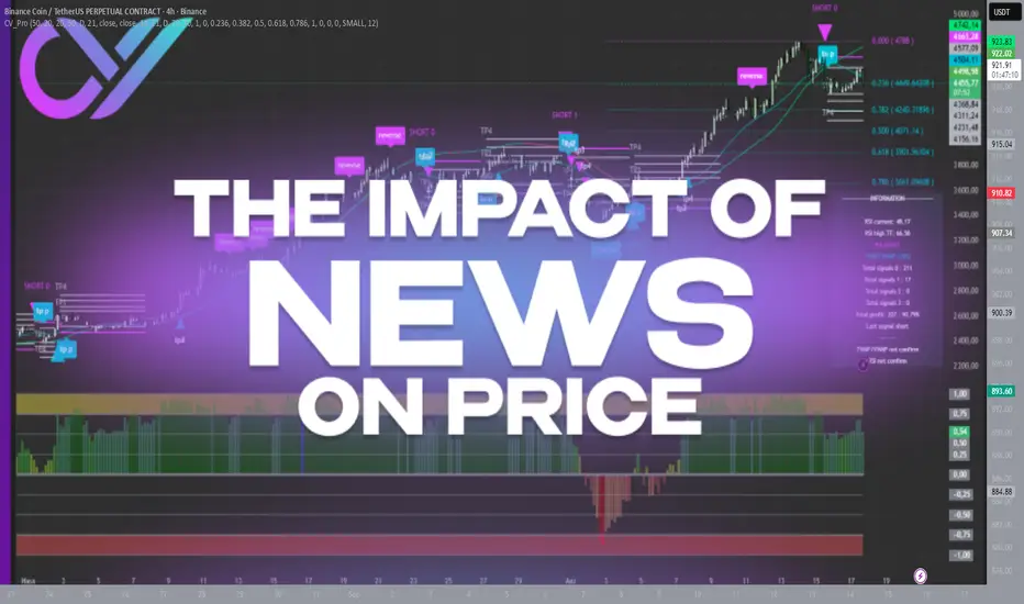
The Impact of News on Price: Should You React?"
In trading, news has always been a powerful factor capable of moving markets by double digits within hours. A single headline in the financial media or a tweet from a politician can send an asset soaring or crashing, wiping out stop-losses and creating waves of panic. Many traders have faced moments when a sudden “breaking story” ruined carefully built plans: technical analysis showed a steady trend, but a flood of headlines turned the market in the opposite direction. Naturally, the question arises: should we react to news immediately, or is it better to stay calm?
Most traders make their biggest mistakes during such moments. The temptation appears to jump straight into a position or close one in fear. Emotions take over: fear of missing out and greed for quick profits. The problem is, these decisions rarely come from a system. More often, they turn trading into gambling, where outcomes depend on luck instead of analysis.
The truth is, news itself doesn’t always have a straightforward impact on the market. What matters more is how participants react. The same piece of information can trigger a rally or a sell-off depending on how major players interpret it. Blindly following the headlines rarely leads to consistent results.
A more effective approach is to treat news as background, not as a direct call to action. At the core of successful trading lies discipline and an understanding of levels, not headlines. If the price is approaching a pre-marked zone, that zone—not a comment on a news feed—defines the scenario. This way, the trader avoids guessing crowd reactions and focuses on what is objectively visible on the chart.
Consider two scenarios. In the first, a trader sees news that a large fund has purchased crypto and instantly opens a long. In the second, the same trader reads the same news but acts only after confirming the move technically, at pre-defined levels. The difference is striking: the first approach is emotional, the second is structured. And it’s the latter that reduces chaotic mistakes.
To trade this way, it’s not enough to simply recognize levels—you need a system to control them. That’s where structured analysis comes in: viewing price step by step, turning trading into a managed process. With this approach, profit targets, risk zones, and scenarios are mapped out in advance. Strong news flow becomes a side factor, not the core driver of decisions.
Experienced traders know that news will always shake markets. Instead of chasing every headline, it’s more effective to build trades that can withstand volatility. What helps here is having a process that removes emotions and focuses on numbers. Automation of analysis and clear visualization of key levels transform trading from chaotic reactions into a disciplined plan.
So, should you react to news? The answer is: yes, but not directly. React through your system. If the news aligns with the technical picture, it can add conviction. If it contradicts it, the priority remains with structure, not emotion. This is what allows you to operate calmly, without panic or euphoria.
Markets will never stop being unpredictable, and news is just one facet of that uncertainty. But discipline, technical analysis, and structured control can turn even the noisiest events into a manageable process. In the end, it’s not the headlines that matter most, but your ability to stay focused and consistent. And this is exactly where tools that automate the process, reduce chaos, and keep logic at the center become indispensable."
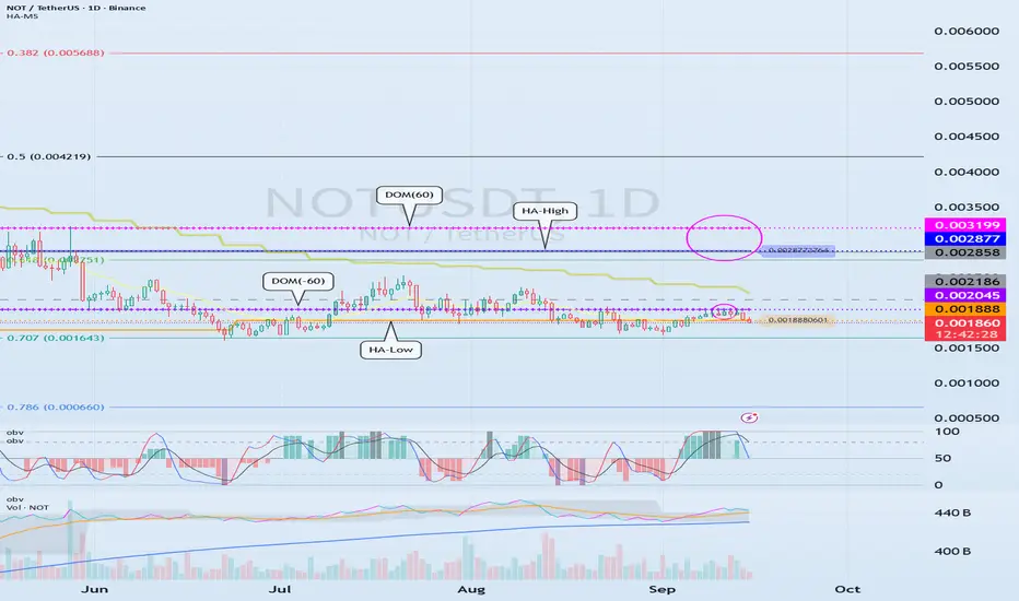
Explanation of the Basic Trading Strategy
Hello, fellow traders!
Follow me to get the latest information quickly.
Have a great day.
-------------------------------------
To understand the charts, the basic trading strategy is the concept used.
Let's look at an example.
---------------------------------------------------------
The OBV indicator, which follows the Low Line ~ High Line channel, has shown an upward trend as it has broken above EMA 1 and EMA 2.
Afterwards, the DOM(60) and HA-High indicators were formed, ultimately returning the price to its original position.
Since the HA-Low indicator is forming at 0.001888, we need to examine whether it can find support and rise around this level.
In other words, a buy signal is in the 0.001888-0.002045 range, where support is found and the price rises.
Since the HA-Low and HA-High indicators have converged, a sharp rise is expected if the sideways movement ends and the price rises above 0.002877-0.003199.
-
The basic trading strategy is based on the HA-Low and HA-High indicators, indicators developed for trading on Heikin-Ashi charts.
The basic trading strategy is to buy in the DOM(-60) to HA-Low range and sell in the HA-High to DOM(60) range.
However, if the price rises from the HA-High to DOM(60) range, a step-like upward trend is likely, while if it falls from the DOM(-60) to HA-Low range, a step-like downward trend is likely.
Therefore, the basic trading strategy should be a segmented trading approach.
Therefore, rather than predicting trends based on the movements of one or two indicators, you should prioritize developing a basic trading strategy.
-
If the HA-Low indicator touches and rises to meet the HA-High indicator, the wave should be considered closed.
Furthermore, if the HA-High indicator touches and falls to meet the HA-Low indicator, the wave should also be considered closed.
Remember that the closing of these waves serves as a benchmark for creating new trading strategies.
Previous waves should be forgotten and new trading strategies developed.
-
Thank you for reading to the end.
I wish you successful trading.
--------------------------------------------------
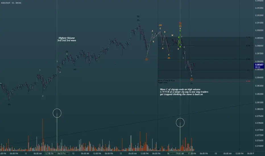
Using simple volume for added confluence in Elliott Wave Theory!Shown on the chart is 2 of the ways you can use the highest volume spikes on the chart to find out where you are in the wave count. Easiest way is to find the highest volume with the steepest slope of trend to label as your third wave. Same concept whether its bearish bars printing or bullish bars. The highest volume shown is actually part of the retracement, albeit in one of the actionary waves (moving with trend), alot of buying happened at the termination of the wave C of the zig zag shown in green. Perfect scenario to rake in buy orders from retail then dump on them to finish out the WXY pattern. This is just 2 of the many scenarios in which you can find help from the volume oscillator to give you a directional bias in Elliott Waves. Happy Trading
Floating vs. Pegged Exchange Rates in the Global MarketUnderstanding Exchange Rate Systems
1. Floating Exchange Rate
A floating exchange rate (also called a flexible exchange rate) is determined primarily by the free interaction of demand and supply in the forex market. Governments and central banks may intervene occasionally to smooth out volatility, but fundamentally, market forces dictate the price.
For example:
If global investors demand more U.S. dollars for trade or investment, the dollar appreciates.
If demand weakens, the dollar depreciates.
Countries like the United States, Japan, the Eurozone, Canada, and the UK operate under floating exchange rate regimes.
2. Pegged Exchange Rate
A pegged or fixed exchange rate system involves a government or central bank fixing its currency’s value relative to another “anchor” currency, often the U.S. dollar or the euro. This peg is maintained through direct intervention in forex markets or monetary policy adjustments.
For instance:
Hong Kong pegs the Hong Kong dollar to the U.S. dollar at a fixed rate of around 7.8 HKD/USD.
Saudi Arabia pegs the riyal to the dollar, ensuring stability for its oil exports priced in USD.
Pegged systems can be hard pegs (currency board arrangements or dollarization) or soft pegs (adjustable or crawling pegs).
Historical Context
The Gold Standard (1870s–1914)
Currencies were pegged to gold at a fixed rate. This ensured global stability but limited monetary flexibility.
Bretton Woods System (1944–1971)
After WWII, countries pegged their currencies to the U.S. dollar, which itself was convertible into gold at $35/ounce. The system collapsed in 1971 when the U.S. suspended dollar-gold convertibility, paving the way for floating exchange rates.
Post-1970s Era
Most advanced economies adopted floating exchange rates, while developing countries often retained pegged systems to ensure stability.
Mechanisms of Floating vs. Pegged
Floating Exchange Rate Mechanism
Market Driven: Currency value fluctuates daily based on demand/supply.
Determinants: Trade balance, interest rate differentials, inflation, speculation, capital flows.
Volatility: High sensitivity to market news, geopolitical events, and investor sentiment.
Pegged Exchange Rate Mechanism
Official Fix: Government declares a fixed parity with another currency.
Central Bank Role: Uses reserves of foreign currency to buy/sell its own currency to defend the peg.
Policy Trade-off: Sacrifices independent monetary policy for stability.
Advantages & Disadvantages
Floating Exchange Rates
Advantages:
Automatic Adjustment – Trade imbalances are corrected naturally. A deficit leads to currency depreciation, making exports cheaper and imports costlier, restoring balance.
Monetary Independence – Central banks can use interest rates for domestic goals (inflation, growth).
Shock Absorption – Floating currencies can absorb external shocks like oil price fluctuations.
No Need for Reserves – Less dependence on large forex reserves.
Disadvantages:
Volatility – Exchange rates can swing dramatically, hurting exporters/importers.
Speculative Attacks – Vulnerable to speculative flows and sudden capital flight.
Imported Inflation – A weaker currency raises import costs.
Uncertainty in Trade – Businesses face risks in cross-border contracts.
Pegged Exchange Rates
Advantages:
Stability – Predictable exchange rates encourage trade, investment, and confidence.
Inflation Control – Pegging to a stable currency (like the USD) can anchor inflation expectations.
Investor Confidence – Reduces currency risk, attracting foreign capital.
Economic Integration – Helps small, open economies integrate into global markets.
Disadvantages:
Loss of Monetary Policy Independence – Central banks cannot freely adjust interest rates.
Risk of Currency Crisis – Maintaining a peg under speculative attack can deplete reserves (e.g., Asian Financial Crisis, 1997).
Distorted Trade Balances – Pegs can create artificial competitiveness or overvaluation.
Cost of Reserves – Countries must hold massive forex reserves to defend the peg.
Global Case Studies
Floating Exchange Rate Examples
United States (USD) – The dollar floats freely, driven by capital flows, interest rate policies of the Federal Reserve, and global demand for safe assets. Despite volatility, it remains the world’s reserve currency.
Eurozone (EUR) – The euro floats against global currencies. The European Central Bank targets inflation, not exchange rate levels, showcasing independence.
Japan (JPY) – Historically intervened to weaken the yen to support exporters but maintains a floating regime.
Pegged Exchange Rate Examples
Hong Kong Dollar (HKD) – Pegged to USD since 1983 at ~7.8. The currency board system ensures credibility but ties Hong Kong’s interest rates to U.S. policy.
Saudi Riyal (SAR) – Pegged to USD to stabilize oil trade revenues. Provides certainty but makes the economy vulnerable to U.S. monetary policy shifts.
China (CNY) – Historically pegged to USD, now operates a managed float. The People’s Bank of China intervenes to guide the yuan’s value, balancing trade competitiveness and stability.
Argentina (1990s) – Pegged peso to USD at 1:1 to fight hyperinflation. Initially successful but collapsed in 2001 due to unsustainable debt and loss of competitiveness.
Impact on Global Markets
Trade Flows
Floating currencies allow natural adjustment, promoting fair competition.
Pegged currencies provide certainty but may lead to trade distortions if misaligned.
Capital Flows & Investment
Stability of pegged systems attracts FDI but risks sudden collapse.
Floating regimes can deter investment due to volatility, though hedging instruments mitigate this.
Financial Stability
Pegged regimes are prone to speculative crises (e.g., Thailand 1997, UK’s “Black Wednesday” 1992).
Floating systems face volatility but rarely collapse outright.
Global Imbalances
Persistent pegs (e.g., China’s undervalued yuan in early 2000s) contribute to global trade imbalances, fueling disputes with trading partners.
Future Trends
Rise of Managed Floats – Pure floats and hard pegs are rare. Most countries adopt intermediate systems for balance.
Digital Currencies & Exchange Rates – Central Bank Digital Currencies (CBDCs) could change how pegs/floats operate in practice.
Multipolar Currency World – As China, India, and others gain influence, multiple anchor currencies may coexist, complicating peg strategies.
Geopolitical Pressures – Sanctions, capital controls, and global fragmentation will influence exchange rate choices.
Conclusion
Floating and pegged exchange rates represent two ends of a spectrum in international monetary policy. Floating systems emphasize market freedom, flexibility, and autonomy, while pegged systems prioritize stability, predictability, and investor confidence. Both have strengths and vulnerabilities, and their suitability depends on a country’s economic structure, development stage, and integration with global markets.
In today’s interconnected world, a majority of nations operate hybrid or managed float systems, reflecting the need for both stability and adaptability. As global trade, digital finance, and geopolitical dynamics evolve, the debate between floating and pegged exchange rates will remain central to discussions on international economic governance.
World Bank & Emerging Market DevelopmentUnderstanding Emerging Markets
1. Defining Emerging Markets
An “emerging market” is typically defined as an economy that is not yet fully developed but exhibits high growth potential. They are characterized by:
Rising GDP growth rates.
Rapid urbanization and industrialization.
Expanding financial markets.
Increasing foreign direct investment (FDI).
Growing importance in global trade.
Examples include India, Brazil, South Africa, Turkey, Mexico, Vietnam, and Indonesia, as well as frontier economies like Kenya, Bangladesh, and Ethiopia.
2. Characteristics of Emerging Markets
Demographics: Large young populations, creating both opportunities (labor force, consumption) and challenges (employment, education).
Infrastructure Needs: Roads, ports, electricity, and digital networks are often underdeveloped.
Governance Challenges: Issues of corruption, weak institutions, and political instability persist.
Vulnerability to Shocks: They depend on commodities, remittances, and global capital flows, making them exposed to volatility.
Dual Economies: Often a mix of modern urban centers with advanced industries and rural areas dependent on agriculture.
The World Bank: An Overview
1. Structure of the World Bank Group (WBG)
The World Bank is part of the World Bank Group, which includes:
IBRD (International Bank for Reconstruction and Development) – provides loans to middle-income and creditworthy low-income countries.
IDA (International Development Association) – provides concessional loans and grants to the poorest countries.
IFC (International Finance Corporation) – promotes private sector development.
MIGA (Multilateral Investment Guarantee Agency) – offers political risk insurance and credit enhancement.
ICSID (International Centre for Settlement of Investment Disputes) – provides arbitration facilities for investment disputes.
2. Objectives of the World Bank
Reducing extreme poverty.
Promoting sustainable economic development.
Facilitating investment in infrastructure, education, health, and governance.
Supporting private sector growth and job creation.
Strengthening resilience to climate change and global crises.
World Bank’s Role in Emerging Market Development
1. Financing Infrastructure
One of the World Bank’s biggest contributions is funding infrastructure projects: roads, ports, power plants, water systems, and digital networks. Infrastructure lays the foundation for industrialization, trade, and productivity growth.
In India, the World Bank has funded rural electrification and metro transport systems.
In Africa, it has supported the Africa Power Project to expand electricity access.
2. Poverty Reduction Programs
The World Bank invests heavily in programs aimed at reducing poverty and inequality. Examples include:
Conditional cash transfers in Latin America.
Rural development projects in South Asia.
Healthcare and vaccination programs in Sub-Saharan Africa.
3. Strengthening Institutions and Governance
Emerging markets often face weak institutional frameworks. The World Bank provides technical assistance to improve governance, transparency, tax collection, and public financial management.
4. Promoting Private Sector Development
Through the IFC, the World Bank fosters private enterprise, small and medium enterprises (SMEs), and access to finance. It mobilizes private investment in sectors such as energy, manufacturing, and digital technology.
5. Crisis Response and Resilience
Emerging markets are vulnerable to financial crises, pandemics, natural disasters, and climate shocks. The World Bank provides rapid financing and policy support in times of crisis. For example:
During COVID-19, the Bank committed billions for vaccines and health system strengthening.
In food crises, it has supported agricultural productivity and emergency aid.
Case Studies of World Bank in Emerging Markets
1. India
The World Bank has invested in education projects like Sarva Shiksha Abhiyan, enhancing literacy and enrollment rates.
It has supported clean energy projects, such as solar parks and wind farms.
World Bank loans have also been directed towards digital governance and financial inclusion (Aadhaar-linked systems).
2. Brazil
The World Bank has funded projects in Amazon rainforest conservation.
It has also supported urban infrastructure in cities like São Paulo and Rio de Janeiro.
Programs addressing inequality and slum rehabilitation have benefited from World Bank assistance.
3. Sub-Saharan Africa
In Kenya, the World Bank financed the Geothermal Energy Expansion project.
In Ethiopia, it has invested in agriculture modernization and irrigation.
Across Africa, the IDA is the largest source of concessional financing, focusing on health, infrastructure, and governance.
4. Vietnam
Transitioned from a centrally planned to a market economy with World Bank guidance.
Major infrastructure projects (roads, ports, and power grids) were co-financed.
Poverty rates fell dramatically from over 70% in the 1980s to under 6% today.
Successes of World Bank in Emerging Markets
Poverty Reduction – Countries like Vietnam, India, and Bangladesh have seen significant poverty reduction with World Bank support.
Infrastructure Development – Roads, ports, and energy systems financed by the Bank have fueled industrialization.
Human Capital – Investments in education and health have improved literacy, reduced infant mortality, and increased life expectancy.
Private Sector Growth – Through the IFC, the Bank has boosted SME development, job creation, and entrepreneurship.
Global Integration – World Bank programs helped countries integrate into global trade and attract FDI.
Emerging Challenges and Future Role
1. Climate Change and Sustainability
Emerging markets are among the most vulnerable to climate shocks. The World Bank is increasingly focusing on green financing, renewable energy, and climate resilience.
2. Digital Transformation
The future of development is digital. The Bank supports digital finance, e-governance, and broadband connectivity to bridge the digital divide.
3. Inequality and Inclusive Growth
Even as GDP grows, inequality remains high in emerging markets. World Bank programs are now emphasizing inclusive growth, targeting women, rural populations, and marginalized groups.
4. Geopolitical Tensions and Multipolarity
As China expands its influence through the Asian Infrastructure Investment Bank (AIIB) and Belt & Road Initiative (BRI), the World Bank faces competition in development finance. Collaborations and new models of financing will define the future.
5. Health and Pandemic Preparedness
The COVID-19 pandemic revealed the fragility of health systems. The Bank is likely to expand investments in universal health coverage, vaccine development, and pandemic resilience.
Conclusion
The relationship between the World Bank and emerging market development is a story of both achievement and controversy. On one hand, the Bank has helped lift millions out of poverty, build transformative infrastructure, and create opportunities for growth and integration into the world economy. On the other, it has been criticized for policies that sometimes exacerbated inequality, debt, or environmental harm.
As the global landscape shifts—with climate change, digital transformation, geopolitical rivalries, and health crises at the forefront—the World Bank’s role in emerging markets will evolve. Its challenge will be to balance financing with sustainability, growth with inclusivity, and global integration with local autonomy.
Ultimately, the World Bank remains a cornerstone of development finance, and for emerging markets, it will continue to be a vital partner in the pursuit of prosperity, stability, and resilience in the 21st century.
Mastering Market Rhythm Through Adaptation👋Welcome, everyone!
In my previous post, I shared “The Secret Formula: Time + Structure = 80% Win Rate!” – a powerful way to increase your trading accuracy. But here’s the truth: even the best formula won’t work if you apply it blindly to every situation.
That’s why today I want to dive deeper into the next key lesson:
👉 Mastering Market Rhythm Through Adaptation
Why is this important?
The market has its own rhythm. Sometimes it trends strongly, sometimes it ranges, and other times it becomes extremely volatile. If you try to force one strategy on every scenario, you’ll be out of sync – and out of money.
By adapting, you will:
Know when to trade aggressively and when to scale down.
Choose the right strategy for the right market phase.
Most importantly: protect your capital and survive long enough to thrive.
How to adapt in practice
- Identify the market condition: Trend – Range – High Volatility.
- Adjust your strategy:
Clear trend → trend-following.
Range-bound → trade support and resistance.
High volatility → reduce lot size, focus on risk control.
- Multi-timeframe analysis: H1 may look sideways while H4 shows a clear trend.
- Always prepare a Plan B: If the market shifts, you won’t be caught off guard.
Real-world examples
XAUUSD: Fed cuts rates → gold rallies → follow the trend.
EURUSD: Pre-news uncertainty, ranging between 1.0850 – 1.0950 → range trading.
BTCUSDT: ETF approval sparks huge volatility → cut position size, wait for stability.
Final thoughts
There is no “holy grail” in trading. The real edge comes from knowing how to dance in sync with the market’s rhythm . The formula Time + Structure shows you where and when, while market adaptation shows you how long you can stay in the game.
👉 Would you like me to share a live case study on XAUUSD , applying both Time + Structure and Market Condition Analysis step by step?

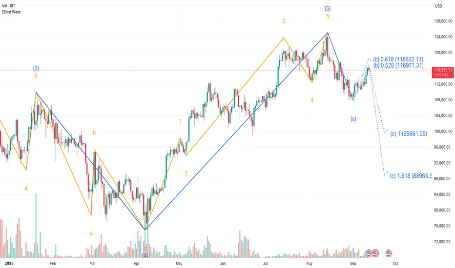
Understanding Elliott Wave Theory with BTC/USD If you’ve ever stared at a Bitcoin chart and thought, “ This looks like chaos ”, Ralph Nelson Elliott might disagree with you. Back in the 1930s, Elliott proposed that markets aren’t just random squiggles — they actually move in recognizable rhythms. This became known as Elliott Wave Theory .
So, what is Elliott Wave Theory? In the simplest terms, it’s the idea that market psychology unfolds in waves: five steps forward, three steps back, repeat. Not every chart follows it perfectly, but when you see it play out, it feels like spotting order in the middle of crypto madness.
⚠️ Before we dive in: remember, no single tool or pattern works alone. Elliott wave trading is most useful when combined with other methods.
The Elliott Wave Principle
At the heart of the Elliott Wave principle are two phases:
Impulse Waves (5 waves) : Markets advance in five moves — three with the trend, two counter-trend. This is when optimism snowballs.
Corrective Waves (3 waves) : The market cools off in three moves. Usually messy, choppy, and fueled by doubt.
Put them together, and you get a “5-3“ structure that repeats at different scales. That’s what gives Elliott Wave its fractal character. Again, don’t treat this as a crystal ball. Elliott Wave Theory rules are guidelines, not guarantees. Real-world Bitcoin charts bend, stretch, and sometimes ignore them altogether.
Elliott Wave Theory Explained with BTC
Let’s use an example: Bitcoin’s rally from early 2025 till now .
This downturn marked the first step in a broader consolidation, signaling that momentum was beginning to fade.
The corrective sequence unfolded in a classic A-B-C structure.
❗This three-part move effectively reset the market, washing out excess leverage and preparing the ground for the next impulsive cycle.
From that low, Bitcoin launched into a textbook five-wave impulsive rally.
This initial leg down, labeled wave (a), suggested that a larger corrective phase was now underway, replacing the bullish momentum with profit-taking and distribution.
That’s a textbook case of Bitcoin Elliott wave analysis . But notice: it wasn’t clean. Some traders counted the waves differently. Some saw extensions or truncations. That’s the thing with Elliott — interpretation matters as much as the rules.
Elliott Wave Theory Rules and Flexibility
The classic Elliott wave rules say things like: Wave 2 can’t retrace more than 100% of Wave 1. Wave 3 is never the shortest impulse wave. Wave 4 can’t overlap with Wave 1 in most cases.
But in practice, Bitcoin often blurs these lines. Extreme volatility, liquidation cascades, and macro shocks can distort wave counts. That’s why even seasoned analysts will say, “This is my Elliott count,” not the Elliott count.
The takeaway? Think of Elliott as a lens, not a lawbook.
Tools That Pair with Elliott
Many traders use the MT5 Elliott Wave Indicator or TradingView drawing tools to sketch their wave counts. Despite the waves becoming far more meaningful when tied to other signals:
Fibonacci Retracements: For example, watching how corrections line up with golden pocket levels. Momentum Oscillators: That confirm or contradict the wave structure. Macro Sentiment: Shifts that often align with corrective or impulsive phases.
Elliott Wave Theory trading doesn’t exist in a vacuum. Used alone, it’s like trying to predict the weather with just cloud shapes.
Why Beginners Should Care
If you’re new, you might be asking: “ Okay, but why bother with this at all? ” The answer: Elliott Wave Theory explained the psychology behind price swings long before the existence of cryptocurrency. It captures the human emotions behind markets — fear, greed, doubt, euphoria. And Bitcoin, perhaps more than any other asset, runs on psychology.
So whether you’re sketching waves, testing them on the Bitcoin Elliott wave chart , or just trying to understand why BTC always seems to surge then collapse, this framework helps put the chaos into context.
Final Thoughts 🌊
What is Elliott Wave Theory in trading? It’s not a magic formula. It’s a structured way of looking at markets through recurring patterns of optimism and pessimism.
And just like with every other tool we’ve discussed, it’s not about using it alone. The best insights come when you combine the Elliott Wave principle with other indicators: Fibonacci, moving averages, and even plain old support and resistance.
So the next time someone posts a “ wave count ” on a Bitcoin Elliott Wave analysis, don’t take it as gospel. Treat it as one possible map of where we are in the cycle. Because in trading, it’s never about certainty. It’s about perspective.
This analysis is performed on historical data, does not relate to current market conditions, is for educational purposes only, and is not a trading recommendation.
The Witch Hunt Against 0.5R – A Reversed Perspective on TradingThe case for 0.5R: probability over ego
Most traders focus on 1:2 or 1:3 targets – but here I’ll show why 0.5R with ATR can be an easier, more consistent approach for many.
Till today, I’ve posted 6 trade ideas here on TradingView. All of them hit their targets. That’s a 100% winrate – all with the exact same simple structure.
(On TradingView, published Ideas cannot be edited or deleted – so these trades are shown exactly as they happened.)
Here’s a recent example where the 0.5R concept played out perfectly:
Before diving into the details, let’s first define two key terms: R and ATR.
What is “R”?
In trading, “R” = one unit of risk. It’s the amount you are willing to lose on a single trade.
If you risk $100 per trade, then:
• If the stop is hit → –1R = –$100.
• If the target is hit → +0.5R = +$50.
So when I say “0.5R target,” it simply means half the size of the risk you took.
What is ATR?
ATR = Average True Range, a measure of market volatility.
It tells us how much price typically moves during a given period.
By default, ATR is calculated from the last 14 candles – this is the standard setting most traders use.
Using ATR makes stops and targets logical, not random.
For example:
• 2 ATR stop, 1 ATR target = 0.5R
• 3 ATR stop, 1.5 ATR target = 0.5R
Both setups respect market volatility while keeping the same risk/reward structure.
The Setup in Numbers
All my trades here used exactly this approach:
• Stop: 2 ATR (sometimes 3 ATR)
• Target: 1 ATR (or 1.5 ATR)
• Risk/Reward: 0.5R
For example, with ATR = 1200:
• Stop = 2 ATR = 2400 points = –1R
• Target = 1 ATR = 1200 points = +0.5R
One green Trading Unicorn beats two reds – that’s the 0.5R logic.
That’s the foundation. Everything else – winrate, psychology, consistency – builds on this.
The Dogma of 1:2R, 1:3R and Higher
The trading world has developed a kind of witch hunt against any setup below 1:2 or 1:3. It has become the so-called “professional standard.”
But here’s the truth nobody talks about:
• 1:3 rarely hits on the first attempt.
• It usually takes multiple tries – each one adding risk, losses, and stress.
• By the time one 1:3 target is finally hit, many traders have already lost money or burned mental energy.
On paper, high-R multiples look perfect.
In practice, for most traders, they are psychological torture.
One small green Trading Unicorn win is often worth more than chasing oversized targets that almost never arrive.
Visual breakdown:
• 1:3 R/R – great if it hits, but usually doesn’t on the first try.
• 1:2 R/R – “more realistic,” yet still often fails before reaching target.
• 0.5R ATR – smaller, faster, higher probability – it usually hits first.
Why 0.5R Flips the Script
A 0.5R setup often looks “too small” to many traders – but that’s exactly the point.
• High probability: most trades hit target on the first attempt.
• Not mentally exhausting: no long waiting, no constant pressure.
• Quick wins and confidence: reward comes fast, reinforcing discipline.
• Consistency: with an 80%+ winrate, just a couple winners cover the losses.
Example: If 1 trade loses (–1R), only 2 winners (+2 × 0.5R = +1R) are enough to breakeven.
This isn’t just math – it’s where probability and psychology align in practice.
And here’s the hidden edge: with smaller, faster ATR-based targets, you don’t need to commit to being a “bull” or a “bear.”
• Bulls chase big breakouts, but often wait too long.
• Bears fight the trend, but usually get stopped before reversal.
• With 0.5R, you don’t need to predict who’s right. You can profit both ways, even against the trend, because the distance to target is short and realistic.
And here’s an extra advantage most traders ignore: markets range about 70% of the time and trend only 30%.
That means setups that require huge trending moves (1:2, 1:3, etc.) automatically have fewer chances.
A 0.5R setup, however, thrives in both conditions – ranging or trending – giving you far more opportunities simply because your target is closer and hits faster.
The Trading Unicorn stands in the middle, keeping both bull and bear under control – that’s the real power of the 0.5R concept.
Leverage and the “Close Target Paradox”
Many dismiss 0.5R targets as “not worth it” because they look close on the chart.
But here’s the paradox:
• Thanks to leverage, even a small target can equal meaningful percentage gains.
• On a 10k account, 1% = $100. That can be made in a few minutes – sometimes seconds – with a single 0.5R trade.
• Whether the market is quiet or volatile, the math still works.
This means you don’t need to wait for “the perfect market.”
With ATR-based sizing and proper leverage, the 0.5R concept can be applied to crypto, metals, forex, or stocks – anytime, anywhere.
Strategy in Action
For me, the 0.5R system works best in:
• Quick breakouts
• Break of structure followed by a pullback to a key level
• Confluences stacking at support/resistance
• Then targeting a 1 ATR move out of that zone
It doesn’t matter if I trade 1m charts, 1h, or 4h. The principle is the same.
Here’s another recent trade hitting target:
The Psychological Trap
But let’s be real. This strategy has a dangerous side: it’s too tempting.
• If you can make 1% in 3 minutes, your brain immediately wants to repeat it.
• “Just one more quick trade” becomes the thought that destroys consistency.
• Survival instinct takes over. Ego wants more.
• Soon, rules are broken.
This is why discipline and rules are non-negotiable.
And why, many times, a mentor is necessary – to keep us from breaking our own system for the hope of more gains.
The Wine Analogy
Think of 0.5R like a glass of wine:
• One or two? It relaxes you, maybe even healthy.
• Ten glasses? You lose control, do things you regret.
The concept itself is not dangerous.
The problem is how you use it. With moderation and rules, it becomes a consistent tool. Without them, it can become self-destruction.
The Hidden Cost of Chasing Big R
Trading is not just about money. It’s also about emotional capital.
• Every missed big-R target eats away at confidence.
• Every time you intervene because you “couldn’t hold,” you reinforce bad habits.
• Eventually, you’re not just losing money – you’re losing trust in yourself.
This is why so many traders sabotage themselves. The targets they set are beyond their psychological tolerance.
AI sanity-check (do it yourself)
You don’t have to take my word for it. Anyone with an AI in their pocket can sanity-check this:
Inputs:
• Winrate: 80%+
• Outcomes (in R): +0.5R on wins, –1R on losses
• Risk per trade: 1% of current equity (compounded)
• Pace: max 4 trades/day
• Sample size: 100–1000 trades
• Market: BTCUSD, 1-minute
• Profiles: (A) 2 ATR stop / 1 ATR target, (B) 3 ATR stop / 1.5 ATR target
• Entry filter: only confluences & high-probability breakouts
• Include: compounding
Prompt to any AI:
“Run a Monte Carlo with the above inputs and return the median equity curve, drawdown distribution, and percentiles.”
Final Thoughts
The 0.5R ATR system is not a holy grail.
But it challenges the dogma of chasing huge R multiples at all costs.
• It shows that winrate × probability can be just as powerful as high reward multiples.
• It adapts across instruments, timeframes, and lifestyles.
• It doesn’t care about ego. It cares about results.
Trading is personal. For some, 1:3 works.
For others, 0.5R unlocks the consistency they’ve been searching for.
Don’t be the elephant trying to climb a tree just because everyone else says it’s “the way.” Find what works for you.
Hope this perspective gave you some value.
Cheers,
Trading Unicorn

Global Currency Movements (Dollar, Euro, Yen, Yuan)Part 1: The U.S. Dollar (USD) – The Global Kingpin
1.1 Historical Background
The U.S. dollar has been the undisputed global reserve currency since World War II. Before that, the British pound held the crown during the height of the British Empire. But after the Bretton Woods Agreement (1944), the dollar became the anchor of the global monetary system, pegged to gold at $35 per ounce. Even after the Nixon Shock (1971) ended the gold standard, the dollar retained its dominance because of America’s economic size, deep financial markets, and political power.
1.2 Why the Dollar is So Dominant
Reserve Currency Status: Over 58% of global foreign exchange reserves are in USD.
Petrodollar System: Oil and many other commodities are priced and traded in dollars.
Financial Markets: U.S. bond markets are the deepest and most liquid, attracting global investors.
Military and Political Power: The U.S. exerts influence through sanctions, trade deals, and global institutions.
1.3 Movements of the Dollar
The dollar index (DXY) tracks the USD against a basket of currencies (EUR, JPY, GBP, CAD, SEK, CHF). It rises during:
Tight U.S. monetary policy (higher interest rates attract foreign capital).
Global crises (investors flee to dollar as a safe-haven).
Weakness in other currencies (especially Euro and Yen).
It falls during:
Loose monetary policy (printing money, quantitative easing).
High U.S. deficits and debt concerns.
Strong growth abroad (capital flows shift to emerging markets).
1.4 Impact of Dollar Movements
Strong Dollar: Bad for U.S. exporters, good for U.S. consumers (cheaper imports). Hurts emerging markets with dollar-denominated debt.
Weak Dollar: Boosts U.S. exports, fuels inflation at home, but supports global liquidity.
Part 2: The Euro (EUR) – The Challenger
2.1 Birth of the Euro
The Euro was launched in 1999 as a bold project of European integration. Today, 20 of 27 EU nations use the Euro, making it the second-most traded currency after the dollar.
2.2 Strengths of the Euro
Large Economy: The Eurozone has a GDP close to the U.S.
Trade Power: Europe is a major exporter of machinery, luxury goods, and chemicals.
Reserves: Around 20% of global reserves are in euros.
2.3 Weaknesses of the Euro
Lack of Fiscal Unity: Different countries, different budgets, but one currency.
Debt Crises: The 2010–2012 Eurozone debt crisis (Greece, Italy, Spain) exposed structural flaws.
Political Tensions: Brexit and rising nationalism pose risks.
2.4 Euro Movements
The euro’s value against the dollar (EUR/USD) is the world’s most traded currency pair. It rises when:
The European Central Bank (ECB) raises rates.
Europe has strong trade surpluses.
Dollar weakens due to U.S. deficits.
It falls when:
Debt crises or recessions hit Europe.
Energy shocks raise import costs (Europe imports lots of oil & gas).
ECB follows looser monetary policy compared to the Fed.
2.5 Impact of Euro Movements
Strong Euro: Hurts European exports but reduces import costs.
Weak Euro: Boosts exports but fuels inflation (especially energy prices).
Part 3: The Japanese Yen (JPY) – The Safe Haven
3.1 Historical Role
Japan became a global economic powerhouse in the 1970s–80s. The yen was seen as a strong currency due to Japan’s trade surpluses, technological dominance, and manufacturing exports.
3.2 Why Yen is a Safe Haven
High Current Account Surplus: Japan consistently exports more than it imports.
Political Stability: Despite slow growth, Japan is politically stable.
Low Inflation: The yen has maintained purchasing power compared to many currencies.
3.3 Yen Movements
The yen is often linked to carry trades:
Japan keeps ultra-low interest rates.
Investors borrow cheaply in yen and invest in higher-yielding assets abroad.
When global risk sentiment worsens, investors unwind trades, repurchasing yen → yen strengthens.
So the yen tends to:
Strengthen in crises (safe-haven flows).
Weaken when global markets are bullish (carry trades flourish).
3.4 Impact of Yen Movements
Strong Yen: Hurts Japanese exporters like Toyota, Sony, and Panasonic. But lowers import costs (energy, raw materials).
Weak Yen: Helps exporters, boosts inflation, but reduces Japanese consumers’ purchasing power.
Part 4: The Chinese Yuan (CNY/RMB) – The Rising Power
4.1 Historical Transformation
Before the 2000s, the yuan was tightly controlled and not relevant globally. But as China opened up, became the world’s factory, and the second-largest economy, its currency gained importance.
In 2016, the IMF included the yuan in its SDR (Special Drawing Rights) basket, alongside the dollar, euro, yen, and pound—cementing its status as a global currency.
4.2 Controlled Currency
Unlike the dollar, euro, or yen, the yuan is not fully free-floating. The People’s Bank of China (PBOC) sets a daily reference rate and allows it to trade within a band.
4.3 Yuan Movements
The yuan rises when:
China’s trade surplus is strong (exports booming).
PBOC supports stability to attract global investors.
Global demand for Chinese bonds and equities grows.
It weakens when:
China faces capital outflows.
U.S. imposes tariffs or sanctions.
Domestic economy slows down (property crisis, low growth).
4.4 China’s Strategy
China actively promotes the yuan in trade (especially with Belt & Road partners). Many oil deals with Russia, Iran, and Middle Eastern countries are increasingly settled in yuan—challenging the petrodollar system.
4.5 Impact of Yuan Movements
Strong Yuan: Makes Chinese exports less competitive but strengthens China’s global financial credibility.
Weak Yuan: Helps exports but risks capital flight and global accusations of “currency manipulation.”
Part 5: Interplay Between Dollar, Euro, Yen, and Yuan
Currencies don’t move in isolation—they interact.
Dollar vs Euro: Often a mirror image. If dollar rises, euro falls (and vice versa).
Dollar vs Yen: Sensitive to Fed and Bank of Japan interest rate policies.
Dollar vs Yuan: Politically charged, linked to U.S.-China trade tensions.
Euro vs Yen/Yuan: Reflects Europe’s role in Asia trade.
These currencies dominate Forex trading:
EUR/USD → most traded.
USD/JPY → second most traded.
USD/CNY → increasingly important.
Conclusion
The U.S. Dollar, Euro, Yen, and Yuan are not just symbols on forex screens—they are reflections of global power, trade, and politics. The dollar remains king, the euro is a strong but fractured challenger, the yen is a safe haven, and the yuan is the ambitious rising star.
Currency movements will continue to shape the global economy—deciding who gains, who loses, and how wealth shifts across borders. For traders, policymakers, and everyday citizens, watching these four currencies is key to understanding the world’s financial heartbeat.

Geopolitical Tensions & Trade Wars1. Understanding Geopolitical Tensions
Definition
Geopolitical tensions refer to conflicts or rivalries between nations that arise from differences in political systems, territorial claims, military strategies, or economic interests. These tensions often extend beyond diplomacy into military confrontations, sanctions, cyber warfare, and trade restrictions.
Key Drivers of Geopolitical Tensions
Territorial disputes – e.g., South China Sea, India-China border, Israel-Palestine conflict.
Resource competition – oil, natural gas, rare earth minerals, and even water supplies.
Ideological differences – democracy vs. authoritarianism, capitalism vs. socialism.
Technological dominance – battles over 5G, semiconductors, and artificial intelligence.
Strategic influence – the U.S. vs. China in Asia-Pacific, Russia vs. NATO in Eastern Europe.
Geopolitical tensions may not always escalate into war, but they often manifest as economic weapons, including tariffs, sanctions, and restrictions on trade.
2. What Are Trade Wars?
Definition
A trade war is an economic conflict between nations where countries impose tariffs, quotas, or other trade barriers against each other, often in retaliation. Instead of cooperating in the free exchange of goods and services, they use trade as a weapon to gain leverage.
Mechanisms of Trade Wars
Tariffs – taxes on imported goods (e.g., U.S. tariffs on Chinese steel).
Quotas – limits on the number of goods imported (e.g., Japan’s rice import restrictions).
Subsidies – financial aid to domestic industries, making exports cheaper.
Export controls – restricting key goods, like semiconductors or defense equipment.
Sanctions – blocking trade altogether with specific countries or entities.
Difference Between Trade Dispute and Trade War
A trade dispute is usually limited and negotiable (resolved via WTO).
A trade war escalates into repeated rounds of retaliatory measures, often causing collateral damage to global supply chains.
3. Historical Background of Trade Wars
Mercantilism in the 16th–18th centuries – European powers imposed heavy tariffs and colonized territories to control resources.
Smoot-Hawley Tariff Act (1930, USA) – raised tariffs on over 20,000 goods, worsening the Great Depression.
Cold War Trade Restrictions (1947–1991) – U.S. and Soviet blocs limited economic interaction, fueling technological and arms races.
Japan-U.S. Trade Tensions (1980s) – disputes over Japanese car and electronics exports to the U.S. led to tariffs and voluntary export restraints.
U.S.-China Trade War (2018–present) – the most significant modern trade war, involving hundreds of billions in tariffs, sanctions, and tech restrictions.
4. Causes of Trade Wars in the Modern Era
Economic Protectionism – shielding domestic industries from foreign competition.
National Security Concerns – restricting sensitive technologies like 5G, AI, and semiconductors.
Geopolitical Rivalry – economic weapons as part of larger power struggles (e.g., U.S. vs. China, Russia vs. NATO).
Unfair Trade Practices Allegations – accusations of currency manipulation, IP theft, or dumping.
Populism & Domestic Politics – leaders use trade wars to appeal to local voters by promising to "bring jobs back home."
5. Case Study: The U.S.-China Trade War
The U.S.-China trade war (2018–present) is the most important example of how geopolitical rivalry shapes global trade.
Phase 1 (2018): U.S. imposed tariffs on $50 billion worth of Chinese goods, citing unfair trade practices and intellectual property theft.
Retaliation: China imposed tariffs on U.S. agricultural products, especially soybeans, targeting American farmers.
Escalation: Tariffs expanded to cover $360+ billion worth of goods.
Technology Restrictions: U.S. banned Huawei and restricted semiconductor exports.
Phase 1 Agreement (2020): China promised to increase U.S. imports, but tensions remain unresolved.
Impact:
Global supply chains disrupted.
Rising inflation due to higher import costs.
Shift of manufacturing from China to Vietnam, India, and Mexico.
U.S. farmers and Chinese exporters both suffered losses.
6. Geopolitical Hotspots Affecting Trade
1. Russia-Ukraine War
Western sanctions cut Russia off from global finance (SWIFT ban, oil & gas restrictions).
Europe shifted away from Russian energy, sparking energy crises.
Global wheat and fertilizer exports disrupted, raising food inflation worldwide.
2. Middle East Conflicts
Oil is a geopolitical weapon—any conflict in the Persian Gulf impacts global crude prices.
OPEC+ decisions are often politically influenced, affecting both producers and consumers.
3. South China Sea
A vital shipping lane ($3.5 trillion in trade passes annually).
Territorial disputes between China and Southeast Asian nations raise risks of blockades.
4. Taiwan & Semiconductors
Taiwan produces over 60% of global semiconductors (TSMC).
Any conflict over Taiwan could paralyze global tech supply chains.
5. India-China Border & Indo-Pacific Rivalries
India bans Chinese apps and tightens investment rules.
Strengthening of Quad alliance (US, India, Japan, Australia) reshapes Asian trade.
7. Impact of Geopolitical Tensions & Trade Wars
1. On Global Economy
Slower global growth due to reduced trade flows.
Inflationary pressures from higher tariffs and supply disruptions.
Increased uncertainty reduces foreign direct investment (FDI).
2. On Businesses
Supply chain realignments (China+1 strategy).
Rising costs of raw materials and logistics.
Technology companies face export bans and restrictions.
3. On Consumers
Higher prices for imported goods (electronics, fuel, food).
Limited choices in the market.
4. On Financial Markets
Stock market volatility increases.
Commodity prices (oil, gold, wheat) spike during conflicts.
Currency fluctuations as investors seek safe havens (USD, gold, yen).
5. On Developing Nations
Export-dependent economies suffer as global demand falls.
Some benefit by replacing disrupted supply chains (e.g., Vietnam, India, Mexico).
8. The Role of International Institutions
World Trade Organization (WTO)
Provides a platform to resolve disputes.
However, its influence has declined due to U.S.-China disputes and non-compliance.
International Monetary Fund (IMF) & World Bank
Provide financial stability during crises.
Encourage open trade but have limited enforcement power.
Regional Trade Agreements
CPTPP, RCEP, EU, USMCA act as counterbalances to global tensions.
Countries diversify trade partnerships to reduce dependence on rivals.
9. Strategies to Manage Geopolitical Risks
Diversification of Supply Chains – "China+1" strategy by multinationals.
Hedging Against Commodity Risks – futures contracts for oil, wheat, etc.
Regionalization of Trade – building self-sufficient trade blocs.
Technology Independence – countries investing in local semiconductor and AI industries.
Diplomacy & Dialogue – ongoing talks via G20, BRICS, ASEAN, and other forums.
10. The Future of Geopolitical Tensions & Trade Wars
Rise of Economic Nationalism: Countries prioritizing local industries over globalization.
Technology Wars Intensify: AI, semiconductors, and green energy will be new battlegrounds.
Fragmentation of Global Trade: Shift from globalization to "regionalization" or "friend-shoring."
Energy Transition Risks: Conflicts over rare earth metals, lithium, and cobalt needed for batteries.
New Alliances: BRICS expansion, Belt & Road Initiative, and Indo-Pacific strategies will reshape global economic influence.
Conclusion
Geopolitical tensions and trade wars are not temporary disruptions but structural features of the modern global economy. While globalization created interdependence, it also exposed vulnerabilities. Trade wars, sanctions, and economic blockades have become powerful tools of foreign policy, often with far-reaching economic consequences.
For businesses and investors, the challenge lies in navigating uncertainty through diversification, resilience, and adaptation. For policymakers, the task is to strike a balance between protecting national interests and sustaining global cooperation.
Ultimately, the world may not return to the hyper-globalization era of the early 2000s. Instead, we are moving toward a multipolar trade system shaped by regional blocs, strategic rivalries, and technological competition. How nations manage these tensions will determine the stability and prosperity of the 21st-century global economy.
How to recognize the Fundamentals Support in a stock chart.Candlesticks are more than just a buy entry signal or a sell short entry signal. Candlesticks offer far more information such as where are the fundamentals of a company in relation to its stock price? The chart of AMZN shows the current level of fundamentals at this time which is within the outlined price level. AMZN is an excellent example of a company that is prospering during a time of rising tariffs and trade wars.
AMZN chart also show Buy Side "Support the Market" activity and quiet accumulation for much of this year. The steady rise of Accum/Dist is a pattern in the indicator that represents quiet accumulation over time.
Reminder: When Dark Pools are in accumulation mode they do not move price in huge price action. The candles will be small, uniform, and periodic. TWAP orders, Time Weighted at Average Price are used to set an automatic ping to buy when a stock falls below the fundamental level of a sideways trend. Fundamentals are always sideways trends.
If the stock moves beyond the high price set for the TWAP order, then the accumulation buying ping halts and waits.
Therefore, you can see the area where the majority of Dark Pool TWAP orders are buying and when the orders pause.
This is very useful information as Professional Independent Traders are monitoring the Dark Pool Buy Zone and will buy with the Dark Pools in anticipation that the liquidity draw is going to drive price upward suddenly as HFTs AI suddenly find the liquidity draw which occurs slowly over time, often several months.

Can someone please help me with M2 Index? Hello, My M2 global liquidity index seems to have bugged out. I cannot chat with anyone as I am new to using trading view and need more "points". I've tried commenting in community posts and its still not working.
I dont know why this is happening on my account as it works fine on my friends account.
Please help.
Thank you.

World Market Types 1. Stock Markets (Equity Markets)
The stock market is where people buy and sell shares of companies. A share means a small piece of a company.
Why it exists?
Companies need money to grow. They sell shares to the public. In return, investors can make money if the company does well.
Two parts:
Primary Market: Where new shares are first sold (IPO).
Secondary Market: Where old shares are bought and sold between investors.
Examples:
New York Stock Exchange (USA)
London Stock Exchange (UK)
National Stock Exchange (India)
👉 Simple Example: If you buy shares of Apple, you own a very tiny part of Apple.
2. Bond & Debt Markets
Bonds are like loans. Governments and companies borrow money from people. In return, they promise to pay interest.
Why it exists?
To fund big projects (like roads, airports) or business expansion.
Types of Bonds:
Government Bonds (very safe, like U.S. Treasuries).
Corporate Bonds (issued by companies).
Municipal Bonds (issued by cities).
Example: India issues “G-Secs” (Government Securities).
👉 Simple Example: If you buy a bond for ₹1,000, the government will return your money later and give you interest in the meantime.
3. Commodity Markets
Commodities are raw materials like gold, oil, wheat, or coffee.
Two ways to trade:
Spot Market: Immediate buying/selling.
Futures Market: Agreement to buy/sell at a fixed price in the future.
Examples:
Chicago Mercantile Exchange (USA)
Multi Commodity Exchange (India)
👉 Simple Example: A coffee company may buy coffee beans in advance to protect against future price hikes.
4. Foreign Exchange Market (Forex)
The forex market is where currencies are traded. It’s the biggest market in the world, with $7 trillion traded every day.
Why it exists?
For global trade. (India imports oil and pays in USD).
For travel (changing INR to USD or EUR).
For investment and speculation.
Examples: EUR/USD, USD/INR, GBP/USD pairs.
👉 Simple Example: When you travel abroad and exchange rupees for dollars, you are part of the forex market.
5. Derivatives Market
Derivatives are contracts whose value comes from something else (like stocks, gold, or currency).
Types:
Futures
Options
Swaps
Why it exists?
To manage risk.
To make profit through speculation.
👉 Simple Example: An airline can buy a futures contract for oil to protect against rising fuel costs.
6. Real Estate Market
This market is about buying, selling, or renting property (land, houses, offices, malls, factories).
Direct Way: Owning a house or land.
Indirect Way: Investing in REITs (Real Estate Investment Trusts), which let people invest in property without owning it directly.
👉 Simple Example: If you buy a flat in Mumbai, you are part of the real estate market.
7. Cryptocurrency Market
This is a new and fast-growing market. It deals with digital coins like Bitcoin and Ethereum.
Where it happens?
On exchanges like Binance, Coinbase, or decentralized apps (Uniswap).
Why it exists?
People use it for investment.
Some use it for payments.
Others use it for decentralized finance (DeFi).
👉 Simple Example: If you buy Bitcoin on Binance, you are in the crypto market.
8. Primary vs Secondary Markets
Primary Market: New shares/bonds are sold for the first time (IPO).
Secondary Market: Old shares/bonds are traded among investors (stock exchange).
👉 Simple Example: Buying Zomato shares during IPO = Primary. Buying Zomato shares on NSE later = Secondary.
9. Developed, Emerging, and Frontier Markets
Markets are also classified based on the country’s economy.
Developed Markets: Rich, stable, and safe. Examples: USA, UK, Japan.
Emerging Markets: Fast-growing but risky. Examples: India, Brazil, China.
Frontier Markets: Very small, risky, but full of potential. Examples: Vietnam, Nigeria.
👉 Simple Example: Investing in USA is safer, but investing in India may give higher returns.
10. Domestic, International, and Regional Markets
Domestic: Inside one country (NSE India).
International: Across countries (Forex, Eurobond).
Regional: Between groups of countries (EU Single Market, ASEAN).
👉 Simple Example: Trading only in India = Domestic. Trading USD/EUR = International.
11. OTC (Over-the-Counter) vs Exchange-Traded
Exchange-Traded: Official, transparent, with rules (Stock Exchange).
OTC: Directly between two parties, less regulated (Bond and Forex markets).
👉 Simple Example: Buying Reliance shares on NSE = Exchange. A bank selling USD to another bank = OTC.
12. Traditional vs Digital Markets
Traditional Markets: Face-to-face, physical trading pits.
Digital Markets: Online platforms, apps, and blockchain.
👉 Simple Example: Old stock exchanges used hand signals; now trades happen in seconds via computers.
13. Special Market Segments
Insurance Markets: For managing risks (life, health, property).
Carbon Credit Markets: For trading emission rights.
Art & Luxury Markets: Trading in paintings, collectibles, wine, etc.
14. Future of World Markets
Markets are changing fast. Some big trends are:
AI and Algorithmic Trading – Robots and AI make trades in microseconds.
Green & ESG Investing – Investors prefer eco-friendly companies.
Tokenization of Assets – Even property or art can be split into digital tokens.
Central Bank Digital Currencies (CBDCs) – Countries creating digital versions of money.
Conclusion
World markets are the backbone of global trade and investment. From stock markets in New York to commodity markets in Chicago, from bond markets in Europe to crypto markets online, each type of market serves a unique purpose.
Stock markets give companies money and investors ownership.
Bond markets provide loans to governments and companies.
Commodities markets keep global trade flowing.
Forex markets keep international payments possible.
Derivatives markets help manage risks.
Real estate and crypto open new doors for investors.
In simple words: Markets are where the world connects. They decide prices, move money, and drive economies forward.
Role of Imports, Exports, and Tariffs Globally1. Understanding Imports
1.1 Definition and Importance
Imports refer to the goods and services that a country buys from foreign nations. They can include raw materials like crude oil, intermediate goods like steel, or finished consumer products like smartphones and luxury cars.
Imports are vital because no country is self-sufficient in everything. For example:
Japan imports crude oil because it lacks natural reserves.
India imports gold, electronics, and crude oil to meet domestic demand.
The U.S. imports cheap consumer goods from China and agricultural products from Latin America.
1.2 Role of Imports in Development
Imports help countries:
Access resources not available domestically (e.g., oil, rare earth minerals).
Improve quality of life by offering consumer choices.
Boost competitiveness by supplying industries with cheaper or better raw materials.
Promote innovation through exposure to foreign technology.
For example, many developing nations import advanced machinery to modernize their industries, which eventually helps them become competitive exporters.
1.3 Risks and Challenges of Imports
However, heavy reliance on imports can create vulnerabilities:
Trade deficits when imports exceed exports, leading to debt and currency depreciation.
Dependence on foreign suppliers can be risky during geopolitical tensions.
Loss of domestic jobs if foreign goods outcompete local industries.
A classic example is the U.S. steel industry, which suffered from cheap imports from China and other countries.
2. Understanding Exports
2.1 Definition and Importance
Exports are goods and services sold by one country to another. Exports are the lifeline of many economies, especially those with limited domestic markets.
For example:
Germany thrives on exports of automobiles and machinery.
China became the “world’s factory” by exporting electronics, textiles, and manufactured goods.
Middle Eastern countries like Saudi Arabia rely on oil exports for government revenue.
2.2 Role of Exports in Growth
Exports contribute to:
Economic growth by earning foreign exchange.
Employment creation in manufacturing, agriculture, and services.
Technology transfer and skill development.
Trade balance improvement, reducing dependency on foreign debt.
Export-led growth has been a successful model for many Asian economies. South Korea, Taiwan, and later China built their prosperity on robust export sectors.
2.3 Risks and Challenges of Exports
Reliance on exports also carries risks:
Global demand fluctuations can hurt economies. For instance, oil-exporting nations face crises when oil prices fall.
Trade wars and tariffs can reduce access to markets.
Overdependence on one sector creates vulnerability (e.g., Venezuela relying heavily on oil).
3. Tariffs and Their Role in Global Trade
3.1 Definition and Purpose
Tariffs are taxes imposed on imported (and sometimes exported) goods. Governments use them to:
Protect domestic industries from foreign competition.
Generate revenue.
Influence trade balances.
Exercise political or economic leverage.
3.2 Types of Tariffs
Ad valorem tariffs: Percentage of the good’s value.
Specific tariffs: Fixed fee per unit.
Protective tariffs: Designed to shield local industries.
Revenue tariffs: Focused on government income.
3.3 Role of Tariffs in Trade Policy
Tariffs can:
Encourage domestic production by making imports more expensive.
Shape consumer preferences toward local products.
Serve as negotiation tools in international diplomacy.
However, tariffs often lead to trade wars. For example, the U.S.-China trade war (2018–2020) disrupted global supply chains, increased costs for consumers, and created uncertainty in markets.
4. Interconnection of Imports, Exports, and Tariffs
Imports, exports, and tariffs are deeply interconnected. Together they define a country’s trade balance and influence its global economic standing.
Countries that export more than they import run a trade surplus (e.g., Germany, China).
Countries that import more than they export run a trade deficit (e.g., the United States).
Tariffs can alter this balance:
High tariffs discourage imports but can provoke retaliatory tariffs, hurting exports.
Low tariffs encourage open trade but may harm domestic producers.
This interplay is at the heart of trade agreements, disputes, and organizations like the World Trade Organization (WTO).
5. Historical Evolution of Global Trade
5.1 Mercantilism (16th–18th century)
Mercantilist policies emphasized maximizing exports and minimizing imports, with heavy reliance on tariffs. Colonial empires used this strategy to enrich themselves at the expense of colonies.
5.2 Industrial Revolution
Exports of manufactured goods surged from Europe to the world, while colonies provided raw materials. Imports fueled industrial growth, while tariffs protected nascent industries.
5.3 Post-World War II Liberalization
The General Agreement on Tariffs and Trade (GATT) and later the WTO promoted free trade, reducing tariffs globally. Exports and imports flourished, creating the modern era of globalization.
5.4 21st Century Dynamics
Today’s global trade is shaped by:
Free trade agreements (e.g., NAFTA/USMCA, EU Single Market, RCEP).
Trade wars (e.g., U.S.-China).
Strategic tariffs to protect industries (e.g., solar panels, steel, agriculture).
6. Case Studies
6.1 China: Export Powerhouse
China’s rise is a textbook case of export-led growth. By keeping tariffs low, encouraging manufacturing, and integrating into global supply chains, China became the world’s largest exporter. However, its dependence on exports also made it vulnerable to U.S. tariffs in recent years.
6.2 United States: Import-Heavy Economy
The U.S. is the world’s largest importer, relying on foreign goods for consumer demand and industrial inputs. While this supports consumer affordability, it creates persistent trade deficits. The U.S. has used tariffs strategically to protect industries like steel and agriculture.
6.3 European Union: Balanced Trade
The EU maintains both strong exports (cars, pharmaceuticals, machinery) and imports (energy, raw materials). Its single market and common external tariffs demonstrate how regional integration manages trade collectively.
6.4 India: Emerging Economy
India imports heavily (crude oil, electronics, gold) but also pushes exports in IT services, pharmaceuticals, and textiles. Tariffs are frequently used to protect local farmers and small industries.
7. Benefits and Drawbacks of Free Trade vs. Protectionism
7.1 Free Trade Benefits
Efficiency and lower costs.
Greater consumer choices.
Encouragement of innovation.
Economic interdependence, reducing chances of conflict.
7.2 Protectionism Benefits
Protects infant industries.
Safeguards jobs.
Shields strategic sectors (defense, agriculture).
7.3 Risks of Each
Free trade can erode domestic industries.
Protectionism can lead to inefficiency and higher consumer costs.
The balance between these approaches is often contested in politics and economics.
8. Global Organizations and Trade Regulations
WTO: Ensures fair rules and resolves disputes.
IMF and World Bank: Influence trade indirectly through development aid and financial stability.
Regional Trade Blocs: EU, ASEAN, MERCOSUR, RCEP—all shape tariff policies and trade flows.
These organizations seek to balance national interests with global cooperation.
Conclusion
Imports, exports, and tariffs are not just economic mechanisms; they are the foundations of globalization, growth, and international relations. Imports ensure access to essential resources and products, exports drive growth and competitiveness, and tariffs shape the balance between free trade and protectionism.
Their interaction defines trade balances, influences politics, and shapes the destiny of nations. In a world increasingly interconnected yet fraught with geopolitical rivalries, the careful management of imports, exports, and tariffs will remain one of the greatest challenges and opportunities of the 21st century.
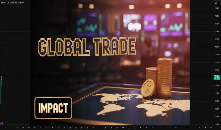
Inflation & Interest Rate Impact on Global Markets1. Inflation: The Silent Force Driving Markets
1.1 What is Inflation?
Inflation refers to the sustained increase in the general price level of goods and services in an economy over time. It reduces the purchasing power of money and reflects imbalances between demand and supply.
Types of Inflation:
Demand-Pull Inflation: Caused by strong consumer demand exceeding supply.
Cost-Push Inflation: Triggered by higher production costs (e.g., rising wages, raw materials).
Built-In Inflation: Wage-price spirals where higher wages lead to higher prices.
Hyperinflation: Extremely rapid price increases, often due to monetary mismanagement.
1.2 Measurement of Inflation
Central banks and governments use indexes like:
Consumer Price Index (CPI)
Producer Price Index (PPI)
Personal Consumption Expenditure (PCE)
Each index provides a different angle on price changes affecting households, businesses, and producers.
1.3 The Global Relevance of Inflation
Inflation impacts nearly every financial market:
Equities: Erodes corporate profits unless firms pass costs to consumers.
Bonds: Fixed interest payments lose real value when inflation rises.
Currencies: High inflation weakens a nation’s currency.
Commodities: Often act as a hedge (gold, oil, agricultural products).
2. Interest Rates: The Monetary Lever
2.1 What are Interest Rates?
Interest rates represent the cost of borrowing money or the return on lending capital. Central banks set benchmark rates (e.g., the U.S. Federal Reserve’s Federal Funds Rate, ECB’s Main Refinancing Rate) to guide economic activity.
2.2 How Central Banks Use Interest Rates
Lowering Rates: Stimulates growth, encourages borrowing, raises asset prices.
Raising Rates: Controls inflation, curbs excessive lending, can cool overheated economies.
2.3 Real vs. Nominal Interest Rates
Nominal Rate: Stated percentage without inflation adjustment.
Real Rate: Nominal rate minus inflation. Investors care about real returns.
3. The Inflation–Interest Rate Nexus
The relationship between inflation and interest rates is central to market behavior. High inflation often prompts central banks to raise rates, while low inflation or deflation encourages rate cuts.
Phillips Curve Theory: Historically suggested an inverse relationship between inflation and unemployment, though its relevance is debated today.
Taylor Rule: A monetary policy guideline suggesting how central banks should adjust interest rates in response to inflation and output gaps.
This interaction affects everything from stock market valuations to cross-border capital flows.
4. Impact on Global Asset Classes
4.1 Equity Markets
High Inflation + Rising Rates: Compresses valuations, reduces consumer demand, and lowers corporate earnings. Growth stocks, especially in tech, often suffer.
Low Inflation + Low Rates: Favors risk assets, boosts valuations, supports speculative bubbles.
Historical Example: The 1970s stagflation period saw equities underperform due to high inflation and rising rates. In contrast, the 2010s "low-rate decade" fueled massive equity rallies.
4.2 Bond Markets
Rising inflation hurts bondholders since fixed payments lose real value. Yields rise to compensate for inflation, causing bond prices to fall.
Interest rate hikes directly impact yields, particularly on short-term government securities.
4.3 Currency Markets
Higher rates typically attract foreign capital, strengthening the domestic currency.
Inflation erodes currency value unless offset by aggressive monetary tightening.
Case Study: The U.S. dollar often strengthens during Federal Reserve hiking cycles, while emerging market currencies weaken due to capital flight.
4.4 Commodities
Commodities like gold, oil, and agricultural products are often seen as hedges against inflation.
Higher interest rates can reduce commodity demand since financing costs rise, but supply shocks may offset this.
4.5 Real Estate
Inflation raises construction costs, boosting property prices.
High interest rates increase mortgage costs, dampening housing demand.
4.6 Alternative Assets (Crypto, Private Equity, Venture Capital)
Cryptocurrencies gained popularity as “inflation hedges,” though their effectiveness is debated.
Low interest rates fuel venture capital and private equity booms, while higher rates reduce risk appetite.
5. Regional & Global Perspectives
5.1 United States
As the world’s largest economy, U.S. inflation and Fed policy significantly shape global markets. The Fed’s actions affect:
Dollar strength (USD as reserve currency)
Capital flows into emerging markets
Global bond yields and equity valuations
5.2 Eurozone
The European Central Bank balances inflation control with fragile growth. Its historically lower rates have influenced capital allocation globally.
5.3 Emerging Markets
Emerging economies are particularly sensitive to U.S. interest rate hikes:
Capital outflows occur as investors chase higher U.S. yields.
Currencies depreciate, making imports costlier and inflation worse.
Governments face debt repayment pressures on dollar-denominated bonds.
Example: Turkey, Argentina, and other EMs have repeatedly faced crises linked to inflation and external rate shocks.
5.4 Asia (China, India, Japan)
China: Inflation is less of a concern; focus is on growth management.
India: Sensitive to global oil prices and capital flows; RBI uses rate adjustments to maintain balance.
Japan: Longstanding deflationary pressures have led to ultra-low/negative rates. Rising global inflation creates challenges for the yen.
6. Historical Lessons
1970s Stagflation: High inflation and weak growth caused equity crashes and bond turmoil.
1980s Volcker Shock: U.S. Fed raised rates sharply, crushing inflation but triggering global debt crises.
2008 Financial Crisis: Ultra-low rates fueled recovery but sowed seeds for asset bubbles.
2020 Pandemic & Aftermath: Stimulus + supply chain disruptions caused inflation surges, forcing aggressive central bank tightening in 2022–23.
Investment Strategies in Inflation & Interest Rate Cycles
Inflation Hedging: Gold, commodities, inflation-linked bonds (TIPS).
Diversification: Across asset classes and geographies to manage volatility.
Sector Rotation: Moving capital into sectors resilient during high inflation (energy, financials).
Duration Management: Shorter-duration bonds during rising rate cycles.
Currency Hedging: Protecting portfolios from FX risks due to rate differentials.
Conclusion
Inflation and interest rates remain the twin pillars shaping global financial markets. Their interplay drives asset valuations, capital flows, and investor psychology. While moderate inflation and stable interest rates foster growth, extremes in either direction often destabilize economies and markets.
For policymakers, the challenge lies in navigating between controlling inflation and supporting growth. For investors, success depends on adapting strategies to different inflation and interest rate environments.
The coming decades may witness structural shifts—climate change, geopolitical realignments, and technological revolutions—that redefine inflationary pressures and interest rate dynamics. Yet, the central truth remains: understanding inflation and interest rates is essential to navigating the ever-evolving global markets.
How to Use Moving Averages in TradingViewMaster moving averages using TradingView's charting tools in this comprehensive tutorial from Optimus Futures.
Moving averages are among the most versatile technical analysis tools available, helping traders analyze trends, identify overbought/oversold conditions, and create tradeable support and resistance levels.
What You'll Learn:
Understanding moving averages: lagging indicators with multiple applications
Simple moving average basics: calculating price averages over set periods
Key configuration choices: lookback periods, price inputs, and timeframes
How to select optimal lookback periods (like 200-day) for different trading styles
Using different price inputs: close, open, high, or low prices
Applying moving averages across all timeframes from daily to 5-minute charts
Analyzing price relative to moving averages for trend identification
Using 50-day and 200-day moving averages for trend analysis on E-Mini S&P 500
Mean reversion trading: how price tends to return to moving averages
Trend direction analysis using moving average slopes
Famous crossover signals: "Death Cross" and "Golden Cross" explained
Trading moving averages as dynamic support and resistance levels
Advanced moving average types: weighted and exponential moving averages
Applying moving averages to other indicators like MACD and Stochastics
Balancing sensitivity vs. noise when choosing periods
This tutorial may benefit futures traders, swing traders, and technical analysts who want to incorporate moving averages into their trading strategies.
The concepts covered could help you identify trend direction, potential reversal points, and dynamic trading levels across multiple timeframes.
Learn more about futures trading with TradingView:
optimusfutures.com
Disclaimer:
There is a substantial risk of loss in futures trading. Past performance is not indicative of future results. Please trade only with risk capital. We are not responsible for any third-party links, comments, or content shared on TradingView. Any opinions, links, or messages posted by users on TradingView do not represent our views or recommendations. Please exercise your own judgment and due diligence when engaging with any external content or user commentary.
This video represents the opinion of Optimus Futures and is intended for educational purposes only. Chart interpretations are presented solely to illustrate objective technical concepts and should not be viewed as predictive of future market behavior. In our opinion, charts are analytical tools—not forecasting
