BTC EMA TRADING STRATEGYIn this video, I show you guys how I trade using the higher timeframe 12,21 EMA bands to find entries on 1min timeframe and capture the bigger trend with tight SL and huge R/R.
Benefits
1. Tight invalidation, leading to Massive winners
2. Entry and SL is based on pure Market structure.
3. Price first apporach
X-indicator

Mastering Fibonacci Retracements & Extensions on TradingView!1. Introduction to Fibonacci in Trading
Fibonacci levels are widely used in trading to identify potential reversal zones, support, and resistance levels. These levels are derived from the Fibonacci sequence, a mathematical pattern found in nature and financial markets. Traders rely on Fibonacci retracements to find potential entry points and Fibonacci extensions to determine profit targets. The most critical area of interest is the golden pocket zone, which ranges between 0.618 and 0.65. Price often reacts strongly in this zone, either reversing or continuing its trend, making it a key level for traders to watch.
2. Key Fibonacci Levels for Trading
Several Fibonacci levels are commonly used in trading. The 0.5 level, although not an actual Fibonacci number, is often observed as a psychological retracement level. The golden pocket zone, which consists of the 0.618 and 0.65 levels, is considered the most important for potential reversals. The 0.786 level represents a deeper retracement and is frequently used by traders for more precise entries before a strong price move. On the other hand, Fibonacci extensions, such as -0.618 and -1.618, are used to project potential price targets. These levels serve as reference points for identifying support and resistance, allowing traders to make more informed trading decisions.
3. How to Draw Fibonacci Retracements on TradingView
To effectively use Fibonacci retracements, traders must first identify a swing high and a swing low on the chart. This process starts by recognizing a strong uptrend or downtrend. Once identified, the Fibonacci tool in TradingView can be used to plot retracement levels. By selecting the swing low and dragging it to the swing high in a bullish setup, or vice versa in a bearish setup, traders can visualize the key Fibonacci levels. It is essential to adjust the settings to only display 0.5, 0.618, 0.65, 0.786, -0.618, and -1.618 for better clarity. This method provides a structured approach to analyzing potential price reactions and planning trades with greater accuracy.
4. Trading Strategies Using Fibonacci Levels
A. The Golden Pocket Entry Strategy (0.618–0.65)
One of the most reliable trading strategies involving Fibonacci retracements is based on the golden pocket zone. When price retraces to the 0.618–0.65 area, traders look for confirmation signals before entering a trade. These confirmations may include bullish or bearish candlestick patterns, such as engulfing candles, pin bars, or hammer formations. Additionally, traders may use momentum indicators like RSI or MACD to identify divergences, which suggest a potential trend reversal. A spike in volume at these levels can further validate the trade setup. A typical strategy involves entering a trade within the golden pocket, setting a stop-loss slightly below the 0.786 level for risk management, and targeting Fibonacci extensions for profit-taking.
B. Fibonacci Extensions (-0.618 & -1.618) for Profit Targets
Fibonacci extensions serve as valuable tools for setting take-profit levels in trending markets. Once price confirms a reversal from a retracement level, traders use extensions to project future price movements. The -0.618 extension is often considered a conservative target, providing an early profit-taking opportunity. Meanwhile, the -1.618 extension is a more aggressive target, generally used in strong trends where price momentum is high. By integrating Fibonacci extensions into their strategy, traders can optimize their exits, ensuring they capture the full potential of a move while minimizing premature exits.
5. Common Mistakes & How to Avoid Them
Despite its effectiveness, Fibonacci analysis requires proper execution. One common mistake traders make is drawing Fibonacci levels incorrectly by selecting the wrong swing points. Accuracy in identifying the correct high and low points is crucial for reliable retracement levels. Another mistake is over-reliance on Fibonacci without additional confirmations. Traders should always seek confluence with other technical indicators, such as support and resistance levels, moving averages, or volume analysis. Additionally, failing to wait for confirmation signals can lead to premature entries, increasing the risk of losses. Understanding these pitfalls and applying Fibonacci with proper validation techniques can significantly improve trading outcomes.
6. Pro Tips for Using Fibonacci Like a Pro
For best results, traders should use Fibonacci analysis on higher timeframes, such as the 1-hour, 4-hour, or daily charts, as these provide more reliable signals compared to lower timeframes. Confluence plays a crucial role in validating Fibonacci levels, so traders should always look for overlapping support and resistance, trendlines, or moving averages. Additionally, backtesting Fibonacci strategies using TradingView’s replay mode can help traders refine their approach and gain confidence in their setups before applying them in live trading. By combining Fibonacci with other technical tools and maintaining discipline in execution, traders can enhance their decision-making process and improve their overall trading success.
Final Thoughts
Mastering Fibonacci retracements and extensions can significantly improve trade accuracy. By focusing on the golden pocket zone (0.618–0.65) and using Fibonacci extensions like -0.618 and -1.618 as profit targets, traders can refine their strategies and maximize profitability. Understanding how price interacts with these levels and applying additional confirmations ensures more precise trade entries and exits. With practice and proper analysis, Fibonacci can become a powerful tool in any trader’s arsenal.
__________________________________________
Thanks for your support!
If you found this idea helpful or learned something new, drop a like 👍 and leave a comment, I’d love to hear your thoughts! 🚀
Make sure to follow me for more price action insights, free indicators, and trading strategies. Let’s grow and trade smarter together! 📈

Behind the Curtain The Economic Pulse Behind Euro FX1. Introduction
Euro FX Futures (6E), traded on the CME, offer traders exposure to the euro-dollar exchange rate with precision, liquidity, and leverage. Whether hedging European currency risk or speculating on macro shifts, Euro FX contracts remain a vital component of global currency markets.
But what truly moves the euro? Beyond central bank meetings and headlines, the euro reacts sharply to macroeconomic data that signals growth, inflation, or risk appetite. Using a Random Forest Regressor, we explored how economic indicators correlate with Euro FX Futures returns across different timeframes.
In this article, we uncover which metrics drive the euro daily, weekly, and monthly, offering traders a structured, data-backed approach to navigating the Euro FX landscape.
2. Understanding Euro FX Futures Contracts
The CME offers two primary Euro FX Futures products:
o Standard Euro FX Futures (6E):
Contract Size: 125,000 €
Tick Size: 0.000050 per euro = $6.25 per tick per contract
Trading Hours: Nearly 24 hours, Sunday to Friday (US)
o Micro Euro FX Futures (M6E):
Contract Size: 12,500 € (1/10th the size of 6E)
Tick Size: 0.0001 per euro = $1.25 per tick per contract
Accessible to: Smaller accounts, strategy testers, and traders managing precise exposure
o Margins:
6E Initial Margin: ≈ $2,600 per contract (subject to volatility)
M6E Initial Margin: ≈ $260 per contract
Whether trading full-size or micro contracts, Euro FX Futures offer capital-efficient access to one of the most liquid currency pairs globally. Traders benefit from leverage, scalability, and transparent pricing, with the ability to hedge or speculate on Euro FX trends across timeframes.
3. Daily Timeframe: Key Economic Indicators
For day traders, short-term price action in the euro often hinges on rapidly released data that affects market sentiment and intraday flow. According to machine learning results, the top 3 daily drivers are:
Housing Starts: Surging housing starts in the U.S. can signal economic strength and pressure the euro via stronger USD flows. Conversely, weaker construction activity may weaken the dollar and support the euro.
Consumer Sentiment Index: A sentiment-driven metric that reflects household confidence. Optimistic consumers suggest robust consumption and a firm dollar, while pessimism may favor EUR strength on defensive rotation.
Housing Price Index (HPI): Rising home prices can stoke inflation fears and central bank hawkishness, affecting yield differentials between the euro and the dollar. HPI moves often spark short-term FX volatility.
4. Weekly Timeframe: Key Economic Indicators
Swing traders looking for trends spanning several sessions often lean on energy prices and labor data. Weekly insights from our Random Forest model show these three indicators as top drivers:
WTI Crude Oil Prices: Oil prices affect global inflation and trade dynamics. Rising WTI can fuel EUR strength if it leads to USD weakness via inflation concerns or reduced real yields.
Continuing Jobless Claims: An uptick in claims may suggest softening labor conditions in the U.S., potentially bullish for EUR as it implies slower Fed tightening or economic strain.
Brent Crude Oil Prices: As the global benchmark, Brent’s influence on inflation and trade flows is significant. Sustained Brent rallies could create euro tailwinds through weakening dollar momentum.
5. Monthly Timeframe: Key Economic Indicators
Position traders and institutional participants often focus on macroeconomic indicators with structural weight—those that influence monetary policy direction, capital flow, and long-term sentiment. The following three monthly indicators emerged as dominant forces shaping Euro FX Futures:
Industrial Production: A cornerstone of economic output, rising industrial production reflects strong manufacturing activity. Strong U.S. numbers can support the dollar, while a slowdown may benefit the euro. Likewise, weaker European output could undermine EUR demand.
Velocity of Money (M2): This metric reveals how quickly money is circulating in the economy. A rising M2 velocity suggests increased spending and inflationary pressures—potentially positive for the dollar and negative for the euro. Falling velocity signals stagnation and may shift flows into the euro as a lower-yield alternative.
Initial Jobless Claims: While often viewed weekly, the monthly average could reveal structural labor market resilience. A rising trend may weaken the dollar, reinforcing EUR gains as expectations for interest rate cuts grow.
6. Strategy Alignment by Trading Style
Each indicator offers unique insights depending on your approach to market participation:
Day Traders: Focus on the immediacy of daily indicators like Housing Starts, Consumer Sentiment, and Housing Price Index.
Swing Traders: Leverage weekly indicators like Crude Oil Prices and Continuing Claims to ride mid-term moves.
Position Traders: Watch longer-term data such as Industrial Production and M2 Velocity.
7. Risk Management
Currency futures provide access to high leverage and broad macro exposure. With that comes responsibility. Traders must actively manage position sizing, volatility exposure, and stop placement.
Economic indicators inform price movement probabilities—not certainties—making risk protocols just as essential as trade entries.
8. Conclusion
Euro FX Futures are shaped by a deep web of macroeconomic forces. From Consumer Sentiment and Oil Prices to Industrial Production and Money Velocity, each indicator tells part of the story behind Euro FX movement.
Thanks to machine learning, we’ve spotlighted the most impactful data across timeframes, offering traders a framework to align their approach with the heartbeat of the market.
As we continue the "Behind the Curtain" series, stay tuned for future editions uncovering the hidden economic forces behind other major futures markets.
When charting futures, the data provided could be delayed. Traders working with the ticker symbols discussed in this idea may prefer to use CME Group real-time data plan on TradingView: www.tradingview.com - This consideration is particularly important for shorter-term traders, whereas it may be less critical for those focused on longer-term trading strategies.
General Disclaimer:
The trade ideas presented herein are solely for illustrative purposes forming a part of a case study intended to demonstrate key principles in risk management within the context of the specific market scenarios discussed. These ideas are not to be interpreted as investment recommendations or financial advice. They do not endorse or promote any specific trading strategies, financial products, or services. The information provided is based on data believed to be reliable; however, its accuracy or completeness cannot be guaranteed. Trading in financial markets involves risks, including the potential loss of principal. Each individual should conduct their own research and consult with professional financial advisors before making any investment decisions. The author or publisher of this content bears no responsibility for any actions taken based on the information provided or for any resultant financial or other losses.

How to Trade Descending Channels Like a Pro!
🚀 TRON (TRX) is stuck in a descending channel! But how can you trade this setup effectively? Let’s break it down:
📌 What is a Descending Channel?
A descending channel forms when price makes lower highs and lower lows, staying between two parallel trendlines. It shows a downtrend, but it also creates trading opportunities!
🔥 How to Trade It?
✅ Breakout Strategy: If price breaks above the channel and retests, it could signal a bullish move! (Potential target: $0.29)
✅ Breakdown Strategy: If price drops below the key level, it might dump to the next support ($0.19).
✅ Mid-Range Trades: You can short at resistance and long at support inside the channel – but only with strong confirmations!
💡 Pro Tip: Always wait for confirmation candles before entering a trade to avoid false breakouts!
📊 What do you think? Will TRX break out or dump? Comment below! 👇👇
🔄 Tag a trader who needs to learn this! 🚀 #CryptoEducation #TradingTips #TRX #TradingView
#Miracle #TradeWithMky #MegaAltseason 2025

Trading Is Not Gambling: Become A Better Trader Part III'm so thankful the admins at Tradingview selected my first Trading Is Not Gambling video for their Editor's Pick section. What an honor.
I put together this video to try to teach all the new followers how to use analysis to try to plan trade actions and to attempt to minimize risks.
Within this video, I try to teach you to explore the best opportunities based on strong research/analysis skills and to learn to wait for the best opportunities for profits.
Trading is very similar to hunting or trying to hit a baseball... you have to WAIT for the best opportunity, then make a decision on how to execute for the best results.
Trust me, if trading was easy, everyone would be making millions and no one would be trying to find the best trade solutions.
In my opinion, the best solution is to learn the skills to try to develop the best consistent outcomes. And that is what I'm trying to teach you in this video.
I look forward to your comments and suggestions.
Get some.
#trading #research #investing #tradingalgos #tradingsignals #cycles #fibonacci #elliotwave #modelingsystems #stocks #bitcoin #btcusd #cryptos #spy #gold #nq #investing #trading #spytrading #spymarket #tradingmarket #stockmarket #silver

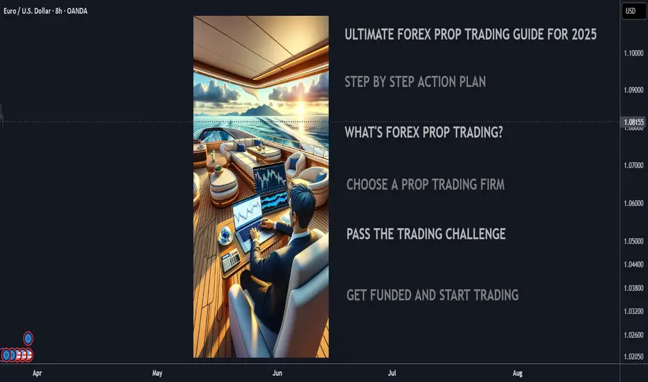
Ultimate 2025 Forex Prop Trading FAQ + Strategy Guide🧠 Forex Prop Trading: What Is It?
Prop trading (proprietary trading) is when a trader uses a firm’s capital to trade the markets (instead of their own), and keeps a share of the profits – usually 70–90%.
✅ Low startup cost
✅ No personal risk (firm takes the loss)
✅ Big upside potential with scaling plans
📋 Step-by-Step Action Plan to Get Started (2025)
🔍 1. Understand the Prop Firm Model
🏦 Prop firms fund skilled traders with $10K to $500K+
🎯 You pass a challenge or evaluation phase to prove your skills
💵 Once funded, you earn a profit split (70%–90%)
🧪 2. Choose a Top Prop Firm (2025)
Look for reliable and regulated firms with transparent rules:
FTMO 🌍 – Trusted globally, up to $400K scaling
MyFundedFX 📊 – Up to 90% profit split, no time limit
E8 Funding ⚡ – Fast scaling and instant funding
FundedNext 💼 – 15% profit share during challenge phase
The Funded Trader 🏰 – Up to $600K with leaderboard bonuses
🔎 Compare features: fees, drawdown limits, trading style freedom
💻 3. Train & Master Your Strategy
🧠 Pick a clear, rule-based strategy (e.g. trend following, breakout, supply/demand)
📅 Backtest over 6–12 months of data
💡 Use AI tools & trade journals like Edgewonk or MyFXBook
🎯 Focus on:
Win rate (above 50–60%)
Risk-reward ratio (1:2 or better)
Consistency, not wild profits
🧪 4. Pass the Evaluation Phase
🔐 Follow risk rules strictly (daily & max drawdown)
⚖️ Use proper risk management (0.5–1% risk per trade)
🧘♂️ Trade calmly, avoid overtrading or revenge trades
📈 Most challenges:
Hit 8–10% profit target
Stay under 5–10% total drawdown
Trade for at least 5–10 days
🧠 Tip: Pass in a demo environment first before going live!
💵 5. Get Funded & Start Earning
🟢 Once approved, you trade real firm capital
💰 You keep up to 90% of profits, with withdrawals every 2 weeks to 1 month
🚀 Many firms offer scaling plans to grow your account over time
💬 FAQ – Prop Trading in 2025
❓ How much can you make?
🔹 Small accounts ($50K): $2K–$8K/month with 4–8% returns
🔹 Large accounts ($200K+): $10K+/month possible for consistent traders
💡 Many traders start part-time and scale as they build trust with the firm
❓ How much do I need to start?
💳 Challenge fees range from:
$100 for $10K
$250–$350 for $50K
$500–$700 for $100K+
⚠️ No need to deposit trade capital – just the challenge fee
❓ What are the risks?
You can lose the challenge fee if you break rules or over-leverage
You won’t owe money to the firm
The biggest risk is psychological – many fail from overtrading or emotional decisions
🚀 Final Tips to Succeed
✅ Trade like a robot, think like a CEO
✅ Journal every trade – self-awareness is key
✅ Avoid over-leveraging and gambling mindset
✅ Stick to one strategy and master it
✅ Focus on consistency over quick wins
About the Volume OBV indicator...
Hello, traders.
If you "Follow", you can always get new information quickly.
Please click "Boost" as well.
Have a nice day today.
-------------------------------------
I think TradingView is attractive because users can create charts as they want.
However, since the number of indicators that can be added to the chart is limited depending on the plan, you have to add indicators that fit your plan.
As a result, I ended up integrating multiple indicators into one indicator.
-
The HA-MS indicator in this chart is a public indicator.
If you search the Internet, you can find detailed explanations on how to interpret the OBV indicator.
I expressed it as follows to make this interpretation method more realistic.
The body color of the candlestick is indicated by the 4-stage OBV indicator.
The OBV indicator is distinguished in the same way as the Price Channel indicator.
You can interpret it like the Bollinger Band.
That is, if the middle line that divides 2 and 3 rises by more than 3, you can interpret that the buying force is increasing.
1: It means below the lower line of the Price Channel and is indicated in dark red.
If you enter this section, there is a high possibility of a sharp decline.
You should check the support and resistance points because it is likely to stop falling soon and rise to 2.
2: It means between the lower line and the middle line of the Price Channel and is indicated in red.
This section is likely to show a weak downward sideways movement.
Therefore, if it rises from 1->2, there is a possibility of a short rise. However, if it fails to rise to 3, it is likely to fall back to 1, so it is recommended to make short trades.
3: It means between the middle line and the upper line of the Price Channel and is displayed in green.
This section is likely to show a weak upward sideways movement.
If it rises from 2 -> 3 and shows a sideways movement, you should focus on finding a buying point.
4: It means above the upper line of the Price Channel and is displayed in dark green.
If it enters this section, there is a high possibility of a sharp rise.
Since it is likely to stop rising soon and fall to 3, you should check the support and resistance points.
-
What we should pay attention to is when it changes from 1 -> 2, 4 -> 3.
As explained above, 1 is a section located below the lower line of the Price Channel, so there is a high possibility of a sharp fall.
4 is a section located above the upper line of the Price Channel, so there is a high possibility of a sharp rise.
Therefore, you can proceed with an aggressive buy when it changes from 1 -> 2, and you can proceed with a sell when it changes from 4 -> 3.
In the case of futures, it can be used as reference information for entering and liquidating LONG and SHORT positions.
-
They say that the only things you need on a chart are price and trading volume.
However, it is not easy to interpret this in reality.
To compensate for this, we hid the colors of the existing candles and displayed them in 4 stages of OBV so that you can intuitively see which stage the current price is at.
-
Thank you for reading to the end.
I hope you have a successful transaction.
--------------------------------------------------

SMART MONEY FOOTPRINT ON NIFTY CHART, REVERSAL SIGN APPEAR ?Today on 21/03/2025 with upward rally, on hourly chart I found similarity or smart money footprint (sign of weakness) at the time of closing bell same as (sign of strength) on 28 February 2025. what was that? Let's try to Dig....
previous days when market was forming lower low, that was downtrend look at the time on 28 February 2025 that was 14.15 pm on hourly chart an ultrahigh volume rejection candle appear which volume was around164 M. thereafter short seller trapped to see big red candle and market move toward upward.
:
:
Today on 21/03/2025 also market gave a rejection candle on hourly chart with around 164 M ultrahigh volume Exact at 14:15 Pm so conclusion is that market may give correction after trapping Buyers or it may go downtrend again if fundamental don't support.
what is similarity?
: Same Time 14:15
: Same Volume
: same Candle body Size
: appear after strong moment
REVERSAL INDICATION:
Nifty may Facing resistance of downtrend channel on Daily Chart.
Away from 50 EMA on hourly chart.
Smart money Ultra High volume on Rejection candle indicating selling zone there
:
SO, INVESTOR NO NEED TO TRAP TO JUST SEE NEXT BIG GREEN CANDLE

Trading Is Not Gambling : Become A Better Trade Part IOver the last few weeks/months, I've tried to help hundreds of traders learn the difference between trading and gambling.
Trading is where you take measured (risk-restricted) attempts to profit from market moves.
Gambling is where you let your emotions and GREED overtake your risk management decisions - going to BIG WINS on every trade.
I think of gambling in the stock market as a person who continually looks for the big 50% to 150%++ gains on options every day. Someone who will pass up the 20%, 30%, and 40% profits and "let it ride to HERO or ZERO" on most trades.
That's not trading. That's flat-out GAMBLING.
I'm going to start a new series of training videos to try to help you understand how trading operates and how you need to learn to protect capital while taking strategic opportunities for profits and growth.
This is not going to be some dumbed-down example of how to trade. I'm going to try to explain the DOs and DO N'Ts of trading vs. gambling.
If you want to be a gambler - then get used to being broke most of the time.
I'll work on this video's subsequent parts later today and this week.
I hope this helps. At least it is a starting point for what I want to teach all of you.
Get some.
#trading #research #investing #tradingalgos #tradingsignals #cycles #fibonacci #elliotwave #modelingsystems #stocks #bitcoin #btcusd #cryptos #spy #gold #nq #investing #trading #spytrading #spymarket #tradingmarket #stockmarket #silver

How To Properly Read Open Interest (OI) Identify Trends $VARAIn crypto, especially when trading shit coins, measure OI on BTC, ETH, and any other asset that has futures up against whatever you are trading.
Most importantly identify positive or negative correlation between the asset pair and TRADE accordingly.
i.e. if you are measuring OI for USDX or DXY know that it will have negative correlation toward your risk asset whatever it is.
Open Interest and Volume ARE NOT THE SAME THING!
Volume is the measure of contracts settled in a trading session (hourly, daily, monthly, etc.)
Open interest (or OI for short) is the total number of contracts still outstanding.
OI and order wall size are correlated.
OI is charted.
Increasing OI means an increase in liquidity i.e. open contracts.
Decreasing OI means that there is a decrease in liquidity i.e. liquidity is leaving the market either cash or asset.
Open Interest can help you identify trend shifts. Use it along with order flow the compliment each other.
OI Rising - Market trends up - Volume increasing - Trend will continue
OI Falling - Market trends up - Volume decreasing - Trend will turn bullish
OI Rising - Market trends down - Volume rising - Strong bearish continuation
OI Falling - Market trends down - Volume falling - Bearish bias is lessening
Notice in the above simplified examples that volume MUST be paired with OI to be useful.
One might mistake that volume on it's own can be used to judge trends.
Open interest will increase as more traders enter the market which means often that money is coming into the market.
OI will decrease as traders exit the market or as contracts are closed. This means that money is leaving the market i.e. less buyers

Behind the DCA Strategy: What It Is and How It WorksWho invented the Dollar Cost Averaging (DCA) investment strategy?
The concept of Dollar Cost Averaging (DCA) was formalized and popularized by economists and investors throughout the 20th century, particularly with the growth of the U.S. stock market. One of the first to promote this strategy was Benjamin Graham , considered the father of value investing and author of the famous book The Intelligent Investor (published in 1949). Graham highlighted how DCA could help reduce the risk of buying assets at excessively high prices and improve investor discipline.
When and How Did Dollar Cost Averaging Originate?
The concept of DCA began to take shape in the early decades of the 20th century when financial institutions introduced automatic purchase programs for savers. However, it gained popularity among retail investors in the 1950s and 1960s with the rise of mutual funds.
Overview
The core principle of DCA involves investing a fixed amount of money at regular intervals (e.g., every month. This approach allows investors to purchase more units when prices are low and fewer units when prices are high, thereby reducing the impact of market volatility.
Why Was DCA Developed?
The strategy was developed to address key challenges faced by investors, including:
1. Reducing Market Timing Risk
Investing a fixed amount periodically eliminates the need to predict the perfect market entry point, reducing the risk of buying at peaks.
2. Discipline and Financial Planning
DCA helps investors maintain financial discipline, making investments more consistent and predictable.
3. Mitigating Volatility
Spreading trades over a long period reduces the impact of market fluctuations and minimizes the risk of experiencing a significant drop immediately after a large investment.
4. Ease of Implementation
The strategy is simple to apply and does not require constant market monitoring, making it accessible to all types of investors.
Types of DCA
Dollar Cost Averaging (DCA) is an investment strategy that can be implemented in two main ways:
Time-Based DCA → Entries occur at regular intervals regardless of price.
Price-Based DCA → Entries occur only when the price meets specific criteria.
1. Time-Based DCA
How It Works: The investor buys a fixed amount of an asset at regular intervals (e.g., weekly, monthly). Entries occur regardless of market price.
Example: An investor decides to buy $200 worth of Bitcoin every month, without worrying whether the price has gone up or down.
2. Price-Based DCA
How It Works: Purchases occur only when the price drops below a predefined threshold. The investor sets price levels at which purchases will be executed (e.g., every -5%). This approach is more selective and allows for buying at a “discount” compared to the market trend.
Example: An investor decides to buy $200 worth of Bitcoin only when the price drops by at least 5% compared to the last entry.
Challenges and Limitations
1. DCA May Reduce Profits in Bull Markets
If the market is in an bullish trend, a single trade may be more profitable than spreading purchases over time or price dips.
2. Does Not Fully Remove Loss Risk
DCA helps mitigate volatility but does not protect against long-term bearish trends. If an asset continues to decline for an extended period, positions will accumulate at lower values with no guarantee of recovery.
3. May Be Inefficient for Active Investors
If an investor has the skills to identify better entry points (e.g., using technical or macroeconomic analysis), DCA might be less effective. Those who can spot market opportunities may achieve a better average entry price than an automatic DCA approach.
4. Does Not Take Full Advantage of Price Drops
DCA does not allow aggressive buying during market dips since purchases are fixed at regular intervals. If the market temporarily crashes, an investor with available funds could benefit more by buying larger amounts at that moment.
5. Higher Transaction Costs
Frequent small investments can lead to higher trading fees, which may reduce net returns. This is especially relevant in markets with fixed commissions or high spreads.
6. Risk of Overconfidence and False Security
DCA is often seen as a “fail-proof” strategy, but it is not always effective. If an asset has weak fundamentals or belongs to a declining sector, DCA may only slow down losses rather than ensure future gains.
7. Requires Discipline and Patience
DCA is only effective if applied consistently over a long period. Some investors may lose patience and leave the strategy at the wrong time, especially during market crashes.

Chande Kroll Stop: Definition, Calculation, and Trading StrategyChande Kroll Stop: Definition, Calculation, and Trading Strategies
In the ever-changing landscape of financial markets, traders are constantly seeking effective tools to manage risk and protect their investments. The Chande Kroll Stop, a dynamic indicator, is one such tool that has gained popularity due to its ability to help traders determine optimal stop loss locations. In this article, we will delve into the Chande Kroll Stop, exploring its definition, formula, and application.
What Is the Chande Kroll Stop?
The Chande Kroll stop is a technical analysis indicator that is used to determine the optimal placement of a stop-loss order. It was developed by Tushar Chande and Stanley Kroll, two highly-respected figures in trading in the mid-90s, and is grounded in the idea of volatility.
By taking into account the current price, market volatility, and the security's average true range (ATR), the indicator calculates an appropriate stop-loss level that moves in tandem with the security's price. It’s plotted as two lines that help traders determine their stop losses, regardless of whether they go long or short. It is applicable to virtually every asset class – traders can use the Chande Kroll Stop for forex, commodities, stocks, and cryptocurrencies*.
Calculation of Chande Kroll Stop
The Chande Kroll encompasses three key components: the average true range (ATR), the multiplier, and the current price of the security.
ATR: The ATR is a volatility measure calculated by averaging the true ranges over a specific timeframe. The true range is determined by finding the maximum of the following:
- The range between the high and low of the current period.
- The difference between the close of the previous period and the high of the current period.
- The difference between the close of the previous period and the low of the current period.
Multiplier: The multiplier adjusts the ATR and is typically set between 1 and 3, depending on the trader's risk tolerance.
Price: The current price of the security being analysed.
The Chande Kroll Stop formula is as follows:
Initial high stop = HIGHEST (high) - x * Average True Range
Initial low stop = LOWEST (low) + x * Average True Range
Short stop = HIGHEST (Initial high stop)
Long stop = LOWEST (Initial low stop)
This calculation produces two stop-loss levels, typically a red (or orange) and green (or blue) line. The stop-loss may be placed below the green line for a long position, while it could be placed above the red line for a short position.
So what are the three numbers for the Chande Kroll stop? The ATR’s current period is denoted by the letter P (10 by default), while X represents the ATR multiplier (1 by default). Q is the lookback period for updating the indicator lines; its initial value, 9, means that the indicator will adapt to the highest and lowest values of the short-stop and long-stop lines, respectively, across the previous 9 bars.
However, there’s no need to perform these calculations yourself. In TradingView, you’ll discover the Chande Kroll Stop alongside dozens of other tools ready to help you navigate the markets.
How to Use the Chande Kroll Stop Indicator in Trading
When learning how to read the Chande Kroll stop, there are three key areas to be aware of: setup, stop-loss implementation, and entry signals.
Setup
The first step is to adjust your Chande Kroll Stop settings to suit your risk tolerance and trading style. In essence, setting a higher period for P will widen both lines and give your positions more room to breathe, while increasing X will bring the line closer to the current price. Similarly, a lower Q value will produce a more responsive indicator that will stop you out sooner.
Stop Loss Implementation
Once you have found your preferred settings and added the indicator to your chart, you can use it as a dynamic stop-loss. For a long position, you can place your order below the applicable level (blue line) and adjust it as the indicator adapts. In a short position, traders place it above the orange line.
Entry Signals
Although the Chande Kroll is primarily a stop-loss tool, it can also provide entry signals. When the long-stop line crosses above the short-stop line, it can signal that bullish momentum is entering the market. Conversely, the opposite can indicate that a short position could be opened.
Advantages and Limitations of Chande Kroll Stop Indicator
Advantages:
The Chande Kroll Stop is a dynamic indicator that adapts when the price moves, making it a potent risk management tool.
By taking into account market volatility, it offers protection against sudden price fluctuations, becoming particularly useful in volatile assets.
The simplicity of Chande Kroll's calculation and application makes it accessible to traders of all experience levels.
Limitations:
The indicator can be overly sensitive to price movements, leading to premature stop-outs and potentially missed opportunities.
It may be less effective for assets with low volatility, which could make it unsuitable for certain trading approaches or timeframes.
The Chande Kroll should not be used in isolation. It's best to combine it with other technical indicators and analysis techniques.
Final Thoughts
Overall, the Chande Kroll stop is a useful tool for traders looking for a dynamic stop-loss order that takes into account volatility. Now that you have a solid overview of the Chande Kroll stop and how to use it, why not consider opening an FXOpen account? You can enjoy access to over 700 markets and low-cost trading. Good luck!
*Important: At FXOpen UK, Cryptocurrency trading via CFDs is only available to our Professional clients. They are not available for trading by Retail clients. To find out more information about how this may affect you, please get in touch with our team.
This article represents the opinion of the Companies operating under the FXOpen brand only. It is not to be construed as an offer, solicitation, or recommendation with respect to products and services provided by the Companies operating under the FXOpen brand, nor is it to be considered financial advice.

Mastering MACD- Complete Guide- 10 ways to trade itThe Moving Average Convergence Divergence (MACD) is a versatile indicator that can help traders navigate the markets with precision. From trend identification to momentum assessment, the MACD provides multiple actionable insights. In this educational post, we’ll explore the key ways to use MACD effectively, with an example illustration accompanying each strategy.
________________________________________
1. Signal Line Crossovers
The most common use of MACD is the signal line crossover, which identifies potential shifts in market momentum:
• Bullish Signal: When the MACD line (fast-moving) crosses above the signal line (slow-moving), it suggests upward momentum is increasing. This can be an entry signal for a long trade. Bullish crossovers often occur after a period of consolidation or a downtrend, signaling a reversal in market sentiment.
• Bearish Signal: When the MACD line crosses below the signal line, it signals downward momentum, often triggering a short-selling opportunity. Bearish crossovers can occur during retracements in an uptrend or at the start of a bearish reversal.
How to Use: Look for confirmation from price action or other indicators, such as a breakout above a resistance level for a bullish signal or a breakdown below support for a bearish signal. It's essential to avoid acting solely on a crossover; consider volume (stocks, crypto), candle stick formations and other market conditions.
Example: A bullish crossover on the daily chart on TRADENATION:XAUUSD indicates a potential buying opportunity as the price begins to rise. Add a stop-loss below recent lows to manage risk and look for a 1:2 risk:r eward in the next resistance.
________________________________________
2. Zero Line Crossovers
The MACD’s zero line acts as a boundary between bullish and bearish momentum, making it a valuable trend confirmation tool:
• Above Zero: When the MACD line moves above the zero line, it confirms an uptrend, as the fast-moving average is above the slow-moving average. Sustained movement above zero often indicates a strong bullish trend.
• Below Zero: A MACD line below zero reflects a downtrend, indicating bearish market conditions. Persistent movement below zero confirms bearish momentum.
How to Use: Use the zero line crossover to validate trades based on other signals, such as candlestick patterns or trendline breaks. The crossover can act as a second layer of confirmation for existing trade setups.
Example: MACD on a crypto pair crosses above the zero line, confirming the start of a new bullish trend. Traders can combine this with volume analysis to ensure strong market participation.
________________________________________
3. Histogram Analysis
The histogram represents the distance between the MACD line and the signal line, offering insights into momentum:
• Expanding Histogram: Indicates strengthening momentum in the direction of the trend. Larger bars show increasing dominance of bulls or bears.
• Contracting Histogram: Suggests weakening momentum, signaling a possible reversal or consolidation. Smaller bars indicate a loss of trend strength.
How to Use: Monitor the histogram for early signs of momentum shifts before a crossover occurs. The histogram can act as a leading indicator, providing advanced warning of potential changes in price direction.
Example: A shrinking histogram in a forex pair signals that the bullish momentum is losing steam, warning traders of a possible retracement. This can be a cue to tighten stop-loss levels or take partial profits. Conversely, an expanding histogram during a breakout confirms the strength of the move.
________________________________________
4. Identifying Divergences
MACD divergences are powerful tools for spotting potential reversals:
• Bullish Divergence: Occurs when the price makes a lower low, but the MACD forms a higher low, signaling weakening bearish momentum. This often precedes a trend reversal to the upside.
• Bearish Divergence: Happens when the price makes a higher high, but the MACD forms a lower high, indicating diminishing bullish strength. This suggests a potential reversal to the downside.
How to Use: Combine divergence signals with support or resistance levels to enhance reliability. Divergences are most effective when spotted at major turning points in the market.
Example: On a TRADENATION:EURUSD chart, a bearish divergence signals an upcoming price reversal from an up trend to a down trend.
________________________________________
5. Trend Confirmation
MACD confirms trends by staying consistently above or below the zero line:
• Above Zero: Indicates a strong uptrend. Look for pullbacks to enter long trades. The longer the MACD remains above zero, the stronger the trend.
• Below Zero: Reflects a persistent downtrend. Use rallies as opportunities to short. A sustained period below zero reinforces bearish dominance.
How to Use: Use MACD’s trend confirmation alongside other trend-following tools like moving averages or Ichimoku clouds. Ensure that market conditions align with the broader trend.
Example: Combining MACD trend confirmation with moving averages helps traders stay on the right side of the trend in a stock market index. For example, buy when both MACD and a 50-day moving average indicate an uptrend. Exit trades when the MACD begins to cross below zero or shows a divergence.
________________________________________
6. Overbought and Oversold Conditions
Although MACD is not traditionally an overbought/oversold indicator, extreme deviations between the MACD line and the signal line can hint at stretched market conditions:
• Overbought: When the MACD line is significantly above the signal line, it may indicate a price correction is imminent. This often occurs after an extended rally.
• Oversold: When the MACD line is well below the signal line, it suggests a potential rebound. Such conditions are common following sharp sell-offs.
How to Use: Monitor extreme readings in conjunction with oscillators like RSI for added confidence. Look for reversals near key support or resistance levels.
Example: An extended bearish move with a large MACD-signal line gap warns traders of a potential price correction. This can signal an opportunity to exit. Pair this observation with a bullish candlestick pattern to confirm the move (in this example morning star)
________________________________________
7. Combining MACD with Other Indicators
MACD works best when paired with complementary indicators to provide a more comprehensive market analysis:
• RSI (Relative Strength Index): Use RSI to confirm momentum and overbought/oversold conditions.
• Bollinger Bands: Validate price breakouts or consolidations with MACD signals.
• Support and Resistance: Use MACD signals around key levels for confluence.
How to Use: Wait for MACD signals to align with other indicator readings to improve accuracy. Cross-validation reduces false signals and increases confidence in trades.
Example: A bearish MACD crossover near a key resistance level reinforces a short-selling opportunity.
________________________________________
8. Multi-Timeframe Analysis
Using MACD across different timeframes strengthens trade signals and provides context:
• Higher Timeframe: Identify the broader trend to avoid trading against the market. For instance, if the daily chart shows a bullish MACD, focus on long trades in lower timeframes.
• Lower Timeframe: Pinpoint precise entries and exits within the higher timeframe’s trend. The MACD on lower timeframes can help fine-tune timing.
How to Use: Align MACD signals on both higher and lower timeframes to confirm trade setups. This alignment minimizes the risk of false signals.
________________________________________
9. Customizing MACD Settings
Traders can tailor MACD settings to suit different trading styles and timeframes:
• Shorter Periods: Provide more sensitive signals for scalping or day trading. Shorter settings react quickly to price changes but may generate more false signals.
• Longer Periods: Produce smoother signals for swing trading or position trading. Longer settings are less responsive but more reliable.
How to Use: Experiment with different settings on a demo account to find what works best for your strategy. Adjust settings based on the volatility and nature of the asset.
Example: A scalper uses a 5, 13, 6 MACD setting to capture quick momentum shifts in the market, while a swing trader sticks with the standard 12, 26, 9 for broader trends. Compare results across different markets to refine the approach.
________________________________________
10. Crossovers or Divergence at Key Levels
Combining MACD crossovers with price action levels enhances the reliability of trade signals:
• Horizontal Levels: Use MACD signals to confirm reversals or breakouts at support and resistance levels. Crossovers near these levels are often more reliable.
• Fibonacci Retracements: You can combine MACD with retracement levels to validate potential entries or exits. Confluence with retracements adds weight to the signal.
How to Use: Wait for MACD signals to align with key price levels for higher probability trades. Confirmation from candlestick patterns or volume (stock and crypto) adds further credibility.
Example: A bullish MACD divergence aligns with a strong support level, signaling a strong buy setup. Add confirmation with a candlestick reversal pattern, such as a piercing pattern in our case, to enhance precision.
________________________________________
Conclusion:
The MACD indicator’s flexibility makes it a must-have tool for traders of all styles. By mastering these strategies and integrating them in your trading, you can elevate your trading decisions.
Disclosure: I am part of Trade Nation's Influencer program and receive a monthly fee for using their TradingView charts in my analyses and educational articles.

Chart Analysis and Trading Strategy (2)
Hello, traders.
If you "Follow", you can always get new information quickly.
Please also click "Boost".
Have a nice day today.
-------------------------------------
If you look at the candle that the finger is pointing to, you can see that it is a bearish candle with Open > Close.
If you look at this on a 30m chart, you can see that it moves as follows and forms lows and highs.
These candle movements come together to form a candle arrangement, and by looking at this, we ultimately set support and resistance points.
As your understanding of candles deepens, you will study charts in various ways.
The reason is that you may know it when you look at the chart, but you cannot when you trade.
That is, because the understanding of candles is not clear.
As you study the charts over and over again, you will learn that charts tend to converge to the median and average values.
You learn that they converge to the median and average values while studying various indicators, but you end up not knowing what you can learn from them.
What is important in the arrangement of candles is that the arrangement of the Open and Close bodies and the Low and High tails that make up the candles play an important role in setting support and resistance points.
I recommend that you understand this explanation through the Internet or a book.
The reason is that it is something that requires a lot of time investment to acquire.
-
The HA-MS indicator was created to quickly display support and resistance points as objective information.
Therefore, you can see that when the channel composed of the HA-Low indicator and the HA-High indicator is broken, a trend is formed, and if not, a sideways movement is shown.
The HA-Low, HA-High indicators are indicators created by combining the arrangement of candles and the RSI indicator on the Heikin-Ashi chart.
Therefore, the trading strategy is used to create a trading strategy depending on whether there is support near the HA-Low, HA-High indicators.
The other indicators, BW(0), BW(100), DOM(-60), and DOM(60), are used as support and resistance to create a detailed response strategy.
-
Based on this information, trading should be divided into trading in the sideways section and trading in the trend to create a trading strategy.
This trading time is created based on whether there is support in the HA-Low, HA-High indicators.
Since it is made of indicators, I think it provides objective information for chart interpretation with others, reducing the room for controversy.
This is the fundamental reason for using indicators.
It is because we can share objective information with each other.
-
In trading within the sideways section, information about the trend is not particularly necessary.
If you set the sideways section with your own indicator or support and resistance points, you can trade based on whether there is support at the end of that section.
-
However, when you leave the sideways section, information about the trend is necessary.
That is why we use the M-Signal indicator and Trend Cloud indicator on the 1D, 1W, and 1M charts as indicators for the trend.
For short-term information, you can use the M-Signal indicator and Trend Cloud indicator on the 1D chart.
If the Trend Cloud indicator is displayed in green and the price is maintained above the M-Signal indicator on the 1D chart, it can be interpreted that there is a high possibility of a turn to an uptrend.
If not, it can be interpreted that there is a high possibility of a downtrend.
The mid- to long-term trend can be identified by checking the arrangement status of the M-Signal indicator on the 1W chart and the M-Signal indicator on the 1M chart.
That is, if the M-Signal on the 1W chart > the M-Signal on the 1M chart, it can be interpreted that the mid- to long-term trend is maintaining an uptrend.
Therefore, in order to continue the uptrend from a long-term perspective, the price must be maintained above the M-Signal indicator on the 1M chart.
If not, it is recommended to make short trades if possible.
-
To better set the support and resistance points, look at the 1M chart > 1W chart > 1M chart in that order and draw a horizontal line on the indicators (HA-Low, HA-High, BW(0), BW(100), DOM(-60), DOM(60)) displayed on the chart and mark them on the chart.
Mark the support and resistance points on the chart as above.
This marks the support and resistance points with the low and high points.
-
It is not easy to start trading at the low or high points every time.
Therefore, as I mentioned earlier, it is important to create a detailed response strategy based on the median and average values.
For this, the StochRSI 50 indicator is displayed.
In addition, the Close of the Heikin-Ashi chart of the 1D chart, which can be usefully utilized when trading below the 1D chart, is added.
-------------------------------------------------
The information I mentioned above is ultimately information that can be obtained through chart analysis.
You can create a trading strategy by deciding whether to check it directly with your eyes and indicate support and resistance points, or to use an indicator that can be checked more quickly.
Chart analysis is about understanding the movement of the chart, and actual trading is conducted according to the trading strategy.
You may think that chart analysis is the trading strategy, but it is not.
No matter how well you analyze charts with your eyes, if you analyze charts when your psychological state is unstable due to subjective thoughts based on various information other than the chart, as I mentioned earlier, you may end up trading in the wrong direction.
To prevent this, it is necessary to use indicators so that subjective thoughts are not applied.
Even if you start trading at the support and resistance points created by the indicator, and it goes in the opposite direction and you suffer a loss, the influence will be weak.
The reason is that you created a trading strategy with the support and resistance points created by the indicator in advance.
Things to consider when starting a trade in a trading strategy are:
1. When to buy or how to buy
2. When to cut loss or how to cut loss
3. How to realize profit
For this reason, it is important to set support and resistance points through chart analysis.
-
It is better to do chart analysis briefly.
If you spend too much time analyzing charts, you may end up being trapped in your own subjective thoughts, so be careful.
I think you can tell whether you will do chart analysis in an analyst-like manner or in a chart analysis necessary for trading by looking at how the support and resistance points are marked on the chart.
The ideas of chart analysis often do not include things that need to be considered when starting a trade.
Therefore, in order to apply them to actual trading, you need to create a trading strategy through chart analysis.
The chart analysis for trading reduces the need for separate chart analysis because the information necessary for the trading strategy is displayed on the chart.
However, it may need to change depending on your investment style or the time frame chart you are actually trading on, but it can be advantageous for trading because the support and resistance points are marked.
To ensure this, you need to create an indicator and receive support and resistance points as objective information.
-
Thank you for reading to the end.
I hope you have a successful trade.
--------------------------------------------------

Behind the Curtain: Unveiling Gold’s Economic Catalysts1. Introduction
Gold Futures (GC, MGC and 1OZ), traded on the CME market, are one of the most widely used financial instruments for hedging against inflation, currency fluctuations, and macroeconomic uncertainty. As a safe-haven asset, gold reacts to a wide range of economic indicators, making it crucial for traders to understand the underlying forces driving price movements.
By leveraging machine learning, specifically a Random Forest Regressor, we analyze the top economic indicators influencing Gold Futures on daily, weekly, and monthly timeframes. This data-driven approach reveals the key catalysts shaping GC Futures and provides traders with actionable insights to refine their strategies.
2. Understanding Gold Futures Contracts
Gold Futures (GC) are among the most actively traded futures contracts, offering traders and investors exposure to gold price movements with a range of contract sizes to suit different trading strategies. CME Group provides three types of Gold Futures contracts to accommodate traders of all levels:
o Standard Gold Futures (GC):
Contract Size: Represents 100 troy ounces of gold.
Tick Size: Each tick is 0.10 per ounce, equating to $10 per tick per contract.
Purpose: Ideal for institutional traders and large-scale hedgers.
Margin: Approximately $12,500 per contract.
o Micro Gold Futures (MGC):
Contract Size: Represents 10 troy ounces of gold, 1/10th the size of the standard GC contract.
Tick Size: Each tick is $1 per contract.
Purpose: Allows smaller-scale traders to participate in gold markets with lower capital requirements.
Margin: Approximately $1,250 per contract.
o 1-Ounce Gold Futures (1OZ):
Contract Size: Represents 1 troy ounce of gold.
Tick Size: Each tick is 0.25 per ounce, equating to $0.25 per tick per contract.
Purpose: Provides precision trading for retail participants who want exposure to gold at a smaller contract size.
Margin: Approximately $125 per contract.
Keep in mind that margin requirements vary through time as market volatility changes.
3. Daily Timeframe: Key Economic Indicators
Gold Futures respond quickly to short-term economic fluctuations, and three key indicators play a crucial role in daily price movements:
o Velocity of Money (M2):
Measures how quickly money circulates within the economy.
A higher velocity suggests increased spending and inflationary pressure, often boosting gold prices.
A lower velocity indicates stagnation, which may reduce inflation concerns and weigh on gold.
o Unemployment Rate:
Reflects the strength of the labor market.
Rising unemployment increases economic uncertainty, often driving demand for gold as a safe-haven asset.
Declining unemployment can strengthen risk assets, potentially reducing gold’s appeal.
o Oil Import Price Index:
Represents the cost of imported crude oil, influencing inflation trends.
Higher oil prices contribute to inflationary pressures, supporting gold as a hedge.
Lower oil prices may ease inflation concerns, weakening gold demand.
4. Weekly Timeframe: Key Economic Indicators
While daily fluctuations impact short-term traders, weekly economic data provides a broader perspective on gold price movements. The top weekly indicators include:
o Nonfarm Payrolls (NFP):
Measures the number of new jobs added in the U.S. economy each month.
Strong NFP numbers typically strengthen the U.S. dollar and increase interest rate hike expectations, pressuring gold prices.
Weak NFP figures can drive economic uncertainty, increasing gold’s safe-haven appeal.
o Nonfarm Productivity:
Represents labor efficiency and economic output per hour worked.
Rising productivity suggests economic growth, potentially reducing demand for gold.
Falling productivity can signal economic weakness, increasing gold’s appeal.
o Personal Spending:
Tracks consumer spending habits, influencing economic activity and inflation expectations.
Higher spending can lead to inflation, often pushing gold prices higher.
Lower spending suggests economic slowing, which may either weaken or support gold depending on inflationary outlooks.
5. Monthly Timeframe: Key Economic Indicators
Long-term trends in Gold Futures are shaped by macroeconomic forces that impact investor sentiment, inflation expectations, and interest rates. The most influential monthly indicators include:
o China GDP Growth Rate:
China is one of the largest consumers of gold, both for investment and jewelry.
Strong GDP growth signals robust demand for gold, pushing prices higher.
Slower growth may weaken gold demand, applying downward pressure on prices.
o Corporate Bond Spread (BAA - 10Y):
Measures the risk premium between corporate bonds and U.S. Treasury bonds.
A widening spread signals economic uncertainty, increasing demand for gold as a safe-haven asset.
A narrowing spread suggests confidence in risk assets, potentially reducing gold’s appeal.
o 10-Year Treasury Yield:
Gold has an inverse relationship with bond yields since it does not generate interest.
Rising yields increase the opportunity cost of holding gold, often leading to price declines.
Falling yields make gold more attractive, leading to price appreciation.
6. Risk Management Strategies
Given gold’s volatility and sensitivity to macroeconomic changes, risk management is essential for trading GC Futures. Key risk strategies may include:
Monitoring Global Liquidity Conditions:
Keep an eye on M2 Money Supply and inflation trends to anticipate major shifts in gold pricing.
Interest Rate Sensitivity:
Since gold competes with yield-bearing assets, traders should closely track interest rate movements.
Higher 10-Year Treasury Yields can weaken gold’s value as a non-yielding asset.
Diversification and Hedging:
Traders can hedge gold positions using interest rate-sensitive assets such as bonds or inflation-linked securities.
Gold often performs well in times of equity market distress, making it a commonly used portfolio diversifier.
7. Conclusion
Gold Futures remain one of the most influential instruments in the global financial markets.
By leveraging machine learning insights and macroeconomic data, traders can better position themselves for profitable trading opportunities. Whether trading daily, weekly, or monthly trends, understanding these indicators allows market participants to align their strategies with broader economic conditions.
Stay tuned for the next "Behind the Curtain" installment, where we explore economic forces shaping another key futures market.
When charting futures, the data provided could be delayed. Traders working with the ticker symbols discussed in this idea may prefer to use CME Group real-time data plan on TradingView: www.tradingview.com - This consideration is particularly important for shorter-term traders, whereas it may be less critical for those focused on longer-term trading strategies.
General Disclaimer:
The trade ideas presented herein are solely for illustrative purposes forming a part of a case study intended to demonstrate key principles in risk management within the context of the specific market scenarios discussed. These ideas are not to be interpreted as investment recommendations or financial advice. They do not endorse or promote any specific trading strategies, financial products, or services. The information provided is based on data believed to be reliable; however, its accuracy or completeness cannot be guaranteed. Trading in financial markets involves risks, including the potential loss of principal. Each individual should conduct their own research and consult with professional financial advisors before making any investment decisions. The author or publisher of this content bears no responsibility for any actions taken based on the information provided or for any resultant financial or other losses.

HOW-TO: Optimizing FADS for Traders with Investment MindsetIn this tutorial, we’ll explore how the Fractional Accumulation/Distribution Strategy (FADS) can help traders especially with an investment mindset manage risk and build positions systematically. While FADS doesn’t provide the fundamentals of a company which remain the trader’s responsibility, it offers a robust framework for dividing risk, managing emotions, and scaling into positions strategically.
Importance of Dividing Risk by Period and Fractional Allocation
Periodic Positioning
FADS places entries over time rather than committing the entire position at once. This staggered approach reduces the impact of short-term volatility and minimizes the risk of overexposing the capital.
Fractional Allocation
Fractional allocation ensures that capital is allocated dynamically during building a position. This allows traders to scale into positions as the trade develops while spreading out the risk.
Using a high volatility setting, such as a Weekly with period of 12 , optimizes trend capture by filtering out minor fluctuations.
Increasing Accumulation Factor to 1.5 results in avoiding entries at high price levels, improving overall risk.
Increasing the Accumulation Spread to a higher value, such as 1.5 , expands the distance between buy orders. This leads to fewer trades and a more conservative accumulation strategy. In highly volatile markets, a larger distance between entry positions can significantly improve the average cost of trades and contribute to better capital conservation.
To compensate for the reduced number of trades, increasing the Averaging Power intensifies the position sizing proportionate to price action. This balances the overall risk profile by optimizing the average position cost.
This approach mimics the behavior of successful institutional investors, who rarely enter the market with full exposure in a single move. Instead, they build positions over time to reduce emotional decision-making and enhance long-term consistency.

Forex Trend Trading: A Complete Guide for Traders📊 Market Structure: Uptrend vs. Downtrend
🔼 Uptrend Market Structure (Higher Highs & Higher Lows)
Price makes higher highs (HH) and higher lows (HL).
Indicates buyers are in control.
Traders look for buying opportunities at key support levels.
Example Structure:
📍 HH → HL → Higher HH → Higher HL (trend continuation).
🔽 Downtrend Market Structure (Lower Highs & Lower Lows)
Price forms lower highs (LH) and lower lows (LL).
Sellers dominate the market.
Traders look for selling opportunities at resistance levels.
Example Structure:
📍 LL → LH → Lower LL → Lower LH (trend continuation).
📌 Steps to Trade Trends Effectively
1️⃣ Identify the Trend
✅ Use a higher timeframe (H4, D1, W1) to determine the major trend.
✅ Look for HH & HL (uptrend) or LH & LL (downtrend).
✅ Use trendlines, moving averages, and price action for confirmation.
2️⃣ Find Key Support & Resistance Levels
✅ Use previous swing highs and swing lows to mark key levels.
✅ Identify trendline support & resistance zones.
✅ Look for breakouts or retests for entry confirmation.
3️⃣ Use Technical Indicators for Confirmation
🔹 Moving Averages (MA) – 50 EMA & 200 EMA for trend direction.
🔹 RSI (Relative Strength Index) – Overbought (>70) or Oversold (<30) for trend exhaustion.
🔹 MACD (Moving Average Convergence Divergence) – Confirms trend strength & momentum.
4️⃣ Plan Your Entry & Exit Points
✅ Entry Strategy:
Buy at higher lows (HL) in an uptrend.
Sell at lower highs (LH) in a downtrend.
Use candlestick patterns (pin bars, engulfing candles) for confirmation.
✅ Exit Strategy:
Place Stop Loss (SL) below last HL (uptrend) or above LH (downtrend).
Use Take Profit (TP) at key resistance/support levels.
Consider trailing stop losses to maximize gains.
5️⃣ Risk Management & Trade Execution
✅ Risk-to-Reward Ratio (RRR) – Aim for at least 1:2 or higher.
✅ Position Sizing – Risk only 1-2% of your capital per trade.
✅ Monitor Trade – Adjust SL/TP as the trade progresses.
🎯 Trend Trading Strategies
📌 Pullback Trading
Wait for a retracement to a support/resistance level.
Enter at key Fibonacci levels (38.2%, 50%, 61.8%).
Confirm with price action signals.
📌 Breakout Trading
Enter when price breaks a major resistance (uptrend) or support (downtrend).
Wait for a retest of broken structure before entering.
Avoid false breakouts using volume confirmation.
📌 Trendline Trading
Draw trendlines connecting HLs (uptrend) or LHs (downtrend).
Enter when price bounces off the trendline in the direction of the trend.
⚠️ Common Mistakes to Avoid
❌ Trading against the trend without confirmation.
❌ Ignoring risk management and overleveraging.
❌ Entering too late in an extended trend.
❌ Ignoring economic news & fundamental factors.
📌 Final Thoughts
✅ Trend trading is a powerful strategy when used with proper market analysis.
✅ Always confirm trends with technical indicators & price action.
✅ Stick to your plan, manage risk, and stay disciplined for long-term success.
🔹 Happy Trading & Stay Profitable! 🚀📊

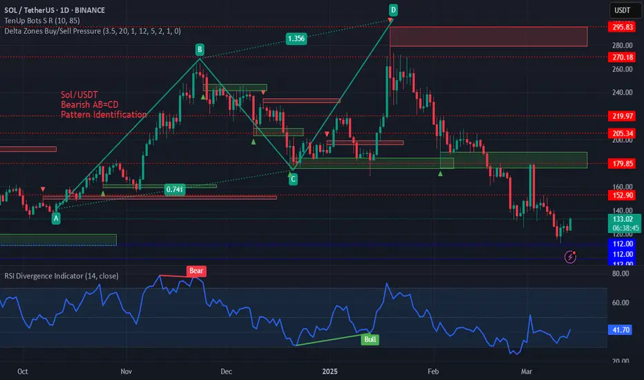
Pattern Identification on SOL/USD AB=CD Pattern on SOL/USDT on daily time frame.
These are harmonic patterns and these can be seen on hourly, 4h, 1day etc. time frames and the trader can take positions in the market according to the trend.
5 Most Popular Momentum Indicators to Use in Trading in 20255 Most Popular Momentum Indicators to Use in Trading in 2025
Want to master the art of momentum trading? Look no further. In this FXOpen article, we’ll explore how to use momentum indicators, the signals they generate, and five most popular momentum indicators for trading in 2025.
What Is a Momentum Indicator?
Momentum in technical analysis refers to the rate at which an asset's price accelerates or decelerates, helping traders identify potential trend continuations or reversals.
A momentum indicator is a tool used in technical analysis to measure the speed and strength of an asset’s price movements. By analysing changes in price over a specific period, these indicators provide insights into the underlying force driving market trends.
Momentum indicators do not focus on the direction of the price movement itself, but rather the strength behind it. Traders use these tools to gauge whether the market is overbought, oversold, or losing momentum, which helps determine entry or exit points. A stock momentum indicator like the Relative Strength Index (RSI), for instance, may indicate that stocks are currently bought or sold too heavily and their price is due for a reversal.
The Significance of Momentum Technical Indicators
Momentum indicators do not focus on the direction of the price movement, but rather on the strength behind it. They’re able to quantify and represent hidden clues about the future market direction in an easily interpretable way. By learning to read momentum indicators, traders can develop effective trading strategies, identify potential opportunities, and manage risk more efficiently.
Momentum tools produce a range of signals that offer traders an edge over the markets. Let’s take a look at some of the most common momentum signals.
Overbought and Oversold Conditions
These signals indicate when an asset's price has moved too far in one direction without sufficient support from fundamental or technical factors and is likely to reverse. For example, RSI generates overbought signals when the reading rises above 70 and signals oversold conditions when the reading falls below 30.
Divergence
Divergence occurs when the price of an asset moves in the opposite direction of the indicator, suggesting an upcoming reversal. For instance, when the price is making higher highs, but RSI is making lower highs, this indicates a bearish divergence that increases the likelihood of a downward move.
Crossover
These signals are generated when the indicator's lines cross each other or a certain threshold. A common example is the MACD, where traders look for crossovers between the fast MACD line and the slower signal line to spot potential entry and exit points.
Top Five List of Momentum Indicators for Technical Analysis
Now that we understand the types of signals that momentum tools produce, let’s break down five of the most popular with a momentum indicators list.
1. Relative Strength Index (RSI)
The RSI is one of the most popular and well-documented momentum indicators. It measures the speed and change of price movements by comparing the average gain to the average loss over a specified period, usually 14.
RSI is an oscillator, moving between 0 and 100. Values above 70 reflect overbought conditions, while values below 30 indicate oversold conditions. When the RSI moves out of overbought or oversold territory, many traders interpret this as a reversal confirmation. Sustained movements above or below the midpoint (50) can also be used to confirm a bullish or bearish trend, respectively. Moreover, traders look for divergence between the RSI and price to identify weakening trends and possible reversals.
2. Average Directional Index (ADX)
The ADX is a momentum indicator used to determine a trend’s strength. Unlike most other tools, its reading doesn’t move according to the direction of price action, i.e. it doesn’t move up if bullish or down when bearish. Instead, it ranges from 0 to 100, with values above 25 indicating a strong trend and below 25 suggesting a weak or non-trending market.
ADX is commonly used in combination with other tools, as it simply confirms the trendiness of a market. For example, traders might use a leading indicator like RSI to anticipate bullishness and confirm the trend when ADX crosses over 25.
3. Commodity Channel Index (CCI)
The CCI is a versatile momentum indicator. It uses a constant in its calculation to ensure that 75% of values fall between +/- 100, with moves outside of the range generally indicating a trend breakout or continuation. It can also show extreme overbought or oversold conditions when its value exceeds +/- 200.
The CCI requires a more nuanced approach than other tools and is typically used to confirm a trader’s directional bias and to identify potential opportunities. For instance, a visually identifiable bullish trend can be confirmed by looking at the CCI. If its value is skewed toward 100+, traders can be confident in their observation. When the market cools off, CCI will fall below 100. Traders can then confirm a pullback entry with a move back into the +/- 100 range.
4. Moving Average Convergence Divergence (MACD)
The MACD is a highly regarded trend-following momentum indicator that shows the relationship between two moving averages of an asset's price. It’s used in technical analysis to identify the relationship between two moving averages of a security’s price. It helps traders understand the trend’s strength, direction, and duration, as well as possible reversal points.
Traders use crossovers between the MACD and signal lines as potential entry and exit signals. Additionally, when the MACD histogram crosses above or below the zero line, it can indicate bullish or bearish momentum in the market. Lastly, it’s also possible to spot divergences between price and the indicator’s peaks and troughs, similar to how divergences are identified with RSI.
5. Momentum (Mom)
The Momentum indicator is a simple yet potentially effective tool that measures the rate of change in an asset's price over a specific period. The value of the Momentum depends on the market it’s applied to. For example, using the Momentum indicator in stocks will result in a fluctuating value typically between +/- 20, depending on the stock’s price. For forex pairs, its range may look more like +/- 0.02.
The common feature across all markets, however, is the zero line. Generally speaking, positive Momentum values indicate upward price movement, while negative values suggest downward movement. It can also show overbought and oversold conditions, but its lack of defined boundaries means this can be tricky. However, Momentum is especially useful for identifying divergences.
Advantages of Momentum Indicators
Momentum indicators are valuable tools in technical analysis, helping traders assess the strength and speed of price movements. They offer several benefits that enhance trading strategies and decision-making:
- Identify Trends Early: Market momentum indicators can reveal the start of a new trend and the end of the old trend, allowing traders to enter trades at opportune moments.
- Objective Analysis: They provide quantifiable data, reducing reliance on subjective analysis and emotional decision-making.
- Spot Overbought and Oversold Conditions: Momentum tools help traders identify when an asset is overbought or oversold, signalling potential reversals and exit points.
- Confirm Trade Signals: Combining momentum indicators with other technical tools enhances the accuracy of trade signals, providing stronger confirmation for trading decisions.
- Adaptable Across Markets: They can be applied to various assets, including stocks, forex, and commodities, making them versatile tools for traders.
Things to Consider When Trading Momentum Indicators
While momentum indicators can be an effective addition to any trader’s arsenal, there are a few things to be aware of:
- Trade with the Trend: Trends often last longer than you may think, and constantly looking for trend reversals will only end in frustration. Look for bullish signals during an uptrend and bearish signals in a downtrend.
- Use Multiple Indicators: Relying on a single tool can lead to false signals. Many traders combine a lagging indicator, like MACD, with a leading indicator, like RSI. Combining two or three tools can help confirm signals and improve trade accuracy.
- Beware of False Signals: Momentum indicators can sometimes generate false signals, especially in sideways or choppy markets. Being patient and waiting for confirmation before entering a trade is vital.
- Don’t Rely Too Heavily on Indicators: While momentum indicators can be helpful, relying solely on them without considering price action, market structure, or fundamental aspects can lead to poor trading decisions. Use these indicators alongside other tools for a momentum indicator strategy.
Final Thoughts
Now that you have a comprehensive overview of momentum indicators and the signals they produce, it’s time to put your knowledge into practice. After experimenting with a few tools and settling on your favourites, you can open an FXOpen account. You’ll be able to trade over 600+ markets with low costs and ultra-fast execution speeds while partnering with one of the world’s fastest-growing forex brokers. Good luck!
FAQ
How to Use Momentum Indicators?
With momentum indicators, traders monitor the rate of price changes to assess whether it is gaining or losing strength. Traders look for overbought or oversold conditions, divergences, and crossovers to determine potential entry and exit points.
What Is the Best Period for a Momentum Indicator?
If we are talking about the Momentum indicator, the best period depends on your trading style. For short-term traders, 7 and 10 periods are common, while long-term traders may prefer 14 and 21 periods. Testing various periods based on asset volatility can improve results.
What Is the Best Momentum Indicator for Scalping?
There is no best momentum indicator for scalping but the Relative Strength Index (RSI) is often favoured by scalpers due to its ability to quickly identify overbought or oversold conditions. Its responsiveness helps scalpers make rapid decisions in fast-moving markets.
What Is the Difference Between Momentum and Trend Indicators?
Momentum trading indicators measure the speed of price changes, while trend indicators assess the direction and persistence of price movements. To put it simply, momentum focuses on strength, while trend indicators focus on the overall direction.
Is MACD a Momentum Indicator?
Yes, the Moving Average Convergence Divergence (MACD) is one of the most popular momentum indicators, especially in stock trading. It reveals changes in momentum and helps identify potential trend reversals.
This article represents the opinion of the Companies operating under the FXOpen brand only. It is not to be construed as an offer, solicitation, or recommendation with respect to products and services provided by the Companies operating under the FXOpen brand, nor is it to be considered financial advice.

Lesson 1.0.1A lesson I find myself forgetting many times over is
DO NOT ENTER IMMEDIATELY AT BREAKOUT/BREAKDOWN
In these markets, it is generally better to wait for a candle close confirmation above zone, followed by a retracement, and then you can enter.
Generally it is better to miss a move than lose money regardless.
Essentially if you want more of your trades to work, even at breakout or breakdown, wait.
While some may argue that you would miss the move, I would counter to say that if a move is incredibly and rapidly directional it is very likely there will be a retracement. Markets prefer a slow and steady rise or decline for stability, if it moves jaggedly it will eventually regress to the mean all the same.

How to Trade Trend ReversalsThey say, “the trend is your friend”—until it bends at the end. Every strong move eventually runs out of steam, but spotting the turn and trading it effectively is no easy task. Some traders try to anticipate the reversal, positioning ahead of time, while others wait for confirmation, entering once the trend has already shifted. Both methods have their strengths and weaknesses, and the best approach depends on your risk tolerance and trading style.
Anticipating the Turn: Catching the Reversal Early
This approach focuses on momentum shifts and false breakouts before the price fully confirms a new trend. The goal is to enter before the crowd, capturing a reversal at the best possible price.
Key Tools:
Momentum Divergence – If price makes a new high or low, but RSI fails to follow, it suggests the trend is weakening.
False Breakouts – If price breaks a key level but immediately reverses, it signals a trap set for traders expecting continuation.
Benefits:
• Better risk-reward – Entering before the confirmation means stops can be tighter, allowing for a larger potential profit.
• First-mover advantage – Catching a trend change early means getting in at a great price before the majority of traders react.
Drawbacks:
• Higher failure rate – Many trends look weak before resuming, leading to premature entries and false starts.
• Requires precision – Entry and stop placement must be exact to avoid being caught in noise.
Waiting for Confirmation: Trading the Break
Rather than trying to predict the turn, this method waits for price to confirm the reversal by breaking key levels or forming a clear new trend structure.
Key Tools:
Trend Structure Shift – A series of lower highs in an uptrend, or higher lows in a downtrend, signals exhaustion.
Break of Key Support/Resistance – Once price decisively moves beyond a critical level, it confirms the trend change.
Benefits:
• Higher probability trades – Waiting for confirmation reduces the risk of being faked out by temporary pullbacks.
• Less stressful – Entering after the break avoids the uncertainty of catching tops and bottoms.
Drawbacks:
• Worse risk-reward – Entry is later, meaning stops tend to be wider and potential profits smaller.
• Missed moves – Sometimes, a reversal happens too quickly, leaving conservative traders behind.
Applying Both Methods: Two Live Market Examples
1. EUR/USD – A Potential Trend Reversal in Progress
Recently, EUR/USD had been stuck in a long-term downtrend, with lower lows forming consistently. But the latest attempt to break support failed spectacularly.
Anticipatory Approach: Traders watching for a false breakout could have entered after price dipped below support and immediately reversed. RSI also showed bullish divergence—momentum was no longer confirming the downtrend. Entry would be placed just above the reclaimed support, with a tight stop below the false breakdown.
Momentum-Based Approach: Traders waiting for confirmation would have looked for a strong breakout above the first major resistance. After the false breakdown, price surged above prior swing highs, confirming buyers had taken control. The break of horizontal resistance provided a clearer entry signal, with stops below the breakout level.
EUR/USD Daily Candle Chart
Past performance is not a reliable indicator of future results
2. S&P 500 – The Start of a Breakdown?
The S&P 500 had been in a strong uptrend, but multiple failed attempts to break through resistance suggested buyers were losing momentum. Eventually, price broke below key support, triggering a sharp decline.
Anticipatory Approach: Traders looking for early signs of weakness could have entered short after noticing a series of failed breakouts. RSI divergence signalled that momentum was waning, and the repeated failures at resistance suggested a sell-off was brewing. The entry would have been placed near resistance, with stops just above the recent highs.
Momentum-Based Approach: A more patient trader would have waited for a confirmed break of support. Once the S&P sliced through a major level, a short trade could be initiated on the retest of the broken support, with stops just above the previous swing low.
S&P Daily Candle Chart
Past performance is not a reliable indicator of future results
Final Thoughts: Choosing the Right Approach
Both methods have their advantages. Anticipating reversals can offer an early entry with strong risk-reward potential, but it also comes with a higher chance of false signals. Waiting for confirmation provides greater clarity and reduces the likelihood of premature entries, though it often means entering later in the move.
Neither approach is inherently better—it depends on your trading style, risk tolerance, and strategy. The key is consistency: whichever method you use, having a clear plan and following it with discipline is what separates successful traders from those who get caught on the wrong side of a trend change.
Disclaimer: This is for information and learning purposes only. The information provided does not constitute investment advice nor take into account the individual financial circumstances or objectives of any investor. Any information that may be provided relating to past performance is not a reliable indicator of future results or performance. Social media channels are not relevant for UK residents.
Spread bets and CFDs are complex instruments and come with a high risk of losing money rapidly due to leverage. 83% of retail investor accounts lose money when trading spread bets and CFDs with this provider. You should consider whether you understand how spread bets and CFDs work and whether you can afford to take the high risk of losing your money.


18 Times, +2000%, 5800 Days - All About NASDAQ100 Corrections!Hi, all!
I need to repost some of my recent ideas on TradingView due to issues with the platform's moderation. Let's start! The most up-to-date post is coming right away - one that serves as a timely reminder during these interesting times: never forget history.
From November 2008 to February 2025, the Nasdaq 100 (NDX) index has grown by over 2000%! Yes, that’s a 20x increase! This tech giant, made up of the 100 leading technology stocks, has shown impressive strength.
For comparison, the S&P 500 has risen about 820% in the same period. A great performance but Nasdaq 100 leaves it far behind.
Has this been a straight-line rise? Not really. Looking back, it may seem like the perfect investment. But the road was not smooth. Nasdaq 100’s success came with painful drops, investor panic, and moments when it felt like the market would never recover.
From the outside, everything looks great. But would you sit through a 30% drop, while the news is screaming about the "end of the world"?
So, I decided to analyze every correction of 10% or more since the market bottom in 2008.
- How long do corrections and recoveries last?
- How often do they happen?
- What should investors know?
- Can this help you in any way?
DATA ANALYSIS - 18 corrections in Nasdaq 100 (2008–2025), -10% or more.
Retracement Stats:
- Average drop: -15%
- Median drop: -13%
- Biggest drop: -37.72%
- Smallest drop: -10%
Correction Length (17 completed corrections): How many days does a correction last from the peak to the bottom?
- Average: 60 days
- Median: 35 days
- Longest: 325 days
- Shortest: 14 days
Recovery Time: From bottom back to new highs.
- Average: 165 days (~5.5 months)
- Median: 119 days (~4 months)
- Longest: 752 days (over 2 years)
- Shortest: 42 days (~1.5 months)
Correction Frequency
If we take a rough estimate, in 5800 days, there were 18 corrections, which means a correction happens every 322 days (~10.5 months) on average.
Total Time Spent in Corrections vs. Rising Markets
- Corrections lasted 1016 days
- Recoveries lasted 2801 days
- Total time spent in "work mode": 3817 days
- Total "smooth uptrend" days: 1983 days (~5.4 years)
Basically, like a hardworking employee – the market spends more time struggling than rising!
What Can Investors Learn from This?
1. Accept Volatility
Knowing that market swings are normal, investors can keep a long-term perspective and avoid panic-selling during downturns.
2. Nasdaq 100 Has Always Recovered
In the long run, Nasdaq 100 has always bounced back to new highs. Each recovery has been different, but so far, making new all-time highs has never been a problem.
3. Make Better Decisions
Understanding psychological biases helps investors make rational choices and manage risks better.
4. Market Drops = Opportunities, Not Threats
Most big market rallies started when most investors were too scared to buy.
"A simple rule dictates my buying: Be fearful when others are greedy, and be greedy when others are fearful." – Warren Buffett
Market drops always feel unique and scary but history shows they follow repeating patterns. And those who keep their emotions in check have the best opportunities.
"The time to buy is when there's blood in the streets." – Baron Rothschild
Final Thoughts: Is the current retracement a buying opportunity? No one knows for sure but history suggests - stay calm!
So, that's all. Like & Boost if you find this useful! 🚀
Have great day,
Vaido
💬 Before you leave... What’s your take on the current Nasdaq 100 correction? Drop your thoughts in the comments 👇