Shifts in Global Trade Patterns and Supply ChainsIntroduction: The New Dynamics of Global Trade
The 21st century has witnessed an unprecedented transformation in global trade patterns and supply chains. From the post–World War II dominance of Western industrial economies to the rise of Asia as the global manufacturing hub, and now to an era shaped by digitalization, sustainability, and geopolitical realignment, trade is no longer just about goods crossing borders—it’s about interconnected systems, data flows, and strategic dependencies.
The COVID-19 pandemic, escalating trade wars, and regional conflicts like the Russia–Ukraine war have further reshaped the global trade map, compelling nations and corporations to rethink where and how they source, produce, and distribute goods. Today’s supply chains are not just economic instruments but also political, environmental, and technological battlegrounds.
This essay explores how global trade patterns and supply chains are shifting—highlighting the key forces driving these changes, the regions gaining and losing influence, and the implications for the future of global commerce.
1. Historical Context: From Globalization to Strategic Localization
In the decades following the 1990s, globalization reached its peak. Corporations sought efficiency through offshoring—relocating production to countries with cheaper labor and favorable trade policies. China, in particular, became the “world’s factory,” while emerging economies like Vietnam, Bangladesh, and Mexico grew as secondary manufacturing centers.
However, this model also created vulnerabilities. The overdependence on a few key suppliers and logistical routes meant that any disruption—whether a natural disaster, pandemic, or political tension—could paralyze entire industries. The 2008 global financial crisis and the 2020 pandemic both exposed these structural weaknesses, sparking a paradigm shift from efficiency-driven globalization to resilience-driven regionalization.
This historical backdrop set the stage for today’s reconfiguration of global trade and supply chains.
2. The Decline of Traditional Globalization
The forces of globalization—free trade, open markets, and integrated supply networks—are no longer the sole organizing principles of world commerce. Instead, nations are turning inward or aligning with regional blocs.
Key drivers of this shift include:
Trade Protectionism: The US–China trade war initiated in 2018 marked a turning point. Tariffs on hundreds of billions of dollars’ worth of goods disrupted established supply chains and forced firms to reconsider sourcing strategies.
National Security Concerns: Sensitive technologies, semiconductors, and critical minerals are now treated as strategic assets. Countries are restricting exports and promoting domestic production to avoid dependency.
Pandemic Disruptions: COVID-19 halted global logistics, revealed the fragility of “just-in-time” supply chains, and accelerated the adoption of “just-in-case” models emphasizing inventory buffers and regional diversification.
As a result, global trade growth has slowed. According to the World Trade Organization (WTO), the share of global trade in GDP has plateaued since 2015, signaling a structural slowdown in hyper-globalization.
3. Regionalization and the Rise of New Trade Hubs
A major trend reshaping global trade is the regionalization of supply chains. Instead of sourcing components from far-flung regions, companies are building shorter, more localized networks to reduce risk and improve resilience.
Key examples include:
Asia-Pacific Integration: While China remains central, production is increasingly distributed across ASEAN nations—Vietnam, Indonesia, Malaysia, and Thailand. This “China + 1” strategy helps reduce dependency on Chinese manufacturing while keeping access to its vast ecosystem.
North American Reshoring: Under the USMCA (United States–Mexico–Canada Agreement), companies are bringing manufacturing closer to home, especially in sectors like electronics, autos, and semiconductors. Mexico, benefiting from proximity to the US, has emerged as a major reshoring destination.
European Realignment: The EU is striving for “strategic autonomy” by strengthening internal supply networks, investing in renewable energy, and reducing reliance on Russian gas and Chinese raw materials. Eastern European nations like Poland, Hungary, and the Czech Republic are gaining traction as nearshoring hubs.
Regionalization doesn’t mean de-globalization—it represents a reconfiguration where trade flows become more concentrated within strategic clusters rather than globally dispersed.
4. The Digital Revolution and Smart Supply Chains
Technology is fundamentally transforming how global supply chains operate. Digital tools—ranging from artificial intelligence (AI) and blockchain to the Internet of Things (IoT) and advanced data analytics—are making supply chains smarter, more transparent, and adaptive.
Key technological impacts include:
AI-driven demand forecasting: Firms now predict market shifts with greater precision, reducing overproduction and wastage.
Blockchain for traceability: This ensures transparency across complex multi-tier supplier networks, particularly vital in industries like pharmaceuticals, food, and luxury goods.
Automation and robotics: Advanced robotics and 3D printing are reducing the cost differential between developed and developing countries, encouraging some industries to “reshore” production.
Digital trade platforms: Cloud-based trade management systems are facilitating faster customs clearance and cross-border documentation.
Digitalization thus acts as a “force multiplier,” enabling efficiency even within shorter, regional supply chains.
5. Geopolitical Tensions and Strategic Supply Chains
Geopolitics now plays a decisive role in shaping global trade patterns. The rivalry between major powers—particularly the US and China—has spilled into areas like technology, finance, and infrastructure.
Examples of this geopolitical fragmentation include:
The US–China Tech War: Restrictions on semiconductor exports, Huawei’s global ban, and supply chain decoupling efforts in critical tech sectors.
The Russia–Ukraine Conflict: Disruption in global energy and food supplies led Europe to accelerate diversification away from Russian dependence and invest in renewable alternatives.
Taiwan’s Semiconductor Dominance: Taiwan’s TSMC produces over 60% of the world’s advanced chips, making it a geopolitical flashpoint. Nations are now racing to build domestic semiconductor capabilities.
Governments worldwide are responding with industrial policies—such as the US CHIPS Act and the EU’s Green Deal Industrial Plan—to strengthen domestic supply resilience and reduce strategic vulnerabilities.
6. Sustainability and Green Supply Chains
Sustainability has become another key pillar shaping global trade. Corporations and countries are now judged not just by efficiency but by environmental and social responsibility.
Emerging sustainability trends include:
Carbon Border Adjustments: The EU’s Carbon Border Adjustment Mechanism (CBAM) will impose tariffs on carbon-intensive imports, encouraging cleaner production methods globally.
Circular Supply Chains: Companies are reusing materials, recycling components, and designing products for longevity—reducing dependency on raw material imports.
Renewable Energy Integration: Nations are aligning trade policies with green energy goals, influencing logistics routes and energy-intensive production locations.
This “green reindustrialization” is creating new opportunities for economies investing in clean manufacturing and renewable technologies, while penalizing those relying heavily on fossil fuels.
7. Emerging Markets: The New Centers of Trade Gravity
While developed economies are reshaping strategies for security and sustainability, emerging markets are becoming the new growth engines of global trade.
India: With its large labor force, pro-manufacturing policies (like “Make in India”), and digital infrastructure, India is positioning itself as a credible alternative to China for global manufacturers.
Vietnam and Indonesia: Both are attracting massive FDI inflows in electronics, apparel, and automotive sectors as part of the “China + 1” diversification strategy.
Africa: The African Continental Free Trade Area (AfCFTA) is creating a single market of over a billion people, opening new avenues for intra-African trade and global partnerships.
Latin America: Mexico and Brazil are emerging as nearshoring hubs for North America and Europe respectively.
These shifts mark a rebalancing of global economic power, where trade is less dominated by a single country or region and more evenly distributed across multiple growth centers.
8. The Logistics Revolution: Ports, Corridors, and Connectivity
Global trade depends not only on production but also on transport and logistics. Recent developments show a massive reorientation of global transport networks.
Alternative Shipping Routes: The Russia–Ukraine war and tensions in the Red Sea have redirected maritime traffic toward longer but safer routes, impacting global shipping costs.
India–Middle East–Europe Economic Corridor (IMEC): Announced in 2023, this new trade corridor aims to counterbalance China’s Belt and Road Initiative by linking India with Europe via the Middle East.
Automation in Ports: Smart ports and AI-based logistics management are reducing turnaround times and improving efficiency in global trade routes.
The next phase of trade will rely on infrastructure intelligence—where logistics are powered by data, automation, and alternative energy.
9. Supply Chain Resilience: From Just-in-Time to Just-in-Case
The traditional “just-in-time” model—minimizing inventory to cut costs—proved fragile under recent crises. Today, supply chain resilience has become a corporate priority.
Resilience strategies include:
Diversification of suppliers and locations to avoid overreliance on one country.
Inventory buffers for critical materials like semiconductors, lithium, and rare earths.
Multi-shoring and friend-shoring—favoring trade with politically aligned or nearby nations.
Scenario planning and stress testing to anticipate disruptions.
Resilience no longer means inefficiency—it is an investment in stability and strategic independence.
10. The Future of Global Trade: Multipolar, Digital, and Sustainable
The future of global trade will be multipolar, digital, and sustainability-driven. Power will no longer be concentrated in one global hub like China or the US, but spread across multiple regional clusters—each specializing in distinct industries.
Key trends for the next decade include:
Expansion of digital trade agreements (like the Digital Economy Partnership Agreement, DEPA).
Integration of AI and data analytics for predictive supply chain management.
Growth of sustainable trade finance linked to ESG (Environmental, Social, Governance) metrics.
The rise of cross-border e-commerce as small businesses join global trade through digital platforms.
In essence, globalization is not disappearing—it is evolving into a more complex, technology-enabled network of regional and digital ecosystems.
Conclusion: The Great Reconfiguration
The global trade system is undergoing its most profound transformation in decades. The twin forces of geopolitical realignment and technological innovation are redrawing the map of commerce. Efficiency is no longer the sole metric of success—resilience, sustainability, and strategic autonomy now define the new era of global trade.
Nations that adapt to these shifts—by investing in technology, building sustainable industries, and forging resilient partnerships—will lead the next chapter of globalization. Meanwhile, those clinging to old models of cost-driven offshoring may find themselves sidelined in an increasingly fragmented but interconnected world.
The global trade landscape of the 2030s will thus be characterized not by the dominance of any single power, but by the emergence of a networked, multipolar world—where innovation, adaptability, and trust define the flow of goods, data, and ideas.
X-indicator

Strategies for Investors in Emerging Markets1. Understanding Emerging Markets: The Opportunity and the Risk
Emerging markets are nations transitioning from low-income to middle-income status with improving infrastructure, industrial capacity, and governance. They typically exhibit higher GDP growth rates compared to developed economies but are also prone to fluctuations due to external shocks, commodity cycles, and policy uncertainty.
Opportunities:
High Growth Potential: Economic expansion driven by demographics, technology, and urbanization.
Rising Middle Class: Increasing disposable incomes create strong demand for goods, housing, and financial services.
Untapped Markets: Sectors like renewable energy, digital payments, healthcare, and logistics are still underpenetrated.
Diversification: Adding emerging markets exposure helps investors reduce overreliance on developed market cycles.
Risks:
Political Instability: Policy reversals and corruption can disrupt business environments.
Currency Volatility: Exchange rate fluctuations can erode returns for foreign investors.
Liquidity Risk: Many emerging market stocks and bonds are thinly traded.
Regulatory Uncertainty: Sudden capital controls or taxation changes may impact investments.
The challenge is balancing these opportunities and risks through intelligent portfolio design and disciplined execution.
2. Strategic Approach: Building an Investment Framework
Before diving into specific markets or sectors, investors must establish a framework that defines their objectives, time horizon, and risk tolerance.
A. Long-Term Orientation
Emerging markets tend to be volatile in the short term but rewarding over longer periods. A 7–10 year investment horizon allows investors to ride out short-term turbulence and benefit from structural growth trends like digitization, infrastructure expansion, and industrial modernization.
B. Top-Down vs. Bottom-Up Analysis
Top-Down Approach: Focuses on macroeconomic indicators like GDP growth, fiscal health, inflation, interest rates, and political stability to identify attractive countries or regions.
Bottom-Up Approach: Focuses on identifying fundamentally strong companies within those economies that are capable of delivering consistent earnings growth regardless of external volatility.
A blend of both approaches ensures that investors capture macroeconomic upside while remaining selective at the micro level.
3. Geographic Diversification: Don’t Bet on a Single Country
One of the core principles in emerging market investing is diversification. No two emerging markets move in the same direction at the same time. For example, India’s tech-led growth story differs from Brazil’s commodity-driven economy or Vietnam’s export manufacturing model.
Key Diversification Strategies:
Regional Balance: Spread exposure across Asia, Latin America, Eastern Europe, and Africa.
Economic Model Diversification: Combine consumer-driven economies (India, Indonesia) with export-driven ones (Vietnam, Mexico).
Political Diversity: Mix stable democracies with reform-driven autocracies to spread political risk.
Exchange-Traded Funds (ETFs) like iShares MSCI Emerging Markets ETF (EEM) or Vanguard FTSE Emerging Markets ETF (VWO) provide diversified exposure across multiple markets, reducing country-specific volatility.
4. Sectoral Allocation: Focus on Structural Growth Themes
Emerging markets often lead global trends in specific sectors. Identifying high-growth industries within these regions helps investors capture sustainable long-term returns.
Promising Sectors:
Technology & Digital Infrastructure: The explosion of fintech, e-commerce, and AI startups in India, Indonesia, and Latin America.
Renewable Energy: Transition toward solar, wind, and green hydrogen projects in India, Brazil, and South Africa.
Healthcare & Pharmaceuticals: Growing middle-class populations are demanding better healthcare access and quality.
Consumer Goods & Retail: Expanding domestic consumption supports strong demand for FMCG and retail companies.
Financial Services: Low financial penetration opens vast opportunities for banking, insurance, and digital finance firms.
Investors should look for sectors aligned with long-term development trends and domestic reforms rather than short-term cyclical plays.
5. Currency and Inflation Management
One of the most overlooked risks in emerging market investing is currency fluctuation. Even if local asset prices rise, depreciation in the local currency against the U.S. dollar can wipe out gains for foreign investors.
Strategies to Manage Currency Risk:
Hedged ETFs: Use instruments that neutralize foreign exchange exposure.
Dollar-Cost Averaging: Regular investments over time reduce the impact of exchange rate timing.
Local Currency Bonds: Some investors use local bonds to balance currency exposure since yields often compensate for risk.
Stable Country Selection: Prioritize countries with credible central banks and stable monetary policies (e.g., India or Chile).
Inflation, too, can erode real returns. Investing in inflation-resilient assets such as commodities, real estate, or dividend-paying equities helps offset purchasing power loss.
6. Active vs. Passive Investment Strategies
Passive Investing
Investors can use index funds or ETFs tracking emerging market indices for cost-effective diversification. These instruments provide broad exposure and reduce single-country or single-stock risk.
However, passive strategies may miss out on specific outperformers or structural changes in certain markets.
Active Investing
Active fund managers can exploit inefficiencies in emerging markets by selecting undervalued companies, timing entries, and managing risk dynamically.
Successful active investing requires local knowledge, deep research, and a long-term view.
Blended Approach
Many investors use a core-satellite strategy:
Core portfolio: Passive exposure to broad emerging markets.
Satellite portfolio: Active bets on select countries or sectors with strong upside potential.
This combination provides balance between stability and opportunity.
7. Incorporating ESG and Governance Factors
Environmental, Social, and Governance (ESG) considerations have become integral to investment decisions worldwide. In emerging markets, ESG risks—such as corruption, labor practices, or environmental degradation—can directly affect returns.
ESG Strategies:
Screening Out High-Risk Firms: Avoid companies with poor governance or environmental violations.
Engagement: Encourage companies to improve transparency and sustainability practices.
ESG-Focused Funds: Many global asset managers now offer emerging market ESG ETFs and funds.
ESG adoption is not only ethically sound but also improves long-term performance as well-governed companies often enjoy lower borrowing costs and better investor confidence.
8. Timing and Entry Strategy
Emerging markets are highly sensitive to global liquidity cycles. When interest rates in developed markets rise, capital often flows out of emerging economies, leading to currency depreciation and market corrections.
Timing Tips:
Avoid Herd Behavior: Don’t chase rallies driven by short-term sentiment.
Buy During Corrections: Use market pullbacks to accumulate high-quality stocks at attractive valuations.
Follow Global Monetary Trends: Emerging markets typically perform better when the U.S. dollar weakens and global liquidity expands.
Technical Indicators: Use support levels and moving averages to identify favorable entry points.
Investors who remain disciplined and patient tend to benefit from long-term uptrends following temporary volatility.
9. Using Local Expertise and Partnerships
Investing directly in foreign markets can be complex due to legal, taxation, and information asymmetry challenges.
Collaborating with local fund managers, research firms, or regional ETFs provides better access to data, understanding of cultural nuances, and insight into domestic market behavior.
For example:
Joint ventures with local asset managers can open doors to private equity opportunities.
Local advisory services help navigate regulations and currency repatriation rules.
10. Risk Management and Hedging Tools
Emerging market investors must prioritize capital preservation as much as growth. Key risk management measures include:
Position Sizing: Avoid concentrating too much in a single country or sector.
Stop-Loss and Rebalancing: Regularly review portfolios to lock in gains and cut losses.
Derivatives and Hedging Instruments: Use currency futures or options to mitigate exchange risk.
Fixed Income Allocation: Pair equity exposure with sovereign or corporate bonds for income stability.
Liquidity Buffer: Maintain cash reserves to take advantage of opportunities during volatility spikes.
Effective risk management separates disciplined investors from speculative traders.
11. Case Studies: India and Vietnam
India: The Digital and Consumption Story
India represents one of the strongest long-term emerging market stories, driven by digital transformation, manufacturing expansion under “Make in India,” and a rising young population.
Sectors like IT services, fintech, renewable energy, and capital goods have delivered consistent returns. The government’s focus on infrastructure and fiscal reforms adds structural strength.
Vietnam: The Manufacturing Powerhouse
Vietnam benefits from trade diversification, young labor force, and foreign investment inflows as companies relocate from China. Its export-oriented economy, stable governance, and strategic location make it a regional favorite. However, investors must watch for banking sector vulnerabilities and currency management challenges.
These examples highlight the importance of aligning investment strategy with each country’s unique growth narrative.
12. Long-Term Vision: Compounding in High-Growth Economies
Emerging markets reward investors who think in decades, not quarters. Compounding works best when capital remains invested during both upcycles and corrections. Reinvesting dividends, staying informed on macroeconomic trends, and maintaining a disciplined approach can create exponential growth over time.
Global investors like BlackRock, Fidelity, and Franklin Templeton have consistently emphasized that emerging markets are no longer speculative bets — they are essential components of global portfolios.
Conclusion: Balancing Risk and Reward in the New Global Order
The next wave of global economic growth will likely come from emerging markets. With technological innovation, demographic dividends, and economic reforms, these nations are shaping the new world order.
However, investing in them requires a careful balance between optimism and prudence.
Successful investors in emerging markets:
Diversify broadly.
Focus on long-term structural growth themes.
Actively manage currency and political risks.
Blend passive exposure with active conviction plays.
Stay disciplined during volatility.
Emerging markets are not for the faint-hearted, but for those with patience, research, and strategy — they offer some of the most rewarding opportunities in global investing today.
Blockchain’s Role in Different Trading Segments1. Introduction: Redefining Trust in the Trading World
The modern trading ecosystem — spanning financial markets, commodities, forex, and digital assets — relies heavily on trust, transparency, and speed. For decades, intermediaries such as brokers, clearing houses, and central depositories have played a vital role in ensuring smooth settlements and recordkeeping. However, this system is often plagued by inefficiencies, high transaction costs, and occasional lapses in security or accountability.
Enter blockchain technology — a decentralized ledger system that offers immutable, transparent, and secure recordkeeping. By eliminating the need for traditional intermediaries, blockchain has the potential to revolutionize how trades are executed, verified, and settled across different segments of the global financial market.
Blockchain’s role in trading is not confined to cryptocurrencies. Its applications now extend to stock markets, commodity exchanges, forex trading, derivatives, and even carbon credit and energy trading. Each of these sectors can benefit from blockchain’s ability to automate trust and reduce systemic inefficiencies.
2. Understanding Blockchain in the Context of Trading
At its core, blockchain is a distributed database shared among a network of participants. Once data — such as trade details or payment confirmations — is recorded on the blockchain, it cannot be altered without the consensus of the network. This ensures that all trading participants operate from a single, verified source of truth.
In trading terms:
Each transaction (buy or sell order) is a “block.”
These transactions are chained together chronologically.
The system is decentralized, meaning no single entity can manipulate data.
This architecture has far-reaching implications for global markets:
Instant settlements instead of multi-day clearing cycles.
Elimination of counterparty risk, as smart contracts execute automatically.
Lower transaction costs due to reduced intermediary dependence.
Enhanced auditability, since all data is time-stamped and verifiable.
3. Blockchain in Stock Market Trading
The traditional equity trading system involves multiple intermediaries — brokers, stock exchanges, clearing corporations, and custodians — all performing specific functions such as matching orders, confirming trades, and settling securities. While effective, this system is slow and costly.
How Blockchain Transforms Stock Trading
Real-Time Settlement: Blockchain can reduce the settlement period from the current T+2 (trade date plus two days) to near-instantaneous settlement (T+0). This significantly reduces liquidity risk and capital lock-in.
Tokenization of Assets: Shares can be represented as digital tokens on a blockchain. This enables fractional ownership, making high-value stocks accessible to smaller investors.
Decentralized Exchange Platforms: Decentralized stock trading platforms can facilitate peer-to-peer transactions without intermediaries, ensuring transparency and reducing costs.
Immutable Recordkeeping: Corporate actions such as dividends, bonus issues, and stock splits can be recorded permanently and automatically distributed using smart contracts.
Examples
Nasdaq Linq: One of the early adopters of blockchain, Nasdaq used the Linq platform to record private securities transactions, demonstrating efficiency and transparency.
India’s NSE pilot programs: The National Stock Exchange of India has experimented with blockchain for know-your-customer (KYC) data and settlement tracking.
4. Blockchain in Forex (Foreign Exchange) Trading
The foreign exchange market is the world’s largest financial market, with daily volumes exceeding $7 trillion. Yet, it remains fragmented, opaque, and reliant on central intermediaries like banks and payment processors.
Blockchain’s Advantages in Forex
Cross-Border Settlement: Blockchain enables direct peer-to-peer currency exchange without intermediaries, drastically cutting transfer times and fees.
Transparency and Auditability: All trades recorded on a blockchain are verifiable, reducing manipulation and fraud risks.
Smart Contracts for FX Swaps: Automated execution of forex swaps and forward contracts ensures minimal counterparty risk.
24/7 Accessibility: Unlike traditional systems, blockchain-based FX networks can operate continuously without downtime.
Example
RippleNet and Stellar Lumens use blockchain to enable instant cross-border currency transfers with minimal costs, challenging the dominance of SWIFT.
5. Blockchain in Commodity Trading
Commodity trading — involving oil, metals, and agricultural goods — often suffers from documentation delays, supply chain opacity, and settlement inefficiencies. Blockchain brings trust and traceability to this sector.
Applications
Smart Contracts for Trade Settlement: Automatically execute trades once contractual conditions are met (e.g., delivery confirmation triggers payment).
Supply Chain Transparency: Blockchain can trace commodities from extraction or production to final sale, ensuring authenticity and sustainability.
Tokenization of Commodities: Commodities like gold, crude oil, or carbon credits can be represented digitally, making them easier to trade and fractionalize.
Reduction in Paperwork: Blockchain eliminates the need for multiple physical documents like bills of lading, inspection certificates, and letters of credit.
Example
Vakt, a blockchain-based platform supported by BP and Shell, digitizes the post-trade processes in oil markets, improving efficiency and reducing fraud.
6. Blockchain in Derivatives and Futures Markets
Derivatives — including futures, options, and swaps — are complex instruments often involving multiple intermediaries. Blockchain’s smart contracts can automate these trades and settlements with precision.
Benefits
Instantaneous Settlement: Reduces the time gap between contract execution and settlement, minimizing counterparty and liquidity risks.
Automated Margin Calls: Smart contracts can automatically adjust margin requirements based on real-time price movements.
Transparency: Blockchain’s shared ledger ensures all participants view the same data, reducing disputes.
Regulatory Compliance: Blockchain enables real-time reporting to regulators, improving oversight.
Example
DTCC (Depository Trust & Clearing Corporation), which handles trillions in derivatives, has explored blockchain for trade reporting and settlement to enhance efficiency.
7. Blockchain in Cryptocurrency Trading
Cryptocurrency trading is the first and most obvious area where blockchain has already established dominance. Cryptos like Bitcoin and Ethereum are themselves blockchain-native assets, and their trading happens entirely on blockchain-based exchanges.
Innovations
Decentralized Exchanges (DEXs): Platforms like Uniswap and PancakeSwap allow traders to exchange tokens directly from their wallets without intermediaries.
Liquidity Pools: Smart contracts automatically match buyers and sellers, ensuring market liquidity.
Transparency and Security: Every trade is publicly recorded on the blockchain, ensuring full auditability.
Challenges
High volatility, lack of regulation, and scalability limitations still pose obstacles to mainstream adoption.
8. Blockchain in Energy and Carbon Credit Trading
The rise of sustainability-focused finance has introduced new markets like carbon credits and renewable energy certificates. Blockchain ensures authenticity and prevents double-counting in these emerging asset classes.
Applications
Tokenized Energy Certificates: Renewable energy output (solar, wind, hydro) can be tokenized and traded on blockchain platforms.
Carbon Credit Trading: Blockchain ensures each credit is unique, traceable, and not resold multiple times.
Peer-to-Peer Energy Trading: Consumers with solar panels can directly sell surplus energy to others through blockchain-enabled microgrids.
Example
Power Ledger (Australia) uses blockchain to enable P2P renewable energy trading, giving consumers control over energy distribution and pricing.
9. Blockchain in Real Estate and Asset Tokenization
Although not traditionally viewed as a “trading” sector, real estate is rapidly evolving into a digital trading marketplace through blockchain tokenization.
Benefits
Fractional Ownership: High-value properties can be divided into digital tokens, allowing small investors to participate.
Instant Liquidity: Instead of lengthy paperwork, property tokens can be traded instantly on secondary markets.
Transparency and Authenticity: Land titles and ownership histories recorded on blockchain reduce fraud.
Example
Platforms like RealT and Propy are pioneering blockchain-based real estate trading with tokenized assets.
10. Blockchain’s Role in Regulatory Compliance and Risk Management
Beyond execution and settlement, blockchain plays a crucial role in compliance, auditing, and risk management.
Regulatory Advantages
Real-Time Monitoring: Regulators can access immutable records of trades in real-time.
KYC/AML Integration: Blockchain-based identity systems simplify customer verification while maintaining data privacy.
Reduced Fraud and Errors: Tamper-proof records and automated reconciliations enhance overall market integrity.
Example
The European Securities and Markets Authority (ESMA) has studied blockchain-based trade reporting to enhance transparency across the EU markets.
11. Challenges and Limitations
Despite its immense potential, blockchain adoption in trading faces practical and regulatory hurdles:
Scalability Issues: Large exchanges process millions of transactions daily; most blockchains still struggle with high throughput.
Regulatory Uncertainty: Many governments have yet to create clear frameworks for blockchain-based trading systems.
Integration Complexity: Legacy financial infrastructure is deeply entrenched, making transition costly and time-consuming.
Privacy Concerns: While transparency is valuable, full data visibility may conflict with confidentiality requirements in institutional trading.
Energy Consumption: Proof-of-work systems like Bitcoin consume significant power, though newer consensus models (e.g., proof-of-stake) are more efficient.
12. The Future of Blockchain in Global Trading
As the technology matures, blockchain is expected to become the backbone of next-generation trading infrastructure. The future may see:
Fully tokenized stock exchanges, where equities, bonds, and derivatives exist as digital assets.
Interoperable blockchains, allowing seamless transfers between different networks and asset classes.
AI and blockchain integration, combining data-driven trading strategies with transparent execution.
Central Bank Digital Currencies (CBDCs) simplifying settlement between global financial institutions.
The convergence of blockchain, AI, and IoT will lead to hyper-efficient, transparent, and inclusive trading ecosystems — reshaping how capital, commodities, and data flow across borders.
13. Conclusion
Blockchain’s entry into the trading world represents a paradigm shift — from trust-based intermediaries to trustless digital verification. Whether in stock markets, forex, commodities, or emerging asset classes like carbon credits, blockchain introduces unmatched levels of transparency, efficiency, and inclusiveness.
While challenges persist, the direction is clear: blockchain is not just a supporting technology; it is the new foundation of global trading architecture. The world’s markets are moving steadily toward an era where every trade, every asset, and every participant is digitally connected in a decentralized, verifiable, and borderless network of trust.
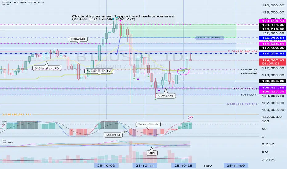
Predicting Intraday CRASHES 10%+ w/ 5 Easy Steps1️⃣ Daily imbalance above has been rebalanced.
2️⃣ Price is rejecting from premium arrays (above equilibrium of the daily dealing range).
3️⃣ Intraday displacement (#4) aligns perfectly with that macro rejection.
4️⃣ Volume and spread expand on the breakdown — that’s real order-flow, not stop-hunts.
5️⃣ There’s untouched liquidity resting below the daily lows. That’s where the algorithm’s draw is.

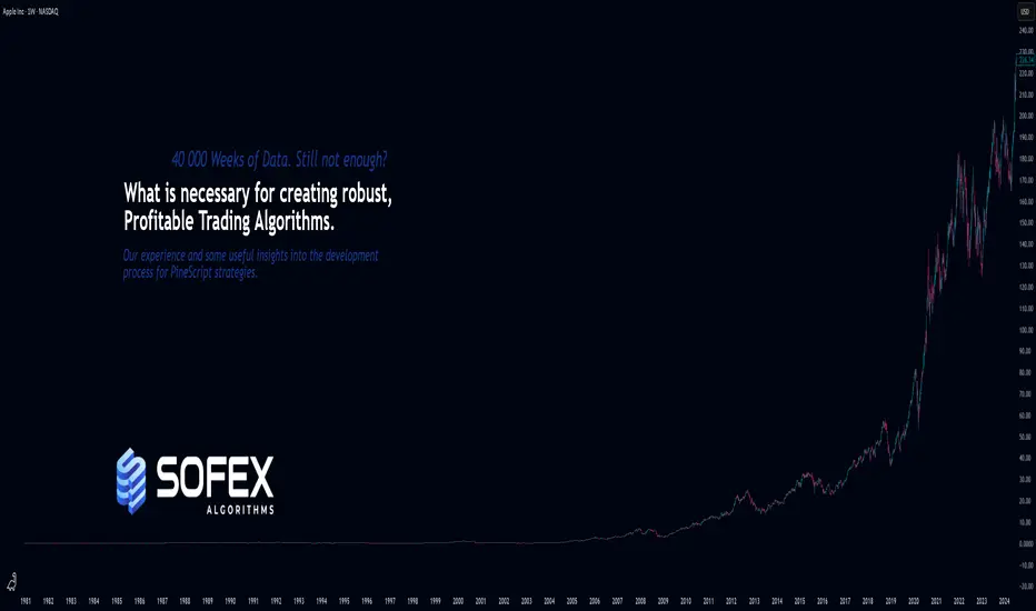
A few important steps for creating robust and winning StrategiesAs the title says, I want to share knowledge & important insights into the best practices for creating robust, trustworthy and profitable trading Strategies here on TradingView.
These bits of information that my team I have gathered throughout the years and have managed to learn through mostly trial and error. Costly errors too .
Many of these points more professional traders know, however, there are some that are quite innovative for all levels of experience in my opinion. Please, feel free to correct me or add more in the comments.
There are a few strategic and tactical changes to our process that made a noticeable difference in the quality of Strategies and Indicators immediately.
Firstly and most importantly, we have all heard about it, but it is having the most data available. A good algorithm, when being built NEEDS to have as many market situations in its training data as possible. Choppy markets, uptrends, downtrends, fakeouts, manipulations - all of these are necessary for the strategy to learn the possible market conditions as much as possible and be prepared for trading on unknown data.
Many may have heard the phrase "History doesn't repeat itself but rhymes well" - you need to have the whole dictionary of price movements to be able to spot when it rhymes and act accordingly.
The TradingView Ultimate plan offers the most data in terms of historical candles and is best suited for creating robust strategies.
___
Secondly, of course, robustness tests. Your algorithm can perform amazingly on training data, but start losing immediately in real time, even if you have trained it on decades of data.
These include Monte-carlo simulations to see best and worst scenarios during the training period. Tests also include the fundamentally important out-of-sample checks . For those who aren’t familiar - this means that you should separate data into training sets and testing sets. You should train your algorithm on some data, then perform a test on unknown to the optimization process data. It's common practice to separate data as 20% training / 20% unknown / 20% training etc. to build a data set that will show how your algorithm performs on unknown to it market movements. Out of sample tests are crucial and you can never trust a strategy that has not been through them.
Walk-forward simulations are similar - you train your algorithm on X amount of data and simulate real-time price feeds and monitor how it performs. You can use the Replay function of TradingView to do walk-forward tests!
When you are doing robustness tests, we have found that a stable strategy performs around 90% similarly in terms of win rate and Sortino ratio compared to training data. The higher the correlation between training performance and out of sample performance, the more risk you can allocate to this algorithm.
___
Now lets move onto some more niche details. Markets don’t behave the same when they are trending downward and when they are trending upwards. We have found that separating parameters for optimization into two - for long and for short - independent of each other, has greatly improved performance and also stability.
Logically it is obvious when you look at market movements. In our case, with cryptocurrencies, there is a clear difference between the duration and intensity of “dumps” and “pumps”. This is normal, since the psychology of traders is different during bearish and bullish periods. Yes, introducing double the amount of parameters into an algorithm, once for long, once for short, can carry the risk of overfitting since the better the optimizer (manual or not), the better the values will be adjusted to fit training data. But if you apply the robustness tests mentioned above, you will find that performance is greatly increased by simply splitting trade logic between long and short. Same goes for indicators.
Some indicators are great for uptrends but not for downtrends. Why have conditions for short positions that include indicators that are great for longs but suck at shorting, when you can use ones that perform better in the given context?
___
Moving on - while overfitting is the main worry when making an algorithm, underoptimization as a result of fear of overfitting is a big threat too . You need to find the right balance by using robustness tests. In the beginning, we had limited access to software to test our strategies out of sample and we found out that we were underoptimizing because we were scared of overfitting, while in reality we were just holding back the performance out of fear. Whats worse is we attributed the losses in live trading to what we thought was overfitting, while in reality we were handicapping the algorithm out of fear.
___
Finally, and this relates to trading in general too, we put in place very strict rules and guidelines on what indicators to use in combination with others and what their parameter range is. We went right to theory and capped the values for each indicator to be within the predefined limits.
A simple example is MACD . Your optimizer might make a condition that includes MACD with a fast length of 200, slow length of 160 and signal length of 100. This may look amazing on backtesting and may work for a bit on live testing, but these values are FUNDAMENTALLY wrong (Investopedia, MACD). You must know what each indicator does and how it calculates its values. Having a fast length bigger than the slow one is completely backwards, but the results may show otherwise.
When you optimize any strategy, manually or with the help of a software, be mindful of the theory. Mathematical formulas don’t care about the indicator’s logic, only about the best combination of numbers to reach the goal you are optimizing for - be it % Return, Profit Factor or other.
Parabolic SAR is another one - you can optimize values like 0.267; 0.001; 0.7899 or the sort and have great performance on backtesting. This, however, is completely wrong when you look into the indicator and it’s default values (Investopedia, Parabolic SAR).
To prevent overfitting and ensure a stable profitability over time, make sure that all parameters are within their theoretical limits and constraints, ideally very close to their default values.
Thank you for reading this long essay and I hope that at least some of our experience will help you in the future. We have suffered greatly due to things like not following trading theory and leaving it all up to pure mathematical optimization, which is ignorant of the principles of the indicators. The separation between Long / Short logic was also an amazing instant improvement.
View the linked idea where we explain the psychology of risk management and suggest a few great ways to calculate and manage your risk when trading - just as important as the strategy itself!
What do you think? Do you use any of these methods; Or better ones?
Let us know in the comments.
Position Sizing: The Math That Separates Winners from LosersMost traders blow up their accounts not because of bad entries, but because of terrible position sizing. You can have a 60% win rate and still go broke if you risk too much per trade.
The 1-2% Rule (And Why It Works)
Never risk more than 1-2% of your account on a single trade.
Here's why this matters:
Risk 2% per trade → You can survive 50 consecutive losses
Risk 10% per trade → 10 losses = -65% drawdown (you need +186% just to break even)
Risk 20% per trade → 5 losses = game over
The Position Sizing Formula
Position Size = (Account Size × Risk %) / (Entry Price - Stop Loss)
Real Example:
Account: $10,000
Risk per trade: 2% = $200
Entry: $50
Stop loss: $48
Risk per share: $2
Position Size = $200 / $2 = 100 shares
If stopped out → You lose exactly $200 (2%)
If price hits $54 → You make $400 (4% gain, 2:1 R/R)
Different Risk Frameworks
Conservative (1% risk)
Best for: Beginners, volatile markets, high-frequency trading
Survivability: Can take 100+ losses
Growth: Slower but steady
Moderate (2% risk)
Best for: Experienced traders, tested strategies
Survivability: 50 consecutive losses
Growth: Balanced risk/reward
Aggressive (3-5% risk)
Best for: High conviction setups, smaller accounts trying to grow
Survivability: 20-33 losses
Growth: Faster but dangerous
Warning: Never go above 5% unless you're gambling, not trading.
The Kelly Criterion (Advanced)
For traders with significant backtested data:
Kelly % = Win Rate -
Example:
Win rate: 55%
Avg win: $300
Avg loss: $200
Win/Loss ratio: 1.5
Kelly % = 0.55 - = 0.55 - 0.30 = 25%
But use 1/4 Kelly (6.25%) or 1/2 Kelly (12.5%) - Full Kelly is too aggressive for real markets.
Common Position Sizing Mistakes
❌ Revenge trading larger after a loss
✅ Keep position size constant based on current account value
❌ Risking the same dollar amount regardless of setup quality
✅ Risk 0.5% on B-setups, 2% on A+ setups
❌ Ignoring correlation risk
✅ If you have 5 tech stocks open, you're really risking 10% on one sector
❌ Not adjusting after drawdowns
✅ If account drops 20%, your 2% risk should recalculate from new balance
The Volatility Adjustment
In high volatility (VIX > 30):
Cut position sizes by 30-50%
Widen stops or risk less per trade
Market can gap past your stops
In low volatility (VIX < 15):
Can use normal position sizing
Tighter stops possible
More predictable price action
My Personal Framework
I use a tiered approach:
High conviction setups (A+): 2% risk
Good setups (A): 1.5% risk
Decent setups (B): 1% risk
Experimental/learning: 0.5% risk
Maximum combined risk: Never more than 6% across all open positions.
The Bottom Line
Position sizing is the only thing you have complete control over in trading. You can't control:
Where price goes
Market volatility
News events
But you CAN control how much you risk.
The traders who survive long enough to get good are the ones who master position sizing first.
What's your current risk per trade? Drop it in the comments. If it's above 5%, we need to talk.
Evolution of Corporate Influence in World TradeIntroduction
The evolution of corporate influence in world trade represents one of the most transformative developments in global economic history. From the early trading companies of the 17th century to today’s multinational conglomerates and digital giants, corporations have continuously reshaped global commerce, policy, and power dynamics. Their role has expanded far beyond mere trade intermediaries — corporations now shape labor markets, technological innovation, geopolitics, environmental policy, and international relations. This essay explores the historical evolution of corporate power, its mechanisms of influence, and the profound implications it has for global trade and governance.
1. The Early Foundations: Mercantilism and Trading Empires
The Rise of Charter Companies
The earliest forms of corporate influence in global trade emerged during the age of mercantilism (16th to 18th centuries). European powers such as Britain, the Netherlands, Portugal, and Spain established state-chartered trading companies to explore and exploit overseas markets.
Notable examples include:
The British East India Company (1600)
The Dutch East India Company (VOC, 1602)
The French East India Company (1664)
These companies enjoyed monopolies granted by royal charter, allowing them to act as quasi-sovereign entities. They could wage wars, negotiate treaties, mint currency, and establish colonies — effectively merging commerce with imperialism.
Corporate Power and Colonial Expansion
Such corporations were instrumental in establishing global trade networks in spices, silk, tea, and other commodities. However, their influence went beyond trade: they facilitated colonial expansion, exploited local populations, and restructured indigenous economies. The intertwining of corporate and state interests laid the foundation for what would later become the modern model of corporate globalization.
2. Industrialization and the Birth of Modern Corporations
Industrial Revolution and Capital Formation
The Industrial Revolution in the 18th and 19th centuries marked the birth of the modern corporation. With advancements in steam power, mechanization, and transport, trade expanded rapidly. To finance large-scale industrial projects, the joint-stock company model emerged, enabling shared ownership and limited liability — key features that made large-scale enterprises sustainable.
Expansion of International Trade
Corporations such as Standard Oil, U.S. Steel, and Siemens became pioneers of industrial capitalism. They drove innovation, mass production, and international competition. Global trade became increasingly structured around industrial goods, rather than raw materials alone. These firms began to establish foreign subsidiaries, export products, and influence global commodity prices.
Corporate-State Symbiosis
Governments supported corporate expansion through trade agreements, colonial protection, and infrastructure development (railways, ports, telegraph lines). This partnership between corporations and states reinforced the idea that corporate success was synonymous with national economic strength.
3. The Early 20th Century: Corporations and Global Power
Monopolies, Trusts, and Regulation
By the early 20th century, corporate concentration led to monopolies and trusts that controlled entire industries. For instance, Standard Oil dominated the petroleum industry, while U.S. Steel shaped the steel market. Such dominance triggered anti-trust movements and regulatory reforms, such as the Sherman Antitrust Act (1890) in the United States, aiming to curb excessive corporate power.
Corporations in Global Conflict
During both World Wars, corporations became strategic actors. Industrial firms produced weapons, vehicles, and logistics for wartime economies. Post-war reconstruction further expanded corporate reach, especially under U.S. leadership. The Marshall Plan (1948), for example, not only rebuilt Europe but also created markets for American corporations, embedding them into global trade networks.
4. The Post-War Era: Multinational Expansion
The Bretton Woods System
After World War II, the establishment of institutions like the International Monetary Fund (IMF), World Bank, and General Agreement on Tariffs and Trade (GATT) provided a stable framework for global commerce. Corporations flourished under this system, expanding operations across borders with relative security.
The Rise of Multinational Corporations (MNCs)
From the 1950s onward, multinational corporations became the dominant players in world trade. Companies like Coca-Cola, IBM, Unilever, and General Motors established production and distribution networks worldwide. They pursued foreign direct investment (FDI) to gain access to new markets, labor, and resources.
Technology and Supply Chains
Technological advancements in communication, shipping, and computing revolutionized corporate operations. The emergence of global supply chains allowed firms to outsource production, reduce costs, and manage logistics more efficiently. Trade became not just about exports and imports but about cross-border production networks — the hallmark of modern globalization.
5. The Late 20th Century: Globalization and Deregulation
Neoliberal Policies and Market Liberalization
The 1980s and 1990s marked a new era of neoliberal globalization. Policies promoted by the World Trade Organization (WTO) and international financial institutions emphasized free trade, privatization, and deregulation. This environment enabled corporations to expand aggressively into emerging markets.
Corporate Mergers and Financialization
Massive mergers and acquisitions consolidated corporate power further. Financial markets became increasingly integrated, allowing corporations to access global capital easily. Corporations not only produced goods but also engaged in complex financial activities — hedging, speculation, and portfolio diversification — amplifying their influence over global capital flows.
The Rise of Emerging Market Corporations
During this period, corporations from emerging economies — such as Samsung (South Korea), Huawei (China), and Tata Group (India) — began to challenge Western dominance. These firms leveraged domestic growth and international partnerships to expand their footprint in world trade.
6. The Digital Age: Tech Giants and Data-Driven Trade
The Internet Revolution
The 21st century has been defined by the rise of the digital economy. Companies like Google, Amazon, Apple, Meta, and Microsoft dominate global commerce through data, platforms, and digital infrastructure. These corporations transcend traditional trade barriers by operating in cyberspace, reshaping consumer behavior and global business models.
E-Commerce and Digital Trade
Digital platforms have revolutionized global trade by enabling small businesses to access international markets with minimal cost. However, large corporations still dominate these ecosystems, often setting rules on pricing, logistics, and data ownership. Amazon’s marketplace, for example, is both a facilitator and a competitor to millions of sellers worldwide.
Data as a Trade Commodity
In the digital era, data has become a new form of economic power. Tech corporations collect, analyze, and monetize vast quantities of consumer information, giving them unprecedented control over market trends, consumer preferences, and even policymaking. The debate over data sovereignty and digital governance illustrates the growing intersection of corporate power and national security.
7. Corporate Influence on Global Policy and Governance
Lobbying and Policy Shaping
Corporations exert significant influence on trade policy through lobbying, think tanks, and participation in international organizations. They shape regulatory standards on intellectual property, environmental protection, and taxation. For instance, global pharmaceutical companies have heavily influenced World Trade Organization (WTO) rules on patent protection.
Public-Private Partnerships (PPPs)
Corporations increasingly collaborate with governments and international institutions on infrastructure, health, and sustainability initiatives. While such partnerships can drive progress, they also blur the lines between public interest and private profit.
Corporate Social Responsibility (CSR)
Amid growing scrutiny, corporations have embraced CSR and ESG (Environmental, Social, and Governance) standards. These frameworks aim to align business goals with global development priorities such as the UN Sustainable Development Goals (SDGs). However, critics argue that CSR is often used as a branding tool rather than a commitment to systemic change.
8. Challenges and Criticisms of Corporate Power
Economic Inequality and Market Dominance
While corporations drive innovation and growth, they also exacerbate economic inequality. Market monopolization, labor exploitation, and wealth concentration undermine equitable development. For instance, tech giants control entire sectors, stifling competition and small business growth.
Environmental Impact
Corporations are major contributors to global environmental degradation, from deforestation to carbon emissions. Although sustainability initiatives have gained traction, corporate-driven globalization continues to prioritize profit over ecological balance.
Tax Avoidance and Regulation Gaps
Through complex financial structures and tax havens, many multinational corporations minimize their tax liabilities. This erodes national revenues, limiting the capacity of governments to invest in public welfare.
9. The Future of Corporate Influence
Sustainability and Green Trade
Corporations are now under pressure to lead the transition to a green economy. Renewable energy firms, electric vehicle manufacturers, and sustainable agriculture companies are emerging as global trade leaders. Future corporate influence will depend on how effectively they balance profit with environmental and social responsibility.
Decentralization and Digital Empowerment
The advent of blockchain, Web3, and decentralized finance (DeFi) may reduce centralized corporate power. These technologies allow peer-to-peer trade, potentially redistributing influence from giant corporations to individuals and small enterprises.
Geopolitical Realignment
The rise of China’s corporate champions (e.g., Alibaba, Tencent, BYD) and Western tech dominance is shaping a new bipolar corporate world order. Geoeconomic competition between these blocs will define the next phase of global trade, where corporations act as proxies for national power.
Conclusion
The evolution of corporate influence in world trade reflects a continuous expansion of economic power and global reach. From colonial trading monopolies to multinational giants and digital empires, corporations have been both engines of prosperity and agents of inequality. Their ability to innovate, integrate markets, and shape global policy has transformed the world economy, but also raised pressing questions about accountability, fairness, and sustainability.
In the coming decades, corporate influence will remain a defining force — but the challenge for global governance lies in ensuring that this influence serves not just shareholders, but society and the planet as a whole.
Geopolitical Tensions and Energy MarketsIntroduction
Energy markets are among the most geopolitically sensitive sectors in the global economy. The production, transportation, and consumption of oil, gas, and other energy sources are deeply intertwined with the political and strategic interests of nations. Geopolitical tensions—ranging from wars and sanctions to diplomatic conflicts and trade restrictions—can dramatically alter the dynamics of energy supply, demand, and pricing. The 21st century has witnessed several such disruptions, from the U.S.–Iran confrontations and Russia–Ukraine war to Middle East instability and U.S.–China trade tensions. These events reveal a clear pattern: energy is not merely a commodity; it is a strategic weapon and a cornerstone of national security.
This essay explores how geopolitical tensions influence energy markets globally, analyzing the historical context, current landscape, major case studies, and future implications for energy security and transition.
The Geopolitical Nature of Energy
Energy, particularly oil and natural gas, has long been at the center of global power dynamics. The distribution of energy resources is highly uneven—Middle Eastern nations hold roughly half of the world’s oil reserves, while Russia, the U.S., and a few others dominate gas and shale production. This geographic concentration creates dependency relationships between energy-producing and energy-consuming countries.
For instance, Europe has traditionally depended heavily on Russian natural gas, while China and India rely on Middle Eastern oil. Such dependencies grant exporting nations substantial geopolitical leverage. Conversely, import-dependent economies must ensure access through alliances, trade routes, and sometimes military presence, as seen in the U.S. naval presence in the Persian Gulf.
Energy is therefore both an economic resource and a political instrument. The price of oil and gas, the stability of supply chains, and the policies of major producers like OPEC and Russia all have direct implications for global economic health and security.
Historical Context: Energy and Geopolitics
The relationship between geopolitics and energy markets has a long and turbulent history:
The 1973 Oil Embargo – The Arab members of OPEC cut oil supplies to Western nations supporting Israel during the Yom Kippur War, causing a global oil shock. Prices quadrupled, inflation surged, and energy security became a top priority for Western governments.
Iranian Revolution (1979) – The overthrow of the Shah and subsequent instability in Iran, one of the world’s major oil producers, led to another sharp increase in oil prices.
Gulf War (1990–91) – Iraq’s invasion of Kuwait raised fears of disrupted oil supplies. The U.S.-led coalition intervened not just for political reasons but also to safeguard global energy flows from the Persian Gulf.
Russia–Ukraine Conflict (2014 onwards) – Russia’s annexation of Crimea and subsequent tensions with the West led to sanctions, pipeline disputes, and a reassessment of Europe’s dependence on Russian gas.
These events highlight that geopolitical conflicts often trigger major shifts in energy markets, influencing both pricing and investment trends.
Recent Geopolitical Tensions Affecting Energy Markets
1. Russia–Ukraine War (2022–present)
Perhaps the most consequential recent example of geopolitics disrupting energy markets is the Russian invasion of Ukraine. Russia was a leading exporter of oil, natural gas, and coal. The European Union’s decision to impose sanctions and phase out Russian energy imports triggered a seismic shift in global energy flows.
Impact on Europe: European countries scrambled to secure alternative sources of natural gas, turning to liquefied natural gas (LNG) from the U.S., Qatar, and Australia. Germany rapidly built LNG terminals, while the EU boosted renewable energy investment to reduce dependence on imports.
Impact on Prices: Oil and gas prices surged to multi-year highs in 2022. The benchmark Brent crude briefly crossed $120 per barrel, while European gas prices hit unprecedented levels.
Global Realignment: The crisis deepened Russia’s energy partnership with China and India, as both nations increased imports of discounted Russian oil. This realignment signaled a shift in energy geopolitics toward a more multipolar world.
2. Middle East Instability
The Middle East remains a focal point of geopolitical tension, with conflicts in Israel–Palestine, Iran–Saudi rivalry, and Yemen affecting energy production and supply routes.
Strait of Hormuz: Nearly 20% of global oil passes through this narrow maritime chokepoint. Any threat to its stability, such as Iranian naval maneuvers or Western sanctions, instantly raises oil price volatility.
Iran and Sanctions: U.S. sanctions on Iran’s oil exports have repeatedly tightened global supply, forcing importers like India and China to diversify their sourcing strategies.
3. U.S.–China Strategic Competition
The energy market is also influenced by the broader strategic rivalry between the U.S. and China. As China is the world’s largest importer of oil and gas, its energy security policies have global repercussions.
Energy Supply Routes: China has invested heavily in pipelines and maritime routes through the Belt and Road Initiative (BRI) to reduce vulnerability to U.S.-controlled sea lanes.
Technology and Energy Transition: The U.S. and China are competing not only for fossil fuel security but also for dominance in renewable energy technologies, electric vehicles, and rare earth materials used in batteries.
4. OPEC+ Policy and Internal Tensions
The Organization of the Petroleum Exporting Countries (OPEC) and its allies (OPEC+) continue to play a central role in stabilizing or manipulating oil prices. However, internal political and economic tensions often create uncertainty.
Disagreements between Saudi Arabia and Russia over production quotas have led to volatile price swings.
Saudi Arabia’s Vision 2030 plan aims to diversify its economy, but oil revenue remains essential, linking its domestic stability to global oil demand.
Energy as a Strategic Weapon
Energy resources are frequently used as instruments of political leverage. For example:
Russia has repeatedly used gas supply as a geopolitical tool, cutting or limiting deliveries to Ukraine and Europe during disputes.
The U.S. uses its position as the world’s largest oil and gas producer to influence markets through strategic petroleum reserves and export controls.
OPEC decisions to cut or increase production can serve political objectives beyond pure market stabilization.
Such actions demonstrate that energy is not merely an economic commodity—it is a strategic asset used to advance national interests or punish adversaries.
Impact on Energy Prices and Global Inflation
Geopolitical tensions typically lead to supply disruptions or fears thereof, which in turn drive price volatility. Oil and gas prices are especially sensitive to perceived risk in producing regions.
For example:
The 2022–2023 European energy crisis pushed natural gas prices in Europe up by over 400%, triggering widespread inflation.
High energy costs ripple through the global economy, increasing transportation, manufacturing, and food prices.
Inflationary pressures have forced central banks to tighten monetary policies, contributing to slower economic growth.
Thus, geopolitical events in one region can have global macroeconomic consequences, illustrating the interconnectedness of energy and financial stability.
Energy Security and Policy Responses
Governments worldwide are adapting to growing geopolitical risks by prioritizing energy security and diversification.
Diversification of Supply: Countries are seeking new suppliers to reduce dependence on politically unstable regions. For example, the EU’s LNG diversification strategy post-Ukraine war.
Strategic Reserves: Many nations maintain strategic petroleum reserves to cushion against supply shocks.
Investment in Renewables: The transition toward renewable energy sources such as solar, wind, and hydrogen is increasingly viewed as a way to enhance long-term energy independence.
Regional Cooperation: Initiatives like the European Energy Union or India’s International Solar Alliance aim to strengthen collaborative resilience.
The Energy Transition and Geopolitical Realignment
The global push toward clean energy introduces a new layer of geopolitical complexity. While renewable energy reduces reliance on fossil fuel exporters, it also creates new dependencies—on minerals such as lithium, cobalt, and nickel used in batteries and solar panels.
China’s Dominance: China currently dominates the global supply chain for critical minerals and clean energy technologies. This gives it significant strategic leverage in the emerging energy economy.
New “Green” Geopolitics: Countries rich in rare earth elements, such as Chile, the Democratic Republic of Congo, and Australia, are becoming new centers of strategic competition.
Energy Transition Risks: Fossil fuel-dependent nations like Saudi Arabia, Russia, and Nigeria face economic vulnerability if demand for hydrocarbons declines faster than they can diversify.
Thus, while the energy transition may reduce some traditional geopolitical risks, it will likely create new ones centered around technology, minerals, and control of renewable infrastructure.
Future Outlook
The future of energy geopolitics will be shaped by several key trends:
Regionalization of Energy Trade: The post-globalization era may see more regional energy blocs, such as Asia’s growing intra-regional trade or Europe’s internal energy integration.
Technological Sovereignty: Nations will compete to control green technology supply chains—solar panels, hydrogen production, and carbon capture systems.
Strategic Energy Corridors: Pipelines, undersea cables, and new shipping routes (such as the Arctic route) will emerge as contested zones of influence.
Hybrid Energy Warfare: Cyberattacks on energy infrastructure, such as the 2021 Colonial Pipeline incident in the U.S., underscore the growing vulnerability of digitalized energy systems.
Conclusion
Geopolitical tensions and energy markets are inseparable. The global energy landscape is not determined solely by supply and demand fundamentals but also by power politics, alliances, and conflicts. From the oil crises of the 1970s to the Russia–Ukraine war, the world has repeatedly witnessed how geopolitical shocks can reshape energy flows, drive inflation, and influence economic stability.
As the world transitions to cleaner energy, new forms of energy geopolitics are emerging—centered on technology, critical minerals, and renewable dominance. Ensuring stable, affordable, and sustainable energy supplies in such a volatile geopolitical environment will require international cooperation, strategic diversification, and robust investment in energy innovation.
In essence, the 21st century’s energy security challenge lies not only in managing fossil fuel dependencies but also in navigating the geopolitical complexities of a rapidly transforming global energy order.

ESG and the Sustainable Investing Revolution1. Understanding ESG Investing
ESG investing is the practice of incorporating environmental, social, and governance factors into investment decisions, alongside traditional financial metrics. The idea is that companies that are responsible stewards of resources, communities, and governance are more likely to deliver sustainable returns over time.
Environmental factors examine how a company impacts nature — such as its carbon footprint, energy efficiency, waste management, and use of renewable resources.
Social factors focus on human capital issues like employee welfare, diversity, community engagement, and respect for human rights.
Governance factors assess corporate ethics, leadership structure, executive pay, transparency, and shareholder rights.
ESG investing doesn’t reject profitability; instead, it broadens the definition of value creation. It recognizes that environmental degradation, social inequality, and poor governance can ultimately undermine financial performance. Hence, ESG acts as a risk management framework that identifies both threats and opportunities.
2. The Historical Evolution of Sustainable Investing
The roots of sustainable investing can be traced back centuries, when religious and ethical groups avoided investing in “sin stocks” such as tobacco, alcohol, or weapons. However, modern ESG investing began to take shape in the 1960s and 1970s, coinciding with rising environmental awareness and civil rights movements.
The Socially Responsible Investing (SRI) movement of the 1980s and 1990s laid the foundation for ESG, as investors began screening out companies with unethical practices. The 21st century saw the formalization of ESG frameworks, with key milestones such as:
2004: The United Nations launched the “Who Cares Wins” initiative, coining the term ESG.
2006: The UN Principles for Responsible Investment (UN PRI) were established, encouraging investors to integrate ESG principles.
2015: The Paris Agreement and UN Sustainable Development Goals (SDGs) set global sustainability targets.
2020s: ESG became mainstream, with trillions of dollars flowing into sustainable funds.
Today, ESG investing is no longer optional; it is an expectation from institutional investors, regulators, and consumers alike.
3. The Drivers Behind the ESG Revolution
Several powerful forces have propelled the ESG revolution forward:
a. Climate Change and Environmental Risks
The increasing frequency of extreme weather events, global warming, and biodiversity loss have made climate risks financially material. Companies that fail to adapt to environmental realities face supply chain disruptions, regulatory fines, and reputational damage. Investors now view climate resilience as a critical factor in long-term valuation.
b. Regulatory and Policy Changes
Governments and financial regulators worldwide have introduced sustainability disclosure requirements. The European Union’s Sustainable Finance Disclosure Regulation (SFDR), India’s Business Responsibility and Sustainability Reporting (BRSR) framework, and U.S. SEC’s climate risk proposals compel companies and funds to be transparent about their ESG performance.
c. Changing Consumer and Investor Preferences
Millennials and Gen Z investors, who prioritize social and environmental impact, are driving demand for ESG products. Similarly, consumers are favoring brands that demonstrate corporate responsibility, pushing companies toward sustainable practices.
d. Technological Advancements
Big data, artificial intelligence, and blockchain technologies have improved ESG measurement, reporting, and transparency. For instance, satellite imagery helps track deforestation, while blockchain verifies supply chain ethics.
e. Corporate Accountability
The rise of shareholder activism and public scrutiny has made it harder for corporations to ignore ESG concerns. Shareholders are voting for climate resolutions, demanding diversity on boards, and insisting on ethical governance.
4. ESG Investment Strategies
ESG investing is not a single approach but a spectrum of strategies tailored to investor goals and risk appetite. The main strategies include:
a. Negative Screening
Excluding industries or companies that fail ESG criteria — such as fossil fuels, weapons, or tobacco — from portfolios. This traditional SRI approach aligns investments with ethical principles.
b. Positive Screening
Selecting companies that perform better than peers on ESG metrics. For example, choosing renewable energy firms over oil producers.
c. ESG Integration
Embedding ESG considerations into fundamental analysis alongside financial data. This approach seeks to identify ESG risks and opportunities that may affect long-term returns.
d. Thematic Investing
Focusing on specific sustainability themes, such as clean energy, electric vehicles, gender equality, or water conservation.
e. Impact Investing
Investing directly in projects or enterprises that generate measurable social and environmental benefits, alongside financial returns — such as microfinance, green bonds, or sustainable infrastructure.
f. Shareholder Advocacy
Using ownership rights to influence corporate behavior through voting, dialogue, and engagement.
5. ESG Metrics and Reporting Challenges
While ESG investing has grown rapidly, one major challenge remains: standardization. There is no single global framework for ESG reporting, leading to inconsistencies and “greenwashing.”
Several frameworks attempt to address this issue:
Global Reporting Initiative (GRI)
Sustainability Accounting Standards Board (SASB)
Task Force on Climate-related Financial Disclosures (TCFD)
International Sustainability Standards Board (ISSB)
Despite progress, ESG ratings can still vary widely between providers. A company rated “AAA” by one agency might receive a lower rating from another, reflecting different methodologies. Investors must therefore exercise due diligence and avoid overreliance on a single rating source.
6. ESG Performance and Returns
A persistent myth surrounding ESG investing is that it sacrifices financial returns. However, multiple studies have shown the opposite. Companies with strong ESG profiles often demonstrate:
Lower cost of capital
Greater operational efficiency
Stronger risk management
Better long-term profitability
During the COVID-19 pandemic, ESG funds outperformed traditional funds, underscoring their resilience. Sustainable businesses tend to attract loyal customers, committed employees, and long-term investors — all of which enhance financial stability.
7. The Rise of Green Finance and Innovation
The ESG revolution has spurred innovation across financial markets. Green finance — encompassing green bonds, sustainability-linked loans, and ESG ETFs — is now a multi-trillion-dollar industry.
Green Bonds: Used to finance environmentally friendly projects like renewable energy, energy-efficient buildings, and sustainable transportation.
Sustainability-linked Loans: Offer lower interest rates to borrowers who meet ESG performance targets.
ESG ETFs: Provide diversified exposure to companies with high ESG scores, democratizing sustainable investing for retail investors.
Additionally, carbon trading, renewable energy funds, and social impact bonds are transforming how capital flows toward sustainability goals.
8. Regional Perspectives on ESG Investing
a. United States
The U.S. ESG market is driven by institutional investors and corporate disclosure requirements. While political debates occasionally challenge ESG mandates, major asset managers like BlackRock and Vanguard continue to advocate for sustainability integration.
b. Europe
Europe leads the ESG revolution with stringent regulations, sustainability benchmarks, and investor awareness. The EU Taxonomy defines what qualifies as sustainable, ensuring clarity and preventing greenwashing.
c. Asia-Pacific
In Asia, ESG adoption is rapidly accelerating. Countries like Japan, Singapore, and India have launched ESG funds and mandatory disclosure frameworks. India’s BRSR mandate for top-listed companies is a key milestone in corporate sustainability reporting.
d. Emerging Markets
ESG investing is unlocking opportunities in developing countries through clean energy transitions, inclusive finance, and social impact projects. However, challenges include data quality and regulatory gaps.
9. The Role of Technology in ESG Advancement
Technology has become a game-changer for sustainable investing.
Artificial Intelligence (AI) analyzes massive ESG datasets for insights.
Blockchain enhances transparency in supply chains and ESG reporting.
Fintech platforms allow investors to track the real-world impact of their portfolios.
Smart grids and IoT enable efficient energy usage and carbon tracking.
These innovations empower investors to make data-driven sustainability decisions, enhancing accountability and trust.
10. Challenges and Criticisms of ESG Investing
Despite its popularity, ESG investing faces several criticisms:
a. Greenwashing
Some companies exaggerate their sustainability credentials to attract investors, leading to misleading claims.
b. Data Inconsistency
Different ESG rating systems and lack of standardization create confusion.
c. Short-Termism
Investors may focus on ESG scores rather than long-term impact.
d. Political Backlash
In certain regions, ESG is seen as politically motivated, sparking debates about the role of capitalism in social change.
e. Implementation Complexity
Integrating ESG into traditional investment frameworks requires expertise, reliable data, and alignment with financial objectives.
11. The Future of ESG and Sustainable Investing
The future of ESG investing lies in greater integration, standardization, and impact measurement. Key trends include:
Mandatory ESG disclosures across global markets.
AI-driven ESG analytics for precision and transparency.
Integration with the circular economy, emphasizing resource reuse and waste reduction.
Focus on social equity, including gender inclusion, human rights, and diversity.
Alignment with global net-zero targets by 2050.
As capital continues to flow into sustainable investments, ESG will reshape not only financial markets but also the broader global economy.
12. Conclusion: A New Era of Responsible Capitalism
The ESG and Sustainable Investing Revolution marks the dawn of a new era — one where profit and purpose coexist. It challenges the outdated notion that financial success must come at the expense of the environment or society. Instead, it promotes responsible capitalism, where investors, corporations, and governments collaborate to create a resilient and inclusive economy.
In the coming decades, ESG will not merely be an investment trend but a core determinant of global economic stability. The revolution has already begun — and those who embrace sustainability today will be the market leaders of tomorrow.
The future of finance is not just about earning returns; it’s about earning them responsibly — ensuring that growth today does not compromise the prosperity of future generations.

De-Dollarization and Global Currency ShiftsIntroduction
For over seven decades, the U.S. dollar has been the undisputed king of global finance — the preferred reserve currency, the benchmark for international trade, and the foundation of global capital markets. However, recent years have seen increasing talk and tangible actions toward de-dollarization — the gradual movement away from dependence on the U.S. dollar in global trade, finance, and reserves. This shift is not merely theoretical but increasingly visible in trade agreements, reserve allocations, and cross-border payment systems. Understanding this process requires exploring its historical roots, current dynamics, major players, and the profound implications for the global economy.
1. Historical Dominance of the U.S. Dollar
The dollar’s dominance began after World War II, cemented through the Bretton Woods Agreement of 1944, which established the dollar as the central currency in the international monetary system. Under this system, other currencies were pegged to the dollar, which itself was backed by gold at a fixed rate of $35 per ounce. The U.S. economy, being the largest and most stable, became the anchor of global trade and finance.
Even after the Nixon Shock of 1971, when the U.S. abandoned the gold standard, the dollar maintained its supremacy due to America’s economic might, deep financial markets, and the establishment of the petrodollar system — where oil and other commodities were priced and traded in U.S. dollars. This gave the U.S. an “exorbitant privilege,” enabling it to run large deficits and influence global financial flows without losing credibility.
2. The Concept of De-Dollarization
De-dollarization refers to the global trend of countries reducing their reliance on the U.S. dollar for international trade, reserves, and financial transactions. It encompasses several dimensions:
Trade De-dollarization: Using alternative currencies for bilateral or multilateral trade settlements.
Financial De-dollarization: Diversifying reserves and foreign assets away from the dollar.
Institutional De-dollarization: Creating mechanisms that bypass U.S.-dominated systems like SWIFT.
While the dollar still dominates, de-dollarization is gradually reshaping the landscape, driven by economic pragmatism, geopolitical tensions, and the desire for monetary sovereignty.
3. Factors Driving De-Dollarization
a. Geopolitical Motivations
The most significant catalyst has been geopolitics. The U.S. has frequently used the dollar as a geopolitical weapon, imposing sanctions on nations like Russia, Iran, and Venezuela. This weaponization of the dollar has alarmed countries that fear similar vulnerabilities. For example, after Russia’s exclusion from the SWIFT system in 2022, Moscow and Beijing accelerated moves to use their national currencies for trade.
b. Economic Diversification
Emerging economies, especially China, India, Brazil, and Russia, are seeking greater autonomy in financial dealings. Holding large dollar reserves exposes them to U.S. monetary policy and inflation risks. Diversifying into gold, yuan, or euro assets reduces exposure to dollar volatility.
c. Rise of Alternative Economic Blocs
The BRICS alliance (Brazil, Russia, India, China, and South Africa) has become a strong advocate for a multipolar currency system. Their growing share of global GDP and trade makes it feasible to trade among themselves in local currencies, reducing the dollar’s centrality.
d. Technological Innovation and Digital Currencies
Blockchain technology and Central Bank Digital Currencies (CBDCs) are providing infrastructure for cross-border payments independent of the dollar system. China’s digital yuan and experiments by the European Central Bank and Reserve Bank of India are examples of monetary innovation accelerating de-dollarization.
e. U.S. Fiscal and Monetary Policies
Massive U.S. debt, persistent deficits, and inflationary pressures have raised concerns about long-term dollar stability. As the Federal Reserve’s interest rate policies cause volatility in global markets, many nations seek alternatives to reduce vulnerability to U.S. economic cycles.
4. Key Players in the De-Dollarization Movement
China
China is at the forefront of de-dollarization. Through its Belt and Road Initiative (BRI), it has expanded yuan-denominated trade and investment. The Cross-Border Interbank Payment System (CIPS) is Beijing’s alternative to SWIFT, facilitating international settlements in yuan. The digital yuan (e-CNY) further strengthens China’s ability to bypass the dollar in trade.
Russia
Following Western sanctions after the annexation of Crimea (2014) and the 2022 Ukraine war, Russia drastically reduced its dollar holdings, increasing reserves in gold and yuan. Russian oil and gas are now traded with countries like China and India in local currencies or through barter mechanisms.
India
India has begun signing bilateral trade agreements that allow settlement in Indian Rupees (INR). For example, the INR-Vostro account system facilitates trade with countries like Russia and Sri Lanka. India’s cautious yet steady participation highlights its interest in a diversified currency regime without abruptly destabilizing its financial relations with the West.
Middle East and Africa
Saudi Arabia, traditionally a key pillar of the petrodollar system, has signaled openness to accepting yuan or euros for oil sales, particularly with China. African nations engaged with BRICS and China’s infrastructure projects are also using local currency or yuan settlements, contributing to the multipolar trend.
European Union
The euro remains the second-most used currency in global reserves. The EU’s promotion of the euro in energy and technology trade aims to strengthen its global role and reduce dependence on U.S. financial systems, particularly in the face of unilateral sanctions.
5. Mechanisms of De-Dollarization
a. Bilateral Currency Swaps
Central banks are entering currency swap agreements, enabling direct trade in local currencies. China has over 40 such agreements worldwide, including with nations like Argentina, Pakistan, and Russia.
b. Local Currency Settlements
Countries like India, Brazil, and Indonesia are developing systems for local currency trade settlements, bypassing the dollar in invoicing and payment processing.
c. Multilateral Platforms
The Asian Infrastructure Investment Bank (AIIB) and the New Development Bank (BRICS Bank) are examples of financial institutions providing loans and investments in local currencies rather than dollars.
d. Gold Accumulation
Several nations have increased gold reserves as a hedge against dollar volatility. Central banks worldwide, led by China and Russia, are buying gold at record levels, viewing it as a neutral asset outside U.S. control.
6. Implications for Global Trade and Finance
a. Reduced Dollar Demand
As trade and financial flows diversify, global demand for U.S. dollars may decline gradually. This could weaken the dollar’s exchange rate and reduce the U.S.’s ability to finance its deficits cheaply.
b. Rise of Multipolar Currency System
A more balanced currency system may emerge, dominated by the U.S. dollar, euro, and Chinese yuan, with regional currencies playing niche roles. This diversification could enhance global stability but complicate exchange rate management and liquidity flows.
c. Shifts in Reserve Composition
According to IMF data, the dollar’s share of global reserves has declined from over 70% in 2000 to about 58% in 2024. This trend is expected to continue as central banks increase allocations to gold, yuan, and other assets.
d. New Trade Alliances
Countries prioritizing local currency trade are forming new alliances and payment networks, reshaping global trade routes. For instance, the India-Russia-China corridor and BRICS payment system are notable examples.
e. Impact on U.S. Influence
De-dollarization could gradually diminish U.S. geopolitical leverage. The ability to impose sanctions, control global liquidity, or influence monetary policy worldwide would be reduced. However, this process will likely be slow, given the depth and liquidity of U.S. financial markets.
7. Challenges and Limitations
While the momentum toward de-dollarization is real, several constraints limit its pace:
a. Lack of Deep Capital Markets
The U.S. still offers the largest, most liquid, and transparent capital markets. Alternatives like the yuan or rupee lack full convertibility, regulatory clarity, and global trust.
b. Network Effects
Once a currency dominates, it benefits from self-reinforcing network effects. Most global commodities are priced in dollars, and firms prefer it due to stability and universal acceptance.
c. Political and Institutional Trust
Many countries still view the U.S. legal and financial framework as safer than those of emerging powers. China’s capital controls and Russia’s geopolitical isolation hinder full global acceptance of their currencies.
d. Technological Fragmentation
Although CBDCs and digital platforms offer alternatives, interoperability and security issues remain unresolved. Competing systems could lead to inefficiency rather than integration.
8. Future Outlook: The Road Ahead
The world is unlikely to see the immediate end of the dollar era, but a gradual rebalancing is underway. The next decade could witness:
A tripolar currency system led by the U.S. dollar, euro, and Chinese yuan.
Expansion of digital and regional currencies for trade within Asia, Africa, and Latin America.
Declining U.S. dominance in global reserves but continued dollar primacy due to market depth.
Growth of commodity-backed and digital settlement systems to stabilize cross-border payments.
The dollar’s resilience should not be underestimated — it remains a symbol of trust, backed by strong institutions and deep markets. Yet, as emerging powers grow and technology disrupts traditional finance, the unipolar dollar era is transforming into a multipolar monetary order.
Conclusion
De-dollarization represents one of the most significant shifts in the global economic landscape of the 21st century. It is not an overnight revolution but a gradual evolution driven by geopolitical tensions, technological progress, and the rise of new economic powers. While the U.S. dollar will likely remain dominant for the foreseeable future, its uncontested supremacy is fading. The emerging multipolar currency world — led by the dollar, yuan, and euro — will redefine global finance, trade, and geopolitics.
In essence, de-dollarization is not just a financial adjustment; it is a statement of sovereignty, resilience, and the world’s ongoing journey toward a more balanced and diversified economic order.

How to Select the Best Broker Platform in World TradingIntroduction
In the modern era of globalized finance, traders and investors have access to an unprecedented range of brokerage platforms that connect them to markets across the world. Whether one trades in equities, commodities, forex, derivatives, or cryptocurrencies, the choice of broker plays a decisive role in determining profitability, safety, and overall trading success. Selecting the right broker platform is not simply about finding low fees or fast execution—it is about identifying a partner that offers transparency, reliability, cutting-edge technology, and effective regulatory protection.
As financial markets evolve, traders now face both opportunity and complexity. There are hundreds of global brokers offering advanced trading tools, algorithmic integration, zero-commission models, and access to multiple asset classes. However, not every platform suits every trader. Choosing the best broker depends on a careful assessment of one’s trading style, capital, goals, and risk appetite. This essay explores the critical factors involved in selecting the best broker platform in world trading.
1. Understanding the Role of a Broker in Global Trading
A broker is an intermediary that connects traders and investors to financial markets. Without brokers, individuals would not be able to directly execute trades on exchanges such as the NYSE, NASDAQ, LSE, or the NSE. Modern brokers also provide access to decentralized markets like forex and cryptocurrencies. They supply not only the trading interface but also tools for analysis, leverage options, customer support, and regulatory compliance.
The broker’s role includes:
Order execution: Carrying out buy and sell orders efficiently.
Liquidity access: Providing deep market access to minimize slippage.
Risk management tools: Offering stop-loss, margin calls, and hedging features.
Research and analytics: Equipping traders with data, charts, and insights.
Regulatory safety: Protecting investor funds through segregated accounts and oversight.
Because brokers vary in technology, pricing models, and regulations, traders must evaluate them systematically before committing funds.
2. Types of Brokerage Platforms
Before choosing a broker, it’s essential to understand the major types of brokerage models that exist globally:
a. Full-Service Brokers
These brokers offer a complete range of services, including portfolio management, advisory, and research. They are best suited for long-term investors or high-net-worth clients who seek guidance rather than self-directed trading. Examples include Morgan Stanley, Charles Schwab, and Fidelity.
b. Discount Brokers
Discount brokers provide basic trading services with minimal commissions. They cater to self-directed traders who prefer to make their own decisions. Platforms like Interactive Brokers, TD Ameritrade, and Zerodha are popular examples.
c. Direct Market Access (DMA) Brokers
DMA brokers offer traders direct connectivity to exchanges without dealer intervention. This is preferred by professional traders, institutions, and algorithmic traders for faster execution and transparency.
d. Forex and CFD Brokers
These brokers allow leveraged trading in foreign exchange and contracts for difference (CFDs). They provide access to global currencies, indices, commodities, and cryptocurrencies.
e. Crypto Brokers and Exchanges
These specialize in digital assets like Bitcoin, Ethereum, and altcoins. Examples include Binance, Coinbase, and Kraken.
Understanding which type of broker suits your goals helps narrow down the search.
3. Key Criteria for Selecting the Best Broker Platform
a. Regulation and Security
The first and most critical factor is regulatory compliance. A regulated broker ensures transparency, fund protection, and adherence to fair trading standards. Traders should verify if the broker is supervised by reputable authorities such as:
U.S.: Securities and Exchange Commission (SEC), Commodity Futures Trading Commission (CFTC), FINRA
U.K.: Financial Conduct Authority (FCA)
Europe: Cyprus Securities and Exchange Commission (CySEC), BaFin
Australia: Australian Securities and Investments Commission (ASIC)
India: Securities and Exchange Board of India (SEBI)
A regulated broker keeps client funds in segregated accounts, meaning they are protected even if the broker becomes insolvent. Moreover, strong regulation ensures transparency in pricing, order execution, and customer dispute resolution.
b. Trading Fees and Costs
Costs have a direct impact on profitability. Traders should analyze:
Commissions per trade
Spread (difference between buy and sell prices)
Overnight financing or swap fees
Deposit and withdrawal charges
While some brokers advertise “zero-commission trading,” they may compensate through wider spreads or hidden fees. Hence, traders must look at the effective cost per trade rather than headline offers. For high-frequency or intraday traders, low spreads and quick execution are crucial; long-term investors may prioritize other features.
c. Trading Platforms and Technology
A reliable trading platform is essential for success. The best broker platforms offer advanced technology that ensures:
Fast order execution with minimal latency
Comprehensive charting tools
Access to multiple asset classes
Mobile and desktop synchronization
API or algorithmic trading integration
Some popular global trading platforms include:
MetaTrader 4/5 (MT4/MT5): Widely used in forex and CFD markets
TradingView: Advanced charting and community-driven analytics
Thinkorswim (TD Ameritrade): Robust U.S. platform for stocks and options
Interactive Brokers’ Trader Workstation (TWS): Professional-grade multi-asset trading
A good platform should be stable, intuitive, and customizable for both beginners and professionals.
d. Range of Markets and Instruments
A top-tier global broker offers access to a wide variety of markets, including:
Equities (global stock exchanges)
Commodities (oil, gold, agricultural)
Forex (major, minor, and exotic pairs)
Cryptocurrencies
Bonds and ETFs
Derivatives (options, futures, CFDs)
Diversified access allows traders to hedge risk, diversify portfolios, and capitalize on global opportunities. For example, an investor might trade U.S. tech stocks while hedging currency exposure through forex instruments.
e. Leverage and Margin Policy
Leverage amplifies both profits and losses. Hence, brokers’ leverage policies must be transparent and regulated. For example, in Europe under ESMA rules, retail forex traders can use maximum leverage of 1:30, while some offshore brokers offer up to 1:500. While high leverage attracts traders, it also increases risk. The best broker offers adjustable leverage levels, negative balance protection, and clear margin requirements.
f. Order Execution and Slippage Control
Fast and fair order execution is vital, especially for day traders and scalpers. A good broker provides:
Low latency servers
No dealing desk (NDD) or electronic communication network (ECN) access
Transparent order routing
Minimal slippage and requotes
ECN and STP brokers directly route trades to liquidity providers, ensuring real market prices and avoiding manipulation.
g. Customer Support and Service Quality
In world trading, markets operate 24/5 or even 24/7 in crypto trading. Hence, round-the-clock multilingual customer support is critical. The best brokers offer:
Live chat, phone, and email support
Multilingual representatives
Educational resources and webinars
Prompt issue resolution
Reliable support can prevent small technical problems from becoming costly trading mistakes.
h. Account Types and Accessibility
Different traders require different account setups. The best brokers offer:
Demo accounts for beginners
Micro or mini accounts with small capital requirements
Professional accounts with advanced tools and higher leverage
Islamic swap-free accounts for Sharia-compliant trading
Account flexibility ensures inclusivity and scalability as traders grow.
i. Deposit and Withdrawal Options
Global accessibility requires flexible and secure payment methods. The best brokers provide:
Bank wire, debit/credit cards
E-wallets (PayPal, Skrill, Neteller)
Local payment gateways
Crypto payments in some cases
Equally important is the speed and transparency of withdrawals. A reliable broker processes withdrawals within 24–48 hours without hidden charges.
j. Reputation and User Reviews
The broker’s track record, customer feedback, and years of operation indicate reliability. Traders should check:
Online reviews and trust scores (Trustpilot, Forex Peace Army)
Industry awards and recognitions
Transparency in management and ownership
Avoid brokers with regulatory warnings, frequent downtime, or unrealistic promises like guaranteed profits.
4. Evaluating Global Broker Leaders
A few globally recognized brokers consistently rank high across categories:
Interactive Brokers (IBKR):
Known for its vast market access, low commissions, and professional-grade trading tools. Regulated in the U.S., U.K., and Asia, IBKR is ideal for institutional and serious retail traders.
TD Ameritrade:
Offers excellent education, advanced platform (Thinkorswim), and strong regulatory protection. Best for U.S. stock and options traders.
Saxo Bank:
A Danish investment bank providing global multi-asset trading with deep liquidity and professional tools. Suited for experienced traders.
IG Group:
A leading CFD and forex broker with over 45 years of experience. It offers excellent mobile platforms and regulatory coverage.
eToro:
Popular for its social trading feature, allowing users to copy successful traders. Great for beginners and global retail investors.
Binance & Coinbase:
Top platforms in cryptocurrency trading with advanced security, liquidity, and compliance.
Each of these brokers offers a mix of accessibility, regulation, and innovation that can serve different trading profiles.
5. Matching Broker Features with Trading Style
To choose the best broker, one must align the platform’s features with personal trading goals:
Trading Style Ideal Broker Features
Scalping/Day Trading Low spreads, fast execution, ECN access
Swing/Position Trading Advanced charting tools, moderate fees
Long-term Investing Portfolio management, research access
Algorithmic Trading API integration, low latency
Crypto Trading Cold wallet protection, high liquidity
Beginner Trading Educational resources, demo accounts
The perfect broker for one trader might not suit another. Customization and compatibility are key.
6. Red Flags: Brokers to Avoid
Certain warning signs indicate a broker might be unsafe or fraudulent:
Lack of regulatory license
Unrealistic bonuses or “risk-free” trading offers
Delayed withdrawals or hidden charges
Poor customer support
Negative online reputation or unresolved complaints
Always verify broker registration numbers on official regulatory websites.
7. The Future of Broker Platforms
Broker technology is rapidly evolving with innovations like:
AI-based trading assistants
Blockchain transparency
Fractional investing
Copy and social trading networks
Decentralized finance (DeFi) integration
The best global broker of the future will combine speed, accessibility, transparency, and education, ensuring even small investors can trade globally with institutional-grade tools.
Conclusion
Selecting the best broker platform in world trading is one of the most crucial decisions for any trader or investor. A broker acts as the gateway to global financial opportunities — but also as the guardian of one’s capital. The right broker should align with your trading goals, offer robust regulation, competitive pricing, and cutting-edge technology.
In essence, the “best” broker is not universally defined — it is the one that offers the perfect balance between trust, performance, and personal suitability. By carefully analyzing regulatory standards, fees, platform quality, and reputation, traders can confidently choose a platform that empowers them to succeed in the global marketplace.
Recap: No Signal? No Problem. Reading Price Like a ProFellow Traders,
I had some time today to do a quick recap — let’s break it down.
Opening Morning
What happened? Exactly what needed to happen: nothing.
No signal. No golden pocket retracements. Nothing worth forcing a trade.
We saw a break of the ORB at 10:40 AM on the 5-minute chart. A bearish candle closed just below that level, but there was no signal giving any conviction of a further move.
Between 10:00 AM and 10:20 AM, the 5-minute candles also showed no real conviction. Even though they played right in the Golden Pocket, there was no close inside the pocket itself.
Looking for confluences in other signals — particularly the 0DTE Context Indicator — price action on both the 5-minute and 15-minute charts never pushed below any of the EMA, SMA, or VWAP lines. Again, no conviction for the bears to step in.
First Entry
I played the waiting game today. My first trade on QQQ 0DTE didn’t happen until 11:05 AM. When I saw price holding above my lines and refusing to break lower, I knew a trade was setting up to the upside.
You’re probably wondering what kind of contracts I took.
I typically trade CALL or PUT options with a Greek Delta of 0.40 or higher, which puts me just under an ITM option. Once I’m in, I aim for a 50% profit target, which can come fast with the right move. The lower the Delta, the higher the risk — so I keep it tight.
If you want more details on how I time those entries, feel free to DM me.
Price Action Confirmation
After entering, I made a few additional plays as price began to push above my 0DTE Context Indicator lines. On the 5-minute chart, the candles between 12:05 PM and 12:20 PM played directly into the Golden Pocket — this gave me strong conviction that price was heading for new highs.
Final Thoughts
Today was a bit tricky. It required more patience and reading the tape than I would have liked. But as traders, we’ll see plenty of days like this. The key is to not overstay your welcome. Don’t force trades. Let price action finish its story before making your move.
I hope these recaps help you better understand how to use the indicators I’ve built. If you have any questions or feedback, drop a comment or DM me — I’d love to hear from you.
Thank you again for the continued support.
— TradeswithB
Why Most Traders Exit Too Early — Psychology of Taking Profits1. Introduction
Most traders obsess over finding the perfect entry.
But what really separates professionals from everyone else is how they exit.
Closing trades too early kills more profits than bad setups ever will.
The problem might be one's psychology.
2. The Two Fears That Control Exits
When managing profits, every trader battles two emotions:
Fear of Loss – “ What if the PRICE reverses?”
Fear of Regret – “What if it keeps running after I close?”
Both pull you in opposite directions. One makes you take profit too soon; the other makes you hold too long.
The balance between them defines your discipline.
3. Why Most Traders Close Too Early
After entering a good trade, emotions rise. As profit builds, so does anxiety.
Instead of trusting their plan, traders imagine losing what they’ve just gained, so they close the trade prematurely.
In doing so, they trade emotion, not logic.
It feels safe in the moment, but long term it destroys reward-to-risk consistency.
4. The Solution: Predefine the Exit
The only way to remove hesitation is to plan exits before entering.
Decide in advance:
– Target levels based on structure or risk-reward.
– Conditions that justify partial profits.
– Situations that allow for trailing stops.
When these decisions are made beforehand, emotions can’t interfere mid-trade.
You act according to a plan, not a feeling.
Visual idea: Screenshot-style mockup of trade plan with marked “Entry,” “Partial,” “Final Target.”
5. The Real Lesson
Profit-taking should be systematic, not emotional.
Your job isn’t to catch every little move, it’s to execute your plan without hesitation.

IMF’s Crucial Role in the Global EconomyIntroduction
The International Monetary Fund (IMF) stands as one of the most influential international financial institutions in the world. Established in 1944, it has played a pivotal role in maintaining global monetary stability, providing financial assistance to countries in distress, and shaping the world’s economic policies. Over the decades, the IMF has evolved from a post-war reconstruction tool into a global financial watchdog that guides nations through crises, fosters economic cooperation, and promotes sustainable development. Its crucial role is rooted in the principles of global economic interdependence, stability, and inclusive growth.
Historical Background and Foundation
The IMF was conceived during the Bretton Woods Conference in July 1944, held in New Hampshire, USA. This conference was attended by representatives of 44 nations who sought to rebuild the international economic order after the devastation of World War II. The primary architects, John Maynard Keynes from Britain and Harry Dexter White from the United States, envisioned a system that would ensure exchange rate stability and prevent the kind of competitive devaluations and trade barriers that contributed to the Great Depression.
The IMF officially came into existence on December 27, 1945, with 29 member countries signing its Articles of Agreement. Its initial mission was to oversee the fixed exchange rate system and provide short-term balance of payments assistance. Over time, as the world economy evolved—especially after the collapse of the Bretton Woods system in 1971—the IMF adapted its functions to address new global challenges.
Objectives of the IMF
The IMF’s mandate, as outlined in its Articles of Agreement, revolves around several key objectives:
Promoting International Monetary Cooperation – The IMF provides a forum for consultation and collaboration on international monetary issues among its 190+ member countries.
Ensuring Exchange Rate Stability – It aims to maintain stable exchange rates and prevent competitive devaluations that can destabilize trade and investment flows.
Facilitating Balanced Growth of Trade – The IMF works to promote the expansion of international trade, which contributes to economic growth and employment.
Providing Financial Assistance – It extends financial resources to member countries facing balance of payments problems, enabling them to stabilize their economies.
Reducing Global Poverty – Through concessional lending and structural reform programs, the IMF seeks to alleviate poverty, especially in developing nations.
These objectives make the IMF not just a lender of last resort but a central institution for economic governance, coordination, and stability.
Structure and Governance
The IMF’s structure reflects its global membership and collaborative nature. Its main organs include:
The Board of Governors – Composed of one governor from each member country, usually the finance minister or central bank governor. It meets annually to make key policy decisions.
The Executive Board – Consists of 24 Executive Directors representing member countries or groups of countries. It handles the day-to-day operations and decisions.
The Managing Director – The head of the IMF, appointed by the Executive Board, oversees the institution’s operations. Traditionally, the Managing Director is European, while the President of the World Bank is American—a reflection of post-war political arrangements.
Quota System – Each member’s financial contribution (quota) determines its voting power and access to IMF resources. The quota reflects the country’s relative size in the global economy.
While this structure is designed to balance representation, there have been debates about reforming the quota system to give emerging economies like China, India, and Brazil greater influence.
Functions of the IMF
The IMF’s role extends across several crucial domains:
1. Surveillance
IMF surveillance involves the monitoring of global, regional, and national economies to identify potential risks and recommend corrective measures. Through the Article IV Consultations, the IMF reviews each member country’s economic policies and provides policy advice. These reviews promote transparency, fiscal discipline, and effective governance.
The IMF also publishes the World Economic Outlook (WEO) and the Global Financial Stability Report (GFSR), which are highly respected analyses of global economic trends and risks.
2. Financial Assistance
When countries face severe economic crises, such as currency collapses or balance of payments deficits, the IMF provides financial support. This assistance is typically conditional on the implementation of policy reforms—known as IMF programs or conditionalities.
Some of the key lending instruments include:
Stand-By Arrangements (SBA): For short-term balance of payments problems.
Extended Fund Facility (EFF): For longer-term structural issues.
Poverty Reduction and Growth Trust (PRGT): For low-income countries at concessional rates.
Rapid Financing Instrument (RFI): For emergency assistance, such as during the COVID-19 pandemic.
These programs are designed to stabilize economies, restore investor confidence, and lay the groundwork for recovery.
3. Technical Assistance and Capacity Development
The IMF helps countries strengthen their institutions and human capital through training and technical assistance. This covers areas like fiscal policy, central banking, statistics, and legal frameworks. Such capacity-building programs are crucial for developing nations seeking to modernize their economies and manage resources effectively.
IMF’s Role in Global Financial Crises
The IMF has been central in managing several major financial crises throughout history. Its interventions have often defined the path of global recovery.
1. The Latin American Debt Crisis (1980s)
During the 1980s, many Latin American countries defaulted on their debts due to rising interest rates and falling commodity prices. The IMF stepped in with stabilization programs aimed at restructuring debt and curbing inflation. Although these programs helped restore macroeconomic stability, they were also criticized for imposing austerity measures that deepened poverty.
2. The Asian Financial Crisis (1997–1998)
The crisis that began in Thailand spread rapidly across East Asia, leading to currency collapses and severe recessions. The IMF provided substantial financial packages to countries like Indonesia, South Korea, and Thailand. However, its insistence on fiscal austerity and structural reforms was controversial, with some critics arguing that these policies worsened the downturn. Nonetheless, the IMF later adapted its approach, incorporating lessons from this crisis.
3. The Global Financial Crisis (2008–2009)
The 2008 crisis marked a turning point for the IMF. For the first time in decades, advanced economies sought IMF advice and support. The institution played a key role in coordinating global stimulus measures, advising on monetary easing, and supporting emerging economies with emergency funds. The IMF also increased its lending capacity and introduced flexible credit lines to respond more effectively to future shocks.
4. The COVID-19 Pandemic (2020–2022)
The pandemic triggered an unprecedented global economic shutdown. The IMF acted swiftly, approving over $250 billion in financial support to more than 90 countries. It created emergency lending mechanisms and temporarily suspended debt payments for low-income countries. The IMF also emphasized inclusive recovery, digital transformation, and climate resilience as new priorities.
IMF’s Role in Developing Economies
Beyond crisis management, the IMF plays a vital role in supporting developing and low-income nations. Through its Poverty Reduction and Growth Trust (PRGT) and Extended Credit Facility (ECF), the IMF offers low-interest or interest-free loans to promote sustainable growth.
The IMF’s support extends to:
Encouraging fiscal responsibility and public financial management.
Advising on tax reforms to improve revenue collection.
Supporting exchange rate stability and foreign reserve management.
Promoting structural reforms that attract investment and create jobs.
However, the IMF’s involvement in developing countries is often debated. Critics argue that its policy prescriptions sometimes prioritize financial stability over social welfare. In response, the IMF has increasingly integrated social spending protections and climate policies into its programs.
Criticisms and Controversies
Despite its critical role, the IMF has faced substantial criticism over the years:
Austerity Measures:
IMF programs often require governments to cut public spending and increase taxes, leading to social unrest and inequality.
Sovereignty Concerns:
Countries receiving IMF loans must often implement policy reforms dictated by the Fund, which some view as external interference.
Western Dominance:
The United States and European countries hold disproportionate voting power, raising questions about fairness and representation.
One-Size-Fits-All Policies:
Critics argue that the IMF’s macroeconomic models do not always account for the unique conditions of individual economies.
Slow Adaptation to Climate and Inequality Issues:
Although the IMF has recently embraced climate finance and inclusive growth, its traditional focus on fiscal stability sometimes limits flexibility.
Despite these criticisms, the IMF has made significant efforts to reform its approach—introducing debt sustainability analyses, gender equality frameworks, and climate resilience funding.
IMF’s Modern Role: A Shift Toward Sustainability
In recent years, the IMF’s priorities have broadened beyond financial stability to encompass inclusive and sustainable development. Key initiatives include:
Climate Change:
The IMF now assesses climate risks in its surveillance and offers support for green transitions through its Resilience and Sustainability Trust (RST).
Digital Finance:
It monitors the rise of central bank digital currencies (CBDCs) and crypto-assets, ensuring global financial stability in the digital era.
Gender Equality and Social Inclusion:
Recognizing that inequality can undermine growth, the IMF integrates social spending and gender equality goals into its programs.
Debt Transparency:
It promotes clear reporting of public debt to avoid hidden liabilities that could trigger future crises.
These reforms signify the IMF’s evolution into a comprehensive guardian of global stability, addressing not only monetary issues but also social and environmental challenges.
Conclusion
The International Monetary Fund remains a cornerstone of the global financial system. From its origins in the post-war era to its modern-day role in managing crises, supporting development, and promoting sustainability, the IMF has continuously adapted to a changing world.
Its crucial role lies in balancing economic stability with social progress, bridging the gap between nations, and offering a safety net in times of uncertainty. Despite its flaws and criticisms, the IMF’s presence ensures that no nation stands alone in the face of economic turbulence. As globalization deepens and new challenges—like digital disruption and climate change—emerge, the IMF’s role will become even more essential in shaping a resilient, inclusive, and sustainable world economy.
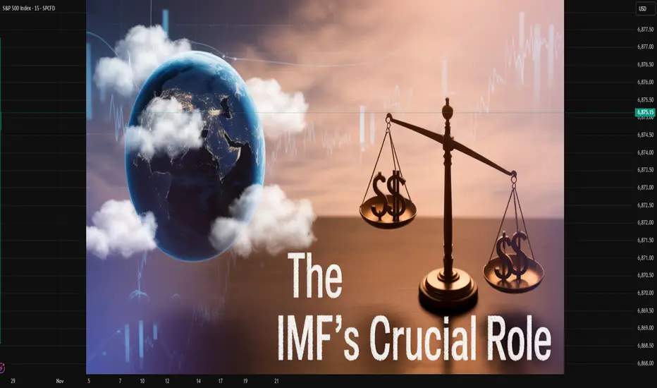
Global Property SurgeUnderstanding the Boom in Real Estate Markets Worldwide
Over the past decade, the world has witnessed an extraordinary surge in property prices across both developed and emerging economies. This global property surge has reshaped housing markets, altered wealth distribution, and prompted major policy responses from governments and central banks. The phenomenon is driven by a complex interplay of economic, demographic, and geopolitical factors — including low interest rates, pandemic-era shifts, urbanization, foreign investments, and the evolving role of real estate as an asset class. In this comprehensive analysis, we explore the causes, characteristics, impacts, and potential future trajectories of the global property surge in approximately 1500 words.
1. Historical Context: From Stability to Surge
Historically, property markets tended to move in relatively predictable cycles driven by local demand, income growth, and credit conditions. However, since the early 2010s, global real estate has transformed into a highly interconnected financial asset class. Following the 2008 global financial crisis, central banks worldwide adopted ultra-low interest rates and quantitative easing to stimulate growth. These measures made borrowing cheaper than ever, encouraging both households and investors to pour money into real estate.
The 2020–2022 COVID-19 pandemic further accelerated this surge. As economies locked down and stock markets turned volatile, real estate emerged as a safe and tangible store of value. Work-from-home trends reshaped living preferences, boosting demand for suburban and rural properties. The combination of limited supply, cheap money, and changing lifestyles ignited property booms from Sydney to Toronto, from London to Mumbai.
2. Key Drivers of the Global Property Surge
a. Ultra-Low Interest Rates
Central banks like the U.S. Federal Reserve, the European Central Bank, and the Bank of Japan slashed interest rates to near zero. Low borrowing costs reduced mortgage repayments, allowing buyers to afford higher-priced homes. Simultaneously, investors searching for yield turned to real estate for better returns than traditional savings or bonds.
b. Limited Supply and Urbanization
Global population growth and rapid urbanization intensified housing shortages. In cities like Hong Kong, London, and San Francisco, land scarcity and restrictive zoning regulations created supply bottlenecks. The imbalance between supply and demand pushed property values higher year after year.
c. Foreign and Institutional Investment
Real estate has increasingly attracted foreign and institutional investors. Sovereign wealth funds, private equity firms, and pension funds view property as a stable, inflation-resistant asset. Foreign capital inflows into major cities — especially from China, the Middle East, and Europe — have inflated prices, sometimes pricing out local buyers.
d. Inflation Hedge and Store of Value
Real estate serves as a traditional hedge against inflation. As currencies depreciate and costs rise, tangible assets like land and housing tend to maintain or increase in value. With rising inflation in the 2020s, investors flocked to property markets as a defensive strategy.
e. Digitalization and Real Estate Technology
Technological innovation in property transactions, data analytics, and financing platforms has made global real estate more accessible. PropTech companies, blockchain-based land registries, and digital marketplaces have simplified international investment, leading to greater capital mobility.
3. Regional Dynamics of the Surge
a. North America
The U.S. and Canadian housing markets have experienced dramatic growth. In the U.S., cities such as Austin, Miami, and Phoenix saw price increases of over 30–40% between 2020 and 2023. Cheap mortgages, limited inventory, and migration from urban to suburban areas fueled this boom. In Canada, markets like Toronto and Vancouver reached record highs, supported by foreign investments and immigration.
b. Europe
European property markets saw uneven growth. While Southern Europe (Spain, Italy, Greece) recovered slowly post-crisis, Northern and Western Europe — especially Germany, the Netherlands, and the U.K. — saw soaring prices. London and Berlin became magnets for global investors, though affordability concerns led to regulatory crackdowns, including rent caps and foreign buyer taxes.
c. Asia-Pacific
Asia witnessed one of the strongest property surges. In China, years of urban expansion and speculative investment drove housing prices to unsustainable levels, prompting government intervention. Australia and New Zealand saw housing affordability crisis levels, leading to tax reforms and stricter lending standards. Meanwhile, India’s urban centers — Mumbai, Bengaluru, Delhi — witnessed a post-pandemic revival driven by economic recovery and infrastructure growth.
d. Middle East and Africa
The Middle East, particularly Dubai, experienced a renewed boom as foreign investors sought tax advantages and luxury developments. Dubai’s property market rebounded sharply after 2020, supported by economic diversification and visa reforms. In Africa, cities like Nairobi, Lagos, and Cape Town saw increasing investment, driven by rapid urbanization and diaspora capital.
e. Latin America
Latin American real estate saw mixed trends. Countries with political instability or currency devaluation, like Argentina and Venezuela, struggled to attract stable investments. However, Mexico, Brazil, and Chile benefited from growing middle-class demand and tourism-driven development.
4. Socioeconomic Impacts of the Property Boom
a. Widening Wealth Inequality
Property ownership has become a key determinant of wealth. Rising prices have benefited asset owners while excluding younger generations and lower-income groups. In many cities, housing affordability has deteriorated, creating “generation rent” — people who can afford only to rent, not buy.
b. Rising Rent and Living Costs
As housing becomes scarce and expensive, rents have risen significantly, putting pressure on household budgets. This has fueled social and political debates over housing as a human right versus a financial asset.
c. Urban Sprawl and Environmental Strain
The search for affordable housing has pushed development to suburban and rural areas, leading to urban sprawl, deforestation, and increased commuting times. The construction boom has also raised concerns over sustainability and carbon emissions.
d. Financial Risks and Market Speculation
Rapid price escalation often breeds speculative behavior. Investors purchasing properties solely for price appreciation can inflate bubbles. If interest rates rise or economies slow, property markets risk sharp corrections. China’s Evergrande crisis exemplifies how overleveraged real estate sectors can threaten financial stability.
5. Government and Policy Responses
To control overheating housing markets, many governments have introduced a range of policy measures:
Monetary Tightening: Central banks, including the U.S. Federal Reserve and European Central Bank, began raising interest rates in 2022–2023 to curb inflation. This cooled some markets, but prices in high-demand areas remain resilient.
Macroprudential Regulations: Countries like Canada and New Zealand imposed stricter mortgage rules, such as higher down payments and limits on investor loans, to prevent excessive speculation.
Foreign Buyer Restrictions: Governments in Australia, Canada, and Singapore restricted foreign property purchases to protect local affordability.
Affordable Housing Initiatives: Some nations launched large-scale housing projects, rent control laws, and subsidies for first-time buyers to restore balance.
Property Taxes: Higher property or vacancy taxes were introduced in major cities to discourage speculative holdings and vacant investment properties.
6. Post-Pandemic Adjustments and Interest Rate Shifts
As the global economy emerged from the pandemic, inflation surged due to supply chain disruptions and energy price shocks. Central banks responded by hiking interest rates aggressively. This marked a turning point for global property markets.
In the U.S., mortgage rates more than doubled from their 2021 lows, cooling demand and leading to slight price corrections in overheated markets. Europe saw similar slowdowns, while Asia-Pacific remained more mixed. Despite short-term adjustments, structural shortages and urban migration continued to support long-term price growth.
7. The Rise of Alternative Real Estate Segments
The property surge also extended beyond residential housing:
Commercial Real Estate: While traditional office spaces suffered from remote work trends, logistics and warehousing boomed due to e-commerce expansion.
Luxury and Vacation Homes: Wealthy investors turned to luxury villas, second homes, and resort properties in scenic destinations like Bali, Dubai, and the Mediterranean.
Green and Smart Buildings: Sustainability-focused real estate gained prominence as investors prioritized energy efficiency, green certifications, and smart technologies.
Co-living and Co-working Spaces: Urban millennials increasingly preferred flexible living and working arrangements, fostering a new sub-sector of real estate innovation.
8. Long-Term Outlook: Boom, Plateau, or Correction?
The question remains: Is the global property surge sustainable? Analysts offer varying views.
a. Optimistic Scenario
Proponents argue that global housing demand remains structurally strong due to urbanization, migration, and demographic growth. Limited land supply and construction delays will continue to support prices. Moreover, real estate remains a hedge against inflation and currency depreciation.
b. Pessimistic Scenario
Skeptics warn of overvaluation and the potential for price corrections, particularly in overheated markets like Canada, Australia, and parts of Asia. Rising borrowing costs and declining affordability could lead to reduced demand, defaults, and even mini-bubbles bursting.
c. Moderate Scenario
The most likely outcome may be a gradual stabilization. Prices could plateau as rising interest rates cool demand while long-term fundamentals like population growth and supply shortages sustain a baseline of value. Governments will play a crucial role in balancing affordability with market stability.
9. Future Trends in Global Real Estate
Looking ahead, several transformative trends will define the next phase of the global property market:
Sustainability and Green Development: Energy-efficient and carbon-neutral buildings will dominate future construction.
Digital Real Estate and Tokenization: Blockchain-based property ownership and fractional investment models will democratize access to global assets.
Remote Work and Hybrid Cities: The reshaping of cities will continue as flexible work arrangements reduce the need for dense office districts.
Demographic Shifts: Aging populations in developed nations and youth-driven demand in emerging economies will create divergent regional patterns.
Governmental Regulation: More countries will adopt policies to cool speculative demand and promote affordable housing.
Conclusion
The global property surge is more than a housing trend — it is a reflection of broader economic transformations, technological advancements, and societal changes. While property markets have delivered immense wealth to owners and investors, they have also deepened inequality and raised pressing policy challenges.
As the world navigates a new era of higher interest rates, inflationary pressures, and climate imperatives, real estate must evolve beyond speculation and luxury toward sustainability, inclusivity, and affordability. The future of global property lies in balancing financial opportunity with social responsibility — ensuring that homes are not just investments but foundations of human stability and progress.

Investing in the World Market: A Global PerspectiveIntroduction
In today’s interconnected global economy, investing is no longer limited by national borders. The expansion of technology, communication, and international finance has enabled investors from every corner of the world to participate in global markets. Whether it’s buying shares in a European automaker, investing in Asian technology startups, or purchasing U.S. Treasury bonds, the opportunities for global investing have multiplied. Investing in the world market allows individuals and institutions to diversify portfolios, access high-growth economies, and reduce risk through global exposure. However, it also introduces complexities such as currency risk, geopolitical tensions, and varying regulatory frameworks.
This essay explores the concept of world market investing, its benefits, key strategies, associated risks, and how investors can position themselves for long-term global success.
1. Understanding the World Market
The world market refers to the aggregate of all financial markets where securities, commodities, currencies, and other assets are traded internationally. It includes stock exchanges, bond markets, forex, and derivatives markets across developed and emerging economies.
Key components of the world market include:
Global Equity Markets – Stocks traded across countries such as the U.S., Japan, China, the U.K., Germany, and India.
Bond Markets – Governments and corporations issue debt instruments to global investors seeking fixed returns.
Foreign Exchange Market (Forex) – The world’s largest financial market, where currencies are traded 24/7.
Commodities Market – Trading in physical goods like oil, gold, and agricultural products.
Emerging Market Investments – Investments in rapidly growing economies offering higher potential returns.
Investing in these markets provides investors with access to diverse economic cycles, industries, and currencies, making it an essential part of modern portfolio management.
2. Evolution of Global Investing
The journey of world market investing has evolved significantly over time. Before the 1980s, most investors focused on domestic assets due to limited access to foreign exchanges. However, with globalization and technological advancements, financial integration accelerated.
1980s–1990s: Globalization of capital markets began. Mutual funds and international ETFs emerged, allowing small investors to access foreign equities.
2000s: The rise of the internet, deregulation, and electronic trading platforms opened cross-border investing to retail participants.
2010s–2020s: The integration of artificial intelligence, fintech platforms, and online brokers such as Interactive Brokers and eToro made investing in foreign markets seamless and affordable.
Today, investors can diversify portfolios globally within minutes, using technology that once was accessible only to large institutions.
3. Why Invest in the World Market?
a. Diversification
Global investing reduces the risk of concentration in one economy. When one region underperforms, another may thrive. For instance, during the 2008 U.S. financial crisis, some Asian markets showed resilience.
b. Access to Growth Opportunities
Developing economies in Asia, Africa, and Latin America are expected to lead global economic expansion. Investing internationally allows participation in this growth story.
c. Currency Benefits
Investing in multiple currencies can protect against domestic currency depreciation. For example, if an investor from India holds U.S. dollar assets, a fall in the rupee can boost returns when converted back to local currency.
d. Exposure to Global Innovation
Technology and biotechnology companies in the U.S. and Asia are leading global innovation. Investing internationally provides exposure to sectors not available domestically.
e. Inflation Hedge
Certain global assets, like commodities and real estate investment trusts (REITs), can serve as inflation hedges, maintaining purchasing power across economic cycles.
4. Types of World Market Investments
a. International Stocks and ETFs
Investors can directly buy foreign company shares or invest through exchange-traded funds (ETFs) that track international indexes such as the MSCI World Index or FTSE Global All Cap Index.
b. Global Mutual Funds
Mutual funds that invest across several countries provide professional management and diversification for investors who prefer a hands-off approach.
c. Bonds and Fixed Income Securities
Sovereign bonds from developed nations (e.g., U.S. Treasuries) offer safety, while emerging market bonds offer higher yields.
d. Commodities
Investing in gold, oil, and agricultural products can provide portfolio stability during market volatility.
e. Real Estate and REITs
Global REITs allow investors to access real estate markets in cities like London, Singapore, or New York without buying property directly.
f. Alternative Assets
Private equity, hedge funds, and infrastructure investments are increasingly global, offering diversification beyond traditional asset classes.
5. Strategies for Global Market Investing
a. Top-Down Approach
This involves analyzing global macroeconomic trends, identifying strong economies, and then selecting sectors or companies within those regions.
b. Bottom-Up Approach
Investors focus on company fundamentals — profitability, valuation, and management quality — irrespective of location.
c. Regional Allocation Strategy
Investors allocate funds across continents or countries to balance risk. For instance, 40% in North America, 30% in Asia-Pacific, 20% in Europe, and 10% in emerging markets.
d. Thematic Investing
Investing based on global themes such as renewable energy, digital transformation, or aging populations.
e. Passive vs Active Management
Passive Investing (via ETFs or index funds) tracks global indexes with low cost.
Active Investing involves fund managers seeking to outperform through research-driven decisions.
f. Dollar-Cost Averaging
Investing a fixed amount regularly in global funds can reduce timing risk and average out entry costs.
6. Risks in World Market Investing
a. Currency Risk
Fluctuations in exchange rates can impact returns. A strong domestic currency can reduce the value of foreign investments when converted back.
b. Political and Geopolitical Risk
Elections, trade wars, sanctions, or conflicts (like U.S.-China tensions or the Russia-Ukraine war) can disrupt markets and reduce investor confidence.
c. Economic Instability
Recessions or debt crises in major economies can spill over globally, affecting emerging markets.
d. Regulatory Differences
Foreign investment laws, taxation, and reporting standards vary widely, adding complexity for global investors.
e. Liquidity Risk
Some international markets have lower trading volumes, making it harder to enter or exit positions efficiently.
f. Cultural and Information Barriers
Differences in business practices and language can lead to misinterpretation of company data or performance indicators.
7. Tools and Platforms for Global Investing
The rise of digital platforms has democratized access to international markets. Some popular tools include:
Online Brokerage Accounts: Interactive Brokers, Charles Schwab, and eToro allow global trading from one account.
Global ETFs and Index Funds: Products from Vanguard, iShares, and SPDR track international markets efficiently.
Robo-Advisors: Automated platforms like Betterment and Wealthfront build globally diversified portfolios based on risk tolerance.
Mobile Apps: Platforms like Groww, Zerodha, and INDmoney now provide Indian investors with direct access to U.S. equities.
These innovations have simplified global investing, reducing transaction costs and improving transparency.
8. Role of Emerging Markets
Emerging markets such as India, China, Brazil, and Indonesia play a growing role in global investing. They offer rapid GDP growth, young populations, and expanding middle classes.
However, these markets also come with higher volatility due to political instability, currency fluctuations, and limited regulatory oversight. Investors must weigh the potential for high returns against these risks.
A balanced global portfolio often includes a mix of developed markets (for stability) and emerging markets (for growth).
9. The Importance of Diversification
Diversification remains the cornerstone of world market investing. By spreading investments across different regions, sectors, and currencies, investors can mitigate risks associated with any single economy or event.
For example, during the European debt crisis, U.S. and Asian markets provided stability. Similarly, when technology stocks in the U.S. underperform, commodity-rich nations or Asian manufacturing hubs may deliver better returns.
Effective diversification smooths portfolio performance and enhances long-term wealth creation.
10. Long-Term Outlook of Global Investing
The future of world market investing is being shaped by several powerful trends:
a. Technological Advancements
Artificial intelligence, blockchain, and digital trading platforms are revolutionizing access to global assets. Tokenization of securities may allow fractional ownership of foreign companies or properties.
b. Sustainable Investing (ESG)
Environmental, Social, and Governance (ESG) factors are becoming global standards. Investors increasingly favor companies with sustainable and ethical business models.
c. Global Economic Shifts
The economic center of gravity is gradually moving toward Asia, especially China and India. Investors who position early in these markets may benefit from the next wave of growth.
d. Increased Retail Participation
Retail investors, empowered by mobile apps and online education, are participating in world markets like never before.
e. Institutional Globalization
Large funds, pension plans, and sovereign wealth funds continue to allocate significant capital across borders, maintaining liquidity and integration in global markets.
11. Steps for Successful Global Investing
Define Financial Goals: Determine whether your focus is growth, income, or capital preservation.
Assess Risk Tolerance: International markets can be volatile; align investments with your comfort level.
Start with Global Funds: Beginners can use global mutual funds or ETFs before direct stock investing.
Monitor Currency Movements: Keep track of forex trends affecting international returns.
Stay Informed: Follow global economic indicators, interest rate changes, and geopolitical developments.
Rebalance Regularly: Adjust your portfolio periodically to maintain target allocations.
12. Conclusion
Investing in the world market is not just an option—it’s a necessity in the modern financial era. Global markets offer unmatched opportunities for diversification, innovation exposure, and growth potential. With the right knowledge, risk management, and tools, investors can turn global investing into a long-term wealth-building strategy.
While risks such as currency fluctuations, geopolitical instability, and economic cycles persist, prudent diversification and disciplined investing can mitigate them effectively. The global financial landscape will continue to evolve, offering investors new frontiers of opportunity in technology, sustainability, and emerging economies.
In essence, the future of investing is global — and those who embrace it stand to benefit from the ever-expanding opportunities of the interconnected world economy.

Global Recession and Its Impact on the Stock MarketIntroduction
A global recession represents a broad-based and prolonged decline in economic activity across multiple countries and regions. It is typically marked by a fall in global GDP, reduced industrial production, trade contraction, unemployment rise, and declining consumer confidence. Global recessions are rare but powerful events that send shockwaves through financial markets, especially the stock market, which is often the first and most visible indicator of economic distress.
The stock market, being a forward-looking mechanism, tends to react sharply to expectations of slower growth, reduced profits, and heightened uncertainty. During a global recession, investors often flee from equities to safer assets like bonds, gold, or cash, leading to widespread declines in stock prices. This essay explores how global recessions affect stock markets — examining their causes, transmission mechanisms, investor behavior, sectoral performance, historical examples, and long-term implications.
1. Understanding Global Recession
A global recession occurs when the world economy experiences a significant and synchronized slowdown. The International Monetary Fund (IMF) defines it as a decline in world real GDP per capita accompanied by a drop in industrial production, trade, employment, and consumption. Common triggers include:
Financial crises (e.g., 2008 Global Financial Crisis)
Geopolitical conflicts or wars
Commodity price shocks (such as oil price collapses)
Pandemic outbreaks (e.g., COVID-19)
Tight monetary policy cycles leading to credit crunches
When major economies like the United States, China, and the European Union contract simultaneously, the global economy faces ripple effects that reduce cross-border trade, investment, and market confidence.
2. The Stock Market as a Barometer of Economic Health
Stock markets reflect investor expectations about corporate profits, interest rates, and economic stability. Rising stock prices generally signal optimism about economic growth, while falling prices reflect fear, uncertainty, and expected contraction. In a global recession, three major channels affect the stock market:
Earnings Channel – Corporate profits decline as demand falls, leading to earnings downgrades and lower valuations.
Liquidity Channel – Investors move capital to safer assets, reducing market liquidity and amplifying volatility.
Sentiment Channel – Fear and pessimism dominate investor psychology, often leading to panic selling and large corrections.
Because stock markets are forward-looking, they often decline before a recession officially begins and start recovering before it ends.
3. Causes of Stock Market Decline During Recession
a. Declining Corporate Earnings
When consumer spending contracts globally, businesses experience falling revenues and profits. Investors, anticipating lower earnings, adjust stock valuations downward. This is particularly evident in cyclical sectors like automobiles, construction, and retail, where profits are closely tied to economic growth.
b. Rising Unemployment and Reduced Demand
Job losses during a recession reduce disposable income, causing lower demand for goods and services. This dampens business confidence and leads to slower growth forecasts, which are quickly priced into stock valuations.
c. Credit Tightening and Liquidity Crunch
Central banks may raise interest rates before a recession to combat inflation. When the slowdown hits, credit availability decreases, making it harder for companies to refinance debt or fund operations. High-debt companies see their stock prices plunge as default risks rise.
d. Investor Panic and Risk Aversion
Market psychology plays a crucial role. Fear-driven sell-offs can cause stock markets to overshoot fundamental valuations. Institutional investors and retail traders alike often engage in herd behavior, selling equities en masse, further intensifying market downturns.
4. Historical Evidence of Global Recession Impacts
a. The Great Depression (1929–1933)
The most catastrophic stock market collapse in history began in 1929 when the U.S. stock market crashed. The Dow Jones Industrial Average lost nearly 90% of its value from its peak, and the global economy plunged into a prolonged depression. International trade shrank by over 65%, and unemployment soared worldwide.
b. The Global Financial Crisis (2008–2009)
Triggered by the collapse of the U.S. housing bubble and subsequent banking crisis, this recession led to one of the steepest stock market declines since the 1930s. The S&P 500 fell by over 50% between 2007 and 2009, while global indices mirrored the trend. Major economies faced bailouts, bankruptcies, and massive investor losses.
c. The COVID-19 Pandemic (2020)
The sudden halt in global activity in early 2020 led to a historic crash. Within a few weeks, global stock indices fell by 30–40%. However, massive fiscal and monetary stimulus by governments led to a rapid recovery, marking one of the shortest bear markets in history.
These examples highlight that while the causes of recessions differ, the impact on stock markets—steep declines followed by eventual recovery—remains consistent.
5. Sectoral Impacts During a Global Recession
Different industries react differently to a recession:
a. Cyclical Sectors
Industries like automobiles, construction, luxury goods, and industrial manufacturing are hit hardest. Their revenues depend heavily on consumer and business spending, both of which decline during a downturn.
b. Financial Sector
Banks and financial institutions suffer as loan defaults rise and credit markets tighten. During 2008, financial stocks were the worst performers due to exposure to toxic assets.
c. Energy and Commodities
Demand for oil, metals, and raw materials declines, leading to falling commodity prices. Energy companies’ stock prices fall due to lower profitability.
d. Defensive Sectors
Utilities, healthcare, and consumer staples tend to perform better because their demand is less elastic. People continue to buy food, medicine, and basic utilities even during tough times, making these stocks safer havens.
e. Technology
Tech stocks may experience mixed outcomes. While valuations drop due to market fear, sectors like cloud computing and digital services often show resilience due to their global scalability and lower operational dependency on physical supply chains.
6. Behavioral and Psychological Factors
Investor behavior amplifies market reactions during recessions. Common psychological responses include:
Loss aversion: Investors fear losses more than they value gains, prompting premature selling.
Herd mentality: Panic spreads rapidly, causing synchronized selling across global markets.
Flight to safety: Capital shifts from equities to bonds, gold, or U.S. dollar assets.
Speculative rebounds: After sharp declines, opportunistic investors re-enter markets seeking undervalued assets, triggering short-term rallies.
Behavioral biases thus intensify volatility, making markets swing between extremes of pessimism and optimism.
7. Central Bank and Government Responses
To cushion stock markets from recessionary shocks, policymakers deploy various fiscal and monetary interventions:
a. Monetary Stimulus
Central banks lower interest rates to stimulate borrowing and investment. Quantitative easing (QE) programs inject liquidity into financial systems, boosting asset prices and restoring confidence.
b. Fiscal Stimulus
Governments increase public spending or provide direct relief (tax cuts, subsidies, or stimulus checks) to boost consumption. Such actions, as seen in 2020, can trigger rapid stock market recoveries.
c. Market Stabilization Measures
Regulators sometimes impose short-selling bans, capital infusions, or emergency lending facilities to prevent financial system collapse.
While these measures can provide short-term relief, they may also create long-term risks such as inflation, excessive debt, and asset bubbles once recovery begins.
8. Global Interconnectedness and Contagion Effect
In today’s interconnected world, financial markets are tightly linked through trade, investment flows, and multinational corporations. A recession in one major economy can quickly spread through:
Trade channels: Falling demand in the U.S. or China reduces exports from emerging economies.
Financial linkages: Global investors withdraw funds from riskier markets to repatriate capital.
Currency volatility: Recessionary shocks can cause wild currency swings, hurting companies with foreign exposure.
Commodity markets: Slowing industrial demand depresses prices of oil, metals, and agricultural goods.
Thus, even countries with relatively stable domestic conditions can suffer from capital outflows and stock market declines during global downturns.
9. The Role of Inflation and Interest Rates
During recessions, inflation typically falls due to weak demand. However, in stagflationary recessions (like the one seen in parts of 2022–2023), high inflation coexists with slow growth, creating complex challenges for policymakers.
High inflation erodes corporate margins and consumer purchasing power, pressuring equity markets.
High interest rates, used to fight inflation, reduce liquidity and make bonds more attractive relative to stocks.
Conversely, rate cuts during deep recessions often trigger market recoveries by lowering borrowing costs and boosting valuations.
10. Recovery Patterns and Investment Opportunities
Historically, stock markets begin recovering before economic data show improvement. This occurs because investors anticipate recovery 6–12 months in advance. The recovery process often unfolds in stages:
Panic Phase: Sharp sell-offs and extreme volatility.
Stabilization Phase: Policy interventions restore confidence.
Recovery Phase: Earnings rebound and long-term investors re-enter.
Expansion Phase: Bull market resumes with renewed optimism.
Savvy investors often use recessions as opportunities to accumulate quality stocks at discounted valuations, focusing on financially strong companies with low debt and stable cash flows.
11. Lessons from Past Recessions
Diversification mitigates risk exposure during downturns.
Long-term perspective is crucial; panic selling locks in losses.
Monetary and fiscal policy coordination can soften the impact of global recessions.
Defensive and dividend-paying stocks offer resilience in volatile markets.
Technological innovation and structural reforms often emerge stronger post-recession, creating new market leaders.
12. The Modern Outlook
In the post-pandemic era, global economies face multiple headwinds: rising geopolitical tensions, supply chain fragmentation, climate change pressures, and high sovereign debt levels. These factors increase the risk of future synchronized slowdowns. However, the global financial system is more resilient due to improved regulatory frameworks, diversified capital flows, and digital market infrastructure.
While recessions remain inevitable parts of economic cycles, stock markets continue to play a central role in signaling, absorbing, and eventually driving recovery through efficient capital allocation.
Conclusion
A global recession exerts profound and far-reaching impacts on the stock market, reshaping investor behavior, sectoral performance, and economic policy across the world. As global demand contracts, earnings fall, and uncertainty rises, equities suffer steep corrections. Yet, history demonstrates that recessions, while painful, are temporary phases in the economic cycle.
Stock markets, though volatile, possess a remarkable ability to recover and adapt — reflecting human innovation, policy support, and long-term growth potential. For investors and policymakers alike, understanding the intricate relationship between global recessions and stock markets is essential to navigating uncertainty and building resilience in the ever-evolving world economy.
The Impact of International Trade PolicyIntroduction
International trade policy plays a central role in shaping the global economic landscape. It encompasses the set of laws, agreements, and regulations that govern how countries trade goods, services, and capital across borders. The policies that a nation adopts determine its trade openness, competitiveness, and relationship with other economies. These decisions influence economic growth, employment, industrialization, innovation, and even geopolitical alliances. Over time, trade policy has evolved from protectionist models to liberalized frameworks, reflecting changing political ideologies and global economic realities.
The impact of international trade policies is profound. They influence prices, productivity, income distribution, and global supply chains. Whether it’s tariffs, quotas, free trade agreements, or export subsidies, every trade measure carries consequences for domestic industries and the international community. Understanding the implications of these policies helps policymakers strike a balance between protecting local interests and promoting global cooperation.
1. The Nature and Objectives of International Trade Policy
International trade policy refers to the set of strategies and regulations that guide a country’s transactions with other nations. The primary objectives of trade policy include:
Promoting Economic Growth:
Trade policies aim to enhance national income through exports and foreign investments. By opening markets, countries can leverage comparative advantages and increase efficiency.
Protecting Domestic Industries:
Some trade policies impose tariffs or quotas to shield local producers from foreign competition, particularly in emerging sectors.
Ensuring Balance of Payments Stability:
Trade regulations help maintain equilibrium between imports and exports, reducing dependence on foreign debt.
Encouraging Employment:
Strategic trade policies promote industries that create jobs and sustain livelihoods.
Advancing Geopolitical Goals:
Trade policies are also used to strengthen diplomatic ties or exert economic pressure, such as through sanctions or preferential trade agreements.
Fostering Innovation and Technology Transfer:
Open trade environments often accelerate the diffusion of technology and innovation across borders.
Ultimately, international trade policy reflects the economic philosophy of a nation—whether it leans toward protectionism or free trade liberalization.
2. Major Instruments of Trade Policy
Trade policy uses a range of instruments to regulate international transactions:
a. Tariffs
Tariffs are taxes imposed on imported goods. They raise import prices, protecting domestic industries from cheaper foreign products. However, high tariffs can provoke retaliation and reduce global trade efficiency.
b. Quotas
Quotas limit the quantity of goods that can be imported or exported. While they protect local industries, they often lead to inefficiencies and higher consumer prices.
c. Export Subsidies
Subsidies encourage domestic firms to export by lowering production costs. While this can boost competitiveness, it may distort market competition and lead to trade disputes.
d. Trade Agreements
Bilateral, regional, or multilateral agreements—such as NAFTA (now USMCA), the European Union, or ASEAN—facilitate freer movement of goods and services by reducing barriers.
e. Non-Tariff Barriers
These include product standards, licensing requirements, and customs procedures that indirectly restrict trade.
f. Exchange Rate Policies
A country’s currency valuation can influence trade competitiveness. A depreciated currency makes exports cheaper and imports costlier, affecting trade balances.
Each of these instruments has a specific impact on domestic markets and the global economy.
3. Historical Evolution of International Trade Policy
The history of trade policy reflects the global struggle between protectionism and liberalization.
Mercantilist Era (16th–18th Century):
Nations viewed wealth in terms of gold and silver reserves. They imposed high tariffs to maximize exports and minimize imports.
Free Trade Movement (19th Century):
The Industrial Revolution and the works of economists like Adam Smith and David Ricardo popularized the idea of comparative advantage, leading to lower tariffs and greater global trade.
Post–World War II Liberalization:
The establishment of the General Agreement on Tariffs and Trade (GATT) in 1947 marked a turning point toward multilateral trade liberalization.
World Trade Organization (WTO) Era (1995–Present):
The WTO institutionalized global trade rules and dispute resolution mechanisms, promoting freer and fairer international commerce.
Recent Protectionist Resurgence:
Events like Brexit, U.S.–China trade tensions, and supply chain disruptions have reignited debates over economic nationalism and trade protectionism.
This historical evolution shows that trade policy continuously adapts to changing political and economic dynamics.
4. Economic Impact of International Trade Policy
a. Impact on Economic Growth
Open trade policies generally promote higher growth. Countries like South Korea, Singapore, and Germany have leveraged export-led strategies to achieve rapid industrialization. By contrast, overly restrictive policies often hinder competitiveness and innovation.
b. Impact on Employment
Trade liberalization can both create and destroy jobs. While export industries grow and employ more workers, import-competing sectors may experience layoffs. Hence, labor retraining and social safety nets are crucial to manage transitions.
c. Impact on Prices and Inflation
Trade liberalization reduces the cost of imported goods, benefiting consumers with lower prices. Conversely, protectionist tariffs increase costs and contribute to inflationary pressures.
d. Impact on Industrial Development
Strategic trade policies can nurture infant industries by protecting them from international competition until they become globally competitive—a strategy used successfully by Japan and China.
e. Impact on Income Distribution
Trade liberalization often benefits skilled workers and capital owners, while unskilled labor may face downward pressure on wages. Thus, inequality may rise without inclusive policies.
5. Political and Social Implications
International trade policy is not merely economic—it is deeply political. Trade decisions influence national sovereignty, labor rights, and even cultural identity.
Political Influence:
Governments use trade policy as a diplomatic tool. Sanctions, embargoes, or preferential agreements can shift power balances in international relations.
Social Consequences:
Global trade can reshape social structures. While it creates wealth, it can also lead to job displacement and social unrest if benefits are unevenly distributed.
Environmental Impact:
Trade policies can either encourage sustainable practices through green standards or exacerbate environmental degradation through overexploitation of resources.
6. The Role of International Institutions
Institutions like the World Trade Organization (WTO), International Monetary Fund (IMF), and World Bank play critical roles in shaping and enforcing trade policy.
World Trade Organization (WTO):
The WTO ensures that trade flows as smoothly and fairly as possible by setting global rules and resolving disputes.
International Monetary Fund (IMF):
The IMF stabilizes exchange rates and provides financial assistance to countries facing balance-of-payments crises, indirectly supporting trade stability.
World Bank:
The World Bank supports trade-related infrastructure and development projects to integrate developing nations into the global economy.
These institutions provide a framework for cooperation, transparency, and accountability in global trade.
7. Regional Trade Agreements and Blocs
Regional integration has become a cornerstone of modern trade policy. Examples include:
European Union (EU):
A single market allowing free movement of goods, services, labor, and capital among member states.
North American Free Trade Agreement (NAFTA/USMCA):
Strengthens trade ties between the U.S., Canada, and Mexico by reducing tariffs and harmonizing regulations.
Association of Southeast Asian Nations (ASEAN):
Promotes economic cooperation and market integration in Southeast Asia.
African Continental Free Trade Area (AfCFTA):
Aims to create a unified market across Africa, enhancing intra-continental trade.
These agreements stimulate economic cooperation and regional stability while creating large integrated markets that attract foreign investment.
8. Trade Policy Challenges in the 21st Century
Modern trade policy faces several emerging challenges:
Protectionism and Trade Wars:
Rising nationalism has led to tariff battles, particularly between major economies like the U.S. and China.
Digital Trade and E-Commerce:
Policies must adapt to data flows, digital services, and cybersecurity concerns in global online commerce.
Supply Chain Disruptions:
Events like the COVID-19 pandemic exposed the vulnerabilities of global supply chains, prompting calls for “reshoring” or “friend-shoring.”
Climate Change and Green Trade Policies:
Nations are incorporating environmental standards into trade deals to encourage sustainable production and carbon reduction.
Inequality and Labor Standards:
Policymakers must address the social costs of globalization, ensuring fair wages and ethical labor practices.
Technological Advancements:
Automation, AI, and robotics influence trade competitiveness, requiring rethinking of industrial and education policies.
9. Impact on Developing Economies
For developing countries, trade policy can be a double-edged sword.
Positive Impacts:
Trade liberalization opens access to global markets, encourages investment, and fosters technology transfer. Nations like Vietnam and Bangladesh have used export-oriented strategies to lift millions out of poverty.
Negative Impacts:
Weak infrastructure, lack of competitiveness, and dependency on raw material exports make developing economies vulnerable to global shocks. Poorly designed liberalization can lead to deindustrialization and income inequality.
Therefore, balanced trade policies that combine openness with domestic capacity building are crucial for sustainable development.
10. The Future of International Trade Policy
Looking ahead, the future of trade policy will likely focus on sustainability, digitalization, and inclusivity. The next generation of trade agreements will emphasize:
Green Trade: Incentivizing low-carbon production and renewable energy trade.
Digital Economy Governance: Regulating data flows, privacy, and digital taxation.
Resilient Supply Chains: Diversifying trade partners and promoting regional production hubs.
Inclusive Growth: Ensuring that trade benefits reach small businesses, women, and underrepresented communities.
Geopolitical Cooperation: Strengthening trade diplomacy to mitigate conflicts and foster global stability.
The trade policy of the future will balance national security with economic efficiency and social welfare.
Conclusion
International trade policy is one of the most powerful tools in shaping global prosperity and stability. Its impacts span economic growth, employment, innovation, and geopolitical relations. While liberalization has fostered unprecedented global integration, it has also exposed vulnerabilities—inequality, environmental strain, and dependence on fragile supply chains.
The challenge for policymakers lies in designing trade frameworks that are fair, resilient, and sustainable. Balancing national interests with global cooperation remains the cornerstone of effective trade policy. In an increasingly interconnected world, the success of any nation’s trade policy depends not only on its domestic priorities but also on its capacity to collaborate, adapt, and lead within the global economic system.

Emerging Markets vs. Developed MarketsIntroduction
Global financial markets can broadly be divided into two categories — developed markets and emerging markets. This classification plays a vital role in understanding investment strategies, economic potential, and risk-return dynamics. Developed markets, often referred to as advanced economies, are characterized by stability, technological innovation, and mature financial systems. In contrast, emerging markets represent nations that are transitioning toward industrialization and modernization but still face structural, political, and economic challenges.
The distinction between emerging and developed markets is not merely geographical; it reflects differences in income levels, governance quality, capital flows, infrastructure, and market maturity. Understanding these differences helps investors, policymakers, and corporations make strategic decisions in global trade, investment diversification, and growth planning.
Definition and Classification
Developed Markets
Developed markets are countries with high per capita income, robust industrialization, stable political systems, and mature financial infrastructure. These economies exhibit slow but steady economic growth and low volatility. The International Monetary Fund (IMF), the World Bank, and financial index providers like MSCI and FTSE classify countries such as the United States, United Kingdom, Japan, Germany, France, Canada, and Australia as developed markets.
Key characteristics include:
High GDP per capita (typically above $12,000).
Advanced infrastructure and technological capabilities.
Stable currency and monetary systems.
Transparent legal and regulatory frameworks.
Deep and liquid financial markets.
Emerging Markets
Emerging markets refer to countries undergoing rapid growth and industrialization, moving from a developing to a developed status. These markets display expanding economic activity, growing middle classes, and increasing integration into global trade systems. Examples include China, India, Brazil, South Africa, Indonesia, Mexico, and Turkey.
Emerging economies typically show:
Moderate to high GDP growth rates.
Rapid industrialization and urbanization.
Expanding capital markets but with higher volatility.
Political and institutional challenges.
Greater potential for long-term returns coupled with higher risk.
Organizations like MSCI Emerging Markets Index include over 25 nations that collectively represent a significant share of global GDP and trade.
Economic Growth and Development Patterns
The most striking difference between emerging and developed markets lies in their growth trajectories. Developed markets tend to have slow but stable growth, whereas emerging markets exhibit fast but volatile expansion.
Developed Markets: Economies like the U.S. or Japan grow at annual rates of around 1–3%. Their mature industrial bases and saturated markets limit further expansion, but the growth is sustained by innovation, services, and technology.
Emerging Markets: Countries such as India and China have historically grown between 5–8% per year, driven by manufacturing, exports, infrastructure, and consumption. The catch-up effect — where developing nations grow faster as they adopt technologies and practices from advanced economies — explains their higher growth rates.
However, this rapid expansion is often accompanied by inflationary pressures, income inequality, and dependency on external capital.
Infrastructure and Industrial Base
Infrastructure is a key determinant of market classification.
Developed Markets: They possess world-class infrastructure, including efficient transportation, advanced energy grids, and digital networks. Industries in these economies are diversified, with a focus on high-value sectors such as aerospace, biotechnology, artificial intelligence, and financial services.
Emerging Markets: Infrastructure development remains a top priority. Many nations are still expanding highways, energy networks, and digital access. Industrialization is often manufacturing-driven, with growth concentrated in textiles, automotive, and electronics sectors. The Make in India initiative or China’s Belt and Road Initiative are prime examples of infrastructure-led growth strategies in emerging economies.
Political and Regulatory Environment
The political and regulatory climate significantly influences investor confidence.
Developed Markets: Typically feature stable democracies, established rule of law, and predictable regulatory systems. This fosters investor trust and reduces systemic risk. Regulatory institutions such as the U.S. Securities and Exchange Commission (SEC) or the European Central Bank (ECB) ensure market integrity and transparency.
Emerging Markets: Political systems vary from stable democracies (India) to authoritarian regimes (China). Policy changes can be abrupt, and corruption or bureaucratic inefficiencies may persist. Currency controls, trade barriers, and sudden regulatory reforms create uncertainty, impacting investment sentiment.
Despite these challenges, emerging markets are progressively adopting governance reforms and digital transparency measures to attract foreign capital.
Financial Markets and Investment Opportunities
Developed Market Dynamics
Developed financial markets are highly liquid and efficient. They are characterized by:
Strong institutional participation (pension funds, mutual funds, hedge funds).
Sophisticated instruments like derivatives, ETFs, and structured products.
Stable interest rates and monetary policies.
Lower transaction costs and higher transparency.
For example, the New York Stock Exchange (NYSE) and London Stock Exchange (LSE) represent mature ecosystems with global influence.
Emerging Market Potential
Emerging financial markets, while less liquid, provide substantial growth potential. Factors such as urbanization, rising consumer demand, and technological leapfrogging create massive investment opportunities in sectors like infrastructure, energy, and digital finance. However, market volatility, limited liquidity, and political interference can heighten risks.
Instruments such as Emerging Market ETFs or sovereign bonds allow global investors to gain exposure while balancing risks. The BRICS economies (Brazil, Russia, India, China, South Africa) collectively represent more than 40% of the world’s population, making them central to global growth narratives.
Currency and Inflation Dynamics
Currency stability and inflation management are central to economic maturity.
Developed Markets: Maintain stable currencies (like USD, EUR, GBP, JPY) supported by independent central banks and deep foreign exchange reserves. Inflation rates typically range from 1–3%, ensuring purchasing power stability.
Emerging Markets: Frequently face volatile exchange rates due to capital flows, current account deficits, or political uncertainty. Inflation can rise rapidly due to supply chain disruptions or weak fiscal discipline. For instance, Argentina and Turkey have experienced persistent inflation crises, while India and Indonesia have improved monetary control through institutional strengthening.
Trade and Global Integration
Emerging markets increasingly drive global trade. They serve as both manufacturing hubs and consumer markets for multinational corporations.
Developed Markets: Have historically dominated global exports in high-tech goods, services, and intellectual property. They also invest heavily in emerging regions to tap into new markets.
Emerging Markets: Are now central to global supply chains. China, often referred to as the “world’s factory,” exports everything from electronics to automobiles. India’s service sector — particularly IT and outsourcing — contributes significantly to global digital trade. However, emerging markets remain vulnerable to trade wars, tariff policies, and commodity price fluctuations.
Demographics and Labor Markets
Demographics form a vital structural difference between emerging and developed markets.
Developed Economies: Often face aging populations, shrinking labor forces, and rising dependency ratios. Japan and much of Western Europe experience demographic challenges that constrain productivity and fiscal stability.
Emerging Economies: Benefit from youthful populations and expanding labor pools. India, for example, has a median age below 30, providing demographic dividends that fuel consumption and innovation. However, unemployment, underemployment, and skill mismatches pose challenges to maximizing this advantage.
Technological and Digital Transformation
Technology acts as a bridge between economic stages.
Developed Markets: Lead global innovation with dominant technology firms (Apple, Microsoft, Amazon). They invest heavily in research, AI, and digital infrastructure.
Emerging Markets: Rapidly adopt new technologies, often leapfrogging traditional stages. The rise of fintech in Kenya (M-Pesa), e-commerce in India (Flipkart), and digital payments in China (Alipay, WeChat Pay) illustrate how innovation in emerging economies can reshape global business models.
Risk and Return Trade-Off
Investors differentiate markets based on the balance between risk and reward.
Developed Markets: Offer predictable but modest returns. Their stability and low-risk profiles make them suitable for conservative investors and institutional portfolios.
Emerging Markets: Present higher growth potential but come with greater volatility. Political instability, currency fluctuations, and weaker governance contribute to risk. Yet, investors seeking alpha — above-average returns — often find emerging markets attractive, particularly during global economic expansions.
Diversification strategies often combine both market types to balance safety and growth.
Impact of Globalization
Globalization has blurred the line between emerging and developed markets. Capital, technology, and labor now flow more freely across borders. Multinational corporations operate seamlessly in both categories, integrating global supply chains. However, globalization also exposes emerging markets to external shocks — such as the 2008 financial crisis or the 2020 pandemic — which can rapidly disrupt capital inflows and currency stability.
Developed markets, on the other hand, face increased competition from low-cost emerging producers, compelling them to innovate and shift toward service- and knowledge-based industries.
Sustainability and ESG Trends
Environmental, Social, and Governance (ESG) factors increasingly define global investment patterns.
Developed Markets: Lead in green finance and sustainability policies. They set global climate standards and promote decarbonization through regulatory frameworks.
Emerging Markets: Confront the dual challenge of sustaining growth while managing environmental impact. Nations like India and Brazil are investing in renewable energy, but limited capital and institutional capacity often hinder progress.
The integration of ESG principles is creating new partnerships between developed and emerging economies, driving sustainable global development.
Future Outlook
The future global economic landscape will likely feature greater convergence between emerging and developed markets. The digital revolution, demographic shifts, and policy reforms are enabling emerging economies to catch up rapidly. Meanwhile, developed markets continue to lead in innovation, capital formation, and governance models.
However, geopolitical tensions, climate challenges, and automation could reshape comparative advantages. The balance of global economic power is gradually tilting toward Asia — particularly China and India — signaling a multi-polar economic order.
Conclusion
The comparison between emerging and developed markets reveals a complex yet complementary global ecosystem. Developed markets offer stability, innovation, and mature institutions, while emerging markets provide dynamism, growth, and opportunity. Both are indispensable to global prosperity.
For investors and policymakers, the key lies in understanding their distinct risk-return profiles, structural differences, and evolving interdependencies. In an interconnected world, the lines between “emerging” and “developed” continue to blur — giving rise to a new era of global economic synergy and shared growth.
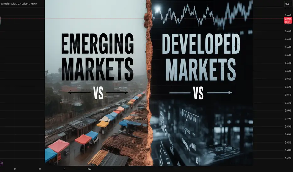
Scalping in the World Market:A Deep Dive into High-Speed TradingIntroduction
In the fast-paced world of financial markets, every second counts. Among the various trading strategies that traders employ to profit from price movements, scalping stands out as one of the most intense and rapid forms of trading. Scalping is a short-term trading technique where traders aim to make numerous small profits by taking advantage of minor price fluctuations throughout the trading day. It is practiced across the world markets — including equities, forex, commodities, and cryptocurrencies — and requires a unique blend of precision, technology, and psychological discipline.
Scalping has evolved alongside technological innovation. With the rise of algorithmic trading, high-frequency trading (HFT), and global interconnectivity, scalping has become a refined art and a science of exploiting micro-movements in price within seconds or even milliseconds. This essay explores the concept of scalping in global markets, its mechanisms, advantages, challenges, and the evolving landscape shaped by automation and regulation.
1. Understanding Scalping
Scalping is the fastest form of intraday trading, where traders open and close multiple positions within seconds or minutes. Unlike swing or positional traders who rely on long-term price trends, scalpers depend on the market’s immediate momentum and liquidity.
The goal of scalping is to accumulate small gains repeatedly, which, when aggregated, can lead to substantial daily profits. For example, a trader may target just 3 to 10 pips in the forex market or ₹0.50–₹1 in an Indian stock like Reliance Industries — but execute 100–200 trades in a single day.
Scalpers rely heavily on:
High liquidity (to enter and exit positions instantly),
Tight spreads (to minimize transaction costs),
Leverage (to amplify small price movements),
Fast execution (to avoid slippage).
2. The Core Principles of Scalping
Successful scalping requires adherence to certain core principles:
Speed and Timing:
Execution speed is critical. Scalpers use advanced trading platforms and direct market access (DMA) to ensure orders are executed without delay.
Volume and Frequency:
Scalpers execute numerous trades throughout the day. Profit per trade is small, but consistency is key.
Risk Management:
Because price movements are small, even a minor loss can offset several successful trades. Scalpers often use tight stop-loss levels.
Market Liquidity:
Scalping is most effective in highly liquid markets such as EUR/USD in forex, Nifty and Sensex futures in India, or S&P 500 in the U.S. where bid-ask spreads are minimal.
Psychological Discipline:
Scalping demands quick decision-making, emotional control, and strict adherence to rules. Hesitation or greed can lead to instant losses.
3. Scalping Across Global Markets
Scalping strategies are implemented differently across various global markets, depending on market structure, volatility, and liquidity.
a) Forex Market
The foreign exchange (forex) market is the most popular arena for scalping due to its 24-hour global operation and massive liquidity.
Key features include:
Pairs like EUR/USD, GBP/USD, and USD/JPY are ideal for scalping.
Traders focus on economic releases (like U.S. Non-Farm Payrolls or CPI data) that trigger sharp but brief volatility.
Scalpers exploit spreads and momentum using tools like tick charts, moving averages, and momentum indicators (RSI, Stochastic).
Automated systems or forex scalping bots are widely used to detect and act on price anomalies in milliseconds.
b) Stock Market
In equity markets, scalping is common among day traders and proprietary trading firms.
Examples include:
U.S. stocks like Apple, Tesla, and Nvidia, known for high daily volumes.
In India, Nifty 50 constituents such as HDFC Bank, Reliance, and Infosys attract scalpers due to tight spreads and liquidity.
Stock scalpers look for momentum patterns, news-based volatility, or order book imbalances. They might buy thousands of shares for seconds, targeting minimal profits before closing the position.
c) Futures and Commodities
Scalping in commodities and futures markets involves exploiting volatility in contracts like crude oil, gold, or agricultural futures.
Traders use tools like order flow analysis and depth of market (DOM) screens to gauge real-time liquidity and trading pressure.
d) Cryptocurrency Markets
The crypto market, operating 24/7, has become a paradise for scalpers.
Crypto scalpers focus on pairs like BTC/USDT, ETH/USDT, and SOL/USDT.
Due to crypto’s volatility and decentralized nature, price gaps can occur frequently — ideal for short bursts of profit.
However, exchange fees and latency issues can reduce profitability if not managed carefully.
4. Tools and Technologies Used in Scalping
Scalping in the modern world market is inseparable from technology. Traders leverage powerful tools and systems to execute high-speed trades.
Advanced Trading Platforms:
Tools like MetaTrader 5, NinjaTrader, and ThinkorSwim offer real-time data and one-click execution.
Direct Market Access (DMA):
Allows traders to bypass brokers’ delays and interact directly with exchange order books.
Algorithmic Trading Systems:
Algorithms identify opportunities based on pre-set criteria — momentum, volatility, or volume spikes — and execute trades automatically.
High-Frequency Trading (HFT):
HFT firms use co-located servers near exchange data centers to minimize latency, executing thousands of trades per second.
Scalping Indicators:
Popular technical indicators for scalping include:
Moving Averages (MA & EMA crossover)
Bollinger Bands
Relative Strength Index (RSI)
Volume Weighted Average Price (VWAP)
Stochastic Oscillator
Order Book and Tape Reading:
Scalpers often study the Level 2 market data or time and sales (T&S) to identify buy/sell pressure.
5. Common Scalping Strategies
Several refined strategies are used across markets:
a) Market-Making Scalping
The trader continuously buys and sells around the current market price, profiting from bid-ask spreads. This is common among institutional scalpers.
b) Momentum Scalping
Scalpers enter trades in the direction of strong momentum, capturing the initial burst of price movement before retracement.
c) Breakout Scalping
When price breaks through key support or resistance levels, scalpers enter immediately to profit from quick follow-through moves.
d) News-Based Scalping
Economic or corporate news creates temporary volatility. Scalpers take advantage of short-lived surges in liquidity and price movement.
e) Range Scalping
When the market is moving sideways, traders buy at support and sell at resistance repeatedly for small gains.
6. Advantages of Scalping in Global Markets
Quick Profits:
Scalping allows traders to capitalize on even the smallest market fluctuations multiple times a day.
Reduced Overnight Risk:
Since all positions are closed within the day, scalpers avoid overnight news or gap risks.
Constant Opportunities:
In volatile and liquid markets like forex or crypto, there are always micro-movements to trade.
Lower Exposure to Market Trends:
Long-term trends or macroeconomic shifts have minimal effect on a scalper’s strategy.
Compounding Potential:
Small profits, if made consistently and reinvested, can lead to exponential growth over time.
7. Challenges and Risks of Scalping
While potentially lucrative, scalping carries significant challenges:
High Transaction Costs:
Multiple trades lead to substantial brokerage and commission expenses, reducing net profit margins.
Execution Speed Dependency:
Delays in order execution or slippage can turn profitable setups into losses within seconds.
Psychological Stress:
Constant focus, speed, and decision-making can be mentally exhausting.
Limited Profit Margin:
Each trade yields very little. A few losing trades can wipe out hours of gains.
Broker Restrictions:
Some brokers discourage scalping due to its demand for resources and liquidity. They may impose minimum time limits on trade duration.
Market Noise:
Scalping often occurs amid unpredictable short-term noise, increasing the risk of false signals.
8. Regulatory and Ethical Considerations
Scalping operates within a complex regulatory framework that varies by region:
In the U.S., the SEC and FINRA monitor trading activity to prevent market manipulation and unfair HFT practices.
In India, SEBI imposes strict margin and trading rules for intraday traders to prevent excessive risk-taking.
In Europe, ESMA (European Securities and Markets Authority) oversees algorithmic trading to maintain transparency and fairness.
While scalping itself is legal, front-running, spoofing, or quote stuffing are illegal activities often associated with unethical HFT scalping.
9. The Role of Artificial Intelligence in Scalping
Modern scalping has been revolutionized by artificial intelligence (AI) and machine learning (ML).
AI systems can:
Analyze millions of data points in real-time,
Detect micro-trends invisible to humans,
Adapt strategies dynamically to changing volatility.
For example, reinforcement learning algorithms continuously optimize execution timing, while predictive analytics models forecast micro price shifts milliseconds ahead.
AI-based scalping bots now dominate global markets — especially in forex, equities, and crypto exchanges — representing a new era of autonomous high-frequency trading.
10. Future of Scalping in Global Markets
The future of scalping is being shaped by several trends:
Technological Evolution:
Quantum computing and ultra-low latency networks will further accelerate trade execution.
Tighter Regulation:
Regulators may impose stricter measures to curb manipulation and ensure market fairness.
Increased Retail Participation:
With access to zero-commission platforms and advanced analytics tools, retail traders are now entering the scalping domain.
Integration of AI and Blockchain:
Blockchain-based exchanges offering transparent and decentralized order books could redefine scalping strategies.
Cross-Market Scalping:
Traders may increasingly arbitrage between stock indices, forex pairs, and crypto assets, exploiting correlation inefficiencies.
Conclusion
Scalping represents the essence of high-speed global trading, combining technology, psychology, and precision to extract profits from fleeting market inefficiencies. It is not for everyone — the intensity, costs, and risks are substantial — but for disciplined and technologically equipped traders, it offers a consistent edge in liquid markets.
As global markets continue to evolve with innovations in AI, automation, and digital assets, scalping will remain at the cutting edge of trading strategy. The future of scalping will likely be smarter, faster, and more data-driven than ever before — shaping the pulse of the world’s financial ecosystems one tick at a time.
RECAP TODAY. USING THE SIGNALS AND TOOLS Fellow traders - followers,
I have some today to recap on the day.
Now I will say this. Today went the way they said it would go UP! All the overnight new, the morning media and the tech headlines all made today a profitable day for the bulls! I will also say this: it is a scary situation, because we have no resistance levels up here, so where does all this up trend movement stop? What do we know or where to put our stop losses?
In building these indicators, I'm learning a few things. I'm learning more about myself and about what to look for exactly. There will be days where I will lose. Just like Friday: -$280! The price action was just not as consistent and friendly like it was today.
Let me break down today:
1. I attached the 5min chart to show you what the " Golden Pocket " of my indicator resembles.
A confirmation of price action and direction.
It reacted perfectly. 10:15am Bear candle - 10:20am Bull Doji inside pocket - 10:30am Engulfing Bull candle with a long signal! You couldn't ask for a better set up to the upside to make your money!
2. The 15min time frame was a little more of a bulky solid read. Bull candles with wicks.
The 10:15am candle carried the long signal with it. The wick within that candle was our 5min candles playing out.
Weather you waited for the 15min plays or you entered in the 5mins. You won.
3. So, with all this, there is another indicator I play. That is my 0dte Context bundle. How this works in our favor is that in this specific situation you want to make sure your trends are moving where they need to go. The EMA, SMA and VWAP lines all had same up direction. The Green EMA/SMA Cloud all indicated up is where it's going.
You have the tools to assist in decisions. If you need more help with reading these indicators. Let me know. I'm always down to help out.
Patient is still key. Confirmations are still key. Remember that when trading. Do not get antsy and enter in trades that are not strong or that will not check all your entry boxes.
Thank you again for the follows and the support. I hope these are helpful.
God Bless,
Trades with B!

Examples of Chart Interpretation Methods
Hello, fellow traders!
Follow us to get the latest information quickly.
Have a great day!
-------------------------------------
#BTCUSDT
To break above a key point or range and continue the uptrend,
1. The StochRSI indicator must be trending upward. Ideally, it should not enter the overbought zone. 2. The On-By-Signal (OBV) indicator must show an upward trend. If possible, it should remain above the High Line.
3. The TC (Trend Check) indicator must show an upward trend. If possible, it should remain above the 0 level.
Currently, only the TC indicator satisfies the above conditions.
Therefore, if the price remains above the 110644.40-111696.21 range and the above conditions are met, we should see if the price rises above 116259.91 and remains there.
If the On-By-Signal (OBV) indicator remains above EMA 1 and EMA 2 and rises above the High Line, further upside is likely.
However, if the K indicator of the StochRSI indicator enters the overbought zone and the slope changes, the upside may be limited.
When the TC (Trend Check) indicator touches its highest point, there's a high probability of forming a new high, so you should consider a response plan.
Summary of the above:
Support Zone: 110644.40-111696.21
Resistance Zone: 116259.91-119086.64 (up to 124658.54)
------------------------------------
#ETHUSDT
As mentioned in the BTC chart description, ETH is also showing similar movements.
However, the OBV indicator is just about to break above EMA 1 and EMA 2, so if it finds support near 4109.80, there's a possibility of further upside.
-------------------------------------
#ZECUSDT
Based on the BTC chart description, ZEC is likely to continue its upward trend.
The chart is broken due to the sudden surge, making it difficult to determine the duration of volatility.
--------------------------------------------
#XRPUSDT
The key is whether the price can find support at key support and resistance levels and rise above 2.9092.
------------------------------------------
Ultimately, trading will be based on the support and resistance levels drawn on the 1M, 1W, and 1D charts.
However, it is recommended to use auxiliary indicators to confirm whether to initiate a trade.
The basic trading strategy is to buy in the DOM(-60) ~ HA-Low range and sell in the HA-High ~ DOM(60) range.
However, if the price rises in the HA-High ~ DOM(60) range, a step-up trend is likely, while if the price falls in the DOM(-60) ~ HA-Low range, a step-down trend is likely.
Therefore, a fractional trading strategy is recommended.
In this context, the coin (token) currently closest to buying is XRP.
-
Thank you for reading to the end.
I wish you successful trading.
--------------------------------------------------