Hot Investment Sectors to Watch in 2025:Future of Global Capital1. Artificial Intelligence and Machine Learning
Artificial Intelligence (AI) and Machine Learning (ML) continue to be at the forefront of technological innovation. In 2025, AI is increasingly integrated into various sectors, including healthcare, finance, and manufacturing, driving efficiency and creating new business models. The proliferation of AI-as-a-Service platforms and advancements in natural language processing and computer vision are expanding the applicability of AI across industries.
Key Investment Areas:
AI Software and Services: Companies developing AI algorithms and providing AI solutions are experiencing rapid growth. Investments in AI startups and established tech firms focusing on AI capabilities are gaining momentum.
Automation and Robotics: The adoption of AI-driven automation in manufacturing and logistics is enhancing productivity and reducing operational costs. Investors are keen on companies leading in robotics and automation technologies.
AI Infrastructure: The demand for specialized hardware, such as AI chips and data centers optimized for AI workloads, is rising. Investments in semiconductor companies and cloud infrastructure providers are attracting attention.
Risks and Considerations:
Ethical and Regulatory Challenges: The rapid development of AI raises concerns about privacy, security, and ethical implications. Investors must stay informed about evolving regulations and public sentiment regarding AI technologies.
Market Volatility: The AI sector is characterized by high volatility, with startups experiencing significant fluctuations in valuations. Diversification and thorough due diligence are essential for mitigating risks.
2. Renewable Energy and Clean Technologies
The global shift towards sustainability is accelerating investments in renewable energy and clean technologies. In 2025, the International Energy Agency (IEA) projects global energy investment to reach a record $3.3 trillion, with $2.2 trillion allocated to renewables, nuclear, and energy storage—double the amount for fossil fuels.
Key Investment Areas:
Solar and Wind Energy: Solar energy leads clean technology spending with $450 billion expected, driven by increased exports to emerging economies. Wind energy financing, both onshore and offshore, grew by about 25%, particularly in China and Europe.
Energy Storage Solutions: Battery storage investment is rising to about $66 billion, addressing the intermittency of renewable power sources.
Grid Infrastructure: Investments in grid modernization and smart grid technologies are essential to accommodate the increasing share of renewable energy in the power mix. The IEA highlights a shortfall in grid infrastructure spending, currently at $400 billion annually, which lags generation investments and poses risks to electricity security.
Risks and Considerations:
Policy and Regulatory Risks: Changes in government policies and subsidies can significantly impact the profitability of renewable energy projects. Investors should monitor policy developments and government incentives in key markets.
Technological Risks: Advancements in energy storage and grid technologies are critical for the integration of renewable energy. Investors should assess the technological maturity and scalability of solutions offered by companies in this sector.
3. Healthcare Technology and Biotechnology
The healthcare sector is experiencing a technological renaissance, with innovations in biotechnology, digital health, and personalized medicine transforming patient care and treatment outcomes. The "biotech boom" refers to a period of rapid growth in the biotechnology sector, fueled by groundbreaking innovations, increasing investments, and expanding global demand for advanced medical, agricultural, and environmental solutions.
Key Investment Areas:
Biotechnology: Advancements in gene editing technologies like CRISPR, immunotherapies, and regenerative medicine are opening new frontiers in disease treatment. The biotech market is projected to grow from $1.74 trillion in 2025 to $5.04 trillion by 2034.
Digital Health: Telemedicine, wearable health devices, and AI-driven diagnostics are revolutionizing healthcare delivery. Investments in healthtech startups and digital health platforms are gaining traction.
Pharmaceuticals: The development of personalized medicines and targeted therapies is enhancing treatment efficacy and patient outcomes. Pharmaceutical companies focusing on innovative drug development are attracting investor interest.
Risks and Considerations:
Regulatory Hurdles: The healthcare industry is heavily regulated, and changes in regulations can impact the approval and commercialization of new therapies and technologies. Investors should stay informed about regulatory developments in key markets.
Clinical Trial Uncertainties: The success of biotech investments is often contingent on the outcomes of clinical trials. Investors should assess the risk profiles of companies based on their clinical trial pipelines and success rates.
4. Cybersecurity
As digital transformation accelerates, the need for robust cybersecurity measures becomes paramount. In 2025, the cybersecurity sector is experiencing heightened demand due to increasing cyber threats and regulatory requirements for data protection.
Key Investment Areas:
Cybersecurity Software and Services: Companies providing endpoint security, cloud security, and threat intelligence services are witnessing increased adoption across industries.
Identity and Access Management: Solutions that ensure secure user authentication and access control are critical as organizations move towards zero-trust architectures.
Security Infrastructure: Investments in hardware and infrastructure that support secure networks and data centers are essential for protecting organizational assets.
Risks and Considerations:
Evolving Threat Landscape: Cyber threats are constantly evolving, and companies must continuously update their security measures to address new vulnerabilities. Investors should assess the adaptability and innovation capabilities of cybersecurity firms.
Market Competition: The cybersecurity market is highly competitive, with numerous players offering similar solutions. Investors should evaluate companies based on their market positioning, technological differentiation, and customer base.
5. Infrastructure and Real Estate
Infrastructure development and real estate investments remain attractive in 2025, driven by urbanization, population growth, and government spending on public works. The global infrastructure investment gap presents opportunities for private capital to participate in large-scale projects.
Key Investment Areas:
Smart Cities: Investments in urban infrastructure, including transportation, utilities, and communication networks, are essential for developing smart cities.
Green Building Projects: Sustainable construction practices and energy-efficient buildings are gaining popularity, driven by environmental regulations and consumer preferences.
Public-Private Partnerships: Collaborations between governments and private investors in infrastructure projects offer opportunities for stable returns and long-term growth.
Risks and Considerations:
Political and Regulatory Risks: Infrastructure projects are subject to political decisions and regulatory approvals, which can impact project timelines and profitability. Investors should assess the political stability and regulatory environment of the regions where they invest.
Capital Intensity: Infrastructure investments often require significant capital outlays and have long payback periods. Investors should consider the liquidity and financial stability of infrastructure funds and projects.
Conclusion
The investment landscape in 2025 offers a plethora of opportunities across various sectors, each driven by unique technological advancements, societal shifts, and economic factors. While these sectors present promising growth prospects, they also come with inherent risks that require careful consideration and strategic planning. Investors should conduct thorough due diligence, diversify their portfolios, and stay informed about global trends to navigate the complexities of the evolving investment environment successfully.
X-indicator

Stock Market and Financial Market Fluctuations1. Understanding Financial Market Fluctuations
Financial market fluctuations refer to the variability or volatility in the prices of financial instruments such as stocks, bonds, derivatives, and currencies. These fluctuations can be short-term (daily, weekly, or monthly) or long-term (over years or decades).
Volatility: A statistical measure of the dispersion of returns. High volatility indicates large price swings, while low volatility suggests relative stability.
Liquidity: The ease with which an asset can be bought or sold without significantly affecting its price. Illiquid markets often experience sharper fluctuations.
Market Sentiment: Investor psychology, often driven by fear or greed, significantly impacts fluctuations.
2. Types of Market Fluctuations
Financial market fluctuations can be categorized based on their nature and time horizon:
Short-Term Fluctuations
Occur daily or intraday due to news, earnings reports, or geopolitical events.
Driven mainly by speculation and market sentiment.
Medium-Term Fluctuations
Occur over weeks or months.
Often linked to macroeconomic indicators like GDP growth, inflation, or employment data.
Long-Term Fluctuations
Spanning years or decades.
Driven by structural changes such as technological innovations, demographic shifts, or policy reforms.
3. Causes of Financial Market Fluctuations
Financial markets fluctuate due to multiple interconnected factors. Broadly, these causes can be categorized into economic, political, psychological, and external triggers:
A. Economic Factors
Macroeconomic Indicators:
GDP Growth: Strong growth increases corporate earnings expectations, boosting stock prices.
Inflation: High inflation erodes purchasing power, causing uncertainty and volatility.
Interest Rates: Central banks' policies influence borrowing costs, impacting investment and consumption.
Corporate Performance:
Earnings reports, debt levels, mergers, and acquisitions influence investor perceptions and stock valuations.
Liquidity and Money Supply:
Excess liquidity often drives speculative investment, leading to sharp market swings.
B. Political and Geopolitical Factors
Government Policies: Tax reforms, subsidies, or regulatory changes can create uncertainty or optimism.
Elections and Political Stability: Investor confidence often fluctuates around elections or political upheavals.
Geopolitical Tensions: Wars, conflicts, and international disputes affect global supply chains and market stability.
C. Psychological and Behavioral Factors
Herd Behavior: Investors often follow trends, amplifying market swings.
Fear and Greed: Panic selling during crises or over-optimism during booms contributes to volatility.
Speculation: High-risk speculative trading, particularly in derivatives and margin trading, can exacerbate fluctuations.
D. External and Global Factors
Global Economic Conditions: Slowdowns in major economies (like the US or China) affect global trade and investor sentiment.
Currency Movements: Exchange rate fluctuations impact multinational corporations and emerging markets.
Commodity Prices: Oil, gold, and other commodities influence inflation expectations and corporate costs.
Technological Disruptions: Automation, AI, and digital finance innovations can rapidly shift market dynamics.
4. Mechanisms of Market Fluctuations
Financial market fluctuations arise from the interplay of supply and demand, investor behavior, and market infrastructure:
Price Discovery Mechanism: Prices adjust continuously based on incoming information and market participants’ reactions.
Order Flow and Liquidity: Large buy or sell orders can create temporary imbalances, causing sharp price swings.
Leverage and Margin Trading: Borrowed funds amplify gains and losses, increasing volatility.
Derivative Markets: Futures, options, and swaps allow hedging but can also magnify speculation-driven fluctuations.
Algorithmic and High-Frequency Trading: Automated trading can accelerate market reactions, sometimes causing flash crashes.
5. Effects of Market Fluctuations
Market fluctuations have both positive and negative effects on the economy, corporations, and investors:
A. Positive Effects
Price Adjustment: Fluctuations allow markets to quickly incorporate new information.
Investment Opportunities: Volatile markets can offer profitable opportunities for skilled investors.
Capital Allocation: Efficient fluctuations help allocate capital to productive sectors and companies.
B. Negative Effects
Economic Uncertainty: Excessive volatility discourages long-term investment.
Wealth Erosion: Sudden market crashes can reduce household and institutional wealth.
Corporate Planning Challenges: Firms may delay investment decisions during uncertain periods.
Systemic Risk: Sharp fluctuations can trigger financial crises if they affect banking and credit systems.
6. Historical Examples of Market Fluctuations
The 1929 Great Depression: Stock market crash leading to global economic collapse.
Black Monday (1987): A single-day market drop of over 22% due to panic selling and program trading.
Dot-com Bubble (2000): Technology stock overvaluation followed by a massive correction.
Global Financial Crisis (2008): Triggered by subprime mortgage defaults, affecting global markets.
COVID-19 Pandemic (2020): Rapid declines followed by unprecedented monetary interventions and market rebounds.
These events highlight how economic, political, and psychological factors combine to drive market fluctuations.
7. Risk Management and Mitigation Strategies
Investors and policymakers adopt strategies to mitigate the adverse effects of market fluctuations:
A. For Investors
Diversification: Spreading investments across sectors, geographies, and asset classes reduces risk.
Hedging: Using derivatives like options and futures to protect portfolios.
Asset Allocation: Adjusting exposure to equities, bonds, and cash according to market conditions.
Long-Term Investing: Focusing on fundamental value rather than short-term price movements.
B. For Policymakers
Monetary Policy: Central banks can stabilize markets through interest rates, liquidity injections, or quantitative easing.
Regulatory Measures: Circuit breakers, margin requirements, and trading restrictions reduce extreme volatility.
Market Surveillance: Monitoring insider trading, market manipulation, and systemic risks.
8. Modern Trends in Market Fluctuations
Algorithmic Trading and AI: Algorithms react instantly to news, increasing short-term volatility.
Globalization: Interconnected markets amplify contagion risks.
Cryptocurrency and Digital Assets: New, highly volatile asset classes are reshaping investment behavior.
Sustainability and ESG Investing: Market fluctuations increasingly reflect environmental, social, and governance risks.
Central Bank Policies: Markets are sensitive to forward guidance and unconventional interventions.
9. Theoretical Perspectives
Efficient Market Hypothesis (EMH): Suggests prices reflect all available information, implying fluctuations are random responses to new data.
Behavioral Finance: Argues that investor psychology, biases, and heuristics often drive market anomalies and fluctuations.
Random Walk Theory: Markets move unpredictably, making short-term predictions unreliable.
Adaptive Markets Hypothesis: Combines evolutionary principles with EMH, explaining why fluctuations vary over time.
10. Conclusion
Stock market and financial market fluctuations are inevitable and essential components of economic systems. While they create risks, they also enable efficient capital allocation, price discovery, and investment opportunities. Understanding their causes—from economic indicators and corporate performance to investor psychology and global shocks—is crucial for investors, policymakers, and corporations.
With proper risk management, diversification, and regulatory oversight, the adverse effects of volatility can be mitigated. Modern technological innovations, globalization, and digital finance are reshaping fluctuation dynamics, requiring continuous adaptation. Ultimately, market fluctuations reflect both the uncertainty and dynamism of global financial systems, serving as both a challenge and an opportunity for all market participants.

Core Concepts of Digital Assets & Economy1. Defining the Digital Economy
The digital economy refers to all economic activities that are based on or significantly shaped by digital technologies. It is built upon the interconnectedness of the internet, cloud computing, mobile applications, artificial intelligence (AI), blockchain, and big data analytics.
Key characteristics of the digital economy include:
Intangibility of Value – Value is increasingly derived from information, algorithms, and digital assets rather than physical goods.
Global Connectivity – The digital economy transcends geographical borders, enabling instant cross-border transactions.
Platform-Centric Business Models – Companies like Amazon, Google, and Alibaba leverage platforms to connect producers and consumers digitally.
Data as the New Oil – Data is both an asset and a currency in the digital economy, driving decision-making, personalization, and automation.
The digital economy represents a shift from traditional capital and labor-based growth models to innovation, intellectual property, and technological adoption.
2. What Are Digital Assets?
A digital asset is any item of value that exists in digital form and can be owned, transferred, or exchanged. While traditional assets such as stocks, bonds, or real estate are physical or paper-based, digital assets are intangible and exist in electronic environments.
Examples include:
Cryptocurrencies like Bitcoin and Ethereum
Tokenized assets (fractional ownership of real estate, stocks, or commodities)
Non-Fungible Tokens (NFTs) representing art, music, or collectibles
Intellectual property (patents, copyrights, digital designs)
Virtual goods in gaming ecosystems
Personal data and digital identities
Core properties of digital assets:
Intangibility – Exists only in digital form.
Transferability – Can be exchanged globally within seconds.
Programmability – Assets can be coded with rules (smart contracts).
Security & Scarcity – Blockchain ensures authenticity and prevents duplication.
3. Classifications of Digital Assets
Digital assets can be broadly categorized into the following:
a. Cryptocurrencies
Decentralized digital currencies secured by cryptography, such as Bitcoin, Ethereum, and stablecoins. They serve as mediums of exchange, stores of value, and units of account in the digital economy.
b. Security Tokens
Digitized representations of traditional financial instruments like stocks, bonds, or derivatives. They are regulated and offer investor rights, dividends, and voting power.
c. Utility Tokens
Tokens that grant access to a product or service within a specific blockchain ecosystem. Example: Ether (ETH) is used to pay for transactions on Ethereum.
d. Non-Fungible Tokens (NFTs)
Unique digital certificates of ownership for art, collectibles, music, and other creative assets. They have revolutionized content monetization.
e. Central Bank Digital Currencies (CBDCs)
Digital versions of national currencies issued by central banks. Examples: e-CNY (China), Digital Euro, and India’s e-Rupee.
f. Tokenized Real-World Assets
Fractional ownership of real-world assets (real estate, gold, art) represented digitally, enabling liquidity and global access.
4. Technological Foundations
The rise of digital assets and the digital economy is powered by several foundational technologies:
Blockchain & Distributed Ledger Technology (DLT) – Ensures transparency, immutability, and security in digital asset transactions.
Smart Contracts – Self-executing agreements coded into blockchains, enabling automation of trust.
Artificial Intelligence & Machine Learning – Power predictive analytics, personalized services, and fraud detection.
Cloud Computing – Provides scalability and infrastructure for digital platforms.
Internet of Things (IoT) – Connects devices and enables real-time data-driven economic models.
Cybersecurity – Protects data, digital identities, and financial transactions.
5. Economic Implications of Digital Assets
The integration of digital assets into global markets has profound economic consequences:
Financial Inclusion – Cryptocurrencies and mobile banking provide unbanked populations access to financial services.
New Forms of Value Creation – NFTs empower artists and creators to monetize directly without intermediaries.
Liquidity in Illiquid Markets – Tokenization makes assets like real estate and fine art more accessible and tradable.
Disintermediation – Blockchain eliminates traditional intermediaries (banks, brokers), reducing costs.
Cross-Border Trade – Digital currencies enable instant, low-cost international remittances.
Gig & Creator Economy Expansion – Platforms monetize skills, data, and content more efficiently.
6. Digital Assets as a New Asset Class
Digital assets are increasingly recognized as a distinct asset class in investment portfolios. Institutional adoption is rising, with hedge funds, pension funds, and sovereign wealth funds diversifying into cryptocurrencies and tokenized assets.
Key investment features:
Volatility & High Returns – Cryptocurrencies are volatile but potentially yield high returns.
Correlation Diversification – Digital assets often move differently from traditional equities and bonds.
Hedging Against Inflation – Bitcoin is often termed “digital gold” due to its scarcity.
Programmable Income – DeFi allows investors to earn yield through staking, lending, and liquidity provision.
7. Risks & Challenges
While digital assets promise innovation, they come with risks:
Volatility – Price swings can destabilize portfolios.
Regulatory Uncertainty – Lack of uniform global frameworks creates risks for investors and businesses.
Cybersecurity Threats – Hacks and frauds remain major concerns in exchanges and wallets.
Scalability Issues – Networks like Ethereum face high transaction costs during peak demand.
Environmental Concerns – Proof-of-Work blockchains consume significant energy.
Illicit Use – Cryptocurrencies have been linked to money laundering and dark web activities.
8. Regulation of Digital Assets
Governments worldwide are grappling with regulating digital assets:
United States – The SEC and CFTC regulate cryptocurrencies as securities or commodities depending on classification.
European Union – Introduced MiCA (Markets in Crypto-Assets Regulation) to standardize frameworks.
China – Banned cryptocurrencies but promotes its CBDC, e-CNY.
India – Taxed crypto gains but has yet to establish a comprehensive regulatory law.
Global Organizations – The IMF and BIS advocate for international cooperation on digital currency regulation.
Regulation aims to balance innovation and investor protection, prevent financial crime, and ensure monetary stability.
9. The Digital Economy Ecosystem
The digital economy is composed of multiple interconnected ecosystems:
E-commerce & Digital Platforms – Amazon, Flipkart, and Alibaba dominate online retail.
Digital Finance & Fintech – Payment apps (PayPal, UPI, Stripe) and DeFi platforms.
Gig & Freelance Economy – Platforms like Upwork and Fiverr enable remote work monetization.
Metaverse & Virtual Economies – Virtual real estate, gaming assets, and social experiences.
Data Economy – Data marketplaces and AI-driven businesses monetize personal and enterprise data.
10. Future of Digital Assets & the Digital Economy
Looking ahead, digital assets will continue to reshape economies:
Mainstream Adoption – With regulatory clarity, institutional and retail adoption will surge.
Rise of CBDCs – National digital currencies will modernize monetary systems.
Tokenization of Everything – From cars to carbon credits, all assets may become tradable on blockchains.
Integration with AI & IoT – Smart cities and autonomous economies will emerge.
Decentralized Autonomous Organizations (DAOs) – Communities will govern businesses democratically through tokens.
Sustainable Finance – Shift to energy-efficient blockchain systems.
11. Case Studies
a. Bitcoin’s Role in Inflation-Hedging
During periods of global uncertainty, Bitcoin has been compared to gold as a hedge against inflation. In countries like Venezuela and Turkey, citizens turned to Bitcoin when national currencies collapsed.
b. NFTs in the Creative Industry
Artists like Beeple sold digital art for millions using NFTs, disrupting the traditional art world by eliminating galleries as gatekeepers.
c. China’s e-CNY Experiment
China is pioneering CBDC adoption through pilot programs in cities, with potential to influence cross-border trade settlement systems.
12. Ethical & Social Considerations
Digital assets also raise ethical debates:
Data Privacy – Who owns and monetizes personal data?
Digital Divide – Wealthier nations may dominate digital finance while poorer countries lag.
Speculation vs. Utility – Many crypto projects focus more on speculation than genuine utility.
Sustainability – Transition to green blockchain systems is crucial for climate goals.
Conclusion
The fusion of digital assets and the digital economy represents a fundamental transformation of global finance, trade, and innovation. Digital assets are not merely speculative instruments but new forms of value representation that empower individuals, democratize finance, and reimagine ownership. Meanwhile, the digital economy provides the infrastructure, platforms, and ecosystems where these assets thrive.
However, this transformation is not without risks—volatility, regulation, cybersecurity, and ethical challenges must be addressed to ensure stability and inclusivity. As technology evolves, the future will likely see a convergence of blockchain, AI, IoT, and tokenization, shaping a borderless, data-driven economy.
In essence, understanding the core concepts of digital assets and the digital economy is crucial not only for investors and policymakers but also for individuals and businesses seeking to thrive in an increasingly digital world.
Stop Hunts & Fakeouts – The Art of Execution🧠 The Art of Execution – Trading Between Illusion and Precision
You see the zone. Crystal clear.
Your analysis screams: “Long!” or “Short!”
The market comes – you’re ready. Entry set. SL perfect. RR fits.
And then?
Boom. Wick. Stop hit.
Price moves your way – without you.
👉 Welcome to real trading.
The Hunt for Liquidity
The market doesn’t care about fairness – it seeks liquidity.
Your perfect entry is exactly where everyone else places it.
That’s why bots, algos, and smart money know where to strike.
Common traps:
Breakout → Fakeout
Pullback → No confirmation
Pattern → Hope → Liquidity taken
Structure vs. Illusion
The market rewards structure, not ego.
It doesn’t care about your feelings or your hopes.
The first spike isn’t the move – it’s just preparation.
Example:
You short after a breakout.
Price spikes 15 pips higher, takes your SL – and then drops 80 pips in your original direction.
👉 Classic liquidity grab.
Three Types of Traders
🎯 The Sniper – few shots, precise, structured.
🤞 The Hope Trader – strong analysis, poor execution.
💥 The Kamikaze – no plan, all-in, three trades later: margin call.
Mindset is the Key
Most traders don’t fail because they don’t know what to do –
they fail because they can’t execute what they already know.
FOMO, fear of being wrong, and chasing perfection destroy more accounts than bad analysis ever will.
Food for Thought
Every trader has faced the wick, the fakeout, the stop-hunt.
The real question is:
👉 Do you adapt – or do you repeat the same mistake again and again?

Types of Sanctions: Economic, Trade, and Diplomatic1. Introduction to Sanctions
Sanctions are restrictive measures imposed by one entity—such as a country, group of countries, or international body—on another. Their purpose is to restrict or alter the actions of the target, which may be a nation-state, corporation, or even individuals. The rationale behind sanctions is that applying pressure can compel behavioral change without resorting to direct military conflict.
Sanctions often arise in response to:
Violations of international law (e.g., territorial aggression).
Human rights abuses (e.g., apartheid in South Africa).
Threats to global peace (e.g., nuclear proliferation).
Terrorism or organized crime (e.g., freezing terrorist assets).
Sanctions can be unilateral (imposed by a single state), multilateral (involving multiple states), or global (authorized by organizations like the United Nations).
Among the many forms of sanctions, three stand out due to their widespread application: economic, trade, and diplomatic sanctions.
2. Economic Sanctions
2.1 Definition
Economic sanctions are financial penalties or restrictions imposed to influence the policies or actions of another state or entity. They usually target banking, investment, currency, or financial transactions to undermine the economic stability of the sanctioned party.
2.2 Mechanisms of Economic Sanctions
Economic sanctions typically involve:
Asset Freezes: Blocking access to bank accounts, properties, and other financial holdings.
Restrictions on Financial Transactions: Prohibiting banks from processing payments linked to sanctioned entities.
Investment Bans: Preventing new investments in specific industries or regions.
Debt Restrictions: Limiting borrowing or access to international credit markets.
Currency Controls: Restricting access to foreign reserves.
2.3 Objectives of Economic Sanctions
Deterring aggression: Make the cost of war or hostile acts prohibitively high.
Limiting capacity: Restrict a nation’s ability to fund military or illicit programs.
Promoting policy change: Push governments to alter domestic or foreign policies.
Punishing violations: Penalize actions that contravene international law or norms.
2.4 Case Studies
Iran: Economic sanctions imposed by the U.S. and EU targeted Iran’s banking and oil industries, aiming to prevent nuclear weapon development. These sanctions severely curtailed Iran’s economy and pressured it into negotiations, resulting in the 2015 Joint Comprehensive Plan of Action (JCPOA).
Russia (2014 and 2022): Following Russia’s annexation of Crimea and later the invasion of Ukraine, sweeping sanctions targeted its financial institutions, reserves, and access to global markets. The aim was to weaken its economy and reduce its ability to sustain military operations.
North Korea: Sanctions restrict Pyongyang’s access to global finance and luxury goods, designed to limit its nuclear program’s funding.
2.5 Effectiveness and Criticisms
While economic sanctions can exert enormous pressure, their effectiveness varies. Sometimes, they succeed in bringing parties to the negotiating table; other times, they push states toward alternative alliances or informal economies. Criticisms include:
Humanitarian impacts: Ordinary citizens often suffer more than ruling elites.
Circumvention: Nations may evade sanctions via smuggling or alternative partners.
Political resistance: Instead of weakening regimes, sanctions may strengthen nationalist sentiments.
3. Trade Sanctions
3.1 Definition
Trade sanctions are restrictions on imports, exports, or access to markets. Unlike broad economic sanctions, trade sanctions specifically target goods, services, or technologies.
3.2 Mechanisms of Trade Sanctions
Export Bans: Prohibiting certain goods or technologies from being exported.
Import Restrictions: Blocking the purchase of goods from the target state.
Tariffs and Quotas: Raising barriers to trade to reduce economic interaction.
Sectoral Restrictions: Targeting industries such as energy, technology, or defense.
Embargoes: Comprehensive bans on all trade with a country.
3.3 Objectives of Trade Sanctions
Reduce economic growth: By cutting off access to international trade.
Limit access to technology: Prevent development of weapons or advanced systems.
Send political messages: Isolate regimes diplomatically through trade exclusion.
Promote human rights: Restrict the export of goods that could enable repression.
3.4 Case Studies
Cuba Embargo: The U.S. imposed a trade embargo on Cuba in 1960 to weaken Fidel Castro’s communist regime. While the embargo isolated Cuba for decades, it did not topple the government, sparking debate about its long-term utility.
South Africa (Apartheid Era): Trade sanctions and boycotts against South Africa in the 1980s targeted its exports, particularly minerals, to pressure the government into ending apartheid. These measures, combined with internal resistance, helped bring reform.
Technology Sanctions on China: Recent sanctions have restricted China’s access to advanced semiconductor technologies, aiming to slow its military and technological advancements.
3.5 Effectiveness and Criticisms
Trade sanctions can be powerful but have mixed results:
Effective when applied multilaterally (e.g., South Africa).
Ineffective when targets find new markets (e.g., Cuba trading with Europe and Asia).
Criticism: Often harm economic growth broadly, with limited influence on ruling elites.
4. Diplomatic Sanctions
4.1 Definition
Diplomatic sanctions involve reducing or severing official diplomatic relations. Unlike economic or trade sanctions, they focus on political isolation rather than financial or commercial restrictions.
4.2 Mechanisms of Diplomatic Sanctions
Expulsion of Diplomats: Declaring diplomats persona non grata.
Suspension of Diplomatic Relations: Downgrading or cutting ties entirely.
Exclusion from International Forums: Preventing participation in organizations (e.g., G8 suspension of Russia in 2014).
Visa Bans: Restricting leaders and officials from traveling abroad.
Symbolic Actions: Boycotting state events or summits.
4.3 Objectives of Diplomatic Sanctions
Signal disapproval: Express international condemnation of actions.
Isolate politically: Reduce legitimacy and influence of governments.
Pressure regimes: Encourage policy changes through political isolation.
Prevent escalation: Use symbolic actions instead of military confrontation.
4.4 Case Studies
Russia’s G8 Suspension (2014): Following the annexation of Crimea, Russia was expelled from the G8, signaling diplomatic condemnation.
Myanmar (Post-2021 Coup): Many countries downgraded diplomatic engagement and excluded Myanmar from ASEAN summits.
Iran (Post-1979 Revolution): The U.S. severed diplomatic ties after the hostage crisis, limiting formal engagement for decades.
4.5 Effectiveness and Criticisms
Diplomatic sanctions are often symbolic but can still have impact:
Effective when combined with economic/trade sanctions.
Symbolic in cases where states already embrace isolation.
Criticism: They limit dialogue, reducing opportunities for peaceful negotiation.
5. The Interconnected Nature of Sanctions
In practice, these sanctions rarely exist in isolation. Governments and international bodies often use them together as part of a broader strategy. For instance, against Russia in 2022, the West imposed:
Economic sanctions (asset freezes, exclusion from SWIFT).
Trade sanctions (bans on oil and technology exports).
Diplomatic sanctions (diplomatic expulsions, exclusion from forums).
Together, these measures amplify impact and present a united front, but they also carry risks such as retaliatory actions, global market disruptions, or long-term geopolitical divides.
6. Global Consequences of Sanctions
Sanctions reshape global politics and economics in multiple ways:
Geopolitical Realignments: Countries under sanctions may seek new alliances (e.g., Russia and China deepening ties).
Impact on Global Trade: Sanctions disrupt supply chains, especially in energy and commodities.
Humanitarian Implications: Civilians often face shortages, inflation, and unemployment.
Technological Fragmentation: Trade restrictions on high-tech goods may create separate technological ecosystems.
Erosion of Multilateralism: Unilateral sanctions sometimes undermine collective international decision-making.
7. Critiques and Ethical Considerations
Sanctions, though non-military, raise important ethical debates:
Do they harm the guilty or the innocent? In many cases, ordinary citizens bear the brunt, while elites remain insulated.
Are sanctions coercion or legitimate pressure? Critics argue sanctions can be instruments of coercion and neo-imperialism.
Do sanctions work long-term? Some argue they harden regimes instead of weakening them.
8. Future of Sanctions
The global landscape suggests sanctions will remain central to international diplomacy. Trends include:
Targeted Sanctions: Focusing on elites and sectors instead of entire populations.
Technological Sanctions: Increasing emphasis on restricting access to AI, semiconductors, and advanced technologies.
Financial Innovation: Cryptocurrencies may help evade sanctions, requiring new regulatory approaches.
Greater Multilateralism: Sanctions are more effective when applied collectively.
Hybrid Sanctions: Combining economic, trade, and diplomatic measures with cyber and informational tools.
Conclusion
Sanctions represent a powerful yet imperfect alternative to military conflict. Economic, trade, and diplomatic sanctions serve different but interconnected purposes: economic sanctions weaken financial capabilities, trade sanctions restrict goods and markets, and diplomatic sanctions isolate states politically.
Their effectiveness depends on global cooperation, the resilience of the targeted state, and the degree to which they align with broader strategic goals. While sanctions can promote peace and discourage aggression, they also risk unintended consequences, particularly humanitarian crises.
Ultimately, sanctions are tools—not solutions. They can pressure, isolate, and punish, but sustainable change requires diplomacy, dialogue, and international consensus. As the global order becomes increasingly multipolar and interconnected, sanctions will continue to evolve as instruments of statecraft—balancing between coercion, persuasion, and the pursuit of stability.
The Digital Transformation of Global TradeIntroduction
Global trade has always been the backbone of economic growth and cultural exchange. From the Silk Road caravans of ancient times to the container ships and jet aircraft of the modern era, trade has continually evolved with technology. The 21st century, however, marks a revolutionary shift unlike any before. This shift is powered not just by physical innovations in transportation and logistics, but by digital transformation—the integration of digital technologies into every aspect of how goods, services, capital, and data move across borders.
Digital transformation is reshaping how companies interact with partners, regulators, and customers in global trade. Technologies like artificial intelligence (AI), blockchain, cloud computing, big data, Internet of Things (IoT), and 5G connectivity are no longer optional; they are fundamental drivers of efficiency, transparency, and competitiveness. At the same time, e-commerce platforms and digital trade finance tools are democratizing access, allowing even small businesses to participate in international commerce.
This transformation has created both opportunities and challenges. While efficiency, inclusivity, and sustainability are key benefits, the transition also brings risks like cybersecurity threats, regulatory mismatches, and digital inequality. Understanding this ongoing shift is crucial for businesses, policymakers, and individuals who wish to thrive in the future of global trade.
In this essay, we will explore the digital transformation of global trade in detail, examining its origins, technologies, impacts, and future directions.
Historical Context: Trade Before the Digital Era
Before diving into the digital wave, it’s important to understand how trade operated in the pre-digital age. Historically, global trade was characterized by several defining features:
Manual Processes: Paper-based documents like letters of credit, bills of lading, and customs forms were central to international transactions. These often took weeks to process.
High Transaction Costs: Cross-border transactions involved multiple intermediaries, from banks to freight forwarders, making trade expensive, especially for small businesses.
Limited Transparency: Once goods left a port, tracking their journey was extremely difficult. Miscommunication and disputes were common.
Access Gaps: Only large corporations with resources and networks could reliably engage in international trade. Small and medium enterprises (SMEs) often struggled.
Slow Communication: Fax machines, telex, and postal systems were the primary communication methods, creating delays and inefficiencies.
These limitations set the stage for digital disruption. The need for speed, reliability, and transparency was already present; digital technologies provided the tools to meet these demands.
Drivers of Digital Transformation in Trade
Several forces have accelerated the adoption of digital solutions in global trade:
Globalization and Competition: As trade expanded, firms sought ways to cut costs and improve efficiency to remain competitive.
E-Commerce Growth: Platforms like Amazon, Alibaba, and Shopify created a demand for fast, digital-first trade solutions.
Technological Advances: The rise of cloud computing, mobile devices, and AI made digital solutions accessible and affordable.
Consumer Expectations: Customers began to demand transparency in supply chains, faster delivery, and digital payments.
Regulatory Push: Governments and organizations like the World Trade Organization (WTO) have promoted digital trade facilitation initiatives.
Pandemic Impact: COVID-19 highlighted vulnerabilities in traditional supply chains and accelerated digital adoption globally.
Key Technologies Driving Transformation
1. Blockchain
Blockchain is revolutionizing trust in trade by creating tamper-proof digital ledgers. Bills of lading, customs documents, and financial settlements can be securely stored and shared, reducing fraud and errors. Companies like Maersk and IBM have pioneered blockchain-based shipping platforms that enable real-time visibility and reduce paperwork.
2. Artificial Intelligence (AI) and Machine Learning
AI optimizes trade flows by predicting demand, identifying risks, and automating routine processes. For instance, AI algorithms can analyze shipping routes to minimize delays or detect fraudulent trade documents. AI-driven chatbots also improve customer service in cross-border e-commerce.
3. Internet of Things (IoT)
IoT devices like GPS trackers and smart sensors provide real-time data on shipments. Containers can now report temperature, location, and even tampering, ensuring sensitive goods like pharmaceuticals or food remain safe.
4. Big Data and Analytics
Trade generates vast amounts of data, from shipping manifests to customs records. Big data analytics allows businesses to identify trends, optimize supply chains, and mitigate risks. For governments, data-driven insights help in improving customs efficiency and detecting illicit trade.
5. Cloud Computing
The cloud enables collaboration across borders. Platforms for digital trade documentation, payment gateways, and supply chain management systems are now hosted on cloud networks, accessible globally and scalable at low costs.
6. Digital Payments and FinTech
Cross-border payments have traditionally been slow and expensive. FinTech solutions like PayPal, Wise (formerly TransferWise), and blockchain-based payment systems are reducing transaction times and costs, enabling SMEs to trade globally.
7. 5G Connectivity
5G enhances real-time data transmission, enabling instantaneous updates in logistics and supporting technologies like autonomous shipping and drones.
8. Digital Platforms and Marketplaces
Marketplaces like Alibaba, Amazon Global, and eBay allow businesses, especially SMEs, to reach global customers instantly. These platforms integrate logistics, payments, and marketing, simplifying international trade.
Benefits of Digital Transformation in Global Trade
1. Efficiency and Cost Reduction
Digital technologies reduce paperwork, eliminate redundancies, and automate tasks, lowering trade costs significantly. The World Bank estimates that digital trade facilitation can cut costs by up to 14%.
2. Transparency and Trust
Blockchain, IoT, and data analytics improve visibility across supply chains. Businesses and consumers can verify product origins, ensuring ethical and sustainable sourcing.
3. Inclusivity for SMEs
Digital platforms lower entry barriers, enabling small businesses in developing countries to access global markets without massive infrastructure.
4. Faster Transactions
Digital payments and automated customs clearance reduce delays. What once took weeks can now be completed in hours or even minutes.
5. Risk Management
Data analytics and AI help companies anticipate risks such as geopolitical disruptions, weather conditions, or supplier failures.
6. Sustainability
Digital tools optimize transport routes, reduce fuel consumption, and support the circular economy by tracking product lifecycles.
Challenges of Digital Transformation
While the benefits are significant, challenges remain:
Digital Divide: Many developing countries lack the infrastructure or skills to participate fully in digital trade. This widens inequality.
Cybersecurity Risks: As trade becomes digital, it becomes a target for cyberattacks, data theft, and ransomware.
Regulatory Fragmentation: Different countries have different digital trade rules, creating friction. Harmonization is still a work in progress.
Privacy Concerns: The collection of massive data raises questions about consumer privacy and surveillance.
High Initial Costs: For smaller firms, the upfront investment in digital technologies can be prohibitive.
Resistance to Change: Some industries and stakeholders remain attached to traditional, paper-based systems.
Case Studies of Digital Transformation
1. Maersk and IBM’s TradeLens
TradeLens, a blockchain-based platform, digitizes shipping documentation, reducing delays and fraud. It demonstrated how collaboration among competitors could create industry-wide efficiency.
2. Alibaba’s E-Commerce Ecosystem
Alibaba enables millions of SMEs in China to access international markets, combining digital payments, logistics, and AI-driven insights in one ecosystem.
3. Singapore’s National Trade Platform
Singapore has developed a one-stop digital trade ecosystem integrating customs, logistics, and finance. It serves as a model for other nations.
4. Amazon’s Global Logistics Network
Amazon uses AI, IoT, and big data to optimize warehouses, shipping routes, and last-mile delivery, setting global standards for efficiency.
The Role of Governments and Institutions
Governments and international organizations are key enablers of digital trade. Their roles include:
Digital Infrastructure Investment: Building internet connectivity, 5G networks, and cloud systems.
Regulatory Harmonization: Working through organizations like WTO to create common standards for digital trade.
Cybersecurity Frameworks: Protecting businesses and consumers from digital threats.
Capacity Building: Supporting SMEs and developing nations with training and digital literacy programs.
Promoting Digital Inclusion: Ensuring marginalized groups can benefit from global trade opportunities.
Future of Digital Trade
The future of global trade is digital-first, with several trends shaping its trajectory:
Autonomous Logistics: Self-driving trucks, drones, and automated ports will further streamline trade flows.
Digital Trade Agreements: Nations are negotiating digital economy agreements focusing on data flows, digital payments, and e-commerce rules.
Sustainable Trade Practices: Digital tools will help track carbon footprints and ensure compliance with green trade policies.
Artificial Intelligence at Scale: AI will become central in trade compliance, risk assessment, and customer experience.
Metaverse and Virtual Trade Shows: Companies may engage in virtual trade fairs and immersive B2B interactions, reducing the need for physical presence.
Quantum Computing: Though still emerging, it promises to revolutionize logistics optimization and encryption in trade.
Conclusion
The digital transformation of global trade represents a turning point in economic history. Where once trade was slow, opaque, and exclusive, it is now becoming fast, transparent, and inclusive. Digital technologies are reshaping supply chains, reducing costs, and enabling even the smallest businesses to participate in the global economy.
However, this transformation is not without its challenges. The digital divide, cybersecurity risks, and regulatory fragmentation could hinder progress if not addressed collaboratively. Success in this new era requires partnerships between governments, businesses, and international organizations to ensure that digital trade remains fair, secure, and accessible to all.
Ultimately, the digital transformation of global trade is not just about efficiency; it’s about redefining the way nations, companies, and individuals connect. Just as the Silk Road once wove together distant civilizations, today’s digital highways are knitting together a truly interconnected world economy.

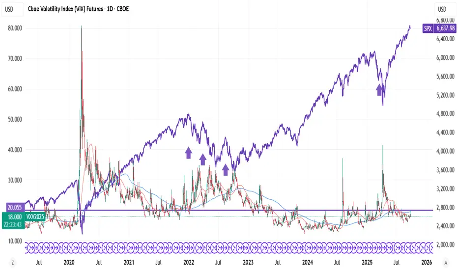
VIX FUT trending above 20 - high probability SPX crash indicatorVIX never trends above 20. You lose money buying VIX FUT above 20.
In nutshell, VIX FUT supporting at 20 is a guaranteed crash - for low risk positions.
Did Crypto Just Find a Bottom?After the recent crash, is the crypto market finally finding a short-term bottom?
In this video I dive deep into the charts for Bitcoin (BTC), Ethereum (ETH), and the total crypto market cap to answer that question.
Here’s what I cover:
- Signs that a short-term bottom could be in place
- My upside targets for BTC, ETH, and alts if we bounce
- Key levels I expect price to pull back into on a move higher
- The downside scenario if the market fails to hold
I break this down using ICT concepts like order blocks, fair value gaps, and liquidity sweeps to show exactly what I’m watching.
👉 Do you think we’ve found a bottom, or is more downside coming? Drop your thoughts in the comments.
#Crypto #Bitcoin #Ethereum #Altcoins #BTC #ETH #CryptoAnalysis #ICTTrading

How to Avoid Massive Losses in Crypto ChaosThe crypto market is full of volatility and excitement these days.
How ready are you to make the right decisions amid this chaos?
Many traders enter without a plan and experience huge losses, but you can be different.
Hello✌️
Spend 2 minutes ⏰ reading this educational material.
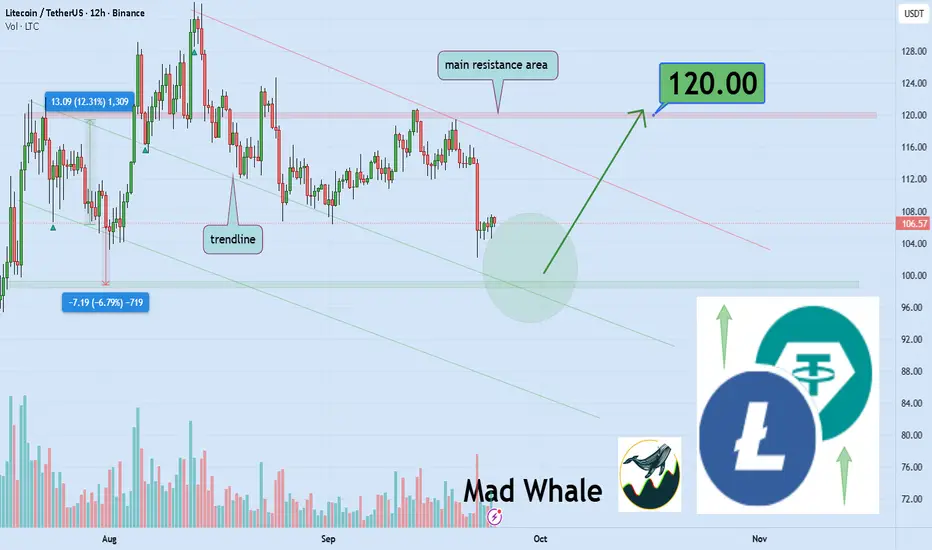
🎯 Analytical Insight on Litecoin:
Litecoin is testing a critical trendline and support zone 📉.
If it holds, a 12% rally could push price toward 120 USD 🚀.
Now , let's dive into the educational section,
Understanding Market Psychology and Trader Emotions 🧠
When the market is chaotic, fear and greed heavily influence your decisions.
Many traders panic sell during sharp drops and suffer major losses.
On the other hand, FOMO can push you to buy at the top and regret it after corrections.
Focusing on collective market behavior and identifying dominant emotions can help you avoid these mistakes.
Strategies to Prevent Big Losses 🚨
Always define your maximum acceptable loss.
Avoid heavy positions and high leverage.
Diversify your portfolio to reduce risk.
Use a combination of technical and on-chain analysis for smart decisions.
Watch whale movements; their large trades can shake the market.
Managing Emotions and Staying Focused ⚖️
Take deep breaths and avoid impulsive decisions.
Have a daily plan to check the market and resist FOMO.
Keep a trading journal to analyze and improve your behavior.
Practical Strategy During High Volatility 🔄
Volatile markets trigger impulsive decisions.
Always identify support and resistance levels.
In extreme swings, trade smaller and safer positions.
Avoid high leverage to prevent large losses in sudden moves.
Focus on the overall trend, not short-term price noise, to protect your capital.
Key TradingView Tools 🛠️
Stop Loss and Take Profit
Limit losses and lock in profits
Set entry and exit points before trading
RSI and MACD
Detect overbought or oversold conditions
Identify short-term trends
Volume Profile
See trading volume at different price levels
Spot real support and resistance zones
Alerts and Notifications
Set alerts on key levels
Stay ahead of sudden market movements
Short Summary 📌
By managing risk, using TradingView tools, and controlling emotions, you can limit big losses and identify safer opportunities.
3 Top Recommendations for Traders 💡
Always have a plan before entering any trade and set your maximum loss.
Avoid following crowd emotions and make decisions logically.
Use analysis tools in combination and practice to minimize risk effectively.
✨ Need a little love!
We pour love into every post your support keeps us inspired! 💛 Don’t be shy, we’d love to hear from you on comments. Big thanks , Mad Whale 🐋
📜Please make sure to do your own research before investing, and review the disclaimer provided at the end of each post
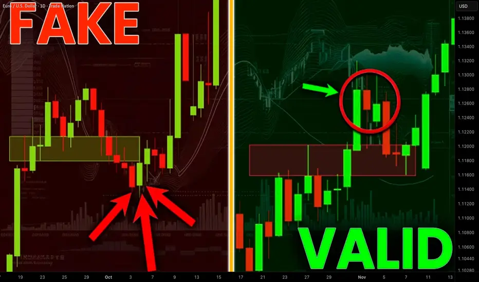
The Only Breakout / Fakeout Technical Indicator You Need
This technical indicator will help you to avoid every fakeout on Forex, Gold or any other market and will accurately confirm a valid support or resistance violation.
It is absolutely free and it is available on TradingView, MetaTrader 4/5 or any other trading terminal.
This indicator is very easy to use, and you can set it up in just 1 click.
Discover a proven way to identify traps.
This technical indicator is called On Balance Volume.
To add that to your chart simply open indicators window on TradingView and search it.
By clicking on that, it will immediately start working.
You can find it on the bottom of the chart.
And here is what this free indicator does:
On forex market, this indicator measures tick volume - the number of a price change for a certain period.
Then it compares a current price close with a previous one.
If a current price is higher than previous, it takes a previous volume and adds that to a current volume, making the indicator rise .
If a current price is lower than previous, it takes a previous volume and subtracts a current volume from that, making the indicator fall .
If a current price is the same as the previous, the indicator remains unchanged .
And that indicator can be used to spot fakeouts and traps.
The idea is that valid bullish and bearish breakouts should be accompanied by volume spikes.
If price breaks resistance but OBV doesn’t make a new high, it’s likely a fake breakout. Because a violation occurs with low volumes.
Examine a breakout candle of a horizontal resistance on EURUSD forex pair.
The market successfully closed above that.
On balance volume set a new higher high, confirming a strength of this up movement.
The market continued rising then.
Now compare a previous breakdown to a bullish violation of a resistance area on AUDUSD.
Though, a candle close above that, the indicator sets a lower high, creating a divergence .
It indicates a price manipulation by smart money.
And this breakout was false and On Balance Volume helped us to predict that.
Now let's study bearish breakouts and fakeouts.
A key horizontal support was broken on USDJPY forex pair.
A bearish candle successfully closed below that.
On Balance Volume confirms this bearish violation by a formation of a new local Lower Low.
It signifies that this breakout occurred with a spike of selling activity.
And the price went way lower then.
A bearish violation of a support cluster on NZDCAD is not confirmed by On Balance Volume.
While a candle successfully closed below the underlined area, the indicator sets a Higher Low.
That is an important warning that this violation can be a fakeout.
You can see that it was a bearish trap.
Smart money were manipulating the market, making the price violate that support. The absence of a selling volumes spike suggested that.
As you can see, this indicator is very simple to use.
Integrate that in your trading plan.
It will dramatically increase the accuracy of your breakout trading and fakeout avoidance.
It will help you find traps and expose manipulations.
❤️Please, support my work with like, thank you!❤️
I am part of Trade Nation's Influencer program and receive a monthly fee for using their TradingView charts in my analysis.
SUCCESS OR FAILURE: MINDSET OR SKILLS?Anfibo's here. Today, I wanna share you guys my valuable experience.
For new traders who just want to trade, after learning the basics, your strategy boils down to 4 things:
Fundamental Analysis (FA)
Technical Analysis (TA)
Fund Management (FM)
Risk Management (RM)
Think of it like a battle. The market is the battlefield, and you’re the warrior:
FA and TA are your sword and spear. The more you sharpen these skills, the better your edge in trading.
FM and RM are your shield and armor. Manage them well, and you’ll stay protected and survive longer.
But gear alone isn’t enough to win!
MINDSET—like a warrior’s spirit—is the real key to success or failure. Here are 6 common psychological factors, or keywords that every trader faces:
1. TREND FOLLOWING: The trend is your friend. Don’t fight it!
2. OPPORTUNITY COST: In the end, we only regret the chances we didn’t take
3. ENDOWMENT EFFECT: This is when you overvalue something just because you own it. Don’t fall in love with your trades—overpricing them leads to disaster!
4. ANCHORING EFFECT: This happens when you cling to the first piece of info you get and base decisions on it, even if it’s wrong. Don’t let one bit of news steer your choices.
5. GREED: Wanting too much can backfire. Greed leads to mistakes!
6. DECISIVE: Be bold. Hesitating at key moments can cost you.
I call these six keywords my “SIX-WORD MANTRA.” Why? Because in trading, mindset controls 60% of your success or failure. Skills make up the other 40% —and if you’re not great at them, you can lean on others’ expertise.
That’s why I always tell newbies: at the very least, learn enough to read someone else’s chart, spot the entry and stop-loss points, and make your own decisions. Don’t just blindly follow some influencer or “expert” online shouting to buy something—that’s a recipe for trouble if you lack knowledge or your own judgment!
What’s your take? Drop a comment, and let’s discuss!
If you agree with me, follow me to read more of my good articles.
And I’m An, just sharing what I know about finance ;)

Major Global Soft Commodity Markets1. Understanding Soft Commodities
1.1 Definition and Classification
Soft commodities are raw materials that are cultivated, harvested, and traded for various purposes, including food, feed, fuel, and fiber. Unlike hard commodities such as metals and energy resources, softs are perishable and subject to seasonal cycles. They are typically traded on futures markets, allowing producers to hedge against price fluctuations and investors to speculate on price movements.
1.2 Key Characteristics
Perishability: Most soft commodities have a limited shelf life, requiring efficient storage and transportation systems.
Seasonality: Production cycles are influenced by planting and harvesting seasons, affecting supply and prices.
Geographic Concentration: Certain regions dominate the production of specific soft commodities, making them vulnerable to local disruptions.
Price Volatility: Prices can be highly volatile due to factors like weather events, pests, and geopolitical tensions.
2. Major Soft Commodities and Their Markets
2.1 Coffee
Coffee is one of the world's most traded commodities, with Brazil, Vietnam, and Colombia being the top producers. The market is influenced by factors such as climate conditions, currency fluctuations, and global demand trends. Futures contracts for coffee are traded on exchanges like ICE Futures U.S., providing a benchmark for global prices.
2.2 Cocoa
Cocoa is primarily produced in West Africa, with Ivory Coast and Ghana leading global production. The market has experienced significant price fluctuations due to supply deficits, often caused by adverse weather conditions and political instability in producing countries. The New York Cocoa Exchange, now part of ICE Futures U.S., plays a crucial role in setting global cocoa prices.
2.3 Sugar
Sugar is a staple in the global food industry, with Brazil, India, and China being major producers. The market is influenced by factors such as government policies, biofuel mandates, and global consumption patterns. Futures contracts for sugar are traded on exchanges like ICE Futures U.S., providing transparency and liquidity to the market.
2.4 Cotton
Cotton is essential for the textile industry, with China, India, and the United States being the largest producers. The market is affected by factors like weather conditions, labor costs, and global demand for textiles. Futures contracts for cotton are traded on exchanges such as ICE Futures U.S., offering a platform for price discovery and risk management.
2.5 Corn and Soybeans
Corn and soybeans are vital for food, feed, and biofuel industries. The United States is a leading producer of both crops, with significant exports to countries like China and Mexico. Futures contracts for these commodities are traded on exchanges like the CME Group, providing mechanisms for hedging and speculation.
2.6 Wheat
Wheat is a staple food for billions worldwide, with major producers including Russia, the United States, and China. The market is influenced by factors such as weather conditions, global demand, and trade policies. Futures contracts for wheat are traded on exchanges like the CME Group, offering a platform for price discovery and risk management.
3. Trading and Investment in Soft Commodities
3.1 Futures Markets
Futures markets are central to the trading of soft commodities, allowing producers to hedge against price fluctuations and investors to speculate on price movements. Exchanges like ICE Futures U.S. and the CME Group provide platforms for trading futures contracts, offering transparency and liquidity to the market.
3.2 Exchange-Traded Funds (ETFs)
ETFs provide investors with exposure to soft commodities without the need to directly trade futures contracts. For example, the Teucrium Corn Fund (CORN) and the Teucrium Soybean Fund (SOYB) offer investors a way to invest in these commodities through the stock market.
3.3 Physical Trading
Physical trading involves the buying and selling of actual commodities, often through long-term contracts between producers and consumers. Companies like ECOM Agroindustrial play a significant role in the physical trading of commodities such as coffee, cocoa, and cotton.
4. Factors Influencing Soft Commodity Markets
4.1 Weather and Climate Conditions
Adverse weather events like droughts, floods, and hurricanes can significantly impact the production of soft commodities, leading to supply shortages and price volatility.
4.2 Geopolitical Events
Political instability, trade disputes, and sanctions can disrupt supply chains and affect the prices of soft commodities.
4.3 Economic Policies
Government policies, such as subsidies, tariffs, and biofuel mandates, can influence the production and consumption of soft commodities, impacting their market dynamics.
4.4 Global Demand Trends
Changes in consumer preferences, population growth, and dietary habits can affect the demand for soft commodities, influencing their prices.
5. Challenges and Risks in Soft Commodity Markets
5.1 Price Volatility
Soft commodity markets are characterized by high price volatility due to factors like weather conditions, geopolitical events, and market speculation.
5.2 Supply Chain Disruptions
Natural disasters, transportation issues, and political instability can disrupt supply chains, leading to shortages and price increases.
5.3 Regulatory Uncertainty
Changes in government policies, such as trade restrictions and environmental regulations, can create uncertainty in the market.
6. Outlook for Soft Commodity Markets
6.1 Emerging Markets
Countries in Asia and Africa are becoming increasingly important players in the production and consumption of soft commodities, influencing global market trends.
6.2 Technological Advancements
Innovations in agricultural technology, such as precision farming and biotechnology, have the potential to improve yields and reduce the environmental impact of soft commodity production.
6.3 Sustainability Initiatives
There is a growing emphasis on sustainable practices in the production and trade of soft commodities, driven by consumer demand and regulatory pressures.
7. Conclusion
Soft commodities are integral to the global economy, influencing food security, industrial production, and trade dynamics. Their markets are complex and influenced by a myriad of factors, including weather conditions, geopolitical events, and economic policies. Understanding these markets is crucial for producers, traders, and investors alike to navigate the challenges and opportunities they present.
Cybersecurity in Global Trade1. Introduction
Global trade has been the backbone of economic development, facilitating the exchange of goods, services, and capital across borders. The digital transformation of global trade has enhanced efficiency, reduced costs, and increased connectivity. From electronic trading platforms and automated customs procedures to blockchain-based supply chain management, technology is integral to modern trade. However, this digital integration has also exposed global trade networks to cyber threats.
Cybersecurity in global trade refers to the measures, technologies, policies, and practices aimed at protecting trade-related digital assets, networks, and operations from unauthorized access, data breaches, cyberattacks, and other forms of cyber risk. As trade becomes increasingly digital, cybersecurity is no longer an optional investment but a critical component of economic resilience.
2. The Digital Transformation of Global Trade
2.1 Digitization in Trade
Over the past two decades, international trade has shifted from paper-based documentation to digital processes. Key digital advancements include:
Electronic Data Interchange (EDI): Enables the exchange of trade documents electronically, reducing errors and delays.
Automated Customs and Border Systems: Streamlines import/export procedures through digital submission and tracking of customs declarations.
Blockchain and Distributed Ledger Technology (DLT): Enhances supply chain transparency and traceability.
Internet of Things (IoT): IoT devices track goods in real time, improving logistics efficiency.
While these technologies improve speed and efficiency, they also create new entry points for cybercriminals.
2.2 Benefits of Digital Trade
Efficiency: Reduced paperwork and faster transactions.
Transparency: Real-time tracking of goods and financial flows.
Cost Reduction: Lower operational and administrative costs.
Market Expansion: Easier access to global markets, particularly for SMEs.
However, each digital advancement introduces new cybersecurity vulnerabilities, making global trade more complex to protect.
3. Cyber Threat Landscape in Global Trade
3.1 Types of Cyber Threats
Global trade faces a wide array of cyber threats, including:
Phishing Attacks: Fraudulent emails targeting trade operators to steal credentials.
Ransomware: Attackers encrypt critical trade or supply chain data and demand payment.
Supply Chain Attacks: Compromising a supplier’s systems to infiltrate larger networks.
Malware and Viruses: Disrupting logistics, payment processing, and operational systems.
Denial-of-Service (DoS) Attacks: Disabling e-commerce platforms or trade portals.
3.2 Notable Cybersecurity Incidents in Trade
Several high-profile incidents demonstrate the vulnerability of global trade:
Maersk Shipping Attack (2017): The NotPetya ransomware attack disrupted Maersk’s global operations, costing over $300 million.
Targeted Supply Chain Attacks: Hackers infiltrated logistics providers to steal sensitive trade data.
3.3 Emerging Threats
AI-powered cyberattacks: Advanced attacks using artificial intelligence for phishing, intrusion, and reconnaissance.
IoT vulnerabilities: Insecure IoT devices in shipping and logistics networks can provide gateways for attackers.
Digital currency fraud: Cryptocurrencies used in cross-border trade are susceptible to theft and fraud.
4. Impact of Cybersecurity Risks on Global Trade
4.1 Financial Impact
Cyber incidents can lead to:
Direct financial losses through theft or ransomware payments.
Increased insurance premiums and regulatory fines.
Costly operational disruptions, such as shipment delays or halted production.
4.2 Operational Impact
Interruptions in supply chains can delay the delivery of goods and services.
Reduced visibility in logistics networks due to compromised tracking systems.
Loss of competitive advantage due to intellectual property theft.
4.3 Reputational Impact
Damage to corporate reputation can reduce consumer trust.
Loss of business partnerships due to perceived insecurity.
Long-term decline in investor confidence.
4.4 Strategic Impact
Cyberattacks can influence trade policies and international relations.
Heightened geopolitical tensions may result from state-sponsored cyber intrusions.
Businesses may reconsider expansion into high-risk regions.
5. Key Cybersecurity Challenges in Global Trade
5.1 Complex Supply Chains
Global trade involves multi-tiered supply chains, making it difficult to ensure consistent cybersecurity across all partners. A single weak link can compromise the entire chain.
5.2 Cross-Border Data Regulation
Trade across borders must navigate diverse cybersecurity laws, such as:
General Data Protection Regulation (GDPR) in Europe
Cybersecurity Law in China
Cyber Incident Reporting Requirements in the U.S.
Non-compliance increases legal risks and operational burdens.
5.3 Legacy Systems
Many trade platforms still rely on outdated software vulnerable to cyberattacks. Modernization is costly and complex.
5.4 Lack of Cybersecurity Awareness
SMEs, which play a critical role in global trade, often lack awareness and resources to implement robust cybersecurity measures.
5.5 Emerging Technologies
While technologies like blockchain, AI, and IoT improve efficiency, they also introduce new vulnerabilities requiring constant monitoring and adaptation.
6. Cybersecurity Strategies for Global Trade
6.1 Risk Assessment
Identify and prioritize assets, systems, and processes critical to trade operations.
Evaluate threats from internal and external actors.
Conduct periodic security audits and penetration testing.
6.2 Supply Chain Security
Implement supplier vetting and continuous monitoring.
Establish cybersecurity requirements for partners.
Use blockchain to track goods and verify authenticity.
6.3 Data Protection
Encrypt sensitive trade and financial data.
Implement secure communication protocols.
Adopt robust access controls and identity management.
6.4 Incident Response and Recovery
Develop and test cybersecurity incident response plans.
Establish disaster recovery systems to maintain operations.
Maintain cyber insurance to mitigate financial losses.
6.5 Regulatory Compliance
Stay updated on regional and international cybersecurity regulations.
Conduct audits to ensure compliance with standards like ISO 27001 or NIST frameworks.
6.6 Employee Training
Regular cybersecurity awareness programs for staff and partners.
Phishing simulations and security drills to reinforce best practices.
7. Role of Governments and International Organizations
7.1 Governments
Enact cybersecurity laws for critical trade infrastructure.
Establish national CERTs (Computer Emergency Response Teams) to respond to threats.
Promote public-private partnerships to share threat intelligence.
7.2 International Organizations
World Trade Organization (WTO): Encourages digital trade policies and security standards.
International Maritime Organization (IMO): Provides cybersecurity guidelines for shipping.
International Chamber of Commerce (ICC): Develops best practices for digital trade security.
7.3 Multilateral Cooperation
Information sharing between countries on cyber threats.
Harmonization of standards to reduce cross-border compliance complexity.
Joint exercises to strengthen collective resilience.
8. Technological Solutions for Cybersecurity in Trade
8.1 Blockchain
Enhances transparency and traceability in supply chains.
Reduces fraud and unauthorized access.
8.2 AI and Machine Learning
Detect anomalous patterns indicating cyberattacks.
Automate threat detection and response.
8.3 Encryption and Secure Communication
Protect sensitive trade data during transmission.
Prevent interception of financial transactions.
8.4 IoT Security Solutions
Implement device authentication and network segmentation.
Monitor IoT devices for unusual behavior.
8.5 Cloud Security
Secure cloud platforms hosting trade systems with multi-factor authentication and encryption.
Continuous monitoring and automated threat mitigation.
9. Case Studies in Cybersecurity for Trade
9.1 Maersk Shipping (2017)
NotPetya ransomware attack disrupted global shipping operations.
Highlighted the vulnerability of logistics networks.
Led to investments in cyber resilience and contingency planning.
9.2 SolarWinds Attack
Compromised software used by multiple trade organizations.
Demonstrated risks of supply chain attacks and dependency on third-party software.
9.3 Alibaba and E-commerce Platforms
Implemented AI-based monitoring and anti-fraud measures.
Showcases proactive cybersecurity strategies in digital trade.
10. Future Trends in Cybersecurity for Global Trade
10.1 Increased Automation and AI
Automated threat detection and response will become essential.
Predictive analytics will help anticipate cyberattacks.
10.2 Expansion of Digital Trade
Growing cross-border e-commerce will require stronger cybersecurity frameworks.
Small and medium-sized enterprises will need affordable, scalable security solutions.
10.3 Regulatory Evolution
Governments will tighten cyber compliance requirements for trade.
International harmonization of cybersecurity standards may accelerate.
10.4 Cybersecurity as a Trade Differentiator
Companies with robust cyber defenses will gain trust and competitive advantage.
Cyber insurance and certifications may become prerequisites for global trade partnerships.
11. Conclusion
Cybersecurity is a critical pillar of modern global trade. As trade becomes increasingly digitized, vulnerabilities multiply, and the cost of cyber incidents can be enormous—financially, operationally, and reputationally. Effective cybersecurity in trade requires a multi-layered approach: technological safeguards, regulatory compliance, risk management, supply chain security, and human awareness. Governments, international organizations, and businesses must collaborate to develop resilient, adaptive, and forward-looking cybersecurity strategies.
Investing in cybersecurity is no longer just a technical concern—it is a strategic necessity that ensures the sustainability, efficiency, and trustworthiness of global trade. Organizations that prioritize cybersecurity will not only protect their operations but also contribute to a more secure and resilient global trading ecosystem.
Learn What a VOID is and how it Impacts Your Trading A void is a trading condition that occurs when small lot buyers and Odd Lot investors run out of capital to invest. These two retail groups tend to have very little savings to invest so they buy Odd Lots (under 100 shares for one transaction) or Fractional Shares, which is a fraction of ONE single share of stock of a company.
These groups are the LAST buyers in during a Velocity or Speculative Trading Condition which happens often during highly emotional trading activity in a Moderately Up Trending Market Condition.
When the Odd lot and low capital base NEW retail day traders run out of money they stop buying and a VOID of BUYERS occurs.
The Sell Side Institutions, Giant Hedge Funds, Professional Independent Traders all recognize the volume and price patterns that form due to a VOID of BUYERS on the retail side.
Volume bars are the number of ORDERS that are rapidly moving through the huge and very complex stock market systems. Volume, therefore is a primary indicator that warns of an impending VOID of BUYERS. When that occurs, the professionals mentioned above start to prepare to sell short and determined how low they can place a buy-to-cover order to maximize their profits when selling short. Thus, with a surge of HFT sell short orders, the market would gap down at open. HFTS use very small lot orders to fill the queues ahead of the market open and thus force the computers that run the market to lower the price of the stock to where the buy to covers are waiting. So that is WHY there is a sudden collapse of price after a speculative run up as we have had recently and will have again.

Treat your trades like real estate – patience paysSmart Money builds houses – Retail flips huts. Renovate your trade, not your nerves.
📝 Post Description:
Back in the day, many dreamed of striking gold as miners.
But only a few ever found real gold.
The ones who actually got rich?
The ones selling the shovels and tools.
💡 It’s the same in trading today.
Endless tools, indicators, signals, books, courses…
Everyone promises “this one setup will make you a millionaire.”
I bought one of those books 20 years ago.
Three months later, I bought another one:
“How to get out of debt.” 😅
Here’s the thing:
📉 90% of all that stuff is trash.
That’s why less than 10% of traders make it long-term.
Everyone wants to sell you something – very few actually teach.
🔨 Trading = Craft + Fight + Patience
This path is hard – but it shapes you.
You end up fighting two things: the chart and yourself.
In today’s world of high-frequency trading and Smart Money,
no single indicator or theory is enough.
But you still need to read, interpret and understand them —
like a craftsman knows his tools.
I compare trading to combat sports.
I’ve trained since childhood — started with Muay Thai, now I’m an MMA coach in Switzerland.
Just like in a fight, in trading you need:
✅ Clear structure
✅ Fast reaction
✅ A calm mind
✅ A solid plan
✅ Respect for the opponent — the market
🏠 My principle: Trade like real estate
A good trade is like buying a house:
It might not look perfect today…
But the foundation is solid, and the location is prime.
→ The price is under renovation — and you wait.
Once you understand this,
you stop doubting every move on the 1-minute chart.
You trust your setup, your process — and you know the value will rise.
📊 The market rewards preparation – not hope
Ask yourself:
Where are the masses buying?
Where do traders dream — and where do they panic?
What looks too obvious? (Head & Shoulders? Double bottom?)
How does a scalper think? How about a swing trader?
Panic or patience?
The difference is: Preparation.
If you’re prepared, you’re not afraid.
📸 Check out the chart below — it shows exactly that:
Price under renovation. Strong foundation.
The sell comes later — with patience.
🔧 Final Thought:
If you want to survive in this game long-term,
you don’t need 10 indicators.
You need:
Discipline. Reflexes. Mental strength. Respect for the market.
The chart is your opponent – but also your mirror.

Global Commodity Supercycle: Myth or Reality?Understanding Commodity Supercycles
What is a Commodity Supercycle?
A commodity supercycle refers to a prolonged period (usually 10–30 years) of above-trend price growth across a wide range of commodities, driven by structural factors such as industrial revolutions, global wars, or the rise of large economies. Unlike short-term volatility caused by weather, political tensions, or monetary policies, supercycles are deeply tied to transformational demand shifts.
Key characteristics:
Duration: Long-lasting, often over a decade.
Breadth: Not limited to one commodity but across energy, metals, and agriculture.
Drivers: Demand-side shocks (e.g., rapid urbanization, population growth) or supply constraints (e.g., limited mining capacity, technological lags).
Historical Evidence of Commodity Supercycles
Economists generally agree on four major commodity supercycles in modern history:
1. The Late 19th Century (Industrial Revolution Expansion)
Fueled by industrialization in Europe and North America.
Demand for coal, steel, copper, and agricultural goods surged as cities grew.
Railroads, shipping, and mechanization created unprecedented commodity needs.
2. Early 20th Century (World Wars & Reconstruction)
World War I and World War II triggered immense demand for energy, metals, and food.
Post-war reconstruction in Europe and Japan kept demand elevated.
Agricultural products and oil saw sharp price surges.
3. Post-War Boom (1950s–1970s)
The U.S. and Europe experienced economic expansion, while Japan industrialized rapidly.
Oil crises of the 1970s pushed energy prices to historic highs.
This period was marked by strong global GDP growth and industrial demand.
4. China-Led Supercycle (2000–2014)
China’s entry into the World Trade Organization (2001) transformed global trade.
Rapid industrialization, urbanization, and infrastructure projects created insatiable demand for iron ore, copper, coal, and oil.
Commodity-exporting nations (Brazil, Australia, Russia, Middle East, Africa) thrived.
Prices peaked around 2011–2014 before collapsing as Chinese growth slowed and shale oil transformed supply dynamics.
Drivers of Commodity Supercycles
To assess whether a new supercycle is real, it’s essential to understand the core drivers:
1. Demographics & Urbanization
Rising populations require food, energy, housing, and infrastructure.
Urbanization in Asia and Africa remains a structural driver.
2. Industrialization & Technology
Industrial revolutions (steam engine, electricity, digital economy) bring new waves of commodity demand.
Current trends: renewable energy, electric vehicles, AI-driven data centers—all require copper, lithium, cobalt, and rare earths.
3. Global Trade & Economic Growth
Commodity supercycles thrive when global trade is open and economies expand.
Globalization in the 2000s amplified the China-led boom.
4. Supply Constraints
Mining, drilling, and farming face natural limits, capital intensity, and environmental regulations.
Infrastructure projects (mines, pipelines, railways) take years to build, making supply inelastic.
5. Geopolitics & Wars
Wars disrupt supply chains and create artificial scarcity.
Recent example: The Russia-Ukraine war drove up oil, gas, and wheat prices.
6. Monetary Policies & Inflation
Loose monetary policy (low interest rates, money printing) can fuel commodity speculation.
Commodities are often used as a hedge against inflation.
Arguments Supporting the “Reality” of a New Supercycle
Proponents of the new supercycle argue that we are at the beginning of another historic wave:
1. Green Energy Transition
Solar, wind, and EVs require massive amounts of copper, lithium, nickel, cobalt, and rare earths.
International Energy Agency (IEA) predicts demand for critical minerals could increase 4–6 times by 2040.
Renewable infrastructure and electrification of transport could drive decades of elevated prices.
2. Deglobalization & Supply Chain Shocks
Post-COVID and geopolitical tensions are shifting supply chains.
“Friend-shoring” and resource nationalism (countries restricting exports) are making commodities scarcer and pricier.
3. Underinvestment in Supply
After the 2014–2016 commodity crash, mining and energy companies cut investments.
Limited new supply means markets could face shortages as demand rises.
4. Global South Growth
Africa and South Asia are entering rapid urbanization and industrialization phases similar to China in the 2000s.
This could drive another long wave of commodity demand.
5. Inflation & Fiscal Policies
Massive fiscal spending (infrastructure projects in the U.S., India, China) will boost raw material demand.
Persistent inflation may keep commodity prices structurally high.
Arguments for the “Myth” of a Supercycle
Skeptics argue that what we are seeing is not a true supercycle, but short-term volatility and sector-specific booms:
1. Slowing Global Growth
China’s economy is maturing, with slower GDP growth.
Europe faces stagnation, while the U.S. economy is service-driven, not commodity-intensive.
2. Technological Efficiency
Efficiency gains (recycling, renewable energy improvements, lightweight materials) reduce commodity intensity.
Example: Cars now use less steel and more composites.
3. Energy Transition Uncertainty
While green energy requires minerals, oil and gas demand may plateau or decline.
Fossil fuel exporters may face reduced long-term demand, offsetting gains in metals.
4. Cyclical, Not Structural
Commodity booms often follow crises (COVID-19 recovery, Ukraine war), but fade once supply adjusts.
For example, oil prices spiked in 2022 but moderated in 2023–2024.
5. Climate Change & Policies
Global push toward decarbonization may accelerate demand for some commodities but cap fossil fuel consumption.
Governments may regulate excessive commodity dependence, limiting supercycle momentum.
Case Studies of Recent Commodity Trends
Oil
Prices surged in 2022 after Russia’s invasion of Ukraine.
However, shale oil production in the U.S. capped long-term upward momentum.
The long-term outlook depends on balancing declining demand (EVs, green energy) with supply constraints.
Copper
Known as “Dr. Copper” for its link to global growth.
Critical for electrification, data centers, and EVs.
Supply shortages from South America and rising demand suggest potential supercycle conditions.
Agriculture
Climate change is disrupting yields of wheat, rice, and corn.
Rising populations in Africa and Asia sustain demand.
However, technological advances in agriculture (vertical farming, GM crops) could limit long-term price booms.
Lithium & Rare Earths
Prices skyrocketed due to EV adoption but are highly volatile.
Supply expansions in Australia, Chile, and Africa could stabilize markets.
Future Outlook: Are We Entering a Supercycle?
Short-Term (2025–2030)
Critical minerals like copper, lithium, and nickel likely face supply shortages, supporting higher prices.
Oil and gas remain volatile due to geopolitics but may not sustain a supercycle-level rise.
Agriculture could see climate-driven price spikes.
Medium-Term (2030–2040)
Green transition will be the dominant force.
Demand for EVs, renewable infrastructure, and digital economy will keep some metals in structural deficit.
Fossil fuels may decline, but not completely vanish.
Long-Term (2040 and Beyond)
Recycling, substitution technologies, and efficiency could limit extreme supercycle effects.
Commodity markets may fragment: metals could experience structural booms, while fossil fuels decline.
Conclusion
The concept of a global commodity supercycle is not a myth—it has occurred multiple times in history. However, whether the present situation qualifies as one depends on perspective:
Yes, it is real if we focus on critical minerals essential for the green energy transition. The supply-demand imbalance, underinvestment, and geopolitical tensions support the thesis.
No, it is a myth if we view commodities broadly, as oil, gas, and agricultural markets face demand plateaus, efficiency improvements, and technological disruption.
Ultimately, the truth may lie somewhere in between. Instead of a broad, all-encompassing commodity supercycle, we may be entering a “selective supercycle”—where specific commodities (like copper, lithium, cobalt, and rare earths) enjoy structural multi-decade booms, while others remain cyclical.

Climate Change as a Global Trade Disruptor1. Climate Change and Global Trade: The Interconnection
Trade depends on geography, climate, and natural resources. Historically, favorable weather and fertile lands enabled agricultural exports, while stable oceans and rivers facilitated shipping routes. Climate change disrupts all three:
Geography: Rising sea levels threaten coastal cities and ports, where nearly 90% of international trade passes through.
Climate: Heatwaves, floods, and droughts directly impact agricultural yields and energy production.
Natural Resources: Water scarcity and declining biodiversity affect commodity supply.
In short, climate change doesn’t just affect the environment—it directly alters the conditions of trade.
2. Extreme Weather Events and Supply Chain Disruptions
One of the most immediate trade-related consequences of climate change is the increase in extreme weather events. Hurricanes, cyclones, floods, and wildfires damage factories, ports, and transport infrastructure.
Hurricane Katrina (2005): Shut down Gulf Coast oil refineries, sending global oil prices soaring.
Thailand floods (2011): Disrupted automotive and electronics supply chains worldwide.
Australia’s bushfires (2019–2020): Reduced coal exports and disrupted agriculture.
Today’s supply chains are highly interdependent and globalized. A single event in one country can delay production worldwide. For example, flooding in Vietnam affects garment exports to Europe, while droughts in Brazil push up global coffee prices.
Climate-induced supply chain shocks are becoming the new normal. This creates price volatility, inflationary pressures, and higher insurance premiums for shipping and logistics.
3. Agriculture and Food Security in Global Trade
Agriculture is one of the most climate-sensitive sectors and a cornerstone of global trade. Crops like wheat, rice, coffee, and cocoa rely on predictable weather patterns. Climate change threatens this balance in multiple ways:
Droughts in Africa: Reduce maize and sorghum yields, raising import dependency.
Heat stress in India: Threatens rice and wheat production, impacting global food markets.
Coffee production in Brazil & Vietnam: Faces declining suitable land due to rising temperatures.
Food security becomes a trade issue when nations impose export bans to protect domestic supply. During the 2008 food crisis, countries like India and Vietnam restricted rice exports, causing prices to spike globally. Similar patterns may repeat more frequently as climate shocks worsen.
This also affects agribusiness trade patterns. Countries that can adapt (through irrigation, genetic crop engineering, or technology) may dominate future food exports, while vulnerable regions face dependency and trade deficits.
4. Maritime Trade and the Impact on Shipping
Around 80–90% of global trade moves by sea. Climate change is disrupting this backbone in several ways:
Rising Sea Levels: Ports in Bangladesh, Miami, Rotterdam, and Shanghai face flooding risks.
Hurricanes & Cyclones: More frequent storms damage ships and delay cargo.
Melting Arctic Ice: While it opens new shipping routes (e.g., Northern Sea Route), it also creates geopolitical tensions and environmental hazards.
Shallow Water Levels: Droughts in rivers like the Rhine (Europe) and Mississippi (U.S.) reduce shipping capacity.
Insurance and shipping costs rise as companies face unpredictable risks. In turn, these higher costs filter down to consumers through inflation in global trade prices.
5. Energy Trade and Transition
Energy is the engine of trade, but climate change is reshaping both supply and demand.
Fossil Fuel Disruption:
Rising storms affect offshore oil rigs.
Droughts limit water needed for cooling in coal and nuclear plants.
Heatwaves reduce energy efficiency in transportation.
Green Energy Transition:
Demand shifts toward renewable energy technologies (solar panels, wind turbines, EV batteries).
Countries rich in critical minerals (lithium, cobalt, rare earths) gain new trade power.
Nations dependent on fossil fuel exports (like Gulf countries) face future trade risks.
Energy trade is entering a transitional phase, with climate change accelerating the shift toward renewables while simultaneously destabilizing fossil fuel-dependent economies.
6. Climate-Induced Migration and Labor Disruptions
Climate change displaces millions of people due to floods, droughts, and rising seas. According to the World Bank, by 2050, over 200 million people may become climate migrants.
This has direct trade implications:
Labor shortages in agriculture and manufacturing.
Shifting consumer bases as populations relocate.
Trade tensions between host and origin countries.
For example, migration from Central America to the U.S. is partly driven by droughts destroying crops. This alters not just migration policies but also regional trade agreements.
7. Geopolitical Tensions and Trade Wars Linked to Climate
Climate change also fuels geopolitical trade disruptions. Nations with scarce resources (water, arable land, minerals) may restrict exports or engage in conflicts.
Water wars: Between India and Pakistan, or Egypt and Ethiopia, may affect food and trade flows.
Carbon tariffs: The EU’s Carbon Border Adjustment Mechanism (CBAM) imposes costs on imports from high-emission industries, creating new trade barriers.
Resource nationalism: Countries with critical minerals (like Chile for lithium, Congo for cobalt) may restrict exports for domestic benefit, disrupting global supply chains.
Climate change is not just an environmental issue—it’s a geo-economic disruptor reshaping trade alliances and policies.
8. Financial Risks and Trade Insurance
Trade finance and insurance are also feeling the impact:
Rising premiums for ships navigating storm-prone routes.
Higher borrowing costs for exporters in climate-vulnerable regions.
Credit risk as companies in flood-prone areas default on loans.
International banks and insurers are now pricing climate risk into trade deals. This makes it more expensive for vulnerable developing countries to participate in global trade.
9. Adaptation Strategies: Business and Government Responses
Despite the risks, nations and corporations are adapting strategies to reduce disruptions:
Diversification of Supply Chains: Companies are sourcing from multiple regions to reduce climate risks.
Resilient Infrastructure: Investments in flood-resistant ports, smart logistics, and renewable energy.
Trade Policy Reforms: WTO and regional trade blocs are incorporating climate clauses into agreements.
Technological Innovations: AI, blockchain, and IoT for supply chain visibility and risk prediction.
Sustainable Shipping: Investments in low-carbon fuels and energy-efficient vessels.
Adaptation is no longer optional—it is becoming central to trade competitiveness.
10. Future Outlook: Trade in a Climate-Disrupted World
Looking ahead, climate change will continue to reshape trade in profound ways:
Winners and Losers: Climate-resilient nations (Nordics, Canada) may gain trade advantages, while vulnerable regions (South Asia, Sub-Saharan Africa) face disruptions.
Regionalization: To reduce risk, companies may shorten supply chains and rely more on regional trade than global trade.
Climate-Linked Trade Agreements: Carbon border taxes and environmental standards will redefine competitiveness.
Innovation-Driven Trade: Renewable energy technologies, carbon-capture products, and climate-adaptation tools will dominate exports.
In short, climate change will not stop trade, but it will transform it.
Conclusion
Climate change is one of the greatest disruptors global trade has ever faced. Unlike temporary crises—such as financial crashes or pandemics—it is a long-term, structural challenge. It reshapes production, transportation, labor, and even the rules of trade itself. From floods that halt factory production to tariffs on carbon-heavy imports, climate risks ripple through every link of the global supply chain.
The future of trade depends on how quickly nations, businesses, and institutions adapt. Those who build resilience, embrace sustainability, and innovate will thrive. Those who delay will face escalating costs, shrinking markets, and geopolitical vulnerabilities.
Ultimately, climate change is not just an environmental problem—it is a trade problem, an economic problem, and a global governance problem. Recognizing it as a trade disruptor is the first step toward building a system that can withstand its impact.
Introduction to Arbitrage in Global MarketsPart 1: Understanding Arbitrage – The Concept
Arbitrage is a fundamental concept in finance that has existed for centuries, yet it has evolved significantly with the growth of global markets, technology, and financial instruments. At its core, arbitrage is the practice of taking advantage of price differences between markets for the same asset, security, or commodity. By buying low in one market and selling high in another, traders can theoretically make risk-free profits.
Arbitrage is often considered a mechanism that helps maintain market efficiency. Prices in global markets are constantly influenced by supply, demand, and other economic variables. When a price discrepancy arises, arbitrageurs exploit it, which eventually brings prices in different markets back into equilibrium.
Key Characteristics of Arbitrage
Risk-Free Profit (Theoretical Concept):
In ideal conditions, arbitrage is risk-free because it exploits simultaneous price differences. However, in real-world markets, transaction costs, taxes, and timing issues can reduce or eliminate these profits.
Market Inefficiency Exploitation:
Arbitrage exists because markets are not perfectly efficient. Price discrepancies may arise due to delays in information, regulatory differences, or market segmentation.
Simultaneous Transactions:
To be considered true arbitrage, the transactions must occur nearly simultaneously to avoid exposure to price fluctuations.
Leverage of Technology:
In modern global markets, arbitrage often requires sophisticated technology, high-speed trading platforms, and algorithms to detect and exploit price differences in milliseconds.
Types of Arbitrage in Global Markets
Arbitrage is not a one-size-fits-all concept. Over time, financial markets have developed various forms of arbitrage to address different market inefficiencies:
Spatial Arbitrage (Geographical Arbitrage):
This involves exploiting price differences for the same asset across different geographic locations. For example, gold might trade at a slightly lower price in London than in New York. Traders can buy in London and sell in New York, profiting from the discrepancy.
Triangular Arbitrage (Currency Arbitrage):
In the forex market, triangular arbitrage occurs when there is a price imbalance among three currencies. For instance, a trader might notice that the direct exchange rate between USD and EUR is inconsistent with the indirect exchange through JPY. By converting USD → JPY → EUR → USD, a profit can be realized.
Statistical Arbitrage (StatArb):
This approach uses statistical models to identify mispriced securities. Instead of relying solely on observable price differences, traders use historical data and correlations to predict temporary inefficiencies. It is widely used in equity markets and relies heavily on quantitative models and algorithms.
Merger Arbitrage (Risk Arbitrage):
In the M&A (Mergers & Acquisitions) market, arbitrage involves buying the stock of a company being acquired at a discount to the acquisition price and selling the acquirer’s stock if applicable. While profitable, this type carries higher risk due to regulatory hurdles and deal failures.
Convertible Arbitrage:
This involves trading convertible bonds and the underlying stock to exploit price differences between them. Investors buy the undervalued asset and hedge the risk with the other, aiming for a risk-adjusted profit.
Regulatory and Tax Arbitrage:
Different countries have varying tax policies and financial regulations. Some firms structure transactions to exploit these differences to minimize tax liability or regulatory costs. While profitable, it must comply with legal frameworks to avoid penalties.
The Role of Arbitrage in Global Market Efficiency
Arbitrage plays a crucial role in maintaining price consistency across global markets. By exploiting temporary discrepancies:
It narrows bid-ask spreads in financial instruments.
Encourages market integration, connecting local and international markets.
Improves liquidity, as arbitrageurs provide capital and facilitate transactions.
Reduces opportunities for persistent mispricing, making markets more efficient.
Without arbitrage, global markets would suffer from persistent inefficiencies and price distortions. However, with the growth of technology and algorithmic trading, price discrepancies are often corrected in milliseconds, leaving very narrow windows for profitable arbitrage opportunities.
Challenges and Risks in Global Arbitrage
Despite its theoretical promise of risk-free profit, arbitrage in practice involves multiple risks:
Execution Risk:
Delays in executing trades across different markets may lead to losses if prices move before the transaction completes.
Liquidity Risk:
Some markets or assets may lack sufficient liquidity, preventing large trades without impacting prices.
Counterparty Risk:
In global markets, trades often depend on intermediaries. Failure of a counterparty can result in losses.
Regulatory Risk:
Different countries impose varying regulations on trading, capital flows, and taxation. Arbitrage strategies must comply with legal frameworks, or traders risk fines and penalties.
Technological Risk:
Algorithmic and high-frequency trading rely on robust infrastructure. Any malfunction or latency can result in missed opportunities or losses.
Currency and Political Risk:
For international arbitrage, currency fluctuations and political events can quickly erode potential profits.
Global Examples of Arbitrage
Forex Markets:
A classic example is triangular arbitrage among major currencies (USD, EUR, JPY). Even small inefficiencies can generate millions in profit when leveraged across large volumes.
Commodity Markets:
Oil, gold, and agricultural commodities are traded globally. Traders exploit differences in local futures prices or spot markets to profit.
Equity Markets:
Stock exchanges like NYSE, NASDAQ, and LSE often have slight price differences for dual-listed companies. High-frequency traders exploit these micro-movements.
Cryptocurrency Markets:
With the rise of digital assets, arbitrage opportunities emerge across crypto exchanges. Bitcoin, for example, might trade at slightly different prices on Binance, Coinbase, and Kraken.
Part 2: Strategies and Techniques of Arbitrage in Global Markets
1. Classical Arbitrage Strategies
Even in the modern, high-speed trading era, many fundamental arbitrage strategies remain relevant:
a) Cash-and-Carry Arbitrage
Mechanism: Involves buying an asset in the spot market and simultaneously selling its futures contract if the futures price is higher than the spot price plus carrying costs (storage, insurance, interest).
Example: Suppose gold is trading at $2,000/oz in the spot market, while the 3-month futures contract is $2,050/oz. Buying gold today and selling the futures contract locks in a profit, minus carrying costs.
Significance: This strategy aligns spot and futures prices and reduces market mispricing.
b) Reverse Cash-and-Carry Arbitrage
Mechanism: Happens when futures prices are lower than the spot plus carrying costs. Traders sell the spot asset short and buy futures.
Impact: Prevents futures prices from diverging significantly from spot prices, stabilizing derivative markets.
c) Triangular Currency Arbitrage
Mechanism: Exploits discrepancies in exchange rates among three currencies. Traders convert Currency A → B → C → A, aiming for a net gain.
Practical Note: Most forex platforms now detect and automatically exploit small discrepancies, leaving minimal manual opportunities.
2. Statistical and Quantitative Arbitrage (StatArb)
Modern arbitrage increasingly relies on data and algorithms. Statistical arbitrage differs from classical arbitrage because it:
Uses historical price data, correlations, and probability models.
Trades pairs of assets that historically move together but temporarily diverge.
Example: Pairs Trading
Identify two historically correlated stocks, say Stock X and Stock Y.
If X rises significantly while Y lags, buy Y and short X, betting their prices will converge.
Advantage: Market-neutral; profits even in volatile markets if divergence corrects.
Tools Used
Machine learning algorithms to detect anomalies.
High-frequency trading systems for rapid execution.
Risk management frameworks to prevent losses if correlations fail.
3. Risk Arbitrage (Merger Arbitrage)
Mechanism: Focuses on corporate events, such as mergers or acquisitions.
Strategy: Buy shares of the target company at a discount to the announced acquisition price and sell shares of the acquiring company if applicable.
Risks: Deals may fail due to regulatory rejection, shareholder opposition, or financing issues.
Example: If Company A announces it will acquire Company B for $100 per share, and B’s stock trades at $95, arbitrageurs may buy B’s stock hoping it rises to $100 upon deal completion.
4. Technology and Algorithmic Arbitrage
Global markets are increasingly dominated by high-frequency trading (HFT) and automated arbitrage:
Speed Matters: Price discrepancies may exist for mere milliseconds. Only advanced trading algorithms can detect and execute trades fast enough.
Co-location Services: Many hedge funds place servers physically close to exchange servers to reduce latency.
Cross-Market Monitoring: Algorithms monitor multiple global exchanges in real-time for mispricing opportunities.
Example: Buying an undervalued stock in the London Stock Exchange and simultaneously selling its equivalent in the NYSE within milliseconds.
5. Global Commodity Arbitrage
Arbitrage in commodities markets often exploits:
Geographical differences: Prices of oil, gas, or metals vary by region due to local demand, transportation costs, and storage constraints.
Time-based differences: Futures contracts may temporarily misprice compared to spot prices.
Example: Crude oil may be cheaper in the Middle East than in Europe due to local supply-demand imbalances. Traders can transport and sell it at a higher price.
6. Cryptocurrency Arbitrage
Cryptocurrencies present a new frontier:
Exchange Arbitrage: Prices of the same cryptocurrency differ slightly across exchanges like Binance, Coinbase, and Kraken.
Triangular Crypto Arbitrage: Similar to forex, using three crypto pairs.
Decentralized Exchange Arbitrage: Differences between decentralized and centralized exchanges can yield opportunities.
Challenges: High transaction fees, blockchain confirmation delays, and regulatory risks can reduce profits.
7. Implementing Arbitrage: Key Considerations
Even seasoned traders must navigate practical and operational challenges:
Transaction Costs: Profits can evaporate after commissions, spreads, and taxes.
Liquidity: Thinly traded markets can prevent large trades without moving prices.
Currency Conversion: International arbitrage often requires currency conversions, introducing risk.
Legal Compliance: Cross-border trades must comply with regulations, taxes, and anti-money laundering laws.
Capital Requirements: Arbitrage often involves leveraging large amounts of capital to generate meaningful profits.
8. Real-World Examples of Arbitrage in Global Markets
Forex Arbitrage: Major banks frequently exploit triangular currency arbitrage, though opportunities are brief due to automated trading.
Stock Market Arbitrage: Dual-listed companies, e.g., Royal Dutch Shell in London and Amsterdam, present opportunities for price convergence.
Commodity Arbitrage: During periods of supply disruption, oil traders profit from regional price differences.
Crypto Arbitrage: Bitcoin and Ethereum trades across global exchanges illustrate how rapid price movements create opportunities.
Types of World Market Trading,1. Stock Market Trading
What it is:
Trading shares of companies listed on stock exchanges.
How it works:
Investors buy shares hoping their price will rise.
Companies raise money by selling shares to investors.
Trading Styles:
Day Trading: Buying and selling shares in the same day.
Swing Trading: Holding shares for a few days or weeks.
Position Trading: Long-term investment based on company fundamentals.
Scalping: Making quick, small profits from tiny price movements.
Exchanges:
NYSE, NASDAQ, London Stock Exchange, Tokyo Stock Exchange.
Why it matters:
Helps companies raise capital and gives investors opportunities to earn profits.
2. Forex (Currency) Trading
What it is:
Trading currencies like USD, EUR, or JPY against each other.
How it works:
Currencies are traded in pairs, e.g., EUR/USD.
Traders profit from price changes or hedge currency risk.
Types:
Spot Market: Immediate exchange of currencies.
Futures: Agreement to exchange currencies at a future date at a set rate.
Options: Right to buy or sell currency at a set price.
Key Players:
Banks, central banks, hedge funds, retail traders.
Why it matters:
It supports international trade and investment, affecting global economies.
3. Commodity Trading
What it is:
Buying and selling raw materials like oil, gold, wheat, and coffee.
Types:
Hard Commodities: Natural resources like metals and oil.
Soft Commodities: Agricultural products like sugar, coffee, and wheat.
Trading Methods:
Spot contracts (immediate delivery).
Futures contracts (delivery at a future date).
Options on commodities.
Exchanges:
CME, LME, MCX.
Why it matters:
Commodity prices affect industries, inflation, and global trade.
4. Cryptocurrency Trading
What it is:
Trading digital currencies like Bitcoin and Ethereum.
How it works:
Can trade on centralized exchanges (CEX) or decentralized exchanges (DEX).
Investors aim to profit from price movements or hold long-term.
Types of trading:
Day Trading: Short-term trades within a day.
Swing Trading: Holding for days or weeks.
HODLing: Long-term holding strategy.
Why it matters:
Cryptocurrencies offer new investment opportunities and faster global payments.
5. Bond and Fixed-Income Trading
What it is:
Trading government or corporate debt to earn interest and capital gains.
Types of Bonds:
Government Bonds: Low-risk debt from countries.
Corporate Bonds: Issued by companies for funding.
Municipal Bonds: Local government bonds, sometimes tax-free.
How it works:
Investors lend money to the issuer and earn fixed interest over time.
Why it matters:
Bonds are safer than stocks and provide predictable income.
6. Exchange-Traded Funds (ETFs) and Index Trading
What it is:
Trading funds that represent a basket of assets like stocks or commodities.
Types:
Stock ETFs: Track stock market indices.
Bond ETFs: Track bond portfolios.
Commodity ETFs: Track metals, oil, or agriculture.
Sector ETFs: Track specific industries like tech or energy.
Why it matters:
ETFs provide diversification and are easier for small investors to trade.
7. Derivatives Trading
What it is:
Trading contracts based on the value of other assets (stocks, currencies, commodities).
Types:
Futures: Obligation to buy or sell at a future date.
Options: Right, but not obligation, to buy or sell.
Swaps: Exchange cash flows between parties.
Why it matters:
Derivatives help investors hedge risks or speculate on price movements.
8. Emerging Market Trading
What it is:
Trading in developing countries with high growth potential.
Examples:
Asian markets like India and China.
African markets like Nigeria and Kenya.
Latin American markets like Brazil and Mexico.
Opportunities:
Higher potential returns than developed markets.
Exposure to fast-growing industries.
Risks:
Political instability, currency fluctuations, and lower liquidity.
9. Algorithmic and High-Frequency Trading (HFT)
What it is:
Computer programs that execute trades automatically at very high speed.
Key Points:
Uses AI and algorithms to detect market patterns.
Can trade stocks, forex, commodities in milliseconds.
Why it matters:
Increases market liquidity and reduces trading costs but requires advanced technology.
10. Hedging and Risk Management
What it is:
Using financial tools to reduce potential losses in trading.
Methods:
Futures and Options: Lock in prices for stocks, commodities, or currencies.
Swaps: Exchange cash flows to reduce interest rate or currency risk.
Why it matters:
Helps traders, investors, and companies protect themselves from market uncertainty.
11. Sector-Specific Trading
What it is:
Trading in specific industries to capitalize on trends.
Examples:
Technology, healthcare, finance, energy, consumer goods.
Sector ETFs and futures help track industries efficiently.
Why it matters:
Specialization allows investors to profit from specific market trends.
12. Global Trade and Market Influences
Factors affecting world market trading:
Trade Agreements: Reduce barriers and facilitate international commerce.
Global Supply Chains: Affect commodity and product availability.
Geopolitical Events: Wars, sanctions, or pandemics can cause market volatility.
Central Bank Policies: Interest rate changes and currency interventions impact markets globally.
13. Future Trends in World Market Trading
Digitalization:
AI trading, blockchain, and digital currencies are changing market dynamics.
Sustainable Investing:
ESG-focused investments and carbon credit trading are gaining importance.
Integration of Emerging Markets:
Global investors increasingly participate in Asian, African, and Latin American markets.
Regulatory Changes:
Stricter rules for cryptocurrencies, derivatives, and high-frequency trading.
Conclusion
World market trading is diverse and dynamic. It includes stocks, currencies, commodities, bonds, derivatives, ETFs, cryptocurrencies, and emerging market assets. Each type of trading has its own:
Opportunities – Profit potential and growth.
Risks – Market volatility, political instability, or financial loss.
Importance – Supports global trade, investment, and economic growth.
Key Takeaways for Students and Beginners:
Understand the asset before trading.
Use risk management tools like hedging.
Diversify across markets and sectors.
Stay updated on global events, policies, and economic data.
By learning these fundamentals, anyone can participate in world market trading safely and effectively.

Global Trade Policies & Tariffs1. Understanding Global Trade Policies
Global trade policies are essentially the rules of the game for international commerce. They define how countries engage with one another in importing and exporting goods, services, and capital.
At their core, trade policies serve three key purposes:
Promote growth: Encouraging exports to stimulate domestic industries.
Protect interests: Safeguarding local businesses, farmers, and workers from foreign competition.
Manage relationships: Using trade as a diplomatic tool to strengthen alliances or apply pressure.
Key Elements of Trade Policies
Tariffs: Taxes on imports or exports.
Quotas: Limits on how much of a product can be imported.
Subsidies: Government support to domestic producers to make them more competitive.
Standards & regulations: Rules on safety, health, environment, or labor to control imports.
Trade agreements: Formal pacts between countries to lower barriers.
Every nation designs its trade policy according to its economic priorities, political ideology, and stage of development. For instance, emerging economies often protect infant industries, while developed economies push for free trade in areas where they hold an advantage.
2. Evolution of Global Trade Regulations
Trade has always been political. From the mercantilist policies of the 16th–18th centuries, where nations hoarded gold and silver through strict trade control, to the modern era of globalization, trade policies have continuously evolved.
Key Historical Stages
Mercantilism (1500s–1700s): Governments restricted imports and promoted exports to accumulate wealth. Colonies were forced to trade only with their mother countries.
Free Trade Movement (1800s): Thinkers like Adam Smith and David Ricardo argued for specialization and comparative advantage, paving the way for free trade ideologies.
Post-WWII Era (1945 onwards): To avoid economic conflicts that caused wars, nations built institutions like the General Agreement on Tariffs and Trade (GATT), later replaced by the World Trade Organization (WTO) in 1995.
Globalization Wave (1990s–2000s): The collapse of the Soviet Union and rise of China fueled rapid global trade expansion. Free trade agreements like NAFTA (North America Free Trade Agreement) became common.
Trade Wars & Nationalism (2010s–2020s): Countries like the U.S. and China used tariffs strategically, sparking disputes. This era saw rising skepticism about globalization, leading to “reshoring” and “friend-shoring.”
3. The Role of Tariffs
Tariffs are one of the oldest and most powerful tools in global trade policy. They are essentially taxes placed on imported goods (and sometimes exports).
Types of Tariffs
Ad Valorem Tariff: A percentage of the value of the good (e.g., 10% tax on imported cars).
Specific Tariff: A fixed fee per unit (e.g., $5 per imported smartphone).
Compound Tariff: Combination of both (e.g., 5% + $2 per unit).
Objectives of Tariffs
Protect domestic industries: By making imports more expensive, governments encourage people to buy local products.
Revenue generation: Historically, tariffs were a major source of government income.
Strategic leverage: Tariffs can be used as bargaining chips in trade negotiations or political disputes.
Example: U.S.–China Trade War
In 2018, the U.S. imposed tariffs on billions of dollars worth of Chinese goods to address trade imbalances and alleged intellectual property theft. China retaliated with tariffs on U.S. agricultural exports. This trade war disrupted global supply chains and showed how tariffs can reshape international business strategies.
4. Free Trade vs Protectionism
Trade policies are often framed as a tug-of-war between free trade and protectionism.
Free Trade
Encourages open markets with minimal restrictions.
Benefits consumers through lower prices and wider choices.
Promotes efficiency as countries specialize in what they do best.
Examples: WTO principles, EU’s single market, NAFTA/USMCA.
Protectionism
Uses tariffs, quotas, and regulations to shield domestic industries.
Helps safeguard jobs and nurture emerging industries.
Can prevent economic dependence on foreign nations.
Examples: India’s tariff policies on agricultural goods, U.S. steel tariffs.
In reality, most countries adopt a hybrid model — promoting free trade in areas of strength while protecting vulnerable sectors.
5. Modern Trade Agreements
Trade agreements are vital in today’s interconnected world. They aim to reduce trade barriers and set common rules.
Types of Agreements
Bilateral Agreements: Between two countries (e.g., U.S.–Japan Trade Agreement).
Regional Agreements: Among groups of countries (e.g., European Union, African Continental Free Trade Area).
Multilateral Agreements: Global deals under organizations like the WTO.
Notable Trade Agreements
European Union (EU): A single market allowing free movement of goods, services, capital, and people.
NAFTA/USMCA: A pact between the U.S., Canada, and Mexico, updated in 2020.
RCEP (Regional Comprehensive Economic Partnership): The world’s largest trade pact involving Asia-Pacific nations, including China, Japan, and ASEAN members.
CPTPP (Comprehensive and Progressive Agreement for Trans-Pacific Partnership): Another major Asia-Pacific deal excluding the U.S. after its withdrawal.
Such agreements often go beyond tariffs, covering intellectual property, digital trade, environmental standards, and labor rights.
6. Economic & Social Impact of Trade Policies
Trade policies and tariffs directly influence economies and societies.
Positive Impacts
Economic growth: Exports create jobs and stimulate innovation.
Consumer benefits: Access to affordable and diverse products.
Global cooperation: Trade agreements often improve diplomatic ties.
Negative Impacts
Job displacement: Cheaper imports can hurt domestic industries (e.g., U.S. manufacturing jobs lost due to Chinese imports).
Inequality: Benefits may concentrate in certain sectors or regions.
Trade wars: Retaliatory tariffs can escalate into global slowdowns.
7. Challenges in Today’s Trade Environment
The global trade landscape faces new challenges beyond traditional tariffs.
Geopolitical Tensions: U.S.–China rivalry, Russia–Ukraine war, and Middle East conflicts affect trade flows.
Supply Chain Disruptions: Pandemic and climate events exposed vulnerabilities in global supply chains.
Technology & Digital Trade: E-commerce and data flows need updated trade rules.
Environmental Concerns: Policies like the EU’s Carbon Border Adjustment Mechanism (CBAM) link trade with climate action.
Rise of Protectionism: More nations are reconsidering free trade in favor of national security and resilience.
8. Future of Global Trade Policies & Tariffs
The future of trade is being reshaped by three key forces:
Technology: Digital trade agreements, blockchain-based customs, and AI-driven supply chain management.
Sustainability: Green tariffs, carbon credits, and trade policies linked to climate goals.
Geopolitical Realignment: Regional blocs like BRICS+ and RCEP may challenge Western dominance in trade.
We may see a world where:
Tariffs are replaced with non-tariff barriers like environmental or digital standards.
Supply chains shift toward “friend-shoring” (trading with allies) instead of global dependence.
Trade policies integrate AI, data security, and green technology standards.
Conclusion
Global trade policies and tariffs remain one of the most powerful tools in shaping the world economy. They reflect a balancing act: protecting domestic interests while engaging with global opportunities. From the mercantilist era to modern digital trade, these policies have continuously evolved to match economic priorities, political pressures, and technological changes.
The story of tariffs and trade agreements is not just about economics — it is about power, security, and survival in a rapidly changing world. As countries move toward a future of green economies, digital commerce, and geopolitical realignments, trade policies will continue to decide winners and losers in the global marketplace.

Cross-Border Central Bank CooperationI. Mechanisms of Cross-Border Central Bank Cooperation
Central Bank Liquidity Swap Lines
Central bank liquidity swap lines are agreements between central banks to exchange currencies, providing liquidity to financial institutions in foreign markets. These arrangements are crucial during periods of market stress, as they ensure the availability of foreign currency and stabilize financial systems. For instance, the Federal Reserve has established swap lines with numerous central banks, including the European Central Bank (ECB) and the Bank of Japan, to facilitate dollar liquidity during times of need.
Cross-Border Supervisory Cooperation
Effective supervision of internationally active banks requires collaboration between home and host country regulators. Supervisory colleges, comprising representatives from various regulatory bodies, facilitate information sharing and joint decision-making. The Financial Stability Board (FSB) has emphasized the importance of such cooperation in ensuring the stability of cross-border banking operations.
Central Bank Digital Currencies (CBDCs) and Cross-Border Payments
The advent of CBDCs presents new opportunities and challenges for cross-border payments. Initiatives like Project Jura, a collaboration between the Bank of France and the Swiss National Bank, have explored the use of wholesale CBDCs for cross-border settlements, aiming to enhance efficiency and reduce costs. Additionally, the Bank for International Settlements (BIS) has highlighted the potential of CBDCs to improve the efficiency of cross-border payments, provided that countries work together to address interoperability and regulatory issues.
II. Institutional Frameworks Supporting Cooperation
The Bank for International Settlements (BIS)
The BIS serves as a central hub for central bank cooperation, providing a platform for dialogue and collaboration among central banks and international financial institutions. Through its various committees, such as the Committee on Payments and Market Infrastructures (CPMI), the BIS facilitates the development of global standards and best practices in areas like payment systems, financial stability, and digital currencies.
The Financial Stability Board (FSB)
The FSB plays a crucial role in promoting international financial stability by coordinating the development of regulatory, supervisory, and other financial sector policies. It works closely with national authorities and international standard-setting bodies to monitor and address systemic risks, including those arising from cross-border banking activities.
Regional Cooperation Initiatives
In addition to global frameworks, regional cooperation initiatives have emerged to address specific challenges. For example, the European Union's Banking Union aims to integrate banking supervision and resolution mechanisms across member states, enhancing the stability of the euro area banking system.
III. Challenges and Risks in Cross-Border Cooperation
Geopolitical Tensions
Geopolitical factors can influence the dynamics of central bank cooperation. For instance, China's efforts to internationalize the renminbi have led to the establishment of alternative payment systems like the Cross-Border Interbank Payment System (CIPS), which aims to reduce dependence on the U.S. dollar and the SWIFT network.
Regulatory Divergence
Differences in regulatory standards and practices across countries can complicate supervisory cooperation. The Basel Committee on Banking Supervision has worked to harmonize regulations, but challenges remain in aligning national laws with international standards.
Technological Disparities
The rapid advancement of financial technologies, including digital currencies and payment systems, has created disparities in technological capabilities among countries. Ensuring interoperability and security in cross-border digital transactions requires concerted efforts and investments in infrastructure.
IV. Future Directions
Enhanced Digital Currency Collaboration
As countries explore the issuance of CBDCs, international collaboration will be essential to ensure interoperability and address regulatory challenges. Initiatives like the mBridge project, involving multiple central banks, aim to test the feasibility of cross-border CBDC transactions.
Strengthening Supervisory Colleges
Expanding the scope and effectiveness of supervisory colleges can improve the oversight of cross-border banking activities. This includes enhancing information sharing, aligning regulatory practices, and developing joint resolution plans for systemically important financial institutions.
Building Resilient Payment Infrastructures
Developing robust and resilient payment infrastructures is crucial for facilitating efficient cross-border transactions. This involves investing in secure technologies, standardizing protocols, and ensuring that payment systems can withstand disruptions.
Conclusion
Cross-border central bank cooperation is integral to maintaining the stability and efficiency of the global financial system. Through mechanisms like liquidity swap lines, supervisory collaboration, and digital currency initiatives, central banks can address the complexities of international finance. However, to navigate the challenges posed by geopolitical tensions, regulatory divergence, and technological disparities, sustained dialogue, harmonization of standards, and joint efforts are essential. As the global financial landscape continues to evolve, strengthening cross-border cooperation will be pivotal in fostering a resilient and inclusive financial system.
Recent Developments in Cross-Border Central Bank Cooperation
China's Enhanced Regulation of Cross-Border Yuan Financing: China's central bank has announced plans to improve regulation of cross-border yuan financing between banks, aiming to enhance the Chinese currency's global use and reduce dependence on the U.S. dollar amid ongoing trade and geopolitical tensions.
ECB and PBOC Extend Liquidity Swap Agreement: The European Central Bank (ECB) and the People's Bank of China (PBOC) have agreed to extend their existing currency swap agreement for another three years, continuing through October 2028. This arrangement provides temporary liquidity support in renminbi to euro area banks in the event of a sudden market disruption.
HSBC Hong Kong Joins China's CIPS: HSBC Hong Kong has joined China's Cross-Border Interbank Payment System (CIPS) as a direct participant. This move positions HSBC to enhance Beijing's efforts to promote the renminbi's international use, facilitating faster and cheaper transactions for overseas companies.
Mastercard Partners with Infosys to Scale Cross-Border Payments: On August 28, 2025, Infosys announced a strategic partnership with Mastercard aimed at revolutionizing cross-border payments. The collaboration will enable financial institutions to gain enhanced access to Mastercard Move, Mastercard’s suite of money movement services. This initiative is expected to scale and streamline global payment processes, offering improved efficiency and broader capabilities for institutions engaging in international transactions.
Visual Aids
Cross-Border Payments Strategic Initiative
This diagram illustrates the complexities of correspondent banking and the challenges associated with cross-border payments, including multiple intermediaries, increased fees, and delayed fund availability.
Next-Generation Monetary and Financial System
This visual representation showcases how a unified ledger and tokenization can streamline cross-border payments, integrating payment instructions and account updates into a single transaction.
Central Bank Digital Currencies and Cross-Border Payments
This infographic highlights the potential of CBDCs to enhance cross-border payments by reducing inefficiencies, lowering costs, and promoting financial inclusion, particularly in the Middle East.

From Mystery to Mastery: Options ExplainedIntroduction: Why Options Feel Complicated
Options are perhaps the most misunderstood instruments in trading. To the untrained eye, they seem like an impossible puzzle: strange terminology, an overwhelming options chain filled with numbers, and payoff diagrams that bend in multiple directions. Many traders dismiss them as “too complex,” or worse, confuse them with gambling.
But options are not about chance — they are about choice. Each contract offers the trader a way to shape risk, control exposure, and adapt to unique market conditions. While this flexibility comes with greater sophistication, it also unlocks a toolkit that no other instrument can match.
The visuals you can see at the top of this publication — an options risk profile with multiple legs and a snapshot of an options chain — illustrate this dual nature. At first glance, the visuals are busy, packed with strikes, expirations, premiums, and curved payoff lines. Yet these are the very tools that make options versatile. They can be combined to express bullish, bearish, neutral, or volatility-driven views with precision.
The goal of this article is to take the mystery out of options and highlight why their complexity is worth understanding. Step by step, we’ll explore how they work, how the Greeks shape outcomes, how different strategies can be structured, and why they play such a vital role when layered onto futures trading.
What Are Options?
At their simplest, options are contracts that give the buyer the right, but not the obligation, to buy or sell an asset at a predetermined price within a specific time period. That asset may be a stock, a futures contract, or even an index.
Two Building Blocks
Call Options: Give the right to buy the underlying at the strike price. Traders buy calls when they expect the underlying to rise.
Put Options: Give the right to sell the underlying at the strike price. Traders buy puts when they expect the underlying to fall.
The Price of an Option: The Premium
Option buyers pay a premium, while option sellers collect it. This premium reflects the market’s assessment of risk and probability, and it changes constantly with price, volatility, and time.
Intrinsic vs. Extrinsic Value
Intrinsic Value: The amount an option would be worth if it were exercised immediately. For example, a call with a strike below the current price has intrinsic value.
Extrinsic Value: The “time value” built into the premium — compensation for the uncertainty of where price may go before expiration.
Why Options Matter
Unlike buying or selling the underlying directly, options allow traders to shape their exposure: define maximum risk, set conditional payoffs, or even profit from time decay and volatility changes.
The above options chain screenshot illustrates how layered this world can be. Rows of strikes, bid-ask quotes, open interest, and implied volatility may look daunting at first. But each piece of data contributes to building strategies that fit specific objectives.
The Greeks Made Simple
If the options chain is the menu, then the Greeks are the ingredients that determine how a position behaves. Each Greek measures a different sensitivity, helping traders understand not just what they are trading, but how it will move as conditions change.
Delta (Δ)
Measures how much an option’s price will change for a one-point move in the underlying asset.
A delta of 0.50 means the option should gain about 0.50 units if the underlying rises by 1.
Traders often use delta as a proxy for probability of finishing in the money.
Gamma (Γ)
Tracks how much delta itself will change as the underlying moves.
High gamma means delta can shift rapidly, often near at-the-money strikes close to expiration.
This makes gamma a key driver of volatility in option prices.
Theta (Θ)
Represents time decay — the amount an option loses each day, all else equal.
Options are wasting assets; as expiration approaches, time value shrinks faster.
Option sellers often seek to benefit from theta, while buyers must overcome it.
Vega (ν)
Measures sensitivity to changes in implied volatility (IV).
A higher vega means the option’s value rises more when volatility increases.
Since IV often spikes in uncertain times, vega is crucial for traders who position around events.
Rho (ρ)
Tracks sensitivity to interest rate changes.
While less relevant in low-rate environments, rho matters for longer-dated options.
Why the Greeks Matter
Taken together, the Greeks form a multidimensional risk profile. A trader isn’t just long or short — they are exposed to directional risk (delta), acceleration (gamma), time decay (theta), volatility (vega), and interest rates (rho).
The earlier options risk profile diagram illustrates how these forces combine in multi-leg positions. Each curve on the graph reflects the complex interplay of the Greeks, showing why mastering them is essential for managing sophisticated strategies.
Core Options Strategies
Options can be as simple or as sophisticated as a trader chooses. At their core, all strategies are built from just two instruments — calls and puts — yet when combined, they create a vast range of payoff structures.
Directional Strategies
Long Calls: Buying a call gives upside exposure with limited downside (the premium paid).
Long Puts: Buying a put provides downside exposure with limited risk.
These are straightforward but carry the burden of time decay (theta).
Income Strategies
Covered Calls: Holding the underlying asset while selling a call against it. This generates premium income but caps upside.
Cash-Secured Puts: Selling a put while holding cash collateral. If assigned, the trader buys the underlying at the strike price.
Risk-Defined Spreads
Vertical Spreads: Buying one option and selling another at a different strike in the same expiration. This defines both maximum risk and reward.
Iron Condors: A combination of spreads that profits if the underlying stays within a range. Risk and reward are defined upfront.
The above iron condor risk profile chart shows exactly how this works: profit is maximized in the middle range, while losses are capped outside the wings.
Why Structure Matters
Each strategy has its strengths and weaknesses, but the true value of options lies in their flexibility. Traders can design positions to fit directional views, volatility expectations, or income objectives — all with defined risk.
Options strategies are like tools in a kit: the more you understand their mechanics, the more precisely you can shape your market exposure.
Options on Futures
Most traders first encounter options through stocks, but options on futures open the door to even broader applications. While the mechanics are similar, there are key distinctions worth noting.
Underlying Differences
Stock options are tied to shares of a company.
Options on futures are tied to futures contracts — which themselves already embed leverage and expiration.
This layering adds both flexibility and complexity. A trader is essentially trading an option on a leveraged instrument.
Practical Use Cases
Hedging Commodity Risk: An airline might use crude oil futures to lock in prices, then overlay options to cap extreme scenarios while reducing hedging costs.
Speculating with Defined Risk: A trader bullish on gold can buy a call option on gold futures. The maximum loss is the premium, but the upside tracks leveraged futures moves.
Volatility Plays: Futures options often respond strongly to shifts in implied volatility, especially around key reports or geopolitical events.
Why They Matter
Options on futures give traders the ability to fine-tune exposures. Instead of committing to full futures leverage, a trader can scale in with options, controlling downside while keeping upside potential open.
They also broaden the range of strategies available. Futures already expand diversification; adding options introduces an entirely new layer of flexibility.
Index Options
Among the most widely traded options in the world are those based on equity indexes, such as the S&P 500 or Nasdaq-100. These instruments serve as essential tools for institutions and active traders alike.
Why Index Options Are Popular
Portfolio Hedging: Instead of hedging each stock individually, investors can use index puts to protect an entire portfolio.
Exposure Without Ownership: Index options allow participation in market moves without holding any individual company shares.
Liquidity and Depth: Index options often trade with deep volume and open interest, making them attractive for both large and small participants.
Volatility and the Options Surface
A key feature of index options is their relationship with volatility. The chart below — an implied volatility surface/skew diagram — shows how options with different strikes and maturities carry different implied volatilities.
Volatility Skew: Out-of-the-money puts often trade with higher implied volatility, reflecting demand for downside protection.
Term Structure: Near-term expirations may reflect event risk (such as earnings or Fed meetings), while longer maturities capture broader market uncertainty.
Why It Matters
Index options aren’t just directional bets. They are also instruments for trading volatility, sentiment, and risk itself. Institutions rely on them to hedge, while traders use them to capture shifts in implied volatility across strikes and expirations.
By understanding how skew and surfaces behave, traders can better interpret market expectations — not just where prices may go, but how uncertain participants feel about the path forward.
Risk Management with Options
Options provide unmatched flexibility — but that flexibility can tempt traders into overcomplicating positions or underestimating risk. Mastery comes from structuring trades with risk control at the core.
Defined vs. Undefined Risk
Defined-Risk Trades: Spreads and combinations such as verticals or iron condors cap both upside and downside. Maximum loss is known from the start.
Undefined-Risk Trades: Selling naked calls or puts exposes traders to potentially unlimited risk. While these strategies may generate steady premiums, one large adverse move can wipe out months or years of gains.
Managing Volatility Exposure
Volatility can shift rapidly, especially around earnings reports, central bank decisions, or geopolitical events.
A long option position benefits from rising implied volatility but suffers if volatility collapses.
A short option position gains from falling volatility but risks severe losses if volatility spikes.
Theta Decay and Time Management
Time decay (theta) erodes option premiums every day.
Buyers must ensure their directional or volatility edge is strong enough to overcome this drag.
Sellers must balance the benefit of theta decay against the risk of sharp, unexpected price moves.
Position Sizing Still Matters
Even defined-risk strategies can compound losses if oversized. Options’ leverage allows traders to control significant exposure with relatively small premiums, making discipline in sizing just as important as with futures.
The Core Principle
Options don’t eliminate risk — they reshape it. Effective risk management means choosing strategies where the risk profile matches your conviction, market conditions, and tolerance for uncertainty.
Common Mistakes New Options Traders Make
Options open powerful opportunities, but without structure, beginners often fall into predictable traps. Recognizing these mistakes is the first step to avoiding them.
Chasing Cheap Out-of-the-Money Options
Many new traders are attracted to options with very low premiums, believing they offer “lottery ticket” potential. While the payoff looks appealing, the probability of expiring worthless is extremely high.
Ignoring Implied Volatility
Price direction isn’t the only driver of option value. A trader might buy a call, see the underlying rise, yet still lose money because implied volatility dropped. Treating options as simple directional bets ignores one of their most critical dimensions.
Overusing Undefined-Risk Positions
Naked calls and puts can seem attractive because of the steady income from premium collection. But without defined risk, these trades can expose traders to devastating losses when markets move sharply.
Mismanaging Time Decay
Theta works against buyers, and new traders often underestimate how fast options lose value near expiration. Buying short-dated options without accounting for theta can erode capital even when the underlying moves in the expected direction.
Forgetting the Exercise and Assignment Process
Options on futures and equities alike can be exercised or assigned. New traders often overlook the obligations that come with short positions, leading to unexpected futures or stock exposures.
Takeaway
Every mistake above comes from misunderstanding what options truly are: instruments shaped not only by direction, but also by time, volatility, and structure. Avoiding these pitfalls is what separates those who dabble from those who progress toward mastery.
Conclusion: From Complexity to Clarity
Options may seem intimidating at first glance. The crowded options chain, the curved payoff diagrams, and the alphabet soup of Greeks can overwhelm even experienced traders. Yet within this complexity lies unmatched versatility.
Options allow traders to:
Define risk with precision.
Express bullish, bearish, or neutral views.
Trade volatility and time as independent variables.
Hedge portfolios against unexpected events.
The charts in this article — from the iron condor risk profile to the volatility skew surface — highlight the breadth of possibilities. They show why options are not a single strategy, but a toolkit that adapts to any market condition.
The challenge is not to memorize every strategy, but to understand how the pieces fit together: calls, puts, Greeks, spreads, volatility, and time. Once these elements stop being a mystery, options transform from a confusing maze into a structured path toward mastery.
This article completes our From Mystery to Mastery trilogy. We began with Trading Essentials, laying the foundation. We advanced into Futures Explained, exploring leverage and diversification. Now, with Options Explained, we’ve reached the most versatile and sophisticated layer of trading.
The journey doesn’t end here. Futures and options will always evolve with markets, offering new challenges and opportunities. But with a structured process, disciplined risk management, and the mindset of continuous learning, traders can move confidently — from mystery to mastery.
From Mystery to Mastery trilogy:
Options add a powerful layer of flexibility to trading, whether used for directional plays, income strategies, or hedging. Since many actively traded options are written on futures contracts listed on CME Group exchanges, it’s important to note that chart data can sometimes be delayed. For those who wish to analyze these products in real time on TradingView, a CME Group real-time data plan is available: www.tradingview.com . Traders focused on short-term options strategies, where timing and volatility shifts matter most, will find real-time access particularly valuable.
General Disclaimer:
The trade ideas presented herein are solely for illustrative purposes forming a part of a case study intended to demonstrate key principles in risk management within the context of the specific market scenarios discussed. These ideas are not to be interpreted as investment recommendations or financial advice. They do not endorse or promote any specific trading strategies, financial products, or services. The information provided is based on data believed to be reliable; however, its accuracy or completeness cannot be guaranteed. Trading in financial markets involves risks, including the potential loss of principal. Each individual should conduct their own research and consult with professional financial advisors before making any investment decisions. The author or publisher of this content bears no responsibility for any actions taken based on the information provided or for any resultant financial or other losses.
You See the Signals, So Why Are You Still Losing Money?The Crypto Conundrum: You See the Signals, So Why Are You Still Losing Money?
Every morning, thousands of traders boot up their rigs. Their screens light up with flashing RSI, MACD, and moving averages. Crypto Twitter is buzzing with analysts calling the next big move. All the information you could ever want is right at your fingertips. So why, by the end of the week, is your account balance smaller than when you started?
Let’s get one thing straight: the problem isn’t the indicators or the analysts. The problem is the "wetware"—the trader sitting in the chair.
You’re not losing because the signals are wrong. You’re losing because of how you react to them. Let's break down the real reasons your account is bleeding.
Reason #1: Psychology Trumps Logic. Every Single Time.
This is the #1 account killer. The market is an arena ruled by the twin demons of Fear and Greed. Your brilliant technical analysis is just a spectator.
FOMO (Fear Of Missing Out) – The Rocket Ship Trap
The Scene: Some altcoin, let's call it $WAGMI, has pumped 30% in an hour. Every indicator is screaming "overbought." Analysts are saying the news is already priced in. But all you see is a giant green candle. Your brain screams, "What if this thing 100x's? I gotta get in on this rocket ship!"
The Action: You ape in at the top.
The Result: The early buyers start taking profits, and the price nosedives. You're left holding the bag, wondering what went wrong and blaming "market manipulation."
The Mistake: You let an emotional impulse override every logical signal in front of you.
FUD (Fear, Uncertainty, and Doubt) – The Paper Hands Plague
The Scene: You entered a trade following your rules perfectly. The price bounced off a key support level, and the RSI showed a bullish divergence. But an hour later, the market dips slightly, and you're down 2%. A vague headline about crypto regulation in some far-off country flashes across your feed.
The Action: Panic. You slam the "close position" button to "cut your losses before it gets worse."
The Result: A few hours later, the price reverses and rips upward, hitting the exact target you originally set for a 15% gain.
The Mistake: You abandoned your own system because you got spooked by market "noise."
Reason #2: You Have No System. You Have a Gambling Habit.
An indicator signal isn't a magic bullet; it's just one piece of the puzzle.
"Indicator Soup"
The Scene: Your chart is a mess. You’ve got RSI, MACD, Stochastic, Bollinger Bands, and the Ichimoku Cloud all layered on top of each other. One says buy, another says sell, and a third is neutral.
The Action: You either freeze up from "paralysis by analysis" or, even worse, you cherry-pick the one signal that confirms what you wanted to do anyway.
The Result: A series of chaotic, random trades. Any profits are pure luck; the losses are inevitable.
The Mistake: Believing that more indicators equal more certainty. In reality, it just creates noise and confusion.
Ignoring the Stop-Loss: The Ultimate Sin
The Scene: You enter a long position based on a solid signal. But the price immediately starts moving against you. You told yourself you'd exit at a 5% loss, but as the price hits your stop level, you think, "It's gotta turn around any second now. I don't want to lock in a loss."
The Action: You delete your stop-loss, turning what was supposed to be a quick trade into a long-term "investment" you never wanted.
The Result: That 5% loss snowballs into a 20%, then 50% loss, tying up your capital and killing your account.
The Mistake: You violated the golden rule of trading: protect your capital. Hope is not a strategy.
Reason #3: You're Missing the Forest for the Trees
Indicators are useless without understanding the broader market context.
The Scene: The RSI on the 4-hour chart is deep in "oversold" territory—a classic buy signal.
The Action: You go long.
The Result: The price keeps tanking. Why? Because you failed to zoom out. On the daily chart, the asset is in a brutal, multi-month downtrend. A bullish signal in a bear market is often just a bull trap, a brief pause before the next leg down.
The Mistake: You analyzed a single timeframe in a vacuum, ignoring the primary trend.
So, What's the Fix? It's All About Strategy.
A real trading strategy isn't just "buy when the green line crosses the red one." It's a non-negotiable set of rules that dictates your every move. It must include:
Entry Trigger: Exactly what conditions must be met to open a position.
Example: The price must be above the 200-day EMA (confirming an uptrend), and MACD must have a bullish cross on the 4-hour chart.
Stop-Loss (Your Exit for a Loss): A pre-defined price point where you get out, no questions asked. This is your insurance policy against catastrophic loss.
Example: Place the stop-loss just below the most recent swing low.
Take-Profit (Your Exit for a Win): A pre-defined target where you lock in gains. Your potential profit should always be significantly larger than your potential loss (a good Risk/Reward Ratio is at least 2:1).
Example: If your stop-loss is 3% below your entry, your first take-profit target should be at least 6% above it.
A Simple, No-Nonsense Strategy Framework:
Concept: Trade with the trend, not against it.
Toolkit: The 200-day Exponential Moving Average (EMA) for the main trend, and basic support/resistance levels.
The Rules:
If the price is above the 200 EMA on the daily chart, you ONLY look for buys (longs).
Wait for the price to pull back to a key support level.
Enter a long position ONLY when you see a confirmation signal at that level (like a bullish engulfing candle).
Place your stop-loss below that support level. Place your take-profit at the next resistance level.
If the price is below the 200 EMA, you do the exact opposite and ONLY look for sells (shorts).
The Bottom Line
Indicators, charts, and expert analysis are just tools. In the hands of a disciplined craftsman, they can build wealth. In the hands of an emotional amateur, they’re just a way to smash your own thumb.
You lose money not because your tools are bad, but because you lack a plan, discipline, and risk management. Success in trading isn't about finding a holy grail indicator. It’s about the boring, repetitive work of following your rules, day in and day out.
The market doesn't pay you for being smart; it pays you for being disciplined. Period.
