PineScript v6: Conditional Expressions from Libraries
I thought it appropriate to make some quick notes on calling conditional expressions from PineScript v6 libraries, seeing as I have recently updated all of my libraries to v6 and most of my function exports output booleans or values that are ultimately derived from other functions that output booleans.
When calling functions in v6 that output booleans or values derived from other functions that output booleans, it is best practice to first declare the function return globally before you use said output as input for anything else.
For example, instead of calling my swing low and uptrend functions (which both return booleans) as part of a broader conditional expression:
//@version=6
indicator('Example Conditional Expression 1')
import theEccentricTrader/PubLibSwing/3 as sw
import theEccentricTrader/PubLibTrend/2 as tr
uptrend = sw.sl() and tr.ut()
plotshape(uptrend)
I would first declare the function returns as global variables and then call the broader conditional expression using said variables:
//@version=6
indicator('Example Conditional Expression 2')
import theEccentricTrader/PubLibSwing/3 as sw
import theEccentricTrader/PubLibTrend/2 as tr
sl = sw.sl()
ut = tr.ut()
uptrend = sl and ut
plotshape(uptrend)
This demonstrates different behaviour from v5, where you could combine functions that output booleans in conditional expressions without error or warning.
The same also applies to functions that output values derived from other functions that output booleans. In the example below, my swing low price and bar index functions output float and integer values, respectively, but these values are derived from the swing low function, which is a function that returns a boolean. So these return values should also be first declared globally for later use, just like the swing low and uptrend functions:
//@version=6
indicator('Example Conditional Expression 3', overlay = true)
import theEccentricTrader/PubLibSwing/3 as sw
import theEccentricTrader/PubLibTrend/2 as tr
sl = sw.sl()
ut = tr.ut()
slp_0 = sw.slp(0)
slpbi_0 = sw.slpbi(0)
slp_1 = sw.slp(1)
slpbi_1 = sw.slpbi(1)
if sl and ut
line.new(slpbi_1, slp_1, slpbi_0, slp_0, color = color.green)
X-indicator

How to Trade Gold with AI-Powered Algos in 2025📊 How to Trade Gold with AI-Powered Algos in 2025
A practical action plan for serious gold traders
🔍 1. Know Why Gold Requires Custom Algo Tactics
Gold is volatile, news-sensitive, and driven by macro events like Fed policy, geopolitics, and inflation. Generic stock or crypto bots fail here — gold needs precise, event-aware automation.
🧠 2. Use AI-Powered Bots Trained for Gold Volatility
Deploy bots that adapt to real-time data like CPI releases, bond yields, and geopolitical headlines. Use machine learning models that detect gold breakouts, consolidations, and safe-haven flows.
Top AI algos for gold traders: Multiple systems based on MT4/MT5
Fully-automated, AI-based gold bot with breakout detection, precision entries, and built-in risk control.
⚙️ 3. Build or Choose the Right Algo Strategy for Gold
Trend-Following: Use 21/50 EMA crosses on H1 and H4
Mean Reversion: Bollinger Band fades in range-bound sessions
Breakout Algos: Trigger trades on CPI or FOMC event volatility
Volume-Based AI: Analyze volume spikes vs. historical patterns
🧪 4. Backtest Gold-Specific Models
Always test your bot using historical gold data, especially during NFP weeks, Fed meetings, and geopolitical escalations. Use data from 2018 to 2024 for high-volatility periods.
Tools: TradingView for Pine Script testing, MetaTrader 5 for EA deployment
🛡️ 5. Control Risk with Gold-Specific Parameters
Max drawdown: Keep under 15 percent
Stop-loss: Always use hard stops (not just trailing)
Position sizing: 0.5 to 1 percent of capital per trade
Use volatility filters: Avoid entries during thin liquidity hours
🔄 6. Automate Monitoring and Adaptation
Run multiple bots for breakout, momentum, and reversal setups
Use dashboards to track gold-specific metrics like VIX, USDX, DXY, and 10Y Treasury yields Integrate AI that adjusts parameters after major data releases
🚀 7. Prepare for 2025 Market Structure
Gold is increasingly driven by
Central bank digital currency rollouts
USD de-dollarization risks
Global stagflation or recession themes
DeFi and tokenized gold products
Your algo must factor in these macro narratives using real-time data feeds
📌 Gold Algo Trading Success Plan 2025
Use AI bots built for gold volatility
Trade high-probability breakouts post-news
Backtest with gold-specific macro filters
Maintain strict risk limits with max 15 percent drawdown
Monitor global news and macro data with bot triggers
Continuously optimize and adapt
Gold is not just a commodity — it’s a signal of global risk. Automate smartly, manage risk tightly, and use AI to stay one move ahead.

How to Enter Trades the RIGHT Way!In this video, we're tackling an important question from our community member who's been crushing it in paper trading but faces the common challenge of entering trades blindly based on alerts, fearing they'll miss out otherwise.
We'll discuss:
Why blindly following signals can hurt your long-term success
The power of context in market structure: Why waiting for price to hit key support/resistance levels drastically improves your entries
A practical approach to manage FOMO: How scaling into trades can balance quick reaction times with better entries and tighter stops
Real examples of good vs. rushed entries, highlighting the impact on your risk-to-reward

The VWAP Blueprint: Your Gateway to Smart Money MovesVWAP: Volume Weighted Average Price
What is VWAP?
VWAP stands for Volume Weighted Average Price. It’s a trading benchmark that gives the
average price an asset has traded at throughout the day, weighted by volume. This makes it
more accurate than a simple moving average, especially for intraday analysis.
Unlike regular moving averages that treat every price equally, VWAP emphasizes price levels
where heavier trading occurred, providing a realistic snapshot of the true average market price institutions and algorithms are interacting with.
The VWAP Bounce + Rejection Entry Strategy helps you enter trades at optimal zones of value
using the Volume-Weighted Average Price (VWAP). This dynamic line acts as a magnet for
price and often becomes a bounce zone when volume aligns.
Instead of guessing support or resistance levels, this strategy lets you use VWAP as a real-
time value guide, waiting for price to pull into it, show rejection, and bounce away with
momentum.
How VWAP Works
The VWAP is calculated cumulatively from the market open:
VWAP = (Cumulative Price × Volume) / Cumulative Volume
With each tick or candle:
Multiply the price by volume.
Add it to the previous cumulative total.
Divide by the total volume so far.
This means VWAP resets daily and builds throughout the session, offering real-time insight
Into what traders are willing to pay based on volume-weighted interest.
Why VWAP Matters
When price pulls back into VWAP and bounces with rejection, it signals that traders are
defending value. Smart money often uses VWAP as a tool for entries or exits. When you align
with that behavior and combine it with a clean rejection candle, you get a high-probability
trade setup that’s based on logic and flow, not emotion.
1. Institutional Benchmark
Institutions and smart money often aim to buy below VWAP (to secure a better-than-average
price) and sell above VWAP. So the line often acts as a magnet or barrier where decisions
cluster.
2. Intraday Bias Gauge
Price above VWAP: Buyers dominate; bullish bias.
Price below VWAP: Sellers control; bearish bias.
3. Support/Resistance & Mean Reversion
VWAP behaves like a dynamic equilibrium level. Price frequently:
Pulls back to VWAP during trends
Here's a clear down trend 50 and 200 ma cross over. Await a pull back to trend or ma for continuation.
Reverts to VWAP in consolidations
Finds support/resistance at or around VWAP
How to Use VWAP in Trading
1. Trend Confirmation
Use VWAP as a bias filter: if price is cleanly above, favor longs if below, favor shorts.
Combine it with higher highs/lows (or lower highs/lows) to validate trend strength.
2. Entry Opportunities
In an uptrend: look for pullbacks to VWAP as a buy zone
In a downtrend: look for retests of VWAP as a short opportunity.
3. Mean Reversion Strategy
If price is far extended from VWAP, and volume shows divergence or exhaustion, consider
fading the move with a target toward VWAP (especially in range-bound sessions).
4. Anchored VWAP
You can anchor VWAP to specific candles, like a major high, low, or news release, to gauge
value zones within a custom context.
Best Timeframes for VWAP
Intraday trading (1min to 15min): Ideal for scalpers and day traders.
VWAP resets daily it’s not designed for swing trading unless you're using anchored VWAP.
Pro Tips
Don’t use VWAP in isolation pair it with:
Market structure (HH/LL, BOS/CHoCH)
Volume spikes or divergence
Liquidity zones (order blocks, FVGs, imbalance)
Session opens (London/NY open confluence)
Use VWAP for confluence with other tools, not as a single trigger.
VWAP is more than just a line it's a window into the heartbeat of the market. It shows where
real money is positioned and whether you’re trading with or against that flow.
Used with structure and context, VWAP becomes a weapon for precision entries, smart risk, and clean execution.
Vwap entry types
1. VWAP Bounce (Mean Reversion Entry)
Best for: Range-bound or early in the session.
Entry: Price pulls back to VWAP and shows signs of rejection (e.g., pin bar, engulfing candle).
Confirmation: Look for confluence with support/resistance, order blocks, or volume spikes.
Stop: Below the recent swing low (if long).
Target: Prior high or key level.
2. VWAP Break and Retest (Trend Continuation)
Best for: Trending markets.
Entry: Price breaks above VWAP with momentum and retests it from the other side.
Confirmation: Lower time frame bullish structure, bullish candle on retest.
Stop: Below VWAP or structure low.
Target: pivot levels or structure high, fib levels.
3. VWAP Reclaim (Reversal Entry)
Best for: Capturing a shift in momentum.
Entry: Price moves below VWAP, then reclaims it (closes back above with strength).
Confirmation: Break of market structure + volume surge
Stop: Below reclaim candle.
Target: Range high or key fib levels.
4. VWAP Confluence with Other Indicators
Combine with:
Moving Averages: e.g., 9, 50 and 200 SMA OR EMA
Fibonacci retracement levels
Order blocks / Liquidity zones
Pivot points
Use VWAP as a dynamic support/resistance level and enter when multiple signals align.
Vwap examples

SPY/QQQ Plan Your Trade Update : Behind The Scenes ResearchI want to say thank you to all of you and to share with you all the work/resources/servers/and other data I maintain to help me identify where and how the markets will present opportunities to all of us.
This video shows you a bit of the behind-the-scenes work I do and some of my proprietary modeling systems.
I'm not sharing this with you to try to win you over or to tell you I do more than anyone else in terms of research. I'm sure there are many others who go much further than I do in terms of trying to dissect the markets and the opportunities available.
But I do believe I deliver very unique research, which is a one-of-a-kind solution for traders.
Again, I'm not 100% accurate (I wish I were).
But I am trying to share some of the decision-making solutions I use to understand where the markets are likely to move over the next 2- 4+ months and how traders can profit from my research.
Remember, you are only seeing about 10% of my total research, tools, modeling systems, and capabilities in these Plan Your Trade videos.
I want to thank all of you who continue to value my work. It is not easy. It takes money, time, and resources to continue to monitor all of these systems/algos.
The end result, I believe, is one of the most unique future/current modeling system resources you can find anywhere.
Again, thank you for making my research a success. I promise to do more and improve my tools over the next 12+ months for everyone to find better profits.
Get some.
#trading #research #investing #tradingalgos #tradingsignals #cycles #fibonacci #elliotwave #modelingsystems #stocks #bitcoin #btcusd #cryptos #spy #gold #nq #investing #trading #spytrading #spymarket #tradingmarket #stockmarket #silver

How to Trade Liquidity Sweeps Using PDH/PDL Levels (Smart Money This guide shows how to use the **Liquidity Sweep Detector – PDH/PDL Levels** script, now live on my profile.
**What It Does:**
- Accurately plots the previous day's high and low on intraday charts (15m, 1H)
- Detects when price *sweeps* above or below those levels (potential liquidity grabs)
- Visually marks sweeps with a dashed line and alerts you in real time
- Optional table to show current sweep status (can be toggled off)
**How I Use It:**
- Wait for a sweep above PDH or below PDL
- Look for rejection candles or structure shift afterward (e.g., CHoCH or BOS)
- Combine with session timing (e.g., London/NY) for confluence
**Pro Tip:**
Set alerts to catch sweeps even when you're away from the screen. Just click "Add Alert" and use:
- `PDH Sweep Triggered`
- `PDL Sweep Triggered`
This is part of how I approach Smart Money trading — combining market structure with real liquidity events.
Script is open and free to use — find it on my profile:
**Liquidity Sweep Detector – PDH/PDL Levels**

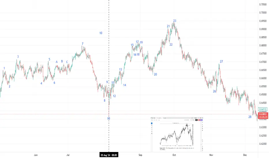
Three Peaks and Domed House
Identification Guidelines
Points Discussion
1, 2 This is the base. It may or may not appear and has no significance.
3, 5, 7 These points form the three peaks pattern. It’s not a triple top where price
needs to peak near the same price. The shape of the peaks may be flat or
pointed. The time between peak 3 and 7 is about 8 months.
4, 6, 8 These are valleys between peaks 3, 5, and 7. The drop to the valley floor
can be considerable (that is, the retrace of the move up from 2 to 3 can
be large).
8, 9, 10 This is the separating decline. Price drops in at least two selling waves (7 to 8
and 9 to 10). The word least suggests there can be multiple selling waves,
so be flexible. The separating decline divides the three peaks from the
domed house, making both look squarish.
10 Valley 10 is always lower than 4 or 6 and often lower than both.
11–14 Price bottoms at 10 and then recovers to form at least two valleys that test
the low at 10. The peaks and valleys here should look symmetrical, not
irregular.
14–23 or 27 The time from turn 14 to 23 should be 7 months and 8-to-10 days, but
the measure from 14 can include peak 27. In other words, be flexible
and don’t exclude a pattern because the duration is incorrect. If price
at 12 or 14 fails to test the low at 10 (or 12 or 14 are absent), then
try using valley 4 or 6 in the 7-month calculation to better predict the
domed house peak.
15 Price rises quickly and steeply to peak 15, forming the left wall of the
first story.
15–20 Look for price to form five waves here, 15–16, 16–17, and so on, ending
at 19–20. Price bounces between peaks and valleys, forming the firstfloor
roof.
20–21 This is the second story’s left wall. It’s the move up to 21 from 20.
21–25 This is the dome of the house. Price forms another set of peaks and valleys,
trying to move to a new high but failing.
25–27 Price drops from 25 and forms a wave 26–27, which may mirror the roof
from 15–20. Point 27, if tall enough, may be the right shoulder of a headand-
shoulders top formed by the move from 21–25.
27–28 Price drops all the way back to the level of point 10 (or close to it). The drop
may be a straight-line run down or it may have several retraces, but price
will eventually make it to the price of 10 (in theory).
Thomas_N_Bulkowski_Encyclopedia_of_Chart_Patterns_John_Wiley_&_Sons
Candlestick Patterns + Trend and Momentum: A Perfect CombinationCandlestick patterns provide valuable insights into price action, showing potential reversals, continuations, or market indecision. However, to significantly improve their effectiveness, combining candlestick analysis with trend and momentum indicators is essential. Here’s how you can use these combinations to trade with more confidence and accuracy.
1. Why Candlestick Patterns Matter
Candlestick patterns visually represent traders’ psychology through price movements, including four key prices: Open, Close, High, and Low. Some of the most common and useful patterns include:
Doji: Indicates market indecision and potential reversals.
Hammer & Hanging Man: Signals possible trend reversals at support or resistance.
Engulfing Pattern: Often marks the beginning of a significant reversal.
Morning/Evening Star: Combination patterns that strongly suggest a trend reversal.
2. Adding Trend and Momentum Indicators
Candlestick patterns alone might lead to false signals or confusion. By pairing them with other technical tools, such as moving averages, RSI (Relative Strength Index), or MACD (Moving Average Convergence Divergence), you gain crucial context to confirm the reliability of the patterns.
Here’s how:
Trend Alignment:
Using moving averages, such as the 20 or 50-period EMA, helps confirm whether a bullish candlestick pattern appears in an uptrend (strengthening the signal) or countertrend (potentially weaker signal).
Momentum Confirmation:
Oscillators like the RSI or MACD can confirm the underlying momentum behind a candlestick pattern. For instance, a bullish engulfing pattern becomes more reliable if it coincides with RSI moving upward from oversold territory or MACD showing a bullish crossover.
Volume Analysis:
Higher volume on the candle that forms the pattern typically confirms increased market interest and strengthens the validity of the signal.
3. Practical Example: Bullish Engulfing + RSI
Imagine you spot a bullish engulfing pattern forming at a clear support level after a downtrend:
Step 1: Identify the Pattern: Confirm the bullish engulfing visually.
Step 2: Check RSI: Ensure RSI is below 30 or rising, signaling oversold conditions and potential bullish momentum.
4. Why This Approach Works
Enhanced Accuracy: Combining candlestick signals with trend and momentum indicators increases signal reliability.
Improved Risk Management: Clearer signals mean more confident entries and better-defined stop-loss levels.
Reduces False Signals: Multiple confirmations reduce the risk of false breakouts or reversals.
5. Final Tips
Always look for multiple confirmations (trend, momentum, volume) before making trade decisions based solely on candlestick patterns.
Be patient—waiting for full confirmation can help avoid premature trades.
Regularly backtest and practice recognizing these combined signals to strengthen your trading strategy.

From Scanner to Trade: Full Workflow GuidesFrom Scanner to Trade: Full Workflow Guides
Table of Contents
Introduction
Why a Full Workflow is Crucial for Consistent Trading
Step 1: Defining Your Edge-What to Scan For
Step 2: Setting Up Scanners in TradingView
Step 3: Filtering & Ranking Potential Trades
Step 4: Deep Analysis-Technical, Fundamental, and Sentiment Checks
Step 5: Planning the Trade-Entries, Exits, and Risk
Step 6: Executing the Trade and Real-Time Adjustments
Step 7: Trade Management-Monitoring and Adapting
Step 8: Post-Trade Review and Journaling
Step 9: Tips, Case Studies, and Advanced Workflows
Conclusion: Making the Scanner-to-Trade Workflow Your Own
Introduction
What separates a consistent trader from someone who hops between strategies, never seeing results? Workflow.
The difference is as dramatic as preparing a gourmet moussaka with carefully layered ingredients versus tossing random ones into a pan.
As passionate trading tool creators, we know the power of process . Yet, most TradingView users stop at scanning for new tickers, rarely following a structured approach from scanning to trade selection , execution , and review . That’s where this in-depth guide comes in.
This article will walk you through a step-by-step workflow , using TradingView’s powerful features and easy-to-follow frameworks to help you transform from a chart-hopper into a methodical trader.
Let’s get started!
Why a Full Workflow is Crucial for Consistent Trading
Before we break down the process, let’s understand why a workflow matters.
Eliminates Guesswork : A workflow ensures every trade passes the same high standards, reducing emotional decisions.
Saves Time : Systematic filtering and ranking quickly highlight the best opportunities.
Improves Results : Backtests show that traders using a structured workflow outperform those who pick trades impulsively.
Enables Review : Every step can be reviewed post-trade, so you always know what worked and what didn’t.
The workflow is your trading “recipe.” Follow it, tweak it, and the results will come.
Step 1: Defining Your Edge-What to Scan For
Your workflow begins before you scan. First, define what you want to find. Are you a breakout trader, mean-reversion specialist, or a momentum chaser? Your edge -the reason you believe you can profit-should drive every scan.
Ask Yourself:
Do I want to catch squeeze breakouts with momentum?
Am I seeking multi-timeframe trend alignment?
Are volume spikes important for my entries?
Do I care about a stock’s fundamentals or just the chart?
Case Study: Finding Squeeze Momentum Setups
Suppose you love the squeeze momentum strategy. Your scanner should look for:
Low Bollinger Bandwidth (market coiling up)
Rising momentum (e.g., MACD turning up)
Volume spike confirming interest
This is your “ingredient list”-customize it to your taste and strategy.
Step 2: Setting Up Scanners in TradingView
TradingView’s Stock Screener is powerful, yet many traders barely scratch the surface. Here’s how to go beyond the basics.
2.1 Launching the Screener
Open any TradingView chart.
Click the Screener tab (bottom panel).
Choose Stocks , Crypto , or Forex according to your focus.
2.2 Customizing Your Filters
Set market (e.g., NASDAQ, NYSE, Crypto Top 100).
Add technical filters: price change %, RSI, MACD, volume, volatility, and, if available, squeeze momentum values (e.g., your custom script output).
Add fundamental filters if needed: EPS growth, P/E ratio, market cap, etc.
Example Setup: Squeeze Momentum Breakout Scan
Market: US stocks (selected in the screener)
Liquidity Filter: Volume × Price > 100M USD (focuses on liquid stocks and avoids thinly traded names)
Volatility & Momentum Filter: Vol Change > 10% (captures stocks with significant recent movement)
Minimum Price Filter: Price > 10 USD (to avoid penny stocks and illiquid tickers)
Volatility Squeeze Condition: 1. Bollinger Bands (20, 1 day) Lower above Keltner Channels (20, 1 day) Lower, and 2. Bollinger Bands (20, 1 day) Upper below Keltner Channels (20, 1 day) Upper (classic squeeze setup: BB inside KC highlights contraction/ready-to-expand momentum)
Calibration isn't about being perfect-it's about making your tools work better for specific markets.
2.3 Saving and Automating Your Scanner
Save your screener settings as a preset ( Save Screener Template ).
Set up alerts (once this feature becomes available in TradingView) so you’ll be notified when a new ticker matches your criteria.
Step 3: Filtering & Ranking Potential Trades
Your scanner likely spits out dozens of results. Time to filter and rank them, so you focus only on the “cream of the crop.”
3.1 The First Pass-Eliminate Noise
Skip tickers with low liquidity (e.g., daily volume < 100,000 shares for stocks).
Ignore assets with unreliable price action (wide spreads, frequent gaps).
Check for major news events or earnings that could cause unexpected volatility.
3.2 Ranking Your Candidates
Prioritize by:
Strength of signal (e.g., squeeze + multi-timeframe trend alignment)
Volume surge (higher is better)
Relative strength vs. benchmark (e.g., SPY, BTC)
Proximity to strong support/resistance (closer is often better for risk/reward)
Pro Tip: Create a Scorecard
Assign 1–5 points for each criterion and total up scores for each ticker. Focus on the top 3–5 results.
Don’t just “feel” your top picks-score them for objective clarity!
Step 4: Deep Analysis-Technical, Fundamental, and Sentiment Checks
With ranked candidates, now perform a deeper dive. This is where your experience and favorite tools come into play.
4.1 Charting and Technicals
Apply your key indicators (e.g., Squeeze Mom, Power Trends, Volume Profile).
Check price structure: higher highs/lows, base breakouts, wedges, etc.
Look for confluence: do different indicators and patterns agree?
4.2 Multi-Timeframe Confirmation
Check setup validity on daily, 4H, and 1H charts.
Does the larger trend support your trade, or are you trading against momentum?
4.3 Optional: Fundamental & Sentiment Checks
Is the company reporting earnings soon? Any big news?
For crypto, is there on-chain or social sentiment you should know about?
Example Workflow:
Chart 1: Daily Squeeze setting up, MACD positive, volume picking up.
Chart 2: 1H uptrend confirmed, minor pullback for entry.
News: No earnings for two weeks-less risk of surprise.
Step 5: Planning the Trade-Entries, Exits, and Risk
Now that you have a shortlist of well-vetted opportunities, it’s time to craft a plan. Failing to prepare is preparing to fail-so we layer in precise entries, realistic targets, and robust risk management.
5.1 Entry Strategies: The Art of Timing
Your scanner found potential, but your entry determines your reward-to-risk. Here’s how to approach it on TradingView:
Breakout Entry: Place buy-stop orders just above resistance or the squeeze “release” point.
Pullback Entry: Wait for a retrace to moving average or previous support, then enter on bullish reversal candle.
Confirmation Entry: Wait for indicator confirmation (e.g., Squeeze firing, MACD cross, volume surge) before pulling the trigger.
Great entries are less about prediction and more about preparation and confirmation.
Visualizing Your Entry
Draw horizontal lines at anticipated entry points ( Alt + J hotkey). Use TradingView’s “long position” tool to visualize profit/loss zones.
5.2 Setting Targets: Aim for Realistic Wins
Don’t hope-measure! Define exits before entering so emotion doesn’t sabotage your plan.
Price Target: Project a move based on past squeeze breakouts (e.g., last breakout ranged $4, set target for similar move).
ATR (Average True Range): Use ATR to estimate typical moves and avoid setting targets too far or too close.
Fibonacci Extensions: Use Fibs to find likely resistance/support for partial profits.
5.3 Stop Losses: Defend Your Capital
Risk management is your lifeline. Set stops where the trade idea is invalidated-not just at arbitrary numbers.
Below previous support or swing low (for long trades).
At technical invalidation-e.g., squeeze fails and price dips below the setup.
ATR-based stop (e.g., 1.5x ATR below entry).
Trade Example:
Entry: Breakout above $100.
Stop Loss: $97 (previous support, 1.5x ATR).
Target: $104 (measured move from last squeeze).
5.4 Position Sizing: How Much to Risk?
Golden Rule: Risk only a small percentage of your trading capital per trade.
Standard: 1–2% of account per trade.
Use TradingView’s position tool to measure.
Calculate shares/contracts based on distance from entry to stop.
Position sizing is the invisible lever that controls your trading destiny.
Step 6: Executing the Trade and Real-Time Adjustments
Execution bridges planning and reality. Even the best plans need discipline, fast reflexes, and the willingness to adapt if markets shift.
6.1 Entering the Trade: Be Precise
Use limit or stop orders, not market orders, to avoid slippage-especially in fast-moving assets.
Review your parameters one last time.
Set alerts using TradingView’s Alarm Clock icon for your entry, stop, and target.
// Basic Alert Example in Pine Script
if (ta.crossover(ta.sma(close, 9),ta.sma(close, 21)) )
alert("Bullish crossover detected", alert.freq_once_per_bar)
6.2 Monitoring During the Trade
Keep emotions out-let the process work. However, always watch for:
Sudden news events or market shocks.
Volume surges against your position.
Reversal candles (e.g., bearish engulfing at target zone).
6.3 Adjusting On-the-Fly
Sometimes, price action demands flexibility:
Move stop to break-even once price moves in your favor.
Scale out (sell a portion) at first target, let the rest run.
Exit early if your setup is invalidated (e.g., heavy volume reversal).
Adaptation is not abandoning the plan-it’s respecting the market’s message.
Step 7: Trade Management-Monitoring and Adapting
Trade management is an art that separates amateur from pro.
7.1 Trailing Stops and Locking Profits
Use trailing stops (fixed % or ATR-based) to lock in gains if price runs well past your target.
TradingView’s “long/short position” tool helps visualize your risk/reward as price moves.
7.2 Scaling In/Out
Scale in: Add to winners on confirmed strength (e.g., after strong breakout retest).
Scale out: Sell partial positions at key resistance/fib levels.
7.3 Dealing With Adverse Moves
If stop hit, close trade-review, don’t revenge trade.
If setup changes dramatically (e.g., news reversal), consider exiting early.
The best traders protect profits, not egos.
Step 8: Post-Trade Review and Journaling
By now, you’ve completed the trade-but the learning (and edge-building) is just beginning.
8.1 Review Every Trade: The Secret to Improvement
Did you follow your plan? If not, why?
What worked? What didn’t?
Were your scanner criteria effective?
Was your sizing/risk on point?
8.2 Journaling Your Workflow
Create a trade journal, either in TradingView’s notes or external tool (Notion, Google Sheets, etc.)
Screenshot entry/exit with annotations.
Log your scanner triggers and reasoning.
Add psychological notes: Were you calm or emotional?
Tag setups: “Earnings Squeeze,” “Breakout,” etc.
A detailed journal is your best trading mentor.
8.3 Performance Analysis
Periodically review your logs to spot patterns:
Which setups yield best R/R?
Where do you most often break your rules?
How does time of day/market impact outcomes?
Step 9: Tips, Case Studies, and Advanced Workflows
9.1 Expert Tips for Workflow Success
Automate alerts for scanner triggers-don’t stare at screens all day.
Batch your research (e.g., scan every evening, then focus only on finalists).
Develop a pre-trade checklist (see sample below).
Refine regularly: Tweak scanner filters as markets evolve.
// Sample Pre-Trade Checklist as Comments
// 1. Is the squeeze setup clear on multiple timeframes?
// 2. Is volume confirming the move?
// 3. Any major news/earnings ahead?
// 4. Stop loss + target realistic?
9.2 Real-World Case Study: Squeeze Momentum on TSLA
Imagine your scanner spits out NASDAQ:TSLA due to a tight squeeze and surge in volume.
Analyze the chart: Daily chart shows a strong squeeze setup with multi-timeframe squeezes firing bullish momentum (see the MTF Squeeze dashboard and green histogram). Volume spikes confirm buying interest. The 4H and daily timeframes are both aligned to the upside.
Check Earnings: Earnings are 30 days away, reducing the risk of event-driven surprises.
Trade Setup: Set entry just above the most recent swing high ( $197.5 ), with stop-loss below the support and squeeze base ( $186 ). The initial profit target is set at a measured move near $220 (prior swing high resistance and typical squeeze expansion).
Manage the Trade: Enter on breakout above $197.5; once price reaches around $208–$210, move stop to break-even. As price hits $220, sell half and trail the remainder using the 4H ATR or dynamic support.
Journal: “Setup fired as per screener and indicator alignment: volume spike, momentum, and squeeze breakout confirmed. Exited partial at target, managed risk throughout.”
9.3 Advanced: Multi-Timeframe, Multi-Asset Workflow
Combine scans across different assets (stocks, crypto, forex) using saved screener presets for catching opportunities globally. Create custom “watchlists” for different strategies, and rotate focus based on market conditions.
Stocks: Focus on squeeze breakouts.
Crypto: Seek mean reversion in sideways markets.
Forex: Look for multi-timeframe trend alignment.
Conclusion: Making the Scanner-to-Trade Workflow Your Own
Trading is not about prediction, but process. The difference between hope and edge is workflow-layered, adaptable, and reviewable.
By mastering the scanner-to-trade workflow, you can:
Act with confidence, not hesitation.
Avoid missed wins and costly emotional losses.
Turn complexity into clarity-one structured step at a time.
Start simple, layer in complexity as your skills grow, and let your journal be your improvement compass. The recipes here are just a foundation-make them your own, adapt them for your tools, markets, and goals.
Your next high-quality trade is just a repeatable workflow away.
Happy trading and happy building!

TWAP and Chaikin's Osc vs VWAP Orders and VWAP IndicatorThere are two primary Order Types that the Professional Side of the market use.
1. Time Weighted at Average Price, aka TWAP , is used extensively by the Dark Pool Buy Side, Derivative Developers, and Sell Side Banks of record for Buybacks for corporations.
The TWAP can be set at a penny to few pennies spread and pings and transacts on a specific TIME to PRICE. It can be set to time intervals shorter or longer. This is why the stock market is called "fully automated".
TWAP is used most of the time. It is rare for the Giant Institutions to use VWAP orders due to the May 2010 FLASH CRASH when a fundamental trader of e-minis accidentally hit the VWAP order type rather than the TWAP order type which caused a massive collapse of all stocks as VWAPs accelerate selling as volume increases.
2. Volume Weighted at Price or VWAP is ALSO an ORDER TYPE. It is primarily used by Small Funds Managers and Small Asset Managers who are independents trading their customers' investment money actively, often intraday. Volume Weighted at price ORDER TYPES are also automated and ping to trigger the order to transact as volume increases.
This is an easy, simple way for a busy small fund manager to cope with the complexity of buying and selling stocks with 10,000 share lots to 100,000 share lots. These are the NEW "whales" of the market.
Professional Traders Swing trade 1 million to 5 million or higher share-lot sizes. The size of the orders of the professional trader has increased significantly in the past decade.
All of you need to be aware of the market participants on the professional side as they control 80% of the 1 trillion dollars that exchange hands daily on the US Markets.
Using Chaikin's Oscillator is ideal for tracking the Dark Pool Buy Side who create the bottoms. This excellent indicator analyzes all 3 data sets: price, volume and time. Thus, it can signal early that the Dark Pools have slowly started to accumulate over time and the runs down will turn into a bottom and then pro traders will nudge price to inspire VWAP orders from the Smaller funds managers.
The VWAP INDICATOR is excellent for tracking the smaller funds managers' trading activity and it ALSO has price, volume, and time in the formula. So this is great for those of you who need an indicator for following smaller funds activity as these smaller funds VWAP orders trigger more and more volume and then runs that can move up or down for several days.
TradingView has an awesome group of indicators to use. You should customize your indicators to which market participant groups you wish to track so that you can be ready and in a position before the big runs up or down.
Trade Wisely,
Martha Stokes CMT

Gravions IG: Why Apple's Shift to India Could Trigger a Drop in Apple is betting heavily on changing its production geography, planning to move a significant portion of iPhone assembly from China to India by 2026. Analysts at Gravions IG have assessed the situation and concluded that this move could negatively impact the company’s stock value in the near term.
Key Risks of Production Relocation
Indian manufacturing facilities, although growing rapidly, have not yet achieved the level of quality and logistical efficiency seen at Chinese plants. Gravions IG emphasizes that reconfiguring production processes takes time, and potential disruptions in supply chains or reduced quality in the early batches could trigger dissatisfaction among consumers and partners.
According to their analysis, the transition could increase product costs and squeeze profit margins, putting pressure on Apple’s financial results over the next few quarters.
Investor Reactions
Current market behavior reflects investor caution: Apple's share price has already fallen nearly 17% since the start of the year, with technical indicators suggesting further declines. The formation of a "death cross" — where the 50-day moving average crosses below the 200-day moving average — heightens concerns about a prolonged downtrend.
Gravions IG stresses that until the Indian production lines are fully operational and stable, Apple's stock will likely remain under selling pressure.
Strategic Perspective: Opportunity or Risk?
In the long run, diversifying manufacturing could benefit Apple by reducing its dependence on China and insulating it from potential geopolitical or economic shocks. Additionally, the Indian government's efforts to bolster its manufacturing sector could provide Apple with a stronger foundation for future expansion.
Still, Gravions IG insists that until Indian facilities reach consistent quality and scale, Apple will be vulnerable to market sentiment swings and potential reputational risks.
Conclusion
Relocating production is a strategically sound but high-risk move for Apple in the short term. Gravions IG advises investors to closely monitor product quality and supply chain stability in India before making long-term investment decisions regarding Apple's stock.

Forex Grid Trading Overview: Practical Guide for 2025Forex Grid Trading Strategy: Detailed Overview & Low-Risk EUR/USD Application
1️⃣ What Is Grid Trading?
A grid trading strategy places a series of **buy** and **sell** orders at fixed intervals (“grid levels”) above and below a base price, without forecasting market direction. As price oscillates, it triggers orders across the grid, locking in small profits on each swing.
- **No Directional Bias** – Profits on both up- and down-moves
- **Automated Entry/Exit** – Ideal for Expert Advisors (EAs) on MT4/MT5
- **Scalable** – Grid size and lot sizing can be tailored to account size and volatility
2️⃣ How It Works – Core Components
1. **Grid Levels**
- Define a **base price** (e.g. current EUR/USD mid)
- Set **intervals** (e.g. every 20 pips) above/below the base
2. **Orders**
- **Buy Limit** orders at 20, 40, 60 pips below base
- **Sell Limit** orders at 20, 40, 60 pips above base
3. **Take Profit (TP) for Each Order**
- TP typically equals the grid interval (e.g. 20 pips) so each triggered order nets a small profit
- No hard Stop Loss per order—risk is managed via overall exposure
4. **Cumulative P&L**
- Winning trades roll profits into the floating drawdown of unfilled orders
- As price oscillates, the grid “locks in” incremental gains
3️⃣ Pros & Cons
| Pros | Cons |
|---------------------------------------|------------------------------------------|
| ✅ Profits in ranging markets | ❌ Can incur large drawdowns in strong trends |
| ✅ Automated, systematic execution | ❌ Requires significant margin for multiple open trades |
| ✅ Scalable to any time-frame | ❌ Floating negative exposure if grid one-sided |
---
✅Low-Risk Best Practices
1. **Grid Spacing & Width**
- Wider grid intervals (e.g. 30–50 pips) reduce order density and margin use
- Use **ATR** (Average True Range) to adapt spacing to EUR/USD volatility
2. **Lot Sizing & Equity Risk**
- Risk ≤ 1–2% equity per full grid cycle
- Use **fixed fractional** sizing: each order size = (Equity × 1%) / (max number of open grid orders)
3. **Drawdown Control**
- **Maximum Open Orders** cap (e.g. 5 orders per side)
- **Equity Stop-Out**: if floating drawdown exceeds e.g. 10% of equity, close all orders
4. **Trend Filters**
- Use a **200-period SMA** or **ADX** filter: only enable sell grid if price < SMA (downtrend) or ADX < 25 (low momentum)
- Disables grid in strong one-way trends
5. **Grid Shifting / Re-Base**
- After a net grid profit, **shift** the base price to current mid to reset exposure
- Prevents runaway open trades far from current price
5️⃣ Step-by-Step: Applying to EUR/USD
1. **Choose Time-Frame**
- **H4 or H1** recommended: balances signal frequency and margin needs
2. **Define Grid Parameters**
- **Base Price:** current EUR/USD mid (e.g. 1.0980)
- **Interval:** 30 pips (≈ recent ATR on H4)
- **Levels:** 3 buys at 1.0950 / 1.0920 / 1.0890; 3 sells at 1.1010 / 1.1040 / 1.1070
3. **Set Order Size**
- Account equity $10 000, risk 1% = $100 per full grid
- Max open orders 6 → each order $100/6 ≈ $16.7 → ≈ 0.02 lots
4. **Configure TP & No SL**
- Each order TP = 30 pips (equals interval)
- No per-order SL; overall drawdown managed by equity stop
5. **Implement Filters**
- Only open **sell** grid if H4 close < 200-SMA; only open **buy** grid if H4 close > 200-SMA
- Pause grid if ADX > 30 (strong trend) or market events (e.g. NFP, ECB rate decision)
6. **Deploy & Monitor**
- Run on MT4 with an EA or semi-automated Expert Advisor
- Monitor margin usage; adjust grid or disable before major news
6️⃣ Example P&L Mechanics
| Trigger Price | Order Type | Entry | TP Target | Profit (pips) |
|---------------|------------|---------|-----------|---------------|
| 1.0950 | Buy Limit | 1.0950 | 1.0980 | 30 |
| 1.0980 | Sell Limit | 1.0980 | 1.1010 | 30 |
- If price moves down to 1.0950: buy executes, TP at 1.0980 nets +30 pips
- If price then climbs above base, sells trigger at 1.1010 nets +30 pips
2️⃣ Introducing Progressive & Regressive Scaling
🔼 2.1 Progressive Scaling
“Let winners run”—increase exposure after success
Concept: After each profitable grid cycle, step up your lot size by a fixed increment.
Why: Capitalizes on momentum and winning streaks.
How to apply:
Base Lot: 0.02 lots per order (1% equity risk).
After grid closes net-positive, next cycle = 0.03 lots.
Continue stepping up (0.04, 0.05 …) until a drawdown or equity-stop is hit.
Reset back to base lot after a losing cycle or whenever floating drawdown > 5%.
Caps & Safeguards:
Max Lot Cap: Never exceed 0.10 lots (or 2% equity risk).
Equity Stop: If floating drawdown > 10%, close cycle & reset.
🔽 2.2 Regressive Scaling
“Protect the downside”—reduce exposure after losses
Concept: After a losing grid cycle, step down your lot size to conserve capital.
Why: Limits damage during rough periods and preserves margin.
How to apply:
Base Lot: 0.02 lots per order.
If grid hits equity-stop or nets negative, next cycle = 0.015 lots.
Continue stepping down (0.01, 0.005) until you record a net-positive cycle.
Reset to base lot after recovery (e.g. two consecutive winning cycles).
Thresholds:
Don’t drop below 0.005 lots (to avoid over-shrinking).
After two winning cycles at reduced lot, return to base.
✅ Bottom Line
Forex grid trading on EUR/USD can generate steady gains in choppy markets—but demands **strict risk controls** (grid spacing, lot sizing, drawdown limits) and **trend filters** to avoid large losses in trending conditions. When properly applied, a low-risk grid on EUR/USD offers a robust, mostly hands-off strategy for capturing repetitive market swings.
4️⃣ Key Takeaways
Progressive Scaling lifts lot sizes on winning streaks, amplifying gains—but must be capped and reset on losses.
Regressive Scaling shrinks exposure after drawdowns, preserving capital until the strategy recovers.
Combine both with your grid’s risk parameters, trend filter, and a solid equity-stop to maintain a balanced, low-risk EUR/USD grid.
By layering scaling rules atop your grid, you adapt dynamically to market performance—maximizing winners and protecting against prolonged losing runs. Good luck! 🚀

Geld Vision Investing with values — how ESG is changing More and more people today not only want to earn money, but also want to know where their money is going and what impact it is having . They want to invest in projects that are not only profitable, but also responsible and sustainable. This is precisely where the ESG investing approach comes into play—a concept in which returns and responsibility go hand in hand.
We explain in a simple and understandable way what ESG means, how it works and why this approach will become increasingly important in 2025.
What does ESG mean?
ESG stands for three central principles:
E — Environmental: Climate protection, CO₂ emissions, resource conservation, waste prevention
S — Social: fair working conditions, human rights, diversity and inclusion
G — Governance: Transparency, anti-corruption, ethical leadership
Companies with high ESG ratings try to act responsibly towards people, the environment and society.
Why invest in ESG?
ESG investing combines ethical values with economic rationality. The benefits are obvious:
Fewer risks. Companies with clear ESG policies are less likely to experience scandals or legal problems.
Long-term stability. Sustainable companies are more resilient to crises and more future-oriented.
Good reputation. Companies with strong values gain trust from customers and partners.
Political support. More and more countries are promoting sustainable economic activity.
The platform allows users to specifically search for ESG-compliant companies and funds and track their development.
ESG and returns – contradiction or win-win?
A common misconception: Companies that operate sustainably earn less. In fact, the opposite is often true.
Numerous studies show that ESG companies perform better in the long term because they:
be managed more efficiently,
respond better to crises,
Attract investors and talent more strongly,
be on the safe side from a regulatory perspective.
Sustainability and profit are not mutually exclusive – they complement each other.
How do I get started with ESG investing?
Clarify your own values. What's important to you? The environment, fair working conditions, equality?
Analyze companies. Many companies publish ESG reports that provide information about their goals and progress.
ESG funds are reviewed. These funds pool audited companies with good ESG ratings.
Review performance regularly. ESG is not a fad, but a long-term approach with measurable results.
GeldVision offers tools that allow you to filter, analyze, and incorporate ESG data into your investment strategy.
In which industries does ESG play a major role?
Renewable energies — solar, wind, hydrogen
Sustainable consumption — environmentally friendly packaging, recycling
Technology and digitalization — inclusive and ethically managed companies
Education and health — socially relevant sectors with great impact
FinTech — Platforms that make investing more transparent and fairer
The ESG approach can be applied across industries—it is not a trend, but a new way of thinking.
Who relies on ESG?
Young investors. Generation Z and Millennials value values.
Large investment funds. ESG is an integral part of their strategy.
Private investors. People who want to make a positive impact with their money.
So ESG is no longer just for idealists — it has become mainstream .
What does Money Vision offer?
The platform helps users invest with a clear conscience. It offers:
Access to ESG rankings and sustainability data
Filters for targeted investment decisions
Market analyses on green and social trends
Support in building a balanced portfolio
Whether you’re a beginner or a professional, Geld Vision makes sustainable investing easier and more transparent.
ESG investing is more than just a trend. It's a new, future-oriented perspective on money, markets, and responsibility.
You can invest today without betraying your values —and still achieve attractive returns. With the right knowledge, the right tools, and platforms like Geld Vision, sustainable investing becomes a true success model.
Because investing responsibly means making profits while contributing to a better world.

Technical Analysis Indicators Cheat SheetHello, traders! 🦾
This cheat sheet provides a comprehensive overview of the most widely used technical analysis indicators. It is designed to support traders in analyzing trends, momentum, volatility, and volume.
Below, you’ll find a handy screenshot of this Cheat Sheet that you can save and peek at whenever you need a quick, friendly refresher on your trading indicators. ;)
1. Trend Indicators
These tools identify the direction and strength of price movements, critical for trend-following strategies.
Moving Averages (MA)
Simple Moving Average (SMA) and Exponential Moving Average (EMA) smooth price data to highlight trends. Crossovers (e.g., 50-day vs. 200-day MA) signal potential trend shifts.
MACD (Moving Average Convergence Divergence) – Tracks the difference between two EMAs, paired with a signal line to generate trade signals. A bullish crossover occurs when MACD rises above the signal line.
Parabolic SAR. Places dots above or below the price to indicate trend direction. Dots below the price suggest an uptrend; above, a downtrend.
ADX (Average Directional Index)
Measures trend strength (0–100). Values above 25 confirm a robust trend; below 20 indicate consolidation.
2. Momentum Indicators (Oscillators)
These indicators assess price movement speed and highlight overbought or oversold conditions.
RSI (Relative Strength Index)
Ranges from 0 to 100, with values above 70 indicating overbought conditions and below 30 indicating oversold. The divergence between the RSI and price can signal impending reversals.
Stochastic Oscillator –Compares closing price to the price range over a period (0–100). Above 80 is overbought; below 20, oversold. %K and %D line crossovers provide precise trade signals.
CCI (Commodity Channel Index) – Measures price deviation from its average. Readings above +100 indicate overbought; below -100, oversold.
Williams %R – Similar to Stochastic, it measures distance from the period’s high (0 to 100). Above -20 is overbought; below -80, oversold.
3. Volatility Indicators
These tools quantify price fluctuation ranges to optimize trade timing.
Bollinger Bands – Comprises a 20-day SMA and two bands (±2 standard deviations). Narrow bands reflect low volatility; wide bands indicate high volatility. A price touching the outer bands may signal a reversal or trend continuation, depending on the context.
ATR (Average True Range) – Calculates the average price range over a period to gauge volatility. Higher ATR values denote greater market movement.
4. Volume Indicators
Volume-based indicators validate price movements and highlight market participation.
OBV (On-Balance Volume) – Cumulates volume to confirm price trends. The rising OBV, alongside rising prices, supports an uptrend. OBV divergence from price may foreshadow reversals.
Volume Oscillator – Compares two volume moving averages to evaluate buying or selling pressure. Positive values suggest stronger buying. It typically confirms breakouts or assesses the sustainability of a trend.
Chaikin Money Flow (CMF) – It analyzes money flow based on price and volume. Positive CMF indicates buying pressure; negative, selling pressure.
5. Other Key Indicators. Advanced Tools for Deeper Market Analysis.
Ichimoku Cloud – Combines five lines and a “cloud” to assess trend, momentum, and support/resistance. Price above the cloud signals an uptrend; below, a downtrend. Cloud thickness reflects the strength of support or resistance levels.
Fibonacci Retracement – Maps potential support and resistance using Fibonacci ratios (23.6%, 38.2%, 50%, 61.8%).
Pivot Points – Derives support (S1, S2) and resistance (R1, R2) levels from the prior period’s high, low, and close.
Skills to Sharpen for Smarter Trading
Successful traders often find that combining indicators from different categories yields better results. For instance, pairing a trend-based EMA with a momentum indicator like RSI can help confirm signals more reliably — much like crafting the perfect coffee blend, where balance is everything.
Many also realize that stacking similar tools, such as using both RSI and Stochastic, tends to clutter the picture rather than clarify it. A focused set of indicators usually proves more effective.
Another common practice is backtesting setups on historical data to understand how strategies perform in specific markets and timeframes. It’s a way to rehearse before stepping onto the stage.
Ultimately, those who see consistent results tend to integrate indicators into a coherent strategy rather than reacting to every signal. That clarity often makes all the difference
Many of these indicators, from MACD to Bollinger Bands, are readily available on platforms like TradingView, making it easy to apply them to your charts.
Subscribe and let us know which of these indicators intrigues you the most so we can explore it further in our next post!
Good luck! 👏

S&P 500: The Indicator to Watch Right NowWith US stocks bouncing on Trump’s backtracking over tariffs — just weeks after a 20% correction — it’s fair to say caution is the name of the game. Even though the headline risk has eased slightly, markets are still navigating through a fog of geopolitical noise and economic uncertainty.
In moments like these, where the fundamental picture feels muddy at best, objective technical analysis can offer clarity — not crystal-ball predictions, but structure and focus.
The Traditional Technical Backdrop
Traditional technical analysis isn’t about magic lines on a chart — it’s about mapping out price behaviour with tools that help us stay grounded. Structural levels, trendlines, and a couple of moving averages might seem basic, but they’ve stood the test of time because they do something incredibly useful: they make sense of chaos.
In the case of the S&P 500, several key structural levels should anchor any serious analysis. We’ve got the pre-sell-off highs from February, the April lows, and two interim levels — broken support levels that flipped to resistance during retracement rallies between February and April. These levels now act like milestones in the market’s memory.
Drawing a downward-sloping trendline through the swing highs during the correction gives us a good sense of the broader downtrend. More recently, we’ve also started to see a modest uptrend emerge from the April lows. That creates something of a wedge formation — a narrowing range that’s coiling tighter as buyers and sellers battle it out.
Simple moving averages like the 50-day and 200-day are useful additions here. While they’re lagging by nature, they give us immediate context for where price sits in relation to recent momentum and long-term sentiment.
US500 Daily Candle Chart
Past performance is not a reliable indicator of future results
The Indicator to Watch
There’s a good argument to be made that the most important indicator to watch right now, with the S&P 500 trying to claw back ground, isn’t a moving average or RSI — it’s Anchored VWAP.
Anchored Volume-Weighted Average Price (VWAP) is one of the most effective ways to cut through the noise and see who’s really in control — buyers or sellers. It tells you the average price that traders have paid for the index, weighted by volume, since a specific event or turning point. And unlike regular VWAP that resets daily, Anchored VWAP lets us choose a significant date and track how price interacts with that “anchor.”
If we anchor the VWAP to the February highs, we’re essentially tracking how the market has performed relative to that peak. This anchored VWAP line becomes a kind of gravity — it reflects the average cost basis of those who bought just before the sell-off. If price remains below it, it tells us those buyers are still underwater, and therefore less likely to add risk. Sellers, in that case, still hold the advantage.
On the flip side, if we anchor VWAP to the April lows, we get the average cost basis of the recent bounce. This line reflects where more optimistic, bottom-fishing buyers stepped in. If price holds above this level, it suggests those participants remain in profit — and potentially willing to buy dips.
Right now, the S&P 500 is stuck in a battle between these two anchored VWAP levels. One tracks the pain, the other tracks the hope. It’s a VWAP funnel, and it won’t last forever. Eventually, price will break above one and leave the other behind — and when it does, we’ll have an objective answer as to which side is winning.
Will it be the late bears holding on from February’s highs, or the early bulls from the April lows? The answer is coming. Keep your eyes on the anchored VWAPs — they’re telling the real story.
US500 Daily Candle Chart
Past performance is not a reliable indicator of future results
Disclaimer: This is for information and learning purposes only. The information provided does not constitute investment advice nor take into account the individual financial circumstances or objectives of any investor. Any information that may be provided relating to past performance is not a reliable indicator of future results or performance. Social media channels are not relevant for UK residents.
Spread bets and CFDs are complex instruments and come with a high risk of losing money rapidly due to leverage. 83% of retail investor accounts lose money when trading spread bets and CFDs with this provider. You should consider whether you understand how spread bets and CFDs work and whether you can afford to take the high risk of losing your money.

How To Customize The 1 Minute Scalping IndicatorThis tutorial explains each setting of the 1 Minute Scalping Indicator in detail so you understand exactly how to adjust your settings to get the results you would like from the indicator.
Here is a list of the details we discuss:
How to fix loading errors
Tooltips that explain each setting for your reference
Trade modes and how they are affected by other settings
Average candle size rejection parameters
Higher timeframe candle filters, settings and levels
External indicator trend filtering capabilities and how to set them up correctly
Stoploss and take profit calculations and settings you can adjust
Signal arrow customization options
Candle coloring adjustments
Visual/styling options
Make sure to watch the whole video so you fully understand how each setting affects the indicator for best results.

Why All You Need Is the Chart: Let the Market Speak FirstYou missed the news? Doesn’t matter. The chart already heard it for you.
________________________________________
1. The Myth of Being “Informed”
Modern traders feel pressured to be constantly plugged in:
• Twitter alerts
• Trump’s latest outburst
• CNBC headlines
It feels like you’re missing out if you’re not watching everything.
But here’s the truth:
By the time you read the news, the market already priced it in.
Being "informed" doesn’t make you early . It usually makes you late .
________________________________________
2. The Chart Already Knows
Imagine a bullish surprise in the economy. You didn’t catch it live.
But when you open your chart, you see this:
📈 A bullish engulfing candle bouncing cleanly off major support.
That’s all you need. That’s your trade. You don’t need to know why it happened.
The chart speaks last. And the chart speaks loudest.
________________________________________
3. Price Is the Final Judge
All the noise — opinions, reports, breaking headlines — flows into a single output: price.
• Economic collapse? The chart shows a break.
• Political turmoil? Price still rejects resistance.
Price is truth.
Instead of asking: " What happened? ", start asking: " What is price doing? "
________________________________________
4. Real-Life Analogy
You don’t need to read the newspaper to know it’s raining. Just look out the window. 🌧️
Same with trading. Just look at the chart.
The price is your weather forecast. React to that. Not to noise.
________________________________________
5. What to Do Instead of Watching News:
• Draw clean support/resistance levels
• Wait for real confirmation (engulfings, breakouts, rejections)
• Manage risk — always
• Be patient. Let the market show its hand
________________________________________
Final Thought:
If something important happened, you’ll see it on the chart. You don’t need 10 sources. You don’t need speed. You need clarity.
Let the chart speak. It knows more than the news ever will.

What Is the Advance-Decline (A/D) Line, and How Can You Use ItWhat Is the Advance-Decline (A/D) Line, and How Can You Use It in Trading?
The Advance-Decline (A/D) Line is a widely used market breadth indicator that provides insights into the strength of trends by tracking advancing and declining stocks. Popular among traders analysing indices like the NASDAQ, it helps identify broad participation or hidden divergences. This article explores how this indicator works and its role in effective market analysis.
What Is the Advance-Decline Line?
The Advance-Decline (A/D) line, also known as the Advance-Decline Index, is a popular market breadth indicator used to gauge the overall health of a market's movement. Instead of focusing solely on price changes in an index, it analyses how many stocks are participating in the market's rise or fall. This makes it particularly useful for traders looking to understand whether a trend is supported by widespread participation or driven by just a handful of stocks.
The indicator can be set up based on stocks on different exchanges. For example, a NYSE Advance-Decline line provides insights into NYSE-listed stocks. However, it can be applied to any index or exchange, resulting in the Nasdaq Advance-Decline line or a line based on stocks listed in the UK, Australia, Europe, or Japan.
At its core, the A/D line is a cumulative measure of the net advances of stocks on a given day. The calculation is as follows:
1. Count the number of advancing stocks (those that closed higher than their previous close).
2. Count the number of declining stocks (those that closed lower than their previous close).
3. Subtract the number of declining stocks from the advancing stocks to get the net advance.
4. Add this net advance to the previous day’s A/D line value.
Formally, the Advance-Decline line formula is:
Net Advances = Advancing Stocks − Declining Stocks
Current A/D Line Value = Previous A/D Line Value + Net Advances
For example, if 500 stocks advanced and 300 declined on a given day, the net advance would be +200. If yesterday’s A/D Line value was 10,000, today’s value would be 10,200. Over time, these daily values form a line that tracks the cumulative net advances.
The indicator provides insights into sentiment. A rising line indicates more advancing stocks than declining ones, while a falling line suggests the opposite. Traders often use this data to determine whether a price trend in an index reflects broad strength or is being carried by a few heavyweights.
Understanding Market Breadth
Market breadth measures the extent to which individual assets are contributing to a market's overall movement, providing a clearer picture of the strength or weakness behind trends. Rather than relying solely on an index's price performance, breadth gives traders insights into how widespread participation is within a rally or decline. This information is crucial for understanding whether market moves are broad-based or concentrated in a few influential assets.
A market with a strong breadth typically sees most stocks or assets moving in the same direction as the overall trend. For example, during a rally, broad participation—where a large percentage of assets are advancing—signals a robust and healthy trend. Conversely, weak breadth occurs when only a small group of assets drives the movement, potentially indicating fragility in the trend. This is especially important in large indices where a few heavily weighted assets can mask underlying weaknesses.
How Traders Use the A/D Line
The A/D Line is more than just a market breadth indicator—it’s a practical tool traders use to gain insight into the strength and sustainability of trends. By analysing how the indicator behaves in relation to price movements, traders can uncover potential hidden opportunities and spot potential risks. Let’s consider how the Advance-Decline line behaves on a price chart.
Identifying Trend Strength
One of the A/D Line’s key uses is evaluating the strength of a market move by examining overall participation. When both the A/D Line and an index rise together, it suggests widespread buying activity, with most stocks contributing to the rally. Similarly, if both the index and the A/D Line decline, it often reflects broad-based selling, indicating that weakness is widespread across the market rather than concentrated in a few assets.
Spotting Divergences
Divergences between the A/D line and price are closely watched by traders. For instance, if an index continues to rise but the A/D line starts declining, it could signal that the trend is losing momentum. Conversely, when it begins rising ahead of a price recovery, it may suggest underlying strength before it becomes apparent in price action.
Complementing Other Indicators
Traders often pair the A/D line with other tools to refine their analysis. For example, combining it with moving averages or oscillators like RSI can help confirm signals or highlight discrepancies. A rising A/D line alongside RSI rising above 50 might reinforce the possibility of a price rise.
Strengths of the A/D Line
The A/D line is a widely respected tool for understanding market dynamics, offering insights that price-based analysis alone can’t provide. Its ability to measure participation across a broad range makes it especially valuable for traders looking to assess sentiment and trend reliability. Let’s explore some of its key strengths.
Broad Market Perspective
The A/D line captures the performance of all advancing and declining stocks within an index, offering a comprehensive view of how much support a trend has. Instead of focusing solely on a handful of large caps that often dominate indices, the indicator reveals whether the majority are moving in the same direction. This helps traders gauge the true strength of a rally or decline.
Early Warnings of Weakness or Strength
Divergences between the A/D line and the price can act as an early signal of potential changes in momentum. When the A/D Line deviates from the overall trend, it can highlight areas where market participation is inconsistent. This allows traders to assess whether a trend is gaining or losing support across a broad range of assets, offering clues about potential shifts before they fully materialise in price action.
Applicability Across Markets
Another strength is its versatility. The A/D line can be applied to indices, sectors, or even individual markets, making it useful across various trading strategies. Whether monitoring a broad index like the S&P 500 or a specific sector, the indicator can be adapted to provide valuable insights.
Limitations of the A/D Line
While the A/D line is a useful tool for analysing breadth, it isn’t without its limitations. Traders need to understand its drawbacks to use it effectively and avoid potential misinterpretations. Here are some of the key challenges to consider.
Ignores Stock Weighting
One major limitation is that the A/D index gives equal weight to every stock, regardless of size or market capitalisation. In indices like the S&P 500, where a small number of large-cap stocks often drive performance, this can create a disconnect. For example, a large-cap stock’s strong performance might lift an index while the indicator shows weakness due to low-caps underperforming.
Vulnerability to Noise
The index can produce misleading signals in certain conditions, such as during periods of low trading volume or heightened volatility. Market anomalies, such as large fluctuations in a small number of stocks, can skew the indicator and make it less reliable. This can be especially problematic in thinly traded assets or at times of high speculation.
Not a Standalone Indicator
The A/D line is combined with other tools. On its own, it doesn’t account for factors like momentum, valuation, or sentiment, which can provide critical context. Traders relying solely on it may miss out on key details or overemphasise its signals.
Comparing the A/D Line with Other Market Breadth Indicators
The A/D Line is a powerful tool, but it’s not the only market breadth indicator traders use. By understanding how it compares to other indicators, traders can select the one that suits their analysis needs or combine them for a more comprehensive view.
A/D Line vs Advance-Decline Ratio
The A/D Ratio measures the proportion of advancing to declining stocks. While the A/D line provides a cumulative value over time, the ratio offers a snapshot of market breadth for a single trading day. The A/D Ratio is often better for identifying short-term overbought or oversold conditions, whereas the A/D line excels at tracking long-term trends.
A/D Line vs McClellan Oscillator
The McClellan Oscillator uses the same advancing and declining stock data but applies exponential moving averages to calculate its value. This approach makes the McClellan Oscillator more sensitive to recent market changes, allowing it to highlight turning points more quickly than the A/D line. However, the A/D line’s simplicity and cumulative nature make it more straightforward to interpret for broader trend analysis.
A/D Line vs Percentage of Stocks Above Moving Averages
This indicator tracks the percentage of stocks trading above specific moving averages, such as the 50-day or 200-day. While the A/D line focuses on daily advances and declines, the moving average approach highlights whether stocks are maintaining longer-term momentum. The A/D line provides a broader perspective on participation, whereas this indicator zeros in on sustained trends.
The Bottom Line
The Advance-Decline line is a valuable tool for traders seeking deeper insights into market trends. By analysing market breadth, it helps identify potential opportunities and risks beyond price movements alone.
FAQ
What Is the Meaning of Advance-Decline?
Advance-decline refers to the difference between the number of advancing stocks (those that closed higher) and declining stocks (those that closed lower) on a specific trading day. It’s commonly used in market breadth indicators like the NYSE Advance-Decline line to measure the overall strength or weakness of the market.
How to Find Advance-Decline Ratio?
The Advance-Decline ratio compares advancing stocks to declining stocks in an index. It is calculated by dividing the number of advancing stocks by the number of declining stocks.
How to Use an Advance-Decline Line Indicator?
The A/D line indicator tracks the cumulative difference between advancing and declining stocks. Traders analyse its movement alongside price trends to assess market participation. For example, divergence between the A/D line and an index price direction can signal potential changes in momentum.
What Is the Advance-Decline Indicator Strategy?
Traders use the Advance-Decline indicator to analyse market breadth, identify divergences, and confirm trends. For example, a rising A/D line with an index suggests broad participation, while divergence may signal weakening trends.
This article represents the opinion of the Companies operating under the FXOpen brand only. It is not to be construed as an offer, solicitation, or recommendation with respect to products and services provided by the Companies operating under the FXOpen brand, nor is it to be considered financial advice.

Are You Backtesting or Backfilling Your Ego?You build the setup.
You run the test.
It’s not quite what you hoped for…
So you tweak it. Then tweak it again. Then again. And again.
Before you know it, you’re not testing a strategy anymore
you’re editing reality until it flatters you.
That’s not refinement.
That’s backfilling your ego.
The urge to make it look right
We’re human.
Nobody likes drawdowns.
Inconsistency feels uncomfortable.
And let’s be real.. win-rates under 50% just look bad.
We don’t want to see our promising idea fall apart in the data.
So instead of facing it, we start sculpting the results to make them easier to accept.
We don’t want to see our promising idea fall apart in the data.
So instead of facing it, we start sculpting the results to make them easier to accept.
Widen the stop just a little.
Tighten the take-profit, Perfect! Now my win-rate is 60%
Add a filter that “feels logical.”
Nudge the indicator setting.
Remove the choppy day, “that was news anyway.”
And just like that, the curve is smoother.
The stats are cleaner.
You feel better.
But here’s the problem:
You’re not building a strategy that works.
You’re building a strategy that looks like it works.
Optimization isn’t the enemy, but your intentions might be
Of course, tuning is part of the process.
You should test different inputs and variables.
But stop and ask yourself: why are you doing it?
If you're refining to understand the behavior of your system, that’s good.
If you're changing things to avoid discomfort? That’s not testing. That’s denial.
The market doesn’t care how hard you worked.
It doesn’t reward effort. It rewards resilience.
If your strategy only performs when everything’s perfectly aligned
when the moving average is exactly 13.53661,
and the RSI is 42.122 instead of 40,
and your entry is two bars after a wick touch…
Then you don’t have a strategy.
You have a sandcastle.
And when the tide shifts, it’s gone.
All because you wanted it to work so badly, you sculpted the data until it told you what you wanted to hear.
A strategy worth trading doesn’t just survive the good times
Anyone can build a system that performs in a trending market.
Or when volatility is ideal.
Or when the dataset ends right before the storm hits.
But markets don’t hand out clean conditions on demand.
So ask yourself:
Have you tested your strategy in stress conditions?
Have you run it through market noise, sideways action, volatility spikes, and traps?
Have you studied its worst stretch and still said, “Yes… I’d take these trades”?
Because if the answer is no, your system isn’t ready.
You’re not building a strategy to trade.
You’re building one to feel safe.. and that’s far more dangerous.
Break it before the market does
The best traders do the opposite of comfort:
They try to break their systems before live money does it for them.
Run a Monte Carlo simulation.
Shuffle the order of trades.
Randomize outcomes.
Apply slippage or missed entries.
If your equity curve collapses under that pressure, if your belief in the system evaporates when the trades aren’t perfectly sequenced, then you didn’t build robustness.
You built a lucky curve.
Loss streaks aren’t a bug, they’re the cost of playing
Too many traders design systems that avoid losing…
instead of building ones that know how to lose..
Every real edge has pain points.
Every equity curve has drawdowns.
Every stretch of performance has some ugly days.
If your backtest doesn’t show that? Be suspicious, because the market will definitely do.
So stop trying to eliminate every loss, and start asking better questions:
Where does this strategy actually break?
What’s the worst losing streak I can expect?
Can I survive that financially and emotionally?
bottom line:
It’s truth over comfort.
Clarity over illusion.
Edge over ego.
Test it honestly, or the market will ..

What Is the McClellan Oscillator (NYMO), and How to Use ItWhat Is the McClellan Oscillator (NYMO), and How to Use It in Trading?
The McClellan Oscillator is a widely used market breadth indicator that helps traders analyse momentum and market strength. It focuses on the relationship between advancing and declining stocks, offering unique insights beyond price movements. This article explains how the McClellan Oscillator works, its interpretation, and how it compares to other tools.
What Is the McClellan Oscillator?
The McClellan Oscillator is a market breadth indicator that traders use to measure momentum in stock market indices. It’s calculated based on the Advance/Decline Line, which tracks the net number of advancing stocks (those rising in price) minus declining stocks (those falling in price) over a given period.
The NYSE McClellan Oscillator is the most common variant, often called the NYMO indicator. However, it can also be applied to any other stock index, like the Dow Jones, Nasdaq, or FTSE 100.
Here’s how it works: the indicator uses two exponential moving averages (EMAs) of the advance/decline data—a 19-day EMA for short-term trends and a 39-day EMA for long-term trends. The difference between these two EMAs gives you the oscillator’s value. Positive readings mean more stocks are advancing than declining, pointing to bullish momentum. Negative readings suggest the opposite, with bearish sentiment dominating.
What makes the McClellan indicator particularly useful is its ability to highlight shifts in market momentum that might not be obvious from price movements alone. For example, even if a stock index is rising, a declining indicator could signal that fewer stocks are participating in the rally—a potential warning of weakening breadth.
This indicator is versatile and works well across various timeframes, but it’s particularly popular for analysing daily or weekly market trends. While it’s not designed to provide direct buy or sell signals, it helps traders identify when markets are gaining or losing momentum,
Understanding the Advance/Decline Line
The Advance/Decline (A/D) Line is a market breadth indicator that tracks the difference between the number of advancing stocks and declining stocks. It’s calculated cumulatively, adding each day’s net result to the previous total. This gives a running tally that reflects the broader participation of stocks in a market’s movement, rather than just focusing on a handful of large-cap stocks.
When the A/D Line shows consistent strength or weakness, the McClellan Oscillator amplifies this data, making it potentially easier to spot underlying trends in market breadth. In essence, the A/D Line provides the raw data, while the McClellan refines it into actionable insights.
How to Calculate the McClellan Oscillator
The McClellan Oscillator formula effectively smooths out the daily fluctuations in the A/D data, allowing traders to focus on broader shifts in momentum.
Here’s how it’s calculated:
- Calculate the 19-day EMA of the A/D line (short-term trend).
- Calculate the 39-day EMA of the A/D line (long-term trend).
- Subtract the 39-day EMA from the 19-day EMA. The result is the McClellan Oscillator’s value.
Giving the formula:
- McClellan Oscillator = 19-day EMA of A/D - 39-day EMA of A/D
The result is a line that fluctuates around a midpoint. In practice, a trader might apply the McClellan Oscillator to the S&P 500 on a daily or weekly timeframe, providing insights for trading.
Interpretation of the Oscillator’s Values
- Positive values occur when the 19-day EMA is above the 39-day EMA, indicating that advancing stocks dominate and the market has bullish momentum.
- Negative values occur when the 19-day EMA is below the 39-day EMA, reflecting a bearish trend with declining stocks in control.
- A value near zero suggests balance, where advancing and declining stocks are roughly equal.
Signals Generated
The indicator is popular for identifying shifts in momentum and potential trend changes.
Overbought and Oversold Conditions
- Readings at or above +100 typically indicate an overbought market, where the upward momentum may be overextended.
- Readings at or below -100 suggest an oversold market, with the potential for a recovery.
Crossing Zero
When the indicator crosses above or below zero, it can indicate shifts in market sentiment, with traders often monitoring these transitions closely.
Divergences
- A positive divergence occurs when the indicator rises while the index declines, signalling potential bullish momentum building.
- A negative divergence happens when the indicator falls while the index rises, hinting at weakening momentum.
Using the McClellan Oscillator With Other Indicators
The McClellan Oscillator is a valuable tool for analysing market breadth, but its insights become even more powerful when combined with other indicators. Pairing it with complementary tools can help traders confirm signals, refine their analysis, and better understand overall market conditions.
Relative Strength Index (RSI)
The Relative Strength Index (RSI) measures the strength and speed of price movements, identifying overbought or oversold conditions. While the McClellan Oscillator focuses on market breadth, using RSI along with it can provide confirmation. For example, if both indicators show overbought conditions, it strengthens the case for a potential market pullback.
Moving Averages
Simple or exponential moving averages of price data can help confirm trends identified by the McClellan Oscillator. For instance, if it signals bullish momentum and the index moves above its moving average, this alignment may suggest stronger market conditions.
Volume Indicators (e.g., On-Balance Volume)
Volume is a key component of market analysis. Combining the Oscillator with volume-based indicators can clarify whether breadth signals are supported by strong participation, improving the reliability of momentum shifts.
Bollinger Bands
Bollinger Bands measure volatility and provide insight into price ranges. When combined with the McClellan Oscillator, they can help traders assess whether market breadth signals align with overextended price movements, providing additional context.
VIX (Volatility Index)
The VIX measures market sentiment and fear. Cross-referencing it with the McClellan Oscillator can reveal whether market breadth momentum aligns with changes in risk appetite, offering a deeper understanding of sentiment shifts.
Comparing the McClellan Oscillator With Related Indicators
The McClellan Oscillator, McClellan Summation Index, and Advance/Decline Ratio all provide insights into market breadth, but they differ in focus and application.
McClellan Oscillator vs McClellan Summation Index
While the Oscillator measures short-term momentum using the difference between 19-day and 39-day EMAs of the Advance/Decline (A/D) Line, the McClellan Summation Index takes a longer-term perspective. It is a cumulative total of the Oscillator's daily values, creating a broader view of market trends.
Think of the Summation Index as the "big picture" complement to the Oscillator's granular analysis. Traders often use the Summation Index to track longer-term trends and identify major turning points, while the Oscillator is more popular when monitoring immediate momentum shifts and overbought/oversold conditions.
McClellan Oscillator vs Advance/Decline Ratio
The Advance/Decline Ratio is a simpler calculation, dividing the number of advancing stocks by the number of declining stocks. While it provides a snapshot of market breadth, it lacks the depth of analysis offered by the McClellan Oscillator.
The Oscillator refines raw A/D data with exponential moving averages, smoothing out noise and making it potentially easier to identify meaningful trends and divergences. The A/D Ratio, on the other hand, is more reactive and generally better suited for short-term intraday signals.
Advantages and Limitations of the McClellan Oscillator
The McClellan Oscillator is a powerful tool for analysing market breadth, but like any indicator, it has strengths and weaknesses. Understanding both can help traders decide how best to integrate it into their analysis.
Advantages
- Focus on Market Breadth: By analysing the Advance/Decline data, the indicator provides a clearer picture of how many stocks are participating in a trend, not just the performance of index heavyweights.
- Momentum Insights: Its ability to highlight shifts in short-term momentum allows traders to spot potential turning points before they become evident in price action.
- Identification of Divergences: It excels at identifying divergences between market breadth and price, offering early signals of weakening trends or upcoming reversals.
- Overbought/Oversold Signals: Its range helps traders analyse extreme conditions (+100/-100), which can signal potential market corrections or recoveries.
Limitations
- Not a Standalone Tool: The indicator is combined with other indicators or broader analysis, as it doesn’t provide specific entry or exit signals.
- False Signals in Volatile Markets: During periods of high volatility or low trading volume, the oscillator may generate misleading signals, making context crucial.
- Short-Term Focus: While excellent for momentum analysis, it doesn’t provide the long-term perspective offered by tools like the McClellan Summation Index.
The Bottom Line
The McClellan Oscillator is a powerful tool for analysing market breadth, helping traders gain insights into momentum and potential market shifts. While not a standalone solution, it is often combined with other indicators for a well-rounded approach.
FAQ
What Is a NYMO Oscillator?
The NYMO oscillator, short for the New York McClellan Oscillator, is a market breadth indicator based on the Advance/Decline stock data of the New York Stock Exchange (NYSE). The NYMO index calculates the difference between a 19-day and 39-day exponential moving average (EMA) of the Advance/Decline line, providing insights into stock market momentum and sentiment.
What Does the McClellan Oscillator Show?
The McClellan Oscillator shows the balance of advancing and declining stocks in a market. Positive values indicate bullish momentum, while negative values reflect bearish sentiment. It’s often used to identify potential shifts in momentum or divergences between market breadth and price.
What Is the McClellan Oscillator in MACD?
The McClellan Oscillator and MACD are distinct indicators, but both use moving averages. While MACD measures price momentum, the Oscillator focuses on market breadth by analysing the Advance/Decline Line.
What Is the McClellan Summation Indicator?
The McClellan Summation Index is a cumulative version of the McClellan Oscillator. It provides a broader view of market trends, tracking long-term momentum and overall market strength.
What Is the Nasdaq McClellan Oscillator?
The Nasdaq McClellan Oscillator, sometimes called the NAMO, applies the same calculation as the NYMO but uses Advance/Decline data from the Nasdaq exchange. It helps traders analyse momentum and breadth in technology-heavy markets.
This article represents the opinion of the Companies operating under the FXOpen brand only. It is not to be construed as an offer, solicitation, or recommendation with respect to products and services provided by the Companies operating under the FXOpen brand, nor is it to be considered financial advice.

This is a divergence cheat sheet showing how to identify and intGreat — now we’re looking at a full reference chart that summarizes all four types of divergence using price action vs RSI. It’s super well-organized. Let me break it down for you clearly:
📊 WHAT THIS ILLUSTRATION REPRESENTS:
This is a divergence cheat sheet showing how to identify and interpret:
🔁 Regular Divergence (signals a potential reversal)
Regular Bullish Divergence (bottom right)
Price: lower lows
RSI: higher lows
🔁 Reversal to the upside possible (after a downtrend)
Regular Bearish Divergence (top center)
Price: higher highs
RSI: lower highs
🔁 Reversal to the downside possible (after an uptrend)
🔄 Hidden Divergence (signals trend continuation)
Hidden Bullish Divergence (bottom left)
Price: higher lows
RSI: lower lows
🔄 Suggests uptrend will continue after a pullback
Hidden Bearish Divergence (top right)
Price: lower highs
RSI: higher highs
🔄 Suggests downtrend will continue after a pullback
💡 Summary Table:
Type Price Pattern RSI Pattern Interpretation
Regular Bullish Lower Lows Higher Lows Reversal to upside
Regular Bearish Higher Highs Lower Highs Reversal to downside
Hidden Bullish Higher Lows Lower Lows Continuation uptrend
Hidden Bearish Lower Highs Higher Highs Continuation downtrend

How to Use Renko Charts for Drawing Support and ResistanceHow to Use Renko Charts for Drawing Support and Resistance Like a Pro
Most traders rely on candlestick charts to identify support and resistance zones—but if you’re still sleeping on Renko charts, you’re missing out on one of the cleanest ways to map market structure.
Renko charts filter out noise and only plot price movement, not time, giving you a stripped-down view of market momentum. That’s exactly what makes them powerful for spotting true support and resistance zones—without all the clutter.
Why Renko Charts Work for Support & Resistance
Support and resistance are areas where price historically reacts—either bouncing or reversing. On traditional candlestick charts, these zones can be hard to identify clearly because of wicks, time-based noise, and volatility.
Renko charts simplify that.
Because Renko bricks are only formed after a specific price move (like 20 pips or using ATR), the chart naturally filters out sideways chop and lets key levels stand out like neon signs.
How to Draw Support and Resistance with Renko
Here’s a quick step-by-step process:
Set Your Brick Size
Use an ATR-based Renko setting (ATR 14 is common), or set a fixed brick size that fits your trading style. For swing trading, slightly larger bricks will work best.
Look for Flat Zones
Identify areas where price stalls or flips direction multiple times. These flat “shelves” on the Renko chart often line up with strong historical support or resistance.
Mark the Bricks, & Sometimes The Wicks
With Renko, you’re not dealing with traditional candlestick wicks. So your levels are based on the tops and bottoms of the bricks, not erratic spikes.
Check for Confirmation
If a level held as resistance and later flips into support (or vice versa), that’s a key zone to mark. These “flip zones” are often hotbeds of institutional activity.
Bonus Tip: Combine with Price Action
Renko charts tell you where price is likely to react—but combining them with price action techniques (like engulfing candles, pin bars, or M/W formations on traditional charts) will give you a lethal edge.
Use Renko to mark the zone, then switch to candlesticks to fine-tune the entry. Best of both worlds.
If you’ve been struggling to draw clean support and resistance levels—or find yourself second-guessing your zones—Renko might be your solution. It’s not about fancy indicators or chart tricks; it’s about removing the noise so you can trade what really matters: structure and momentum.
Are you using Renko in your strategy? Drop a comment or shoot me a message—I want to hear how it’s working for you.

“Does size matter?” when it comes to backtesting?It’s the kind of question that gets a few smirks, sure. But when it comes to backtesting trading strategies, it’s not a joke, it’s the difference between confidence and false hope.
Let’s get real for a minute: the size of your candles absolutely matters.
What you don’t see can hurt you
Most people start testing on bigger timeframes. It’s faster, easier on the eyes, and the results look clean. But clean doesn’t mean correct.
Larger candles blur the details. That one nice-looking 4-hour candle? Inside, price could’ve spiked, reversed, chopped around, or triggered your stop before closing where it did. You’d never know. And that’s the problem.
You might think your entry worked beautifully… but only because the data smoothed out everything that actually happened.
A backtest should feel like a real trade
Trading isn't just about the final price. It’s about what price does to get there. That messy movement inside the candle? That’s where most trades are made or broken.
If your strategy is even remotely reactive, waiting for structure, confirmation, retests, or anything time-sensitive, you need to see what price did between the open and close.
And the only way to see that? Use smaller candles.
Smaller data, clearer picture
1-minute candles might look overwhelming at first, but they give you something the higher timeframes just can’t: behavior.
Not just outcomes. Not just win/loss stats. But the actual shape of the move, the hesitation, the fakeouts, the precise moment when the trade made sense—or didn’t.
And once you start testing with that level of detail, your strategy either earns your trust… or shows its cracks.
So how small should you go?
There’s no one-size-fits-all here. But as a general rule: if your idea relies on precision, go small. Test it on 1-minute or 5-minute charts, even if you plan to execute on higher timeframes. You’ll quickly see if the entry makes sense, or if you’ve been relying on candle-close hindsight.
Yes, it takes longer. Yes, you’ll stare at noisy charts for hours. But your strategy will thank you.
Watch out for “too good to be true”
One last thing, if your backtest results look flawless on 1h or 4h candles, pause. That’s often a sign that you’re testing a story, not a strategy.
Zoom in. See what actually happens. You might be surprised at how different the same trade looks when you’re not glossing over the details.
TL;DR:
In backtesting, size absolutely matters. Smaller candles reveal real behavior. Bigger ones hide the truth. So if you care about how your strategy actually performs not just how it looks.
go smaller. Your backtesting will get sharper, and your confidence? Way more earned.
