Stock Market Crashes & Their Global ImpactIntroduction
Stock markets are often described as the heartbeat of modern economies. They reflect investor confidence, corporate performance, and broader macroeconomic conditions. When markets rise steadily, optimism spreads across societies—businesses expand, jobs are created, and wealth grows. But when they crash, the opposite happens: wealth evaporates, panic sets in, and economies often spiral into recession or even depression.
A stock market crash is typically defined as a sudden, dramatic decline in stock prices across major indexes, often accompanied by panic selling and loss of investor confidence. Crashes are not mere financial events; they ripple through entire economies, affecting employment, government policies, trade, and even geopolitical stability.
This essay explores the history of major crashes, their causes, consequences, and the global impact they leave behind. It also discusses the lessons learned and whether crashes can be prevented—or if they are an unavoidable feature of capitalism.
Understanding Stock Market Crashes
A stock market crash differs from a normal market correction. A correction is usually a modest decline (around 10–20%), often seen as healthy after strong rallies. A crash, however, is sudden and severe, typically involving a drop of 20% or more in a very short time.
Key characteristics of a crash include:
Panic selling – Investors rush to liquidate holdings, driving prices down further.
Liquidity crisis – Buyers disappear, making it difficult to sell assets at fair value.
Systemic contagion – Losses spread to other sectors like banking, housing, and commodities.
Psychological impact – Fear and loss of trust in financial systems exacerbate the downturn.
Historical Stock Market Crashes
1. The Panic of 1907
Triggered by a failed attempt to corner the copper market, the 1907 crash caused bank runs across the U.S. The absence of a central bank made matters worse until J.P. Morgan personally intervened to provide liquidity. The crisis directly led to the creation of the U.S. Federal Reserve in 1913.
2. The Great Depression (1929–1939)
The crash of October 1929 is the most infamous. The Dow Jones lost almost 90% of its value from peak to trough. Banks failed, unemployment in the U.S. reached 25%, and global trade collapsed as protectionist tariffs rose. The Great Depression reshaped the global order and gave rise to both welfare capitalism and extreme political movements.
3. Black Monday (1987)
On October 19, 1987, global markets lost trillions in value, with the Dow plunging 22% in a single day—the largest one-day percentage drop in history. Interestingly, the economic fundamentals were relatively strong, but computerized program trading amplified panic. This crash led to better circuit-breaker mechanisms.
4. Dot-Com Bubble (2000–2002)
Fueled by excessive speculation in internet startups, tech stocks soared in the late 1990s. When profitability didn’t match expectations, the bubble burst, erasing $5 trillion in market value. Many companies went bankrupt, but survivors like Amazon and Google emerged stronger.
5. Global Financial Crisis (2008–2009)
Triggered by the collapse of the U.S. housing bubble and subprime mortgages, this crash nearly collapsed the global banking system. Lehman Brothers’ bankruptcy sent shockwaves worldwide. Governments had to bail out banks, and trillions were injected into economies. The aftershocks shaped global monetary policy for over a decade.
6. COVID-19 Pandemic Crash (2020)
In March 2020, as the pandemic spread globally, markets experienced one of the fastest declines in history. Supply chains froze, oil prices collapsed, and entire economies went into lockdown. Central banks intervened with massive liquidity injections, and markets rebounded faster than expected, though inequality widened.
Causes of Stock Market Crashes
Speculative Bubbles – Excessive optimism leads investors to drive prices far beyond intrinsic values (e.g., tulip mania, dot-com bubble).
Leverage & Debt – Borrowed money magnifies gains but also magnifies losses when markets turn.
Banking Failures – Weak banking systems spread panic when liquidity dries up.
Geopolitical Events – Wars, oil shocks, or political instability can trigger sudden sell-offs.
Technological Factors – Automated trading systems can accelerate crashes.
Psychological Herding – Fear and greed amplify movements, leading to irrational decisions.
Economic & Social Consequences
A market crash is not just numbers falling on screens; it creates real-world damage:
Wealth Destruction – Households lose savings, pensions shrink, and corporate valuations collapse.
Unemployment – Businesses cut back, leading to layoffs and wage stagnation.
Banking Stress – Non-performing loans rise, banks tighten credit, stifling growth.
Government Debt – States often borrow heavily to stabilize economies, leading to long-term fiscal challenges.
Social Unrest – Rising inequality, poverty, and frustration often trigger protests and political upheaval.
Shift in Global Power – Crashes can weaken one region while strengthening another (e.g., U.S. decline in 1930s, rise of Europe and later Asia).
Global Ripple Effects
Stock markets are interconnected; a crash in one major market spills over into others.
Trade Decline: Reduced demand lowers imports/exports, hurting global supply chains.
Currency Volatility: Investors flee to safe havens like gold, U.S. treasuries, or the Swiss franc.
Capital Flight: Emerging markets often see massive outflows during global downturns.
Policy Shifts: Central banks coordinate interventions, lowering rates and providing stimulus.
Geopolitical Shifts: Crashes often weaken alliances, spark nationalism, or accelerate the rise of new powers.
Case Study: 2008 Crisis Global Impact
U.S.: Housing collapse, unemployment peaking at 10%, massive bailouts.
Europe: Sovereign debt crises in Greece, Spain, and Italy.
Asia: Export-driven economies like China saw slowed growth, but also emerged as stronger alternatives to Western dependence.
Developing Nations: Suffered from falling commodity prices, reduced remittances, and currency instability.
This showed how deeply integrated the global economy had become.
Lessons Learned
Stronger Regulation – The 2008 crash showed the need for tighter oversight of derivatives and shadow banking.
Central Bank Coordination – Global central banks now act in unison to stabilize liquidity.
Risk Management – Investors are more cautious about leverage and speculative excess.
Diversification – Global portfolios help mitigate region-specific risks.
Psychological Awareness – Understanding behavioral finance helps explain panic-driven moves.
Are Crashes Preventable?
History suggests crashes are not entirely preventable because markets are built on human behavior, which swings between fear and greed. However, their severity can be managed:
Circuit breakers and trading halts prevent extreme panic.
Transparent regulation reduces systemic risk.
Global cooperation cushions shocks.
Investor education lowers herd mentality.
The Future of Stock Market Crashes
Looking ahead, new risks emerge:
Algorithmic & AI Trading – Speed of trading could magnify volatility.
Cryptocurrency Integration – Digital assets could create new bubbles.
Climate Change – Extreme weather could disrupt industries, creating market shocks.
Geopolitical Tensions – Trade wars, cyber conflicts, and resource scarcity may fuel future crises.
While markets will continue to experience crashes, societies are better equipped to handle them—though not immune.
Conclusion
Stock market crashes are dramatic reminders of the fragility of financial systems. They destroy wealth, disrupt lives, and alter the trajectory of nations. From the Great Depression to COVID-19, each crash has reshaped global finance, politics, and society.
Yet, paradoxically, crashes also pave the way for renewal. They expose weaknesses, force reforms, and create opportunities for resilient businesses to thrive. In this sense, crashes are not just destructive—they are part of capitalism’s self-correcting cycle.
For investors, policymakers, and citizens, the lesson is clear: crashes cannot be avoided, but their impact can be mitigated through preparation, diversification, and prudent regulation. The challenge is not to eliminate volatility but to ensure societies are resilient enough to withstand it.
X-indicator
U.S. Housing DashboardU.S. Housing Market Dashboard. Grab the chart and study along!
Indicators used: USCSHPIYY, FIXHAI, USHST, USBP, USEHS, USMAPL, MORTGAGE30US, DRSFRMACBS
Row 1: Prices and affordability
Row 2: Supply
Row 3: Demand
Row 4: Financing conditions and mortgage stress
USCSHPIYY
Measuring : Case-Shiller Home Price Index (YoY)
Relevance : Benchmark measure of U.S. home price appreciation
Observe : Rising YoY = price inflation / tight supply; Falling YoY = correction risk
FIXHAI
Measuring : Housing Affordability Index (Fixed)
Relevance : Tracks if a median-income family can afford a median-priced home given current prices and mortgage rates
Observe : >100 = affordability is healthy; <100 = affordability stress
USHST
Measuring : Housing Starts
Relevance : Actual new residential construction activity, near-term supply
Observe : Growth = builder confidence; Decline = slowdown in new supply
USBP
Measuring : Building Permits
Relevance : Future housing pipeline, leading indicator of supply
Observe : Decline = pipeline drying up; Increase = expansion confidence
USEHS
Measuring : Existing Home Sales
Relevance : Resale activity, and demand in the housing market
Observe : Rising = strong demand/liquidity; Falling = frozen or weakening market
USMAPL
Measuring : Mortgage Applications
Relevance : Fast-moving gauge of homebuyer demand, reacts quickly to mortgage rate changes
Observe : Surges = buyers returning; Declines = affordability bite
MORTGAGE30US
Measuring : 30-Year Fixed Mortgage Rate
Relevance : Central financing cost, primary driver of affordability
Observe : Rising = demand slowdown; Falling = demand boost
DRSFRMACBS
Measuring : Delinquency Rate on Single-Family Residential Mortgages (Commercial Banks)
Relevance : Tracks financial stress in the housing market via late payments and defaults
Observe : Rising = cracks in housing/credit cycle; Falling = stability and healthier credit conditions

U.S. Macroeconomic DashboardThis is more of a cheatsheet/how-to for my own reference on my macro indicators charting layout. If the chart layout is helpful to the community, all the better! I find it useful for studying events and crises.
Indicators used: SPX, VIX, FEDFUNDS + US10Y + T10Y2Y, USIRYY + USCIR, UNRATE, USBCOI, BAMLH0A0HYM2, DXY
Row 1: Equity and volatility benchmarks
Row 2: Policy stance and inflation
Row 3: Unemployment and growth metrics
Row 4: Credit spreads and USD strength
SPX
Measuring : Equity benchmark
Relevance : Broadest market barometer
Observe : Trend direction, key levels, divergence vs other indicators
VIX
Measuring : Volatility index
Relevance : Market's implied volatility (read: "fear/greed gauge")
Observe : Spike --> risk-off, hedging demand; sustained lows --> complacency
FEDFUNDS + US10Y + T10Y2Y
Measuring : U.S. policy stance and yield curve
Relevance : Monetary tightening and loosening; yield curve recession slope
Observe : T10Y2Y curve inversion --> recession risk; bear steepening --> watch for inflation/deficit concerns; bull steepening --> Fed easing, recovery signal
USIRYY + USCIR
Measuring : Inflation
Relevance : Headline: all prices; Core: Excluding food + energy
Observe : Headline stat drives short-term moves. Core stat drives Fed policy
UNRATE
Measuring : Unemployment rate
Relevance : Labor market health (this is a lagging indicator)
Observe : Rising trend --> recession risk; very low --> possible overheating
USBCOI
Measuring : Manufacturing PMI; Business activity
Relevance : Leading growth indicator for manufacturing, services
Observe : >50 means expansion, <50 means contraction
BAMLH0A0HYM2
Measuring : U.S. High Yield Option-Adjusted Spread (the extra yield/spread investors demand to hold junk bonds vs risk-free Treasuries)
Relevance : Stress in corporate bond markets; risk sentiment
Observe : Widening --> investors demand more compensation for credit risk; narrowing --> investors are confident, low fear of defaults. 2-4 is normal, 4-6 is stressed, 6+ is distress, 10+ is crisis level
DXY
Measuring : USD strength
Relevance : Global liquidity, capital flows, financial conditions
Observe : Strong USD = tighter conditions and pressure on risk assets; inverse for weak USD

Global Private Equity Trends1. Introduction
Private equity (PE) has emerged as one of the most powerful forces in global finance. Over the last four decades, it has transformed from a niche investment strategy practiced by a handful of firms into a multi-trillion-dollar asset class that shapes industries, creates jobs, restructures companies, and influences the broader global economy.
The private equity model—raising capital from institutional investors, acquiring or investing in private companies, actively managing them, and ultimately exiting at a profit—has proven highly successful. Today, pension funds, sovereign wealth funds, university endowments, and family offices rely on private equity as a key component of their portfolios.
But the private equity industry is not static. It evolves in response to macroeconomic conditions, technological innovation, regulatory shifts, and investor demands. In recent years, global private equity trends have reflected both challenges—rising interest rates, geopolitical instability, inflation—and opportunities—digital transformation, ESG investing, and emerging market growth.
2. Historical Evolution of Private Equity
The origins of private equity date back to the mid-20th century. In the 1940s and 1950s, early venture capital firms in the U.S. funded technology startups and post-war industrial companies. The modern private equity boom began in the 1980s, with leveraged buyouts (LBOs) making headlines—most famously the $25 billion buyout of RJR Nabisco by KKR in 1989.
The 1990s saw PE expand into Europe and Asia, with institutional investors increasingly allocating capital. By the 2000s, private equity had become mainstream, with mega-funds raising tens of billions of dollars. The global financial crisis of 2008 slowed activity, but the industry rebounded strongly in the 2010s, fueled by low interest rates and abundant liquidity.
By the 2020s, private equity assets under management (AUM) exceeded $10 trillion, cementing its role as a dominant force in global finance.
3. The Global Scale of Private Equity
As of 2024, global private equity AUM is estimated to exceed $12 trillion, making it one of the fastest-growing segments of the alternative investment universe. North America remains the largest hub, followed by Europe and Asia-Pacific. However, new regions—such as the Middle East and Africa—are increasingly attracting investor interest.
Private equity firms vary in size, from global giants like Blackstone, KKR, Carlyle, and Apollo, to specialized boutique firms focused on specific sectors or geographies. This diversity contributes to a wide spectrum of investment strategies, from billion-dollar buyouts to small growth-capital investments.
4. Key Drivers of Private Equity Growth
Several forces underpin the rise of private equity:
Institutional Investor Demand: Pension funds and sovereign wealth funds allocate heavily to private equity for higher returns compared to public markets.
Low Public Market Returns: Sluggish equity markets push investors toward alternative assets.
Operational Value Creation: Unlike passive stockholders, PE firms actively manage portfolio companies, improving efficiency and profitability.
Globalization of Capital: Cross-border deals and global funds create opportunities beyond domestic markets.
Technological Innovation: PE firms increasingly invest in tech-driven companies and use data analytics to enhance decision-making.
5. Regional Trends in Private Equity
North America
The U.S. remains the largest and most mature private equity market.
Mega-funds dominate, but mid-market firms thrive in niche strategies.
Strong focus on technology, healthcare, and financial services.
Europe
Regulatory oversight is stronger, especially post-Brexit.
Countries like the U.K., Germany, and France are major PE hubs.
Infrastructure and ESG-driven deals are gaining traction.
Asia-Pacific
China and India are hotbeds of growth equity and venture deals.
Japan and South Korea are seeing more buyouts.
Sovereign wealth funds in Singapore and the Middle East play key roles as LPs.
Middle East & Africa
The Gulf states, especially Saudi Arabia and the UAE, are deploying sovereign wealth funds into global private equity.
Africa offers opportunities in infrastructure, fintech, and consumer markets, though risks remain high.
Latin America
Brazil and Mexico are leading PE markets.
Focus on energy, fintech, and consumer growth stories.
Political instability is a limiting factor.
6. Sectoral Trends in Private Equity
Technology
Cloud computing, cybersecurity, fintech, and AI startups attract significant PE capital.
Many PE firms are setting up tech-dedicated funds.
Healthcare
Aging populations and post-pandemic healthcare reforms drive investments.
Biotech, pharmaceuticals, and healthcare services are hotspots.
Infrastructure & Energy
Renewable energy projects are a major PE focus, especially in Europe and Asia.
Infrastructure funds targeting transport, logistics, and utilities are growing.
Consumer & Retail
PE firms are adapting to e-commerce-driven retail models.
Luxury brands and lifestyle companies remain attractive.
Financial Services
Fintech and digital banking are top priorities.
Insurance and asset management firms are also targets for buyouts.
7. Deal-Making Trends
Buyouts: Leveraged buyouts remain the backbone of PE, though high interest rates challenge traditional models.
Growth Equity: Rising interest in scaling innovative companies without full buyouts.
Venture Capital Convergence: Many PE firms are moving into late-stage venture deals.
Distressed & Special Situations: Economic uncertainty creates opportunities in restructuring and distressed debt.
Secondary Market Deals: The secondary market for PE fund stakes has grown into a $100+ billion segment.
8. Fundraising Dynamics
Mega-Funds vs. Mid-Market: Mega-funds raise over $20 billion each, while mid-market players thrive in niche areas.
Niche & Sector-Specific Funds: Focus on technology, ESG, healthcare, and infrastructure.
ESG & Impact Funds: Increasingly popular among institutional investors seeking responsible investing.
9. Exit Strategies
IPOs: Still attractive, though public market volatility poses challenges.
Strategic Sales: Corporations buying PE-backed firms remain a strong exit path.
Secondary Buyouts: Common in mature markets where PE firms sell to other PE players.
Recapitalizations: Partial exits allow firms to return capital while retaining ownership.
10. Role of Technology & Data in Private Equity
AI and machine learning enhance deal sourcing, due diligence, and risk assessment.
Big data analytics improve operational oversight of portfolio companies.
Digital transformation is now a value-creation strategy, not just a risk factor.
Conclusion
Private equity has grown into a cornerstone of global finance, shaping economies and industries. While challenges remain—rising interest rates, regulatory hurdles, and geopolitical risks—the long-term growth story of private equity remains intact. Its adaptability, global reach, and ability to create value beyond capital injection make it an enduring force.
Looking ahead, the industry will continue to evolve—becoming more technology-driven, more sustainability-focused, and more globally interconnected. For investors, entrepreneurs, and policymakers, understanding private equity trends is essential to navigating the future of finance.

Global Agricultural Commodities MarketWhat Are Agricultural Commodities?
Agricultural commodities are raw, unprocessed products grown or raised to be sold or exchanged. They fall broadly into two categories:
Food Commodities
Grains & cereals: Wheat, rice, maize, barley, oats.
Oilseeds: Soybeans, rapeseed, sunflower, groundnut.
Fruits & vegetables: Bananas, citrus, potatoes, onions.
Livestock & animal products: Beef, pork, poultry, dairy, eggs.
Tropical commodities: Coffee, cocoa, tea, sugar.
Non-Food Commodities
Fibers: Cotton, jute, wool.
Biofuel crops: Corn (ethanol), sugarcane (ethanol), palm oil, soy oil (biodiesel).
Industrial crops: Rubber, tobacco.
These commodities are traded on spot markets (immediate delivery) and futures markets (contracts for future delivery). Futures trading, which developed in places like Chicago and London, allows farmers and buyers to hedge against price fluctuations.
Historical Context of Agricultural Commodities Trade
Ancient Trade: The Silk Road and spice trade routes included agricultural goods like rice, spices, and tea. Grain storage and trade were central to the Roman Empire and ancient Egypt.
Colonial Era: European colonial powers built empires around commodities like sugar, cotton, tobacco, and coffee.
20th Century: Mechanization, the Green Revolution, and globalization expanded agricultural production and trade.
21st Century: Digital platforms, biotechnology, and sustainability initiatives shape modern agricultural commodity markets.
This long history shows how agriculture is not just economic, but political and cultural.
Key Players in the Global Agricultural Commodities Market
Producers (Farmers & Agribusinesses): Smallholder farmers in Asia and Africa; large-scale industrial farms in the U.S., Brazil, and Australia.
Traders & Merchants: Multinational corporations known as the ABCD companies—Archer Daniels Midland (ADM), Bunge, Cargill, and Louis Dreyfus—dominate global grain and oilseed trade.
Governments & Agencies: World Trade Organization (WTO), Food and Agriculture Organization (FAO), national agricultural boards.
Financial Institutions & Exchanges: Chicago Board of Trade (CBOT), Intercontinental Exchange (ICE), and hedge funds/speculators who trade futures.
Consumers & Industries: Food processing companies, retailers, biofuel producers, and ultimately, households.
Major Agricultural Commodities and Their Markets
1. Cereals & Grains
Wheat: Staple for bread and pasta, major producers include Russia, the U.S., Canada, and India.
Rice: Lifeline for Asia; grown largely in China, India, Thailand, and Vietnam.
Corn (Maize): Used for food, feed, and ethanol; U.S. and Brazil dominate exports.
2. Oilseeds & Oils
Soybeans: Key protein for animal feed; U.S., Brazil, and Argentina lead.
Palm Oil: Major in Indonesia and Malaysia; used in food and cosmetics.
Sunflower & Rapeseed Oil: Important in Europe, Ukraine, and Russia.
3. Tropical Commodities
Coffee: Produced mainly in Brazil, Vietnam, Colombia, and Ethiopia.
Cocoa: Critical for chocolate; grown in West Africa (Ivory Coast, Ghana).
Sugar: Brazil, India, and Thailand dominate.
4. Livestock & Dairy
Beef & Pork: U.S., Brazil, China, and EU major players.
Poultry: Fastest-growing meat sector, strong in U.S. and Southeast Asia.
Dairy: New Zealand, EU, and India lead in milk and milk powder exports.
5. Fibers & Industrial Crops
Cotton: Vital for textiles; India, U.S., and China are leading producers.
Rubber: Largely grown in Southeast Asia for tires and industrial use.
Factors Influencing Agricultural Commodity Markets
Weather & Climate: Droughts, floods, hurricanes, and heatwaves strongly affect supply.
Technology: Mechanization, biotechnology (GM crops), digital farming, and precision agriculture boost productivity.
Geopolitics: Wars, sanctions, and trade disputes disrupt supply chains (e.g., Russia-Ukraine war and wheat exports).
Currency Fluctuations: Commodities are priced in USD; exchange rates impact competitiveness.
Government Policies: Subsidies, tariffs, price supports, and export bans affect markets.
Consumer Demand: Rising demand for protein, organic food, and biofuels shapes production.
Speculation: Futures and derivatives markets amplify price volatility.
Supply Chain of Agricultural Commodities
Production (Farmers).
Collection (Local traders & cooperatives).
Processing (Milling, crushing, refining).
Storage & Transportation (Warehouses, silos, shipping lines).
Trading & Export (Grain merchants, commodity exchanges).
Retail & Consumption (Supermarkets, restaurants, households).
The supply chain is global—soybeans grown in Brazil may feed livestock in China, which supplies meat to Europe.
Global Trade in Agricultural Commodities
Top Exporters: U.S., Brazil, Argentina, Canada, EU, Australia.
Top Importers: China, India, Japan, Middle East, North Africa.
Trade Routes: Panama Canal, Suez Canal, Black Sea, and major ports like Rotterdam, Shanghai, and New Orleans.
Agricultural trade is often uneven—developed nations dominate exports, while developing nations rely heavily on imports.
Price Volatility in Agricultural Commodities
Agricultural commodities are highly volatile due to:
Seasonal cycles of planting and harvest.
Weather shocks (El Niño, La Niña).
Energy prices (fertilizers, transport).
Speculative trading on futures markets.
Volatility impacts both farmers’ incomes and consumers’ food security.
Role of Futures and Derivatives Markets
Commodity exchanges such as CBOT (Chicago), ICE (New York), and NCDEX (India) allow:
Hedging: Farmers and buyers reduce risk by locking in prices.
Speculation: Traders bet on price movements, adding liquidity but also volatility.
Price Discovery: Futures prices signal supply-demand trends.
Challenges Facing the Global Agricultural Commodities Market
Climate Change: Increased droughts, floods, and pests reduce yields.
Food Security: Rising global population (10 billion by 2050) requires 50% more food production.
Trade Wars & Protectionism: Export bans (e.g., rice from India, wheat from Russia) destabilize markets.
Sustainability: Deforestation for soy and palm oil, pesticide use, and water scarcity are major concerns.
Market Power Concentration: Few large corporations dominate, raising fairness concerns.
Infrastructure Gaps: Poor roads, ports, and storage in developing nations lead to waste.
Future Trends in Agricultural Commodities Market
Sustainability & ESG: Demand for eco-friendly, deforestation-free, and fair-trade commodities.
Digitalization: Blockchain for traceability, AI for crop forecasting, precision farming.
Biofuels & Renewable Energy: Growing role of corn, sugarcane, and soy in energy transition.
Alternative Proteins: Lab-grown meat, plant-based proteins reducing demand for livestock feed.
Regional Shifts: Africa emerging as a key producer and consumer market.
Climate-Resilient Crops: GM crops resistant to drought, pests, and diseases.
Case Studies
Russia-Ukraine War (2022–2025): Disrupted global wheat, corn, and sunflower oil supply, driving food inflation.
COVID-19 Pandemic (2020): Supply chain breakdowns exposed vulnerabilities in agricultural trade.
Palm Oil in Indonesia: Tensions between economic growth and environmental concerns over deforestation.
Conclusion
The global agricultural commodities market is one of the most important pillars of the world economy. It determines food security, influences geopolitics, and drives livelihoods for billions of farmers. However, it is also one of the most vulnerable markets—shaped by climate change, population growth, technological advances, and political instability.
In the future, balancing food security, sustainability, and fair trade will be the central challenge. With the right policies, innovation, and cooperation, agricultural commodity markets can continue to feed the world while protecting the planet.

Global Supply Chain Challenges1. Complexity and Interdependence
One of the biggest challenges of global supply chains is their complexity. Unlike traditional domestic supply chains where most processes are localized, global supply chains involve:
Multiple countries producing different components.
Long transportation routes across oceans and continents.
Coordination among suppliers, manufacturers, warehouses, and retailers.
Dependence on international trade regulations and customs.
For instance, a single smartphone may include rare earth minerals from Africa, semiconductors from Taiwan, assembly in China, and distribution worldwide. If one link fails—say, a port strike in the U.S. or a political dispute in Asia—the entire chain suffers delays and shortages.
This high interdependence means companies cannot operate in isolation. A disruption in one country cascades globally, making supply chain resilience a top concern for businesses.
2. Geopolitical Risks
Geopolitical tensions have always influenced global trade, but recent years have seen an escalation in conflicts that directly impact supply chains:
Trade Wars: The U.S.-China trade war led to tariffs on hundreds of billions worth of goods, forcing companies to rethink their sourcing strategies.
Sanctions and Restrictions: Sanctions on countries like Russia and Iran disrupt the supply of vital energy resources and raw materials.
Conflicts and Wars: The Russia-Ukraine war has severely disrupted grain and energy supplies, causing ripple effects worldwide.
Rising Nationalism: Many countries are moving toward “protectionism,” encouraging local manufacturing instead of relying on imports.
These risks make global supply chains unpredictable. Companies are increasingly exploring China+1 strategies (diversifying production beyond China) and regional supply chain models to reduce exposure.
3. Transportation and Logistics Bottlenecks
The efficient movement of goods is critical for supply chains, but several issues plague the global logistics industry:
Port Congestion: Major ports such as Los Angeles, Shanghai, and Rotterdam often face severe backlogs, delaying shipments for weeks.
Container Shortages: The COVID-19 pandemic revealed imbalances in container availability, as containers got stuck in regions with low exports.
Rising Freight Costs: Shipping costs have skyrocketed in recent years, sometimes increasing fivefold, which directly affects product pricing.
Infrastructure Limitations: Developing countries often lack efficient road, rail, and port infrastructure, adding delays.
Disruptions in Key Routes: Blockages like the 2021 Suez Canal crisis showed how a single incident can paralyze global trade.
Logistics providers are adopting digital tracking, automation, and AI-driven route optimization to address these challenges, but the issues remain significant.
4. Climate Change and Natural Disasters
Climate change has emerged as a critical threat to supply chain stability. Extreme weather events disrupt production, transportation, and distribution. Examples include:
Flooding in Thailand (2011) that severely impacted global electronics and automotive supply chains.
Hurricanes in the U.S. causing oil refinery shutdowns and fuel shortages.
Wildfires in Australia and California disrupting agricultural production.
Moreover, climate change brings regulatory challenges. Many countries are now implementing carbon border taxes, demanding cleaner supply chains. Companies must invest in sustainability—using renewable energy, reducing emissions, and adopting circular economy models—while still managing costs.
5. Pandemics and Health Crises
The COVID-19 pandemic exposed the fragility of global supply chains like never before. Lockdowns, labor shortages, and border closures created massive disruptions:
Factories shut down, halting production of critical goods.
Global demand patterns shifted (e.g., rise in demand for PPE and semiconductors).
Transportation capacity was severely limited.
Panic buying and hoarding caused shortages of essentials.
Even post-pandemic, supply chains continue to struggle with aftershocks—semiconductor shortages, rising e-commerce demand, and workforce restructuring. This has led companies to explore resilient supply chain models focusing on agility, redundancy, and digital monitoring.
6. Labor and Workforce Challenges
Global supply chains rely heavily on human labor at every stage—manufacturing, warehousing, shipping, and retail. However, several issues create challenges:
Labor Shortages: Many industries, particularly trucking and shipping, face chronic labor shortages.
Poor Working Conditions: Sweatshops, low wages, and unsafe working environments create ethical concerns.
Union Strikes: Port worker or factory strikes can halt production for weeks.
Skill Gaps: The shift to digital technologies requires skilled workers in areas like data analytics and AI, but there is a global shortage of such talent.
Companies must invest in workforce development, automation, and fair labor practices to ensure long-term stability.
7. Supply Chain Visibility and Transparency
One of the toughest challenges is the lack of visibility across complex supply chains. Many companies only know their first-tier suppliers but have little knowledge of second- or third-tier suppliers. This lack of transparency creates risks in:
Identifying bottlenecks.
Ensuring compliance with regulations.
Tracking unethical practices such as forced labor or environmental harm.
Digital technologies like blockchain, IoT sensors, and AI analytics are increasingly being used to improve visibility and traceability. However, implementing these systems across global networks is expensive and time-consuming.
8. Cybersecurity Risks
As supply chains become digitized, they are also exposed to cyber threats. Cyberattacks on logistics firms, shipping companies, and manufacturers can cripple operations. For example:
The Maersk cyberattack (2017) disrupted global shipping for weeks.
Ransomware attacks on manufacturing plants caused production halts.
Data breaches expose sensitive supplier and customer information.
Securing global supply chains requires strong cybersecurity protocols, international cooperation, and investment in resilient IT systems.
9. Regulatory and Compliance Challenges
Operating across multiple countries means companies must navigate a complex web of laws and regulations:
Customs Regulations: Varying import-export rules increase costs and delays.
Environmental Laws: Stricter sustainability standards demand cleaner processes.
Product Standards: Different countries have different quality and safety requirements.
Data Protection Laws: With digital trade, compliance with laws like GDPR adds complexity.
Failure to comply can result in fines, reputational damage, and disrupted operations.
10. Rising Costs and Inflation
Another major challenge is the rising cost of operating global supply chains:
Raw Materials: Prices of commodities such as oil, metals, and agricultural products fluctuate widely.
Transportation: Higher fuel costs and freight rates directly impact profitability.
Labor Costs: Wages are rising in traditional manufacturing hubs like China, pushing companies to explore alternatives such as Vietnam and India.
Inflation: Global inflation reduces consumer demand, making supply chains less predictable.
Companies are balancing cost efficiency with resilience—sometimes choosing more expensive but reliable regional sourcing models.
Conclusion
Global supply chains are both the strength and vulnerability of the modern economy. While they enable efficiency, affordability, and innovation, they are also highly exposed to risks—geopolitical, environmental, technological, and social. The challenges are vast and interconnected, meaning solutions require not just corporate strategies but also international cooperation, regulatory reforms, and technological innovation.
In the coming decades, the most successful supply chains will be those that balance cost, resilience, and sustainability. They will not just deliver products efficiently but also adapt quickly to disruptions, respect environmental standards, and uphold ethical values. The challenges are immense, but they also offer opportunities to build stronger, smarter, and more sustainable global supply networks.

The Four Different Sideways TrendsIn the modern Market Structure, stocks, indexes and industry indexes move sideways or trend moving horizontally most of the time. Understanding this phenomenon and how to use it to your advantage is important to learn.
There are 4 different types of price moving sideways:
1. The consolidation is a very narrow price range, often less than 5% but can be wider. The consolidation trend usually lasts a few days to a few weeks. The price action is very tight and small. Pro traders dominate consolidations usually. Price pings between a narrow price range low and high. Price is a penny spread or few pennies at most. This means the candlesticks are very very small and tightly compacted.
Consolidations are relatively easy to identify on a stock chart. These pattern create a liquidity shift which an HFT AI algo discovers and triggers its automated orders to drive price up or down based on the positions the pro traders are holding.
Consolidations create fast paced momentum and velocity runs that you can take advantage of IF you learn to enter the position BEFORE HFTs and then the smaller funds, retail day traders and gamblers drive price upward. You and pro traders ride the run until you see a Pro trader exit candle pattern to close the position.
2. The Platform Position sideways trend is also very precise with consistent highs and lows. These are the realm of the Dark Pools hidden accumulation and if you are trying to day trade a platform then it will whipsaw and cause losses. The width is too narrow for day trading. The platform is about 10% of the price in width. Platforms form after a market has had a correction and numerous stocks are building bottoms. Once the bottom completes and the Dark Pools recognize that the stock price is below fundamental levels the Dark Pool raise their buy zone price range to a new level. Often HFTs gap up a stock and then Dark Pools resume their hidden accumulation at that higher level. The goal is to enter just before the HFT gap up to the new fundamental level for swing or day trading.
Platforms offer low risk and the position can be held for weeks or months generating excellent income with minimal time for busy trades who do not have the time to swing trade. Platforms are also good for swing traders if they time their entry correctly.
3. Sideways trends are a mix of retail investors and retail day traders, smaller funds managers and sometimes Dark Pools hidden within the wider sideways trend. These trends with the wider mix of market participants have inconsistent highs and lows which often times causes retail day traders losses as they do not understand the dynamics of the wide sideways trend. These sideways trends are more than 10% and as wide as 20% of the stock price.
4. The Trading Range is the hardest to trade and often causes the most losses as frequently the trading range is so wide it is not easily recognized on the daily charts but is visible and obvious on a weekly chart. The inconsistent highs and lows within the very wide trading range cause problems and losses for most day and swing retail traders.
The size differential of each sideways trend tells you WHO is in control of price and how to trade it for maximum profits, lower risk, and to make trading fun rather than harder.

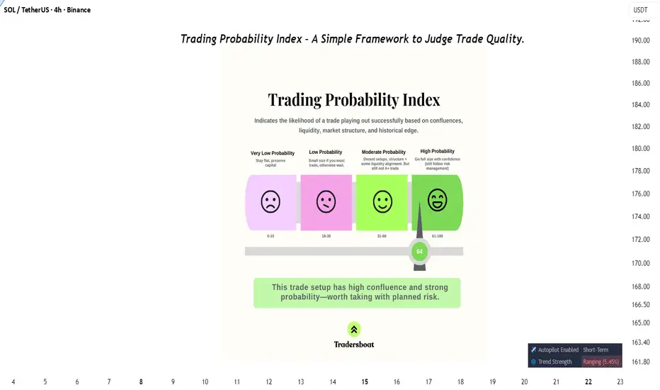
Trading Probability Index – A Simple Framework to Judge Trade Qu📖 Description:
Most traders enter positions without measuring probability. This framework solves that.
The Trading Probability Index (TPI) combines:
✔️ Confluences (indicators & structure)
✔️ Liquidity zones
✔️ Market structure shifts
✔️ Historical edge
It categorizes setups from Very Low → High Probability so traders know when to stay flat, go small, or go big with conviction.
📊 In this example, the trade scored 64 → High Probability Zone, meaning the setup has strong confluence and is worth taking—with proper risk management.
This tool helps traders filter noise, focus on quality setups, and avoid overtrading.
👉 Do you have your own system to measure trade quality? Or do you go by gut feeling?
Impact of Trade Wars on Global CommoditiesUnderstanding Trade Wars
Definition
A trade war occurs when countries engage in escalating retaliatory trade barriers, such as tariffs (taxes on imports), export bans, or quotas. Unlike routine trade disputes resolved through institutions like the World Trade Organization (WTO), trade wars are prolonged confrontations that can severely disrupt global supply chains.
Causes of Trade Wars
Protection of domestic industries – Governments impose tariffs to shield local producers from cheaper foreign imports.
Geopolitical tensions – Strategic rivalry between powers (e.g., U.S.–China).
Perceived unfair trade practices – Accusations of currency manipulation, dumping, or intellectual property theft.
Political populism – Leaders appeal to domestic audiences by promising to revive manufacturing or agriculture.
Mechanisms of Impact
Trade wars affect commodities through:
Tariffs: Increasing the cost of imports reduces demand.
Supply chain disruptions: Restrictions create shortages or gluts in certain markets.
Currency fluctuations: Retaliatory measures often cause volatility in exchange rates.
Investor sentiment: Commodities markets react to uncertainty with price swings.
Historical Trade Wars and Commodities Impact
The U.S.–China Trade War (2018–2020)
The most notable recent example is the U.S.–China trade war, where both nations imposed tariffs on billions of dollars’ worth of goods. Its impact on commodities was profound:
Agricultural Products: China, a major buyer of U.S. soybeans, shifted its purchases to Brazil and Argentina. U.S. farmers faced significant losses, while South American exporters gained.
Metals: U.S. tariffs on Chinese steel and aluminum disrupted global metals supply, increasing costs for downstream industries.
Oil and Gas: China reduced imports of U.S. crude oil, turning to Russia and the Middle East instead.
1970s Oil Crisis and Resource Nationalism
While not a conventional “trade war,” the OPEC oil embargo of 1973 illustrates how commodity trade restrictions can destabilize global markets. By restricting oil exports, OPEC caused a dramatic rise in crude oil prices, triggering global inflation and recessions.
Japan–U.S. Trade Disputes (1980s–1990s)
The U.S. imposed restrictions on Japanese automobiles, semiconductors, and steel. While not as aggressive as the China case, it influenced global steel and automotive commodity supply chains.
Impact on Different Commodities
1. Agricultural Commodities
Trade wars hit agriculture hardest because food products are politically sensitive and heavily traded.
Soybeans: In the U.S.–China conflict, soybean exports from the U.S. plummeted by over 50% in 2018. Brazil emerged as the biggest beneficiary.
Wheat and Corn: Farmers faced surplus production when markets closed, leading to lower farm incomes.
Meat and Dairy: Tariffs on pork and beef reduced demand, leading to oversupply and lower domestic prices.
Key Point: Agricultural producers in exporting countries often lose, while rival exporters in neutral countries gain market share.
2. Energy Commodities
Energy is both a strategic and economic commodity. Trade wars disrupt supply chains and create uncertainty.
Crude Oil: During the U.S.–China dispute, China reduced U.S. crude imports. Instead, it boosted imports from Russia, reshaping global oil flows.
Liquefied Natural Gas (LNG): China, a top LNG importer, reduced its contracts with U.S. suppliers, affecting American energy exports.
Coal: Tariffs on coal imports can shift demand toward domestic suppliers, though with environmental consequences.
Result: Trade wars encourage diversification of energy suppliers, altering global energy geopolitics.
3. Metals and Minerals
Metals are essential inputs for manufacturing and construction. Tariffs in this sector ripple across industries.
Steel and Aluminum: U.S. tariffs in 2018 raised global prices temporarily, hurting consumers (e.g., automakers) but boosting U.S. domestic producers.
Copper: As a key industrial metal, copper prices fell due to weaker global demand expectations from trade wars.
Rare Earth Elements: China, controlling over 80% of rare earth supply, threatened export restrictions during tensions—causing panic in tech and defense industries.
Observation: Strategic metals become bargaining chips in geopolitical disputes.
4. Precious Metals
Gold, silver, and platinum group metals behave differently in trade wars:
Gold: Seen as a “safe haven,” gold prices typically rise during trade war uncertainty. Example: Gold surged during U.S.–China tensions.
Silver and Platinum: Both industrial and investment commodities, they experience mixed effects—falling demand from industries but rising investor interest.
Economic Consequences of Commodity Disruptions
For Producers
Loss of export markets (e.g., U.S. soybean farmers).
Price crashes in domestic markets due to oversupply.
Increased costs if reliant on imported raw materials.
For Consumers
Higher prices for finished goods (e.g., cars with more expensive steel).
Reduced availability of certain products.
Inflationary pressures in commodity-importing nations.
For Global Markets
Increased volatility in commodity exchanges (CME, LME).
Shifts in global trade flows, creating winners and losers.
Distortion of investment decisions in commodities futures markets.
Case Studies
Case Study 1: U.S. Soybean Farmers
When China imposed tariffs on U.S. soybeans, American farmers saw exports fall from $12 billion in 2017 to $3 billion in 2018. Despite government subsidies, many small farmers struggled. Brazil, however, expanded its exports to China, reshaping global agricultural trade.
Case Study 2: Steel Tariffs and the U.S. Auto Industry
The Trump administration’s tariffs on steel and aluminum in 2018 increased input costs for U.S. automakers. While domestic steel producers benefited, car manufacturers faced rising costs, reducing their global competitiveness.
Case Study 3: Rare Earths and Tech Industry
China’s threat to restrict rare earth exports during trade tensions with the U.S. in 2019 raised concerns for tech manufacturers, as rare earths are critical for smartphones, batteries, and defense equipment. Prices surged globally, forcing nations to seek alternative suppliers.
Long-Term Structural Shifts
Trade wars don’t just have short-term impacts; they reshape global commodity systems.
Diversification of Supply Chains
Importers diversify sources to reduce dependence on hostile nations. Example: China diversifying soybean imports beyond the U.S.
Rise of Regional Trade Blocs
Countries form regional agreements (e.g., RCEP, USMCA) to secure commodity flows.
Strategic Stockpiling
Nations build reserves of critical commodities (oil, rare earths, grains) to withstand disruptions.
Technological Substitution
Trade wars accelerate R&D in substitutes (e.g., battery technologies reducing dependence on cobalt).
Shift in Investment Flows
Investors prefer politically stable commodity suppliers, leading to long-term realignments.
Winners and Losers
Winners
Neutral exporting countries that capture lost market share (e.g., Brazil in soybeans).
Domestic producers shielded by tariffs (e.g., U.S. steel).
Investors in safe-haven commodities like gold.
Losers
Farmers and exporters in targeted nations.
Consumers facing higher prices.
Global growth, as uncertainty reduces trade volumes and investment.
Future Outlook
Increasing Commodities Nationalism
Countries may increasingly weaponize commodities as tools of leverage in geopolitical disputes.
Technology and Substitutes
Trade wars may accelerate innovation, such as renewable energy reducing reliance on imported fossil fuels.
Institutional Reforms
The WTO and other institutions may need reforms to mediate commodity-related disputes more effectively.
Climate Change Factor
As climate change reshapes commodity production (e.g., agriculture, water, energy), trade wars could worsen resource scarcity and volatility.
Conclusion
The impact of trade wars on global commodities is multi-dimensional and far-reaching. From agriculture to energy, metals to precious resources, trade disputes disrupt flows, distort prices, and realign global supply chains. While some nations or industries benefit temporarily, the broader effect is one of uncertainty, inefficiency, and economic loss.
In the long run, trade wars reshape the architecture of commodity markets—encouraging diversification, regionalism, and innovation. However, they also raise questions about the sustainability of globalization and the ability of international institutions to maintain stability in a fracturing world.
Ultimately, commodities—being the backbone of human survival and industrial growth—remain at the heart of trade wars. Understanding their dynamics is crucial not only for policymakers and businesses but also for ordinary citizens whose livelihoods are directly or indirectly tied to global trade.
Role of WTO in International TradeIntroduction
International trade is the backbone of the global economy. Countries depend on each other for raw materials, technology, consumer goods, and services. To ensure that this complex web of exchanges remains smooth, fair, and beneficial for all, there must be rules, institutions, and mechanisms for dispute resolution. The World Trade Organization (WTO) plays this central role.
Established in 1995, the WTO replaced the General Agreement on Tariffs and Trade (GATT), which had guided world trade since 1948. Today, it is the only global international organization dealing with the rules of trade between nations. Its primary goal is to help producers of goods and services, exporters, and importers conduct business with as little friction as possible.
The WTO functions as both a forum for trade negotiations and a dispute settlement body. Its agreements, signed by the majority of trading nations, cover not just goods but also services and intellectual property rights. With 164 member countries (as of 2025), representing more than 98% of global trade, the WTO is a critical pillar of globalization.
This essay explores in detail the role of the WTO in international trade, covering its objectives, functions, agreements, dispute settlement system, impact on developed and developing nations, criticisms, and the challenges it faces in the 21st century.
Historical Background
From GATT to WTO
1947: The General Agreement on Tariffs and Trade (GATT) was established after World War II to encourage trade liberalization and economic recovery.
Focus: GATT dealt primarily with trade in goods and sought to reduce tariffs and quotas.
Limitations: GATT was a provisional arrangement and lacked strong enforcement mechanisms. It struggled to handle new trade areas like services, intellectual property, and agriculture.
Creation of the WTO
Uruguay Round (1986–1994): After years of negotiations, member countries agreed to create a stronger institution.
1995: The WTO officially replaced GATT. Unlike GATT, the WTO had a permanent institutional framework, a wider scope, and stronger dispute settlement powers.
Objectives of the WTO
The WTO’s objectives are enshrined in its founding agreements. Some of the key goals include:
Promote Free and Fair Trade
Reduce trade barriers (tariffs, quotas, subsidies).
Ensure equal opportunities for all trading partners.
Establish a Rules-Based System
Provide a transparent, predictable framework for international trade.
Encourage Economic Growth and Employment
Facilitate trade flows that contribute to global economic expansion.
Protect and Preserve the Environment
Ensure trade rules align with sustainable development.
Integrate Developing and Least Developed Countries (LDCs)
Provide special provisions to help them benefit from global trade.
Functions of the WTO
The WTO carries out several critical functions that shape the global trading system:
1. Administering Trade Agreements
The WTO oversees a vast set of agreements that cover goods, services, and intellectual property rights.
Examples: GATT 1994, General Agreement on Trade in Services (GATS), Trade-Related Aspects of Intellectual Property Rights (TRIPS).
2. Acting as a Forum for Trade Negotiations
Members negotiate trade liberalization, new agreements, and reforms.
Example: The ongoing Doha Development Round focused on agricultural subsidies and development issues.
3. Handling Trade Disputes
The WTO provides a structured dispute settlement mechanism.
Example: The US-EU dispute over subsidies to Boeing and Airbus was handled by WTO panels.
4. Monitoring National Trade Policies
Through the Trade Policy Review Mechanism (TPRM), WTO evaluates members’ trade policies to ensure transparency.
5. Technical Assistance and Training
WTO supports developing and least-developed countries by offering training, capacity-building, and special provisions.
6. Cooperation with Other International Institutions
Works with IMF, World Bank, and UN to coordinate trade and financial stability.
WTO Agreements and Coverage
The WTO’s framework is built on a comprehensive set of agreements covering multiple areas of trade.
1. Trade in Goods (GATT 1994)
Rules governing tariffs, quotas, subsidies, anti-dumping measures.
Special agreements on agriculture, textiles, and sanitary measures.
2. Trade in Services (GATS)
Covers sectors like banking, telecommunications, transport, education, and healthcare.
Promotes liberalization of service industries across borders.
3. Intellectual Property Rights (TRIPS)
Protects patents, trademarks, copyrights, and trade secrets.
Ensures innovation while balancing access, especially for medicines.
4. Dispute Settlement Understanding (DSU)
Provides legally binding dispute resolution through panels and an appellate body.
Ensures compliance with rulings.
5. Plurilateral Agreements
Not binding on all members, but important in niche areas.
Example: Agreement on Government Procurement (GPA).
Role of WTO in Promoting International Trade
1. Trade Liberalization
WTO promotes lowering of tariffs and non-tariff barriers.
Example: The Information Technology Agreement (ITA) eliminated tariffs on IT products.
2. Ensuring Fair Competition
Prevents unfair practices like dumping and excessive subsidies.
Allows safeguard measures when domestic industries are threatened.
3. Dispute Resolution
Provides a neutral, rules-based process for settling trade conflicts.
Avoids trade wars and unilateral retaliations.
4. Encouraging Transparency
Members must notify trade measures and policies.
Enhances predictability for businesses.
5. Helping Developing Countries
Special and Differential Treatment (SDT) provisions allow flexibility.
Example: Longer time frames for implementing commitments.
Case Studies of WTO’s Role
1. US–China Trade Disputes
Numerous disputes over intellectual property rights, tariffs, and subsidies.
WTO acted as a mediator, though recent tensions have tested its authority.
2. Bananas Dispute (EU vs. Latin American Countries)
EU’s banana import regime discriminated against Latin American exporters.
WTO panels ruled in favor of Latin American countries.
3. India’s Solar Panels Case
US challenged India’s domestic content requirements for solar power.
WTO ruled against India, showing the clash between trade rules and environmental goals.
Role for Developing and Least Developed Countries
The WTO plays a crucial role in integrating developing nations into global trade.
Market Access: WTO commitments open markets for exports.
Capacity Building: Technical assistance and training programs.
Flexibility: Longer transition periods for reforms.
Special Safeguards: Protection for vulnerable sectors like agriculture.
Example: African nations benefit from WTO’s Aid for Trade initiative.
Criticisms of the WTO
Despite its role, the WTO faces significant criticism:
Favoring Developed Nations
Rules on intellectual property and subsidies often benefit wealthy countries.
Stalled Negotiations
The Doha Round has been largely unsuccessful due to disagreements.
Dispute Settlement Crisis
Since 2019, the Appellate Body has been paralyzed because the US blocked appointments.
Environmental Concerns
Critics argue WTO prioritizes trade over climate change and sustainability.
Limited Inclusiveness
Small economies struggle to influence negotiations dominated by large economies.
Challenges for WTO in the 21st Century
Rise of Protectionism
Trade wars (e.g., US-China) undermine WTO rules.
Digital Trade and E-commerce
WTO lacks comprehensive rules for cross-border digital trade.
Climate Change and Sustainability
Balancing environmental protection with trade liberalization.
Geopolitical Tensions
Rivalries between major economies weaken global consensus.
Reform of Dispute Settlement
Restoring credibility by fixing the Appellate Body crisis.
Future Role of WTO
The WTO must evolve to remain relevant:
Revive Multilateralism: Rebuild trust in global trade rules.
Strengthen Dispute Resolution: Restore a fully functioning appellate system.
Adapt to Digital Trade: Frame rules for e-commerce, data flows, and digital taxation.
Promote Inclusive Growth: Ensure benefits reach developing and least-developed countries.
Support Green Trade: Align trade rules with climate commitments.
Conclusion
The World Trade Organization remains a cornerstone of international trade. Since 1995, it has provided a rules-based system that promotes predictability, reduces trade barriers, and offers a platform for resolving disputes. It has played a vital role in integrating developing nations into the global economy.
However, its credibility has been challenged by stalled negotiations, the crisis in dispute settlement, and rising protectionism. The future of the WTO depends on its ability to reform, embrace digital trade, support sustainability, and balance the interests of both developed and developing nations.
In an interconnected world, no country can afford to isolate itself from global trade. The WTO, despite its shortcomings, is indispensable in ensuring that trade remains a force for prosperity, cooperation, and peace.

Impact of War & Conflicts on Global TradeIntroduction
War and conflict have been recurring themes throughout human history, shaping civilizations, redrawing borders, and influencing the world economy. Among the many areas affected, global trade stands out as one of the most directly influenced domains. Trade thrives on stability, predictability, and cooperation across nations. When war or conflict disrupts these conditions, the impact ripples across supply chains, financial markets, production centers, and consumer behavior.
Global trade today is deeply interconnected, with goods, services, technology, and capital flowing across borders in complex networks. A regional war in one part of the world can disrupt global supply chains thousands of kilometers away. For instance, a conflict in the Middle East may lead to oil price spikes that affect manufacturing costs in Asia, transportation in Europe, and consumer prices in the Americas. Similarly, wars between major trading partners can lead to sanctions, trade restrictions, or complete breakdowns of commerce.
This essay explores the impact of wars and conflicts on global trade, examining historical and modern examples, economic consequences, sectoral disruptions, policy responses, and potential pathways to mitigate such risks.
1. Historical Context: Wars and Trade Disruptions
To understand the current dynamics, it is essential to look back at history. Wars have often determined trade patterns, both by destroying existing networks and by creating new ones.
1.1. Ancient Conflicts
In the Roman Empire, wars of expansion disrupted local economies but also opened up vast trade routes across Europe, the Middle East, and North Africa.
The Silk Road faced repeated interruptions during wars between empires, leading merchants to seek alternative maritime routes.
1.2. Colonial Wars
European colonial expansion was largely driven by trade interests in spices, gold, silver, and textiles. Wars between colonial powers (e.g., Britain and France) frequently disrupted global trade routes in the 17th and 18th centuries.
The Seven Years’ War (1756–1763) reshaped global trade by handing Britain dominance over colonies in North America and India, boosting its economic clout.
1.3. World Wars
World War I severely disrupted trade as maritime routes were blocked, naval blockades imposed, and global shipping shrank drastically.
World War II further devastated global commerce. Countries diverted industrial production to war efforts, international shipping was attacked, and colonies were cut off from their European rulers.
After WWII, however, new institutions like the IMF, World Bank, and GATT (later WTO) were established to stabilize trade and prevent such widespread disruption again.
2. Mechanisms of Disruption
War and conflict affect global trade through multiple direct and indirect mechanisms.
2.1. Physical Disruption of Supply Chains
Destruction of infrastructure such as ports, railways, highways, and airports halts the movement of goods.
Example: In the ongoing Russia–Ukraine war, destruction of Black Sea ports disrupted global grain exports.
2.2. Trade Barriers and Sanctions
Economic sanctions are a common tool of warfare today. They restrict trade flows and isolate nations.
Example: Western sanctions on Russia in 2022 led to bans on oil, gas, banking, and technology trade.
2.3. Energy Price Volatility
Wars in energy-rich regions trigger oil and gas supply shocks.
Example: The 1973 Arab–Israeli War caused the OPEC oil embargo, quadrupling global oil prices.
2.4. Currency Instability
War often leads to currency depreciation, inflation, and volatility in exchange rates. This discourages trade contracts and foreign investment.
2.5. Loss of Human Capital and Production
Conflict zones face reduced productivity as workers flee, factories shut down, and agricultural land is destroyed.
3. Case Studies of Modern Conflicts
3.1. Russia–Ukraine War (2022–Present)
Ukraine is a major exporter of wheat, corn, and sunflower oil. The war disrupted food exports, leading to shortages in Africa and Asia.
Russia, a key oil and gas supplier, faced sanctions, leading Europe to diversify energy imports toward the Middle East, Africa, and the US.
Shipping in the Black Sea became riskier, raising insurance and freight costs.
3.2. Middle East Conflicts
Persistent wars in the Middle East affect global oil supply. Even small disruptions raise oil prices due to the region’s strategic importance.
The Iran–Iraq War (1980–1988) disrupted Persian Gulf oil exports, pushing up global prices.
Recent Houthi attacks in the Red Sea have disrupted shipping routes through the Suez Canal, forcing rerouting via the Cape of Good Hope.
3.3. US–China Trade Tensions
Although not a conventional war, the US–China trade war (2018–2020) disrupted global trade by imposing tariffs on billions of dollars’ worth of goods.
Supply chains in electronics, textiles, and machinery were forced to relocate partially to countries like Vietnam, India, and Mexico.
3.4. African Conflicts
Civil wars in nations like the Democratic Republic of Congo have disrupted the supply of critical minerals such as cobalt, essential for batteries and electronics.
Piracy off the coast of Somalia (linked to instability) once threatened global maritime trade routes in the Indian Ocean.
4. Economic Consequences
4.1. Global Supply Chain Disruptions
Modern trade relies on just-in-time supply chains. Conflicts disrupt these, leading to shortages of semiconductors, food grains, or energy.
4.2. Inflation and Price Instability
War-related shortages push up commodity prices globally. For example, food inflation surged worldwide in 2022 due to the Ukraine war.
4.3. Decline in Global Trade Volume
According to the WTO, global merchandise trade tends to shrink during major wars and conflicts.
4.4. Trade Diversification
Nations often diversify away from conflict-affected suppliers. For example, Europe reduced dependence on Russian gas by importing LNG from the US and Qatar.
4.5. Unequal Impact on Nations
Developed countries often absorb shocks better through reserves and alternative sources. Developing nations, especially import-dependent ones, suffer disproportionately.
5. Sectoral Impact
5.1. Energy Sector
Oil and gas markets are the most sensitive to conflict. Wars in the Middle East, sanctions on Russia, and disputes in the South China Sea all affect energy flows.
5.2. Agriculture
Conflicts destroy farmlands and block exports. The Ukraine war showed how global food security is tied to regional stability.
5.3. Technology and Electronics
Semiconductor supply chains (Taiwan, South Korea) are highly vulnerable to potential conflicts. A war over Taiwan could cripple global electronics production.
5.4. Shipping and Logistics
Wars increase freight rates due to higher insurance premiums and rerouting costs.
Example: Ships avoiding the Suez Canal during Red Sea conflicts pay more in time and fuel.
5.5. Financial Services
Sanctions often target banks, cutting them off from systems like SWIFT. This hampers global transactions.
6. Policy Responses
6.1. Diversification of Supply Chains
Countries are increasingly moving toward “China+1” strategies to reduce dependency on one region.
6.2. Strategic Reserves
Nations maintain oil, gas, and food reserves to buffer against disruptions.
6.3. Trade Agreements and Alliances
Regional trade blocs (EU, ASEAN, CPTPP) help member countries secure trade during conflicts.
6.4. Investment in Domestic Production
Conflicts often push countries to revive domestic manufacturing for critical goods such as semiconductors and defense equipment.
6.5. Humanitarian Corridors
During conflicts, international organizations sometimes negotiate corridors for food and medicine trade to reduce civilian suffering.
7. Long-Term Effects
7.1. Redrawing Trade Routes
Wars can permanently shift trade patterns. Example: European reliance on Russian gas is unlikely to return to pre-2022 levels.
7.2. Rise of Protectionism
Conflicts push countries toward economic nationalism, prioritizing self-sufficiency over globalization.
7.3. Innovation in Trade Systems
Disruptions lead to innovations like alternative payment systems (e.g., Russia’s SPFS, China’s CIPS as alternatives to SWIFT).
7.4. Military-Industrial Boost
War economies often stimulate demand for weapons and defense technology, which becomes an export sector in itself.
8. Opportunities Emerging from Conflict
While the overall effect of war on trade is negative, certain industries or countries sometimes benefit:
Arms manufacturers experience a surge in exports.
Neutral nations can emerge as key alternative suppliers or trade hubs.
Countries like India and Vietnam gained manufacturing opportunities from US–China trade tensions.
9. Future Outlook: Trade in an Era of Geopolitical Uncertainty
As the world moves further into the 21st century, trade will remain deeply vulnerable to wars and conflicts. However, nations and corporations are learning to adapt through diversification, digitalization, and regional integration.
Key trends likely to shape the future include:
Regionalization of Trade – More trade within blocs (EU, ASEAN, BRICS) to reduce vulnerability.
Digital Trade – Growth of services, e-commerce, and remote business that are less affected by physical conflict.
Geoeconomic Competition – Nations will increasingly use trade as a tool of geopolitical rivalry, blending economics with national security.
Sustainability and Resilience – Greater emphasis on secure, sustainable supply chains over efficiency alone.
Conclusion
War and conflicts have always been among the most powerful disruptors of global trade. From the ancient Silk Road to modern semiconductor supply chains, conflicts reshape how nations exchange goods, services, and capital. While globalization has created unprecedented interdependence, it has also heightened vulnerability to disruptions.
The impact of wars on trade manifests in multiple ways: supply chain breakdowns, sanctions, energy crises, food insecurity, financial instability, and long-term shifts in trade patterns. The Russia–Ukraine war, Middle East conflicts, and US–China tensions are clear reminders that political instability in one region can send economic shockwaves worldwide.
However, trade is also resilient. Nations adapt by diversifying partners, building reserves, and investing in domestic capacity. The challenge for policymakers and businesses is to strike a balance between efficiency and resilience, ensuring that global trade continues even in times of uncertainty.
Ultimately, peace remains the greatest enabler of global commerce. As history shows, stable political relations foster economic prosperity, while wars not only destroy lives but also weaken the very foundation of global trade that supports human development.

Global Economic Recessions & RecoveriesPart 1: What is a Global Economic Recession?
Definition
A recession is generally defined as a significant decline in economic activity lasting for a prolonged period, typically identified by two consecutive quarters of negative GDP growth. At the global level, a recession occurs when world output, trade, and employment collectively decline.
But beyond technical definitions, recessions are felt in real life:
Jobs become scarce.
Wages stagnate.
Businesses close.
Governments face reduced tax revenues.
Investors witness stock market downturns.
Features of a Recession
Falling GDP – Global production and services shrink.
Rising Unemployment – Companies lay off workers.
Decline in Trade – Imports and exports fall as demand weakens.
Stock Market Weakness – Investors flee risky assets.
Banking Stress – Credit availability shrinks.
Part 2: Causes of Global Recessions
Recessions can stem from multiple factors, often overlapping:
Financial Crises
Example: The 2008 Global Financial Crisis caused by housing bubbles and excessive leverage in banks.
Policy Errors
Excessively tight monetary policy can choke growth.
Overly aggressive taxation or austerity can reduce demand.
External Shocks
Oil price spikes (1973 Oil Shock).
Wars or geopolitical tensions.
Natural disasters or pandemics (COVID-19).
Speculative Bubbles Bursting
Dot-com bubble (2000).
Cryptocurrency market collapses (2022).
Structural Imbalances
High sovereign debt.
Trade imbalances between nations.
Part 3: Impact of Global Recessions
Recessions are not just economic phenomena—they touch every aspect of human life.
On Individuals
Job losses and wage cuts.
Higher cost of living due to inflation in essentials.
Reduced access to credit.
Mental health stress due to financial uncertainty.
On Businesses
Lower consumer demand.
Rising defaults and bankruptcies.
Reduced investments in innovation and expansion.
On Governments
Lower tax revenues.
Increased welfare spending (unemployment benefits, subsidies).
Rising fiscal deficits.
On Global Trade
Decline in exports and imports.
Shipping, aviation, and logistics industries suffer.
Emerging markets depending on global demand face deep contractions.
Part 4: Historical Global Recessions
1. The Great Depression (1929–1939)
Trigger: US stock market crash in 1929.
Impact: 25% unemployment in the US, collapse of world trade, rise of protectionism.
Lessons: Importance of financial regulation and global cooperation.
2. The Oil Crisis Recession (1973–1975)
Trigger: OPEC oil embargo, quadrupling oil prices.
Impact: High inflation (stagflation), economic slowdown in the West.
Lessons: Vulnerability of economies to energy shocks.
3. The Asian Financial Crisis (1997–1998)
Trigger: Collapse of Thai baht, spreading currency crises across Asia.
Impact: Severe recessions in South Korea, Indonesia, and Malaysia.
Lessons: Risks of excessive foreign debt and weak financial systems.
4. The Global Financial Crisis (2008–2009)
Trigger: Subprime mortgage meltdown, Lehman Brothers collapse.
Impact: Deep recession in US & Europe, contagion worldwide.
Lessons: Need for stricter financial regulations and coordinated stimulus.
5. COVID-19 Recession (2020)
Trigger: Global lockdowns, supply chain breakdowns.
Impact: Largest contraction since WWII, record unemployment.
Lessons: Importance of healthcare resilience and digital infrastructure.
Part 5: Mechanisms of Economic Recovery
Recovery is the phase where the economy rebounds from recession toward growth.
Types of Recovery Shapes
V-Shaped – Sharp fall, quick rebound (COVID-19 recovery in some nations).
U-Shaped – Slow bottoming out, then recovery.
W-Shaped (Double-dip) – Recovery followed by another recession.
L-Shaped – Prolonged stagnation (Japan in the 1990s).
Drivers of Recovery
Government Stimulus – Fiscal spending and tax cuts.
Monetary Easing – Central banks lowering interest rates and buying assets.
Innovation & Productivity – New technologies boosting efficiency.
Global Trade Growth – Rebound in demand for exports and imports.
Consumer Confidence – Households resuming spending.
Part 6: Role of Global Institutions
Organizations play vital roles in stabilizing and guiding recoveries:
IMF (International Monetary Fund) – Provides emergency loans and financial advice.
World Bank – Funds infrastructure and poverty alleviation.
WTO (World Trade Organization) – Ensures smooth global trade.
G20 – Coordinates global economic policies.
Part 7: Challenges in Modern Recoveries
High Debt Levels – Countries borrow heavily during recessions, making recovery harder.
Income Inequality – Recoveries often benefit the wealthy more than workers.
Climate Change Risks – Natural disasters and transition to green energy impact growth.
Geopolitical Tensions – Trade wars, sanctions, and conflicts hinder global cooperation.
Technological Disruptions – Automation may delay job recoveries.
Part 8: Strategies for Strong Recoveries
Balanced Policy Mix
Combine fiscal stimulus with responsible monetary policy.
Investment in Infrastructure
Creates jobs and boosts long-term productivity.
Support for SMEs
Small businesses often generate the most jobs.
Green & Sustainable Growth
Renewable energy and climate-friendly projects.
Strengthening Global Cooperation
Joint efforts on trade, health, and finance.
Part 9: Future Outlook of Global Recessions & Recoveries
Digital Transformation – Technology will play a central role in recoveries.
Decoupling Trends – Some countries reducing dependency on global supply chains.
Demographics – Aging populations in developed nations may slow recoveries.
Emerging Economies – India, Southeast Asia, and Africa may drive global growth.
Resilience Building – More focus on healthcare, energy independence, and financial safety nets.
Conclusion
Global recessions and recoveries are not isolated events—they are part of an ongoing cycle in the world economy. Each downturn brings hardships, but also opportunities to reform, innovate, and build resilience.
The history of past crises shows that while recessions are painful, recoveries can set the stage for long periods of prosperity if managed wisely. The key lies in global cooperation, responsible policymaking, and adaptability.
What is Breakeven"In trading, every step is about risk management. Any position can end in profit or loss, and the trader’s task is to minimize the latter. One of the most debated techniques in this field is moving the stop-loss to breakeven. For beginners, it raises many questions: when should it be done? is it always correct? does it limit profits?
What is Breakeven
Breakeven is the level at which a trade closes without profit and without loss. The trader locks in zero result, preserving capital and avoiding risk if the market suddenly turns against them. Technically, this means the stop-loss is moved to the entry price after the position moves a certain distance in the trader’s favor.
The essence of the technique is to remove the worst-case scenario — taking a loss when the plan fails.
Why Move the Stop to Zero
The main benefit is psychological. While the stop is in the red, a trader feels tension: every fluctuation could knock them out and cut their capital. Moving to breakeven removes that pressure. The trade becomes “free”: it’s either profit, or nothing. This creates calmness and focus for further decisions.
Another aspect is discipline. Breakeven builds the habit of protecting capital. Many traders lose money not because their ideas are bad, but because they lack rules for managing trades. Breakeven enforces discipline and reminds: the priority is not giving more to the market than you planned.
When to Move the Stop to Zero
This is where most beginners go wrong. Moving to breakeven too early means not allowing the trade natural space to breathe. The market almost never moves in a straight line — it pulls back. If the stop is too tight, the position gets closed at zero, and then price continues in the expected direction.
Experienced traders only move stops after price crosses a meaningful level that truly confirms trend strength. This could be:
- a breakout of a significant support or resistance;
- consolidation above a local range;
- reaching the first target level (TP1).
That way, breakeven is not a random act for calming nerves, but part of systematic trade management.
Why Breakeven is Not Always the Best Choice
While useful, the technique has a downside. Moving stops too frequently or too early often leaves traders with “nothing trades” — positions closed at zero while the market later moves in their favor. This slows capital growth.Professionals use breakeven selectively, and always as part of a broader risk and position management strategy. Sometimes it’s more profitable to leave a stop in the red but beyond the level that truly invalidates the scenario. That gives the market room to develop while keeping risk under control.
How to Integrate Breakeven Into a System
Breakeven is not a universal rule, but a tool. To use it effectively, a trader should:
- predefine conditions for moving the stop (e.g., only after TP1 is reached);
- avoid emotional rushes;
- consider market structure and trend strength;
- combine the technique with technical analysis: levels, volumes, candlestick patterns.
With a system in place, breakeven becomes part of the bigger picture rather than a random “just in case” action.
Automation and Cold Logic
The hardest part is that the decision to move a stop is often made under emotional pressure. A trader sees a small retracement and quickly protects themselves. But emotions are exactly what rob good trades of their potential. The solution comes with algorithms. Tools that highlight key levels, guide trade management, and allow partial profit-taking remove emotional bias. A machine doesn’t panic, doesn’t get greedy, and doesn’t hesitate. It follows conditions with statistical precision. In this framework, breakeven is no longer an emotional gesture but a logical step: price broke a level, consolidated, scenario confirmed — the stop is moved.
Conclusion
Breakeven is a powerful risk management tool, but only when used as part of a system. It protects capital, reduces psychological pressure, and builds discipline. But moving stops too early or chaotically can block profits and turn strategy into randomness. In trading, winners are not those who know the most, but those who can keep a clear head and trust the plan. When rules are predefined and tools help visualize the market and control key levels, every decision becomes deliberate. That’s what separates a professional from a gambler."
Explaining Fibonacci Retracement/Extension levelsThis video is designed to help teach you why I use the Fibonacci Defense levels as components of price action and how I use Fibonacci retracement/extension levels (related to previous market trends).
Remember, the three components of price action are TIME, PRICE, & ENERGY.
If you don't understand how price is structured before attempting to use Fibonacci concepts, it's almost like trying to throw darts blindfolded.
You must break down the previous trends in order to try to understand what is happening with current price trends (expansion/contraction/phases).
Watch this video and I hope it helps all of you understand what the markets are doing and how to use Fibonacci Retracement/Extension levels more efficiently.
All types of technical analysis are validation tools - not guarantees. The only thing we get out of technical analysis is a way to validate or invalidate our expectations. A or B. Nothing else.
Get some.
#trading #research #investing #tradingalgos #tradingsignals #cycles #fibonacci #elliotwave #modelingsystems #stocks #bitcoin #btcusd #cryptos #spy #gold #nq #investing #trading #spytrading #spymarket #tradingmarket #stockmarket #silver

International Institutions & Market Stability1. Understanding Market Stability
Before diving into the role of institutions, let’s first clarify what “market stability” means.
Market Stability refers to the smooth functioning of financial systems, where prices of assets (stocks, bonds, currencies, commodities) reflect true economic fundamentals rather than being distorted by extreme volatility, panic, or speculation.
A stable market promotes investment, trade, job creation, and long-term growth.
On the other hand, instability—like currency crashes, hyperinflation, stock market collapses, or debt crises—leads to uncertainty, unemployment, and economic hardship.
Factors that threaten market stability:
Global Financial Crises (e.g., 2008 Lehman Brothers collapse).
Currency Fluctuations (e.g., Asian Financial Crisis of 1997).
Geopolitical Tensions (e.g., Russia-Ukraine war affecting energy markets).
Trade Wars and Tariffs (e.g., US-China trade war).
Pandemics and Natural Disasters (e.g., COVID-19 supply chain shocks).
Without strong international cooperation, these risks can quickly spiral out of control. That’s where institutions step in.
2. Why International Institutions Matter
Markets today are borderless:
Investors in Tokyo hold American bonds.
Indian companies raise money in London.
European banks finance African infrastructure.
Oil prices depend on OPEC+ decisions in the Middle East and Russia.
Because no country can control global markets alone, international institutions act as referees, firefighters, and architects:
Referees: They set rules for trade, finance, and investment.
Firefighters: They provide rescue packages during crises.
Architects: They build long-term frameworks for sustainable growth.
3. Key International Institutions and Their Roles in Market Stability
A. International Monetary Fund (IMF)
Founded: 1944 at Bretton Woods Conference.
Role: To ensure exchange rate stability, provide short-term financial assistance, and monitor global economies.
How it stabilizes markets:
Emergency Loans – Offers bailout packages to countries facing currency crises (e.g., Greece during the Eurozone crisis).
Surveillance – Publishes reports on global economic outlook and warns about risks.
Capacity Building – Provides technical advice on monetary policy, taxation, and banking reforms.
Case Example: During the 1997 Asian Financial Crisis, the IMF intervened with over $100 billion in rescue funds for South Korea, Indonesia, and Thailand.
B. World Bank Group
Founded: 1944, alongside the IMF.
Role: Provides long-term loans for infrastructure, poverty reduction, and sustainable development.
Impact on stability:
Helps developing countries build stable economies through investment in roads, energy, education, and healthcare.
Prevents political unrest and financial volatility by addressing root causes of instability—poverty and inequality.
Example: Post-war reconstruction of Europe and Japan, funded by World Bank loans, set the stage for decades of global growth.
C. Bank for International Settlements (BIS)
Founded: 1930, oldest financial institution.
Role: Acts as the “bank for central banks.”
How it stabilizes markets:
Facilitates cooperation among central banks like the US Federal Reserve, European Central Bank (ECB), Reserve Bank of India, etc.
Sets global banking rules like Basel Accords, which determine how much capital banks must hold to withstand crises.
Provides early warnings about systemic risks.
Example: After the 2008 crisis, BIS strengthened banking regulations to prevent excessive risk-taking.
D. World Trade Organization (WTO)
Founded: 1995, successor of GATT.
Role: Oversees global trade rules to ensure free and fair trade.
Contribution to stability:
Reduces trade disputes that could escalate into economic wars.
Provides a legal framework for resolving conflicts (e.g., US vs EU over aircraft subsidies).
Promotes predictable markets for exporters and importers.
Without WTO, trade disputes could spiral into chaotic tariff wars, destabilizing markets worldwide.
E. United Nations (UN)
Though not a financial institution, the UN ensures political stability, which indirectly supports markets.
Its agencies—UNDP, UNCTAD, UNEP—work on sustainable development, investment flows, and environmental issues.
Peacekeeping operations help restore stability in war-torn regions, creating safer conditions for markets.
F. Regional Institutions
European Central Bank (ECB) – Maintains eurozone stability.
Asian Development Bank (ADB) – Funds Asian infrastructure.
African Development Bank (AfDB) – Strengthens African markets.
BRICS Bank (NDB) – Alternative funding for emerging economies.
These regional players complement global institutions by addressing local challenges.
4. Tools Used by International Institutions for Market Stability
Financial Assistance – Bailouts, emergency funds, and structural adjustment loans.
Regulatory Frameworks – Basel Accords (banking), WTO trade rules.
Surveillance and Monitoring – IMF’s World Economic Outlook, BIS reports.
Capacity Building – Training governments in fiscal and monetary policy.
Dispute Resolution – WTO’s legal panels.
Crisis Coordination – G20 and IMF coordinate during global shocks.
5. Case Studies: Institutions in Action
1. The 2008 Global Financial Crisis
IMF, BIS, and G20 coordinated liquidity injections.
Central banks cut interest rates in unison.
WTO helped prevent protectionist trade measures.
2. COVID-19 Pandemic
IMF approved emergency loans to over 85 countries.
World Bank mobilized billions for vaccine distribution.
WTO worked to ensure supply chain flow of essential goods.
3. Eurozone Debt Crisis
ECB played a key role by buying government bonds.
IMF provided bailout packages to Greece, Portugal, and Ireland.
These examples show how international cooperation prevents local crises from turning into global meltdowns.
6. Challenges Faced by International Institutions
Political Influence – Rich countries dominate decision-making (e.g., US influence in IMF).
Sovereignty Concerns – Countries resist outside intervention in domestic policies.
Inequality of Benefits – Critics argue that IMF and World Bank impose harsh austerity measures that hurt the poor.
Global Power Shifts – Rise of China, BRICS challenges Western-dominated institutions.
Technology and Crypto – Digital currencies and decentralized finance are outside current frameworks.
7. The Future of International Institutions in Market Stability
To remain effective, institutions must adapt:
Greater Inclusiveness: Give emerging markets more voting power.
Focus on Sustainability: Climate finance and green bonds should be prioritized.
Digital Regulation: Create rules for cryptocurrencies and AI-driven trading.
Crisis Preparedness: Build faster response mechanisms for pandemics, cyberattacks, and climate shocks.
Multipolar World: Balance power between the US, EU, China, India, and other rising economies.
Conclusion
International institutions are the backbone of market stability in an increasingly interdependent world. While they face criticism for being slow, biased, or outdated, their importance cannot be denied. From the IMF’s financial lifelines to the WTO’s trade rules, from BIS banking regulations to World Bank’s infrastructure funding, these organizations ensure that crises do not escalate into global catastrophes.
As globalization deepens and new risks emerge—climate change, cyber threats, digital currencies—the role of international institutions will become even more vital. The challenge lies in reforming them to be more inclusive, transparent, and forward-looking. Only then can they continue to safeguard global markets and promote sustainable prosperity.

Global Trade Wars & Tariffs1. Understanding Tariffs
What are Tariffs?
Tariffs are taxes imposed by a government on imported goods. They make imported products more expensive compared to domestically produced goods, thereby encouraging consumers to buy locally.
Example: If India imposes a 20% tariff on imported steel from China, the Chinese steel becomes more expensive in India, making Indian steel relatively cheaper.
Types of Tariffs
Ad Valorem Tariff – A percentage of the product’s value (e.g., 10% of the import price).
Specific Tariff – A fixed fee on each unit (e.g., $5 per imported smartphone).
Compound Tariff – Combination of both ad valorem and specific tariffs.
Why Governments Impose Tariffs
To protect domestic industries from foreign competition.
To raise revenue for the government.
To retaliate against unfair trade practices.
To safeguard national security, especially for critical industries like defense or energy.
2. What are Trade Wars?
A trade war occurs when countries impose tariffs or trade barriers against each other in a tit-for-tat manner. Instead of cooperation, trade partners engage in retaliation, escalating tensions.
Trade wars are not just about economics—they are deeply political. Leaders often use tariffs as tools to project strength, protect domestic jobs, or influence foreign governments.
3. Historical Background of Trade Wars
The Smoot-Hawley Tariff Act (1930, USA)
One of the most infamous tariff laws in history.
Raised U.S. tariffs on over 20,000 imported goods.
Triggered retaliation from other countries, worsening the Great Depression.
World trade collapsed by over 60% in the early 1930s.
U.S.–Japan Trade Tensions (1980s)
The U.S. accused Japan of unfair trade practices in automobiles and electronics.
Washington imposed tariffs and quotas on Japanese goods.
Led to the Plaza Accord (1985), where Japan agreed to appreciate its currency, making its exports costlier.
Banana Wars (EU vs. U.S. & Latin America, 1990s)
Dispute over Europe’s preferential treatment to former colonies in banana imports.
The U.S. and Latin American nations challenged it at the World Trade Organization (WTO).
These historical examples show how tariffs can disrupt alliances, damage global trade, and create long-lasting economic scars.
4. Causes of Trade Wars
1. Protection of Domestic Industries
Countries impose tariffs to shield domestic producers from cheaper imports. For instance, steel tariffs protect local steelmakers from being outcompeted by foreign producers.
2. Trade Deficits
Nations with large trade deficits often accuse their partners of unfair practices. For example, the U.S. trade deficit with China was a major driver of the U.S.–China trade war.
3. Unfair Trade Practices
Currency manipulation
Intellectual property theft
Subsidies to domestic industries
4. National Security Concerns
Countries may block imports in sensitive areas like semiconductors, defense equipment, and telecom networks (e.g., restrictions on Huawei).
5. Political Pressure & Populism
Leaders often use tariffs as a tool to win political support, projecting themselves as defenders of domestic jobs.
5. Key Case Study: U.S.–China Trade War (2018–Present)
The U.S.–China trade war is the most significant trade conflict in recent history.
Background
The U.S. accused China of unfair trade practices: forced technology transfer, intellectual property theft, and state subsidies.
China had a huge trade surplus with the U.S., fueling political tensions.
Timeline of Escalation
2018: U.S. imposed tariffs on Chinese solar panels, washing machines, steel, and aluminum.
China retaliated with tariffs on U.S. agricultural products like soybeans.
2019: Tariffs expanded to cover hundreds of billions worth of goods.
Phase One Deal (2020): China agreed to purchase more U.S. goods, but disputes remained unresolved.
Impact
Global supply chains were disrupted.
Multinational companies relocated manufacturing to Vietnam, India, and Mexico.
U.S. farmers suffered from lost Chinese markets, leading to government subsidies.
Tech war intensified—restrictions on Huawei, bans on semiconductor exports.
6. Other Recent Trade Wars
1. Brexit & EU–UK Tariff Disputes
After Brexit, the UK and EU clashed over fisheries, Northern Ireland trade, and tariffs.
2. U.S.–EU Aircraft Subsidy Dispute
U.S. accused EU of subsidizing Airbus, while EU accused U.S. of supporting Boeing.
Both sides imposed tariffs on billions worth of goods (from airplanes to cheese and whiskey).
3. India vs. U.S. (2019)
The U.S. withdrew India’s special trade privileges under GSP (Generalized System of Preferences).
India retaliated with tariffs on American almonds, apples, and walnuts.
7. Economic Consequences of Trade Wars
1. Impact on Consumers
Tariffs make imported goods more expensive.
Consumers pay higher prices, reducing purchasing power.
2. Impact on Producers
Domestic industries may gain temporary protection.
But industries that rely on imported raw materials suffer higher costs.
3. Impact on Global Supply Chains
Companies diversify production across multiple countries.
Rise of “China+1 strategy”—shifting manufacturing partly to India, Vietnam, or Mexico.
4. Impact on Global Economy
Trade wars reduce global trade volume.
The IMF estimated that the U.S.–China trade war shaved 0.8% off global GDP in 2019.
5. Stock Markets & Currencies
Trade tensions create market volatility.
Safe-haven assets like gold tend to rise.
8. Political & Strategic Consequences
Trade wars strain diplomatic relations.
Countries form new trade blocs to bypass tariffs (e.g., RCEP, CPTPP).
Nationalism rises as governments push “Made in X” campaigns.
Technology becomes a battlefield—restrictions on 5G, semiconductors, AI, and rare earths.
9. Winners and Losers of Trade Wars
Winners
Domestic industries protected by tariffs.
Countries outside the trade war (e.g., Vietnam gained from U.S.–China conflict).
Losers
Consumers facing higher prices.
Exporters losing access to foreign markets.
Global investors facing uncertainty.
10. The Role of WTO in Trade Disputes
The World Trade Organization (WTO) was created to mediate trade conflicts.
Countries can file complaints against unfair tariffs.
WTO panels issue rulings, but enforcement is weak.
In recent years, major economies (U.S., China, EU) have often bypassed WTO, using unilateral measures.
Conclusion
Trade wars and tariffs are not just economic tools—they are deeply political and strategic instruments. While tariffs may protect domestic industries in the short term, they often hurt consumers, disrupt supply chains, and damage global economic growth in the long run.
The U.S.–China trade war, Brexit-related disputes, and other conflicts highlight that globalization is no longer smooth. Countries are rethinking supply chains, prioritizing security over efficiency, and preparing for future battles in technology and sustainability.
Ultimately, the lesson from history is clear: cooperation in trade leads to prosperity, while protectionism often leads to stagnation and conflict. The challenge for the 21st century is to strike a balance between national interests and global cooperation.

Emerging Markets Growth1. Introduction
The term emerging markets refers to countries whose economies are in transition from developing to developed status. These nations are characterized by rapid industrialization, improving infrastructure, growing consumer demand, and expanding participation in global trade. While they may still face challenges such as political instability, income inequality, and underdeveloped financial systems, they are also engines of global growth, innovation, and opportunity.
Over the past few decades, emerging markets have played an increasingly important role in shaping the global economy. From China’s meteoric rise as the “world’s factory” to India’s booming IT and services sector, to Africa’s growing consumer base, these regions have become critical players in trade, finance, and geopolitics. Today, they account for nearly 60% of global GDP growth, underscoring their significance in driving the world economy forward.
Understanding emerging markets growth is not only about tracking numbers—it’s about seeing how societies evolve, how technology leapfrogs traditional barriers, and how billions of people are moving from poverty to middle-class lifestyles.
2. Historical Context
Emerging markets, as a concept, began gaining attention in the 1980s when investment banks like the International Finance Corporation (IFC) coined the term to attract investors toward promising but risky developing nations.
Post-WWII Era (1950s–1970s): Many nations in Asia, Africa, and Latin America gained independence. They began industrializing but were often limited by weak institutions, colonial legacies, and debt crises.
1980s–1990s: Globalization accelerated. China opened its economy in 1978, India liberalized its markets in 1991, and Eastern Europe transitioned after the fall of the Soviet Union. Foreign direct investment (FDI) surged, laying the foundation for rapid economic growth.
2000s: The BRICS nations (Brazil, Russia, India, China, South Africa) became symbols of emerging market potential. They attracted significant global investment and reshaped global trade flows.
2010s onwards: Technology adoption, urbanization, and rising domestic consumption became key drivers of growth, especially in Asia and Africa.
Today, emerging markets are no longer just “developing nations”—they are global players competing with advanced economies in technology, energy, and innovation.
3. Key Drivers of Emerging Market Growth
(a) Demographics & Urbanization
Most emerging markets have younger populations compared to aging developed countries. For example, India’s median age is about 28, compared to 38 in the U.S. and 47 in Japan. Young populations create a large workforce and growing consumer base.
Urbanization is another factor: by 2050, more than 65% of emerging market populations will live in cities, fueling demand for housing, infrastructure, healthcare, education, and consumer goods.
(b) Technology Adoption
Emerging markets often leapfrog older technologies. For example:
Mobile banking in Kenya (M-Pesa) transformed financial inclusion.
India’s UPI system is now one of the world’s most advanced digital payment infrastructures.
China leads in e-commerce and mobile-first ecosystems (Alibaba, WeChat, TikTok).
Technology enables cost efficiency, scalability, and access to services even in rural areas.
(c) Industrialization & Services Boom
Manufacturing hubs like China, Vietnam, and Mexico provide affordable production for global supply chains. Meanwhile, India has become a global leader in IT outsourcing and digital services. This dual engine of manufacturing + services creates a balanced path to growth.
(d) Global Trade & Investments
Emerging markets benefit from trade liberalization and integration into global supply chains. China’s accession to the WTO in 2001 accelerated its export-led growth. Similarly, ASEAN nations (like Vietnam and Indonesia) have become key manufacturing centers for electronics, textiles, and automobiles.
FDI plays a crucial role, as multinationals invest in emerging economies to access labor, resources, and consumer markets.
(e) Financial Markets & Capital Inflows
Stock markets in emerging economies have expanded significantly. For example, India’s market capitalization now ranks among the top five globally. Foreign portfolio investors are increasingly drawn to high-growth prospects, though risks remain tied to volatility and currency fluctuations.
4. Regional Perspectives
(a) Asia
China: The second-largest economy in the world. Growth has slowed but continues to dominate global trade, manufacturing, and technology.
India: One of the fastest-growing major economies, with strong services, IT, and digital finance sectors. Expected to be the third-largest economy by 2030.
ASEAN: Nations like Vietnam, Indonesia, and the Philippines are becoming new growth hubs due to manufacturing shifts from China.
(b) Latin America
Brazil: Rich in natural resources but challenged by political instability and inflation. Still, it is a major agricultural exporter.
Mexico: Integrated closely with U.S. supply chains; benefits from nearshoring trends.
Chile & Peru: Strong in mining (copper, lithium), critical for global clean energy supply chains.
(c) Africa
Nigeria: Large population and growing fintech ecosystem.
South Africa: Industrial hub but faces structural challenges.
Kenya & Ethiopia: Rising in tech startups and infrastructure projects.
Africa’s young population (median age under 20) makes it a future growth engine.
(d) Middle East & Eastern Europe
Middle East: Oil exporters like Saudi Arabia and UAE are diversifying into finance, tourism, and technology.
Eastern Europe: Nations like Poland and Turkey have emerged as industrial and IT outsourcing hubs, though geopolitical risks remain.
5. Opportunities in Emerging Markets
Consumer Market Expansion: Growing middle classes mean higher demand for goods and services—from smartphones to luxury goods.
Infrastructure Development: Massive investments in roads, ports, power, and digital connectivity are reshaping economies.
Energy & Natural Resources: Emerging markets supply vital resources (oil, gas, copper, lithium) crucial for the global energy transition.
Innovation Ecosystems: Startups in India, Africa, and Latin America are solving local problems with global potential—such as digital payments, e-commerce, and health-tech.
6. Challenges to Growth
Political Instability & Corruption: Many emerging markets face governance issues that deter investors.
Debt & Currency Crises: External debt dependency makes them vulnerable to global interest rate hikes (e.g., IMF bailouts in Argentina, Pakistan).
Inequality & Unemployment: Growth does not always trickle down evenly, leading to social unrest.
Climate Change & Sustainability: Many economies rely on fossil fuels or resource extraction, facing risks in the green transition.
7. Global Impact of Emerging Markets
Emerging markets are reshaping global trade and finance.
BRICS: Represent more than 40% of the world’s population and growing political influence.
Technology & Innovation: China leads in AI patents, India in IT services, Africa in mobile banking solutions.
Shift in Economic Power: By 2050, emerging markets are projected to contribute nearly 70% of global GDP growth.
8. Future Outlook (2025–2050)
Next Growth Markets: Countries like Vietnam, Indonesia, Nigeria, and Bangladesh are rising stars.
Green Economy: Renewable energy, EVs, and sustainable agriculture will dominate future investments.
Integration with Developed Economies: Emerging markets will not just be suppliers—they will also become innovators, consumers, and investors globally.
9. Conclusion
Emerging markets are no longer the “junior partners” of the global economy. They are the growth engines, innovation hubs, and consumer bases that will define the next few decades. Despite challenges like inequality, debt, and climate risks, their youthful populations, rapid urbanization, and technology adoption ensure they remain central to global prosperity.
By 2050, the world’s economic map will look very different, with emerging markets holding the majority share of global output. Businesses, policymakers, and investors must adapt to this reality, as the future belongs to the rising economies of Asia, Africa, Latin America, and beyond.
Currency Markets (Forex) & Exchange Rate DynamicsIntroduction
Money is the lifeblood of trade. Just as people in different regions use different languages, nations around the world use different currencies. While within a country people exchange goods and services using their national currency (like Rupee in India, Dollar in the US, Yen in Japan, or Euro in Europe), when trade crosses borders, there arises a need to exchange one currency for another. This mechanism, in which currencies are bought, sold, and exchanged at agreed prices, is called the foreign exchange market (Forex or FX).
The currency market is the largest and most liquid financial market in the world. Every single day, more than $7.5 trillion (as of 2024 estimates) worth of currencies change hands globally—far exceeding daily trading in stocks, bonds, or commodities. Forex is the invisible backbone of international trade, investment, tourism, remittances, and even geopolitics.
This essay will explore the structure of currency markets, the participants, instruments, and mechanics of trading, and then dive deep into exchange rate dynamics—the forces that determine why one currency strengthens or weakens against another.
1. What is the Currency Market (Forex)?
The foreign exchange market (Forex) is a decentralized global marketplace where currencies are traded. Unlike stock exchanges, which operate in specific locations (like NYSE or NSE), Forex is an over-the-counter (OTC) market, meaning that trading happens electronically between banks, brokers, corporations, and individuals worldwide, 24 hours a day, five days a week.
Key features of Forex:
24-hour market: Opens on Monday in Asia (Sydney/Tokyo) and runs through Europe (London) until Friday evening in the US (New York).
Decentralized structure: No single exchange; transactions occur via electronic networks and interbank systems.
High liquidity: With trillions traded daily, currency can be bought/sold almost instantly.
Leverage-driven: Traders often borrow to increase exposure, which magnifies both profits and risks.
Relative value trading: In Forex, one never buys a currency in isolation—it’s always traded against another (e.g., EUR/USD, USD/INR).
2. Why is Forex Important?
The currency market is not just a playground for speculators—it has deep real-world importance:
International Trade & Investment – Exporters and importers depend on Forex to convert earnings. Example: An Indian IT company earning in dollars must convert to rupees to pay local salaries.
Tourism & Travel – A traveler from India to Europe needs Euros, while a European visiting India needs Rupees.
Foreign Direct Investment (FDI) – When companies invest abroad, they convert currencies (e.g., a Japanese firm investing in the US needs dollars).
Remittances – Millions of migrant workers send money home, creating huge Forex flows.
Central Banks & Governments – They intervene in currency markets to stabilize their economies.
Financial Trading & Hedging – Hedge funds, banks, and retail traders seek profits or risk protection by betting on currency movements.
3. Structure of the Forex Market
The Forex market has multiple layers and participants:
(A) Interbank Market
The top level, where large international banks (JPMorgan, Citi, Deutsche Bank, HSBC, etc.) trade billions daily.
Provides liquidity and sets global benchmark rates.
(B) Corporates & Multinationals
Companies engaged in cross-border trade or investment.
Example: A US car company importing parts from Japan needs Yen.
(C) Central Banks & Governments
They buy/sell currencies to manage exchange rates, stabilize economies, and control inflation.
Example: Reserve Bank of India intervening to prevent sharp INR depreciation.
(D) Institutional Investors & Funds
Hedge funds, mutual funds, pension funds speculate or hedge exposures.
(E) Retail Traders
Individuals trading via brokers/platforms. Growing rapidly due to online apps.
Though small compared to banks, retail adds significant market activity.
4. Types of Forex Transactions
Currency trading can be classified by settlement timing and purpose:
Spot Market
Immediate exchange of currencies (settled in 2 business days).
Most visible and liquid segment.
Forward Market
Agreement to exchange currencies at a future date at a pre-agreed rate.
Used by businesses to hedge risks (e.g., an Indian importer locking USD/INR rate for future payment).
Futures & Options (Derivatives)
Standardized contracts traded on exchanges.
Used by traders and funds for speculation or hedging.
Swap Agreements
Two parties exchange currencies temporarily and reverse the deal later.
Often used by banks for liquidity management.
5. Major Currency Pairs
Currencies are quoted in pairs, where one is the base currency and the other is the quote currency.
Major Pairs (involving USD, highly liquid):
EUR/USD (Euro vs Dollar)
GBP/USD (British Pound vs Dollar)
USD/JPY (Dollar vs Yen)
USD/CHF (Dollar vs Swiss Franc)
Minor Pairs (crosses without USD):
EUR/GBP, EUR/JPY, GBP/JPY
Exotic Pairs (developed vs emerging currencies):
USD/INR (Dollar vs Rupee)
USD/BRL (Dollar vs Brazilian Real)
6. Exchange Rate Dynamics – How Currency Values are Determined
At the heart of Forex lies the exchange rate: the price of one currency in terms of another.
Example: 1 USD = 83 INR means 1 US Dollar costs 83 Indian Rupees.
But why does it fluctuate daily? Multiple forces shape exchange rates:
(A) Supply and Demand
If demand for dollars rises (e.g., due to higher imports or capital outflows from India), USD/INR rises (rupee weakens).
Conversely, strong FDI inflows increase rupee demand, strengthening INR.
(B) Interest Rate Differentials
Currencies of countries offering higher interest rates attract investors seeking better returns.
Example: If RBI keeps rates higher than the US Fed, foreign investors may buy Indian bonds, increasing INR demand.
(C) Inflation Levels
Countries with lower inflation usually see stronger currencies, as purchasing power remains stable.
High inflation erodes currency value. Example: Argentina’s peso depreciates sharply due to hyperinflation.
(D) Economic Growth & Trade Balance
Strong GDP growth attracts foreign capital, boosting currency.
A trade surplus strengthens currency (exports > imports), while deficits weaken it.
(E) Political Stability & Governance
Investors prefer stable democracies with strong rule of law.
Political crises, wars, or corruption scandals often trigger capital flight.
(F) Speculation & Market Sentiment
Traders bet on future currency directions. If markets believe the rupee will weaken, speculative selling accelerates the move.
(G) Central Bank Intervention
Central banks directly buy/sell currencies or adjust interest rates to stabilize their currency.
Example: Bank of Japan often intervenes to prevent excessive Yen appreciation.
7. Exchange Rate Systems
Throughout history, different systems have been used to manage currency values:
Fixed Exchange Rate – Currency pegged to gold or another currency (e.g., USD pegged to gold under Bretton Woods until 1971).
Floating Exchange Rate – Market forces determine value (used by US, EU, UK, Japan).
Managed Float – Central bank intervenes occasionally (India, China).
Currency Pegs – Some countries peg to USD (Saudi Riyal, Hong Kong Dollar).
8. Volatility in Forex
Forex is highly volatile—daily fluctuations create both risks and opportunities.
Example: Brexit referendum (2016) caused GBP/USD to crash overnight.
Global crises (COVID-19, Russia-Ukraine war) often trigger “flight to safety,” strengthening USD as investors rush to safe-haven assets.
9. Risks in Currency Markets
Exchange Rate Risk – Loss from adverse moves in rates.
Interest Rate Risk – Changes in rates affect currency value.
Liquidity Risk – Exotic currencies may have wider spreads.
Political/Geopolitical Risk – Wars, sanctions, coups affect currency flows.
Speculative Risk – Leverage magnifies losses.
10. Case Studies of Exchange Rate Dynamics
(A) USD-INR
Over decades, INR has depreciated from 1 USD = 7 INR (1970s) to ~83 INR (2025) due to inflation differentials, trade deficits, and dollar strength.
RBI actively manages volatility via interventions.
(B) Japanese Yen (JPY)
Known as a funding currency due to ultra-low interest rates.
Often used in “carry trades”—borrowing Yen cheaply and investing in higher-yielding assets elsewhere.
(C) Euro (EUR)
World’s second-most traded currency.
Dynamics depend on the Eurozone economy—if Germany faces slowdown, Euro weakens.
Conclusion
The currency market (Forex) is the invisible giant powering the global economy. It ensures that trade, investment, tourism, and remittances flow smoothly across borders. Its exchange rate dynamics reflect a complex interplay of economics, politics, psychology, and speculation.
For businesses, policymakers, and investors, understanding Forex is crucial—because a small change in exchange rates can alter profits, trigger inflation, or shake entire economies.
As the world moves toward digital money, AI-driven trading, and multipolar currency systems, the future of Forex will be even more dynamic and unpredictable. Yet one thing is certain: as long as nations exist with different currencies, Forex will remain the beating heart of global finance.
Candle Metrics: BSP Guide🏛️ RESEARCH NOTES
Buying & Selling Pressure measures the internal dynamics within a candlestick that shapes the trends. It dissects each OHLC range into distinct components made of Body Range, Higher & Lower Wicks, making it possible to quantify bullish & bearish parts of bar range. BSP doesn’t just point direction, it reveals magnitude - how much buyers or sellers injected into the move, and whether that push is accelerating or running out of steam.
Unlike Average %Δ , which uses separate conditional averaging by "count", BSP processes candles through periodic averaging that makes it more responsive for important transitions like: divergence from volatility benchmarks. incentive change (spotting early reversals after impulsive move), filtering false breakouts, confirming trend strength, etc.
⚖️ Candle Metrics
Buying Pressure (BP)
Represents the degree of upward displacement relative to prior reference points.
🟢 Rising BP: Signals growing demand absorption and accumulation, often preceding sustained advances.
🟣 Falling BP: Indicates waning participation from buyers; persistent declines while price rises suggest trend fatigue and elevated risk of retracement.
Selling Pressure (SP)
Captures downward displacement relative to highs and prior closes.
🔴 Rising SP: Reflects heightened distribution activity, consistent with institutional supply or hedging flows.
🟡 Falling SP: Suggests sellers are withdrawing liquidity; commonly observed near troughs as downside momentum exhausts.
Average True Range (ATR) Rising ATR = higher volatility, falling ATR = calm markets. High BP in low ATR = stealth accumulation.
Body Range (BR) Large bodies show conviction, small bodies = indecision. Strong BR + rising BP = solid bullish trend.
Higher Wick (HW) Long HW means rejection at highs (supply). Falling HW means buyers are holding gains.
Lower Wick (LW) Long LW means rejection at lows (demand). Falling LW signals less defense from buyers.
Total Wicks (TW) More wick length = intrabar battles. Expansion of TW with small bodies often precedes reversals.
Average Wick (AW)
Rising AW = more volatility both ways. Falling AW = cleaner, directional trend.
Darkened Tops
Tracks the strongest side (BP or SP) over the lookback period. Its primary function is to dynamically highlight moments of extreme pressure. When either the Buying or Selling Pressure value reaches the level, the tops would . This provides an immediate visual cue for:
Black Colored Plot: A signal that the current buying or selling pressure has hit a significant level relative to recent history, often pointing to climactic activity or a potential exhaustion point.
◇ Practical Interpretation
Trend Confirmation BP ↑, SP ↓, BR ↑, ATR steady → sustainable directional advance.
Exhaustion BP ↓, SP steady or rising, HW ↑ = buyers tiring at resistance, overextended into supply.
Accumulation BP ↑, LW ↑, TW ↑ but ATR low = stealth buying before breakout.
Distribution SP ↑, HW ↑, TW ↑ = sellers unloading into strength. supply emerging into strength, caution warranted.
How to Read Japanese Candles ProperlyWhen traders first look at a chart, they often see what looks like a chaotic mix of red and green bars with shadows. These are Japanese candlesticks — the main language of financial markets. But for many, they remain a mystery: what does a long wick mean? Why does one candle look strong while another looks weak? How can you find structure in this chaos?
In reality, candles are not just colored shapes. Each one represents a small battle between buyers and sellers. The body shows where price opened and closed, while the wicks mark the extremes of that session. A green candle reflects bullish control, a red one shows bearish dominance.
The details matter most. A long upper wick signals that buyers tried to push higher but sellers pushed back. A long lower wick means the opposite — heavy selling pressure was absorbed, and buyers regained control. A doji with small body and long wicks highlights indecision and often warns of a possible shift.
Single candles rarely tell the whole story; combinations and context are far more valuable. A “hammer” at support after a downtrend hints at reversal. A “bullish engulfing” pattern after a series of red candles shows momentum shifting to buyers. On the flip side, a “hanging man” near resistance often warns of correction.
Timeframe also changes the narrative. A candle on the 1-minute chart tells a completely different story than a candle on the daily chart. Aligning short-term candles with higher timeframes helps distinguish noise from meaningful moves.
Experienced traders never rely on candles alone — they integrate them into a system. Candles are confirmed with support and resistance, volume dynamics, divergences, and overall trend structure. Only then does a clear picture of the market emerge.
The key, however, is eliminating emotions. Traders who focus only on candles often act chaotically — exiting too early, holding losing trades too long, or entering impulsively. But when combined with algorithmic analysis and structured trade management, candles become a clear language: they show where the market weakens, where momentum builds, and where it makes sense to take profits.
Japanese candlesticks mirror crowd psychology. Yet only a systematic approach allows traders to truly read their signals. When the market looks chaotic, structure and automation bring control back to the trader, turning emotions into cold calculation.
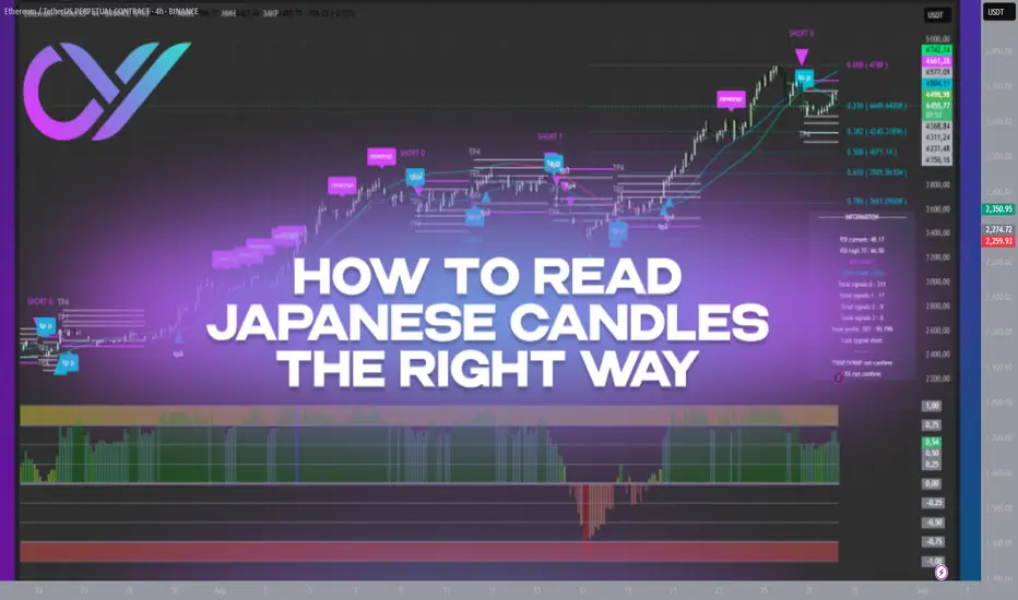
Getting Support and Resistance Levels using optionsI describe a creative method to use external options data to then plot support and resistance levels directly on the chart. Up to 30 tickers supported at once and updates as frequently as you want.

Futures - Commodities / Financial: Nasdaq case (MNQ)Applying A+ setup, volume profile (high volume nodes, low volume nodes day and intra-day and possibly extended to swing probability), smart money concept, numerical volume buy/sell side. trend confirmation, tick charts.

Futures - Commodities / Financial: Gold case (MGC)Applying A+ setup, volume profile (high volume nodes, low volume nodes day and intra-day and possibly extended to swing probability), smart money concept, numerical volume buy/sell side. trend confirmation, tick charts.
