Energy Market Analysis and the Rising Geopolitical Tensions1. Overview of the Global Energy Market
The global energy market is a vast network of interconnected systems that encompass fossil fuels (oil, coal, and natural gas), renewable sources (solar, wind, hydro, and bioenergy), and emerging technologies such as hydrogen and nuclear fusion. As of 2025, fossil fuels still account for approximately 80% of global energy consumption, although renewable energy’s share is growing rapidly due to environmental pressures and technological progress.
Key Players in the Energy Market
OPEC and OPEC+: The Organization of the Petroleum Exporting Countries (OPEC), led by Saudi Arabia, along with partners like Russia (OPEC+), plays a central role in regulating global oil supply and influencing prices.
The United States: A global leader in shale oil and gas production, the U.S. has transformed from an energy importer to a major exporter, significantly altering global trade flows.
China and India: As the world’s largest energy consumers, these nations’ growing demand drives global market trends, particularly in coal and renewable energy investments.
Russia: A dominant exporter of natural gas to Europe and oil to Asia, Russia’s geopolitical strategies have direct consequences on global energy stability.
Current Market Trends
Increased diversification toward renewable energy and energy storage systems.
Shift in trade patterns as Europe reduces dependence on Russian energy.
Price volatility driven by conflicts, sanctions, and supply chain disruptions.
Strategic stockpiling and national energy security initiatives.
2. The Role of Geopolitics in Energy Markets
Energy and geopolitics are deeply intertwined. Control over energy resources has long been a source of both cooperation and conflict among nations. Geopolitical events often cause significant fluctuations in energy supply and prices. For example:
The 1973 Oil Crisis, when Arab nations embargoed oil exports to the West, caused severe economic shocks.
The Gulf War (1990–91) disrupted oil flows and reshaped Middle Eastern energy politics.
The Russia–Ukraine war (2022–present) has triggered global energy shortages and a reorientation of European energy policy.
Why Geopolitics Matters
Energy as a Strategic Weapon: Countries with abundant energy reserves use them as geopolitical tools to influence others.
Supply Chain Disruptions: Political instability or sanctions can halt production or transportation.
Investment Uncertainty: Geopolitical risks discourage long-term investments in exploration and infrastructure.
Shifts in Alliances: Nations often realign politically to secure stable energy supplies.
3. Geopolitical Flashpoints Affecting the Energy Market
a. The Russia–Ukraine Conflict
The ongoing Russia–Ukraine war has had one of the most profound impacts on the global energy system in decades. Before the conflict, Russia supplied nearly 40% of Europe’s natural gas. Sanctions and the subsequent cutoffs have forced Europe to diversify rapidly toward liquefied natural gas (LNG) from the U.S., Qatar, and Norway.
This geopolitical shift has led to:
Record-high energy prices in Europe (2022–2023).
Acceleration of renewable energy projects to reduce dependence on imports.
Growth in LNG infrastructure, especially in Germany, the Netherlands, and Poland.
Increased Russian energy exports to China and India, creating new trade alliances.
b. Middle East Tensions
The Middle East remains the heart of global oil production, with countries like Saudi Arabia, Iran, Iraq, and the UAE controlling vast reserves. However, the region’s persistent instability—stemming from political rivalries, sectarian divides, and external interventions—creates continuous uncertainty.
Recent flare-ups, such as Iran–Israel tensions and Red Sea shipping disruptions, have threatened supply routes through vital chokepoints like the Strait of Hormuz and Suez Canal, through which nearly 20% of global oil shipments pass.
c. The South China Sea Dispute
The South China Sea is a key maritime route that handles nearly 30% of global trade, including large volumes of energy cargo. Competing territorial claims between China, Vietnam, the Philippines, and others create risks for oil and gas exploration and maritime transport. China’s increasing militarization of the area has strategic implications for global energy logistics, especially for nations dependent on oil imports from the Middle East.
d. U.S.–China Strategic Competition
The rivalry between the U.S. and China extends beyond trade—it encompasses technology, semiconductors, and energy resources. Both nations are competing for leadership in clean energy technologies such as solar panels, batteries, and electric vehicles. Additionally, the race to control rare earth minerals—vital for renewable technologies—has become a geopolitical battleground.
4. Energy Security and Supply Chain Vulnerabilities
Energy security refers to the uninterrupted availability of energy sources at an affordable price. Geopolitical tensions undermine this stability in multiple ways:
Disrupted Supply Chains: Wars or sanctions can halt production and transport of energy commodities.
Infrastructure Attacks: Pipelines and refineries are often prime targets during conflicts.
Price Volatility: Market panic and speculation amplify price swings, harming consumers and industries.
Dependence Risks: Heavy reliance on a single supplier or route increases vulnerability.
In response, many countries are pursuing energy diversification strategies, developing domestic reserves, investing in renewables, and building strategic petroleum reserves (SPR) to cushion against shocks.
5. The Green Energy Transition Amid Geopolitical Uncertainty
The global shift toward renewable energy is reshaping the geopolitical map. Solar, wind, hydro, and green hydrogen are reducing dependence on fossil fuels, yet they introduce new challenges—especially around the sourcing of critical minerals like lithium, cobalt, and nickel.
Opportunities in the Green Transition
Energy Independence: Nations can reduce reliance on imports by producing renewable energy domestically.
Job Creation: Expansion of renewable infrastructure creates employment and stimulates innovation.
Climate Commitments: The transition supports global sustainability goals under the Paris Agreement.
Challenges
Mineral Dependency: Many clean technologies rely on minerals concentrated in politically unstable regions (e.g., Congo for cobalt).
High Initial Investment: Developing renewable capacity requires significant capital.
Technological Gaps: Developing nations may struggle to keep pace with advancements in green technology.
6. Market Impacts: Price Fluctuations and Investment Trends
Geopolitical instability exerts a direct impact on energy prices:
Oil Prices: Fluctuate sharply with supply disruptions. For instance, Brent crude spiked above $120 per barrel in 2022 due to the Ukraine crisis.
Natural Gas Prices: Europe’s gas prices increased fivefold amid the cutoff from Russia.
Coal Demand: Surged temporarily as nations sought alternatives to gas.
Renewable Energy Investments: Hit record highs as governments sought energy security through self-sufficiency.
Investors are increasingly incorporating geopolitical risk assessments into portfolio decisions. Energy companies are diversifying geographically and shifting capital toward renewables and resilient infrastructure.
7. Regional Analysis
a. Europe
Europe has taken bold steps toward energy independence. The EU’s REPowerEU plan aims to cut Russian gas imports by 90% and expand renewable capacity. However, the short-term transition has been costly, leading to inflation and industrial challenges.
b. North America
The U.S. continues to leverage its shale revolution and emerging hydrogen sector to strengthen energy security. Canada’s vast oil sands also play a role in regional stability.
c. Asia-Pacific
Asia remains the largest energy-consuming region. China leads in solar and battery manufacturing, while India is aggressively expanding its renewable portfolio. However, both nations remain dependent on coal and imported oil.
d. Middle East and Africa
The Middle East continues to dominate fossil fuel exports, but some nations—like the UAE and Saudi Arabia—are investing in renewable diversification through initiatives like NEOM and Masdar. African countries such as Nigeria and Mozambique are emerging gas exporters, though political instability hinders growth.
8. The Future of Energy Geopolitics
The energy landscape is moving toward multipolarity—no single region will dominate global energy supply. Key trends shaping the future include:
Energy Transition Diplomacy: Nations will compete to lead in clean technology exports.
Technological Dominance: Control over green technology patents and supply chains will become a geopolitical tool.
Strategic Partnerships: New alliances will form around renewable energy corridors, critical minerals, and hydrogen infrastructure.
Decentralization of Power: Smaller nations rich in minerals or renewable potential will gain strategic significance.
9. Policy Recommendations
To mitigate risks and foster stability, global policymakers should:
Diversify Energy Sources: Reduce dependence on single suppliers or regions.
Invest in Infrastructure Security: Protect pipelines, grids, and data networks from attacks.
Strengthen Multilateral Cooperation: Use institutions like the IEA, WTO, and G20 to mediate energy disputes.
Accelerate Renewable Adoption: Support financing and innovation in clean energy technologies.
Promote Strategic Reserves: Maintain emergency stockpiles for oil, gas, and critical minerals.
Conclusion
The global energy market stands at a crossroads where geopolitics and sustainability intersect. Rising geopolitical tensions—whether from wars, trade rivalries, or territorial disputes—continue to disrupt supply chains and influence market dynamics. Yet, this period of uncertainty also presents an opportunity: to accelerate the transition toward a more secure, diversified, and sustainable energy future.
Energy will always remain a cornerstone of national power, but its sources, structures, and strategies are evolving. Nations that adapt—by embracing renewable energy, strengthening supply resilience, and engaging in cooperative diplomacy—will not only withstand geopolitical shocks but also lead the next chapter of the global energy revolution.
X-indicator

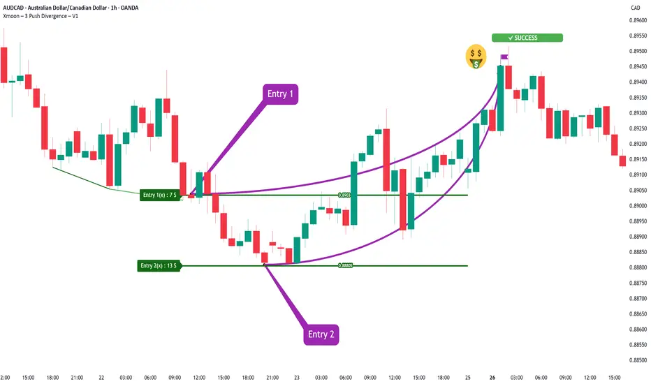
Xmoon Indicator Tutorial – Part 3 – Step Entry (DCA Entry)📘 Xmoon Indicator Tutorial – Part 3
🎯 Step Entry (DCA Entry)
Step-by-step entry, also known as DCA (Dollar Cost Averaging), is one of the key parts of the Xmoon – 3 Push Divergence strategy.
🔹 Why is it important?
After a 3 Push Divergence pattern appears, the market usually doesn’t reverse immediately.
It often moves a bit further in the same direction before turning back.
If we put all our capital in at once, the risk of liquidation increases.
🔹 The solution
We split the capital into several parts and enter the market step by step:
✦ If the market doesn’t reverse from Entry 1 , the chance of reversal at Entry 2 is higher
✦ If it doesn’t reverse from Entry 2, the chance at Entry 3 increases even more
✦ And so on — with each new step, the probability of reversal grows
Benefits of step entries:
✅ Lower overall risk
✅ Higher win rate
✅ Positions reach the Risk Free point faster
📣 If you have any questions or need guidance, feel free to ask us. We’d be happy to help.
Understanding the Money Flow in the Coin Market
Hello, fellow traders!
Follow me to get the latest information quickly.
Have a great day!
-------------------------------------
(USDT 1D Chart)
(USDC 1D Chart)
I believe that USDT and USDC show a gap up trend when funds flow into the coin market, and a gap down trend when funds flow out.
Therefore, unless the gap turns into a downtrend, the coin market is expected to maintain its upward trend.
-
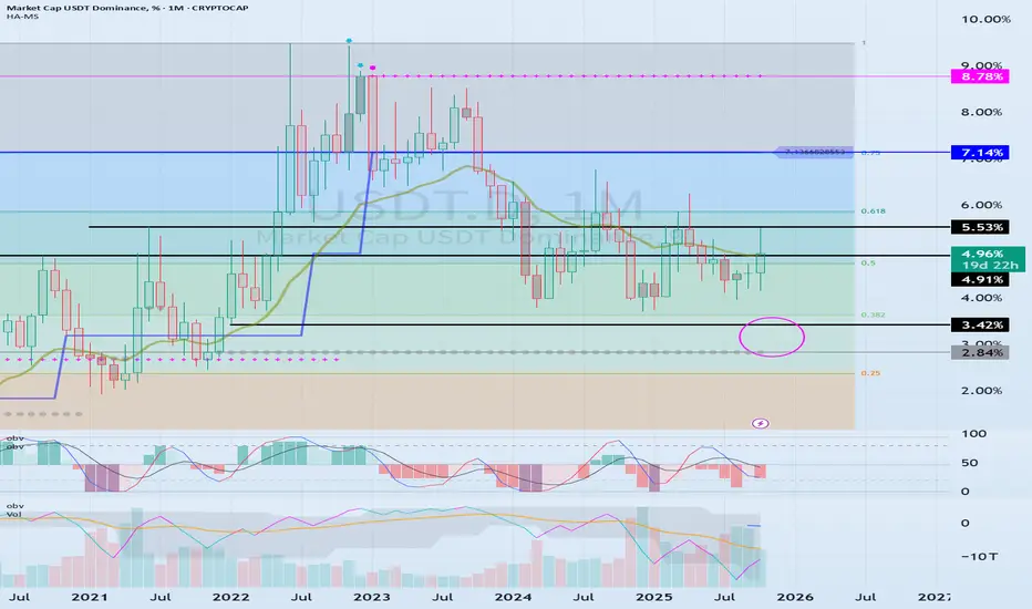
(USDT.D 1D Chart)
(1M Chart)
As funds flow into and out of the coin market through USDT and USDC, USDT dominance is likely to ultimately rise.
However, I believe that the funds (USDT, USDC) flowing into the coin market will change dominance through trading.
In other words, if USDT dominance declines, the coin market is likely to trend upward.
This is because coins (tokens) are being purchased with USDT.
If USDT dominance remains below 4.91 or declines, the coin market is likely to trend upward.
Therefore, if USDT dominance rises without any evidence of fund outflows through USDT or USDC, it can be interpreted as a temporary increase in selling pressure.
If USDT or USDC gaps downward in this situation, the price will fail to defend, leading to a downward trend in the coin market.
Therefore, it's best to look at the USDT and USDT.D charts to understand the general flow of funds.
-
(BTC.D 1D chart)
(1M chart)
I believe BTC dominance reflects the relationship with altcoins, rather than the rise or fall of the coin market or the rise and fall of BTC itself.
In other words, rising BTC dominance indicates a concentration of funds toward BTC, increasing the likelihood that altcoins will gradually move sideways or experience a downward trend.
Therefore, for an altcoin bull market to begin, it must remain below 55.01-62.47 or show a downward trend.
Therefore, it is recommended to check BTC dominance before trading altcoins and develop a trading strategy.
--------------------------------------------------
Summary of the above:
For the coin market to continue its bull market,
1. USDT and USDC must maintain a gaping upward trend.
2. USDT dominance should decline below 4.91.
3. BTC dominance should decline below 55.01.
-
Thank you for reading.
I wish you successful trading.
--------------------------------------------------
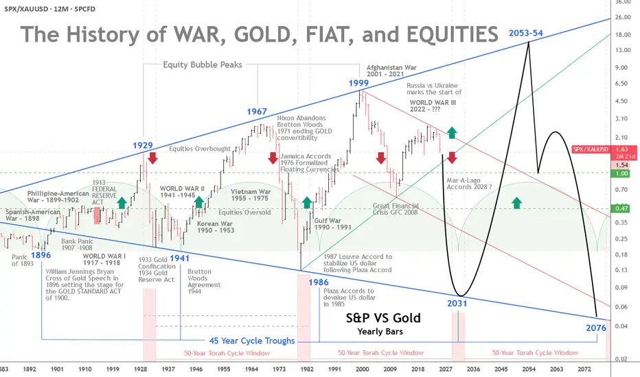
The History of War, Gold, Fiat, and EquitiesGold vs. Equities — The 45-Year Cycle and a Pending Monetary Reset
The interplay of war, gold, fiat money, and equities has long been a barometer of real wealth and economic stability. A recurring pattern emerges across modern history: approximately 45-year intervals when gold strengthens relative to equities.
From the Panic of 1893 to the present, these cycles have coincided with major monetary shifts and geopolitical shocks.
With a broadening 100-year pattern, rising geopolitical tension, and roughly $300 trillion in global debt, a monetary reset by the early 2030s is plausibly on the horizon.
The 45-Year Cycle — Gold’s Strength at Equity Troughs
The pattern’s first trough is traced to 1896, when William Jennings Bryan’s “Cross of Gold” speech preceded the Gold Standard Act of 1900. Equities were weak after the Panic of 1893, and gold gained prominence. Thirteen years later, the Federal Reserve would be created. More on the 45-year cycle later.
The 50-Year Jubilee Cycle
The Torah’s 50-year Jubilee cycle, as outlined in Leviticus 25:8–12, is a profound economic and social reset that follows seven 7-year Shemitah cycles, totaling 49 years, with the 50th year designated as the Jubilee.
Each Shemitah cycle concludes with a sabbatical year (year 7, 14, 21, 28, 35, 42, 49), during which the land rests, debts are released, and economic imbalances are addressed (Leviticus 25:1–7).
The Jubilee, occurring in the 50th year, amplifies this reset by mandating the return of ancestral lands, freeing of slaves, and further debt forgiveness, symbolizing a divine restoration of societal equity.
While built on the 49-year framework of seven Shemitahs, the 50th year stands distinct, marking a transformative culmination rather than a simple extension of the Shemitah cycle.
The five-year Jubilee windows highlighted at the base of the chart compliment the 45-year cycles previously noted. The 4 year Jubilee windows are projected from the roaring 20s peak in 1929 and the 1932 bear market low four years later.
The next Jubilee window is scheduled to occur some time between 2029 and 2031.
Returning to History and the 45-Year Cycles:
The Panic of 1907 and the Fed
The Panic of 1907 was a severe crisis, with bank runs, failing trust companies, and a liquidity crunch centered in New York. The collapse of copper speculators (F. Augustus Heinze and Charles W. Morse) triggered runs on institutions like the Knickerbocker Trust.
Private bankers led by J.P. Morgan injected liquidity (over $25 million) to stabilize the system. The shock exposed the absence of a lender of last resort and precipitated reforms.
Congress responded with the Aldrich–Vreeland Act (1908) and the National Monetary Commission, whose 1911 report recommended a central bank to supply “elastic currency.”
After debate and hearings, President Woodrow Wilson signed the Federal Reserve Act on December 23, 1913, creating a decentralized central bank with 12 regional banks.
Some alternative accounts (e.g., The Creature from Jekyll Island) argue that the panic was exploited to centralize financial control. Mainstream history, however, treats the panic as the genuine catalyst for reform.
Whatever the intent, the Fed’s creation shifted the tools available to manage crises—and, over time, central banks have played an instrumental role in financing wars and expanding Fiat currency.
The Fed and World War I
World War I began in Europe in 1914 (U.S. entry in 1917). The Fed began operations in November 1914 and later supported wartime financing by:
Marketing Liberty Bonds (~$21.5 billion raised, 1917–1919).
Providing low-interest loans to banks buying Treasury securities (via 1916-era amendments).
Expanding the money supply, which contributed to wartime inflation.
Although the Fed was created primarily to prevent panics and stabilize banking, its early role in war finance shifted expectations about central banking’s functions.
From Confiscation to Bretton Woods to the Nixon Shock
In 1933, during the Great Depression, the U.S. effectively nationalized gold—private ownership was outlawed, and the official price was later reset at $35/oz by the Gold Reserve Act of 1934. Private ownership remained restricted until President Ford legalized it again in 1974.
World War II and the Bretton Woods Agreement (1944) cemented gold’s role: the dollar became the anchor of the system, and other currencies pegged to it.
That status persisted until August 15, 1971, when President Nixon suspended dollar-gold convertibility—the “Nixon Shock”—moving the world toward fiat currencies.
The Petrodollar and Post-1971 Arrangements
After 1971, the U.S. worked to preserve dollar demand. The petrodollar system emerged in the early 1970s: following the 1973 oil shock, a U.S.–Saudi understanding (1974) helped ensure oil continued to be priced in dollars and that oil revenues were recycled into U.S. Treasuries—supporting the dollar’s global role despite its fiat status.
Devaluations, Floating Rates, and the End of Bretton Woods
Two formal “devaluations” followed the Nixon Shock:
Smithsonian Agreement (Dec 18, 1971): Raised the official gold price from $35 to $38/oz (an 8.57% change) as a stopgap attempt to stabilize fixed rates without restoring convertibility. It widened exchange banding but proved unsustainable.
On February 12, 1973, the official gold price was revalued to $42.22/oz (roughly a 10% change), a symbolic acknowledgment that Bretton Woods was collapsing. By March 1973, major economies had effectively moved to floating exchange rates, and market gold prices surged.
These moves were reactive attempts to adjust the dollar’s value amid trade deficits, inflation, and speculative pressures. They ultimately ushered in a fiat era, where market forces, not official pegs, set the price of gold.
Triffin’s Dilemma — Then and Now
Triffin’s Dilemma describes the structural tension faced by a reserve currency issuer: it must supply enough currency to ensure global liquidity (running deficits) while risking domestic instability and a loss of confidence.
Britain faced this under the gold standard; the U.S. faced it under Bretton Woods and again after 1971, albeit in a different form.
Modern manifestations include inflation, persistent fiscal and external deficits, and mounting debt. International policy coordination (e.g., the Plaza and Louvre Accords) repeatedly tried—and only partially succeeded—to manage these tensions.
The Plaza (1985) and Louvre (1987) Accords
Plaza Accord (Sept 22, 1985): G5 nations coordinated to depreciate the dollar (it had appreciated ~50% since 1980). The goal was to ease U.S. trade imbalances. The dollar fell substantially vs. the yen and mark by 1987.
Louvre Accord (Feb 22, 1987): G6 sought to stabilize the dollar after its rapid decline following the Plaza Accord, setting informal target zones and coordinating intervention. It temporarily checked volatility but did not solve underlying imbalances.
Both accords illustrate the extreme difficulty in balancing global liquidity needs with domestic economic health in a fiat system.
De-industrialization, Bubbles, and the Broadening Pattern
Orthodox history would argue that U.S. de-industrialization in the 1990s was rational at the time. Globalization and cost arbitrage provided short-term benefits, but they increased trade deficits, foreign dependency, and robbed the middle class of high-paying jobs. That loss of capacity heightens vulnerability to dollar shocks and complicates any re-industrialization efforts today.
Measured in gold, equities have experienced expanding ranges:
Equity peaks (1929, 1967, 1999) were followed by troughs where gold outperformed (1896, 1941, 1980/86).
Gold peaked in 1980, even though the cyclical trough in the broader pattern was nearer 1986—showing that cycles can shift.
The dot-com peak (1999) marked a secular low for gold relative to equities. The ensuing crashes, 9/11, and the War in Afghanistan, followed by the 2008–2009 Financial Crisis (GFC), moved markets profoundly—both nominally and in terms of gold.
From 1999, relative equity values fell until a trough around 2011 (coinciding with the European debt crisis). Quantitative easing and policy responses (2010 onward) restored growth, but frailties remained (e.g., repo market stress in 2018).
COVID produced another shock; aggressive fiscal and monetary responses engineered a V-shaped asset recovery but also higher inflation.
Relative to gold, equities peaked in 1999 and have trended lower since. As nominal stock prices register all-time-highs in dollars—fueled by AI and other themes—equities are historically overvalued. When priced against gold, the apparent bubble in nominal terms looks more like an extended bear market ready for its next down-leg.
The Broadening Pattern and the Next Trough
A broadening pattern illustrates the gold equity ratio range expanding with each major peak and trough. If we accept a roughly 45-year rhythm from the 1980/86 period, the next cyclical trough may fall between 2025 and 2031, with 2031 a focal point. Whether this manifests as a runaway gold price, a sharp equity collapse, or both remains uncertain.
If a sovereign-debt crisis or major war escalates, changes could accelerate—some scenarios even speculate about a negotiated new monetary framework (e.g., “Mar-A-Lago Accords”) in the next 5–15 years.
Geopolitics and the $300 Trillion Debt
Geopolitical tension compounds financial stress. The Russia-Ukraine war, plausibly the start of World War III, NATO involvement, and nuclear saber-rattling evoke systemic risk. Global debt—estimated at around $300 trillion (over 300% of GDP per the Institute of International Finance)—is unsustainable.
U.S. public debt (~$38 trillion) now carries interest costs comparable to defense spending.
Central bank money creation to service debt erodes confidence in fiat currencies and boosts demand for gold. Historical monetary resets (Bretton Woods, Nixon Shock) followed similar pressures of debt and conflict.
A modern reset could push gold well beyond current records—potentially into the high thousands or five-figure territory if confidence collapses.
Implications of a Pending Monetary Reset
A reset might take various forms:
A partial return to a gold-linked standard, perhaps supplemented by tokenized/digital assets.
Forced debt restructuring or coordinated global defaults.
Rapid adoption of digital currencies (including state-issued tokens—CBDCs) as part of a new settlement architecture.
Given Triffin’s Dilemma, inflated financial assets, and interconnected global linkages, a modern reset could be far larger in scale and speed than past adjustments. Assets, trade, and supply chains are far larger and more intertwined than in 1971, increasing contagion risk.
Practical takeaway: investors should consider gold’s role in portfolios; policymakers must confront debt sustainability or risk a market-driven reckoning that could disrupt global finance.
Conclusion
The Torah's 50-year Jubilee, the 45-year cycle and the century-long broadening pattern suggest we are approaching a structural turning point.
Triffin’s Dilemma, decades of accumulated imbalances, de-industrialization, and escalating geopolitical risk suggest a monetary reset is plausible between 2030 and 2035—possibly sooner under severe stress.
A modern reset would be more disruptive than past episodes because today’s global economy is larger, more integrated, and technologically complex. The question is not only whether such a reset will occur, but how policymakers and markets will manage it.
The stakes—global financial stability and the relative value of fiat versus real assets—could not be higher.
Friday - the day the market shows its true faceEveryone loves chasing moves early in the week - Monday, Tuesday, news, data drops. But if you look closer, the most honest market signals usually appear on Fridays. By that time, the fight between buyers and sellers is settled, and the price reveals who really has control.
When big funds and banks are confident about direction, they don’t rush to close positions before the weekend. The market often ends the week at its highs - and Monday continues the same move. But if selling pressure picks up late on Friday, it’s usually a warning sign: traders are nervous and prefer not to hold risk over the weekend.
Friday’s close isn’t just another candle - it’s the verdict for the entire week. A close near the top of the range means demand is strong; near the bottom means fear and profit-taking are taking over.
Retail traders often close everything before the weekend to “stay safe.” But smart money uses those thin Friday hours to shake out weak hands and grab liquidity. That’s why the real moves often begin right after those late-week impulses.
What to keep an eye on:
1. Watch where the price closes within the weekly range - it sets the tone for Monday.
2. Check volume during the last trading hours - it tells you who’s really in control.
3. A strong Friday move with no news? Often that’s the setup for next week’s trend.
Friday’s action is rarely random. It’s the final scene before the next act of the market drama.
Global Market Time Zone ArbitrageExploiting Temporal Gaps in Financial Trading.
Introduction
In the world of finance, time is money—literally. Global markets operate across multiple time zones, from Tokyo to London to New York, creating a continuous 24-hour trading cycle. This nonstop nature of global finance gives rise to an intriguing phenomenon known as “time zone arbitrage.” It refers to the opportunity traders have to profit from differences in asset prices across markets that open and close at different times. These discrepancies often occur due to variations in liquidity, news flow, investor sentiment, and economic data releases.
While traditional arbitrage exploits price differences between identical assets in different locations or exchanges, time zone arbitrage takes advantage of temporal inefficiencies—how the same information is priced differently at different times of day across the globe. Understanding this concept requires a grasp of market interconnections, regional behaviors, and how global events ripple through the timeline of financial markets.
1. The 24-Hour Trading Clock
Global financial markets never sleep. When the Asian markets wind down, Europe takes over, followed by the U.S. sessions, which eventually hand back momentum to Asia. This rotation ensures that trading activity continues around the clock, covering key financial hubs:
Region Major Markets Trading Hours (GMT) Overlap With
Asia-Pacific Tokyo, Hong Kong, Singapore 00:00 – 08:00 Europe (partial)
Europe London, Frankfurt, Paris 07:00 – 15:30 Asia (early), U.S. (midday)
North America New York, Chicago 12:00 – 21:00 Europe (early)
The overlapping hours, especially between London and New York, see the highest liquidity and volatility. However, when one market closes and another opens, temporary inefficiencies can occur. These are the breeding grounds for time zone arbitrage opportunities.
2. Defining Time Zone Arbitrage
Time zone arbitrage is a strategy that seeks to profit from price differences created by timing gaps between global markets. For instance, when an event occurs after the close of one market but before another opens, the latter reacts first. Traders anticipating how the closed market will respond once it opens can position themselves ahead of that reaction.
Example:
Suppose a major tech company listed on both the New York Stock Exchange (NYSE) and the Tokyo Stock Exchange (TSE) releases strong earnings after NYSE closes. The Tokyo market opens several hours later and reacts immediately to the news, pushing prices higher. A savvy trader could buy shares in Japan and later sell in New York when it opens, assuming the NYSE-listed shares will follow the same upward adjustment.
This approach doesn’t involve “insider information”—it’s about acting faster within a global time structure.
3. The Mechanisms Behind Time Zone Arbitrage
a. Information Lag
Financial information doesn’t reach all investors at the same time. Even though digital news travels instantly, the interpretation and pricing of that information vary across regions.
Asian traders may react differently to U.S. Federal Reserve comments than their European counterparts.
Markets that close early might “miss” a late-breaking development, creating temporary mispricing.
b. Fund Valuation Delays
Mutual funds, ETFs, and index funds in certain markets are priced based on closing prices, which creates valuation lags. For example, U.S. mutual funds investing in Asian equities may value their holdings at stale prices, ignoring overnight moves in Asian markets. Arbitrageurs can exploit this discrepancy through stale price arbitrage, a form of time zone arbitrage.
c. Cross-Listed Securities
When the same company’s stock trades on multiple exchanges (e.g., London and New York), time zone differences can create arbitrage windows. Traders monitor price deviations and use derivatives or foreign exchange tools to hedge risk while exploiting temporary inconsistencies.
d. Currency Influence
Because cross-border trading involves multiple currencies, forex market movements play a critical role in time zone arbitrage. Exchange rates fluctuate continuously, impacting how international assets are priced in local currencies.
4. Real-World Examples of Time Zone Arbitrage
i. Japan-U.S. Market Arbitrage
When Wall Street closes, the Nikkei often reacts to the S&P 500’s performance overnight. Traders who anticipate these reactions can use index futures to capitalize on correlations between the two.
ii. Asian ETFs in U.S. Markets
Many U.S.-listed ETFs (like the iShares MSCI Japan ETF) track Asian indices. However, when the U.S. market opens, Asian exchanges are closed. If U.S. traders expect the Asian market to open higher the next day (based on global cues), they can buy the ETF in anticipation—earning profits when the ETF’s price aligns after Asia opens.
iii. Currency Futures
Currency markets, particularly USD/JPY or EUR/USD, exhibit strong correlations with regional stock markets. Traders use these as time-zone proxies, trading currencies in one time zone to predict or hedge equity movements in another.
iv. Gold and Commodities
Commodities like gold trade continuously across exchanges, but price adjustments often occur in waves. If Asian demand pushes gold higher overnight, U.S. traders can anticipate a catch-up rally during their session.
5. Institutional Exploitation and Algorithmic Trading
Modern arbitrage has largely become the domain of institutions equipped with algorithmic trading systems. High-frequency trading (HFT) algorithms scan multiple markets, currencies, and time zones to detect fleeting inefficiencies.
Key techniques include:
Latency Arbitrage: Exploiting milliseconds of delay between data feeds from exchanges in different time zones.
Cross-Exchange Hedging: Simultaneously buying in one market and selling in another as prices converge.
AI-Powered Prediction Models: Using sentiment analysis and global event tracking to forecast market reactions in different time zones.
Because these opportunities exist for only seconds to minutes, manual traders rarely succeed without advanced technology.
6. Risks and Limitations
Despite its appeal, time zone arbitrage isn’t without challenges:
a. Execution Risk
Price discrepancies may vanish before the trade is executed, especially in high-frequency environments. Latency and order execution speed are critical.
b. Currency Risk
Cross-border transactions expose traders to exchange rate volatility. A profitable price move could be offset by an unfavorable currency fluctuation.
c. Transaction Costs
Commissions, spreads, and taxes can erode the small profit margins typical in arbitrage strategies. Institutions often rely on large volumes to make such trades worthwhile.
d. Market Correlations
With globalization, asset correlations have increased, reducing inefficiencies. Arbitrage opportunities are rarer and shorter-lived.
e. Regulatory Barriers
Different countries have distinct trading regulations, taxes, and capital controls. Navigating these legal frameworks requires compliance expertise.
7. Time Zone Arbitrage in Different Asset Classes
a. Equities
Cross-listed stocks and ETFs provide the most direct time-zone arbitrage routes. Example: ADRs (American Depository Receipts) and their foreign counterparts often show price mismatches.
b. Bonds
Fixed-income markets move slower but still present opportunities. Global bond ETFs can react late to sovereign yield changes, creating short-term valuation gaps.
c. Currencies
Forex markets operate 24/7, making them the backbone of time zone arbitrage. Traders use currency pairs as early indicators for equity and commodity moves.
d. Commodities
Oil, gold, and copper often see price leadership shifts between Asia, Europe, and the U.S. as regional demand and supply updates roll out.
e. Cryptocurrencies
Crypto markets are open 24/7, yet time-zone trading patterns persist due to regional investor behavior. Asian sessions often set the tone for early momentum, while U.S. traders influence volatility later in the day.
8. Case Study: The Asia–U.S. Price Reaction Cycle
Consider a simplified chain reaction:
U.S. closes higher on positive economic data.
Asian markets open hours later and react to the U.S. optimism by rallying.
European markets open next, digesting both U.S. and Asian sessions, adding or adjusting momentum.
The U.S. reopens, responding to global sentiment formed overnight.
Traders who understand this cyclical information flow can position themselves to profit. For instance, buying Asian index futures before the open after a strong U.S. session often yields short-term gains—an example of inter-temporal correlation arbitrage.
9. The Future of Time Zone Arbitrage
Technological advancement is both a blessing and a curse for arbitrageurs. On one hand, machine learning and big data analytics enhance detection of global mispricings. On the other, automation has drastically reduced the lifespan of opportunities.
Emerging technologies shaping the future include:
Quantum computing for ultra-fast data analysis.
AI-driven sentiment analysis tracking news flow across time zones.
Decentralized trading platforms reducing latency barriers.
Moreover, as financial institutions seek a “follow-the-sun” trading model, with teams operating in shifts across continents, time zone arbitrage could evolve into real-time global arbitrage networks.
10. Conclusion
Time zone arbitrage stands as a testament to the interconnectedness of modern finance. It reveals how geography and time, despite technological progress, still shape global asset pricing. By leveraging differences in market hours, traders exploit short-lived inefficiencies caused by delayed reactions to information.
However, succeeding in this space requires precision, speed, and understanding of cross-market correlations. What began as a manual strategy has now evolved into a highly automated, algorithm-driven endeavor dominated by institutions.
In essence, time zone arbitrage is the art of turning time itself into a tradable asset—where every second counts, and every sunrise in Tokyo or sunset in New York opens a new chapter of global opportunity.
Currency Shifts and Their Impact on Global Trade1. Understanding Currency Shifts
A currency shift refers to a change in the value of one nation’s currency relative to another in the foreign exchange (forex) market. This movement is driven by multiple factors including interest rates, inflation, fiscal policies, political events, and market psychology.
The value of a currency is typically measured against others through exchange rates — for instance, 1 U.S. Dollar equals ₹83 Indian Rupees. If the rupee weakens to ₹85 per dollar, it means the rupee has depreciated; conversely, if it strengthens to ₹80, it has appreciated.
Key Drivers of Currency Shifts:
Interest Rate Differentials: Higher interest rates attract foreign capital, boosting demand for that currency.
Inflation: Low inflation generally strengthens a currency; high inflation erodes purchasing power.
Economic Growth: Strong GDP growth signals a healthy economy, attracting investment.
Political Stability: Investors prefer stable nations with predictable economic policies.
Trade Balances: Countries with large trade surpluses tend to have stronger currencies due to export demand.
Market Sentiment: Traders’ expectations often move currencies even before data confirms trends.
2. The Mechanics of Currency Appreciation and Depreciation
When a currency appreciates, it gains value relative to others. For example, if the euro strengthens against the dollar, European goods become more expensive for U.S. buyers, potentially reducing exports. On the other hand, depreciation makes exports cheaper and imports more expensive, often improving trade balances for export-heavy economies.
Currency Appreciation:
Exports become costlier, reducing demand abroad.
Imports become cheaper, increasing domestic consumption of foreign goods.
Inflationary pressures ease due to cheaper imports.
Tourism becomes costlier for foreign visitors.
Currency Depreciation:
Exports become cheaper and more competitive globally.
Imports become expensive, raising domestic inflation.
Foreign investors may hesitate due to reduced returns in depreciated terms.
Tourism becomes attractive to foreign travelers.
These movements create ripple effects in trade balances, corporate earnings, and even employment rates in export-dependent industries.
3. Currency Shifts and Export Competitiveness
The direct relationship between currency values and export competitiveness is one of the most crucial aspects of international trade.
When a nation’s currency weakens, its goods and services become more affordable to global buyers. This often leads to:
Increased export volumes.
Higher revenues for export industries.
Improved trade balance.
For example, China’s export boom in the 2000s was partly supported by a deliberately undervalued yuan, which kept Chinese products inexpensive in global markets.
Conversely, a strong currency can hurt exporters. Japan’s experience in the 1990s and early 2000s is a classic case — a strong yen made Japanese goods costly overseas, slowing growth and triggering deflationary pressures.
Example: The Indian Perspective
A weaker Indian Rupee benefits textile and IT exporters, as they earn in dollars but pay costs in rupees. However, it hurts oil importers and increases domestic inflation — showing how currency shifts can have both winners and losers within the same economy.
4. Impact on Imports and Domestic Consumption
Currency shifts don’t just affect exports — they deeply influence imports and consumer prices.
When a country’s currency depreciates, imported goods become more expensive. This can drive up prices of:
Crude oil and energy.
Machinery and electronics.
Raw materials for manufacturing.
As import costs rise, domestic inflation tends to follow, reducing the purchasing power of consumers.
On the other hand, currency appreciation makes imported goods cheaper. This benefits consumers and import-heavy industries but can also weaken domestic producers who face tougher competition from foreign suppliers.
Example: The U.S. Dollar’s Global Role
A strong U.S. dollar makes imports cheaper for Americans — from electronics to automobiles — but can hurt U.S. exporters like Boeing or Caterpillar, as their goods become more expensive abroad.
5. Balance of Payments and Trade Deficits
Currency shifts are closely tied to a country’s balance of payments (BoP) — the record of all transactions between residents of a country and the rest of the world.
A depreciating currency can reduce trade deficits by boosting exports and curbing imports.
An appreciating currency can widen trade deficits as imports rise and exports fall.
However, this relationship isn’t always linear. Sometimes, despite a weaker currency, exports may not rise if:
Global demand is weak.
Supply chains are disrupted.
Exporters rely on imported raw materials (which become costlier).
Case Example: The U.S. Trade Deficit
Despite periodic dollar weakness, the U.S. maintains a persistent trade deficit because of its reliance on imports and strong consumer demand. The dollar’s status as a global reserve currency also keeps it artificially strong, sustaining the deficit.
6. Currency Shifts and Multinational Corporations (MNCs)
For multinational corporations, currency shifts are a constant strategic concern. A company earning revenue in multiple currencies faces exchange rate risk, which can affect profits when converting earnings into the home currency.
Impact Areas:
Revenues: Exporters gain from weaker home currencies, while importers benefit from stronger ones.
Costs: Companies sourcing materials abroad face rising costs when their home currency weakens.
Profits: Fluctuating exchange rates can distort earnings reports and shareholder returns.
Example: Apple and the Dollar
Apple earns a major portion of its revenue overseas. When the U.S. dollar strengthens, Apple’s international earnings, once converted into dollars, decline — even if sales volumes remain constant. Hence, large firms use hedging instruments like forward contracts and options to manage this risk.
7. Currency Wars: Competitive Devaluation and Trade Tensions
At times, nations deliberately weaken their currencies to gain a trade advantage — a phenomenon known as a currency war. By devaluing their currency, they make exports cheaper and imports costlier, spurring domestic production and employment.
However, this often leads to retaliatory devaluations and trade frictions.
For instance:
The 1930s Great Depression saw major economies engage in competitive devaluation, worsening global instability.
The 2010s U.S.-China tensions reignited accusations of “currency manipulation” as China kept the yuan undervalued to boost exports.
Currency wars can escalate into trade wars, where countries impose tariffs or restrictions to counter perceived unfair advantages.
8. Currency Shifts and Commodity Trade
Commodities like oil, gold, and agricultural products are traded globally in U.S. dollars. Therefore, currency shifts — especially movements in the dollar — significantly affect commodity prices.
Strong Dollar:
Commodities become more expensive in other currencies, reducing demand.
Oil and gold prices typically fall.
Weak Dollar:
Commodities become cheaper for foreign buyers.
Prices of oil, metals, and gold usually rise.
This dynamic explains why emerging markets, which rely on commodity exports, are highly sensitive to dollar strength. For example, when the dollar weakens, countries like Brazil, Russia, and Indonesia benefit from higher export revenues.
9. Managing Currency Risks in Global Trade
Given the unpredictability of exchange rates, businesses and governments employ various strategies to manage currency risk.
For Businesses:
Hedging Instruments: Using forward contracts, futures, and options to lock in exchange rates.
Currency Diversification: Operating in multiple markets to balance currency exposure.
Natural Hedging: Matching revenues and expenses in the same currency to minimize conversion losses.
For Governments:
Foreign Exchange Reserves: Central banks hold large reserves to stabilize their currencies.
Monetary Policy Interventions: Adjusting interest rates or directly buying/selling currencies in forex markets.
Trade Policy Adjustments: Imposing tariffs or export incentives to offset currency shifts.
Example: India’s RBI Strategy
The Reserve Bank of India often intervenes to smooth excessive volatility in the rupee, buying or selling dollars to maintain stability. This ensures predictability for exporters and importers alike.
10. The Future of Currency and Global Trade
The 21st century is witnessing rapid shifts in the global currency landscape. The rise of digital currencies, blockchain-based settlements, and central bank digital currencies (CBDCs) may reshape how trade is conducted and how exchange rates are managed.
Key Future Trends:
De-dollarization: Countries are gradually reducing dependence on the U.S. dollar in global trade, using local currencies or alternatives like the yuan.
Digital Payments Revolution: Instant cross-border settlements via blockchain can reduce currency conversion costs.
Geopolitical Realignment: Emerging economies, especially in Asia and Africa, are forming regional trade blocs with local currency trade mechanisms.
AI-Driven Forex Models: Advanced algorithms are increasingly predicting and managing exchange rate risks for corporations and funds.
In the coming decade, the line between traditional currency systems and digital ecosystems may blur, making global trade faster but also more complex to regulate.
Conclusion: The Currency-Trade Equation in a Globalized World
Currency shifts are not mere financial statistics; they are powerful forces shaping the destinies of nations, industries, and individuals. From determining the price of crude oil to influencing job growth in export sectors, exchange rate movements ripple through every layer of the global economy.
A weaker currency can boost exports and employment but risk inflation. A stronger one may curb inflation but dampen competitiveness. Striking the right balance is a constant challenge for policymakers and traders alike.
In today’s interconnected world, understanding the interplay between currency shifts and trade is essential not only for economists and governments but also for investors, businesses, and consumers.
As technology, geopolitics, and digital finance redefine global commerce, the ability to adapt to currency movements will determine who thrives — and who struggles — in the ever-evolving landscape of international trade.
Currency Wars and Forex TradingThe Battle Behind Global Exchange Rates.
1. Understanding Currency Wars
A currency war, often called a “competitive devaluation,” occurs when countries intentionally lower the value of their currencies to boost exports, reduce imports, and stimulate domestic economic growth. The logic is simple:
A cheaper currency makes a nation’s goods more affordable abroad.
Exports rise, and trade balance improves.
However, it comes at a cost — other nations retaliate, leading to global instability.
The term “currency war” gained popularity during the 2008 global financial crisis, when major economies used monetary easing policies to flood markets with liquidity, weakening their currencies in the process. But the roots of currency manipulation stretch back centuries — from the 1930s Great Depression to modern-day U.S.-China tensions.
A currency war can start subtly — through interest rate cuts, quantitative easing (QE), or direct market intervention — but its ripple effects can disrupt entire markets, especially the forex market, where even a 0.5% change can move billions of dollars.
2. The Mechanics of a Currency War
To understand how a currency war unfolds, it’s essential to look at the tools nations use to influence their exchange rates.
a. Monetary Policy Manipulation
Central banks are the first line of action. By cutting interest rates, a country makes its currency less attractive to investors, thereby reducing its value. Conversely, raising rates strengthens the currency.
Example: When the U.S. Federal Reserve cuts rates, the dollar weakens, boosting American exports.
b. Quantitative Easing (QE)
QE involves printing money or purchasing financial assets to inject liquidity into the economy. This floods the market with domestic currency, increasing supply and pushing its value down.
Example: Japan and the European Central Bank have extensively used QE to combat deflation and stimulate exports.
c. Foreign Exchange Intervention
Sometimes, central banks directly buy or sell currencies in the forex market to influence rates.
Example: The Swiss National Bank (SNB) famously intervened to keep the Swiss franc from becoming too strong during the Eurozone crisis.
d. Capital Controls
In extreme cases, countries may restrict capital flows to prevent unwanted appreciation or depreciation of their currency.
Each of these tools affects not just domestic economics but also global forex trading dynamics, as investors respond to shifts in interest rates, liquidity, and political intentions.
3. Historical Examples of Currency Wars
Currency wars are not new. They have shaped global trade and politics for nearly a century.
a. The 1930s “Beggar-Thy-Neighbor” Era
During the Great Depression, countries like the U.K. and U.S. abandoned the gold standard and devalued their currencies to make exports cheaper. This triggered retaliatory actions from others, worsening global economic tensions.
b. The Plaza Accord (1985)
In the 1980s, the U.S. faced massive trade deficits with Japan and Germany. To correct this, the Plaza Accord was signed, where nations agreed to devalue the U.S. dollar. It worked temporarily, but the unintended consequence was Japan’s asset bubble in the 1990s.
c. The Modern Currency War (Post-2008)
After the 2008 global financial crisis, central banks adopted zero interest rates and quantitative easing. The U.S. dollar, euro, and yen became heavily manipulated currencies as nations sought export competitiveness.
China, on the other hand, was accused by the U.S. of artificially weakening the yuan to keep exports cheap — an accusation that led to the so-called U.S.-China currency war.
4. The Role of Forex Traders in a Currency War
Currency wars create both risks and opportunities for forex traders. When nations intervene in their exchange rates, it generates high volatility, making the forex market extremely reactive.
a. Increased Volatility
Central bank announcements or policy changes can lead to sudden 2–3% moves in major currency pairs. Traders who can anticipate or react quickly can profit — but the risk of being caught on the wrong side is immense.
b. Predictable Trends
Currency wars often create long-term directional trends. For example, during QE periods, the USD/JPY or EUR/USD pairs followed consistent paths that skilled traders could exploit.
c. Fundamental Trading Becomes Key
In a currency war, understanding macroeconomic indicators — like interest rates, inflation, and trade data — becomes essential. Technical charts alone are not enough; traders must interpret central bank statements, policy outlooks, and global trade flows.
d. Safe-Haven Currencies
When tensions rise, traders flock to “safe-haven” currencies like the Swiss franc (CHF), Japanese yen (JPY), or U.S. dollar (USD). These currencies tend to strengthen during crises, creating defensive strategies for traders.
5. Major Players in Currency Manipulation
The world’s major economies often play leading roles in currency adjustments, either overtly or covertly.
a. The United States (USD)
The dollar is the world’s reserve currency, making it central to all currency wars. The Federal Reserve’s monetary policy has global consequences — a weaker dollar benefits emerging markets, while a stronger dollar tightens global liquidity.
b. China (CNY)
China has historically pegged the yuan to the dollar to control its export competitiveness. The People’s Bank of China (PBoC) carefully manages its exchange rate, often leading to accusations of manipulation from the U.S.
c. Japan (JPY)
Japan’s decades-long battle with deflation led to repeated rounds of currency weakening through Abenomics, a policy mix of fiscal stimulus and monetary easing.
d. The European Union (EUR)
The European Central Bank (ECB) engages in QE and negative interest rates to stimulate growth in the Eurozone, often weakening the euro.
e. Emerging Markets
Countries like India, Brazil, and Russia intervene occasionally to stabilize their currencies against volatile capital flows or inflationary pressures.
6. How Currency Wars Impact the Global Economy
Currency wars can initially appear beneficial for export-heavy economies, but prolonged conflicts have widespread negative effects:
a. Trade Imbalances
While devaluation boosts exports temporarily, it also increases import costs, leading to inflationary pressures and higher prices for consumers.
b. Inflation and Purchasing Power
A weaker currency means imported goods become expensive. This reduces purchasing power and can erode domestic savings.
c. Market Instability
Competitive devaluations can lead to capital flight, stock market crashes, and loss of investor confidence in emerging economies.
d. Geopolitical Tensions
Currency manipulation often leads to diplomatic strains. The U.S. frequently labels countries as “currency manipulators,” triggering trade disputes and tariffs.
e. Race to the Bottom
When every country tries to devalue its currency simultaneously, it results in a zero-sum game — no one truly wins. Instead, the global financial system becomes more unstable.
7. Forex Trading Strategies During Currency Wars
Smart traders understand that currency wars are not random; they follow predictable policy patterns. Here are some effective strategies to trade during such times:
a. Follow Central Bank Policies
Monitor statements from major central banks like the Federal Reserve, ECB, BoJ, and PBoC. Currency trends often align with their monetary direction.
b. Use Carry Trades Cautiously
In normal times, traders borrow low-interest-rate currencies to invest in high-interest ones. During currency wars, however, central banks often cut rates, making carry trades riskier.
c. Focus on Safe-Haven Assets
When uncertainty rises, traders shift funds to safe-haven currencies and assets like gold or the U.S. Treasury bonds. Pairing risk currencies (like AUD or NZD) against safe havens (like JPY or CHF) can yield profits.
d. Use Fundamental + Technical Analysis
Combine macroeconomic understanding (inflation, GDP, interest rates) with technical signals (support, resistance, trendlines) to identify high-probability trades.
e. Manage Risk Aggressively
Currency wars bring unpredictable volatility. Setting tight stop-loss levels, using smaller position sizes, and avoiding overleveraging are crucial.
8. The Digital Age: Currency Wars in the Era of Cryptocurrencies
The emergence of digital currencies and blockchain technology has introduced a new dimension to currency competition. Nations are now exploring Central Bank Digital Currencies (CBDCs) to maintain control over monetary policy and reduce reliance on foreign currencies.
Cryptocurrencies like Bitcoin are often seen as a hedge against fiat currency manipulation. During aggressive devaluations or hyperinflation, digital assets gain appeal as “non-sovereign stores of value.”
For forex traders, the rise of crypto–forex hybrids — trading Bitcoin against fiat pairs (BTC/USD, BTC/JPY) — offers new diversification opportunities. However, it also adds volatility and complexity to traditional currency markets.
9. The Future of Currency Wars
As global economies recover from recent crises and navigate geopolitical tensions, currency wars are expected to evolve — not disappear.
Artificial Intelligence & Algorithms: Central banks and trading firms are increasingly using AI to predict and manage currency flows.
Energy & Commodity Influence: Nations rich in energy reserves (like Russia or Saudi Arabia) may use oil and commodity pricing to influence currency demand.
De-Dollarization: Many nations, especially BRICS members, are pushing for trade settlement in non-dollar currencies to reduce dependence on the U.S. dollar.
Global Coordination: Institutions like the IMF and G20 continue to push for coordination to prevent destructive currency competition.
The next phase of currency wars may not be about devaluation alone but about digital dominance, monetary sovereignty, and data control.
10. Conclusion: Trading in the Midst of Monetary Battles
Currency wars remind us that the forex market is not just about charts, pips, and leverage — it’s about political strategy, economic survival, and global power. For traders, understanding the deeper forces behind exchange rate movements is crucial.
A skilled forex trader doesn’t just react to price — they interpret the motive behind central bank actions, fiscal policies, and trade tensions. The winners in this environment are those who can combine macro insight with disciplined strategy.
In the end, currency wars may be fought by nations, but their outcomes are traded by individuals. Every pip of movement reflects a global tug-of-war between economic giants — and for those who understand the game, it’s both a battlefield and a goldmine.
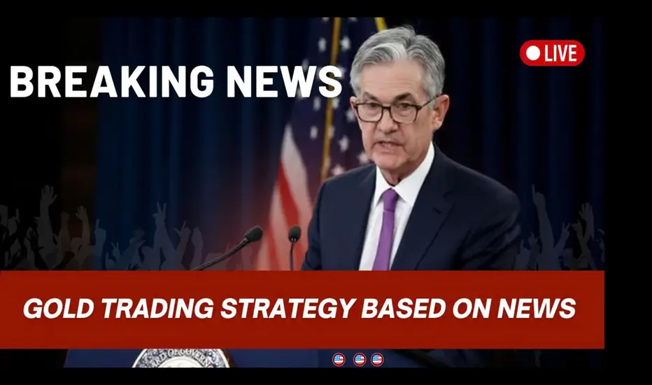
Gold Trading Strategy Based on News (News Trading)Hello everyone,
When it comes to gold, few things move the market faster and stronger than economic news. Data releases such as CPI, NFP, or Fed interest rate decisions can cause gold prices to swing sharply within minutes — creating perfect opportunities for traders who react in time. For example, a higher-than-expected CPI report often pushes gold prices up, while a strong NFP can send them plunging instantly.
To take advantage of these moves, you must first understand how each type of news impacts gold. A high CPI signals rising inflation — gold tends to climb as investors seek protection against inflation. A low CPI usually strengthens the USD, pushing gold lower. A strong NFP indicates economic growth, leading to USD gains and gold weakness, while a weak NFP weakens the USD and boosts gold. As for the Fed’s interest rate decisions : rate hikes strengthen the USD and pressure gold, while rate cuts do the opposite.
The core strategy here is to trade immediately after the news release . If the outcome exceeds expectations, gold typically reacts sharply: high CPI or weak NFP → buy, strong NFP or low CPI → sell . The key is quick execution and strict risk management .
The Economic Calendar on TradingView is your best ally — it helps you track upcoming data releases in real time. Before the news, identify the market expectation and prepare your buy or sell setups. Once the data drops, react based on price action and always set a proper Stop Loss : below support for buys, above resistance for sells, and never risk more than 1–2% of your account per trade .
This strategy’s appeal lies in the high volatility, rapid opportunities , and strong liquidity , which allow for efficient entries and exits. Traders who can stay calm and react correctly can capture sharp profits from news shocks — while those unprepared often get caught in the chaos.
In short, trading gold based on news is a powerful strategy — but it only works if you master timing, manage your risk carefully, and stay updated with tools like the Economic Calendar.
Are you ready to catch gold’s next big move when the news hits?
The Hidden Power of TimeframesThe Hidden Power of Timeframes – Timeframe Alignment Explained! 📊
In this post, we’re diving into a concept that many traders underestimate — and that often silently causes losses:
👉 The interaction between timeframes — also known as Timeframe Alignment.
Or as I like to call it: The Theory of Relativity in Trading. 🕰️📉📈
If you've ever asked yourself:
“Why does the 1H chart look bearish, but the daily chart looks bullish — and what should I do now?”
… then this post might change the way you trade forever. 🔑
🧩 Why Timeframes Are the Missing Piece of the Puzzle
You’ve seen it before:
You flip through 15Min, 1H, 4H, Daily charts...
And every chart tells a different story:
🟢 bullish here — 🔴 bearish there — ⚪ neutral somewhere else.
📌 Each timeframe has its own story.
If you don't align them properly, you often end up trading against your own bias — without even realizing it.
📚 The Principle of Timeframe Alignment
The goal is simple:
👉 Align multiple timeframes so they all point in the same direction — like a well-organized team.
Here’s the metaphor:
💼 Monthly chart = CEO
📅 Weekly chart = Management
📆 Daily chart = Team Lead
🕵️♂️ Intraday (1H, 15Min) = Trader on the floor
If the CEO is heading to Rome, the intern shouldn’t book a flight to Paris.
Trading without higher-timeframe alignment is like driving without a GPS.
🛣️ The Driving Metaphor – How Pros View Charts
Most traders move through the market like they’re driving at night with their low beams on.
They can only see what’s right in front of them.
When you use proper timeframe alignment, it's like switching to high beams:
✅ You see danger zones ahead
✅ You anticipate trend shifts
✅ You spot real, high-probability opportunities
Because timeframes are the gears of your navigation system.
Without them, you're driving blind.
🔗 How It Works in Practice
✔ Monthly chart: Buy-stops have been cleared → potential for trend reversal
✔ Daily chart: Liquidity pool or FVG closed → visible reaction
✔ 1H chart: Local inefficiency + structure break → valid entry zone
✅ Only when all timeframes “communicate” can you execute a clean, high-quality setup. 📈
📌 The 3-Step Analysis Framework
1️⃣ Define Market Bias
→ Use monthly & weekly charts: Bullish or bearish?
→ Add basic fundamental context 🧠
2️⃣ Identify Target Zones
→ Use daily or 4H charts: FVGs, Liquidity Pools, or Orderblocks? 🎯
3️⃣ Use Entry Timeframe
→ Drop to 15Min, 1H, or 4H
→ Wait for reaction, don’t jump in blindly! 🛑
🎯 What Type of Trader Are You?
🕒 Day Trader
✅ Uses 15Min–1H charts
✅ Takes 3–5 trades per week
⚠️ Emotion control & journaling are critical
⚠️ Misaligned timeframes = high failure rate
🛌 Swing Trader
✅ Focuses on Daily & 4H charts
✅ 2–5 trades per month
✅ More time to plan, fewer fees
🌱 Great for working professionals & patient traders
✅ Final Thoughts: No Alignment = No Edge
Timeframe Alignment is not optional —
It’s the foundation of your market structure analysis.
🧠 Not every contradiction in the chart is a signal.
Sometimes, it's just a miscommunication between timeframes.
Structure your timeframes like a pro navigator.
That’s how you stay one step ahead of the market. 🚀
💬 What’s your biggest challenge when it comes to Timeframe Alignment?
Drop your thoughts below! 👇
🔁 Repost this if you know a trader who’s constantly fighting their own timeframes.

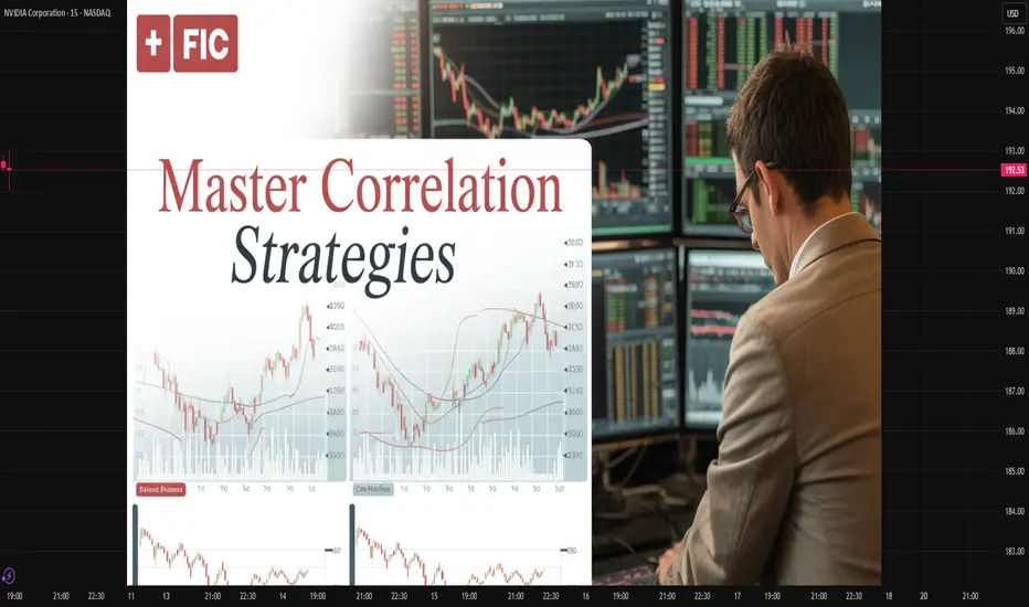
Master Correlation StrategiesUnlocking the Power of Inter-Market Relationships in Trading.
1. Understanding Correlation in Trading
Correlation refers to the statistical relationship between two or more financial instruments — how their prices move relative to each other. It is expressed through a correlation coefficient ranging from -1 to +1.
Positive Correlation (+1): When two assets move in the same direction. For example, crude oil and energy sector stocks often rise and fall together.
Negative Correlation (-1): When two assets move in opposite directions. For instance, the U.S. dollar and gold often have an inverse relationship — when one rises, the other tends to fall.
Zero Correlation (0): Indicates no consistent relationship between two assets.
Understanding these relationships helps traders predict how one market might respond based on the movement of another, enhancing decision-making and portfolio design.
2. Why Correlation Matters
In modern financial markets, where globalization links commodities, equities, currencies, and bonds, no asset class operates in isolation. Correlation strategies allow traders to see the “bigger picture” — understanding how shifts in one area of the market ripple across others.
Some key reasons why correlation is vital include:
Risk Management: Diversification is only effective when assets are uncorrelated. If all your holdings move together, your portfolio is not truly diversified.
Predictive Analysis: Monitoring correlated assets helps anticipate price moves. For example, a rally in crude oil might foreshadow gains in oil-dependent currencies like the Canadian Dollar (CAD).
Hedging Opportunities: Traders can offset risks by holding negatively correlated assets. For instance, pairing long stock positions with short positions in an inverse ETF.
Market Confirmation: Correlations can validate or contradict signals. If gold rises while the dollar weakens, the move is more credible than when both rise together, which is rare.
3. Core Types of Correlations in Markets
a. Intermarket Correlation
This examines how different asset classes relate — such as the link between commodities, bonds, currencies, and equities. For example:
Rising interest rates typically strengthen the domestic currency but pressure stock prices.
Falling bond yields often boost equity markets.
b. Intra-market Correlation
This focuses on assets within the same category. For example:
Technology sector stocks often move together based on broader industry trends.
Gold and silver tend to share similar price patterns.
c. Cross-Asset Correlation
This involves analyzing relationships between assets of different types, such as:
Gold vs. U.S. Dollar
Crude Oil vs. Inflation Expectations
Bitcoin vs. NASDAQ Index
d. Temporal Correlation
Certain correlations shift over time. For instance, the correlation between equities and bonds may be positive during economic growth and negative during recessions.
4. Tools and Techniques to Measure Correlation
Correlation is not merely an observation—it’s a quantifiable concept. Several statistical tools help traders measure and monitor it accurately.
a. Pearson Correlation Coefficient
This is the most widely used formula to calculate linear correlation between two data sets. A reading close to +1 or -1 shows a strong relationship, while values near 0 indicate weak correlation.
b. Rolling Correlation
Markets evolve constantly, so rolling correlation (using moving windows) helps identify how relationships shift over time. For example, a 30-day rolling correlation between gold and the USD can show whether their inverse relationship is strengthening or weakening.
c. Correlation Matrices
These are tables showing the correlation coefficients between multiple assets at once. Portfolio managers use them to construct diversified portfolios and reduce overlapping exposures.
d. Software Tools
Platforms like Bloomberg Terminal, TradingView, MetaTrader, and Python-based tools (like pandas and NumPy libraries) allow traders to calculate and visualize correlation efficiently.
5. Applying Correlation Strategies in Trading
a. Pair Trading
Pair trading is a market-neutral strategy that exploits temporary deviations between two historically correlated assets.
Example:
If Coca-Cola and Pepsi usually move together, but Pepsi lags temporarily, traders may go long Pepsi and short Coca-Cola, betting the relationship will revert.
b. Hedging with Negative Correlations
Traders can use negatively correlated instruments to offset risk. For instance:
Long positions in the stock market can be hedged by taking positions in safe-haven assets like gold or the Japanese Yen.
c. Sector Rotation and ETF Strategies
Investors track sector correlations with broader indices to identify leading and lagging sectors.
For example:
If financial stocks start outperforming the S&P 500, this could signal a shift in the economic cycle.
d. Currency and Commodity Correlations
Currencies are deeply linked to commodities:
The Canadian Dollar (CAD) often correlates positively with crude oil prices.
The Australian Dollar (AUD) correlates with gold and iron ore prices.
The Swiss Franc (CHF) is often inversely correlated with global risk sentiment, acting as a safe haven.
Traders can exploit these relationships for cross-market opportunities.
6. Case Studies of Correlation in Action
a. Gold and the U.S. Dollar
Gold is priced in dollars; therefore, when the USD strengthens, gold usually weakens as it becomes more expensive for other currency holders.
During 2020’s pandemic uncertainty, both assets briefly rose together — a rare situation showing correlation can shift temporarily under stress.
b. Oil Prices and Inflation
Oil serves as a barometer for inflation expectations. When crude prices rise, inflation fears grow, prompting central banks to tighten policies.
Traders who monitor this relationship can anticipate policy shifts and market reactions.
c. Bitcoin and Tech Stocks
In recent years, Bitcoin has shown increasing correlation with high-growth technology stocks. This suggests that cryptocurrency markets are influenced by risk sentiment similar to the equity market.
7. Benefits of Mastering Correlation Strategies
Enhanced Market Insight: Understanding inter-market dynamics reveals the underlying forces driving price movements.
Stronger Portfolio Construction: Diversify effectively by choosing assets that truly offset one another.
Smarter Risk Control: Correlation analysis highlights hidden exposures across asset classes.
Improved Trade Timing: Correlation signals help confirm or challenge technical and fundamental setups.
Global Perspective: By studying correlations, traders gain insight into how global events ripple through interconnected markets.
8. Challenges and Limitations
Despite its power, correlation analysis is not foolproof. Traders must be aware of its limitations:
Changing Relationships: Correlations evolve over time due to policy changes, crises, or shifting investor sentiment.
False Correlation: Sometimes two assets appear correlated by coincidence without a fundamental link.
Lag Effect: Correlation may not capture time delays between cause and effect across markets.
Overreliance: Correlation is one tool among many; combining it with technical, fundamental, and sentiment analysis produces more reliable outcomes.
9. Advanced Correlation Techniques
a. Cointegration
While correlation measures relationships at a moment in time, cointegration identifies long-term equilibrium relationships between two non-stationary price series.
For example, even if short-term correlation fluctuates, two assets can remain cointegrated over the long run — useful in statistical arbitrage.
b. Partial Correlation
This method isolates the relationship between two variables while controlling for others. It’s particularly helpful in complex portfolios involving multiple correlated instruments.
c. Dynamic Conditional Correlation (DCC) Models
These advanced econometric models (used in quantitative finance) measure time-varying correlations — essential for modern algorithmic trading systems.
10. Building a Correlation-Based Trading System
A professional correlation strategy can be structured as follows:
Data Collection: Gather historical price data for multiple assets.
Statistical Analysis: Calculate correlations and rolling relationships using software tools.
Strategy Design: Develop pair trades, hedges, or intermarket signals based on correlation thresholds.
Backtesting: Validate the system across different market phases to ensure robustness.
Execution and Monitoring: Continuously update correlation data and adjust positions as relationships evolve.
Risk Control: Implement stop-loss rules and diversification limits to prevent overexposure to correlated positions.
11. The Future of Correlation Strategies
In an era of high-frequency trading, AI-driven analytics, and global macro interconnectedness, correlation strategies are evolving rapidly. Machine learning models now identify non-linear and hidden correlations that traditional statistics might miss.
Furthermore, as markets integrate further — with crypto, ESG assets, and alternative data sources entering the scene — understanding these new correlations will be crucial for maintaining an edge in trading.
12. Final Thoughts
Mastering correlation strategies isn’t just about mathematics — it’s about understanding the language of global markets. Every movement in commodities, currencies, and indices tells a story about how capital flows across the world.
A trader who comprehends these relationships gains not only analytical power but also strategic foresight. By mastering correlation analysis, you move beyond isolated price charts and see the interconnected web that drives the global financial ecosystem.
In essence, correlation strategies are the bridge between micro-level technical trades and macro-level economic understanding. Those who can navigate this bridge with confidence stand at the forefront of modern trading excellence — armed with knowledge, precision, and an unshakable sense of market direction.
Overtrading: Understand Now to Avoid Mistakes!Hey everyone! 👋
I know that in the world of trading, it’s easy to let emotions take over, especially after a losing streak. Overtrading is one of those invisible enemies that you need to identify and avoid as soon as possible.
1 | What is Overtrading? 💡
Overtrading happens when you take too many trades, usually driven by emotions, especially when you feel the need to "recover" losses from a losing streak. At this point, your decisions are no longer based on technical analysis or your strategy; instead, they are impulsive reactions that lead you to take on more risk.
2 | Psychological and Financial Consequences 😞
Psychological:
When overtrading, you start to feel stressed, exhausted, and lose mental clarity for decision-making. Feelings of disappointment creep in, and gradually, you lose confidence and patience, leaving space only for anxiety.
Financial:
Overtrading also quickly drains your account. Increased transaction fees, prolonged losses, and lack of discipline wear down your capital. Over time, you could lose trust in yourself and compromise your financial stability.
3 | How to Protect Yourself? 💪
To avoid overtrading, the key is having a strict trading plan. Limit the number of trades you take each day, set specific trading hours, and establish clear objectives. Learning patience is crucial — sometimes, the best move is not to trade at all!
Remember: When you have a clear plan and stick to your discipline, you’ll be able to control your emotions and avoid impulsive decisions.
Wishing you all successful and smart trading! 💥
If you found this article helpful, don’t forget to share it and leave your thoughts in the comments. Let’s keep learning and growing together every day! 🙌
Don’t let emotions control you. Let reason guide your trading!
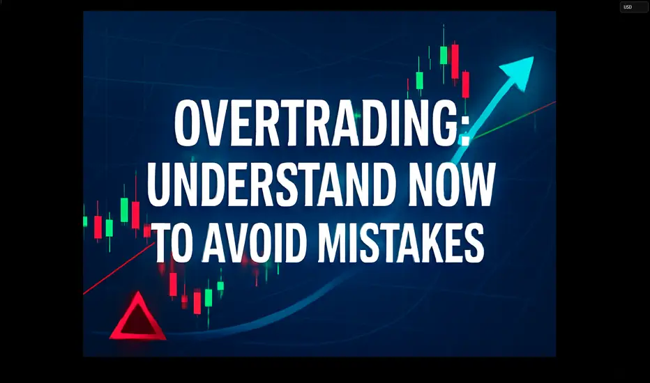
What's RSI indicating about GOLDRSI on Gold's MONTHLY chart hits a whopping 91.3, testing a historic "overbought" level on record, never touched since the 1980s.
Not even in 2001, 2008, or 2020

The Dynamics of the Global Metals MarketIntroduction
The metals market plays a fundamental role in the global economy, serving as the backbone of industrial production, infrastructure development, technological innovation, and trade. From construction and automotive manufacturing to electronics and renewable energy systems, metals such as iron, copper, aluminum, nickel, and precious metals like gold and silver are indispensable. The metals market operates through a complex network of producers, traders, investors, and consumers, driven by global supply-demand dynamics, price fluctuations, and geopolitical influences.
Understanding how the metals market works requires examining the intricate mechanisms that govern mining, refining, pricing, trading, and consumption. This essay explores the structure, participants, and economic functions of the global metals market, with special emphasis on commodity exchanges, price formation, market trends, investment dynamics, and the influence of global factors such as industrialization, technological change, and sustainability transitions.
1. Structure of the Global Metals Market
1.1 Primary and Secondary Metals Markets
The metals market can be broadly categorized into two segments — the primary market, which deals with newly mined and refined metals, and the secondary market, which focuses on recycled or scrap metals.
Primary Metals Market:
The primary market begins with mining operations where raw ores are extracted from the earth. These ores undergo processing and refining to produce pure metals or alloys. The primary market includes large-scale mining corporations such as BHP, Rio Tinto, and Vale, which dominate global production of metals like iron ore, copper, and aluminum.
Secondary Metals Market:
The secondary market handles recycling and reprocessing of scrap metals. It plays a critical role in promoting sustainability and reducing the carbon footprint of the metals industry. For example, recycled aluminum requires only about 5% of the energy needed to produce new aluminum from bauxite ore.
1.2 Classification by Metal Type
Metals are also classified into three categories based on their properties and uses:
Base Metals: Common metals such as copper, aluminum, zinc, lead, and nickel. These are widely used in construction, manufacturing, and energy.
Precious Metals: Metals like gold, silver, platinum, and palladium, valued for rarity, aesthetic appeal, and use as a store of value.
Ferrous and Non-Ferrous Metals: Ferrous metals contain iron (e.g., steel, cast iron), while non-ferrous metals do not (e.g., copper, aluminum, tin). Ferrous metals dominate in heavy industries, while non-ferrous metals are vital in electrical and transportation sectors.
2. Key Participants in the Metals Market
The metals market involves diverse participants with different roles, motivations, and time horizons. These include:
2.1 Producers
Producers are mining and refining companies responsible for the extraction and processing of metal ores. They include global giants like Glencore, Rio Tinto, BHP, and Norilsk Nickel. Producers influence market supply levels, production costs, and long-term investment trends.
2.2 Consumers
Consumers of metals include manufacturing industries such as:
Construction (steel, aluminum)
Automotive (steel, nickel, aluminum)
Electronics (copper, gold, silver)
Energy (copper, nickel, lithium for batteries)
China is the world’s largest consumer of metals, accounting for over 50% of global demand for key industrial metals due to its rapid industrialization and urbanization.
2.3 Traders and Intermediaries
Traders facilitate the buying and selling of metals on global commodity exchanges. They include physical traders (handling actual shipments) and financial traders (speculating through derivatives such as futures and options). Major trading hubs include London, New York, Shanghai, and Singapore.
2.4 Investors and Speculators
Investment funds, hedge funds, and retail investors participate in metals markets for diversification or speculative purposes. They use financial instruments such as exchange-traded funds (ETFs), futures contracts, and options to gain exposure to metal prices.
2.5 Governments and Regulators
Governments play a key role through regulation, taxation, export controls, and strategic reserves. For example, China’s control over rare earth metals impacts global supply chains, while the U.S. maintains a strategic stockpile of critical minerals for defense and technology.
3. Mechanisms of Metal Trading
3.1 Physical Market vs. Paper Market
The metals market operates through two interconnected segments:
Physical Market: Involves the actual buying, selling, and shipment of metals in various forms — ingots, sheets, rods, or concentrates. Pricing is based on spot market rates.
Paper Market: Involves financial contracts such as futures, forwards, and options that represent a promise to deliver or receive a metal at a future date. These are traded on exchanges like the London Metal Exchange (LME), Chicago Mercantile Exchange (CME), and Shanghai Futures Exchange (SHFE).
3.2 Commodity Exchanges
The London Metal Exchange (LME) is the world’s largest market for base metals trading. It sets global benchmark prices for metals such as copper, aluminum, and zinc. Trading occurs through:
Ring trading (open outcry),
Electronic trading, and
Over-the-counter (OTC) contracts.
Each exchange provides transparency, liquidity, and standardized contracts that enable producers, consumers, and investors to hedge against price risks.
3.3 Price Discovery and Benchmarking
Metal prices are determined by global supply and demand but are standardized through benchmark pricing. LME prices often serve as global benchmarks. Prices are influenced by:
Mining output
Industrial demand
Energy costs
Inventory levels
Geopolitical events
Currency fluctuations (especially the U.S. dollar)
4. Price Formation and Market Influences
4.1 Supply-Side Factors
Mining Output and Reserves: Mining disruptions due to strikes, natural disasters, or regulatory issues can reduce supply.
Energy Costs: Metal production is energy-intensive; fluctuations in oil and electricity prices directly affect costs.
Technological Advancements: Innovations in mining and recycling improve efficiency and lower production costs.
4.2 Demand-Side Factors
Industrialization and Infrastructure: Economic growth in developing countries increases demand for steel, copper, and aluminum.
Technology and Electrification: The rise of electric vehicles (EVs) and renewable energy systems has boosted demand for copper, nickel, and lithium.
Consumer Preferences: Shifts toward sustainable and green technologies influence metal consumption patterns.
4.3 Macroeconomic and Financial Factors
Interest Rates and Inflation: Metals often serve as inflation hedges; high inflation or low interest rates drive investment demand.
Currency Movements: Metals are priced in U.S. dollars, so a weaker dollar generally boosts metal prices.
Global Trade Policies: Tariffs, export bans, and sanctions can distort trade flows and pricing.
4.4 Geopolitical and Environmental Influences
Geopolitical Tensions: Conflicts or trade wars can disrupt supply chains. For example, sanctions on Russian nickel and aluminum affected global markets.
Environmental Regulations: Stricter emissions standards and sustainability targets affect mining operations and recycling initiatives.
5. Metals as Investment Assets
5.1 Precious Metals as Safe Havens
Gold and silver are traditional safe-haven assets. During economic uncertainty or financial crises, investors turn to these metals to preserve value. Central banks also hold gold reserves as part of their monetary policy tools.
5.2 Industrial Metals and Economic Growth
Industrial metals such as copper, aluminum, and nickel are considered barometers of global economic health. Rising prices often signal industrial expansion, while declining prices indicate economic slowdown.
5.3 Investment Instruments
Investors can gain exposure to metals through:
Physical bullion and coins
Exchange-Traded Funds (ETFs)
Mining company stocks
Futures and options
Commodity index funds
5.4 Hedging and Risk Management
Manufacturers and producers use metal derivatives to hedge against price fluctuations. For example, an airline company may hedge aluminum prices to stabilize aircraft production costs.
6. Sustainability and the Future of Metals
6.1 Green Transition and Critical Minerals
The global shift toward renewable energy and electric vehicles has created unprecedented demand for critical minerals such as lithium, cobalt, nickel, and rare earth elements. These metals are vital for batteries, solar panels, and wind turbines.
6.2 Circular Economy and Recycling
Recycling metals reduces environmental impact, lowers production costs, and supports the circular economy. Technological advances in metal recovery are making recycling increasingly efficient and profitable.
6.3 ESG and Responsible Mining
Environmental, Social, and Governance (ESG) principles are reshaping the metals industry. Investors now demand transparency on carbon emissions, labor practices, and biodiversity impacts. Companies failing to meet ESG standards face reputational and financial risks.
6.4 Technological Innovations
Automation and AI in mining enhance safety and efficiency.
Blockchain technology is improving supply chain traceability.
Hydrogen-based steel production promises low-carbon alternatives to traditional blast furnaces.
7. Case Studies in the Metals Market
7.1 Copper Market Dynamics
Copper is known as “Dr. Copper” because its price movements reflect global economic health. The rise of electric vehicles and renewable infrastructure has significantly increased copper demand. Supply bottlenecks in Chile and Peru, which together account for nearly 40% of world production, often create price volatility.
7.2 Aluminum and Energy Dependence
Aluminum smelting is highly energy-intensive, making it sensitive to electricity prices. Energy crises, such as the one in Europe in 2022, led to major production cuts and higher aluminum prices worldwide.
7.3 Gold and Monetary Policy
Gold prices are heavily influenced by monetary policy, particularly interest rate decisions by the U.S. Federal Reserve. During periods of economic uncertainty, investors move from equities to gold, driving up demand.
7.4 Rare Earth Metals and Geopolitics
China’s dominance in rare earth metal production (over 80% of global supply) gives it strategic leverage in global technology and defense industries. The U.S. and EU have since accelerated efforts to diversify supply sources.
8. Challenges and Risks in the Metals Market
8.1 Price Volatility
The metals market is inherently volatile due to its sensitivity to macroeconomic and geopolitical developments. Sudden price swings can affect profitability for producers and manufacturers.
8.2 Environmental Concerns
Mining and metal processing contribute to deforestation, water pollution, and greenhouse gas emissions. Transitioning to sustainable mining practices is both a challenge and necessity.
8.3 Resource Nationalism
Countries rich in mineral resources often impose export restrictions or higher taxes to retain more value domestically. This can disrupt global supply chains.
8.4 Technological Disruption
Advances in materials science, such as graphene or alternative composites, may reduce reliance on certain metals, altering long-term demand patterns.
9. The Future Outlook of Metals Markets
The coming decades are expected to bring profound shifts in the metals industry:
Electrification and Energy Transition: Demand for copper, lithium, nickel, and cobalt will continue to soar as the world moves toward clean energy systems.
Digitalization: AI, IoT, and blockchain will enhance transparency and efficiency in metal trading and logistics.
Supply Chain Diversification: Countries will seek to reduce dependence on single suppliers, leading to new mining projects in Africa, South America, and Southeast Asia.
Recycling Revolution: Technological innovation in recycling will make secondary metal markets increasingly competitive.
Carbon Neutrality Goals: The push toward net-zero emissions will reshape production methods and pricing structures across the industry.
Conclusion
The metals market is a dynamic and essential component of the global economy. It integrates the forces of production, consumption, finance, and geopolitics into a vast network that underpins industrial and technological progress. Understanding how the metals market works requires a comprehensive view of its structure, participants, pricing mechanisms, and global interdependencies.
As the world transitions toward a sustainable and digital future, the metals market faces both immense challenges and opportunities. The rise of renewable energy, electric mobility, and green technologies will redefine demand for critical minerals. Meanwhile, innovations in recycling, ESG governance, and digital trading platforms promise to make the industry more efficient and transparent.
Ultimately, the metals market is not merely a trading arena but a mirror of human progress — reflecting the evolution of civilization, the rhythm of industrial growth, and the aspirations of a planet striving toward sustainability and prosperity.
How Shipping, Freight, and Logistics Power Global Market Trading🌍 Introduction: The Invisible Engine Behind Global Trade
Every product that moves across borders — from a smartphone in New York to coffee beans in Paris — owes its journey to the vast and intricate world of shipping, freight, and logistics. These three elements form the invisible yet powerful engine that keeps the global market trading ecosystem running.
Behind every trade agreement, export figure, and import bill, lies a network of ships, trucks, planes, and warehouses. Without this system, the flow of goods would come to a standstill, crippling international economies. As globalization deepens, logistics isn’t just about moving products — it’s about synchronizing global supply chains, optimizing cost efficiency, and maintaining the balance of trade across continents.
In today’s dynamic market, logistics has evolved into a strategic weapon. Countries with superior shipping infrastructure and efficient freight management command a strong position in global trade. Let’s explore how these sectors intertwine to shape the global market’s future.
⚙️ 1. Understanding the Triad: Shipping, Freight, and Logistics
Before diving deeper, it’s essential to distinguish between these three interconnected terms:
Shipping: Refers to the actual physical transportation of goods from one location to another — typically over sea or air.
Freight: Represents the cargo itself or the cost of transporting it. Freight can move via air, land, or sea.
Logistics: A broader term encompassing the entire process — from procurement and storage to shipment, tracking, and delivery.
Together, they form a supply chain ecosystem that connects producers, suppliers, distributors, and consumers across continents.
🚢 2. The Backbone of Global Trade: Maritime Shipping
The shipping industry handles over 80% of global trade by volume. Massive container ships, each capable of carrying over 20,000 TEUs (Twenty-foot Equivalent Units), connect major trade hubs like Shanghai, Rotterdam, Dubai, and Los Angeles.
Why Shipping Dominates:
Cost Efficiency: Sea transport remains the most economical for bulk goods.
Scalability: Ships can carry massive loads, making them ideal for global trade.
Connectivity: Ports link multiple continents through trade routes like the Suez Canal, Panama Canal, and the Strait of Malacca.
Key Global Shipping Hubs:
Singapore: Known for its ultra-modern port infrastructure and strategic location.
China (Shanghai & Ningbo): The heart of global manufacturing and export.
Rotterdam (Netherlands): Europe’s largest port and logistics gateway.
Dubai (Jebel Ali): The Middle East’s most significant trade link.
Challenges in Modern Shipping:
Port Congestion: Especially during global disruptions like COVID-19.
Rising Fuel Costs: Impacting freight rates worldwide.
Environmental Regulations: The shift toward green shipping (LNG, electric, hydrogen-powered vessels).
✈️ 3. Freight Networks: The Arteries of the Global Market
Freight is the lifeblood of commerce. It moves raw materials to factories, finished products to retailers, and food to consumers. The freight sector spans multiple modes:
a) Sea Freight
Still the most widely used due to lower costs. However, it’s slower, making it less suitable for time-sensitive cargo.
b) Air Freight
Used for high-value, urgent, or perishable goods — electronics, pharmaceuticals, and luxury items.
Example: A smartphone assembled in China reaches the U.S. in under 48 hours via air freight.
c) Land Freight (Trucking & Rail)
Essential for last-mile connectivity and regional trade.
Rail Freight: Gaining importance through transcontinental networks like China-Europe Railway Express.
Truck Freight: Vital for connecting ports, airports, and inland destinations.
Freight Pricing Dynamics
Freight rates are influenced by:
Fuel prices (bunker fuel, aviation fuel)
Port handling charges
Supply-demand imbalances
Geopolitical tensions (e.g., Red Sea or Black Sea blockages)
Global crises (pandemics, wars, etc.)
For instance, during the 2021–22 period, container freight rates between Asia and the U.S. soared by over 300%, revealing how fragile and demand-sensitive freight economics are.
🏗️ 4. Logistics: The Brain of the Operation
If shipping is the muscle and freight is the blood, logistics is the brain coordinating every movement.
Modern logistics involves:
Supply chain planning
Inventory management
Warehousing and distribution
Real-time tracking systems
Customs and documentation handling
The Digital Transformation of Logistics
The logistics industry is undergoing a technological revolution:
IoT sensors track container temperature and location.
AI algorithms optimize routes and predict disruptions.
Blockchain ensures transparency and authenticity in transactions.
Drones and robotics accelerate warehouse operations.
Major Global Logistics Players
DHL (Germany) – Known for integrated logistics and global air freight.
Maersk Logistics (Denmark) – Evolved from a shipping company to an end-to-end logistics leader.
FedEx and UPS (USA) – Masters of express logistics.
DB Schenker, Kuehne + Nagel – Giants in multimodal transport and supply chain management.
📈 5. How Logistics Shapes Global Market Trading
The performance of logistics directly impacts global market trading trends, particularly in:
a) Trade Competitiveness
Efficient logistics reduce costs and delivery time, giving countries an edge.
For example, Vietnam and Bangladesh have become major textile exporters due to improving port and logistics infrastructure.
b) Stock Market Sensitivity
Shipping and logistics stocks often act as economic barometers.
When freight demand rises, it signals stronger global trade — often boosting related equities like Maersk, Cosco, or FedEx.
c) Commodity Flow and Pricing
Delays or disruptions in shipping (like the 2021 Suez Canal blockage) can skyrocket oil and commodity prices, shaking markets worldwide.
d) Currency and Inflation Effects
Rising freight costs translate into import inflation, affecting consumer prices and currency values.
🌐 6. The Emerging Trends Transforming the Industry
The next decade of shipping and logistics will be defined by technology, sustainability, and geopolitical realignment.
a) Green Shipping Revolution
To meet carbon-neutral goals, companies are investing in:
Biofuel and hydrogen vessels
Electric trucks and hybrid cargo ships
Port electrification and automation
b) Digital Freight Platforms
Startups and major logistics firms are digitizing operations. Platforms like Flexport, Freightos, and Maersk Spot allow real-time booking, rate comparison, and shipment tracking.
c) Regionalization of Supply Chains
The pandemic taught companies not to depend on single regions (like China). “China +1” strategies are leading to diversification into India, Vietnam, and Mexico.
d) Autonomous Transport
Self-driving trucks are being tested for long-haul logistics.
AI-powered ships are navigating test routes autonomously.
e) Cold Chain Expansion
As pharmaceutical and perishable goods trading grows, demand for temperature-controlled logistics (cold chain) is booming globally.
💥 7. Challenges Facing the Global Shipping and Logistics Sector
Despite its importance, the industry faces intense challenges:
Geopolitical Tensions: Trade wars and conflicts disrupt established routes (e.g., Russia-Ukraine, Red Sea tensions).
Fuel and Energy Volatility: Shipping heavily depends on bunker fuel; any spike raises freight costs globally.
Environmental Regulations: IMO 2020 sulfur caps and net-zero emission goals are increasing operational costs.
Port Infrastructure Gaps: Developing nations face bottlenecks due to outdated facilities.
Digital Divide: Smaller logistics players struggle to adopt advanced tech systems.
Labor Shortages: Shortage of truck drivers, dock workers, and technical staff affects global efficiency.
🧭 8. Future Outlook: The Next Wave of Global Logistics
By 2030, the logistics landscape will look very different:
Smart Ports: Automated cranes, AI scheduling, and blockchain customs.
Hyperloop & Drone Delivery: Faster, cleaner alternatives for intercity and last-mile logistics.
Decentralized Trade Routes: Africa and South America emerging as new freight corridors.
Resilient Supply Chains: Diversification and AI forecasting will reduce dependency on any single geography.
The integration of AI and blockchain will bring transparency and traceability to global supply chains, reducing fraud and inefficiencies. Meanwhile, green logistics will become a major investment theme, attracting ESG-focused capital.
💡 9. Investment & Trading Opportunities in the Sector
For traders and investors, shipping and logistics offer exciting opportunities:
Publicly Listed Giants: Maersk, Hapag-Lloyd, Evergreen Marine, FedEx, and UPS often move in sync with trade growth cycles.
Port Operators: DP World, Adani Ports, and Hutchison are key beneficiaries of rising trade volumes.
Logistics Tech Startups: AI-driven freight management firms are disrupting traditional models.
ETF Exposure: Funds like the Global X Shipping ETF allow investors to ride global logistics growth.
As e-commerce and manufacturing expand globally, logistics stocks could become the backbone of long-term investment portfolios.
🏁 Conclusion: The Flow That Never Stops
Global market trading is like a living organism — and shipping, freight, and logistics are its vital organs. Every container that moves, every parcel delivered, and every port expansion project fuels the heartbeat of the world economy.
As the 21st century progresses, this industry is not just about transportation anymore. It’s about technology, sustainability, and strategy. Those who master logistics control the rhythm of world trade.
From AI-managed ports to zero-emission ships, the next decade promises a revolution in how goods move across the planet — faster, cleaner, and smarter. In the grand theater of global markets, logistics remains the silent powerhouse that keeps the world connected and commerce alive.
Exchange Rate Secrets1. What Are Exchange Rates and Why They Matter
An exchange rate is simply the price of one currency in terms of another. For instance, if $1 = ₹84, that means one US dollar can buy eighty-four Indian rupees.
But this number isn’t just a conversion figure — it’s a snapshot of economic power.
When a country’s currency strengthens, imports become cheaper but exports turn costlier.
When it weakens, exports surge but inflation might rise.
Exchange rates influence:
Global trade balances
Investment decisions
Inflation and interest rates
Tourism and remittances
Stock and commodity markets
Understanding these hidden levers is the first step to decoding the secrets of exchange rate movements.
2. The Real Players Behind the Curtain
Contrary to popular belief, exchange rates don’t move by chance. They’re often influenced — directly or indirectly — by a select few economic giants:
a. Central Banks
Institutions like the US Federal Reserve, European Central Bank, and Reserve Bank of India hold the real levers.
They manipulate interest rates to attract or repel foreign capital.
They intervene in forex markets to stabilize or deliberately weaken their currency.
They issue monetary policies that send shockwaves through global markets.
For example, when the Fed raises interest rates, the US dollar usually strengthens — because higher returns attract global investors.
b. Institutional Traders and Hedge Funds
Major hedge funds trade billions in currencies daily. They anticipate policy changes and use leverage to amplify profits — creating massive short-term moves that can destabilize weaker economies.
c. Governments
Sometimes, governments quietly “manage” their exchange rates for strategic reasons. China, for example, has often been accused of keeping the Yuan undervalued to make its exports more competitive — a tactic dubbed “currency manipulation.”
d. The Market Psychology
Beyond data and policy, market sentiment — the collective emotion of traders — drives currencies. Fear of recession, geopolitical tensions, or even rumors can send exchange rates spinning faster than any spreadsheet can predict.
3. The Core Secrets Behind Currency Movements
Now let’s unlock the deep, often hidden mechanisms that move currencies. These are the five pillars of exchange rate secrets:
1️⃣ Interest Rate Differentials
Currencies tend to flow toward countries with higher interest rates.
If India’s rates are 6% while the US offers 4%, investors may convert dollars to rupees to earn better returns.
This inflow strengthens the rupee.
But here’s the twist: expectations matter more than reality. Even a hint that the Fed may raise rates can trigger massive dollar inflows — long before the actual hike happens.
2️⃣ Inflation and Purchasing Power
Currencies are mirrors of purchasing power.
If inflation is high in one country, its money loses value faster.
Low inflation, on the other hand, indicates stability and boosts confidence.
This is why nations with consistent inflation control — like Switzerland and Japan — often see their currencies appreciated as “safe havens.”
3️⃣ Trade Balances
Countries that export more than they import tend to have stronger currencies.
Why? Because foreign buyers must purchase the exporter’s currency to pay for goods.
For instance, Japan’s trade surplus has historically supported the yen.
Conversely, a nation running persistent trade deficits (like the US) faces downward pressure — unless offset by investment inflows.
4️⃣ Political Stability and Global Confidence
Political chaos often sends investors fleeing.
A coup, election turmoil, or policy uncertainty can cause sudden devaluations.
Meanwhile, stable governments with clear fiscal policies attract long-term investors — strengthening the currency.
When Russia invaded Ukraine in 2022, the ruble initially collapsed. Yet, with aggressive capital controls and energy exports, it later stabilized — showcasing how government measures can rewrite currency fate.
5️⃣ Speculation and Market Manipulation
The most guarded secret: exchange rates aren’t always fair reflections of fundamentals.
Short-term volatility is often fueled by speculation — big money betting on future trends.
Speculators can move billions in seconds, pushing prices away from equilibrium.
Sometimes, their combined power even forces central banks to retreat — like in 1992’s “Black Wednesday”, when George Soros famously broke the Bank of England and earned over $1 billion in a single day.
4. The Hidden Mechanisms: Pegs, Floats, and Hybrids
Every country chooses how “free” its exchange rate should be.
A. Fixed (Pegged) Exchange Rate
Here, the value is tied to another currency, like the US dollar.
Example: Saudi Arabia pegs its riyal to the dollar to stabilize oil revenues.
Advantage: predictability for trade.
Disadvantage: vulnerability to external shocks.
B. Floating Exchange Rate
The value fluctuates based on market demand and supply.
Example: The US dollar, euro, and Indian rupee are managed floats.
Advantage: market-driven flexibility.
Disadvantage: volatility during crises.
C. Managed Float (Dirty Float)
Most modern economies use this hybrid system — allowing markets to move rates but stepping in occasionally to maintain stability.
These systems reveal another secret — that exchange rates are both economic tools and political weapons.
5. Currency Wars and Global Power Play
When one country weakens its currency intentionally, others often retaliate — sparking a currency war.
The logic is simple: a cheaper currency boosts exports and jobs.
But when multiple nations do this simultaneously, it can spiral into global instability.
2010s: The US accused China and Japan of undervaluing their currencies.
2020s: Nations quietly use quantitative easing (printing money) to keep currencies weak.
2025: As emerging markets like India, Brazil, and Indonesia grow, they’re joining this silent battle — balancing competitiveness with credibility.
6. The Psychological Side of Exchange Rates
Money is emotional. Exchange rates reflect not just economic numbers, but confidence.
When investors “believe” in a country’s future — its leadership, innovation, and growth — its currency rises.
Example:
The US dollar thrives during crises — seen as a “safe haven.”
The Swiss franc and Japanese yen surge when global uncertainty spikes.
The Indian rupee strengthens when foreign investors see long-term growth potential.
This psychological dance creates cycles — optimism, panic, correction — that drive exchange rate volatility beyond fundamentals.
7. Modern Secrets: Digital Currencies and Forex Algorithms
The 21st century has introduced new players and tools that redefine how currencies behave.
a. Algorithmic Trading
Over 70% of forex volume now runs on algorithms — automated systems that execute trades based on millisecond data.
These algorithms can amplify moves, creating sharp spikes or sudden reversals within seconds.
b. Cryptocurrencies
Bitcoin and stablecoins have disrupted the concept of “sovereign money.”
Some nations fear them; others embrace them.
El Salvador adopted Bitcoin, while China banned it and launched its own digital yuan — a step toward controlling cross-border transactions.
The secret here: digital currencies could one day bypass traditional exchange rates altogether.
8. The Indian Rupee in the Global Context
India’s exchange rate journey is a fascinating case study:
Pre-1991: A fixed regime tied to the pound, later the dollar.
Post-liberalization: A managed float system with RBI intervention.
Today: The rupee reflects both domestic fundamentals and global capital flows.
Hidden truth?
The RBI quietly smoothens volatility through buying or selling dollars — maintaining competitiveness for exports while protecting inflation targets.
Future outlook:
Stronger digital economy
Growing exports (IT, pharma, energy)
Controlled fiscal deficit
All point toward a more resilient rupee in the long run — though short-term fluctuations will remain.
9. How Traders and Investors Decode Exchange Rate Secrets
Smart investors don’t just watch the numbers — they watch the forces behind them.
Here’s how they stay ahead:
Monitor central bank statements — “forward guidance” often signals currency direction.
Track bond yield differentials — a widening gap means a stronger high-yield currency.
Follow geopolitical developments — sanctions, wars, or trade deals often move currencies overnight.
Use Volume Profile and Market Structure — to identify institutional footprints in forex charts.
Analyze capital flow data — especially FII (Foreign Institutional Investor) movements in emerging markets like India.
By understanding these undercurrents, traders can align with the smart money — not against it.
10. The Future of Exchange Rates: Toward a Digital Reset
Global monetary systems are entering a new era.
The next decade may witness a “global currency reset”, where traditional paper currencies evolve into central bank digital currencies (CBDCs).
This shift could:
Reduce transaction costs
Increase surveillance and control
Challenge the dominance of the US dollar
Create new “exchange rate ecosystems” driven by technology rather than trade alone
In short, the secrets of tomorrow’s exchange rates may lie not in central banks alone, but in blockchain codes and algorithmic governance.
Conclusion: The Art and Science of Exchange Rates
Exchange rates are far more than numbers flashing on a trading screen.
They are reflections of economic strength, political will, psychological trust, and technological evolution.
The secret to understanding them lies in reading between the lines — connecting data with direction, policies with perception, and numbers with narratives.
As global markets evolve, those who grasp these hidden forces won’t just convert currencies — they’ll convert opportunities into fortune.
Because in the end, exchange rates aren’t just about money — they’re about power. 🌍💰
Fibonacci: Theory and Practice (Part 1) RetracementsThe Fibonacci proportions are a widely used technical tool in financial markets. They are based on the Fibonacci sequence, a numerical series introduced to the West by the Italian mathematician Leonardo de Pisa (13th century) after his travels in the Mediterranean (especially in Béjaïa, Algeria): 0, 1, 1, 2, 3, 5, 8, 13, 21, 34, 55, 89, 144..., where each number is the sum of the two preceding ones.
Although Ralph Nelson Elliott incorporated concepts related to Fibonacci ratios in his wave theory (published in 1938), it was Charles Collins who first explicitly used price retracements and extensions in the 1940s.
I will divide the content into three parts to enhance understanding of this approach: Fibonacci Retracements, Fibonacci Extensions, and Harmonic Alignments.
Fibonacci Ratios
In trading, the sequence itself is not used directly but rather its ratios, which approximate natural proportions observed in nature, art, and price patterns.
The ratio of any number to the next higher number approaches 0.618 after the first four numbers. For example, 1/1 is 1.00, 1/2 is 0.50, 2/3 is 0.67, 3/5 is 0.60, 5/8 is 0.625, 8/13 is 0.615, 13/21 is 0.619, etc. (pay attention to the value 0.50).
The ratio of any number to the preceding lower number is approximately 1.618, or the inverse of 0.618. For example, 13/8 is 1.625, 21/13 is 1.615, 34/21 is 1.619. The higher the numbers, the closer they get to 0.618 and 1.618.
The ratios of alternate numbers approximate 2.618 or its inverse, 0.382. For example, 13/34 is 0.382, 34/13 is 2.615.
0.786 is the square root of 0.618.
Personal Perspective on Fibonacci Proportions
None of the ratios we will explore below possess magical properties. The truly decisive factor is price action, which acts as a mirror of the collective psychology of investors. Fibonacci proportions are excellent for highlighting proportionality and harmony, aspects that directly influence participants' decisions. This is where the importance of this approach lies.
Fibonacci Retracement Adjustments
In Figure 1, you can see how to correctly draw Fibonacci retracements in an uptrend: from bottom to top, from the low of the impulse (1) (including the lower wicks or shadows) to the upper high (2) (considering its wicks or shadows). The clearer and more defined these impulses are, the greater their influence on market participants' psychology. Clarity ensures better results when studying tools, indicators, or price action.
I discard the 0.236 level in my trading, but you can include it and experiment.
Timeframe is also important to consider: applying Fibonacci on 5-minute charts, for example, would be like trying to control the ocean with a measuring tape. As I demonstrated in the article “Timeframe is Everything” , lower timeframes degrade the success rate due to the greater influence of news and rumors, high-frequency trading, lower capitalization, and interests, etc.
If the drawing is incorrect, the values will not match those in the image, and the diagonal line will point downward.
Figure 1
In Figure 2, I show the correct drawing of Fibonacci retracements in a downtrend, from top to bottom, from the high of the impulse (1) (including the lower wicks or shadows) to the low (2) (considering its wicks or shadows). If the drawing is incorrect, the values will not match, and the diagonal line will point upward.
Figure 2:
Psychology of the Ratios
Ratio 0.382
This ratio is extremely useful for avoiding premature entries in favor of the trend. In my experience, in most cases, we should wait for the price to touch the 0.382 level unless a consistent price formation justifies a trend continuation.
This level indicates a typical retracement zone, making it ideal for detecting "pauses" in strong trends. It is also necessary that entries at this and other ratios we will study are validated by price action and context.
In Figure 3, you can observe how the price offers an excellent reversal opportunity at the 0.382 Fibonacci level. A previously respected 50 EMA and a strong point like the 50% of the body of a weekly engulfing candle increase the robustness of the zone. The confirmation of price action manifests in increased volumes that may signal a likely reversal and a bullish engulfing candle.
Figure 3
I won’t provide examples in downtrends for this level, as the buying pressure inherent in market nature makes short entries based on the 0.382 level very unstable. Thus, this ratio is primarily evident in uptrends.
Ratio 0.50
It is generally believed that this ratio does not belong to the Fibonacci sequence, but 0.50 is a harmonic starting point in the progression.
It marks a balance between supply and demand, thus serving as a psychological magnet that tends to attract the price while delineating a battle zone between buyers and sellers.
In Figure 4, you can see the correct use of the level: The 0.50 ratio is perfectly aligned with the presence of a 50 SMA and price action elements like a ceiling test , offering extremely robust resistance. An island gap pattern is an excellent reversal signal to confirm a short entry.
Figure 4
In Figure 5, we observe the alignment of the 0.50 level with the presence of a large gap acting as robust support. Additionally, the level coincides with the 50% of the body of a bullish engulfing candle on a weekly chart, adding significant confidence. The price action would confirm an entry with a large bullish engulfing candle.
Figure 5
Ratio 0.618 (Golden Ratio)
The 0.618 ratio is a universal "equilibrium point" in crowd psychology; the place where many investors expect a bounce, as it represents a deep but not exhaustive correction.
Studies and tests (such as those by Robert Prechter in Elliott Wave Principle ) show that the 61.8% level appears in up to 70% of significant corrections in indices like the S&P 500 or Dow Jones, while behavioral economists argue that its "success" is more due to confirmation bias than strict causality.
In Figure 6, we observe how the golden ratio (0.618) aligns with a high order volume zone (volume profile). The noticeable weakness in price action, graphically represented in oscillators like the MACD (bearish divergence), combined with a volume spike, could provide clues about a likely rejection in the zone.
Figure 6
In Figure 7, we observe a bullish example where the 0.618 level aligns with a strong support generated by accumulation. Note how this zone shows a high order volume (volume profile). This support was also backed by a 20 EMA on a weekly chart. The price action would confirm the entry after several rejection candles.
Figure 7
Ratio 0.786
This is my favorite Fibonacci retracement ratio, and I use it exclusively to seek reversals in uptrends. It indicates trend weakness, but I like to consider it a high-probability reaction zone, as selling pressure in such a deep correction tends to be weak, while large participants or institutions may see a good opportunity to buy low.
I apply this ratio exclusively to double bottoms, as seen in Figures 8 and 9.
Figure 8
Figure 9
In Figure 8, the 0.786 level aligns with the 50% of a monthly engulfing candle and a large gap visible on the daily chart. Additionally, volume and a large engulfing candle pattern would have confirmed the entry well.
Figure 9 shows an alignment between the 0.786 level and a strong support on the daily chart. In the same zone, a 20 EMA on a weekly chart coincides. The price action confirmation manifests in compression and an explosion of bullish volatility.
Fun Facts
1-Leonardo de Pisa (or Leonardo Pisano) was born around 1170 in Pisa, Italy, and was the son of Guglielmo Bonacci, a commercial official working in North Africa.
The nickname Fibonacci comes from "filius Bonacci," which in Latin literally means "son of Bonacci." He signed his works as "Leonardo, son of Bonacci, Pisan," but the term "Fibonacci" was shortened and popularized centuries later.
2-The Fibonacci numerical series actually dates back to ancient Indian texts (such as those by Pingala in the 2nd century BC, used for poetic meter).
3-Leonardo de Pisa popularized the numerical series in Western Europe through his book, Liber Abaci (1202), where he used it to solve practical problems, such as rabbit population growth (the famous example: a pair of rabbits produces a sequence of births generating the numbers 1, 1, 2, 3, 5, 8...).
Conclusions
Fibonacci proportions are a valuable complement, but not the holy grail. In my strategies, I find them extremely useful and feel comfortable incorporating them in specific contexts, though not all systems require them. For example, I like having a Fibonacci at hand in patterns like double bottoms to identify key supports or when a price overextends or retraces strongly, delineating potential reversal zones.
I recommend that investors avoid chasing mystical numerical alignments and maintain a logical approach to each tool, method, or pattern studied.
Final Note
If you want to take a look at my analysis record, you can find my profile in Spanish, where I transparently share well-defined market entries. Send your good vibes if you enjoyed this article, and may God bless you all.
Market Expectations Misfire as OPEC Plus Delivers a Smaller HikeOPEC+ surprised markets on 05/Oct (Sun) with a smaller-than-expected output hike, triggering a rebound in crude prices the following day. In contrast, WTI had trended lower the previous week amid expectations of a larger supply increase, rising U.S. inventories, and cautious sentiment.
This paper examines the volatility surrounding OPEC+ meetings, highlighting how market expectations often diverge from actual decisions, driving sharp price swings and uncertainty.
WTI HIT 4-MONTH LOW ON OPEC+ HIKE SPECULATION
WTI crude oil futures fell 7.4% in the week ending on 03/Oct, with prices falling for four consecutive sessions between 29/Sep – 02/Oct. The decline was driven by expectations of a significant increase in OPEC+ supply.
OPEC+ surprised markets by announcing a modest 137,000 bpd output hike for November, matching October’s increase.
The markets initially anticipated a much larger adjustment for November, with speculation centering on a potential 500,000 bpd hike as Saudi Arabia pushed to regain market share.
Although OPEC dismissed media reports on X of such a move as “misleading,” traders continued to price in the possibility of a sizeable increase.
Source: CME Group OPEC+ Watch Tool as of markets on 3rd October 2025
Notably, CME’s OPEC Watch tool reflected a bearish sentiment on 03/Oct (Fri).
Source: CME Group OPEC+ Watch Tool as of markets on 3rd October 2025
Until 26/Sep, the consensus leaned toward a pause or small hike. However, since then, expectations for a moderate or significant increase rose sharply, adding further downward pressure on crude prices.
Nonetheless, the cartel’s decision was a surprise. According to Reuters , this was caused by internal disagreements between Russia and Saudi Arabia.
Russia pushed for a smaller hike to avoid pressuring prices, as sanctions limit its ability to raise output. Saudi Arabia, with ample spare capacity, preferred a larger increase to regain its market share more quickly.
Overall, OPEC+ maintained a positive outlook on the global economy, citing steady growth, healthy market fundamentals, and low oil inventories.
LOW INVENTORIES AND SOFTER U.S. OUTPUT OFFER SUPPORT FOR WTI
Amid expectations of a larger OPEC+ supply hike, WTI also faced pressure from cautious market sentiment as the U.S. government shutdown persisted, and weak economic data weighed on demand outlook.
However, prices found support from persistently low U.S. crude inventories, which remain well below the five-year average and near the lower end of the historical range.
Source: EIA
Despite a slight weekly build, overall supply conditions remain tight. With WTI prices easing, U.S. production has also edged lower, a trend that could further restrict inventory growth and lend near-term support to crude prices.
CONCLUSION
OPEC+ controls more than half of the global oil supply, making its output decisions a major driver of crude prices.
Source: CME’s CVOL Index
Since the group began unwinding supply cuts in 2025, each meeting has triggered noticeable price swings, underscoring the market’s sensitivity to these decisions.
Source: TradingView
While mapping price direction is challenging, options allow traders to gain exposure without directly owning the commodity. They provide flexibility to capitalise on increased volatility around OPEC+ meetings.
The following examples illustrate how options can be strategically used:
Long Call : Seeing the inventory lag, a trader could have taken a bullish stance on the OPEC meeting outcome through a long call on WTI Crude Monday weekly options. On 02/Oct (Thu), the option had settled at USD 0.77 per barrel, implying a premium of USD 770 per lot (contract size = 1,000). By 06/Oct (Mon), after a bullish OPEC outcome had lifted crude prices, the option traded at USD 1.12 per barrel as of 4 AM ET. A single-lot position would have gained USD 350 (USD 1,120 – USD 770). This showed a strong return relative to risk, with losses limited to the premium paid. It underscored how weekly options allowed precise positioning around specific events.
Long Put : Expecting a strong output hike from OPEC+, a trader could have taken a long put position on WTI Crude Monday weekly options. On 02/Oct (Thu), the option had settled at USD 1.07 per barrel, or USD 1,070 per lot (contract size = 1,000 barrels). By 06/Oct (Mon), after OPEC+ announced a smaller-than-expected output hike, the option traded at USD 0.01 per barrel as of 4 AM ET. A single-lot position would have lost USD 1,060 (USD 1,070 – USD 10). Although the trade resulted in a loss, the downside was limited to the option premium. In contrast, holding a futures position in the same direction would have led to significantly larger losses.
Overall, options allow traders to participate in volatile price movements while keeping potential losses limited, making them a valuable tool for strategic positioning around uncertainty.
This content is sponsored.
MARKET DATA
CME Real-time Market Data helps identify trading set-ups and express market views better. If you have futures in your trading portfolio, you can check out on CME Group data plans available that suit your trading needs tradingview.com/cme .
DISCLAIMER
This case study is for educational purposes only and does not constitute investment recommendations or advice. Nor are they used to promote any specific products, or services.
Trading or investment ideas cited here are for illustration only, as an integral part of a case study to demonstrate the fundamental concepts in risk management or trading under the market scenarios being discussed. Please read the FULL DISCLAIMER the link to which is provided in our profile description.
Multiple Correlated Currencies = Confluence to take the trade All the information you need to find a high probability trade are in front of you on the charts so build your trading decisions on 'the facts' of the chart NOT what you think or what you want to happen or even what you heard will happen. If you have enough facts telling you to trade in a certain direction and therefore enough confluence to take a trade, then this is how you will gain consistency in you trading and build confidence. Check out my trade idea!!
www.tradingview.com

Power of ReservesIntroduction: The Invisible Backbone of Global Trade
Behind every strong economy and stable currency lies an invisible force — national reserves. These reserves act as a financial cushion, ensuring stability during crises, boosting investor confidence, and influencing trade decisions worldwide. Whether it’s foreign exchange reserves, gold holdings, or sovereign wealth funds, each component plays a crucial role in determining a nation’s economic resilience and trading strength.
In the dynamic world of global trade, reserves aren’t just numbers sitting in a central bank’s vault. They dictate currency stability, trade competitiveness, and investment flows. Countries with robust reserves — like China, Japan, or Switzerland — often enjoy stronger bargaining power in global markets. On the other hand, nations with weak reserves face currency volatility, trade deficits, and limited import capacity.
This article explores in depth how reserves impact trading — both at the national and global levels, dissecting their role in monetary policy, currency valuation, investor sentiment, and international market behavior.
1. Understanding Reserves: The Foundation of Economic Strength
Reserves are assets held by a country’s central bank or monetary authority to support its currency and meet its international payment obligations. They usually include:
Foreign Currency Assets: USD, Euro, Yen, Pound, and other convertible currencies.
Gold Reserves: Stored as bullion or certificates to hedge against inflation and currency devaluation.
Special Drawing Rights (SDRs): Allocated by the IMF to provide liquidity.
Reserve Position in the IMF: Represents the country's claim on the IMF.
The primary purpose of maintaining reserves is to ensure financial stability, manage exchange rates, and support global trading obligations. For traders, investors, and policymakers, reserve data offers a mirror reflection of a nation’s economic strength and its ability to handle global trade shocks.
2. Reserves and Currency Stability: The Heartbeat of Trading
In global trading, currency stability is vital. A volatile currency disrupts exports, imports, and capital flows. Strong reserves enable central banks to intervene in the foreign exchange market — buying or selling currencies to stabilize exchange rates.
Example:
If a country’s currency is depreciating rapidly, its central bank can sell foreign reserves (like USD) to buy its domestic currency.
This reduces depreciation pressure, boosts confidence, and prevents inflation spikes.
Conversely, if the currency appreciates too much (hurting exports), the bank can buy foreign assets to weaken it. Thus, reserves act as the main defense mechanism against unpredictable market movements.
For traders, stable currencies mean lower hedging costs, predictable returns, and fewer risks. Therefore, countries with high reserves attract more trade deals, foreign investments, and cross-border contracts.
3. Impact on Trade Balance and Import-Export Dynamics
A country’s trade balance — the difference between exports and imports — is directly affected by its reserves.
High Reserves: Allow countries to import essential goods even during economic downturns or geopolitical tensions. It gives importers confidence that the country can pay for foreign goods and services.
Low Reserves: Limit import capacity, create shortages, and increase import costs due to weaker currency value.
Export Competitiveness:
Countries with healthy reserves can manage their currency strategically to maintain export competitiveness. For instance:
China often maintains large reserves to control yuan’s appreciation, keeping exports cheaper and more attractive in global markets.
India, with around $650 billion in reserves, uses them to manage the rupee’s volatility, ensuring exporters remain globally competitive.
Import Stability:
Nations with ample reserves can absorb shocks from rising oil prices, commodity fluctuations, or sanctions. This helps in keeping domestic inflation low, sustaining purchasing power, and ensuring smooth trading operations.
4. Reserves and Investor Confidence in Global Markets
Foreign investors closely monitor a country’s reserve position before committing capital. Strong reserves signal that:
The country can handle external debt payments.
There is low default risk.
The currency is stable, and the economy is resilient to shocks.
As a result, foreign direct investment (FDI) and portfolio inflows increase, strengthening both the capital market and trade.
For example:
Japan and Switzerland are considered safe havens because of their massive reserves and stable currencies.
Conversely, countries like Sri Lanka or Pakistan, with low reserves, face capital flight and currency depreciation, discouraging investors.
Thus, reserves serve as a trust factor — the larger they are, the higher the global confidence in that economy’s trade and investment potential.
5. The Role of Gold Reserves: The Traditional Guardian of Value
Even in today’s digital economy, gold remains a timeless store of value in national reserves. Central banks hold gold because it:
Retains value during inflation or currency crises.
Provides diversification away from fiat currencies.
Acts as a safe asset when geopolitical risks or trade wars escalate.
Gold reserves indirectly influence trading by backing currency credibility. For instance:
In times of global uncertainty, investors flock to gold-backed economies or currencies.
India and China — major gold holders — use gold reserves as insurance against sudden currency outflows.
Thus, while not directly traded in everyday commerce, gold plays a silent yet powerful role in ensuring trade stability and economic security.
6. Reserves and Global Monetary Policy Coordination
Large economies with massive reserves, such as China, the U.S., Japan, and the EU, influence global monetary policy and liquidity. When these nations adjust their reserve holdings, the ripple effects are felt across markets.
Example:
If China decides to diversify its reserves away from USD, it can weaken the dollar and affect global commodities priced in USD.
Similarly, when the U.S. Federal Reserve raises interest rates, countries with smaller reserves face capital outflows, forcing them to use their reserves to defend their currencies.
Reserves also help countries align with global financial standards, such as IMF guidelines, ensuring they can participate smoothly in global trade and monetary cooperation.
7. Crisis Management: Reserves as a Shield Against Shocks
Economic and geopolitical crises can paralyze trade. During such times, reserves become the first line of defense.
Key Functions During Crises:
Liquidity Support: Helps settle international debts and maintain import flows.
Currency Intervention: Prevents currency collapse during capital flight.
Market Confidence: Shows the world that the country can handle uncertainty.
Real-World Example:
During the Asian Financial Crisis (1997), countries like Thailand and Indonesia with low reserves faced severe devaluation.
In contrast, China maintained stability due to its massive reserves, strengthening its trade position in the region.
Similarly, during the COVID-19 pandemic, India’s high reserves enabled it to import medical equipment, oil, and essential goods without currency panic.
Hence, reserves are not just savings — they are insurance policies for trade continuity.
8. Strategic Use of Sovereign Wealth Funds (SWFs)
Some countries, especially oil-rich nations like Saudi Arabia, Norway, and UAE, channel their reserves into sovereign wealth funds. These funds invest globally in:
Infrastructure
Equity markets
Bonds
Real estate
This helps generate long-term returns, diversifies income sources, and supports national trade goals. For example:
Norway’s Government Pension Fund Global uses oil revenue reserves to invest worldwide, ensuring sustainable economic growth even beyond oil dependency.
UAE’s ADIA (Abu Dhabi Investment Authority) invests surplus reserves to stabilize domestic and external trade flows.
These funds not only protect reserves but also enhance global trading relationships through strategic investments.
9. Reserves and Exchange Rate Manipulation Debate
There’s an ongoing global debate about whether large reserves are used for exchange rate manipulation. Some nations allegedly maintain artificially undervalued currencies to boost exports.
For instance:
The U.S. has often accused China of holding vast reserves to control the yuan’s value and maintain trade dominance.
However, such control also helps countries avoid imported inflation and protect export-led growth.
This dual nature makes reserves both a tool of stability and a geopolitical instrument in global trade negotiations.
10. The Indian Perspective: Building a Fortress of Stability
India provides an excellent modern example of how reserves shape a nation’s trading destiny.
Foreign exchange reserves (as of 2025): Over $650 billion
Gold holdings: Over 800 tonnes
These reserves allow India to:
Manage rupee volatility effectively.
Finance essential imports like crude oil and electronics.
Maintain investor confidence despite global uncertainty.
Negotiate trade deals confidently with other nations.
The RBI (Reserve Bank of India) uses these reserves not only to stabilize the currency but also to signal financial strength — crucial for attracting global trade and investment partners.
11. Future Outlook: The Digital Era of Reserve Management
The future of reserves is transforming with the rise of digital currencies, blockchain technology, and tokenized assets. Central banks are exploring digital reserve diversification, such as:
Holding Bitcoin or CBDCs (Central Bank Digital Currencies).
Using blockchain for transparent cross-border settlements.
Diversifying away from the U.S. dollar dominance (a trend tied to de-dollarization).
In the next decade, reserves will evolve beyond traditional forms — becoming digitally liquid, globally diversified, and algorithmically managed, changing the very structure of international trade finance.
12. Challenges and Risks in Managing Reserves
Despite their benefits, reserve management carries significant risks:
Opportunity Cost: Excess reserves may yield low returns compared to productive investments.
Currency Risk: Holding assets in volatile currencies can cause valuation losses.
Geopolitical Sanctions: Reserves held abroad can be frozen during conflicts (as seen in Russia’s 2022 case).
Inflation Erosion: Holding low-yield assets may not offset inflation over time.
Thus, the challenge is maintaining a balance between liquidity, safety, and profitability, ensuring that reserves remain a source of strength, not stagnation.
Conclusion: Reserves – The Silent Engine of Global Trade
In the fast-paced world of international trade, national reserves serve as the hidden engine that keeps economies running smoothly. They stabilize currencies, build confidence, ensure import security, and empower countries to face global crises with resilience.
Whether through gold, forex, or sovereign wealth, reserves represent economic credibility and financial sovereignty. As nations move toward digital globalization, the art of managing reserves will define who leads and who follows in global trade.
In simple terms — reserves are not just savings; they are strategic power.
They determine who controls the currency, who leads trade negotiations, and who thrives during global uncertainty.
The next era of global trading will belong to countries that smartly manage, diversify, and digitalize their reserves — turning them into a true engine of economic growth and global influence.
CPI Data and Its Power in Global Trading MarketsIntroduction: The CPI—A Mirror of Inflation and Economic Health
In the fast-paced world of global finance, one number can send markets soaring or tumbling—the Consumer Price Index (CPI). Whether it’s a sudden rise in U.S. inflation or a dip in Japan’s consumer prices, traders across the world hold their breath when CPI data is released. CPI is more than just an economic statistic—it’s the heartbeat of inflation monitoring, influencing everything from interest rate decisions, currency movements, bond yields, and global stock performance to commodity prices.
The CPI reflects the average change over time in the prices paid by consumers for goods and services. When prices rise, purchasing power falls; when they decline, deflationary risks loom. For traders, investors, and policymakers, CPI acts as a compass, signaling where economies—and markets—are heading next.
In this comprehensive discussion, we’ll explore the importance, impact, and trading implications of CPI data in the global market, with detailed insights into how it shapes financial trends, investor sentiment, and global capital flows.
1. What is CPI and Why It Matters Globally
The Consumer Price Index (CPI) measures the change in prices of a "basket" of commonly purchased goods and services—such as food, housing, clothing, transportation, and healthcare—over a specific period. It’s typically released monthly by government statistical agencies (e.g., the U.S. Bureau of Labor Statistics, the UK Office for National Statistics, or India’s Ministry of Statistics).
The CPI serves as a key inflation indicator. Inflation, in turn, influences the monetary policies of central banks like the Federal Reserve (Fed), European Central Bank (ECB), and Reserve Bank of India (RBI).
For global traders, this means that CPI data releases are among the most market-moving events. A single surprise in CPI—say, inflation coming in higher than expected—can lead to sharp movements in currencies, bonds, equities, and commodities.
2. Components of CPI: The Building Blocks of Inflation
To understand how CPI affects global trading, it’s vital to know what it measures. CPI baskets vary by country, but they usually include:
Food and Beverages: Covers groceries, dining out, and beverages—one of the most volatile components due to weather and geopolitical issues.
Housing: Rent, utilities, and maintenance costs; the largest weight in most economies’ CPI.
Apparel: Clothing and footwear prices, reflecting consumer trends and supply chain conditions.
Transportation: Fuel, vehicle prices, and public transport—closely tied to crude oil prices.
Medical Care: Hospital, medicine, and health insurance costs.
Education and Communication: Tuition fees, phone bills, and internet costs.
Recreation and Other Goods: Entertainment, travel, and miscellaneous services.
Each sector’s performance contributes to the overall CPI value, revealing which parts of the economy are heating up or cooling down.
For example:
Rising housing and fuel costs often signal broad inflationary pressure.
Falling food and commodity prices may indicate deflationary trends or reduced demand.
3. CPI’s Role in the Global Financial Ecosystem
CPI doesn’t operate in isolation—it interacts deeply with global financial systems. Here’s how:
A. Influence on Central Bank Policy
Central banks use CPI to set monetary policy. If inflation exceeds target levels (e.g., the Fed’s 2%), they may raise interest rates to cool spending. Conversely, if inflation is too low, they might cut rates or use quantitative easing to stimulate demand.
Higher CPI → Rate hikes → Stronger currency, weaker stocks
Lower CPI → Rate cuts → Weaker currency, stronger stocks
For instance, when U.S. CPI data shows persistent inflation, the Fed signals rate hikes—strengthening the U.S. dollar (USD) but often causing global equity markets to fall.
B. Impact on Global Currencies
Currency traders react instantly to CPI data. Countries with higher inflation and higher interest rates usually see currency appreciation, as investors chase higher yields.
For example:
A hotter-than-expected U.S. CPI often boosts the USD/INR pair as the dollar gains.
A lower Eurozone CPI may weaken the Euro (EUR/USD), hinting at looser ECB policy.
C. Effect on Bond Markets
Bonds are extremely sensitive to inflation data. Rising CPI reduces the real return from fixed-income securities, prompting investors to sell bonds and push yields higher.
For traders, CPI data drives Treasury yield volatility, a crucial input for pricing everything from derivatives to mortgage rates.
D. Stock Market Reactions
Stock indices like the S&P 500, FTSE 100, and Nifty 50 often rally when CPI cools, as it signals lower inflation and potential rate cuts. Conversely, a spike in CPI dampens investor sentiment, especially in rate-sensitive sectors like banking, housing, and technology.
E. Commodity and Energy Markets
Commodities, particularly gold and oil, react sharply to inflation readings.
Gold acts as an inflation hedge—rising CPI often triggers gold rallies.
Crude oil prices influence and are influenced by CPI; rising energy costs feed inflation and vice versa.
4. CPI Data and Global Market Volatility
The release of CPI data often sparks immediate volatility. For professional traders, it’s a critical time for positioning. Algorithmic and institutional traders monitor CPI in real-time, executing trades within seconds of the release.
A. Pre-Announcement Positioning
Markets often price in expected inflation based on forecasts. If the actual CPI data deviates sharply from expectations, it triggers rapid market repricing.
For instance:
If U.S. CPI is forecast at 3.2% but comes at 3.8%, traders expect tighter Fed policy, selling equities and buying dollars.
If CPI underperforms, investors anticipate easing, leading to a risk-on rally in global stocks.
B. The Volatility Chain Reaction
CPI data doesn’t just move one asset—it triggers a chain reaction:
CPI → Interest rate expectations
Interest rate expectations → Currency and bond yields
Currency moves → Commodity and equity adjustments
This chain makes CPI the most-watched economic indicator globally, alongside GDP and employment data.
5. Global Examples: How CPI Data Drives Markets Worldwide
1. United States (US CPI)
The U.S. CPI release is arguably the most impactful in the world. As the dollar is the global reserve currency, U.S. inflation data shapes global risk appetite.
When the U.S. CPI surged above 9% in 2022—the highest in 40 years—it triggered aggressive Fed rate hikes, leading to:
A stronger dollar,
Global equity selloffs,
Declines in emerging market currencies,
Sharp corrections in tech stocks.
2. Eurozone (HICP – Harmonised Index of Consumer Prices)
The Eurozone uses the HICP for consistency across member states. When Eurozone CPI rises, the ECB faces pressure to tighten policy, affecting global bonds and EUR/USD levels.
3. India
In India, CPI is crucial for the RBI’s monetary policy. A rise in food or fuel inflation pushes the RBI toward rate hikes, influencing:
The Nifty and Sensex indices,
Bond yields,
The Rupee’s strength against the Dollar.
4. Japan
Japan’s CPI data has global attention because of its history with deflation. When Japan’s inflation rose above 2% in 2023, the Bank of Japan hinted at policy normalization, shaking up global carry trades and Yen-linked assets.
5. Emerging Markets
In developing economies like Brazil, Turkey, and South Africa, CPI spikes often lead to currency depreciation and investor flight, as markets fear policy instability and economic overheating.
6. How Traders Use CPI Data Strategically
CPI data isn’t just for economists—it’s a vital signal for trading opportunities. Let’s explore how professional traders integrate it into their strategies:
A. Forex Traders
They trade based on interest rate differentials caused by CPI surprises.
Example: If U.S. CPI beats expectations, traders go long USD/INR or short EUR/USD, anticipating a Fed rate hike.
B. Equity Traders
They focus on sector rotation:
High inflation → Banks and Energy outperform, Tech underperforms.
Low inflation → Growth sectors (Tech, Consumer discretionary) shine.
C. Commodity Traders
They monitor CPI as a proxy for demand. Rising CPI hints at economic expansion, lifting demand for industrial metals and energy.
D. Bond Traders
They hedge inflation risk using Treasury Inflation-Protected Securities (TIPS) or short-duration bonds when CPI is expected to rise.
E. Derivative Traders
CPI announcements often lead to volatility spikes, creating opportunities in options trading, especially in volatility-based instruments like VIX futures.
7. The Global CPI Chain: How Inflation Spreads Across Borders
In an interconnected economy, inflation in one region affects others through trade, energy prices, and currency flows.
Rising U.S. inflation leads to stronger USD → Weakens emerging market currencies → Raises import prices in India, Brazil, etc.
Europe’s energy-driven inflation spills into Asian import prices, raising CPI globally.
Global supply chain disruptions (like during COVID-19) create synchronized CPI surges across continents.
Thus, CPI is not just national data—it’s a global ripple effect determining trade competitiveness and monetary coordination.
8. The Future of CPI and Global Market Analysis
With the advent of AI, big data, and real-time analytics, CPI measurement and interpretation are evolving. Traders now use:
Alternative data (e.g., online retail prices, freight rates) to forecast CPI before official releases.
Machine learning models to detect inflation trends early.
Global CPI correlation models to assess cross-border inflation risks.
Moreover, energy transition, climate costs, and geopolitical risks are reshaping inflation dynamics. CPI in the future may include green energy indices and carbon costs, making it more reflective of modern consumption.
Conclusion: CPI—The Guiding Star of Global Traders
In global trading, CPI is more than just an economic indicator—it’s a market driver. It influences everything from central bank policy decisions to daily trading volumes on Wall Street, London, and Mumbai. Understanding CPI means understanding how money flows, assets reprice, and investor psychology shifts across borders.
For traders and investors, mastering CPI analysis provides an edge in forecasting macro trends, identifying trading opportunities, and managing risks. Whether you’re in forex, equities, bonds, or commodities, CPI remains the most powerful pulse point of global economic health.
In the era of inflation uncertainty and global interconnectedness, keeping an eye on CPI data isn’t optional—it’s essential. It tells the story of every nation’s economic heartbeat and shapes the rhythm of global markets.
How to Use The Relative Strength Index (RSI) in TradingViewMaster RSI using TradingView’s charting tools in this comprehensive tutorial from Optimus Futures.
The Relative Strength Index (RSI) is one of the most widely used momentum indicators in technical analysis. It helps traders identify potential overbought and oversold conditions, spot divergences, and confirm the strength of trends.
What You’ll Learn:
Understanding RSI: a momentum oscillator plotted from 0 to 100
Key thresholds: how readings above 70 suggest overbought conditions and below 30 suggest oversold conditions
Why RSI signals are not automatic buy/sell triggers, and how strong trends can keep RSI extended for long periods
Spotting bullish and bearish price divergences
Using RSI to confirm trends
How to add RSI on TradingView via the Indicators menu
Understanding the default inputs and how changing them affects the indicator
Example on the E-mini S&P 500 futures: how RSI dipping below 30 and crossing back above can highlight momentum shifts
Combining RSI with other analysis for better confirmation
Practical applications across multiple timeframes, from intraday trading to swing setups
This tutorial will benefit futures traders, swing traders, and technical analysts who want to incorporate RSI into their trading strategies.
The concepts covered may help you identify momentum shifts, potential reversal points, and confirmation of trend strength across different markets
Learn more about futures trading with TradingView:
optimusfutures.com
Disclaimer:
There is a substantial risk of loss in futures trading. Past performance is not indicative of future results. Please trade only with risk capital. We are not responsible for any third-party links, comments, or content shared on TradingView. Any opinions, links, or messages posted by users on TradingView do not represent our views or recommendations. Please exercise your own judgment and due diligence when engaging with any external content or user commentary.
This video represents the opinion of Optimus Futures and is intended for educational purposes only. Chart interpretations are presented solely to illustrate objective technical concepts and should not be viewed as predictive of future market behavior. In our opinion, charts are analytical tools—not forecasting.

How We Can Handle & Benefit From The Gaps ? When We Can Enter ?If we checked all JPY Pairs we will see that we have gaps in all JPY Pairs , this post will be on how we can benefit from this gaps , i have my own method , for example in this pair EUR/JPY , The price opened in gap to upside and 95% the price will cover this gap , but when we can do that , in my method , we should wait the price to close below last res with 4h candle and then we can enter a sell trade and targeting the gap . try it and tell me in the comments if it worked with you .