Let's talk about the MACD components, signals and strategies The Moving Average Convergence Divergence (MACD) is a powerful technical indicator widely used in crypto trading to identify trends, momentum shifts, and potential entry or exit points.
Here's how to effectively use MACD in your crypto trading strategy:
Understanding MACD Components
The MACD consists of three main elements:
MACD Line: Calculated by subtracting the 5-period Exponential Moving Average (EMA) from the 20-period EMA
Signal Line: A 9-period EMA of the MACD line
Histogram: Represents the difference between the MACD line and the signal line
Key MACD Trading Signals
Signal Line Crossovers
Buy Signal: When the MACD line crosses above the signal line
Sell Signal: When the MACD line crosses below the signal line.
Zero Line Crossovers
Bullish Signal: MACD crosses above the zero line
Bearish Signal: MACD crosses below the zero line
Divergences
Bullish Divergence: Price makes lower lows while MACD makes higher lows
Bearish Divergence: Price makes higher highs while MACD makes lower highs
MACD Trading Strategies
Trend Following
Use MACD to identify and follow strong trends. When the MACD line is above the signal line, it indicates an uptrend, while the opposite suggests a downtrend
Momentum Trading
The MACD histogram can help identify building momentum. Increasing histogram bars suggest strengthening momentum in the current direction
Divergence Trading
Look for divergences between price action and MACD to spot potential trend reversals
Multiple Timeframe Analysis
Combine MACD readings from different timeframes to get a more comprehensive view of the market
Best Practices
Confirm Signals: Use MACD in conjunction with other indicators like RSI or Bollinger Bands for stronger confirmation
Avoid Choppy Markets: MACD is less effective in ranging or sideways markets, potentially generating false signals
Risk Management: Always use stop-loss orders and proper position sizing to manage risk
Timeframe Selection: Choose an appropriate timeframe based on your trading style (e.g., intraday, swing, or long-term)
Default Settings: Stick to the default MACD settings (12, 20, 5) as most traders use these, potentially creating self-fulfilling prophecies in the market
X-indicator

Is Ripple the best cryptocurrency in the world right now?Hello and greetings to all the crypto enthusiasts, ✌
Reading this educational material will require approximately 10 minutes of your time . For your convenience, I have summarized the key points in 10 concise lines at the end . I trust this information will prove to be insightful and valuable in enhancing your understanding of Ripple and its role in the global financial landscape.
Personal Insights and Technical Analysis of Ripple:
Ripple stands out as an innovative solution for interbank communication and a glimpse into the future of global financial transactions. Its vast potential has caught my attention for several years, and I’ve been following its development closely. From a technical standpoint, I believe Ripple’s price could initially hit targets of $4, $6, and even $10 . Looking further ahead, there's potential for even higher valuations in the long run.
That being said, please take note of the disclaimer section at the bottom of each post provided by the website, this is merely my personal opinion and should not be interpreted as financial advice.
Understanding Ripple’s True Nature:
When most people hear "Ripple," they immediately think of cryptocurrency. However, many overlook that Ripple is not just a digital currency, but mainly a digital payment network. This is a key distinction because Ripple’s goal is much broader than simply being a cryptocurrency. While Bitcoin is mainly a store of value and a form of digital money, Ripple’s primary focus is on facilitating global money transfers.
XRP, often called Ripple, is the currency used within this payment system, mostly for paying transaction fees. Ripple runs on the XRP Ledger (XRPL), an open-source, decentralized blockchain built to enable fast, secure transactions through Ripple's protocol, RTXP.
Ripple’s network is often confused with blockchain, but it’s more accurately a type of distributed ledger technology (DLT). Ripple uses a unique consensus method known as the Ripple Protocol Consensus Algorithm (RPCA), based on the Federated Byzantine Agreement (FBA) protocol. This approach differs from Bitcoin’s, allowing Ripple to offer quicker transactions and lower fees than traditional banking systems.
Ripple's Consensus Mechanism:
Ripple’s RPCA is designed to quickly and securely verify transactions. A group of independent nodes within the network work together to reach a consensus on whether transactions are valid. This process is central to Ripple’s mission of enhancing transaction speed and cutting costs, making it a real alternative to traditional financial systems.
XRP Supply and Distribution:
XRP is integral to Ripple’s network. The total supply of XRP is capped at 100 billion tokens, all of which were pre-mined before Ripple’s official launch in June 2012. Here’s how they were distributed:
20 billion XRP went to Ripple’s founding team and early investors.
55 billion XRP were locked in an escrow account, with 1 billion XRP released each month according to a set plan.
The rest was sold to early investors during the initial coin offering (ICO).
Ripple vs. SEC Legal Dispute:
The legal battle between Ripple and the U.S. Securities and Exchange Commission (SEC) started in late 2020 and became one of the most high-profile cases in cryptocurrency history. The SEC argued that XRP should be classified as an unregistered security, claiming Ripple Labs raised over $1.3 billion from XRP sales. Ripple denied this, stating that XRP is a utility token with multiple use cases beyond being a security.
In June 2023, a judge ruled that while XRP sales to institutional investors counted as unregistered securities, the “blind bid” method (where buyers' identities are hidden) allowed Ripple to win partially. This ruling was a significant step in the case, though legal challenges were far from over.
By October 2023, the SEC expanded its lawsuit to include claims that Ripple executives Garlinghouse and Larsen had violated securities laws. However, in August 2024, the court ruled with Ripple, fining the company $125.023 million—much less than the $1.9 billion the SEC had initially sought. The most important takeaway was that XRP itself was not considered a security.
Ripple’s Main Products:
Ripple offers three key products for banks and financial institutions, collectively known as RippleNet:
xCurrent
xRapid
xVia
Each of these solutions addresses different problems in the financial industry, but it’s important to note that only xRapid directly uses XRP. The other two, xCurrent and xVia, don’t require XRP to function.
xCurrent:
xCurrent allows financial institutions to process real-time, cross-border payments. It uses a distributed ledger called Interledger, which was created by Ripple’s team but is managed by the World Wide Web Consortium (W3C). Unlike Ripple’s proprietary XRP Ledger, Interledger’s role is to facilitate seamless and secure exchanges between currencies, not just digital assets like XRP. XRP is not needed for xCurrent.
xRapid:
xRapid solves liquidity problems in cross-border transactions by using XRP. This service enables financial institutions to convert fiat currency into XRP for transfer, and then back into the local currency when it reaches the destination. This eliminates the need for intermediary banks and makes international payments faster and more cost-effective. However, XRP’s liquidity across global exchanges is crucial to xRapid’s success.
xVia:
xVia is an interface that connects Ripple’s products, xCurrent and xRapid, to streamline how businesses integrate Ripple’s solutions. Launched in 2018 and still in testing, xVia aims to simplify payments for businesses around the world.
Ripple’s Team and Evolution:
Ripple’s journey began in 2004 when Ryan Fugger created RipplePay, a system meant to enable global peer-to-peer payments. Although it had potential, it didn’t gain much traction, with fewer than 10,000 users by 2011.
In 2011, Jed McCaleb, a well-known figure in the Bitcoin community, took over the project. He convinced Fugger to hand him control, setting the stage for Ripple’s transformation.
Chris Larsen’s Role and Ripple’s Rebranding:
In 2012, McCaleb brought on Chris Larsen, a successful tech entrepreneur, to help drive Ripple’s development. Together, they rebranded the company as Opencoin, which was the first of three name changes before it became Ripple Labs.
That same year, Jesse Powell, the founder of a major cryptocurrency exchange, invested $200,000 in Ripple, helping propel the company’s growth, along with backing from early investors like Roger Ver, Bitcoin Cash’s creator.
McCaleb’s Departure and Stellar:
In 2014, McCaleb left Ripple due to internal differences, feeling the company was moving away from his original vision. Soon after, he co-founded Stellar, another blockchain project focused on financial inclusion and cross-border payments.
🧨 Our team's main opinion is: 🧨
Ripple is an innovative digital payment network, not just a cryptocurrency. Its primary focus is enabling global money transfers, with XRP acting as the utility token for transaction fees. Operating on the XRP Ledger, Ripple uses a distinct consensus mechanism (RPCA) to ensure fast and cost-efficient transactions. The total XRP supply is capped at 100 billion, with a large portion kept in escrow. Despite facing legal challenges, particularly with the SEC, key rulings, including one in 2024, affirmed that XRP itself isn't considered a security. Ripple offers three main products: xCurrent (for cross-border payments), xRapid (providing liquidity through XRP), and xVia (for easy integration). Ripple's journey began in 2004, but it took a pivotal turn in 2012 when Chris Larsen and Jed McCaleb rebranded the company. McCaleb eventually left in 2014 to co-found Stellar, another blockchain project focused on similar goals.
Give me some energy !!
✨We invest countless hours researching opportunities and crafting valuable ideas. Your support means the world to us! If you have any questions, feel free to drop them in the comment box.
Cheers, Mad Whale. 🐋

Mastering Bearish Patterns: Trade Like a ProMastering Bearish Patterns: Trade Like a Pro
Bearish patterns are critical tools for traders aiming to anticipate potential downward price movements in financial markets. Here's a complete explanation of some key bearish patterns:
1. Descending Triangle
Definition:
The descending triangle is a bearish continuation pattern that forms when the price makes lower highs while maintaining a horizontal support level. This indicates that sellers are gaining strength, and buyers are struggling to maintain the price.
Key Features:
Lower highs form a descending trendline.
A flat support line at the bottom.
Typically breaks downward when support is breached.
How to Trade:
Enter a short trade when the price breaks below the horizontal support with significant volume.
Place a stop-loss above the most recent lower high.
Target the height of the triangle projected downward from the breakout point.
2. Head & Shoulders Pattern
Definition:
This classic reversal pattern signals a shift from an uptrend to a downtrend. It consists of three peaks: a higher central peak (head) flanked by two lower peaks (shoulders) and a neckline acting as support.
Key Features:
Left shoulder, head, and right shoulder.
Neckline connects the lows of the shoulders and head.
A break below the neckline confirms the pattern.
How to Trade:
Enter a short trade when the price breaks below the neckline.
Place a stop-loss above the right shoulder.
Measure the height from the head to the neckline and project it downward for the profit target.
3. Bearish Flag Pattern
Definition:
The bearish flag is a continuation pattern that occurs after a strong downward move. The "flag" represents a period of consolidation, and the breakout typically continues in the direction of the prior trend.
Key Features:
A steep downward move (flagpole).
A parallel, upward-sloping consolidation channel (flag).
Breaks downward from the flag.
How to Trade:
Enter a short trade when the price breaks below the flag’s lower boundary.
Place a stop-loss above the flag’s upper boundary.
Target the length of the flagpole projected downward.
4. Symmetrical Triangle
Definition:
A symmetrical triangle forms when the price consolidates with lower highs and higher lows, creating a triangle shape. Though this pattern can break in either direction, it often signals a continuation of the prior trend, making it bearish in a downtrend.
Key Features:
Converging trendlines.
Price oscillates within the triangle.
Breaks in the direction of the prevailing trend.
How to Trade:
Enter a short trade when the price breaks below the lower trendline.
Place a stop-loss above the upper trendline.
Target the height of the triangle projected downward.
5. Double Top Pattern
Definition:
The double top is a bearish reversal pattern that forms after an uptrend. It features two peaks at roughly the same level, separated by a trough.
Key Features:
Two similar highs.
A neckline at the trough level.
A break below the neckline confirms the pattern.
How to Trade:
Enter a short trade when the price breaks below the neckline.
Place a stop-loss above the second peak.
Measure the height between the peaks and the neckline and project it downward for the target.
6. Up Channel Pattern
Definition:
An up channel, also known as a rising channel, is a bearish reversal pattern when it forms in a larger downtrend. The price moves within two upward-sloping parallel trendlines before breaking downward.
Key Features:
Parallel upward trendlines.
Lower lows and higher highs within the channel.
Breaks below the lower trendline.
How to Trade:
Enter a short trade when the price breaks below the lower boundary of the channel.
Place a stop-loss above the upper boundary.
Target the height of the channel projected downward.
7. Triple Top Pattern
Definition:
This bearish reversal pattern forms after an uptrend and consists of three peaks at roughly the same level, indicating that buyers are unable to push the price higher.
Key Features:
Three similar highs.
A neckline at the lowest trough between the peaks.
Breaks below the neckline to confirm.
How to Trade:
Enter a short trade when the price breaks below the neckline.
Place a stop-loss above the highest peak.
Measure the height from the peaks to the neckline and project it downward for the target.
8. Bearish Rectangle Pattern
Definition:
A bearish rectangle is a continuation pattern where the price consolidates between two horizontal levels before breaking downward.
Key Features:
Horizontal support and resistance lines.
Price oscillates within the rectangle.
Breaks below the support line.
How to Trade:
Enter a short trade when the price breaks below the support line with volume.
Place a stop-loss above the resistance line.
Target the height of the rectangle projected downward.
9. Inverted Cup & Handle Pattern
Definition:
This bearish reversal pattern resembles an upside-down cup with a handle. The "cup" forms a rounded top, and the "handle" represents a consolidation phase before the breakdown.
Key Features:
Rounded top (cup).
Slight upward-sloping consolidation (handle).
Breaks downward from the handle.
How to Trade:
Enter a short trade when the price breaks below the handle’s lower boundary.
Place a stop-loss above the handle.
Measure the height of the cup and project it downward for the target.
By mastering these bearish patterns, traders can anticipate price movements and execute informed trades with confidence. Practice identifying these patterns on charts and combine them with other technical tools for optimal results.

COFORGE Options Trading Strategy: Breakout and Momentum-BasedIn this post, we’ll explore a couple of options strategies for COFORGE using the data for strike price 9000 . By closely monitoring the price action and key option data, we can make informed decisions that align with market trends. Here’s how we can approach trading this stock’s options effectively:
Key Option Data Breakdown
Call Short Covering: Indicates that the market sentiment is bullish as traders are closing their call positions, signaling a potential upward movement.
Put Writing: A strong sign of bullishness as traders are actively writing puts, expecting the price to stay above the 9000 strike.
Call and Put LTP (Last Traded Price):
Calls LTP: 278.8 (indicating that calls are gaining traction).
Puts LTP: 100.7 (a lower LTP for puts suggests lower demand).
Open Interest (OI) and Change in OI:
Calls OI Change: -47,850 (indicating a reduction in call positions due to short covering).
Puts OI Change: +123,975 (signifying an increase in put writing, which reinforces the bullish sentiment).
Strategy 1: Buying the Call or Put Based on the First 5-Minute Candle
This strategy involves observing the price movement in the initial 5 minutes after the market opens and deciding whether to buy a call or put, depending on the price action and option data.
When to Buy the Call or Put:
If the first 5-minute candle shows a bullish move, consider buying the call option as the market sentiment appears to be in favor of upward movement.
If the first 5-minute candle shows a bearish move, consider buying the put option. However, given the overall data showing strong put writing, this could be less likely.
Why It Works:
The first 5 minutes are crucial for gauging market sentiment, and with the data indicating strong bullishness (due to call short covering and put writing), a call option is likely to perform well.
Considerations:
This strategy requires watching for clear momentum during the first 5 minutes. If the market remains indecisive, it may be better to stay on the sidelines to avoid wasting premium.
Strategy 2: Breakout Strategy – Buy Calls or Puts on the Break of Highs
This strategy involves waiting for a breakout of the call or put’s high price. The breakout indicates a shift in momentum, and we’ll enter the trade based on whichever direction triggers first.
When to Buy the Call:
Watch for the call’s high price (389.85). If the call option breaks this level, it signals that the upward momentum is gaining strength. Buy the call to capitalize on the breakout.
When to Buy the Put:
If the call option doesn’t break its high and the price starts to show weakness, consider buying the put once it breaks its high (360.6). However, the data suggests that the market bias is bullish, so a call breakout is more likely.
Why It Works:
Breakouts are powerful signals of market momentum. Since the data shows heavy put writing, the call option is more likely to break its high first. This creates an opportunity to buy calls in a bullish trend.
Considerations:
Always monitor the volume and the price action for confirmation of the breakout. If both calls and puts test their highs without clear direction, consider waiting for a clearer signal.
Conclusion:
Given the strong bullish sentiment reflected in the options data—call short covering and put writing—the most reliable strategy is Strategy 2. Watch for a call breakout above 389.85 or a put breakout above 360.6 (if the call fails to break its high). The bullish bias suggests that the call option is more likely to outperform, but a breakout in either direction can trigger the strategy.
Pro-Tip: Set a stop loss just below the breakout level to manage risk effectively. The market sentiment is heavily tilted towards bullishness, so a call option breakout is the most probable outcome.

How To Navigate: Breakouts with Tools, Indicators & StrategyHaving a Clear and Precise understanding of whether you're dealing with a Breakout or False Breakout can help you:
1) Find potentially profitable opportunities
&
2) Avoid making risky investment moves!
Also knowing how to Confirm Trend Change can:
1) Rise probability of profitable trades
&
2) Limit the total # taken!
So today, I lay out the tools, indicators and tips I use to visualize and to make a decision!
Examples:
COINBASE:XLMUSD & BITSTAMP:XRPUSD
Tools:
- Trendline
- Parallel Channel
- Rectangle
Indicators:
- Volume
- RSI
- "True or False" Formula : Close + 20-25% Break + 5-6 Days Outside of Break = Breakout

Mastering the Indecision Candle Strategy: Trade with MomentumHave you ever wondered how to spot high-probability trade setups that align with momentum and can quickly deliver solid risk-to-reward ratios? 📊
Candlesticks are one of the most critical tools for traders, second only to volume. Today, I’m sharing one of my go-to setups— the Indecision Candle Strategy —a momentum-based approach that I personally use in my trades. This strategy is built around recognizing indecision candles formed during the second wave of price movement. Let’s dive into how this strategy works, the rules for executing it, and some real market examples.
🔍 What is the Indecision Candle Setup?
The indecision candle forms during the second wave of a price movement and reflects a tug-of-war between buyers and sellers. Here's how to identify it:
- In an uptrend:
The lower shadow of the candle is ≥ 1.5x the body size, indicating strong buyer presence.
The upper shadow is smaller than the body, showing limited seller pressure.
- In a downtrend:
The upper shadow is ≥ 1.5x the body size, showing strong seller dominance.
The lower shadow is smaller than the body, reflecting weak buyer activity.
This setup gains its edge by combining candlestick analysis with momentum indicators, such as the SMA (7), to confirm the strength of the trend.\
Rules for Trading the Indecision Candle Setup
This strategy is momentum-based and requires discipline to follow these specific rules:
📈 Uptrend Setup
1.Candle Characteristics:
Green candle: Lower shadow is at least 1.5x the body size.
Upper shadow is smaller than the body.
2.Momentum Confirmation:
The SMA (7) is below the candle, sloping upward, and either touching or slightly below the shadow.
3.Entry:
Use a stop-buy order above the upper shadow of the candle.
4.Stop-Loss:
Place your stop-loss below the lower shadow or at the SMA if it's slightly below.
5.Ideal Conditions (Optional):
Low volume or momentum before the setup, but this isn’t mandatory.
📉 Downtrend Setup
1.Candle Characteristics:
Red candle: Upper shadow is at least 1.5x the body size.
Lower shadow is smaller than the body.
2.Momentum Confirmation:
The SMA (7) is above the candle, sloping downward, and either touching or slightly above the shadow.
3.Entry:
Use a stop-sell order below the lower shadow of the candle.
4.Stop-Loss:
Place your stop-loss above the upper shadow or at the SMA if it's slightly above.
5.Ideal Conditions (Optional):
Low volume or momentum before the setup, but this isn’t mandatory.
Optimize Entries:
For both uptrend and downtrend setups, consider using the order book to refine your entry and stop-loss levels. This can improve your precision and reduce risk.
🎯 Real-World Example from the Market
Let’s look at a real example:
1.Scenario: Second wave of a downtrend.
2.Candle Setup:
- Red candle with a large upper shadow (≥ 1.5x body size).
- Strong bearish momentum confirmed by the SMA (7) sloping downward and positioned above the body.
3.Trade Setup:
4.Entry: A stop-sell order placed below the lower shadow.
5.Stop-Loss: Above the upper shadow.
Why it Works:
The bearish momentum combined with the indecision candle's characteristics creates a high-probability setup for continuation in the downtrend.
Key Tips for Success
Backtesting is Essential:
Before applying this strategy in a live account, ensure you backtest it thoroughly across multiple markets and timeframes. This will help you gain confidence and understand its performance in different conditions.
Risk Management:
Stick to your capital management plan. Avoid risking more than 1-2% of your account per trade.
Never chase the market out of FOMO (Fear of Missing Out).
Ignore Noise During News Events:
If the market creates large wicks or volatile candles due to news, focus on candles before and after the event for clarity.
The Indecision Candle Strategy is a powerful tool for capturing momentum-driven moves with high risk-to-reward ratios. However, like any strategy, it requires patience, discipline, and proper backtesting before use.
💬 Have you used similar candlestick strategies in your trading? Share your experiences and let’s discuss in the comments!
I’m Skeptic , here to simplify trading and share actionable strategies to help you grow as a trader. Let’s master the markets together !

Trading EURUSD and NZDUSD | Judas Swing Strategy 17/01/2024Last Friday was an exciting day trading the Judas Swing strategy! We were fortunate to spot two solid opportunities, one on EURUSD and the other on NZDUSD. Both trades presented similar setups, and once they ticked all the boxes on our trading checklist, we didn’t hesitate to execute. In this post, we’ll walk you through the entire process, from setup to outcome and share key insights from these trades.
By 8:25 EST, we were at our trading desk, prepping for the session to kick off at 8:30 EST. During that brief wait, we marked our trading zones and patiently watched for liquidity resting at the highs or lows of the zones to be breached. It didn’t take long, NZDUSD breached its low within 20 minutes, while EURUSD followed suit just 40 minutes into the session. With the liquidity sweep at the lows complete, we quickly shifted our focus to spotting potential buying opportunities for the session ahead.
Even though we had a bullish bias for the session, we never jump into trades blindly. Instead, we wait for confirmation—a break of structure to the upside, accompanied by the formation of a Fair Value Gap (FVG). A retrace into the FVG serves as our signal to enter the trade. On this occasion, both currency pairs we were monitoring met these criteria perfectly. All that remained was for price to retrace into the FVG, setting us up to execute the trade with confidence.
Price retraced into the FVG on both EURUSD and NZDUSD, meeting all our entry requirements. We executed the trades risking 1% on each setup, putting a total of 2% on the line. Our target? A solid 4% return. The setup was clear, the risk was calculated, and we were ready to let the trades play out
After executing the NZDUSD trade, it was pure momentum—zero drawdown as the trade went straight into profit without hesitation. The same was true for EURUSD, which also faced minimal to no drawdown and quickly hit our take-profit target. Both trades wrapped up in just 25 minutes, netting us a solid 4% return. These are the kinds of sniper entries traders dream of!
But let’s be real, trading isn’t always this smooth. There will be times when you face deep drawdowns and even losses. The key is ensuring your strategy wins more often than it loses. And if your losses outweigh your wins, make sure your winners are big enough to cover those losses. Consistency and proper risk management are what keep traders in the game for the long haul

Notes on the Correct Use of Technical IndicatorsTrend Indicators : Moving Averages, Ichimoku Cloud, Bollinger Bands, Keltner Channels.
Oscillator Indicators: MACD, RSI, Stochastic, DMI, Fisher Transform.
All these instruments were created to recognize points of equilibrium and disequilibrium (inflection points) in the market. Essentially, they are tools designed to detect the optimal times to buy or sell. The profession of trading can be summarized as follows: people creating theories, tools, indicators, and systems to know when to buy and sell based on the historical record of price.
Keys to Using Technical Indicators
1-Indicators Do Not Predict the Future
Indicators alone lack predictive capability; they are just mathematical formulas based on historical data. However, their correct or incorrect use can significantly impact your success rate.
2-The Importance of Harmony with Price Structure
If your tools or indicators do not show a clear and harmonious pattern aligned with the price structure, you are probably making decisions based on randomness. Avoid erratic movements.
3-Using Trend Indicators Correctly
These indicators detect trends and points of continuity. Your success rate will increase if you avoid looking for trend reversals with them, unless there is a structural or historical pattern in a higher timeframe that justifies such a reversal.
4-Resolving Contradictory Readings
If an indicator shows contradictory readings across various timeframes, give more weight to those harmoniously aligned with the historical price structure.
5-Risk-Reward Ratio
When price fluctuations aligned with your indicators show a risk-reward ratio of at least 1:2, the probability of success in your trades increases, attracting more participants.
6-Conflicting Signals
When trend indicators and oscillators in the same timeframe send contradictory signals, the market is uncertain. Consider moving to a higher timeframe for clarity or avoid entering at that timeframe.
7-Indicator Confluences
Confluences of indicators of the same type in one timeframe do not add value since the signals will be very similar. Aligning multiple indicators does not necessarily improve your success rate.
8-Reversal Signals in Oscillators
Divergences in oscillators show weakness in price action but do not justify a trend reversal unless there is an aligned historical structure or pattern.
9-20-day Moving Average
It is the most used indicator by investors due to its accuracy in revealing trend strength and equilibrium points. It's fundamental in indicators like Bollinger Bands, Donchian Channels, and Keltner Channels.
10-Price Action vs. Technical Indicators
You can make good decisions based solely on price action, but not solely on technical indicators.
Practical Examples:
•MACD : The more erratic, the more randomness. In a trend, if it accompanies continuations harmonically, its predictive capability increases, identifying reliable inflection points.
•Ichimoku Cloud: Useless in range-bound markets; its function is to show strong trends and equilibrium zones.
•EMA 20: If the price reacts strongly when touching it in a trend, it is likely that many market participants are watching it, making it an opportunity zone.
•Crosses of Moving Averages and MACD: If the 20-day and 50-day moving averages cross above a declining price while the MACD crosses upwards, it indicates a contradictory signal of market doubt.
Conclusions:
No single indicator is superior by itself; all have strengths and weaknesses. The key lies in how, where, and when to interpret their signals. Avoiding randomness by relying on structure and historical records improves your success rate.
Remember to study more about mass psychology than psychotrading, do not buy courses (especially scalping courses), respect the ancients, and above all, question everything except your own capabilities.

Using Volume to Validate Market MovesVolume is one of those metrics that often sits quietly at the bottom of your chart, unnoticed by many traders. Yet, it plays a critical role in understanding the market’s behaviour. Think of volume as the fuel behind price movements—without it, even the most promising breakout can fizzle out. But, just like with fuel, more isn’t always better.
Today, we’re focusing on the simple volume histogram that appears at the bottom of most charts. While there are countless indicators built around volume—like On-Balance Volume (OBV) or the Volume-Weighted Average Price (VWAP)—the histogram is a straightforward, effective tool for gauging participation in the market. Let’s explore how to use it, how to put volume into context, and how it behaves with different price patterns, including the concept of volume divergence.
Simple Volume Histogram
Past performance is not a reliable indicator of future results
Why Volume Matters (and Why More Isn’t Always Better)
Volume measures how many shares or contracts change hands during a given period. When volume spikes, it signifies heightened interest—buyers and sellers actively engaging. However, it’s not as simple as “more volume equals better signals.”
For instance, a breakout on high volume often reflects strong conviction, but it can also indicate exhaustion at the end of a trend. Conversely, a low-volume breakout might lack the interest needed to sustain the move. Understanding the relationship between volume and price action is key to avoiding false signals.
A Simple Trick: The Volume Moving Average
One of the easiest ways to contextualise volume is by applying a moving average to the volume histogram. Platforms like TradingView make this simple: double-click the volume histogram, select ‘Style,’ tick the Volume MA box, and adjust the average length under ‘Inputs.’
A 9-period moving average, for example, acts as a baseline. When volume spikes significantly above the average, it suggests increased participation and potentially more meaningful price moves. Conversely, volume below the average often reflects quieter market phases.
Adding MA to Your Volume Histogram
Past performance is not a reliable indicator of future results
Volume Divergence: When Volume and Price Don’t Align
Volume divergence occurs when price action and volume move in opposite directions, often hinting at weakening trends or potential reversals.
Imagine an uptrend where the price makes higher highs, but volume decreases at each new peak. This divergence signals fading participation, suggesting the trend may be losing steam.
On the other hand, if the price trends lower while volume rises, sellers could be gaining momentum, increasing the likelihood of further downside.
Take the example below, where volume divergence on the FTSE 100 preceded a period of sideways consolidation.
Volume Divergence: FTSE 100 Daily Candle Chart
Past performance is not a reliable indicator of future results
Patterns That Thrive on High Volume
Certain price patterns rely on strong volume to confirm their validity. A classic example is a triangle breakout. As the price consolidates within the triangle, volume often contracts. When the breakout finally occurs, you want to see a surge in volume, confirming that participants are backing the move. Without it, the breakout might lack the conviction needed to sustain the trend.
Patterns That Prefer Lower Volume
Other patterns work best with subdued volume. A pullback within a trend is a great example. Let’s say a stock is in a strong uptrend and starts to retrace slightly. Ideally, you want to see declining volume during the pullback. This suggests the selling is more about profit-taking than aggressive distribution.
Once the pullback completes and the trend resumes, volume should pick up again. If the pullback occurs on high volume, it could indicate stronger selling pressure, signalling that the uptrend might be in trouble.
A Practical Example: DXY Pullback and Breakout
Let’s apply these concepts to a real-world case. In October, the dollar index (DXY) formed a steady uptrend followed by a pullback, creating a descending channel or bull flag.
During the flag formation, average volume declined, indicating reduced selling pressure. When the price broke out, volume surged to nearly triple the 20-day average—a clear signal of strong buying interest. This breakout led to a multi-week uptrend.
DXY Daily Candle Chart
Past performance is not a reliable indicator of future results
Final Thoughts
The volume histogram is a simple yet invaluable tool for traders. By applying a moving average to identify volume trends and watching for divergences between price and volume, you can gain a clearer understanding of market dynamics.
Volume isn’t just about how much activity is happening—it’s about when and how it aligns with price action. Whether you’re trading breakouts, pullbacks, or reversals, understanding volume can provide an essential layer of confirmation and help you spot potential warning signs.
Keep in mind, volume is just one piece of the puzzle. But when used correctly, it can give you a better sense of whether a price move has the backing it needs to succeed—or if it’s running on empty.
Disclaimer: This is for information and learning purposes only. The information provided does not constitute investment advice nor take into account the individual financial circumstances or objectives of any investor. Any information that may be provided relating to past performance is not a reliable indicator of future results or performance. Social media channels are not relevant for UK residents.
Spread bets and CFDs are complex instruments and come with a high risk of losing money rapidly due to leverage. 83% of retail investor accounts lose money when trading spread bets and CFDs with this provider. You should consider whether you understand how spread bets and CFDs work and whether you can afford to take the high risk of losing your money.

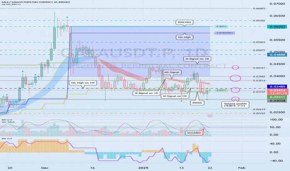
Example of explanation of chart analysis and trading strategy
Hello, traders.
If you "Follow", you can always get new information quickly.
Please click "Boost" as well.
Have a nice day today.
-------------------------------------
There was an inquiry asking for detailed information on how to analyze charts and create trading strategies accordingly, so I will take the time to explain it.
Before reading this article, you need a basic understanding of charts.
That is, you need to understand candles and price moving averages.
If you study this first and then read this content, I think you will have some understanding of trading.
---------------------------------------
Whether you are trading spot or futures, marking support and resistance points according to the arrangement of candles on the 1M, 1W, and 1D charts is the first task you need to do before trading.
To do this, you need to understand the arrangement of candles.
Therefore, before using my indicator, it is better to study candles first and understand the arrangement of candles.
When studying candles, it is better not to try to memorize the names or shapes of various patterns.
This is because the overall understanding of candles is important, not the various patterns of candles.
If you study with a book or video, you will be able to understand candles after reading or watching them at least 3 times.
We study charts to trade, not to analyze charts and teach them to others, so we need to study efficiently and save time.
-
If you study candles, you will naturally understand the price moving average.
The indicator corresponding to the price moving average is the MS-Signal indicator.
This MS-Signal indicator consists of the M-Signal indicator and the S-Signal indicator, and the main indicator is the M-Signal indicator.
Therefore, we added the M-Signal indicator of the 1W chart and the M-Signal indicator of the 1M chart to the 1D chart so that we can see the overall trend.
-
You can see the arrangement of the MS-Signal (M-Signal of 1M, 1W, 1D charts) indicators in the example chart.
Currently, since the M-Signal of the 1M chart > the M-Signal of the 1W chart, we can see that it is a reverse array.
If you understand the price moving average, you will understand that we should not trade when it is a reverse array, but when it is a regular array.
Therefore, since the current state of the example chart is a reverse array, it is not suitable for trading.
However, the reason we brought this chart in this state is because the M-Signal indicators of the 1M and 1W charts are converging.
As convergence progresses, it will eventually diverge.
Therefore, since the possibility of price volatility increases, the possibility of capturing the timing for trading increases depending on whether there is support at the support and resistance points.
-
The indicators included in the example chart are drawn as horizontal lines to indicate support and resistance points.
This work performs the same role as the support and resistance points drawn on the 1M, 1W, and 1D charts according to the arrangement of the candles mentioned above.
Therefore, on the 1M, 1W, and 1D charts, horizontal lines are drawn on the indicators to indicate support and resistance points.
You can draw horizontal lines on indicators that are horizontal for at least 3 candles, and if possible, 5 candles.
-
Among the HA-MS indicators, the important indicators are the HA-Low and HA-High indicators.
The HA-Low and HA-High indicators are indicators created for trading on the Heikin-Ashi chart.
Therefore, it is the next most important indicator after the MS-Signal (M-Signal on 1M, 1W, 1D charts) indicator that can tell the trend.
You can create a trading strategy depending on whether there is support near the HA-Low, HA-High indicators.
-
The next most important indicator is the BW(0), BW(100) indicator.
When this indicator is created or touched, it is time to respond in detail.
That is, when you are trading with a trading strategy created from the HA-Low, HA-High indicators, when the BW(0), BW(100) indicators are created or touched, you can choose whether to proceed with a split transaction.
In addition, you can understand the OBV, +100, -100 indicators as response points for split transactions.
Therefore, you do not need to indicate support and resistance points for the OBV, +100, -100 indicators.
However, it is recommended to mark support and resistance points for the HA-Low, HA-High, BW(0), BW(100) indicators.
-
If you look at the price position in the example chart, you can see that it is located in the 0.03347-0.03485 range.
And, the M-Signal indicator of the 1W chart is passing through this range, and the HA-High indicator of the 1W chart is acting as support and resistance.
Therefore, whether there is support near 0.03485 is an important key point.
If support is confirmed near 0.03485, it is a time to buy.
However, since the MS-Signal (M-Signal on the 1D chart) indicator is passing between 0.03485-0.03814, the point to watch is whether the MS-Signal (M-Signal on the 1D chart) indicator can break through upward.
As I mentioned earlier, if the MS-Signal indicator passes, a trend change will occur, so it is significant.
Therefore, in order to turn into a short-term uptrend, it is likely to be supported around 0.03814-0.03982.
Therefore, the first split selling section will be around 0.03814-0.03982.
At this time, whether to sell or hold depends on your investment style and investment period.
-
Since the M-Signal indicator on the 1M chart is passing around 0.04341, it is likely to start when the price is maintained above the M-Signal indicator on the 1M chart in order to turn into a long-term uptrend.
Therefore, the second split selling period will be around the M-Signal indicator on the 1M chart.
This is also something you can choose.
-
An important volume profile section is formed around 0.03038.
Therefore, the 0.03038 point corresponds to a strong support section.
-
(30m chart)
When the time frame chart you are trading is below the 1D chart, it is recommended to activate the 5EMA indicator on the 1D chart.
(I just used the 30m chart as an example. The same principle applies to any time frame chart you usually use.)
This is because there is a high possibility of volatility when the 5EMA of the 1D chart and the M-Signal indicator of the 1M, 1W, and 1D charts are touched.
In other words, you can understand that it plays a certain role of support and resistance.
If it touches the HA-High, BW(100) indicator and falls and falls below the MS-Signal indicator, it will basically touch the HA-Low or BW(0) indicator.
On the other hand, if it touches the HA-Low, BW(0) indicator and rises and rises above the MS-Signal indicator, it will basically touch the HA-High or BW(100) indicator.
However, since it may not do so and may rise or fall in the middle, it is necessary for the support and resistance points drawn on the 1M, 1W, and 1D charts as mentioned earlier.
The support and resistance points drawn on the 1D chart are currently indicated at the 0.03347 point.
Therefore, even if it falls below the MS-Signal indicator, you can understand that there is a possibility of rising again around 0.03347.
Since the 5EMA of the 1D chart and the M-Signal indicator of the 1W chart are passing around 0.03485, we can see that the area around 0.03485 is an important support and resistance zone.
-
Since the StochRSI indicator is currently above 50, we should focus on finding a time to sell.
Since it has fallen below the BW(100) and HA-High indicators, it has fallen too much to start trading with a sell (SHORT) position.
However, if you can respond quickly, you can enter a sell (SHORT) position when it falls from the 0.03411 point where the MS-Signal indicator is passing.
When the StochRSI indicator falls below 50, we should focus on finding a time to buy.
At this time, you can trade based on whether there is support or resistance at the support and resistance points drawn on the 1M, 1W, and 1D charts or around the MS-Signal (M-Signal on the 1M, 1W, and 1D charts), 5EMA, HA-Low, HA-High, BW(0), and BW(100) indicators on the 1D chart.
As mentioned earlier, you should not forget that trading strategies can be created based on whether there is support at the HA-Low and HA-High indicators.
Therefore, if possible, it is recommended to trade based on whether there is support near the HA-High indicator point of 0.03443.
-
Thank you for reading to the end.
I hope you have a successful trade.
--------------------------------------------------
Using Volume to Validate Market MovesVolume is one of those metrics that often sits quietly at the bottom of your chart, unnoticed by many traders. Yet, it plays a critical role in understanding the market’s behaviour. Think of volume as the fuel behind price movements—without it, even the most promising breakout can fizzle out. But, just like with fuel, more isn’t always better.
Today, we’re focusing on the simple volume histogram that appears at the bottom of most charts. While there are countless indicators built around volume—like On-Balance Volume (OBV) or the Volume-Weighted Average Price (VWAP)—the histogram is a straightforward, effective tool for gauging participation in the market. Let’s explore how to use it, how to put volume into context, and how it behaves with different price patterns, including the concept of volume divergence.
Simple Volume Histogram
Past performance is not a reliable indicator of future results
Why Volume Matters (and Why More Isn’t Always Better)
Volume measures how many shares or contracts change hands during a given period. When volume spikes, it signifies heightened interest—buyers and sellers actively engaging. However, it’s not as simple as “more volume equals better signals.”
For instance, a breakout on high volume often reflects strong conviction, but it can also indicate exhaustion at the end of a trend. Conversely, a low-volume breakout might lack the interest needed to sustain the move. Understanding the relationship between volume and price action is key to avoiding false signals.
A Simple Trick: The Volume Moving Average
One of the easiest ways to contextualise volume is by applying a moving average to the volume histogram. Platforms like TradingView make this simple: double-click the volume histogram, select ‘Style,’ tick the Volume MA box, and adjust the average length under ‘Inputs.’
A 9-period moving average, for example, acts as a baseline. When volume spikes significantly above the average, it suggests increased participation and potentially more meaningful price moves. Conversely, volume below the average often reflects quieter market phases.
Adding MA to Your Volume Histogram
Past performance is not a reliable indicator of future results
Volume Divergence: When Volume and Price Don’t Align
Volume divergence occurs when price action and volume move in opposite directions, often hinting at weakening trends or potential reversals.
Imagine an uptrend where the price makes higher highs, but volume decreases at each new peak. This divergence signals fading participation, suggesting the trend may be losing steam.
On the other hand, if the price trends lower while volume rises, sellers could be gaining momentum, increasing the likelihood of further downside.
Take the example below, where volume divergence on the FTSE 100 preceded a period of sideways consolidation.
Volume Divergence: FTSE 100 Daily Candle Chart
Past performance is not a reliable indicator of future results
Patterns That Thrive on High Volume
Certain price patterns rely on strong volume to confirm their validity. A classic example is a triangle breakout. As the price consolidates within the triangle, volume often contracts. When the breakout finally occurs, you want to see a surge in volume, confirming that participants are backing the move. Without it, the breakout might lack the conviction needed to sustain the trend.
Patterns That Prefer Lower Volume
Other patterns work best with subdued volume. A pullback within a trend is a great example. Let’s say a stock is in a strong uptrend and starts to retrace slightly. Ideally, you want to see declining volume during the pullback. This suggests the selling is more about profit-taking than aggressive distribution.
Once the pullback completes and the trend resumes, volume should pick up again. If the pullback occurs on high volume, it could indicate stronger selling pressure, signalling that the uptrend might be in trouble.
A Practical Example: DXY Pullback and Breakout
Let’s apply these concepts to a real-world case. In October, the dollar index (DXY) formed a steady uptrend followed by a pullback, creating a descending channel or bull flag.
During the flag formation, average volume declined, indicating reduced selling pressure. When the price broke out, volume surged to nearly triple the 20-day average—a clear signal of strong buying interest. This breakout led to a multi-week uptrend.
DXY Daily Candle Chart
Past performance is not a reliable indicator of future results
Final Thoughts
The volume histogram is a simple yet invaluable tool for traders. By applying a moving average to identify volume trends and watching for divergences between price and volume, you can gain a clearer understanding of market dynamics.
Volume isn’t just about how much activity is happening—it’s about when and how it aligns with price action. Whether you’re trading breakouts, pullbacks, or reversals, understanding volume can provide an essential layer of confirmation and help you spot potential warning signs.
Keep in mind, volume is just one piece of the puzzle. But when used correctly, it can give you a better sense of whether a price move has the backing it needs to succeed—or if it’s running on empty.
Disclaimer: This is for information and learning purposes only. The information provided does not constitute investment advice nor take into account the individual financial circumstances or objectives of any investor. Any information that may be provided relating to past performance is not a reliable indicator of future results or performance. Social media channels are not relevant for UK residents.
Spread bets and CFDs are complex instruments and come with a high risk of losing money rapidly due to leverage. 83% of retail investor accounts lose money when trading spread bets and CFDs with this provider. You should consider whether you understand how spread bets and CFDs work and whether you can afford to take the high risk of losing your money.

TYPES OF ORDER BLOCKSThis post is ideal for beginners who are just beginning to explore the basics of Smart Money Concepts (SMC). While we’ve previously covered the concept of an order block, today we’ll shift our focus to exploring other types of blocks in trading.

How to Avoid Falsa Breakouts and Breakdowns?Avoiding False Breakouts and False Breakdowns: A Guide for Traders
Have you ever seen a significant resistance level break and then opened a long trade, only for the market to make a sharp move to the downside? Or perhaps you've entered a short position after the price broke support, only to watch the market rebound?
If so, you're not alone. Many traders have fallen victim to false breakouts, so don't feel bad. Recognizing these situations can be challenging, but it's crucial to learn how to identify them.
In this article, we'll discuss false breakouts and breakdowns, and share two powerful strategies from the CRYPTOMOJO_TA team that can help you stay on the right side of the market and avoid unnecessary losses.
Understanding False Breakouts
The solution to avoiding false breakouts is quite simple: wait for the candle to close before acting on a breakout. Jumping into a trade as soon as the price breaks a key level can often lead to failure. Therefore, avoid placing entry orders above or below support and resistance levels to automatically enter a breakout. These orders can result in getting "wicked" into trades that never materialize.
The only way to successfully trade breakouts is to monitor the market closely and be prepared to act as soon as the candle closes in the breakout zone. Only then can you determine the breakout's strength.
How to Avoid a False Breakout
It can be almost impossible to tell a true breakout from a false one if you're not careful. Here are four ways to avoid falling for a failed breakout:
1. Take It Slow
One of the simplest yet most challenging ways to avoid a false breakout is simply to wait. Instead of rushing to enter a trade when the price breaks through support or resistance, take a step back. Depending on your trading style, give the market a few days to reveal whether the breakout is genuine. Often, the false breakouts will become apparent after some time.
2. Watch Your Candles
A more advanced version of waiting is to use candlestick charts to confirm the breakout. Wait until the candle closes to assess the strength of the breakout. The stronger the breakout appears, the more likely it is genuine.
Many traders lack the time to monitor their charts constantly, but with us, you can set alerts to notify you when specific market conditions are met. For a breakout, create an alert based on the candle's close price to ensure you're only entering after a true breakout.
3. Use Multiple Timeframe Analysis
Multiple timeframe analysis is an efficient way to identify potential breakouts and distinguish between genuine and false ones. Watch your chosen market across various timeframes. For instance, you might spot a potential breakout in the short term and then "zoom out" to analyze the market over a longer period, like a week or a month.
This broader perspective helps identify whether a breakout is significant in the long term or merely a short-term movement that may soon reverse.
4. Know the Usual Suspects
Some chart patterns can indicate the likelihood of a false breakout. These include ascending triangles, the head and shoulders pattern, and flag formations. Familiarizing yourself with these patterns can help you identify when a breakout is more likely to fail.
For example, ascending triangles often indicate a temporary market correction rather than a true breakout.
How to Trade a False Breakout
If you're a trader, you can use a false breakout as an opportunity to go short. Predict that the market will drop after the failed breakout and profit from the decline. Alternatively, you could hedge by opening both a long and a short position—going long in case the breakout is true, and short if it fails.
To trade a false breakout, follow these steps:
Create a live CFD trading account.
Perform technical analysis to identify potential false breakouts.
Manage your risk by using stop orders and limit orders.
Open and monitor your first trade.
How to Trade Breakouts
If you prefer to trade actual breakouts, here's how you can do it:
Create a live account or practice with a demo account.
Learn the signs of a potential breakout. You can find in-depth resources about breakouts on IG Academy to upskill yourself.
Open your first position.
Plan your exit strategy carefully, including setting stop orders and limit orders.
Take steps to manage your risk.
False Breakouts Summed Up
A false breakout occurs when the price moves beyond the normal support or resistance levels but fails to sustain the momentum, leading to a reversal. Traders may mistakenly go long during these events, only to see the price lose momentum shortly after.
You can avoid false breakouts or trade them intentionally by studying the market, learning chart patterns, analyzing timeframes, and using the right tools. With us, you can trade both breakouts and false breakouts using CFDs.
This chart is for informational purposes only.
Never Stop Learning
I would love to hear your thoughts, charts, and views in the comment section. Keep learning, stay patient, and keep improving your trading skills!
Thank you!

Analyzing the Market Performance of Dr. Reddy's Laboratories:Analyzing the Market Performance of Dr. Reddy's Laboratories: Trends, Support, and Resistance
Introduction
Lets delve into the recent market performance of Dr. Reddy's Laboratories (DRREDDY), a prominent player in the global pharmaceutical industry. We will examine the stock's technical aspects, incorporating support and resistance levels, trading volume, and options data to provide a comprehensive view of potential trading opportunities and risk factors.
Technical Analysis
Current Price: ₹1288.15
Resistance Levels:
Resistance 1: ₹1305.52
Resistance 2: ₹1322.88
Resistance 3: ₹1332.82
Support Levels:
Support 1: ₹1278.22
Support 2: ₹1268.28
Support 3: ₹1250.92
The trading volume for the current period stands at 738.79K, indicating moderate market activity. Higher volume often signifies strong investor interest and can be an early indicator of significant price changes.
The chart reveals critical resistance and support zones. The resistance zone around ₹1420.00 serves as a potential barrier to upward price movement, while the support zone around ₹1140.00 provides a safety net against significant downward trends. These zones are crucial for traders to make informed decisions regarding entry and exit points.
Options Data Analysis
The options data provide a detailed view of the current market sentiment and possible future price movements of DRREDDY's stock.
Key Observations:
Call and Put Activities:
Significant call writing activity across various strike prices (1300, 1310, 1320, 1330, 1340, 1360, 1380, 1400) indicates bearish sentiment. Investors are selling call options, expecting the stock not to rise above these levels.
Put short covering is observed at most strike prices, suggesting that investors who had previously sold put options are buying them back, possibly anticipating that the stock's decline might be limited.
At strike prices 1350, 1370, and 1390, there is call long covering, implying that traders are closing their long call positions, which could signal an expectation of decreased upward momentum.
LTP (Last Traded Price) and OI (Open Interest):
Higher LTP for puts compared to calls at lower strike prices indicates a higher demand for put options, reinforcing the bearish sentiment.
Substantial changes in open interest (OI) for calls at various strike prices suggest that traders are actively adjusting their positions in response to market conditions. Increased OI in calls generally signifies a buildup of new positions, while decreased OI indicates position closures.
For puts, the changes in OI also reflect market dynamics, with decreases in OI suggesting that traders are closing their bearish positions.
Strategy - DRREDDY 1300 Strike
DRREDDY is showing signs of action – here’s how you can make the most of it!
Strike Price : 1300 Call Option High: ₹35 Put Option High: ₹36.6
Plan of Action:
Focus on the side (Call or Put) that breaks its high first.
Quick Profits : Lock in gains based on your comfort level and market conditions.
Risk Management : Always implement a strict stop loss to safeguard your capital.
Why This Trade?
This strategy is designed to capture sharp price movements, offering potential opportunities in both upward and downward directions. Ideal for traders prepared to act swiftly on breakout levels.
Stay Ready – Don’t Miss Out! Be prepared to execute when the breakout happens!
Investment Implications
Based on the technical and options data analysis, DRREDDY's stock exhibits a balanced risk-reward ratio. Investors should closely monitor the support and resistance levels for potential breakout or breakdown scenarios. Additionally, keeping an eye on options data such as strike prices, built-up positions, and changes in open interest will aid in identifying the stock's future trajectory and potential trading opportunities.
Conclusion
Dr. Reddy's Laboratories' stock chart and options data offer valuable insights for investors and analysts. By understanding the support and resistance levels, volume trends, market sentiment, and options data, stakeholders can make informed investment decisions. As always, it is crucial to consider external factors and conduct thorough research before making any trading decisions.

Understanding Average True Range (ATR): A Measure of Market VolaThe Average True Range (ATR) is a technical analysis indicator that measures market volatility. Developed by J. Welles Wilder Jr., the ATR provides traders with insights into price fluctuations, helping them set stop-loss levels, identify breakout opportunities, and assess market conditions.
What is ATR?
ATR represents the average range of price movement over a specified period, capturing the level of volatility rather than the direction of price movement. A higher ATR indicates greater volatility, while a lower ATR suggests a calmer market.
How is ATR Calculated?
The ATR calculation involves three steps:
1. Determine the True Range (TR):
The True Range is the greatest of:
- The current high minus the current low.
- The absolute value of the current high minus the previous close.
- The absolute value of the current low minus the previous close.
2. Calculate the Average True Range:
- ATR is the moving average of the True Range over a specified period (typically 14 periods).
How to Use ATR in Trading
1.Set Stop-Loss Levels:
- Use ATR to place stop-loss orders at a distance that accounts for market volatility. For instance, set a stop-loss at 1.5x the ATR below the entry price in an uptrend.
2.Identify Breakouts:
- Compare current ATR values to historical ATR levels. A sudden spike in ATR often signals a breakout, indicating increased volatility and potential price movement.
3. Determine Market Conditions:
- High ATR values suggest volatile markets, often seen during major news events or market openings.
- Low ATR values indicate a period of consolidation or range-bound conditions.
4. Position Sizing:
- ATR can help calculate position sizes based on volatility, allowing traders to adjust their risk exposure accordingly.
Strengths of ATR
-Versatility:Can be applied to any asset class or timeframe.
- Adaptability:Works in trending and range-bound markets to measure volatility.
- Enhances Risk Management:Helps traders set realistic stop-loss levels based on market conditions.
Limitations of ATR
-Lagging Indicator:ATR is based on historical data and doesn’t predict future price movements.
-No Directional Bias:ATR measures volatility, not the direction of the trend.
-Context Needed:ATR values alone don’t provide actionable signals without additional analysis.
Best Practices for Using ATR
1. Combine with Other Indicators:
- Pair ATR with trend-following tools like moving averages or MACD to validate signals.
2.Adjust Periods:
- The default 14-period setting works well for most markets, but traders can adjust it based on their strategy and timeframe.
3.Use with Breakout Strategies:
- Monitor ATR spikes to identify potential breakout opportunities.
Example of ATR in Action
Imagine Ethereum (ETH) has an ATR value of $50 on a daily chart. A trader planning to enter a long position at $1,800 might set a stop-loss at $1,725 ($1,800 - 1.5x ATR) to account for typical price fluctuations. As the ATR increases to $75 during a volatile period, the trader adjusts their stop-loss level to $1,687.50 ($1,800 - 1.5x ATR), ensuring it reflects the heightened volatility.
Conclusion
The Average True Range is an invaluable tool for traders seeking to understand market volatility and manage risk effectively. While it doesn’t predict price direction, its ability to quantify volatility makes it a key component of any robust trading strategy. Practice incorporating ATR into your analysis to refine your approach and improve decision-making.

Commitment of Traders Modelled as Stratified Poissant Processes Hey! This video theorizes about the relevance of the poissant process in predicting areas of support and resistance in a way that accounts for temporal and probabilistic grounding. Essentially, the commitment of traders is modelled as a poissant process. Lambda is remeasured at each time step and the stratas' opacity reflects the strength of the probability, modelling trader capitulation as a time decay function. The recency and recurrence of information is intuitive and visible at a glance. Enjoy!

Example of how to use the Trend-Based Fib Extension tool
Hello, traders.
If you "Follow", you can always get new information quickly.
Please also click "Boost".
Have a nice day today.
-------------------------------------
There was a question about how to select the selection point when using the Trend-Based Fib Extension tool, so I will take the time to explain the method I use.
Since it is my method, it may be different from your method.
-
Before that, I will explain the difference from the general Fibonacci retracement tool.
The Fibonacci retracement tool uses the Fibonacci ratio as the ratio to be retracement within the selected range.
Therefore, the low and high points are likely to be the selection points.
The reason I say it is likely is because the lowest and highest points are different depending on which time frame chart it was drawn on.
Therefore, in order to use a chart tool that specifies a selection point like this, you must basically understand the arrangement of candles.
If you understand the arrangement of candles, you can draw the support and resistance points that make up it and determine the importance of those support and resistance points.
The HA-MS indicator that I am using is a more objective version of this.
Unlike the published HA-MS indicator, several have been added.
I do not plan to disclose the formulas of these added indicators yet.
However, if you share my ideas, you can use them normally at any time.
The selection point for using the current Fibonacci retracement tool is the point that the fingers are pointing to.
In other words, the 1st finger is the low point, and the 2nd finger is the high point.
One question may arise here.
Why is it the position of the 1st finger?
The reason is that it is the starting point of the current wave.
Therefore, you can find out the retracement ratio in the current rising wave.
In fact, it is not recommended to use the Fibonacci ratio as support and resistance.
This is because it is better to use the Fibonacci ratio to check how much wave is being reached and how much movement is being shown in chart analysis.
However, the Fibonacci ratio can be usefully used when the ATH or ATL is updated.
-
If the Fibonacci Retracement tool was a chart tool that found out the retracement ratio in the current wave, the Trend-Based Fib Extension tool can be said to be a chart tool that found out the extension ratio of the wave.
Therefore, while the Fibonacci Retracement tool requires you to specify two selection points, the Trend-Based Fib Extension tool requires you to specify three selection points.
That's how important it is to understand the arrangement of the candles.
The chart above is an example of drawing to find out the extension ratio of an uptrend
The chart above is an example of drawing to find out the extension ratio of a downtrend
Do you understand how the selection points are specified by looking at the example chart?
-
The chart above is the chart when the 1st finger point is selected.
The chart above is the chart when the 1-1 hand point is selected.
When drawing on a lower time frame chart, you should be careful about which point to select when the arrangement of the candles is ambiguous.
Examples include the 1st finger and the 1-1 finger.
It may be difficult to select 1-1 and 1 depending on whether they are interpreted as small waves or not.
The lower the time frame chart, the more difficult this selection becomes.
Therefore, it is recommended to draw on a higher time frame chart if possible.
The reason is that the Fibonacci ratio is a chart tool used to analyze charts.
In other words, it is not drawn for trading.
In order to trade, you trade based on whether there is support or resistance at the support and resistance points drawn on the 1M, 1W, and 1D charts.
-
Thank you for reading to the end.
I wish you successful trading.
--------------------------------------------------

Decoding Market Maker Tactics: An Educational BreakdownDecoding Market Maker Tactics: An Educational Guide for Trading Gold
If you’re trading Gold (XAU/USD), understanding market-maker tactics is essential. This guide will teach you how to decode liquidity traps, fake breakouts, and stop-loss sweeps using the 8H XAU/USD chart as a real-world example.
With recent economic events like U.S. Retail Sales, CPI inflation data, and central bank comments, Gold’s price movement was a textbook case of market-maker manipulation. By studying this chart, you’ll learn how to recognize their tactics and position yourself to trade smarter.
Let’s break it down step-by-step, with direct cues from the chart.
1. Key Levels and Zones: The Battleground
Referencing the 8H XAU/USD Chart, we observe key levels that highlight market maker strategies:
Resistance Zones: Retail Traps
$2,724 – Major Psychological Resistance
🔴 Chart Cue: A highlighted resistance area where sellers aggressively defend. Market makers engineered a fake breakout to trap buyers, as seen with the liquidity sweep warning on the chart.
Lesson: Always be cautious of breakouts at such heavily defended psychological levels unless backed by strong volume.
$2,710 – $2,706 (Point of Control - POC)
🟠 Chart Cue: This area represents the highest volume traded, marked as a pivot zone. Notice how price consolidates here, creating doji candles and indecision before sharp movements.
Support Zones: Stop-Loss Hunting Grounds
$2,689 – Strong Support
🟢 Chart Cue: Buyers defended this level repeatedly (visible with long lower wicks), but market makers pushed below to trigger stop-losses before reversing upward.
Key Insight: This manipulation was a classic liquidity grab.
$2,682 – Secondary Support (Liquidity Grab Zone)
🔴 Chart Cue: The chart identifies this as a prime stop-loss hunting zone, where price dipped sharply before rebounding. The liquidity grab here highlights market maker positioning before a reversal.
2. How Economic News Fueled Manipulation
Recent news amplified volatility and provided market makers with opportunities to manipulate price.
Tuesday: U.S. Retail Sales Data
Impact: Strong retail sales drove the USD higher, pushing Gold below $2,689. Retail traders went short, expecting further declines.
Chart Evidence: The volume imbalance below $2,689 highlights the liquidity grab before the sharp reversal.
Thursday: CPI Inflation Report
Impact: Slightly lower-than-expected CPI figures spiked Gold prices to $2,724, enticing breakout buyers.
Chart Evidence: The liquidity sweep warning at $2,724 confirms a false breakout, where market makers absorbed buy orders before reversing.
Friday: Central Bank Comments
Impact: Dovish remarks boosted Gold momentarily, but price consolidated around $2,710 (POC).
Chart Evidence: Candles near the POC indicate indecision before another stop-loss sweep below $2,689, followed by a recovery.
3. Candlestick and Price Action Patterns
The chart reveals essential price action signals that help anticipate market-maker moves:
Inside Bar Formation:
Multiple candles near $2,724 signal price compression. These patterns often precede false breakouts, as seen after CPI news.
Wick Rejections:
At $2,724: Long upper wicks confirm selling pressure.
At $2,689: Long lower wicks indicate stop-loss hunting.
Candles at POC ($2,706):
Reflect market indecision, hinting at a pending sharp move.
4. Volume and Liquidity Analysis
Volume dynamics reveal critical insights into market manipulation:
Shrinking Volume at Resistance ($2,724):
Weak buying pressure at resistance confirms exhaustion, setting up a fake breakout trap (marked on the chart).
Volume Void Below $2,689:
The chart’s volume analysis indicates a high-probability liquidity grab zone, where market makers fill positions before reversing.
5. Trend and Wave Analysis
Using wave theory and higher-timeframe trends:
Corrective Wave (Wave 4):
The current corrective wave shows typical liquidity grabs and false moves, aligning with the chart’s liquidity sweep zones.
Broader Trend:
Despite the manipulation, Gold remains in a long-term uptrend. The current correction will likely give way to a bullish Wave 5.
6. Market Correlations
The chart’s spillover impact indicators reveal Gold’s self-driven movement last week:
DXY (0.12): Weak positive correlation.
S&P 500 (-0.04): Minimal inverse correlation, as expected for a safe-haven asset. Key Takeaway: Liquidity dynamics remain the primary driver for Gold, not external markets.
7. Hypothetical Trade Setups
Educational trade setups inspired by the chart:
Trade Setup 1: Buy After Liquidity Grab
Order Type: Buy Limit
Entry: $2,682
Take Profit: $2,724
Stop Loss: $2,675
Chart Cue: Liquidity grab zone identified at $2,682, aligning with harmonic reversal.
Trade Setup 2: Sell the Fake Breakout
Order Type: Sell Limit
Entry: $2,724
Take Profit: $2,689
Stop Loss: $2,730
Chart Cue: Liquidity sweep warning at $2,724 indicates a probable fake breakout.
8. Why Use the 8H Chart for Gold?
The uploaded 8H XAU/USD chart offers the perfect balance:
Clarity: It reduces noise from smaller timeframes while revealing mid-term liquidity zones.
Precision: Patterns like wick rejections, volume voids, and fake breakouts are clearly visible.
9. Conclusion: Outsmart the Manipulators
This 8H XAU/USD chart showcases a masterclass in market-maker tactics:
Traps Set: A fake breakout above $2,724 caught breakout buyers.
Stop-Loss Sweep: A liquidity grab below $2,682 punished unprepared buyers.
Final Tip: Trade smart. Focus on liquidity zones and price action setups to position yourself like a professional, avoiding retail traps.

Fast Profits: Bullish Scalping Patterns Every Trader Should Know1. Bullish Exhaustion Bar
Definition:
A bullish exhaustion bar occurs at the end of a bearish trend, signaling that sellers are losing momentum and buyers are stepping in. It reflects the market's indecision before a potential reversal.
Key Characteristics:
Long lower wick (indicates rejection of lower prices).
Small body near the top of the candlestick.
Often forms at support levels or near demand zones.
Volume may spike, signaling increased buyer interest.
Trading Tips:
Look for confirmation on the next bar (e.g., a bullish close above the exhaustion bar).
Combine with other tools like trendlines or indicators (e.g., RSI divergence).
Place a stop-loss below the low of the exhaustion bar.
---------------------------------
2. Bullish Reversal Bar
Definition:
A bullish reversal bar forms during a downtrend and indicates a potential reversal to the upside. This candlestick suggests that buyers are gaining control.
Key Characteristics:
Closes higher than it opens, forming a green candle.
Appears after a series of bearish candles.
Often accompanied by high trading volume.
Trading Tips:
Best used at key support levels or demand zones.
Wait for a bullish confirmation (e.g., a break above the high of the reversal bar).
Place stop-loss below the low of the reversal bar.
---------------------------------
3. Key Reversal Bar
Definition:
A key reversal bar signals a strong change in market sentiment, often marking the end of a trend or the beginning of a new one.
Key Characteristics:
Opens below the previous bar's low but closes above the previous bar's high.
Indicates a sharp shift from bearish to bullish momentum.
Often forms at major support levels or after significant downtrends.
Trading Tips:
Look for confluence with other indicators or support levels.
Use the high of the key reversal bar as an entry point.
Place stop-loss below the low of the reversal bar.
--------------------------------
4. Bullish Pin Bar
Definition:
A bullish pin bar (or hammer) is a single candlestick pattern with a long lower wick and a small body near the top. It shows strong rejection of lower prices and a shift toward bullish momentum.
Key Characteristics:
Long lower shadow, at least two-thirds of the candlestick's length.
Small real body near the upper end of the range.
Little to no upper wick.
Trading Tips:
Effective when it forms at support levels or Fibonacci retracement zones.
Enter on the break of the pin bar's high.
Place a stop-loss below the pin bar’s low.
-------------------------------
5. Bullish 3-Bar Reversal
Definition:
A bullish 3-bar reversal pattern consists of three consecutive candlesticks, signaling a reversal from bearish to bullish momentum.
Key Characteristics:
The first bar is bearish, continuing the downtrend.
The second bar has a smaller body, often an indecision candle.
The third bar is a strong bullish candle that closes above the first bar's high.
Trading Tips:
A reliable pattern for trend reversals at support levels.
Enter after the third bar closes above the first bar’s high.
Stop-loss can be placed below the low of the pattern.
-----------------------------
Final Notes:
To use these patterns effectively:
Combine them with key support/resistance levels, trendlines, or Fibonacci retracements.
Use volume analysis to confirm the strength of the pattern.
Always seek confirmation from subsequent candles before entering trades.

I need objective information to help me interpret the chart
Hello, traders.
If you "Follow", you can always get new information quickly.
Please click "Boost" as well.
Have a nice day today.
-------------------------------------
With this decline, the BW(100) indicator was created at 104556.23.
Accordingly, the high boundary section is the 101947.24-104556.23 section.
Unfortunately, since it fell below 101947.24, the key is whether it can receive support near the MS-Signal (M-Signal on the 1D chart) indicator, i.e., around 98892.0, and rise.
If it falls below the MS-Signal (M-Signal on the 1D chart) indicator and shows resistance, it is highly likely to turn into a short-term downtrend.
-
The settings for the StochRSI indicator I use are 14, 7, 3, 3 (RSI, Stoch, K, D).
The source value is ohlc4.
If you set it as above, it will show a movement similar to the StochRSI indicator on my chart.
When the StochRSI indicator
- falls in the overbought zone,
- is located near the 50 point,
- rises in the oversold zone,
volatility is likely to occur.
However, you should check whether there is support near the support and resistance points drawn on the 1M, 1W, and 1D charts and think of a corresponding response plan.
Therefore, by checking the relationship between the movement of the StochRSI indicator and the support and resistance points drawn on the 1M, 1W, and 1D charts, you can choose the point where you can make a trade.
If you can calculate these selection points, I think it is highly likely that you will be able to create a trading strategy that suits your investment style.
It is good to predict future movements with trends or waves, but if you can calculate the point where you can actually make a trade, I think you can create a better trading strategy.
-
I wrote a long article, but
1. Will the StochRSI indicator fall in the overbought zone?
2. Will it receive support near the MS-Signal (M-Signal on the 1D chart) indicator?
3. Will it rise to the high boundary section?
You should focus on the three things above.
---------------------------------
The method of drawing support and resistance points is drawn according to the arrangement of candles.
This method can actually include subjective thoughts, so it requires skill.
Therefore, if possible, I recommend that you sign up as a paid member of TradingView and share my charts with me, and use the HA-High, HA-Low, BW(100), BW(0), OBV, +100, -100 indicators that appear on 1M, 1W, and 1D charts by the HA-MS_BW+v2 indicator as horizontal lines and use them as support and resistance points.
Then, even if others look at the charts, they will be easier to understand, and it will be easier to share opinions on trading strategies according to each other's investment styles.
By utilizing indicators that anyone can use in this way, you will be able to view the charts objectively.
If you trade based on what others tell you, you will likely not be able to respond quickly when sudden volatility occurs.
Therefore, when creating a trading strategy, you should roughly think about how to respond to all cases, both when it goes up and when it goes down.
That's why it's best to draw support and resistance points or other reference materials on your chart if possible and prepare countermeasures accordingly.
-
Thank you for reading to the end.
I hope you have a successful trade.
--------------------------------------------------

Master ICT Weekly Profiles❔ What Are ICT Weekly Profiles?
ICT Weekly Profiles are conceptual frameworks designed to illustrate common patterns of price behavior observed during a trading week. These profiles help traders analyze and anticipate potential market movements based on historical tendencies and recurring patterns.
Each ICT Weekly Profile has distinct characteristics, providing insights into how price action might unfold within a given week. However, it is essential to emphasize that these profiles are not definitive predictions but tools for understanding market tendencies and guiding decision-making.
Detailed explanations of each ICT Weekly Profile, accompanied by examples, are provided below.
🌟 Classic Tuesday Low of the Week Bullish
In a bullish scenario, the market often exhibits a manipulative move on Monday, hovering above a higher time frame discount array.
By Tuesday, the price typically retraces into this higher time frame discount array, establishing the low of the week before resuming its upward trajectory.
To anticipate this behavior, it is crucial to identify the higher time frame discount array.
If the market does not drop into the discount array on Monday, it is highly likely that Tuesday will see a drive lower, forming the weekly low during the London or New York session.
👉 Classic Tuesday High of the Week Bearish
In a bearish scenario, the market may exhibit a manipulative move on Monday, hovering below a higher time frame premium array.
On Tuesday, the price typically rises into this higher time frame premium array, establishing the high of the week before resuming its downward trend.
To effectively anticipate this behavior, it is essential to identify the higher time frame premium array.
If the market does not rise into the premium array on Monday, it is highly probable that Tuesday will witness a drive higher, forming the weekly high during the London or New York session.
ℹ️ Wednesday Low of the Week Bullish
In a bullish market, price action often exhibits manipulative behavior on Monday and Tuesday, hovering above a higher time frame discount array.
On Wednesday, the price typically drops into the higher time frame discount array, establishing the low of the week before resuming its upward movement.
Key Insight:
To anticipate this phenomenon, it is crucial to identify the higher time frame discount array.
If the market does not drop into the discount array on Monday or Tuesday, it is highly likely that Wednesday will see a drive lower, forming the weekly low during the London or New York session.
🔗 Wednesday High of the Week Bearish
In a bearish market, price action often displays manipulative moves on Monday and Tuesday, hovering below a higher time frame premium array.
On Wednesday, the price typically rises into the higher time frame premium array, marking the high of the week before continuing its downward trajectory.
Key Insight:
To anticipate this phenomenon, understanding the higher time frame premium array is essential.
If the market does not rise into the premium array on Monday or Tuesday, it is highly probable that Wednesday will see a drive higher, forming the weekly high during the London or New York session.
🟢 Consolidation Thursday Bullish Reversal
In a bullish market, price may consolidate from Monday through Wednesday before running the intra-week low and rejecting it, forming a reversal.
How to Anticipate:
Identify the higher time frame discount array.
If price fails to drop into the discount array earlier in the week, Thursday may see a drive lower due to market-moving news or an interest rate release, typically around 2:00 PM (New York local time).
ⓘ Consolidation Thursday Bearish Reversal
In a bearish market, price may consolidate from Monday through Wednesday before running the intra-week high and rejecting it, forming a reversal.
How to Anticipate:
Recognize the higher time frame premium array.
If price fails to rise into the premium array earlier in the week, Thursday may see a drive higher triggered by market news or an interest rate release around 2:00 PM (New York local time).
📈 Consolidation Midweek Rally Bullish
When price is bullish and consolidates from Monday through Wednesday, it may run into the intra-week high and expand higher into Friday.
How to Anticipate:
Look for a scenario where price has yet to reach the higher time frame premium array but has recently rallied from a discount array and paused without any bearish reversal signals.
This suggests the price is preparing to expand higher towards the premium array.
🔴 Consolidation Midweek Decline Bearish
When price is bearish and consolidates from Monday through Wednesday, it may run into the intra-week low and expand lower into Friday.
How to Anticipate:
Identify if price has yet to reach the higher time frame discount array but has recently declined from a premium array and paused without any bullish reversal signals.
This indicates the price is likely to expand lower towards the discount array.
⛔ Seek and Destroy Bullish Friday
This is a neutral to low-probability profile. From Monday to Thursday, price consolidates while running shallow stops above and below the intra-week high. On Friday, it runs the intra-week high and expands higher.
How to Anticipate:
Such conditions often arise during periods of interest rate announcements or Non-Farm Payroll reports, especially in the summer months (July and August).
It is advisable to avoid trading under these conditions due to increased unpredictability.
⚡ Seek and Destroy Bearish Friday
This is a neutral to low-probability profile. From Monday to Thursday, price consolidates while running shallow stops above and below the intra-week high. On Friday, it runs the intra-week low and expands lower.
How to Anticipate:
This profile is common during major news events, such as interest rate announcements or Non-Farm Payroll releases in the summer months (July and August).
Trading in these conditions is best avoided.
🧠 Wednesday Weekly Bullish Reversal
In a bullish market, price consolidates from Monday through Tuesday, drives lower into a higher time frame discount array on Wednesday, inducing sell stops, and then reverses strongly.
Key Characteristics:
This pattern often occurs when the market is trading at long-term or intermediate-term lows.
Institutional buying is paired with sell-side liquidity, typically targeting sell stops.
💪 Wednesday Weekly Bearish Reversal
In a bearish market, price consolidates from Monday through Tuesday, drives higher into a higher time frame premium array on Wednesday, inducing buy stops, and then reverses strongly.
Key Characteristics:
This pattern commonly appears when the market is trading at long-term or intermediate-term highs.
Institutional selling aligns with buy-side liquidity, typically targeting buy stops.
🎉 Conclusion
ICT Weekly Profiles are structured frameworks designed to identify recurring patterns in price movements over the course of a trading week.
These profiles encompass various scenarios, including bullish and bearish trends, midweek reversals, and periods of consolidation.
By studying these patterns, traders can anticipate potential weekly highs and lows by analyzing price behavior on specific days, such as Monday through Wednesday.

combined guide for both the **Regime Classifier** and **kNN Here’s the combined guide for both the **Regime Classifier** and **kNN (k-Nearest Neighbors)** indicators with emojis, tailored for your TradingView chart description:
---
### **🔑 Individual Lesson Steps**
#### **Lesson 1: What is a Regime Classifier?**
👽 **Defining Market Regimes**
- A **market regime** refers to distinct market conditions based on price behavior and volatility.
- **Types of Market Regimes:**
- 🚀 **Advance** (Uptrend)
- 📉 **Decline** (Downtrend)
- 🔄 **Accumulation** (Consolidation)
- ⬆️⬇️ **Distribution** (Topping/Bottoming Patterns)
👾 **Why it Matters:**
- Identifying market regimes helps traders tailor their strategies, manage risk, and make more accurate decisions.
---
#### **Lesson 2: Anatomy of the Regime Classifier Indicator**
👽 **Core Components**
- **Median Filtering:** Smooths out price data to capture significant trends.
- **Clustering Model:** Classifies price trends and volatility into distinct regimes.
- **Volatility Analysis:** Analyzes price volatility with rolling windows to detect high and low volatility phases.
👾 **Advanced Features:**
- **Dynamic Cycle Oscillator (DCO):** Tracks price momentum and cyclic behavior.
- **Regime Visualization:** Color-coded display of market conditions to make trends and patterns clearer.
---
#### **Lesson 3: Configuring the Regime Classifier Indicator**
👽 **Customization Settings**
- **Filter Window Size:** Adjusts sensitivity for detecting trends.
- **ATR Lookback Period:** Determines how far back the volatility is calculated.
- **Clustering Window & Refit Interval:** Fine-tunes how the indicator adapts to new market conditions.
- **Dynamic Cycle Oscillator Settings:** Tailors lookback periods and smoothing factors.
👾 **Why It’s Useful:**
- Customizing these settings helps traders optimize the indicator for different trading styles (e.g., scalping, swing trading, long-term investing).
---
#### **Lesson 4: Using the Indicator for Regime-Based Trading Strategies**
👽 **Adapt Strategies Based on Regimes**
- **Advance Regime:** Focus on long positions and trend-following strategies.
- **Decline Regime:** Prioritize short positions or hedging strategies.
- **Accumulation Regime:** Watch for breakout opportunities.
- **Distribution Regime:** Look for trend reversals or fading trends.
👾 **Using the Dynamic Cycle Oscillator for Confirmation:**
- 🌡️ **Overbought/Oversold Conditions:** Identify potential reversals.
- 🔄 **Trend Momentum:** Confirm if the trend is gaining or losing strength.
---
#### **Lesson 5: Combining Volatility and Price Trends for High-Confidence Trades**
👽 **Interpreting Volatility Clusters**
- 🔥 **High Volatility:** Indicates caution, risk management, or hedging opportunities.
- 🌿 **Low Volatility:** Suggests consolidation or trend continuation.
👾 **How Volatility Clusters Interact with Price Trends:**
- Combine trend direction with volatility analysis to refine trade entries and exits for more precise decisions.
---
#### **Lesson 6: Backtesting and Live Application**
👽 **Validate Using Historical Data**
- Guide traders on **backtesting** strategies using historical data to see how the indicator would have performed.
👾 **Real-Time Application:**
- Implement the Regime Classifier in **live markets** to monitor ongoing price conditions and gain actionable insights.
---
### **🔑 kNN (k-Nearest Neighbors) Indicator Lesson Steps**
#### **Lesson 1: What is kNN?**
👽 **Defining kNN**
- **k-Nearest Neighbors** is a machine learning algorithm that makes predictions based on the proximity of data points.
- It identifies the nearest neighbors of a data point and classifies it according to the majority class of those neighbors.
👾 **Why it Matters:**
- **kNN** helps traders forecast price movement, trends, and potential reversals by analyzing historical data.
---
#### **Lesson 2: Anatomy of the kNN Indicator**
👽 **Core Components**
- **Training Data:** Historical price data used to identify the neighbors of a point.
- **Distance Metric:** Determines the closeness of data points (e.g., Euclidean distance).
- **k Parameter:** The number of nearest neighbors to consider for predictions.
👾 **Advanced Features:**
- **Distance Calculation:** Helps assess how similar current price movement is to historical patterns.
- **Prediction:** The majority of the nearest neighbors determines the expected price movement (up or down).
---
#### **Lesson 3: Configuring the kNN Indicator**
👽 **Customization Settings**
- **k (Number of Neighbors):** Adjust to control how many historical data points influence predictions.
- **Distance Metric:** Choose from Euclidean, Manhattan, or other metrics based on data characteristics.
- **Window Size:** Defines how many data points (e.g., time periods) are used for analysis.
👾 **Why It’s Useful:**
- Tuning these settings allows traders to adjust the sensitivity and precision of predictions, optimizing for various trading styles.
---
#### **Lesson 4: Using the kNN Indicator for Predictive Trading Strategies**
👽 **Predicting Price Movements**
- Use **kNN** to identify trend directions and price reversals based on historical proximity.
- **Uptrend Prediction:** Identify moments where the nearest neighbors suggest a continuation of the trend.
- **Downtrend Prediction:** Signal when the majority of neighbors point toward price decline.
👾 **Using Predictions to Enhance Trade Entries:**
- Use **kNN** signals in conjunction with **Regime Classifier** regimes to validate and enhance entry and exit points.
---
#### **Lesson 5: Combining kNN Predictions with Regime Classifier for Precision**
👽 **Refining Trade Confidence**
- Cross-reference **kNN predictions** (uptrend/downtrend) with **Regime Classifier’s** regime identification for higher precision trades.
- **Example:** If **kNN** predicts an uptrend and the **Regime Classifier** signals an **Advance** regime, you can confidently go long.
---
#### **Lesson 6: Backtesting and Live Application**
👽 **Validate Predictions with Historical Data**
- Backtest using **kNN** on past price data to measure accuracy in predicting trends and reversals.
- **Real-Time Application:** Implement **kNN** in live markets alongside **Regime Classifier** for comprehensive decision-making.
---
### **🔄 Combined Lessons for Advanced Mastery**
#### **Combo 1: Regime Identification and kNN Predictions for Strategy Optimization**
💡 **Objective:** Combine market regime identification with kNN predictions to refine trading strategies.
- Merge **Lesson 1 (Understanding Regimes)** and **Lesson 1 (What is kNN?)**.
- **Practical Exercise:** Use both indicators to identify regimes and predict price trends in live charts.
---
#### **Combo 2: Customization, Practical Usage, and Enhanced Predictions**
💡 **Objective:** Equip traders to fine-tune both indicators for their unique strategies.
- Merge **Lesson 3 (Settings Configuration for Regime Classifier)** and **Lesson 3 (kNN Indicator Configuration)**.
- Walkthrough: Customize settings and combine both indicators to predict price trends and adjust strategies accordingly.
---
#### **Combo 3: Comprehensive Trading Strategy with Regime Classifier and kNN**
💡 **Objective:** Build a full-fledged trading system using both indicators for market regime analysis and predictive signals.
- Combine **all lessons** for a complete, systematic trading approach:
- 🔍 **Identify market regimes**
- 🔄 **Use kNN predictions** to assess potential price movements
- 📈 **Combine with Dynamic Cycle Oscillator** for entry/exit timing
- 💥 **Execute trades** with a comprehensive strategy
---
These lessons and combos provide traders with the essential tools to master both the **Regime Classifier** and **k-Nearest Neighbors** indicators, from understanding the fundamentals to implementing advanced strategies and refining predictions for more accurate market analysis.

The TrumpCoin Craze: What’s Really Going On?Yesterday, something truly bizarre happened in the world of crypto. Donald Trump—yes, that Donald Trump—launched his very own cryptocurrency, TrumpCoin ($TRUMP).
At first, like everyone else, I thought his account had been hacked.
I mean, launching a meme coin just days before his presidential inauguration? Come on...
But nope, it’s 100% real. Verified.
Like many others, I got curious and, let’s face it, greedy. So, I bought in. The result? I cashed out at a nice 3x profit, enough for a fun night out. But before we dive into the crazy market activity, let me clarify a couple of things:
- I’m not a Trump fan. This isn’t about politics.
- I don’t think this is a rug pull, at least not intentionally .
It seems more like someone who doesn’t fully understand how crypto works decided to jump in.
A Brief Timeline of Chaos
TrumpCoin was announced on his social platforms, including Truth Social and X (formerly Twitter). Initially, everyone thought it was fake news. I mean, a meme coin with his name on it? Right before inauguration day? It screams “scam.” But soon after, major crypto news outlets confirmed its legitimacy.
And then the madness began. Within hours:
- Market cap: Over $14 billion at the time of writing(and climbing).
- Trading volume: A jaw-dropping $11 billion in just one day.
- Price swings: The coin hit a high of $3.30 before dipping below $1.50 and now is above $4.
Trump’s company, CIC Digital LLC, reportedly holds 80% of the coin supply, making this a financial windfall for him—even if the project crashes.
The Crypto Community Splits
This move has divided the crypto space. On one hand, you have people who are treating $TRUMP like any other speculative asset. ( Hi, that’s me! )
On the other, there are folks who see it as a statement of loyalty to Trump. Then there’s a third group—the skeptics—who warn that this could end in disaster.
The real problem? Newbies are piling in without understanding what they’re doing. The hype is pulling in people who don’t know a rug pull from a blockchain. They’re buying and buying, hoping to ride the wave, and are likely to get burned when the bubble bursts.
Is This a Rug Pull?
Let’s address the elephant in the room. With 80% of the supply in Trump’s control, the setup raises eyebrows. But is this an intentional scam? Probably not. If anything, this feels more like a PR stunt gone wild—a way to cash in on his fame and make a splash before returning to the White House.
That said, the outcome could still be the same. At some point, the hype will die, the price will tank, and many will lose money. The bigger it gets, the harder it’ll fall.
My Take: Enjoy the Ride, but Be Careful
TrumpCoin is the epitome of crypto’s wild side: volatile, unpredictable, and more about hype than substance. If you’re diving in, know what you’re getting into. For me, it was a quick trade—buy low, sell high, and get out. But I worry about the inexperienced investors who are holding on, hoping for it to hit $10, $20, or even higher.
So, here’s my advice:
Don’t invest more than you can afford to lose.
Take profits while you can.
Remember, just because something is popular doesn’t mean it’s sustainable.
Whether $TRUMP reaches a $25 billion, $50 billion market cap or crashes spectacularly, one thing’s for sure—it’s going to be one heck of a ride.
Stay safe out there, and happy trading!
